Nicole, Copywriter | Branding
Samantha | Social Media Manager & Graphic Designer
Strategic Brand Design for Nicole Paleng, Health Tech Copywriter
The Challenge:
Nicole Paleng, a copywriter in the health tech space, needed a clear and cohesive brand identity to stand out and connect with Gen Z and Millennial professionals. Her existing brand lacked emotional resonance and a unified design that reflected her expertise and values.
The Solution:
The health tech space can sometimes feel impersonal, with a focus on technology rather than human connection. We broke through this norm by creating a comprehensive brand identity for Nicole that reflects warmth, empathy, and a human-centered approach.
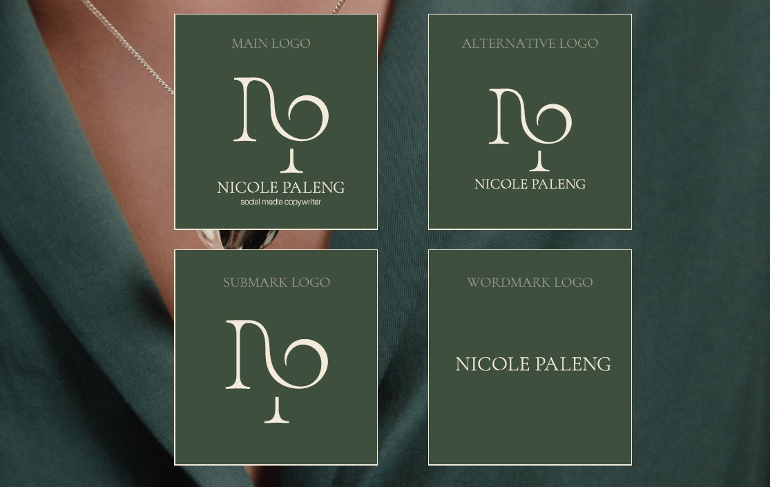
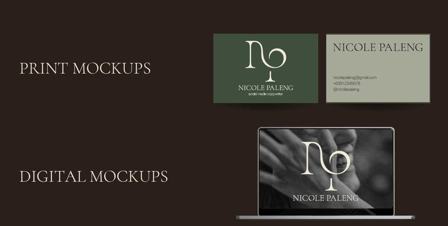
Visual Identity Design:
Her brand identity was designed to embody the “Sage” archetype, representing wisdom, guidance, and truth.
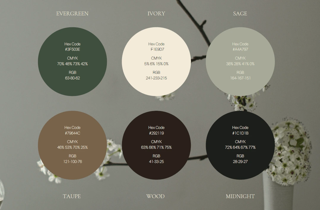
The brand’s color palette is a harmonious mix of earthy and natural tones with primary colors (Evergreen, Ivory, Sage) dominating 60% of the visuals. These colors evoke a sense of calm and sophistication, aligning with Nicole’s aim to create a “safe space” through her online presence.
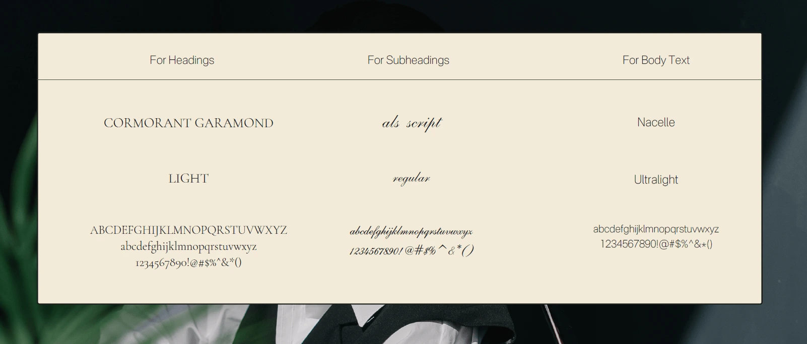
The fonts chosen for her brand—Cormorant Garamond for headings, Als Script for subheadings, and Nacelle for body text—further reflect her values. Cormorant Garamond adds a touch of elegance and professionalism, while the softer, script elements in subheadings lend a sense of approachability and warmth.
We designed custom illustrations and icons that incorporate elements of water lilies, flowers, and the world icon. These symbols represent Nicole's global reach, her commitment to growth and nurturing, and her approach to health tech that centers on compassion and connection.
Water Lilies symbolize tranquility, healing, and the beauty of nature—emphasizing Nicole’s ability to bring calm and clarity in a complex, often overwhelming field.
Flowers represent growth, life, and transformation, aligning with Nicole's mission to foster positive change in health tech.
The World Icon signifies Nicole’s global perspective and the far-reaching impact of her work in health technology.
Together, these elements form a cohesive visual identity that balances professionalism with warmth, reflecting Nicole’s unique approach to the health tech space.
Like this project
Posted Nov 9, 2024
Designed a warm, human-centered brand identity for Nicole Paleng to help her stand out in the cold health tech space.