Swipe, Tap, Done! Redesigning a Local Bank’s App Experience.
Intro
Ever since I got my first job and had to deal with receiving my monthly salary, I also had to deal with banking apps for easy transfers, viewing my balance, and other tasks to avoid going to the bank and performing these actions on-site. Most of the banking apps are really hard to navigate and not very visually appealing; they look like they were made a long time ago and are not up to date. Back then, I had a brief eye for design, but I didn’t think I could do anything about it. However, now that I have started to learn UI/UX design, I chose to redesign a banking app as my first project, and here it is.
The Problem
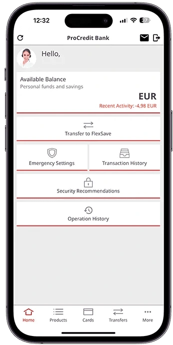
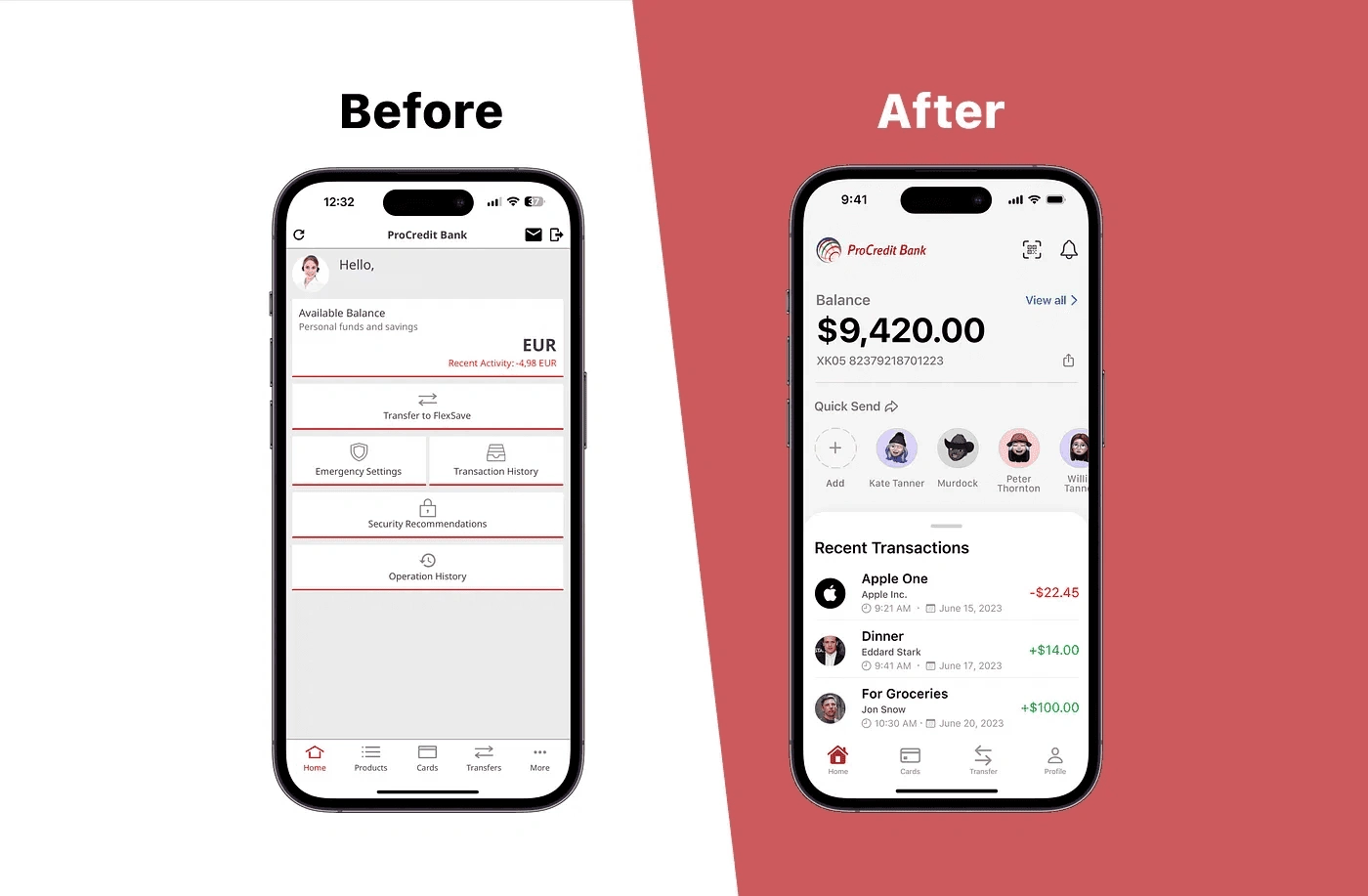
Upon logging into the app, you are directed to the Home Screen. The app generally has an outdated design. The title bar contains the “Log Out” button, which can be pressed accidentally when you want to view your messages. Additionally, there is no need for a refresh button since dragging down to refresh the page has become the go-to action for users.
As you scan down the app, it “greets you,” which is nice if you’ve just downloaded it for the first time, but it’s unnecessary after opening the app for the 100th time.
The main problem with the Home Screen is the inclusion of features that don’t belong there. For example, “Security Recommendations” doesn’t belong on the Home Screen and could be placed on a less important screen since it’s a feature that won’t be frequently used. Similarly, “Emergency Settings,” which allows for actions like freezing a card, changing a PIN, and adjusting card limits, should be placed on the Cards Screen for better navigation.
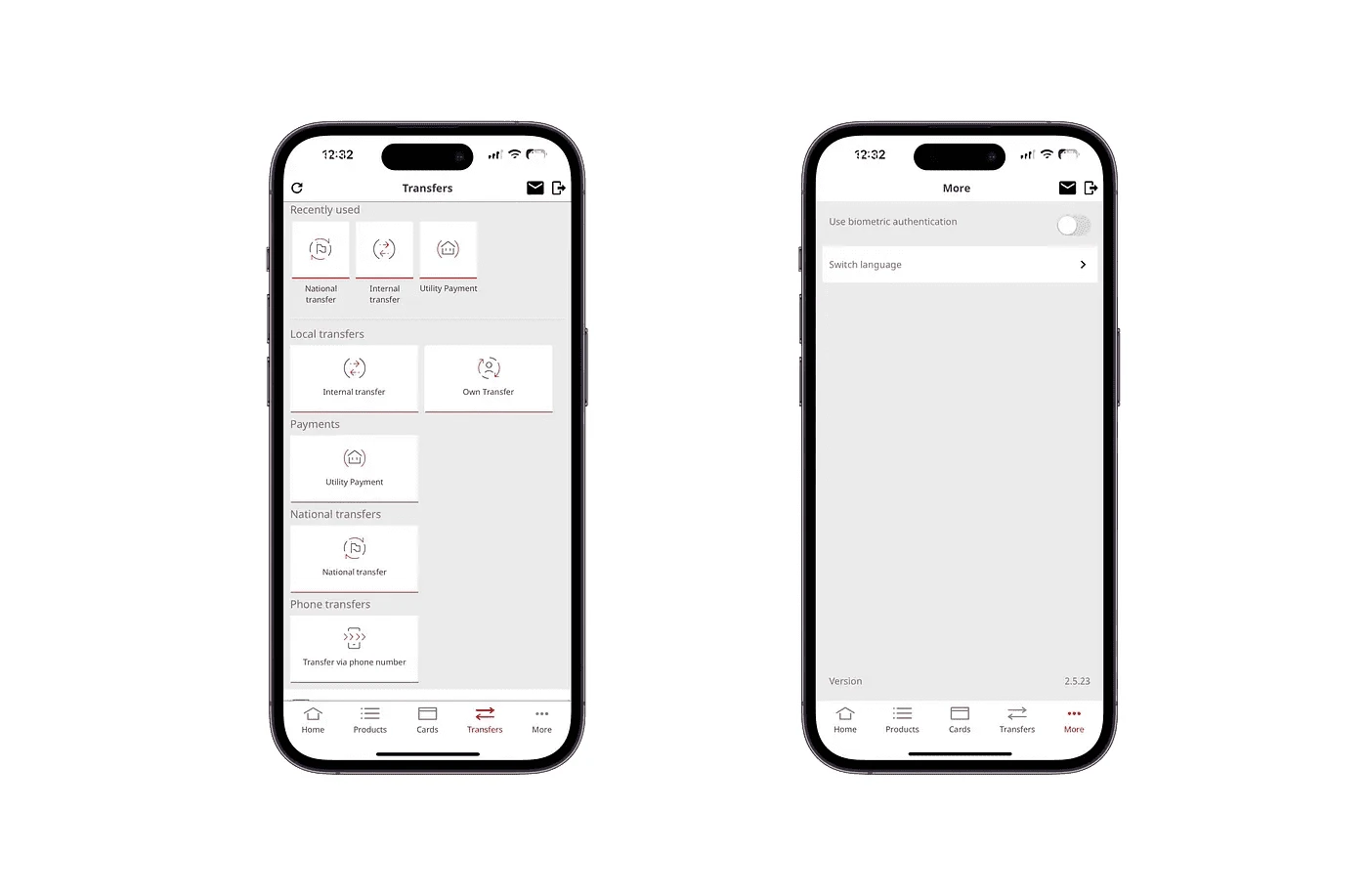
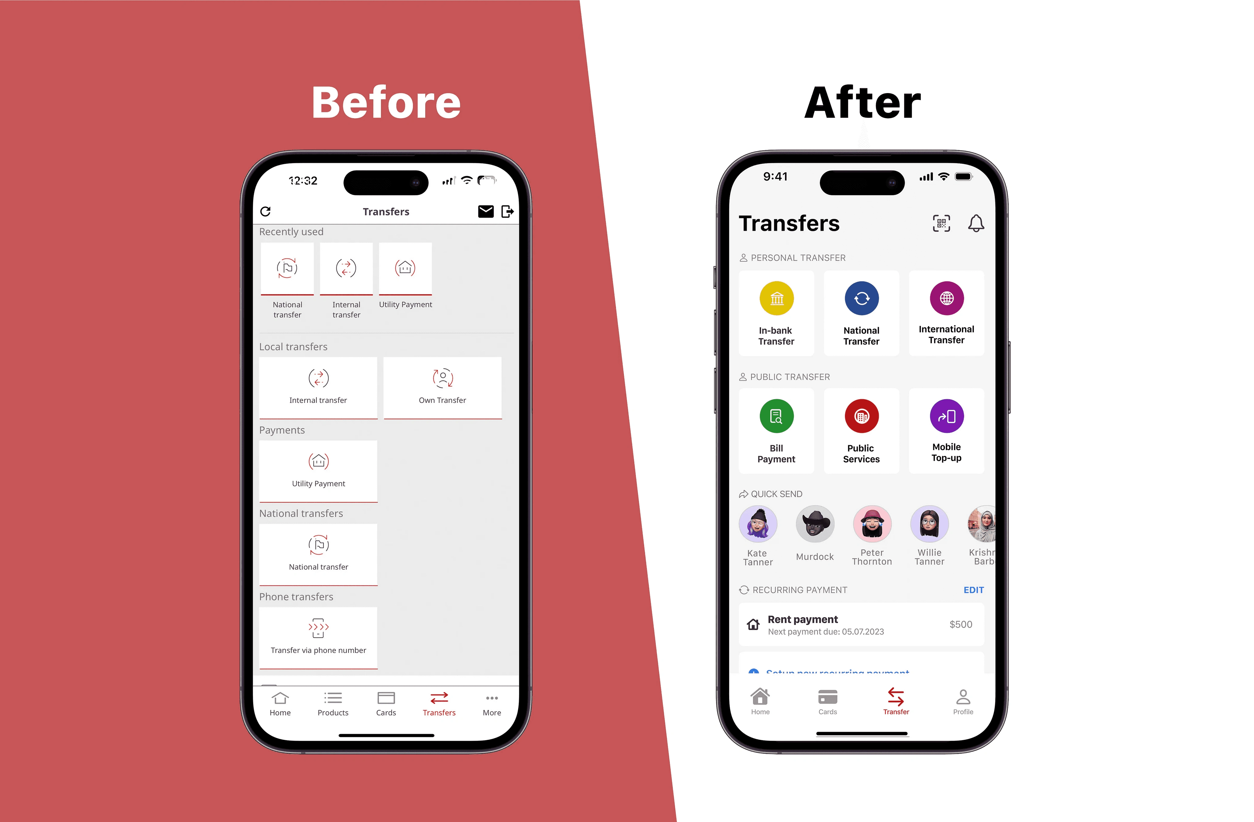
Navigation is also difficult on other screens. “Products” is the second item on the navigation bar, containing the user’s accounts, term deposits, and loans. However, the name doesn’t match the features on the screen, causing confusion among users. Moving to the “Transfers” section, the spacing between transfer cards is awkward. After making a transaction, the user is shown the “Recently Used” transfer form, which is irrelevant.
Lastly, on the navigation bar is “More.” On this screen, users only find features like “Use Biometric Authentication” and “Switch Language.” There are no account settings, profiles, or notification settings.
My Solution
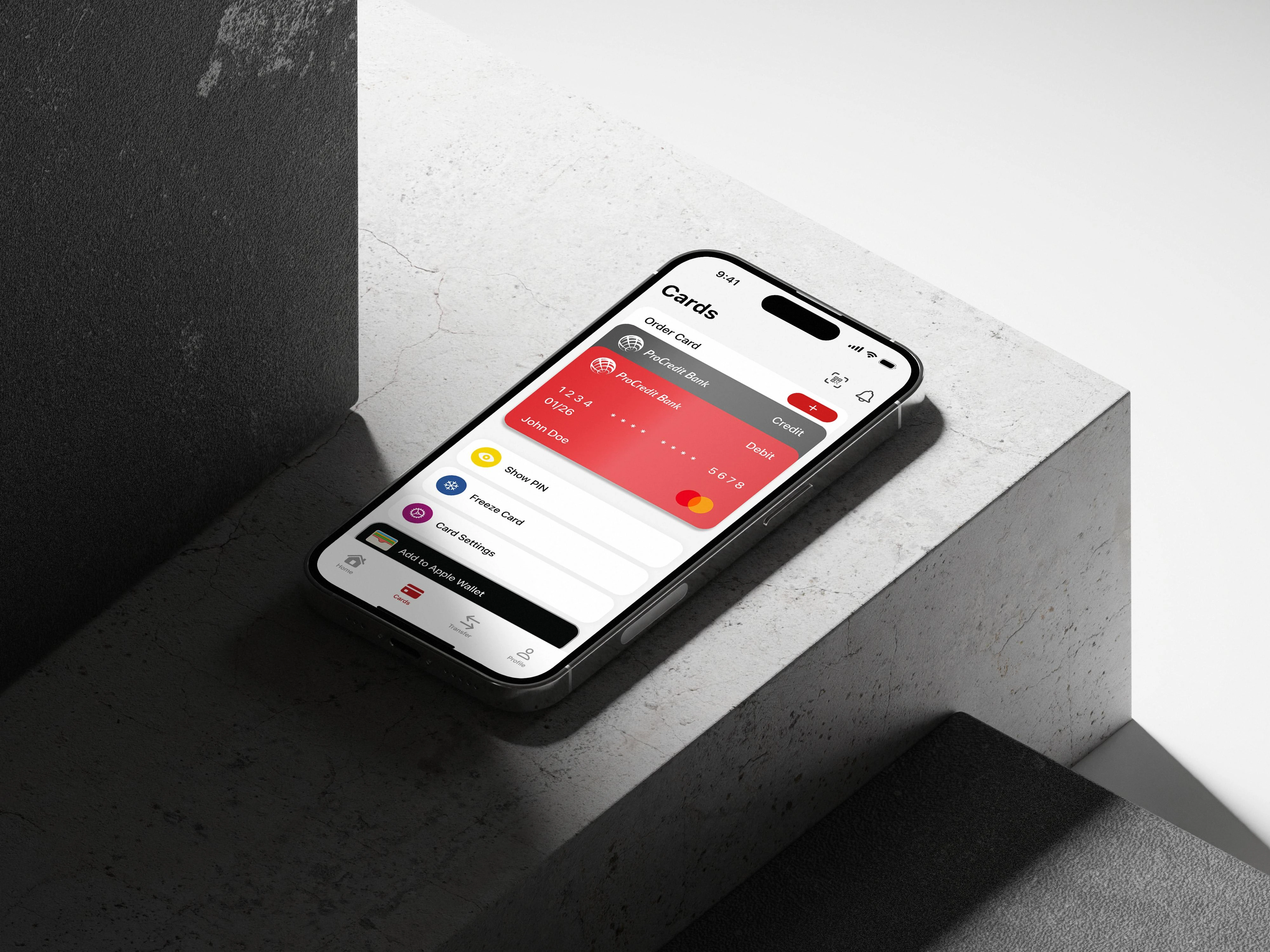
Starting from the Home Screen, I removed the “Log Out” button from the Title Bar and the refresh button. Refreshing now involves a drag-down action. Security Recommendations are now moved to the “Profile” section, as it’s a feature that won’t be frequently used and doesn’t need to be on the Home Screen.
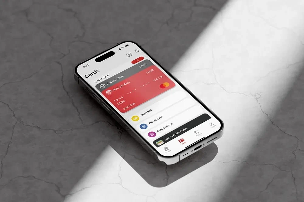
For better navigation, actions like freezing a card, changing a PIN, and adjusting card limits are separated and moved to the “Cards” section. The Navigation Bar now contains four screens instead of five, as “Products” has been removed. You can now switch between your accounts in the Cards section by tapping on your other card (which also changes the home screen to your other account). Your loan details can be accessed by tapping “View all balances,” where you can see the remaining loan, next payment, and more.
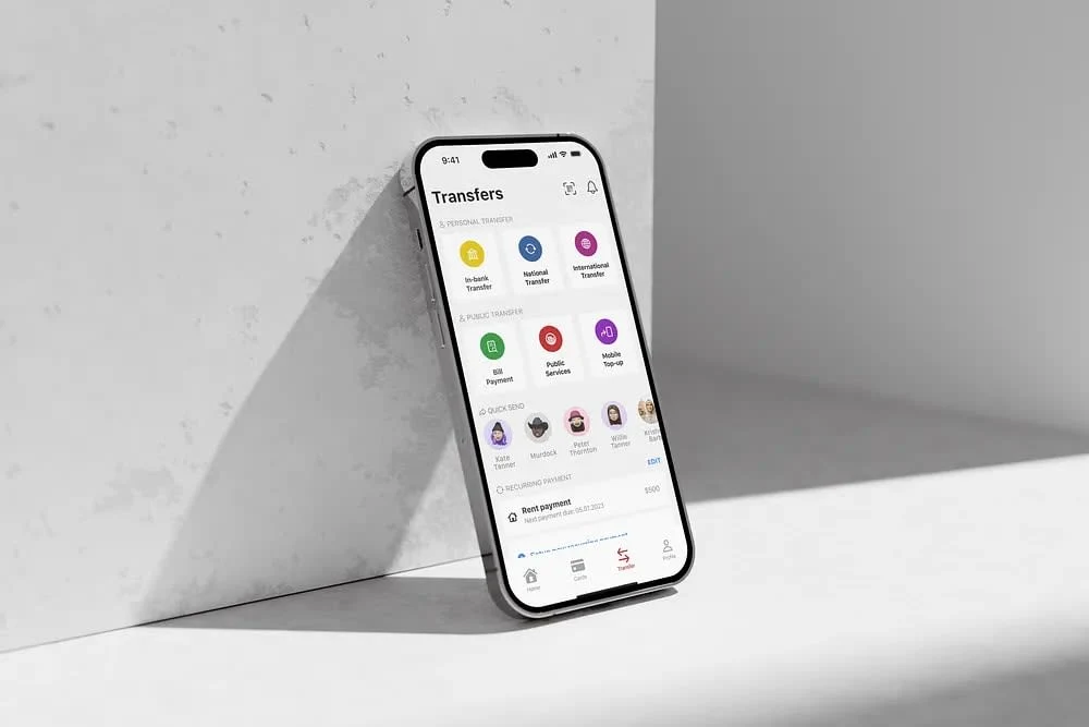
“Transfers” now have improved spacing and appearance. The cards are categorized as Public & Private Transfers for better navigation. This screen also includes the Quick Send option and Recurring Payments, allowing you to set up automatic payments for daily, weekly, and monthly expenses.
On the navigation bar, “More” is replaced with “Profile.” The profile section displays your profile picture and email. Compared to the previous app version, this section now offers more customized features and options that users can modify.
User Research & Insights
User research is an essential part of the process that cannot be skipped if you genuinely care about the user experience. To conduct research, I chose to create a questionnaire using Google Forms and shared it on my social media platforms for people to participate.
As expected, most people use banking apps on their phones, leading me to design the app for a mobile format. The primary features people use on banking apps, based on this questionnaire, are checking current balances, transaction history, money transfers, and bill payments. These features should be easily accessible on the Home Screen or have their own tab in the navigation bar.
Conversely, the least-used feature is the ATM locator, indicating that it can be placed in a less prominent area of the app. Based on the questionnaire, the main challenges users face while using banking apps are slow loading times, challenging navigation, limited functionality, complex verification processes, and security concerns. Furthermore, most users feel that banking apps are not intuitive and well-structured, which leads to decreased usage.
Brainstorm & First Sketches
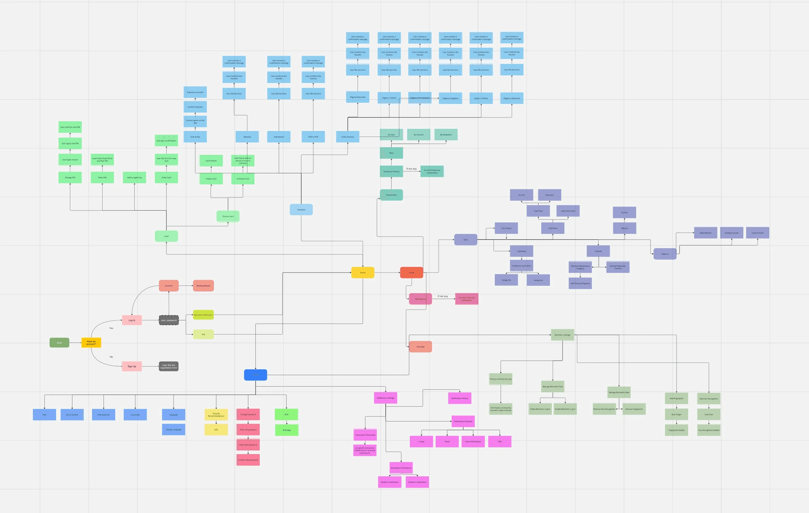
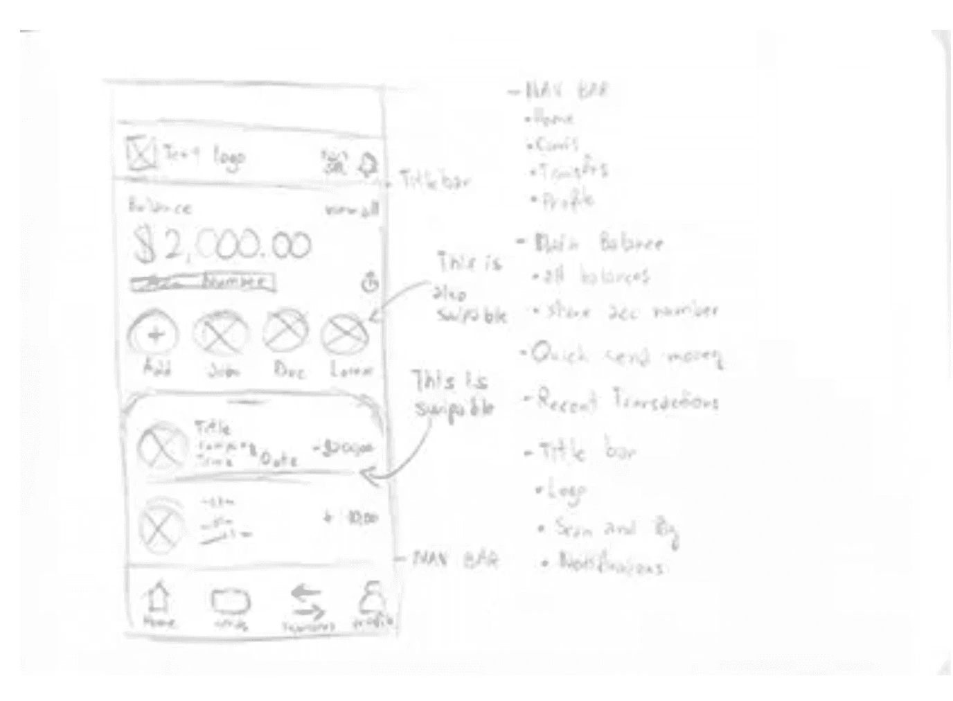
Before creating the initial sketches and wireframes, I organized all the features on a mind map to understand how the screens relate to each other and where each element should be placed. For the mind map, I utilized the web app called Miro, known for its user-friendly interface.
For sketching, I opted for the classic pen and paper method, as it allows for more creativity and freedom compared to using software tools. After completing the wireframes and finalizing the app’s overall look, I can proceed to design it fully.
Final Design
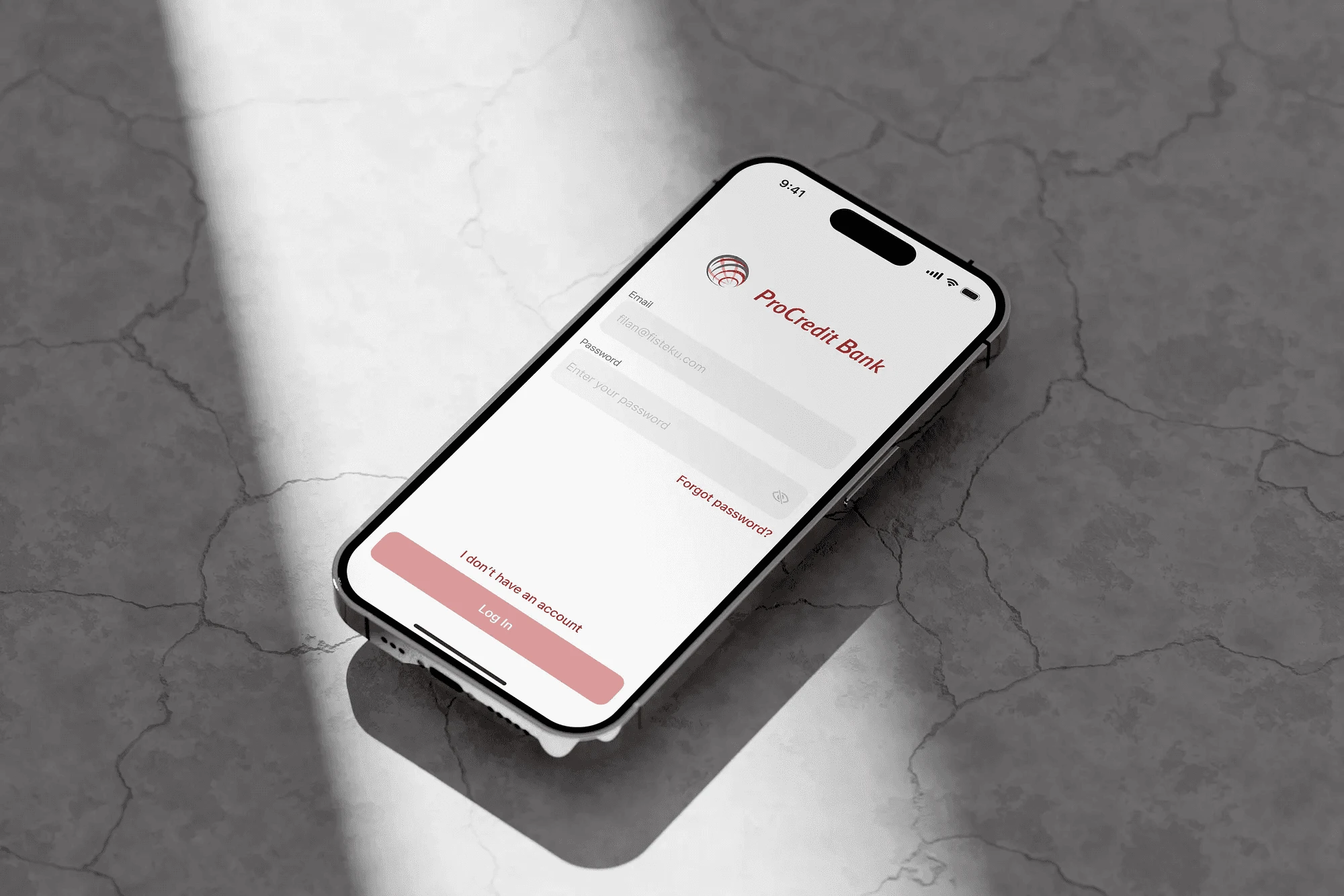
Since the branding and logo have been established, the task becomes much easier. Like the previous version of the app, the updated default version is in Light Mode. The brand colors are consistently used throughout every screen of the app.
One challenge I encountered was the brand’s main color, which happened to be red. As we know, red is often associated with error messages. This prompted me to reconsider my design choices for the application’s interface. The brand colors have been applied in a manner that creates a smooth and unboxy appearance. They are used in various buttons, enhancing user recognition of different features.
Upon reviewing the app, it is now more modern and visually appealing.
Like this project
Posted Sep 18, 2023
In this chat, I'll take you through my journey of redesigning a local bank's mobile banking app. I'll share my personal approach.
Likes
0
Views
4


