Totavi Fintech Website Development

Rufus Taiwo


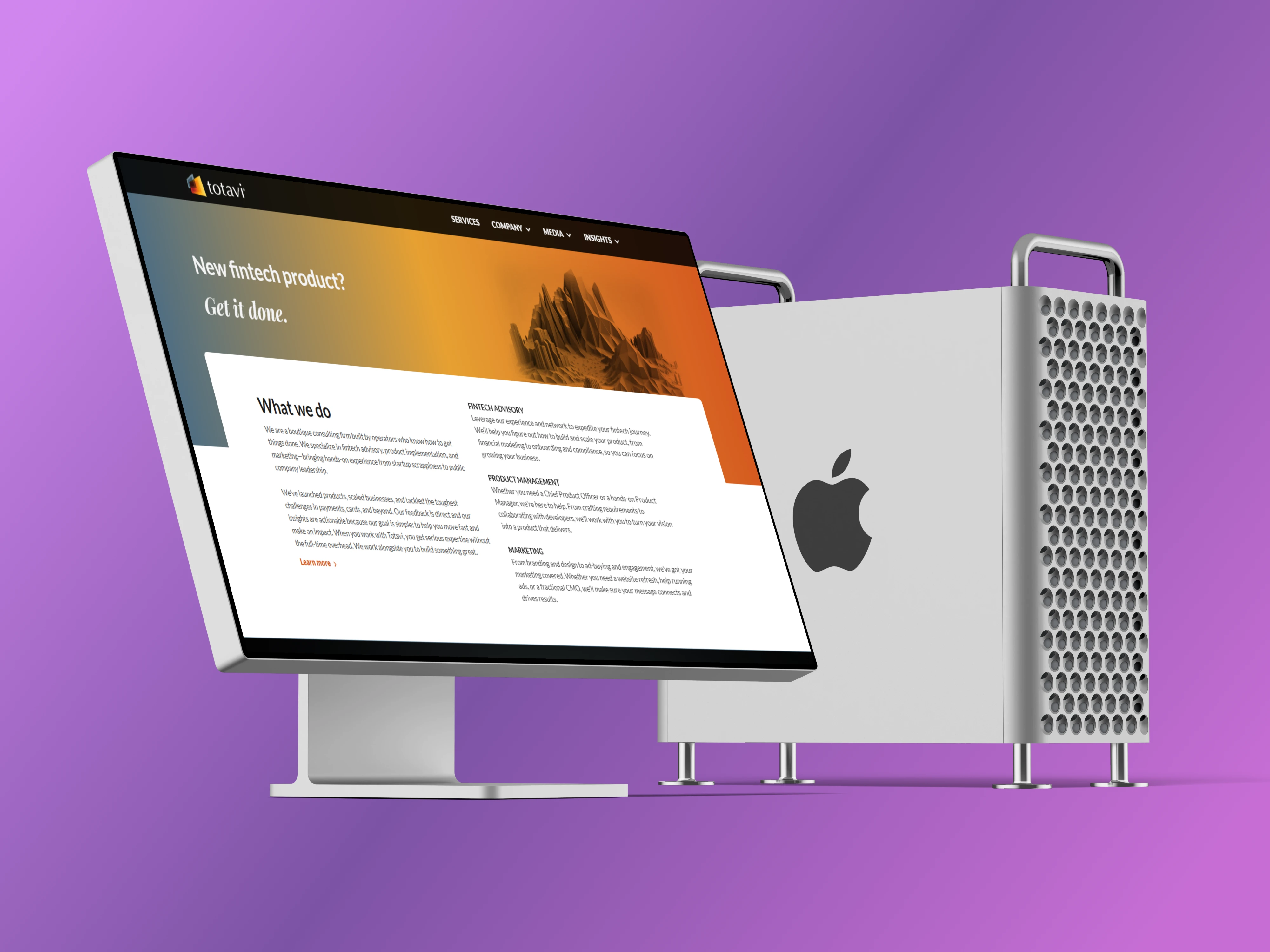
Totavi Fintech - Case Study
Overview
Totavi is a US-based fintech consulting firm helping startups and growing businesses navigate payments, cards, and financial product development. Their clientele includes funded companies and serious operators - meaning their website needed to immediately communicate credibility, expertise, and authority in a space where trust is everything.
What I Built
A Webflow homepage and team page built to fintech-grade standards - precise layout execution, smooth interactions, responsive implementation, and a component structure clean enough that the client used it as the foundation to build out additional pages themselves after handoff.
The Technical Execution
Hero Section
The homepage opens with a bold typographic statement over a full-width mountain landscape image - a deliberate contrast that positions Totavi as both ambitious and grounded. The layout required precise text overlay handling to remain readable and visually balanced across all screen sizes.
Client Logo Strip
A marquee-style logo strip carries partner and client brand names - implemented to scroll seamlessly and reinforce credibility immediately below the hero.
Testimonial Carousel
Client testimonials are presented in a structured carousel, allowing social proof to rotate without cluttering the page - clean interaction, smooth transition, fully responsive.
Content Sections & Newsletter
Multiple structured content sections present Totavi's services, research output, and thought leadership - including a newsletter subscription section that captures leads directly from the homepage.
Podcast & Media Highlight
A dedicated highlight section surfaces Totavi's podcast and media appearances - giving the brand a voice beyond just services and reinforcing the team's industry authority.
Responsive Implementation
The mobile version delivered was cleaner and better structured than what currently exists on the live site - a result of the client extending the site themselves post-handoff. The original responsive build was precise and deliberate across all breakpoints.
Component Architecture
Every section was built as a clean reusable Webflow component. After handoff, the client used these components as the building blocks to extend the site into additional pages - which is the clearest possible signal that the underlying structure was solid, well-organized, and easy to work from.
The Client's Words
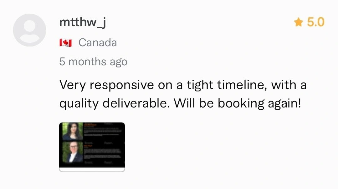
Review received from client via Fiverr as at the time of this project
The Outcome
Totavi launched with a homepage and a team page that positioned them credibly in the competitive fintech consulting space. The component-based build proved solid enough that the client extended it into a full multi-page site without needing to return for further development - a mark of clean, production-ready Webflow work. The site remains live at totavi.com.
Note: The current live site has been extended and modified by the client beyond the original build. The pages shown here reflect the work delivered at handoff.
What This Project Demonstrates
Webflow development from Figma for a fintech client. Hero layout with precise image and text overlay handling. Marquee logo strip. Testimonial carousel. Multi-section content architecture. Newsletter integration. Component-based build clean enough to serve as a design system for future pages. Responsive implementation across all breakpoints.
Like this project
Posted Sep 30, 2026
Webflow development for a US fintech consultancy - homepage and team page built with reusable components the client extended into a full site post-handoff.
Likes
0
Views
0
Clients
Totavi