Tiara's Touch Landing Page Design

Rufus Taiwo


Tiara's Touch - Case Study
Overview
Tiara's Touch is a professional cleaning and laundry service operating across Nigeria, serving homes, offices, and businesses. The business had an active Instagram presence but no website - meaning potential clients couldn't find them online, couldn't understand their services clearly, and had no professional touchpoint beyond social media.
The Brief
The founder gave me two things: a logo and an Instagram bio. No brand guidelines, no copy, no imagery direction, no design reference. The goal was to build a complete landing page that would make the business look credible enough to convert first-time visitors into paying clients.
My Process
I started in Figma - not by designing immediately, but by establishing the foundation first. Before a single section was laid out, I built a complete design system: colour palette, typography scale, button styles, icon library, and component variants. This meant every decision in the design would be consistent and intentional, not made on the fly.
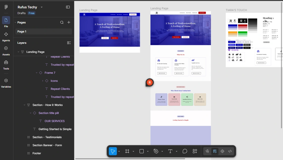
The frame at the right showing how UI elements were built for the landing page before starting the landing page itself
The colour direction came from reading the brand carefully. The logo had a refined, premium feel - so I anchored the palette in deep royal blue for trust and professionalism, paired with red for energy and urgency on CTAs. White space did the rest.
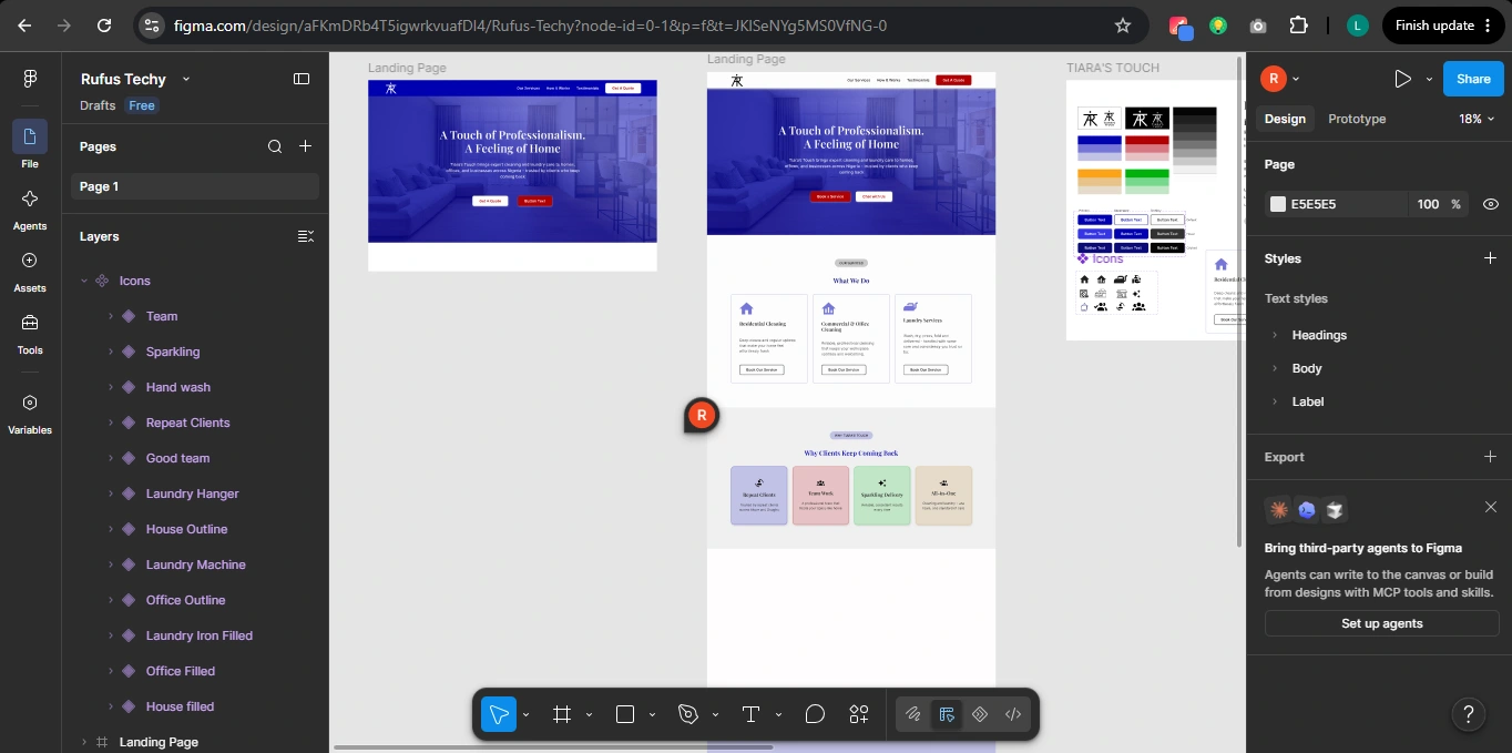
The Icon asset at left panel shows how icons were intentially chosen and named
For copy, I wrote everything from scratch based on what the business actually does and what a first-time visitor would need to feel confident enough to book. The headline - "A Touch of Professionalism. A Feeling of Home" - came from wanting to bridge the functional (clean service) with the emotional (your home feels right again).
The Design
The page was structured around a clear conversion journey: establish credibility immediately in the hero, explain services, prove trustworthiness through social proof, make the next step obvious. Nothing exists on the page without a reason.
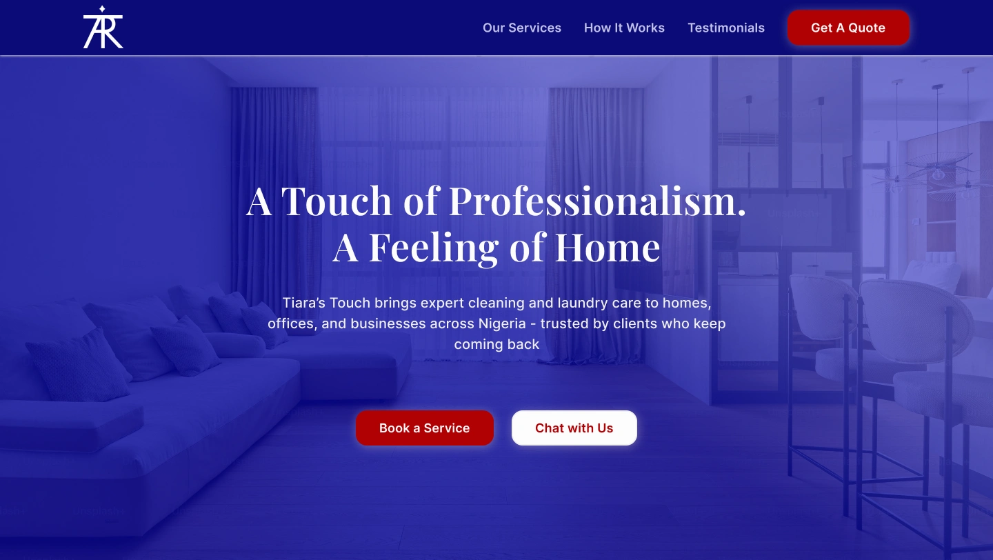
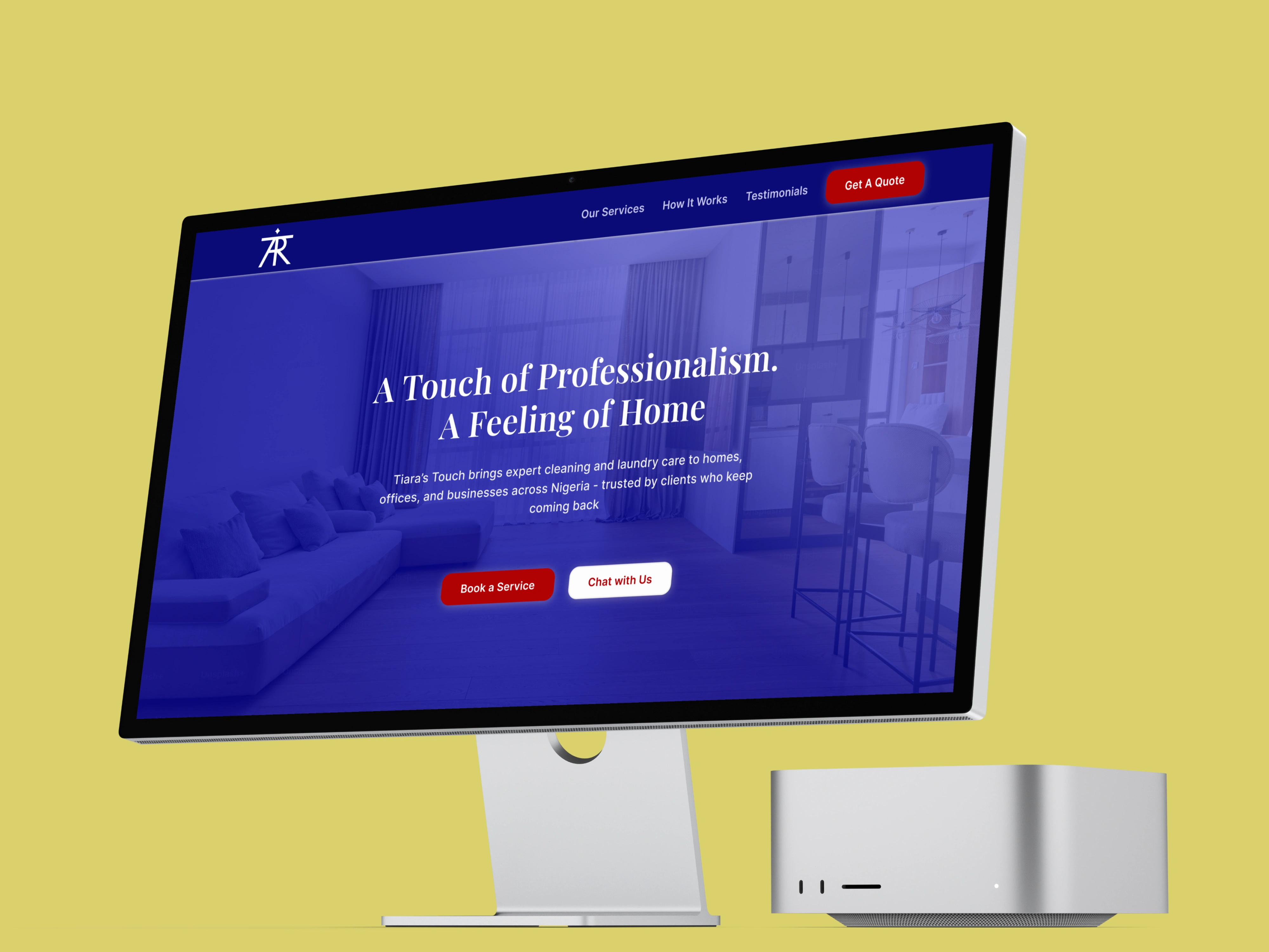
The Hero Section showing the headline, dual CTAs, and nav clearly at large scale
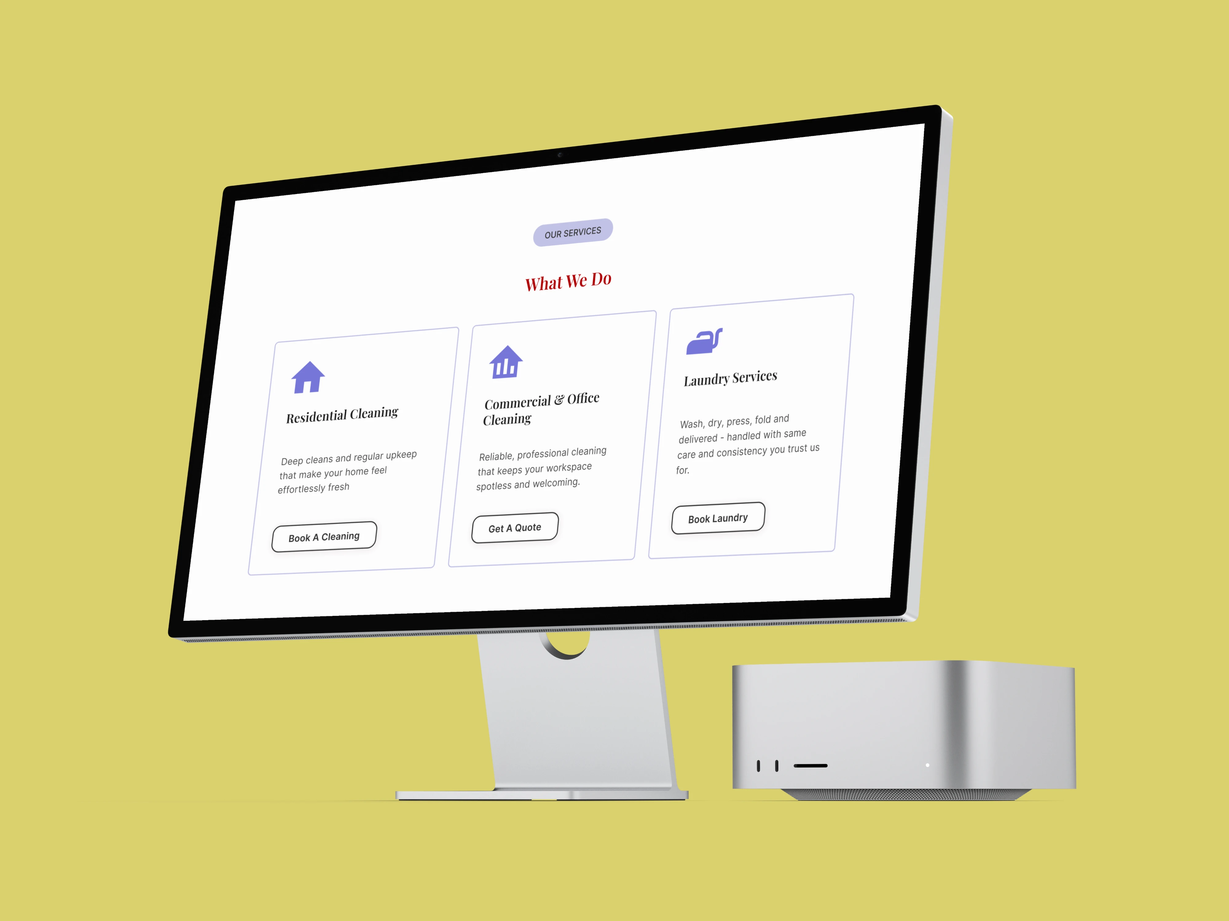
Services section showing clean card layout with icons, descriptions, and individual CTAs per service
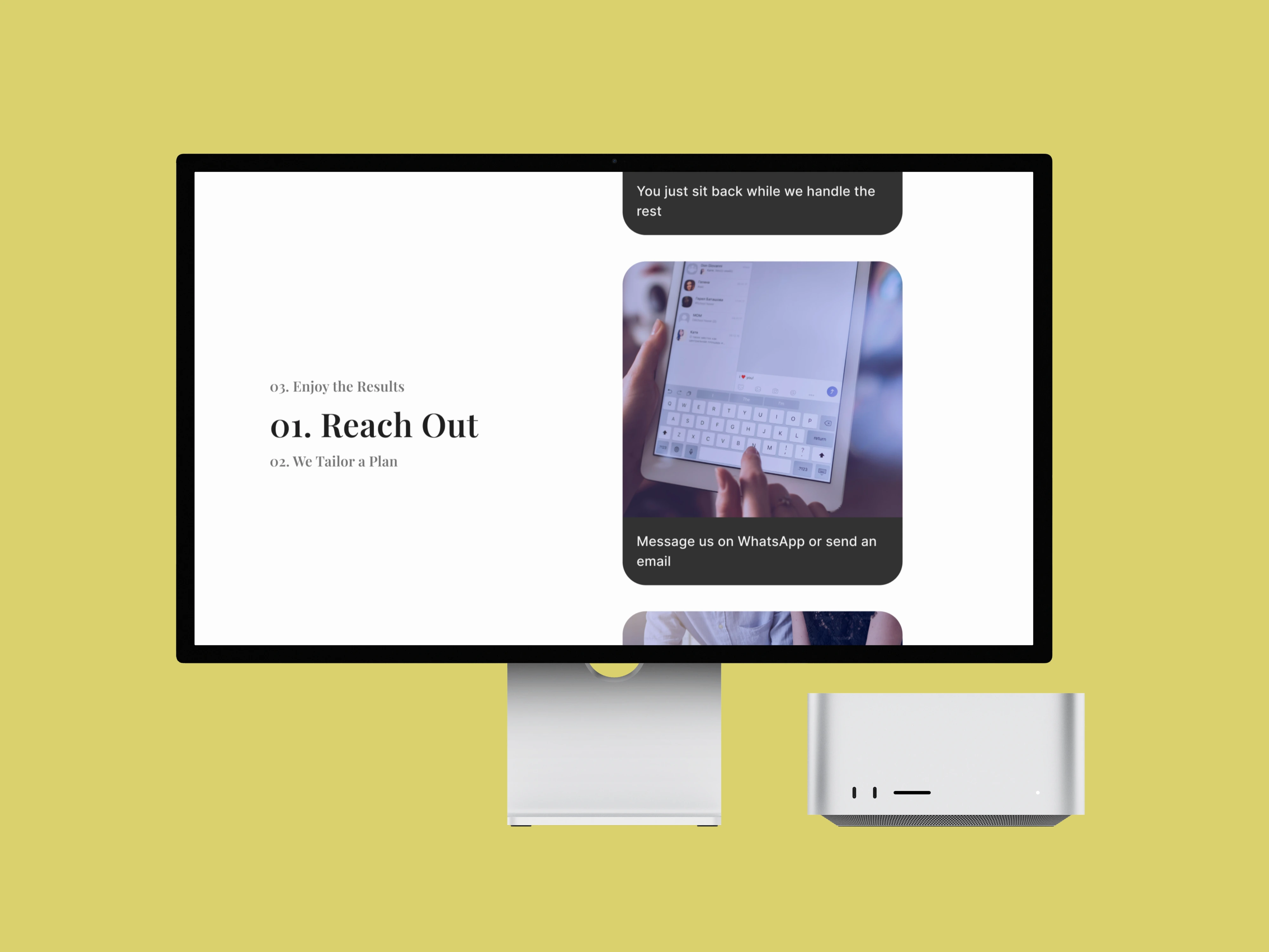
How It Works section showing the scroll interaction layout with numbered steps supporting imagery
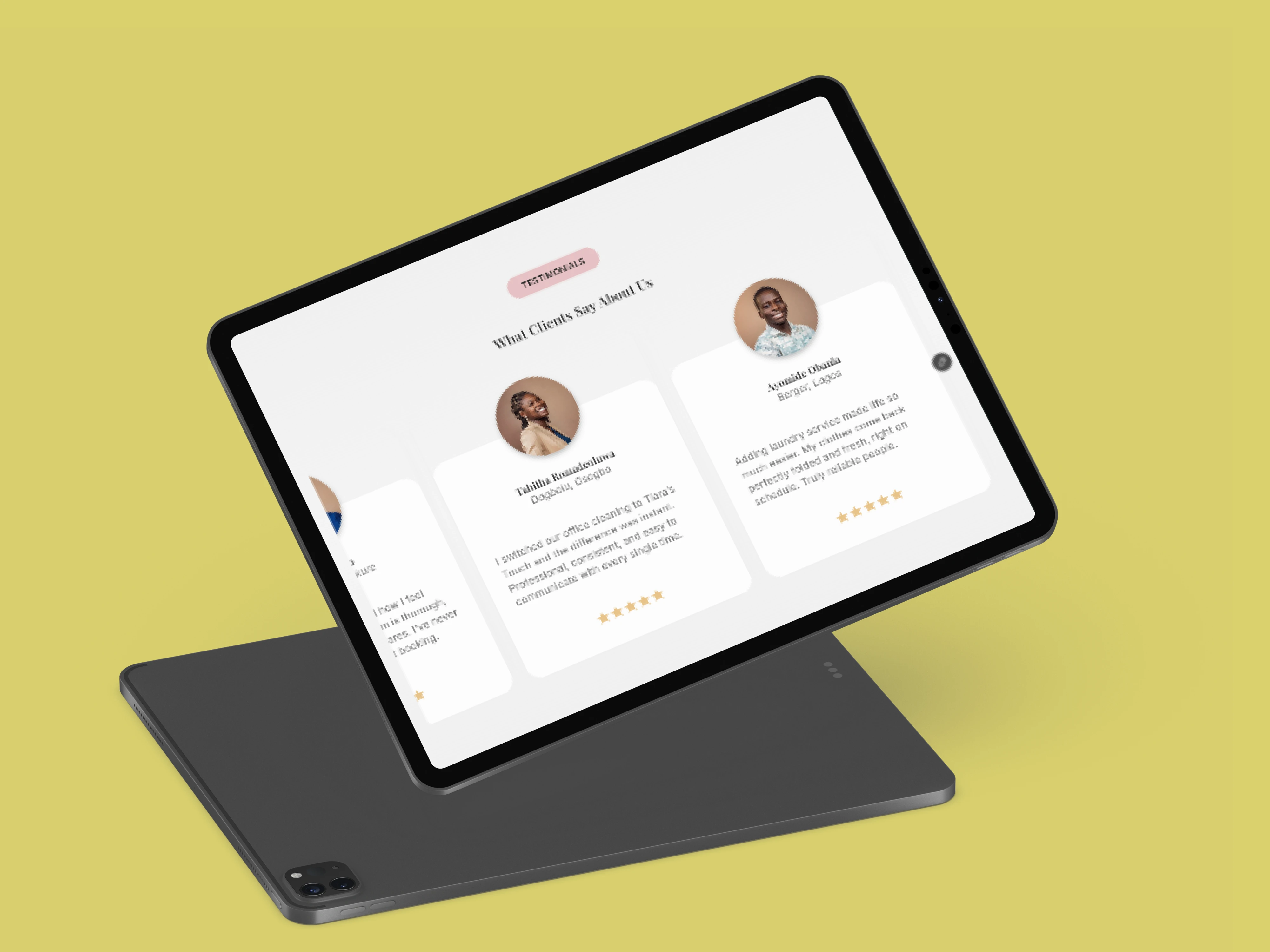
The tablet mockup showing testimonials carousel - responsive on all screen sizes
Responsiveness
The site was built fully responsive across four breakpoints in Framer: 1440px min-width desktop, 1200px desktop, tablet, and mobile. Each breakpoint was designed deliberately - not just resized, but restructured where needed so the experience felt native at every screen size.
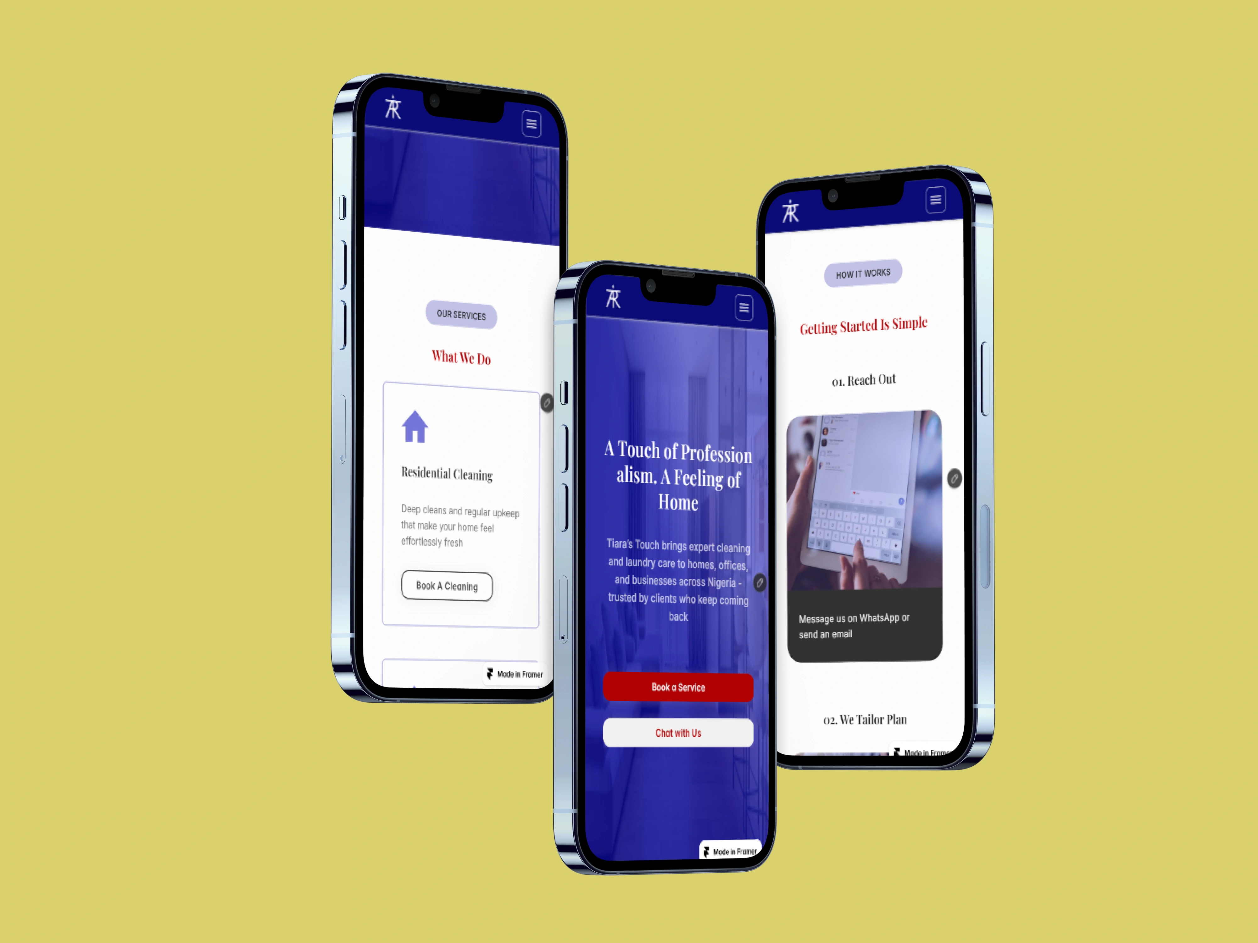
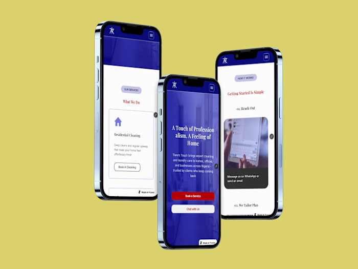
Three different sections of the website showing responsiveness on mobile. Earlier images show responsiveness on tablet and desktop
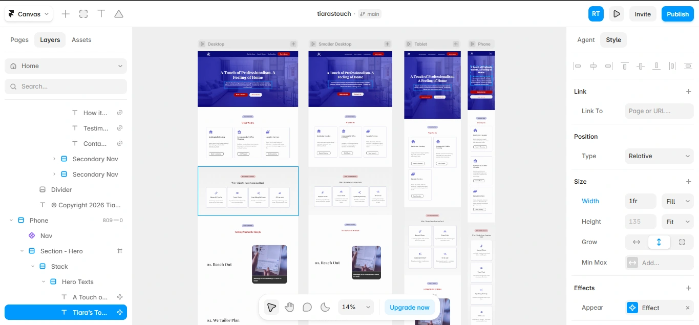
Framer canvas during development showing the four breakpoints being optimized for independently
The Outcome
The business now has a professional digital home that matches the quality of the service they deliver. Visitors can understand exactly what Tiara's Touch offers, see real client testimonials, and book or get in touch in seconds - directly from the site or via WhatsApp. The site also achieved a 100% SEO score on Framer's built-in audit and Google Chrome DevTool Lighthouse - reflecting clean semantic structure, proper meta tags, and optimized page architecture from ground up.
What This Project Demonstrates
Brand direction from scratch. Full UI/UX design in Figma including design system, copy, and icon selection. Framer development across four responsive breakpoints (literally all screen sizes) with custom interactions and scroll animations. SEO-optimized build achieving 100% on Framer's and Lighthouse's audit. End-to-end ownership of a client project - from logo and a bio to a live, functioning website.
View Live Site
Like this project
Posted Sep 24, 2026
Framer design and development for Tiara's Touch Cleaning Service - from logo and Instagram bio, to full UI/UX, to a live, responsive, 100% SEO-scored website.