Project: Hero Section Animation —

ajao jelil


Project: Hero Section Animation — Healthora (Healthcare Platform)
Overview
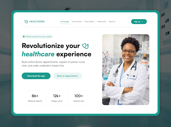
Animated the landing page hero section for Healthora, a healthcare platform offering doctor appointments, nurse visits, and medication ordering, to give the brand a more dynamic, trustworthy first impression.
Problem
The static hero design communicated the message clearly, but on a first visit, a healthcare product needs to feel calm, credible, and alive, not flat. The client wanted the landing page to feel more premium without changing the underlying design.
Solution
Framed the entry with a scale-in reveal of the browser window itself, setting a calm, deliberate pace before any content appears.
Staggered the content reveal in hierarchy order: trust badge, headline, subtext, CTAs, then stats, so the eye is guided rather than overwhelmed.
Used a subtle emphasis animation on the key word in the headline ("healthcare") to reinforce what the product is actually about.
Kept every transition short and smooth, prioritizing a premium, unhurried feel over flashy effects, appropriate for a healthcare brand.
Outcome
A hero section that feels considered and trustworthy from the first second, giving the landing page more presence without changing its core layout or message.
Tools: Figma, Jitter
Role: Product Designer (UI, motion design)
Like this project
Posted Aug 6, 2026
Project: Hero Section Animation — Healthora (Healthcare Platform) Overview Animated the landing page hero section for Healthora, a healthcare platform offer...
Likes
0
Views
0