Creating a Streaming App Targeted for Teens

THE PROBLEM:
With the boom of streaming services as well as being a father myself, whenever my daughter is watching shows, I always try to pay close attention to what she is watching, ultimately, for her safety and my wife and I's peace of mind. But, no matter how many parental restrictions you put in place, something always seems to sneak through the cracks.
This got me thinking...yes, there are children's focused streaming apps such as Noggin which primarily targets 5-8 year old's, but what if there was an all-in-one platform that had children's programming on it for a variety of youthful age groups - 0-4 year old's, 5-8 years old's, 9-12 years old's, 13+ years old? After the parent/guardian subscribes to the service, they could hand the phone/tablet/device over to the child without any worry that their child might be exposed to more mature content which sometimes happens once the child learns how to access Mom and Dad's profile (if it's not password protected) or even on the occasional ad break when the system shows a more adult focused advertisement despite the streaming service playing a children/family targeted show.
RESEARCH & PROBLEM-SOLVING:
According to a survey performed by the Parents Television Council, a large percentage of parents felt that Netflix and other popular streaming services were "unsafe for their kids." This mainly had to do with these particular areas of concern...
Inconsistent ratings (especially for individual episodes for tv series)
Lack of passcode protection
Inappropriate categorizing
Effectiveness of filters
It was also researched and discovered, to my surprise, pre-teens and teens were found to prefer watching entertainment based content via cellphone over their televisions! Cellphones were ranked at the top, with desktops coming in second, televisions coming in third and tablets in fourth. Due to time constraints (as well as this being a passion project), this research led to scrapping the television and desktop versions of the interface design and solely focus on just the mobile interface design.
Originally, which I will include an image of, the design was to include category "boxes" (clickable sub-menus) in which the user would be able to click on their age range and be able to view content appropriate for that demographic. This idea was inspired by the Disney+ app in which has clickable sub menus that showcase content related to Disney, Marvel, Pixar, Star Wars and National Geographic...
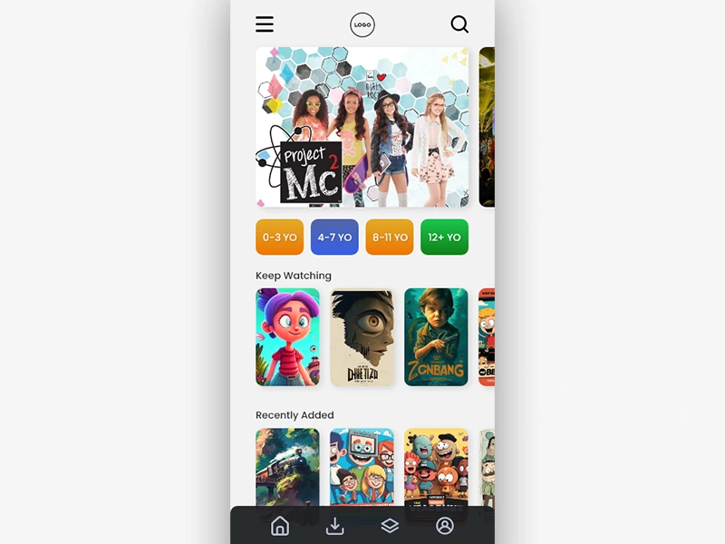
However, once the initial wireframing was complete and the low-fidelity models started to be designed, I found through extended research that color palettes as well as the light/dark interface preferences varied upon age groups. Toddlers and younger children were more attracted to light interfaces with bright colors while the older kids preferred the more "sleek and cool" dark interface. This split ultimately resulted in the difficult decision to remove the younger demographics and solely focus on a design that would intrigue pre-teens and teenagers.
Once this decision was made and the design process continued, a new idea developed. To make this streaming subscription more valuable and potentially draw in more subscribers, what if gaming events and various live streaming was available on top of the traditional movies and tv series programming we receive from streaming apps? I quickly researched the target demographics that typically view live gaming streams and most surveys showed 16 years old and older - it's important to note though, these surveys were performed with the understanding that popular streaming platforms such as Twitch have a minimum account registration of 16 years old. When conducting in the field research, it was discovered a variety of age groups watch Twitch or YouTube Gaming streams, the youngest being 8 years old and the oldest which was interviewed was 24 years old.
USER FLOW & WIREFRAMING:
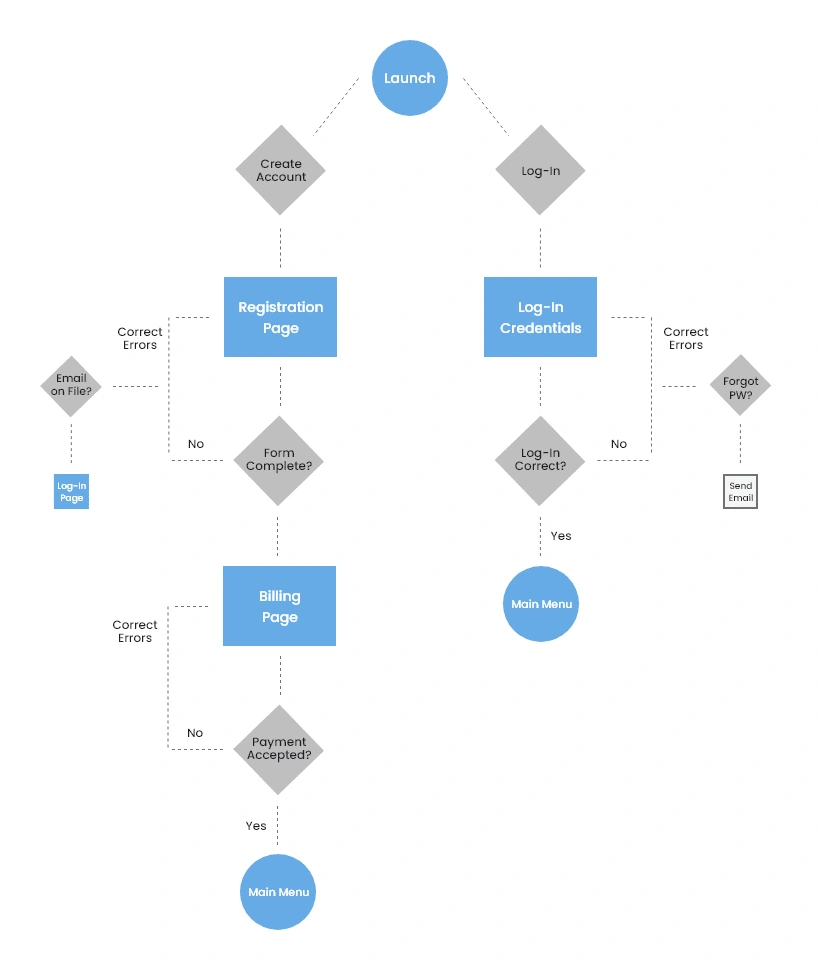
The biggest discrepancies I see on most streaming platforms are two things - navigation and hierarchy of content that creates an intuitive experience. Most platforms, with the mindset of competing, try to develop very "out of the box" and creative interfaces. But, it's important to remember that even though most users are becoming very tech-savvy and are comfortable with navigating an app, there is a fair share of the population that relies of familiarity with icons, text, navigation and layout. This is why we wanted our user flow and initial layouts to look as familiar as possible to the user, with the most important aspects of the app being available with just one button or link press.
SCREENSHOTS:
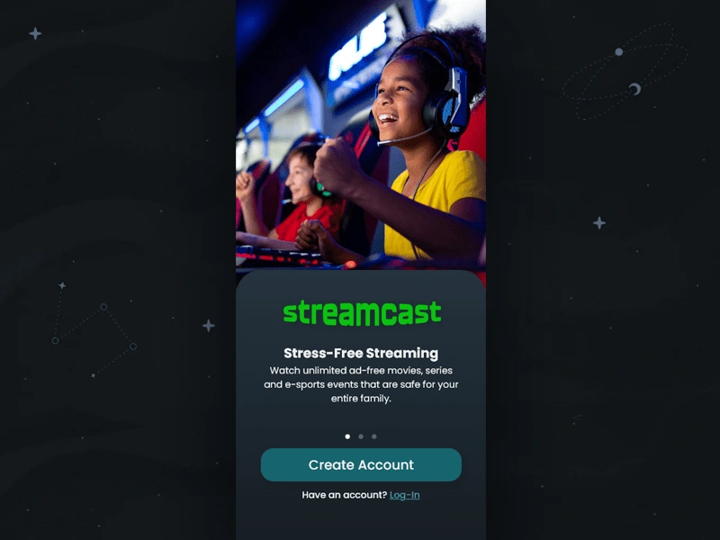
Launch Screen -
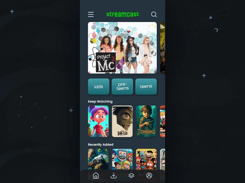
Main Interface - Dark Theme w/Fixed Navigation Bar -
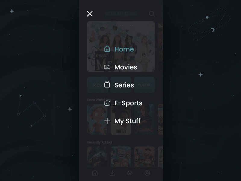
Hamburger Menu Open -
FINAL THOUGHTS:
During this process, I learned a lot about the personal preference differences between age groups as well as generations. Even though there are several streaming platforms, many of them with children's content, I do believe an "all-in-one" platform that combines the best of original entertainment content such as Netflix with a live streaming or e-sports component like Twitch is coming very soon.
Also, credit does have to be given out to the MidJourney AI discord, which is the source of the majority of movie and show "box art" graphics that were used in the interface design.
As useful and entertaining these platforms such as Twitch and Netflix have become, throughout the research process, it was apparent that there is still a long way to go until these platforms reach their true potential and provide parents with the reassurance that their children are safe while using their services. As mobile gaming and subscription based services continue to rise, we should only expect more platforms to be created and bundling up to provide extraordinary value to their users while cutting costs for the subscriber.
To whomever that has the capital to create that all-in-one streaming service, be sure to send me a check for 10% for the idea when the service gets popular ;)
Additional Resources
Taylor Rodriguez
Fractional Marketing Lead for Creative Teams & Service Brands
★ 13+ Years of Experience ★
If you’re looking for a website or marketing strategy that actually brings in leads, feel free to reach out. 👉 https://emberforgefl.com
Like this project
Posted Dec 28, 2024
Created a mobile-first streaming app focused on safe, age-appropriate content for kids & teens, combining entertainment and live gaming for a unique experience!
Likes
0
Views
8

