UX Copywriting Sample for Fitness App
This was a personal project I used to showcase my thought process behind UX writing and microcopy.
For this project, the challenge was to write copy for an introduction screen and onboarding process for ActiveWell, an imaginary fitness app with a professional yet upbeat brand identity.
The problem: The previous UX copy was dry, cluttered, and long-winded, leaving users less engaged with the product overall. Because the text lacked personality or clarity, it was likely that many users would close out of the app before finishing the onboarding process.
The challenge? Improve the UX copy for:
The welcome screen
Three feature screens
Onboarding process that includes basic user information, fitness goals, and workout preferences.
As I tackled this project, I set out to write for…
Clarity and conciseness: The flow should be easy to understand and work through, no matter your experience level. Each screen should feel engaging while not being too wordy.
Tone and branding: Research shows that people who use fitness apps most often fall into the range of 20 to 40 years old. But anyone interested in a fit and healthy lifestyle can sign up for ActiveWell — and that means that the tone should be fun to read, while not being overly full of jargon. With that in mind, I opted for a clear, conversational tone, with the occasional use of words or emojis to convey ActiveWell’s upbeat voice.
Context: I investigated other apps’ onboarding flows to understand the context of each screen’s UX copy.
User empathy: People of all ages, fitness levels, and backgrounds can use an app like ActiveWell. This means that the copy should guide them in a way that addresses their possible concerns — like getting to choose workouts that won’t be too hard, and that they find fun.
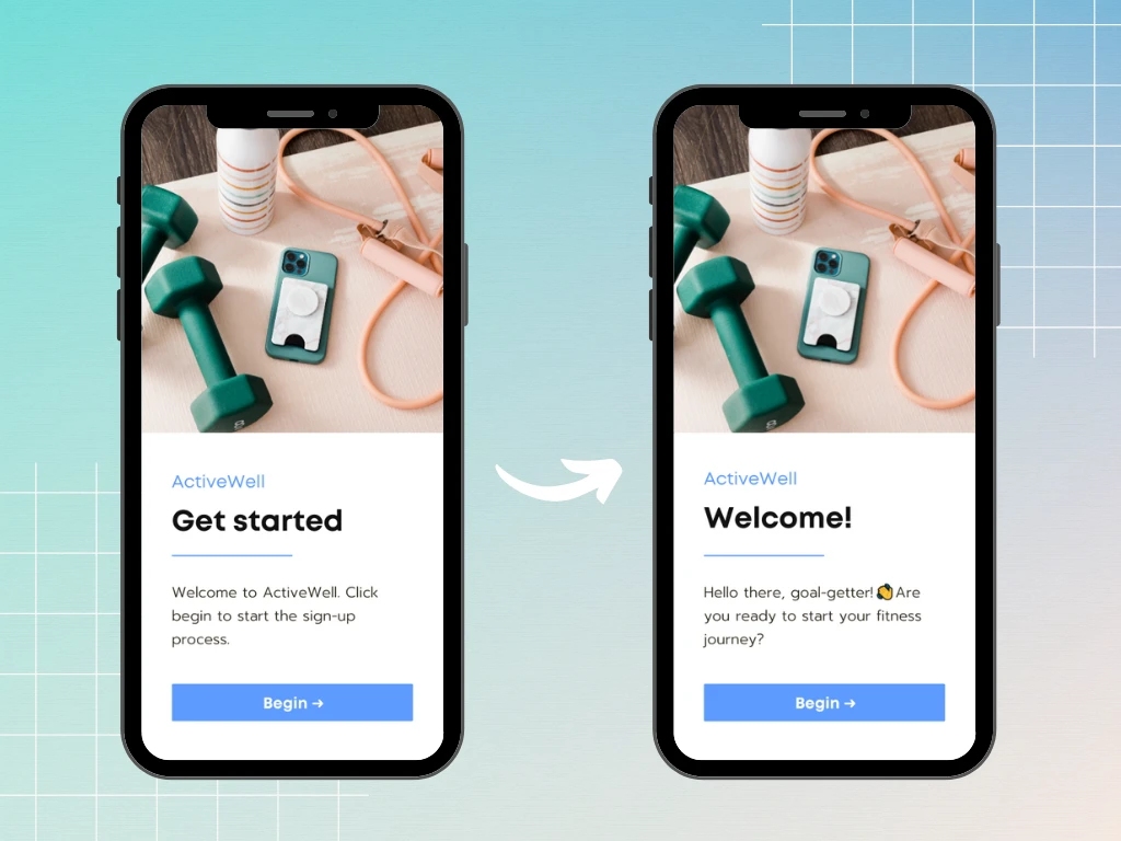
The welcome screen flow
With these notes, I wrote the initial screen for users who have freshly downloaded the app. This took the UX copy from dry (albeit clear), to a little more upbeat and memorable.
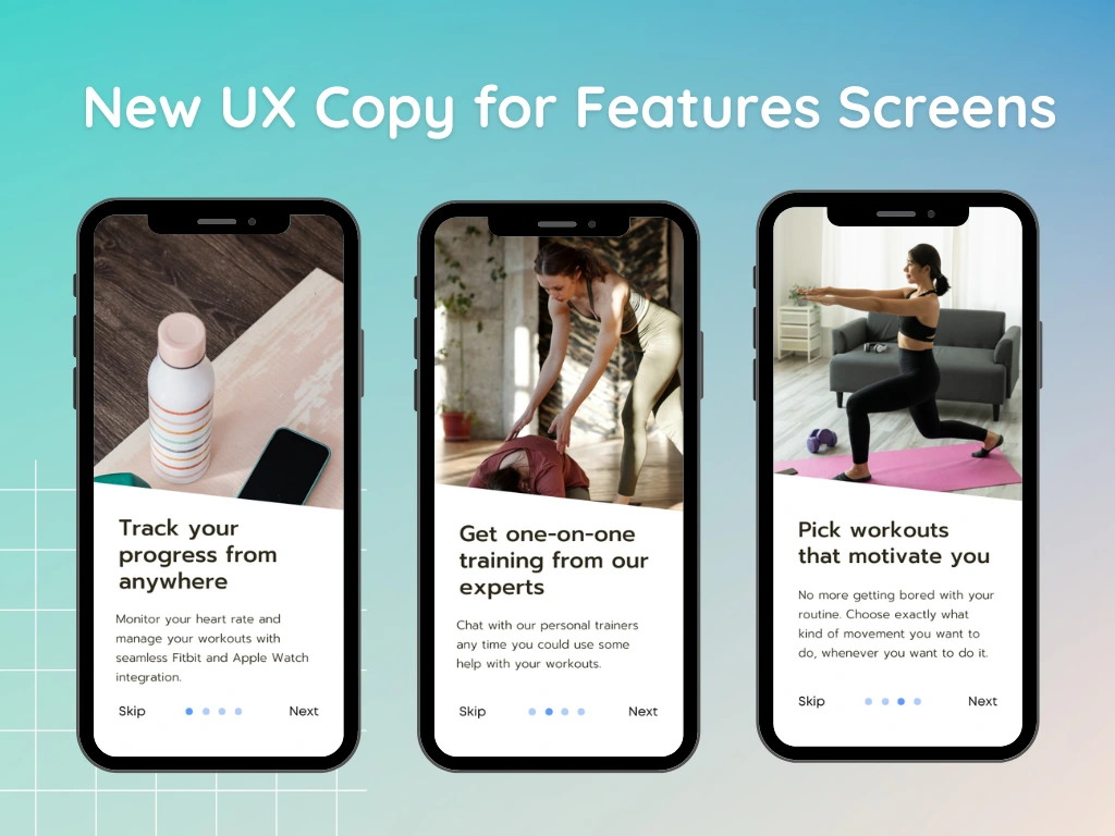
Then, I set out to tackle the content on the features screens. Originally, here’s what the text looked like:
Integrates with your devices: The app offers a feature to integrate with your Fitbit or Apple Watch to change and track your workouts more easily.
Use the chat feature for help: The chat feature allows you to talk to professionals who can teach you how to do workouts that are more confusing or challenging.
Numerous workouts to choose from: ActiveWell has many workouts available, so you can pick an option that fits your schedule and preferences.
While the copy did make sense, it definitely could have been more readable. And it didn’t seem to embody ActiveWell’s upbeat yet professional brand voice.
Here’s how I rewrote it to keep it incredibly clear and personable:
The onboarding process
This is where the brand voice for ActiveWell had a chance to shine. The onboarding process included a screen for goals, user information, scheduling details, and workout preferences.
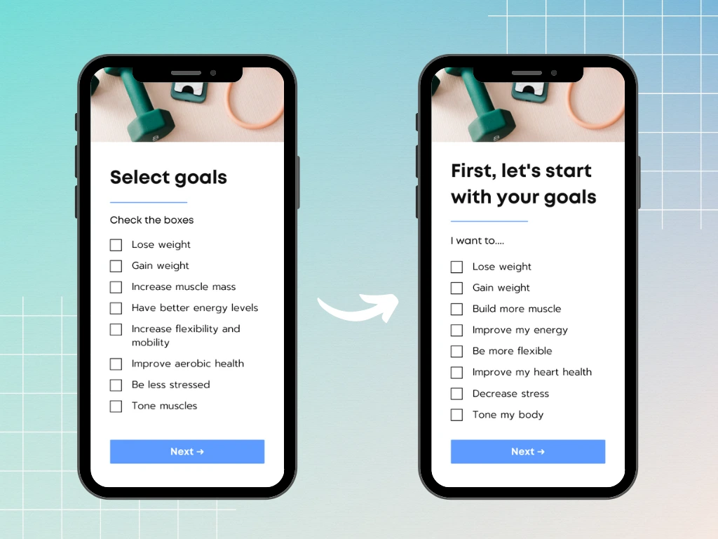
This screen’s UX copy was changed to be more conversational and clear.
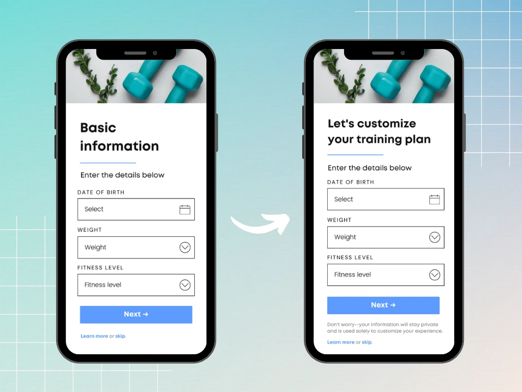
In this screen, I anticipated that some users might have reservations about entering their birthdate or weight. This is where I included a reassuring message explaining that this information is only used to customize their experience.
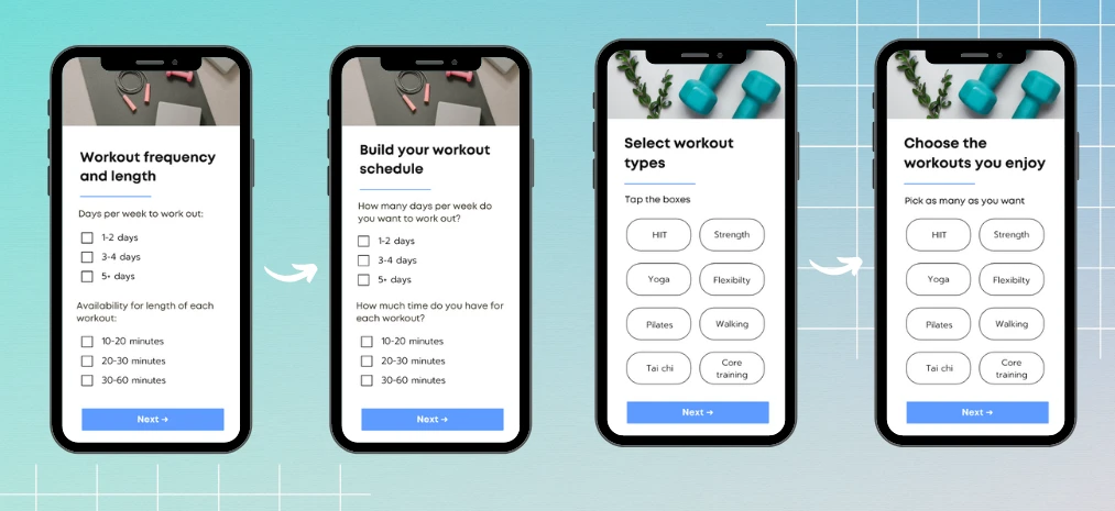
These onboarding screens were only slightly changed to improve the brand voice.
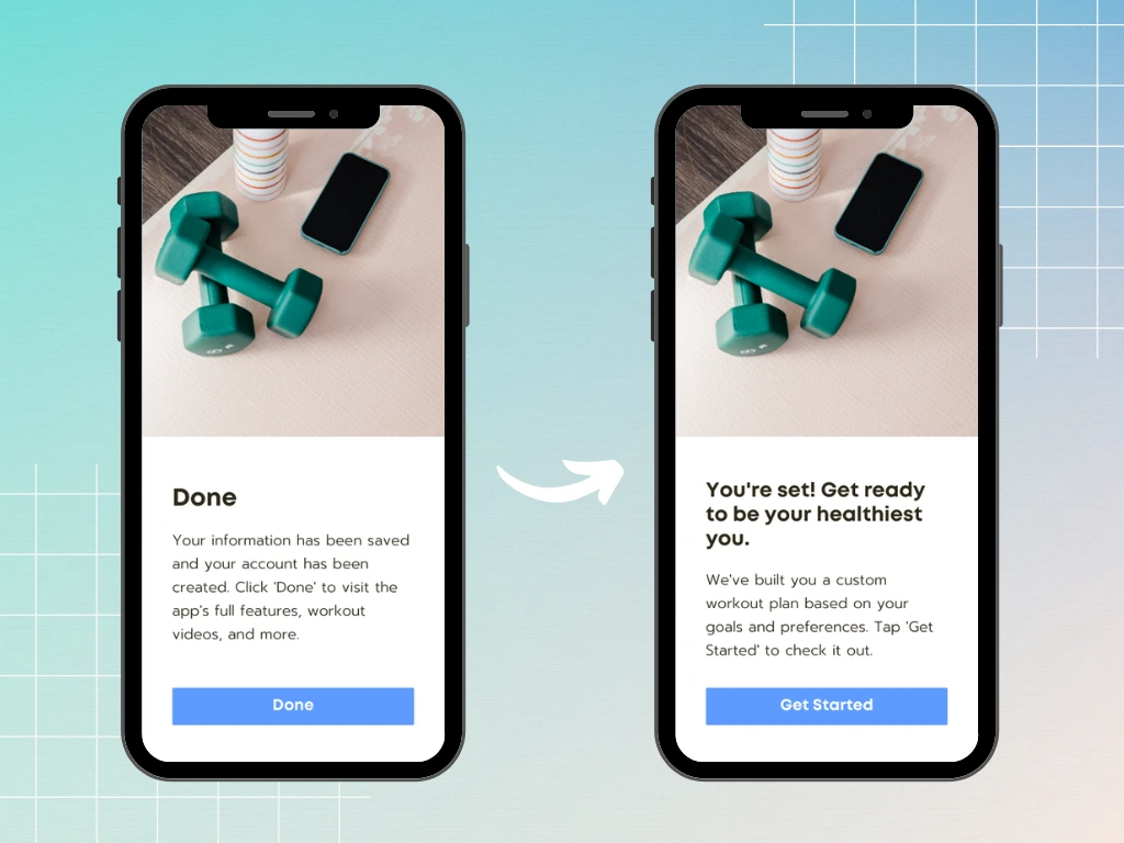
Final screen
The final screen was dry and lacking in ActiveWell’s personality, although it was clear and easy to follow. Here’s how I changed it to be more conversational and upbeat, while still keeping clarity in mind.
The Results
The new UX copy helped more clearly guide users through each step of the process, while staying true to ActiveWell’s brand voice. Overall, it helped create a smoother app experience that felt more trustworthy and empathetic to those using it.
Like this project
Posted Jul 17, 2023
A project diving into my thought process behind UX copywriting for an imaginary fitness app, ActiveWell.
Likes
0
Views
50

