ASGARD Financial Services App
George Ode
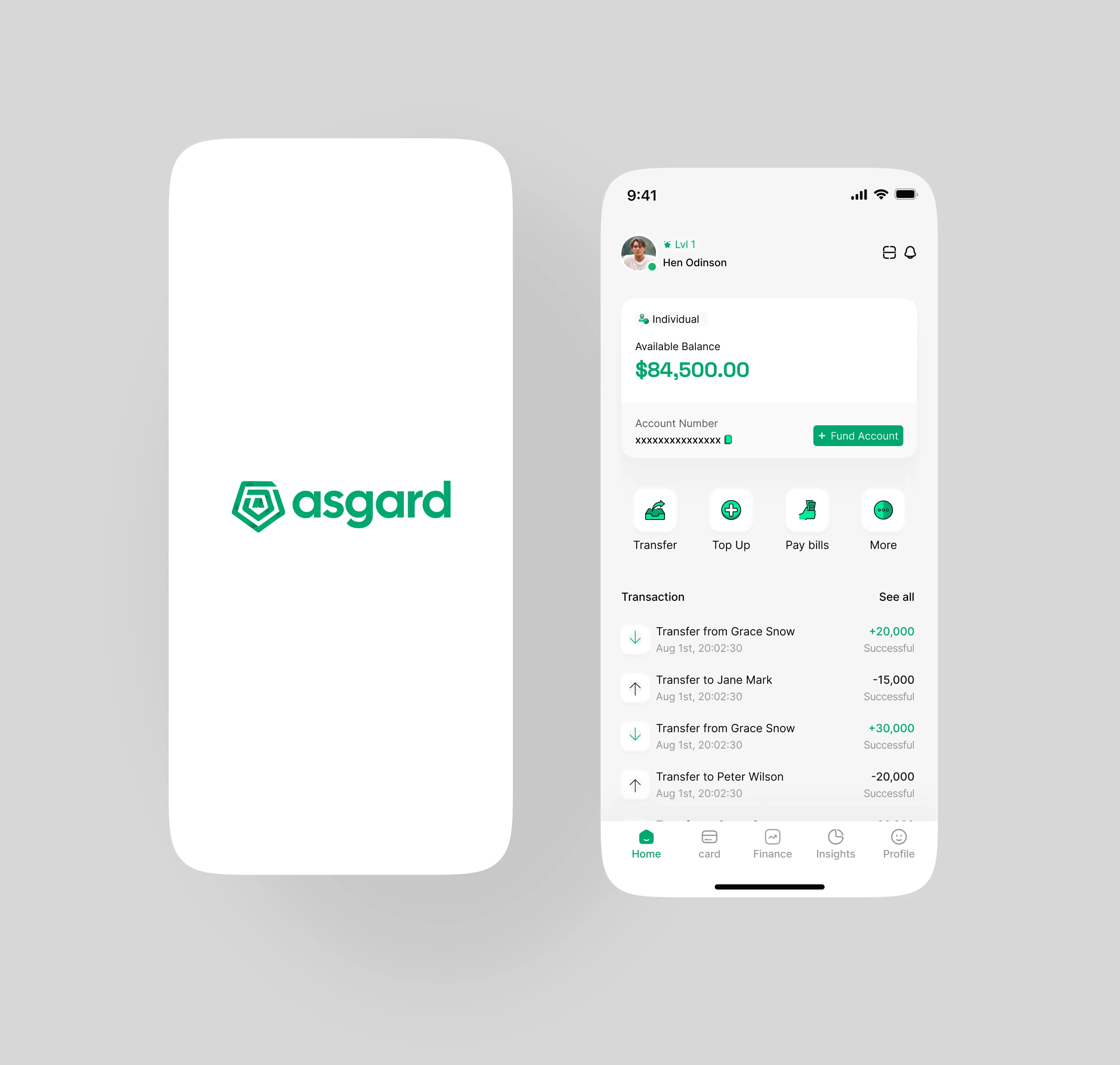
ASGARD – Financial Services App
Asgard is a modern financial services app designed for individuals, agents, and merchants. The platform supports secure digital onboarding, seamless transactions, POS monitoring, wallet management, and role upgrades.
My role was to design a clean, intuitive mobile experience that simplifies complex financial operations while maintaining trust, clarity, and efficiency.
The Challenge
Financial platforms tend to overwhelm users with long processes and cluttered interfaces. Asgard needed a design that makes finance feel simple and approachable, even for first-time or non-tech-savvy users.
Key challenges included:
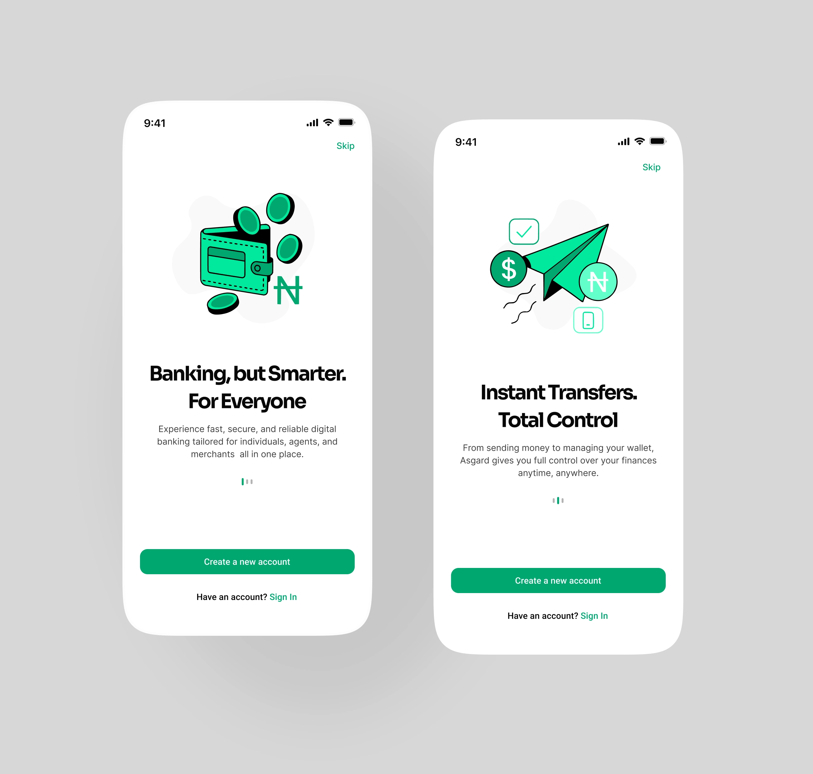
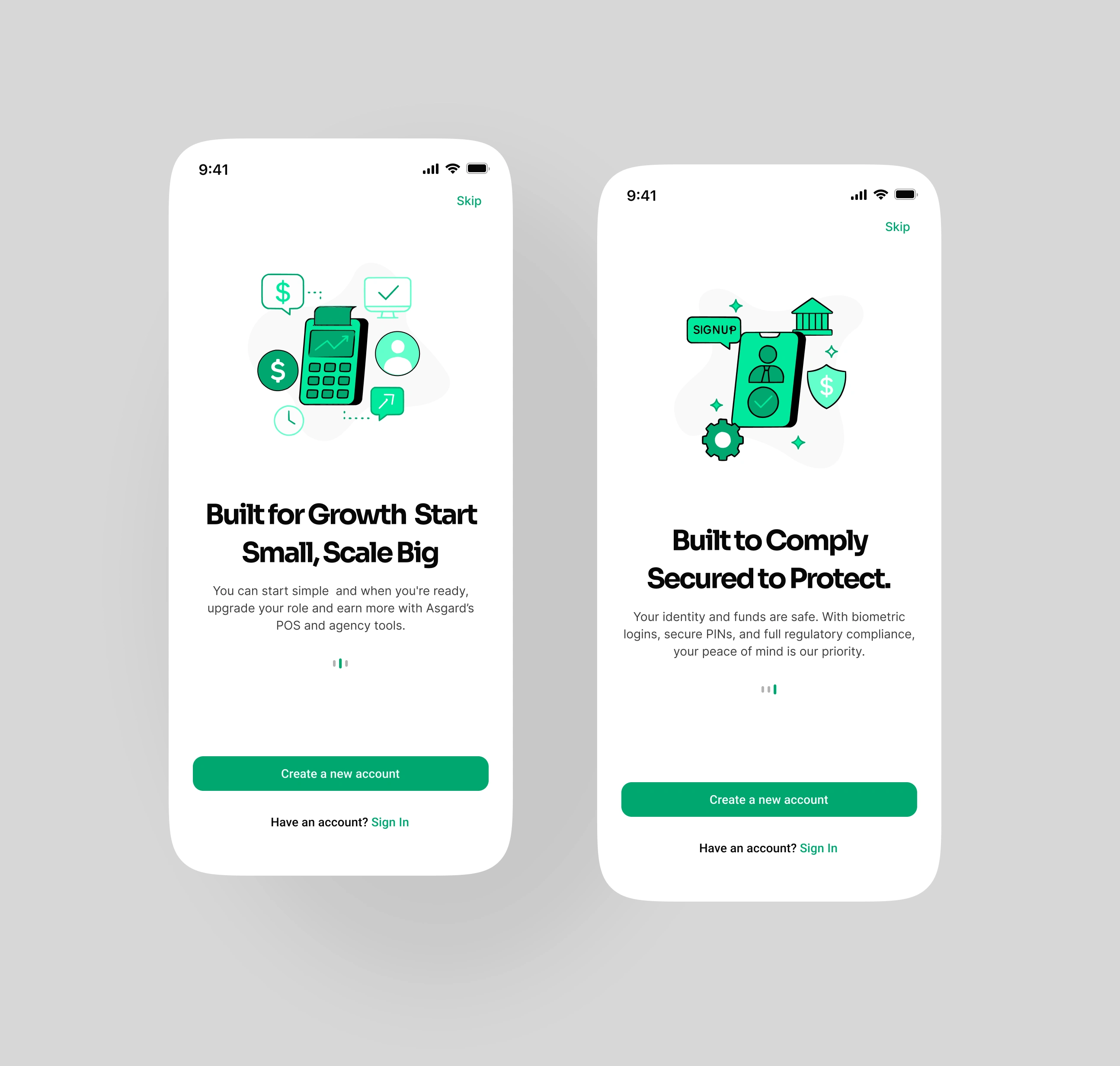
Creating a frictionless onboarding experience
Designing a UI that supports multiple user roles without confusion
Structuring complex flows like transactions, POS monitoring, and wallet management
Building a visual identity that communicates security, trust, and professionalism
Ensuring scalability for future features and user growth
Solution
To address Asgard’s challenges, I focused on redefining the user journey with clarity, structure, and simplicity at the core. I began by breaking down each complex process onboarding, role upgrades, POS monitoring, and wallet management into clear, intuitive steps. This allowed me to transform what could feel overwhelming into a smooth, guided flow that users can complete without confusion or fatigue.
I created a clean, modern interface that reduces cognitive load through spacious layouts, balanced typography, and a consistent visual hierarchy. Each decision was centered on helping users quickly understand what to do, where to go, and how to complete key financial actions like transfers, payments, and POS reviews.
To support multiple user types (individuals, agents, and merchants), I designed flexible flows that adapt to each user’s needs without making the interface feel cluttered. I also introduced strong visual cues, simplified navigation, and reusable components that keep the experience consistent across all screens.
To enhance trust, I leveraged calm colors, clear feedback states, and transparent information structures that help users feel in control of their finances. Finally, I organized the Figma file into structured pages and documented components, ensuring a smooth developer handoff and faster implementation.
The result is a simple, scalable, and user-friendly financial experience that solves complexity by prioritizing clarity and ease of use.
Impact
A smoother, more intuitive onboarding process that increases account activation
A clean, modern interface that enhances user confidence and reduces drop-offs
Improved flow structure for easier navigation across wallets, POS, and role upgrades
A scalable design system prepared for future feature expansion
Faster development due to a well-organized Figma file and reusable components
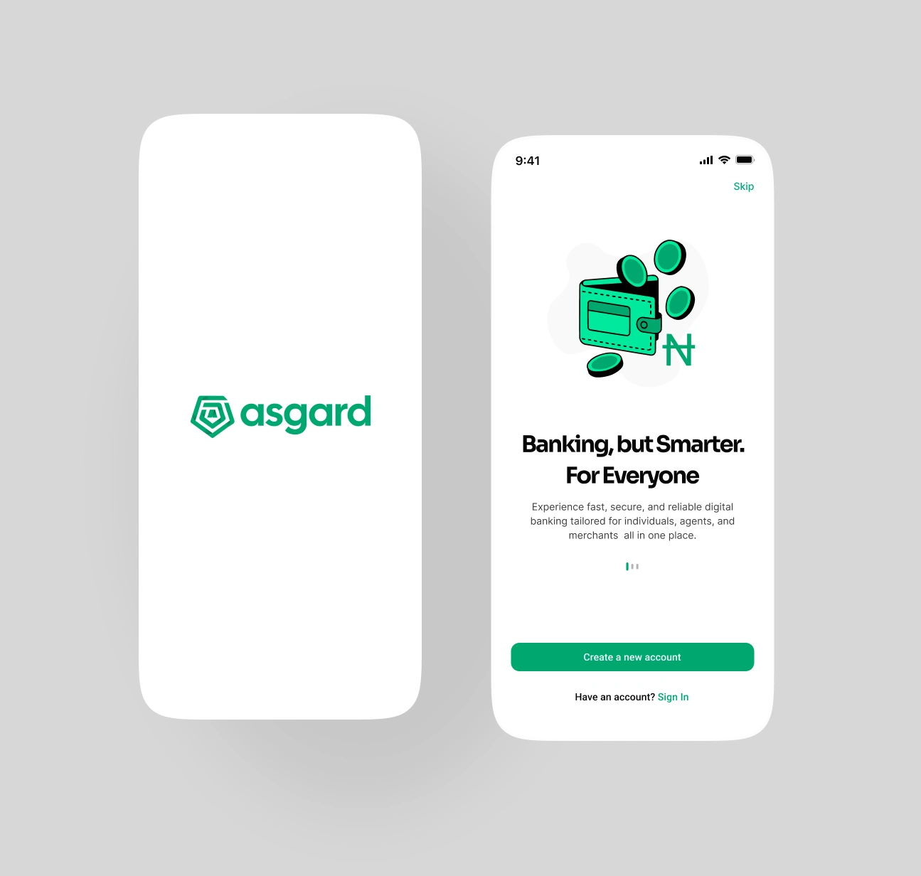
Onboarding
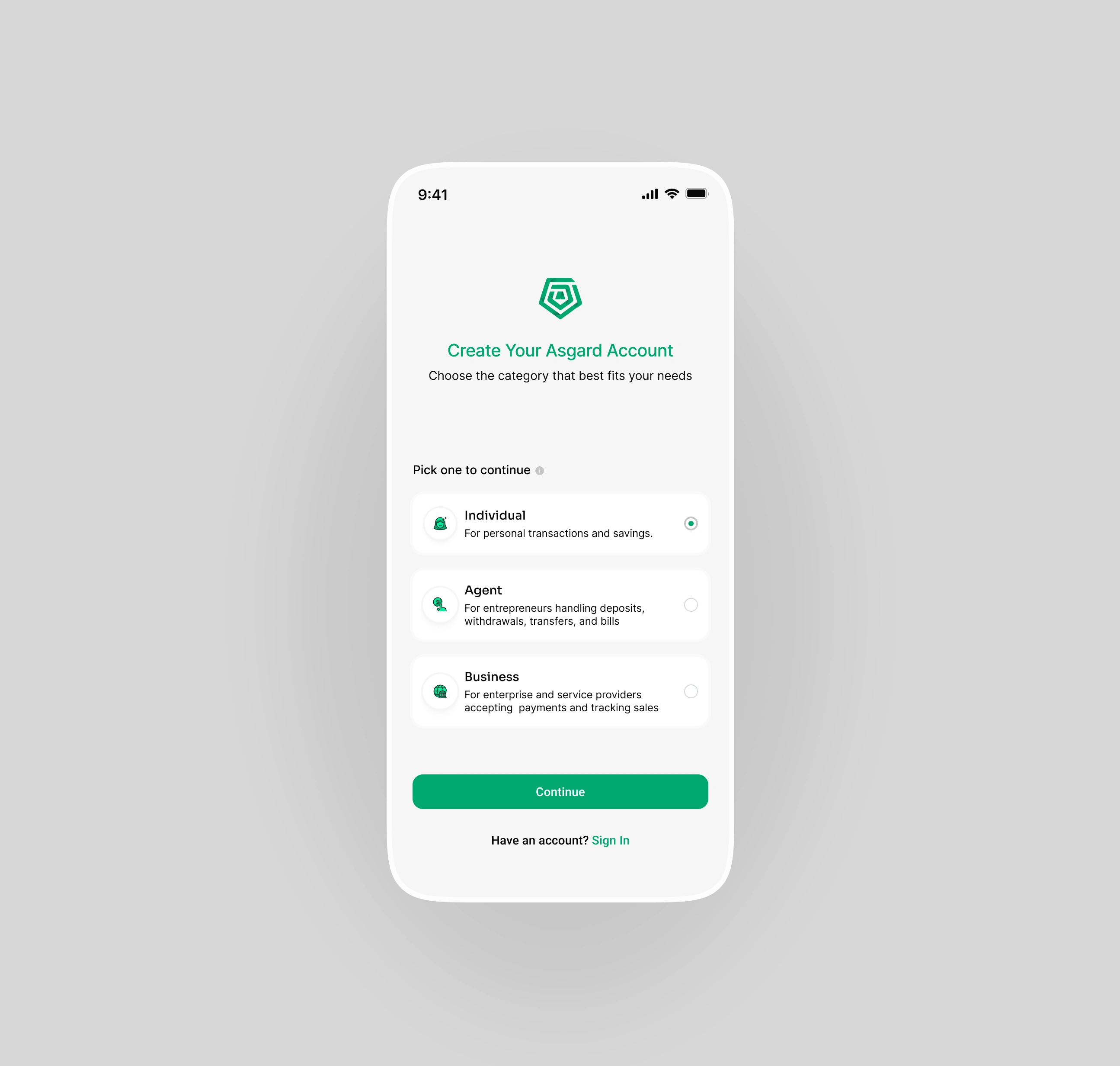
User Role Selection
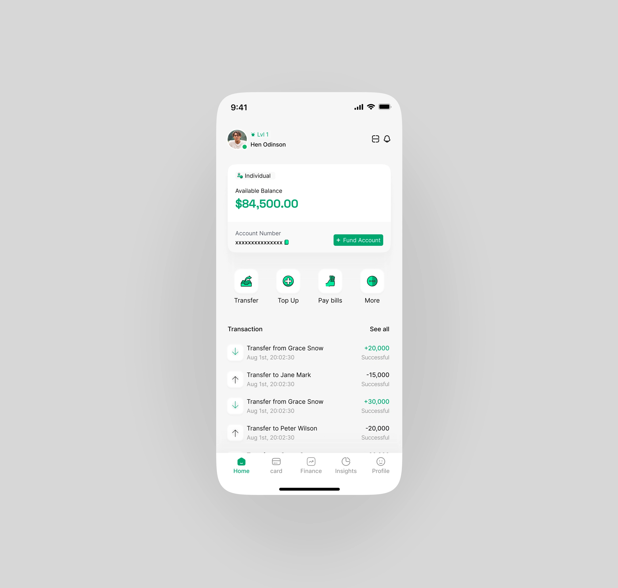
Home Screen

Like this project
Posted Dec 7, 2025
Asgard is a financial app for individuals, agents, and merchants. I designed a clean, intuitive experience for smooth onboarding and transactions.
Likes
0
Views
0
Timeline
Aug 15, 2025 - Nov 20, 2025
Clients
Asgard