Techlane: bilingual site for a Managed IT provider

Valerio Donfrancesco


Context
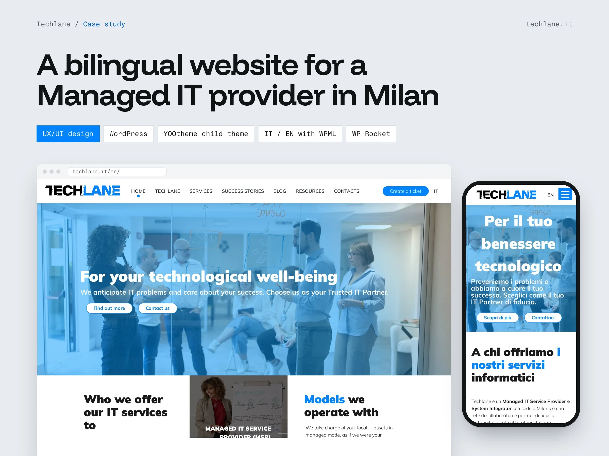
Techlane is a Managed IT Service Provider and System Integrator based in Milan, with a network of collaborators and partners across Italy. It works for two kinds of clients: Italian branches of multinational companies and Italian SMEs. Both need to understand quickly what Techlane does, which service model fits them and how to get help when something breaks. Many of them read in English, many in Italian.
My role
I designed the UX and UI of the whole site and built it on WordPress: information architecture, page templates, the bilingual setup and performance tuning.
What I designed and built
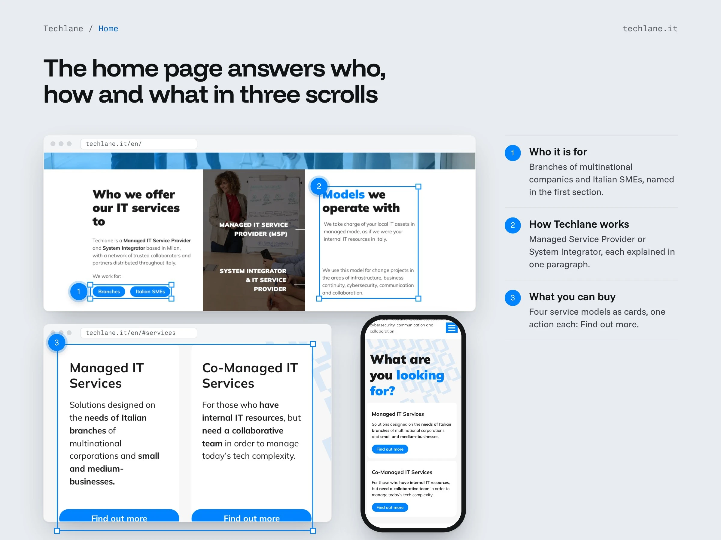
A home page that answers three questions in order: who Techlane works for, how it works (Managed Service Provider or System Integrator) and which service models you can buy.
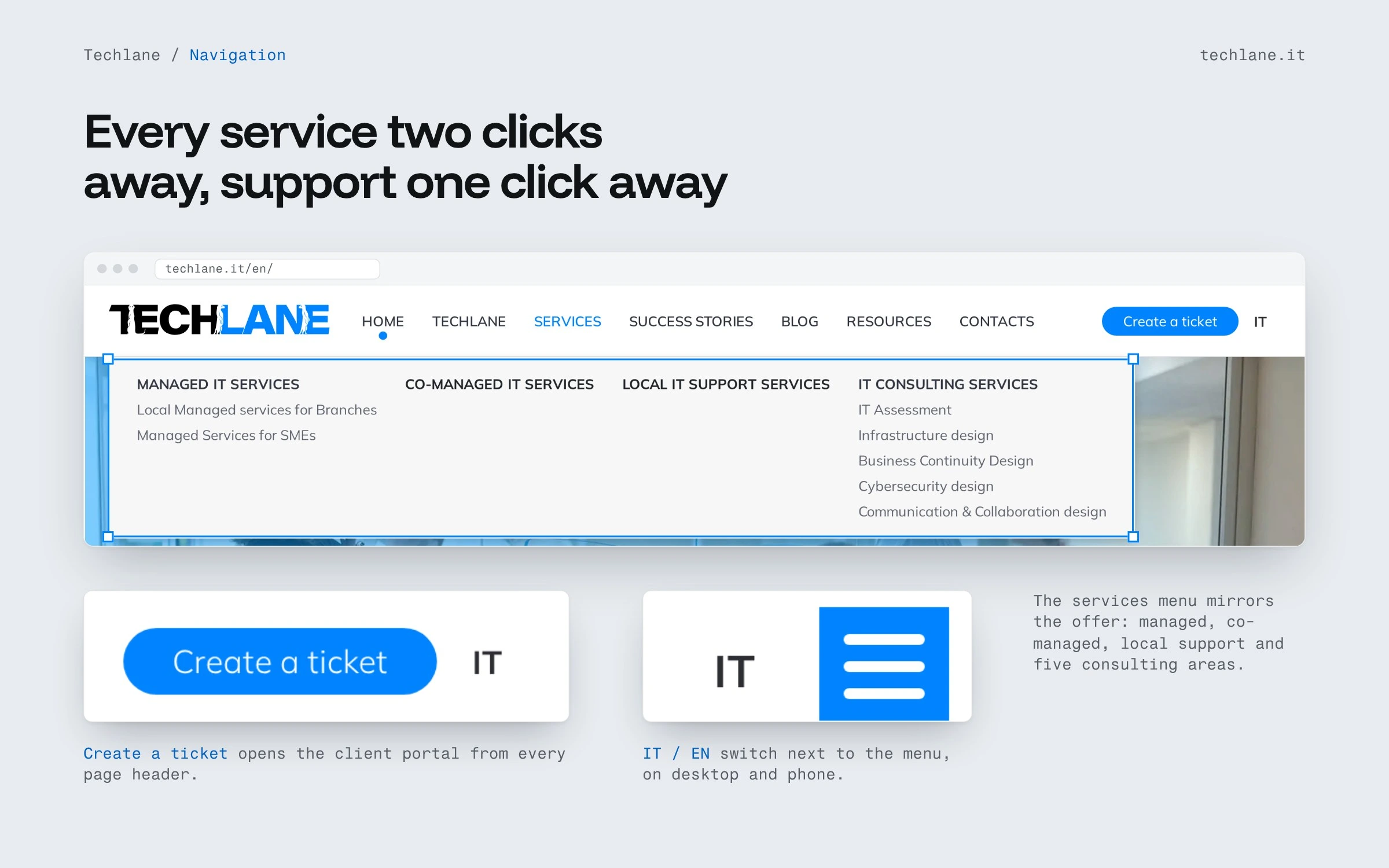
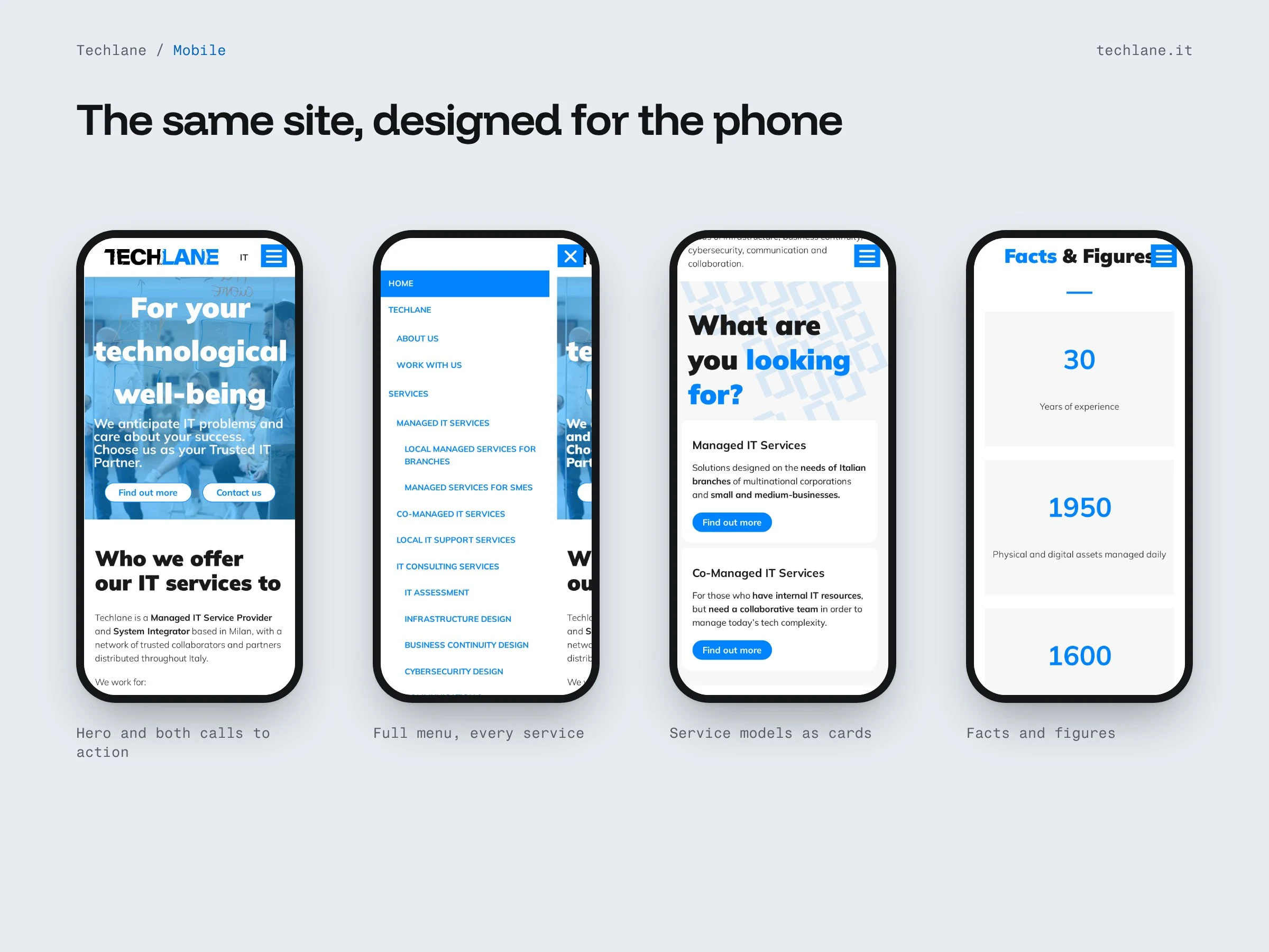
A navigation that mirrors the offer. The Services menu lists managed, co-managed and local support services, plus five consulting areas (IT assessment, infrastructure, business continuity, cybersecurity, communication and collaboration). Existing clients get a "Create a ticket" button in the header of every page that opens their support portal.
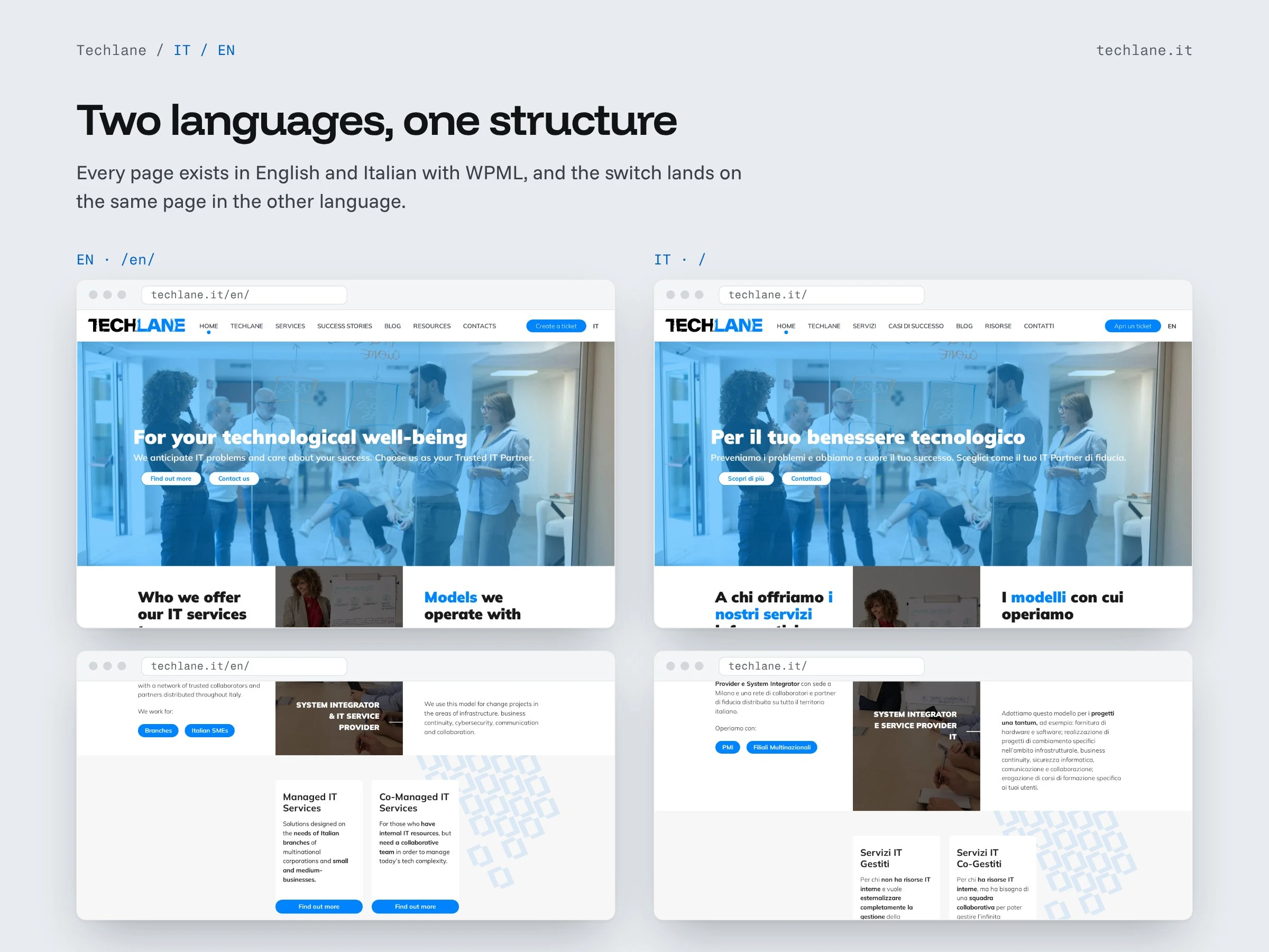
The whole site in English and Italian, with the same structure in both languages and a switch next to the menu.
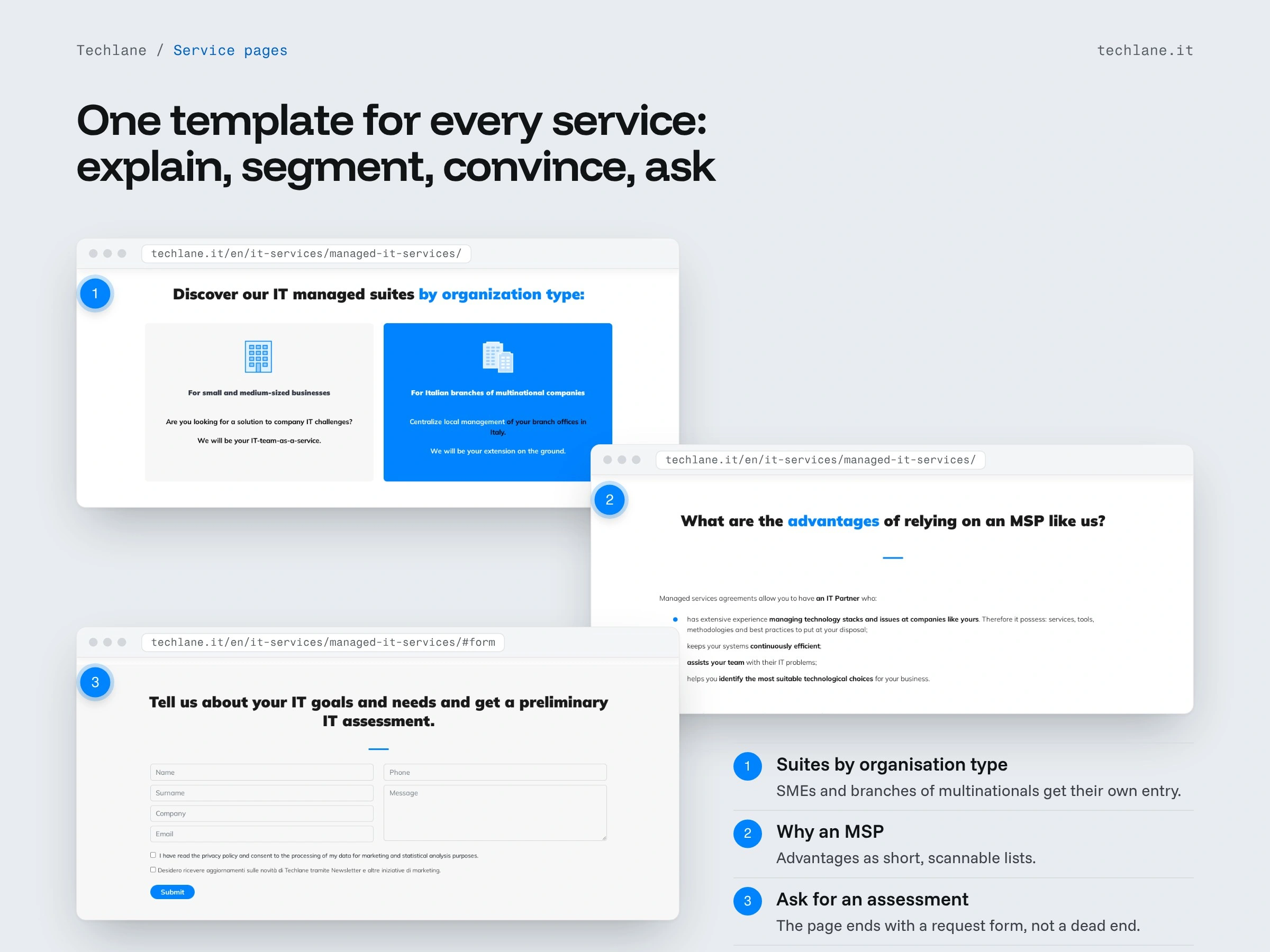
One template for every service page: what the service is, which organisation it is designed for, why it is worth it, and a request form at the end so the page never stops at a dead end.
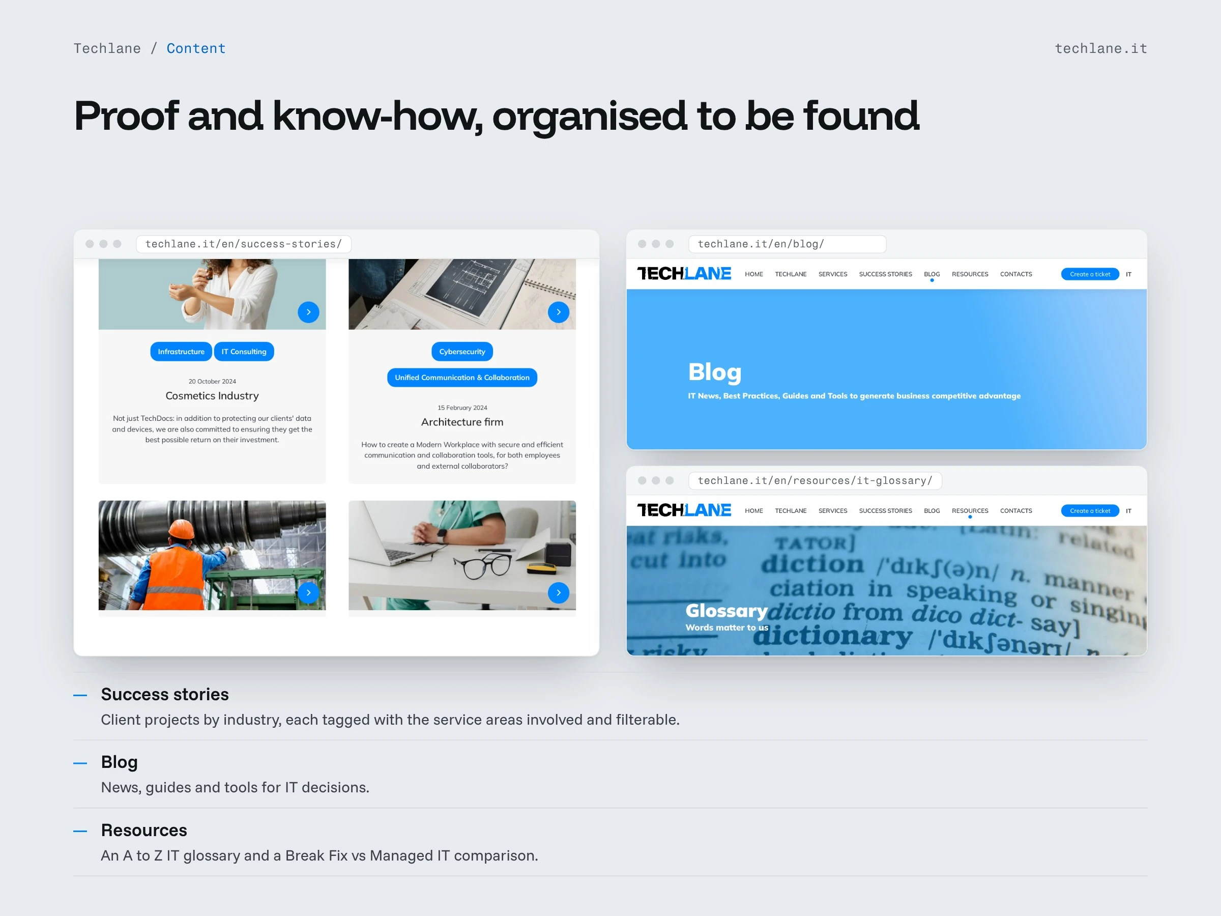
Content sections that prove the experience and share know-how: success stories by industry, tagged with the service areas involved; a blog; and resources such as an IT glossary and a Break Fix vs Managed IT comparison.
A mobile version designed screen by screen, with the full menu, the service cards and the facts and figures readable on a phone.
Key decisions
Segment first, then sell. The first section names the two audiences, branches and SMEs, so each visitor knows from the first scroll that the site is talking to them.
Support is one click away. For an MSP the site is also a tool for current clients, so the ticket portal sits in the header, visually separate from the navigation.
Same structure in both languages. Italian and English pages are equivalent, so the switch always lands on the same page and nobody has to start over.
Every service page ends with a question to the client. The assessment request form turns reading into a conversation.
Under the hood
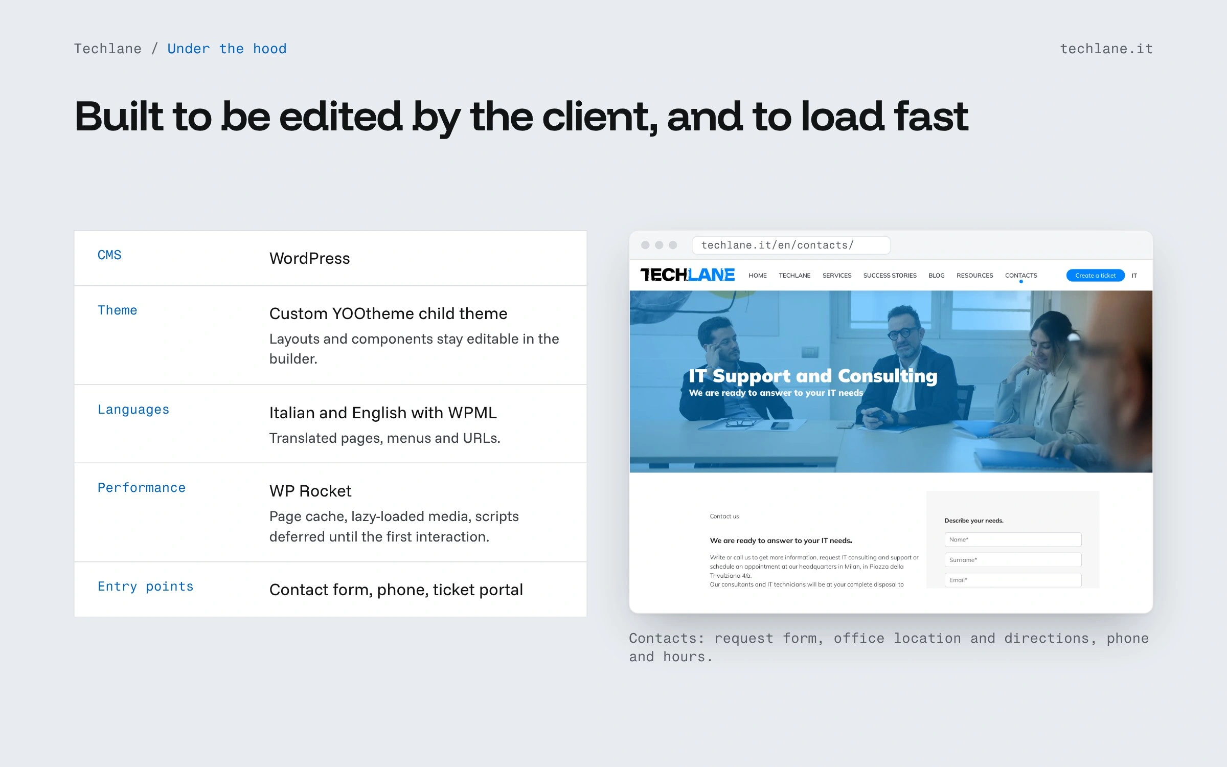
WordPress with a custom YOOtheme child theme: layouts and components stay editable in the YOOtheme builder.
WPML for the Italian and English versions of pages, menus and URLs.
WP Rocket for performance: page cache, lazy-loaded media and scripts deferred until the first interaction.
Clear entry points on every page: contact form, phone and the client ticket portal.
What the client gets
A bilingual corporate site that explains a technical offer in plain language, sends each type of company to the right service, gives existing clients a fast way to open a ticket and stays editable in the page builder.
Like this project
Posted Oct 12, 2026
UX/UI and WordPress build for a Milan Managed IT Service Provider: service pages, success stories, IT/EN with WPML, ticket entry point.