Case Study: Building a Hospital’s IoT platform
Project Brief
The objective of this project was to redesign the user interface (UI) and user experience (UX) of the Hospital IoT System dashboard to make it more visually appealing and user-friendly for the administrators and staff members of the hospital. The stakeholders deemed the existing dashboard design repetitive and too colorful, and the UX did not meet their expectations.
This system allows administrators and staff members to monitor and manage various aspects of hospital operations, such as patient care, equipment maintenance, resource allocation, location tracking & much more.
Some Information has been retracted to maintain client confidentiality.
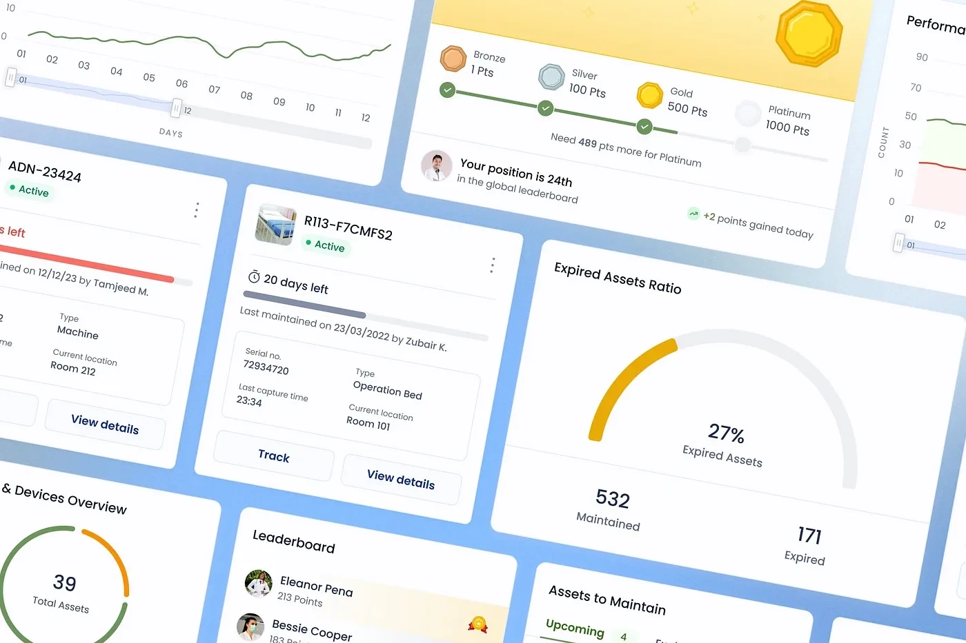
Cover Image
Problem Statement
We want to build an IoT dashboard which we can use to track things such as assets, devices and employees within our hospital
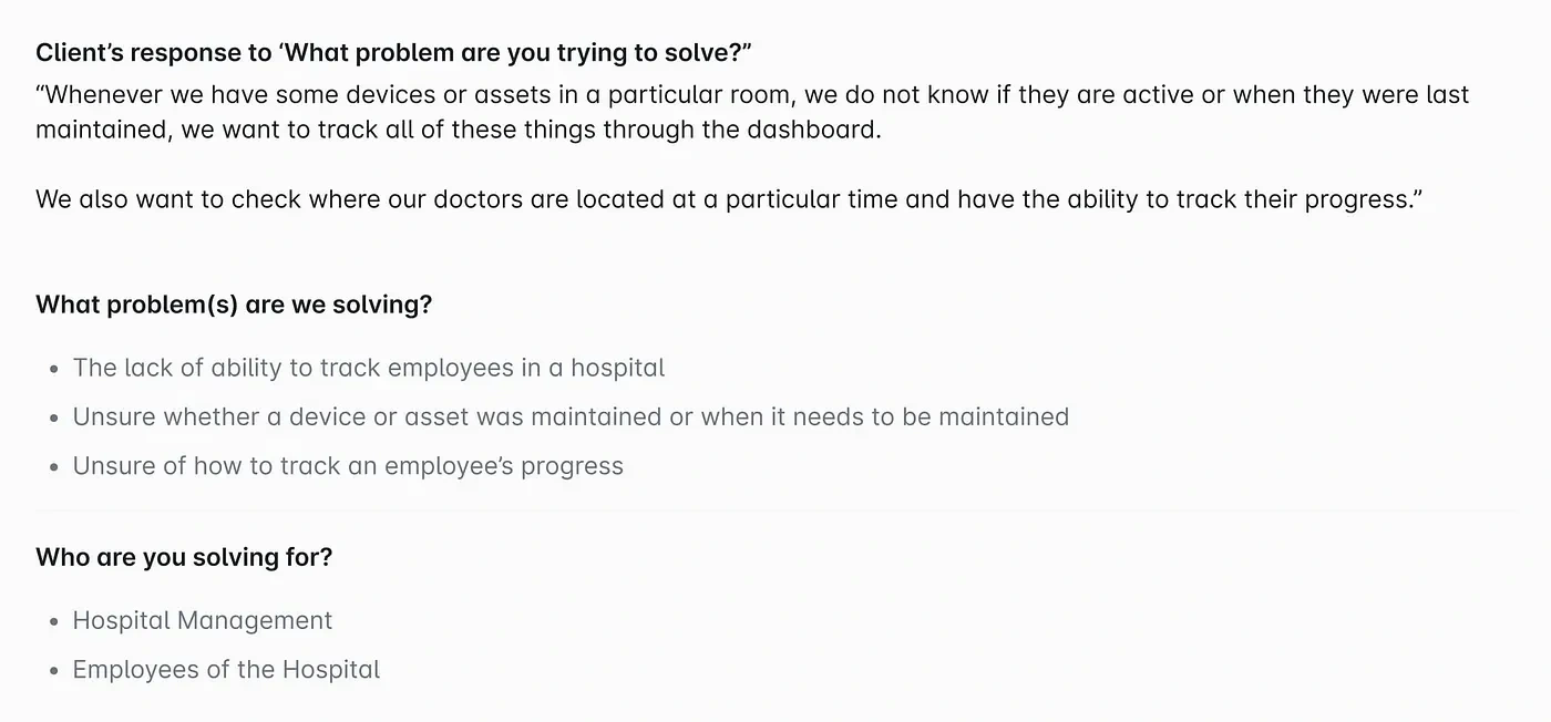
Defining Problem
Outcome
Improve user experience: By redesigning the dashboard to be more intuitive and user-friendly, administrators & staff members should be able to access and navigate various features and functions more efficiently, leading to a better overall experience.
Increase user satisfaction: With a more efficient and enjoyable user experience, administrators & staff members should be more satisfied with their interaction with the dashboard.
Increase user engagement: With a more enjoyable and seamless experience, administrators & staff members should engage with the dashboard frequently and use its various features and functions.
Improve accessibility: By following best practices for accessible design, the dashboard redesign should be usable by people with a wide range of abilities. It needs to be a more inclusive and welcoming environment for all users.
Final UI
Incase you wanted to skip ahead and check out the final design
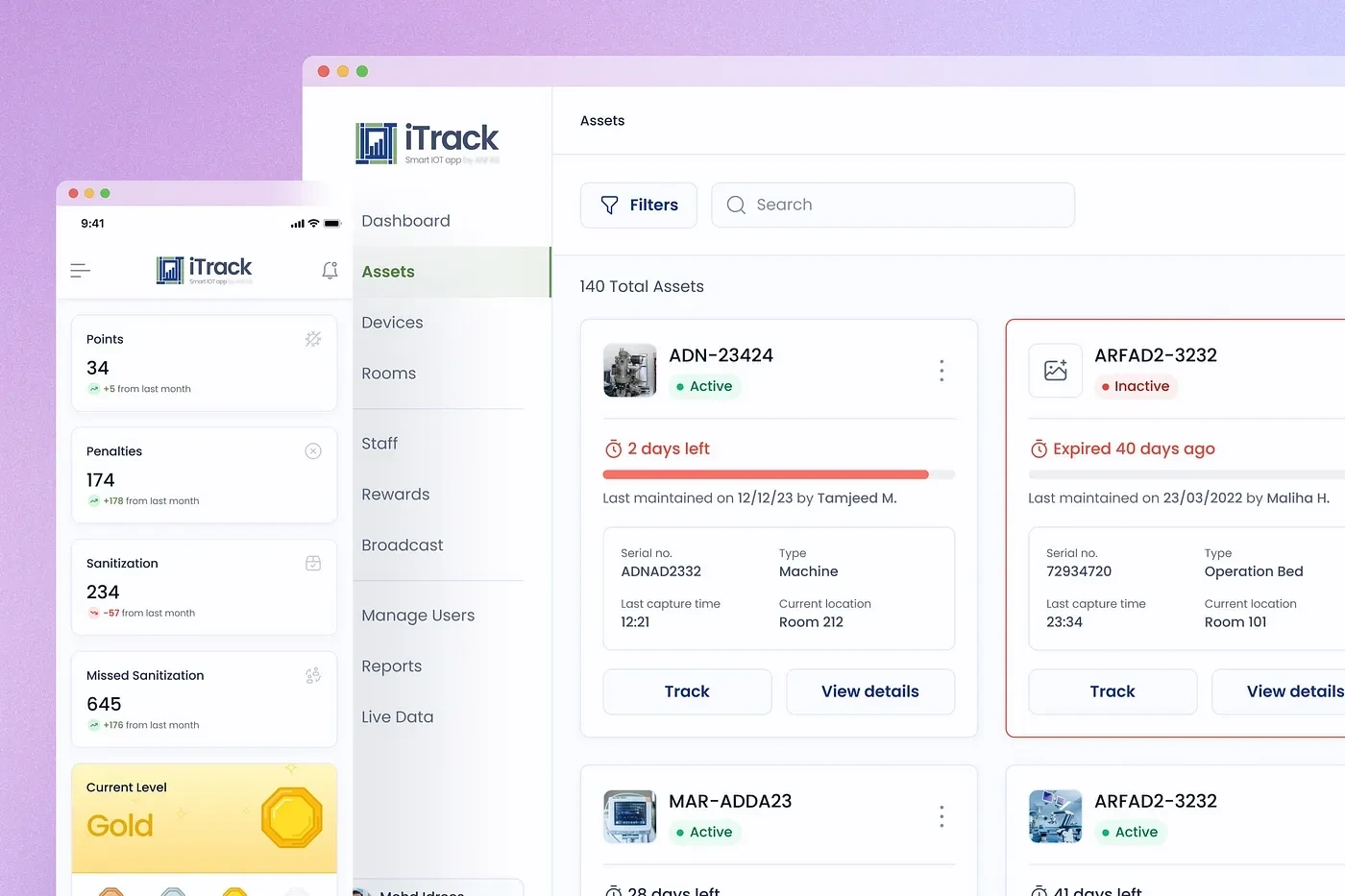
Final Design
Research Process
The research process began with a UX audit, in which I sat down with the stakeholders to understand the frustrations of their employees with the current system. This provided valuable insights into the areas that needed improvement, and it helped to identify the key goals for the redesign.
Based on the results of the UX audit, I conducted a thorough analysis of the existing dashboard, paying special attention to accessibility and contrast issues. This analysis also revealed that the current flows were not mapped correctly, causing confusion and repetition for the users. To fix this problem, I developed a new information architecture flow that better organized the information and functions of the dashboard.
One of the most important features of the redesign was the implementation of a live map that allowed users to zoom, pan, and interact with the map in real time. To make this possible, I had to research and evaluate several APIs to find the one that best fit the system’s needs.
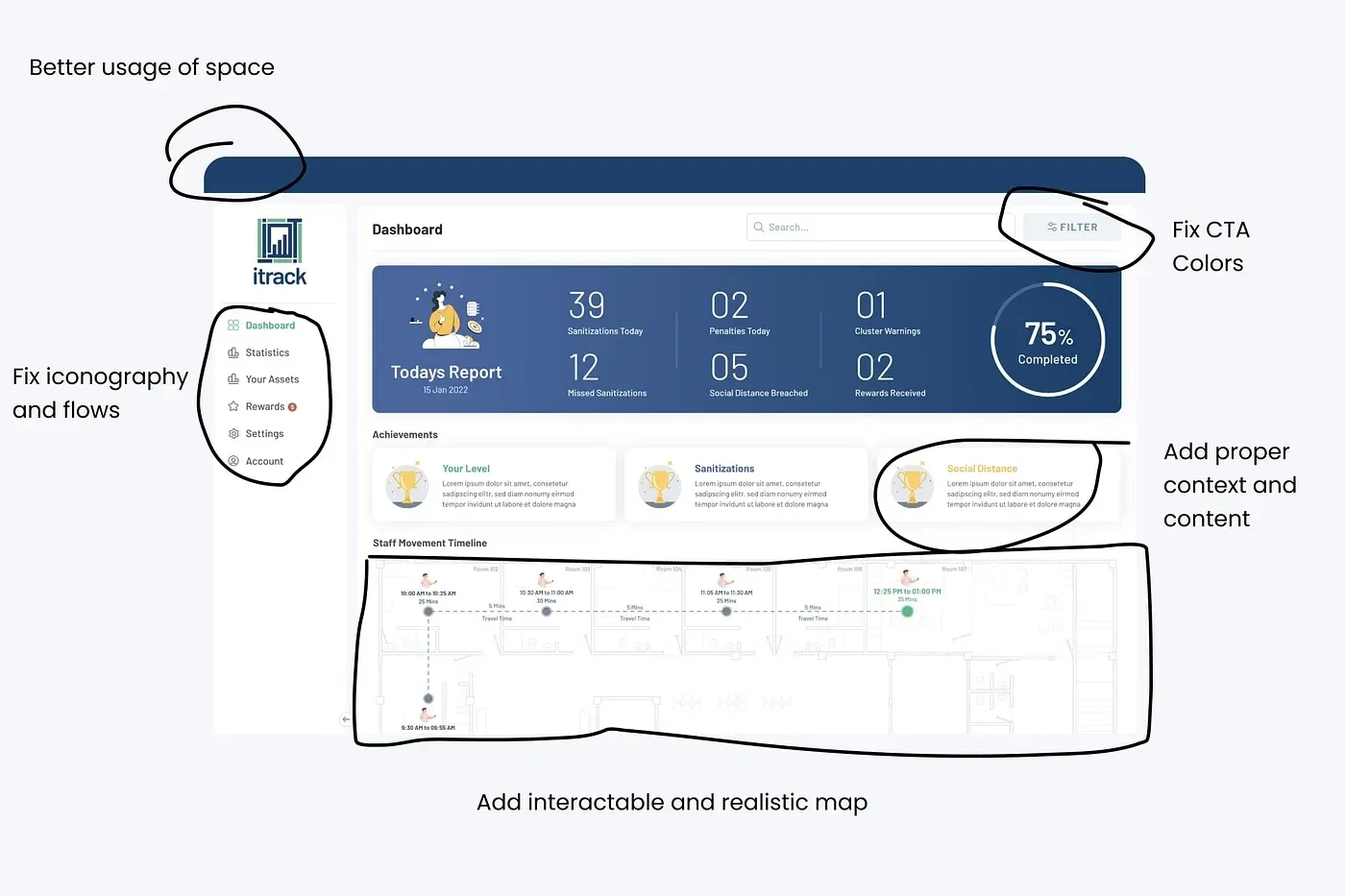
Making Notes
UX Audit
The stakeholders deemed the existing dashboard too colorful. To fix this problem, I worked on a color palette to reduce the number of colors used in the interface and to choose more cohesive and harmonious color schemes.
Several of the components of the existing dashboard were static and not very interactive, which made them less engaging and less beneficial for the users. To address this issue, I planned to make more components dynamic and responsive so that they could provide real-time updates and more interactive features.
The existing dashboard used various typefaces and font sizes, making it difficult to read and creating a disjointed look. To fix this, I standardized the typography of the dashboard and chose a clear and legible typeface that was consistent across the interface.
The charts and graphs used on the existing dashboard were not customizable, so I researched several design systems with open-source APIs that allow us to customize the look and feel of charts and grap. The one I finalized was ANT Design System.
Old Design
Information Architecture
The existing dashboard had several items repeated under different names in the navigation but performed the same action or provided the same user interface. This was confusing for users and made it difficult to find what they were looking for. To fix this problem, I consolidated these items and gave them consistent names, making them easier to locate and understand.
I identified several UX issues in the existing flows of the dashboard, such as unnecessary steps or confusing interfaces. To fix this, I worked to simplify the flows and eliminate unnecessary steps, making them more intuitive and efficient for users.
Some of the flows of the dashboard were complex and contained a large amount of information and functionality. To make these flows easier to understand and use, I segregated them into multiple flows so that the users could more easily find and access the information and tools they needed.
One of the most frustrating aspects of the existing dashboard for users was the complex login process, which required the user to choose from many different options. To make the login process simpler and more user-friendly, I provided email, password, and OTP login as the only options, eliminating the need for users to wade through multiple options and reducing the risk of errors.
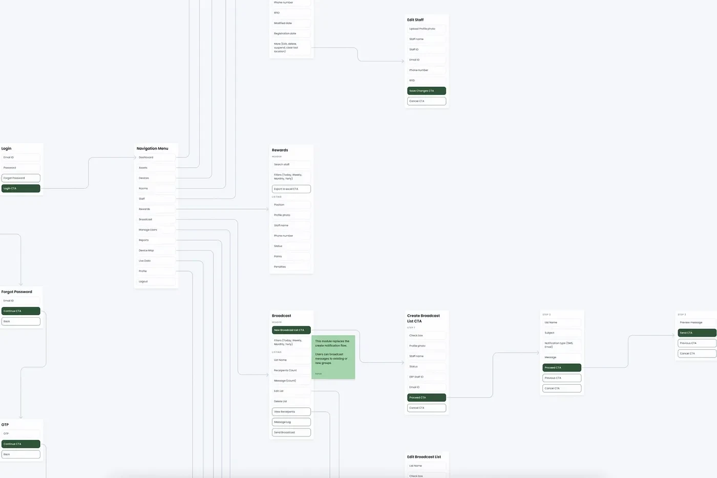
Information Architecture
Map Model Implementation
One of the main functionalities of the dashboard was to build an interactable live map of the hospital, which required the use of a suitable API. To find the right API for this purpose, I researched several options and came across Archilogic, which claimed to offer a “holistic spatial data platform for the internet.”
To understand the capabilities and limitations of Archilogic, I carefully read the documentation provided by the company and conducted additional research to learn more about the platform. This allowed me to better understand how the API worked and what features it offered, and it helped me to determine whether it was a good fit for the needs of the dashboard.
After going through the documentation, I created a few map components and collected references, after which I scheduled a call with the Archilogic’s team to discuss the details of the API and to ask any questions I had.
In the end, I decided to go ahead with Archilogic as the API for the live map feature of the dashboard. The company provided excellent documentation and support, and the API proved to be a reliable and effective solution for the needs of the dashboard. Using Archilogic, I created an interactive map component that allowed the hospital staff to track staff members, assets, and devices on a floor in real-time, greatly enhancing the dashboard’s functionality and usefulness.
Call for Understanding the API
Visuals Process
After completing the research phase, I moved on to the visual design phase. I started collecting ideas and inspiration from various sources to get a sense of the look and feel of the dashboard.
With the inspiration and user research in hand, I began exploring the dashboard's user interface and sketching out different ideas for how it could look and work. This involved creating low-fidelity wireframes and prototypes to test different layouts, navigation patterns, and visual styles.
After I was done with Desktop and Mobile layouts, I created some interactive prototypes in Figma to further refine the dashboard's design. These prototypes allowed me to test out different interactions and animations and get feedback from users and stakeholders.
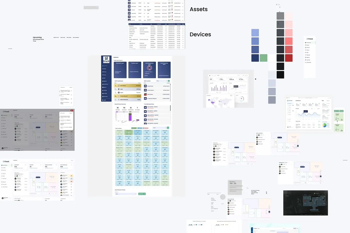
Iterating Visuals
Moodboard
As part of the visual design phase of the redesign, I created a mood board to help guide my design decisions and to ensure that the final product aligned with the desired aesthetic and style.
I researched UI patterns for IoT platforms to create the mood board and collected references from websites such as Dribbble and Pinterest. I also looked at how interactive maps were built in video games, such as Resident Evil, and how icons and objects were placed on the map. This information helped me to understand how to craft a good experience for users of the dashboard.
The mood board I created included a range of visual elements, such as colors, fonts, textures, and imagery, that reflected the dashboard's desired look and feel. It served as a useful reference throughout the design process, helping me to ensure that the final product was cohesive and consistent with the overall vision for the project.
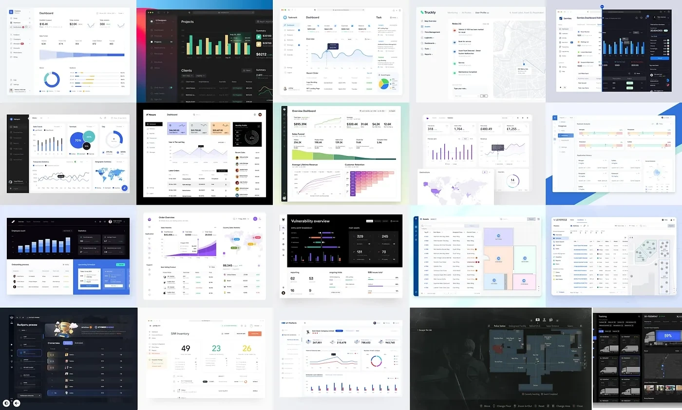
Moodboard
UI Exploration
After organizing my mood board and gathering inspiration, I started iterating on different styles that could be used for the dashboard. My goal was to create a clean and modern aesthetic that was both visually appealing and easy to use. I also wanted to ensure that the interface was accessible and self-explanatory so that users could quickly and easily navigate the dashboard and find the needed information and tools.
To explore different UI styles, I created a number of high-fidelity layouts and prototypes in Figma. These prototypes allowed me to test out different layouts, navigation patterns, and visual elements and to see how they worked in practice. I also solicited feedback, which helped me identify each design’s strengths and weaknesses and refine my ideas.
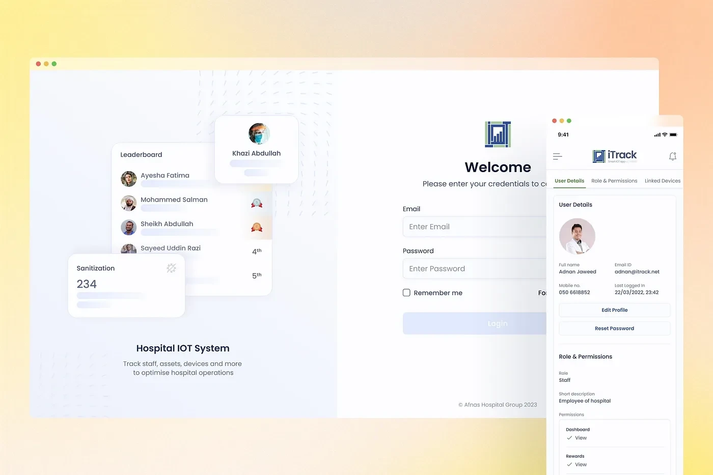
Exploring Design Style
Final UI & Prototype
After completing the UI exploration phase of the redesign of the dashboard, I was able to finalize the look and feel of the interface. With the design direction established, I moved on to building prototypes of the main flows of the dashboard, adding notes as needed to provide guidance for the developer who would be implementing the design.
To ensure a smooth handover process, I communicated effectively with the developer and provided clear and detailed instructions for each element of the design. By doing so, I was able to ensure that the developer had a good understanding of the design and could implement it accurately and efficiently.
Overall, the handover process for redesigning the dashboard was smooth and successful, thanks partly to the clear and effective communication between myself and the developer. This helped to ensure that the final product met the needs and expectations of the stakeholders and provided a positive user experience.
Designing Map Interaction
Learnings
This has been by far one of the most interesting projects I have worked on, especially because of the challenges that I faced and how I learned to overcome them with my process. This is what I learned throughout the design process;
Understanding API Documentations
One of the key things I learned while working on the redesign of the Hospital IoT System dashboard was the importance of understanding API documentation and limitations. As a designer, it was essential for me to have a clear understanding of the APIs we were implementing in the dashboard, in order to design around their capabilities and limitations.
To gain this understanding, I had to carefully read the documentation provided by the API providers and conduct additional research as needed. This required a good attention to detail and the ability to analyze complex technical information. It was a challenging but rewarding process, as it allowed me to create a more seamless and effective user experience for the dashboard.
Overall, learning how to understand API documentation and limitations was a valuable skill that I acquired during the redesign of the Hospital IoT System dashboard, and it will be useful in my future design work as well.
Iterating Map Component
Learning about IoT system
Another important thing I learned while working on the redesign of the Hospital IoT System dashboard was about the inner workings of IoT systems. As this was my first project in this field, I had only a basic understanding of how IoT systems operated and needed to learn more about their technicalities in order to create the best user experience.
To gain this understanding, I had to do a lot of research and ask questions of the developers and other technical experts on the project. I learned about the different components of an IoT system, such as sensors, gateways, and servers, and how they work together to collect and transmit data. I also learned about the challenges of designing for IoT systems, such as the need to consider issues like security, connectivity, and scalability.
Overall, learning about the inner workings of IoT systems was a valuable experience that helped me to create a more effective and user-friendly dashboard for the Hospital IoT System. It was a challenging but rewarding process, and it has given me a deeper appreciation for the complexity and potential of these systems.
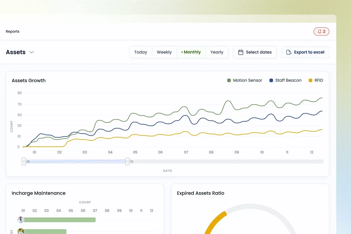
IOT Graphs
Like this project
Posted Oct 25, 2023
Redesigning a Hospital IoT System dashboard, emphasizing improved user experience through intuitive, efficient, and accessible design.
Likes
0
Views
23

