BPR
About the Client
BPR are a brand that sell turnkey racing simulator setups, have a race team that competes in the British Prokart Endurance Championship as well as a sim racing team.
Project Goal
When they came to me they were using a logo that one of their team members had created who had no design experience. The client initially was thinking about keeping the current logo design but needed it updating to include different areas of the business and they wanted to see if I could come up with another logo concept to decide which they would go with.
Design Process
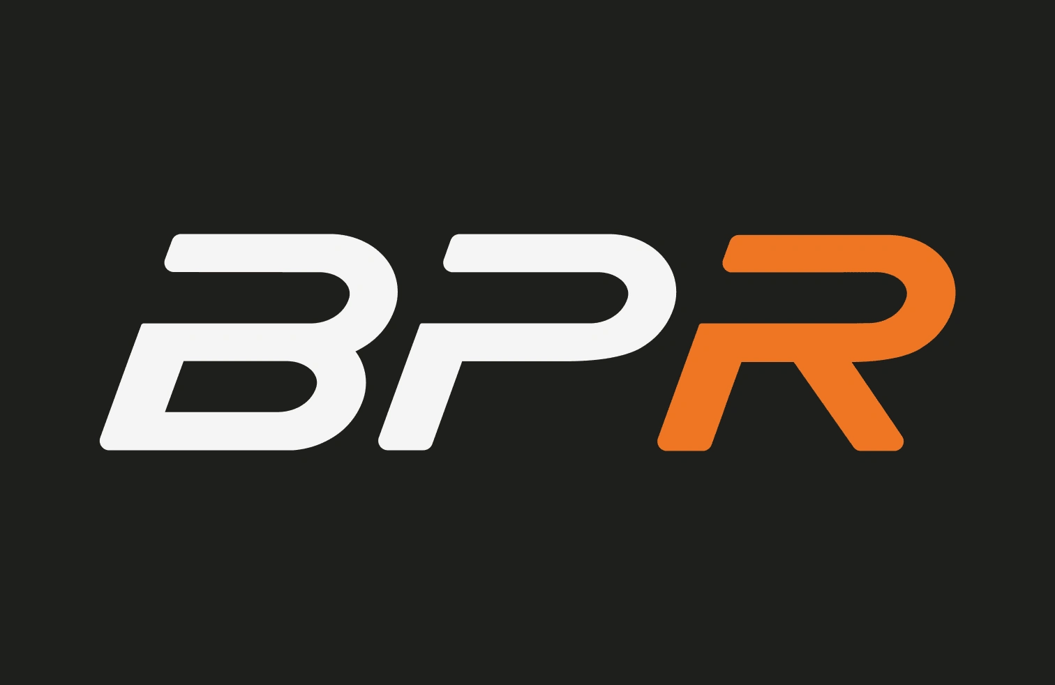
From their brand questionnaire answers, they described their brand as friendly, approachable and passionate. This didn’t really correlate with their previous logo which was more harsh with a dark red/orange and sharp corners. For the new logo concept I used a bright and approachable shade of orange and used rounded corners to appear friendly while still showing the competitive and passionate nature of the sport.
Outcome
I developed a brand identity that truly reflected their personality and could be flexibly applied across various purposes, such as for a motorsport team, esports team, and sim rig company.
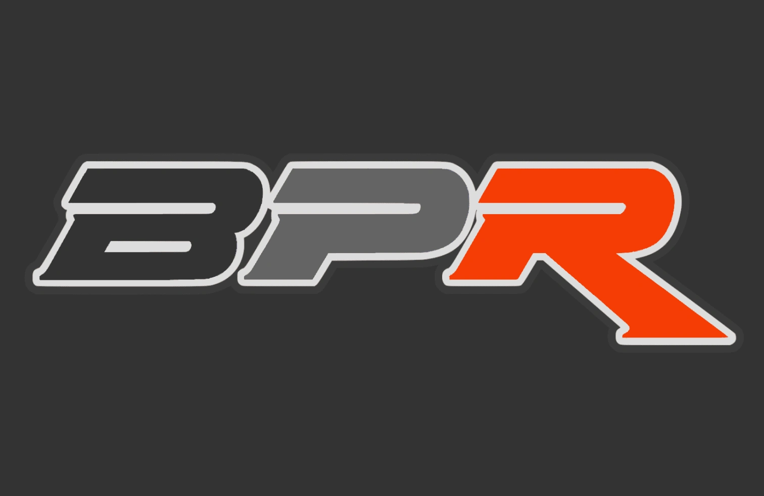
Previous Logo
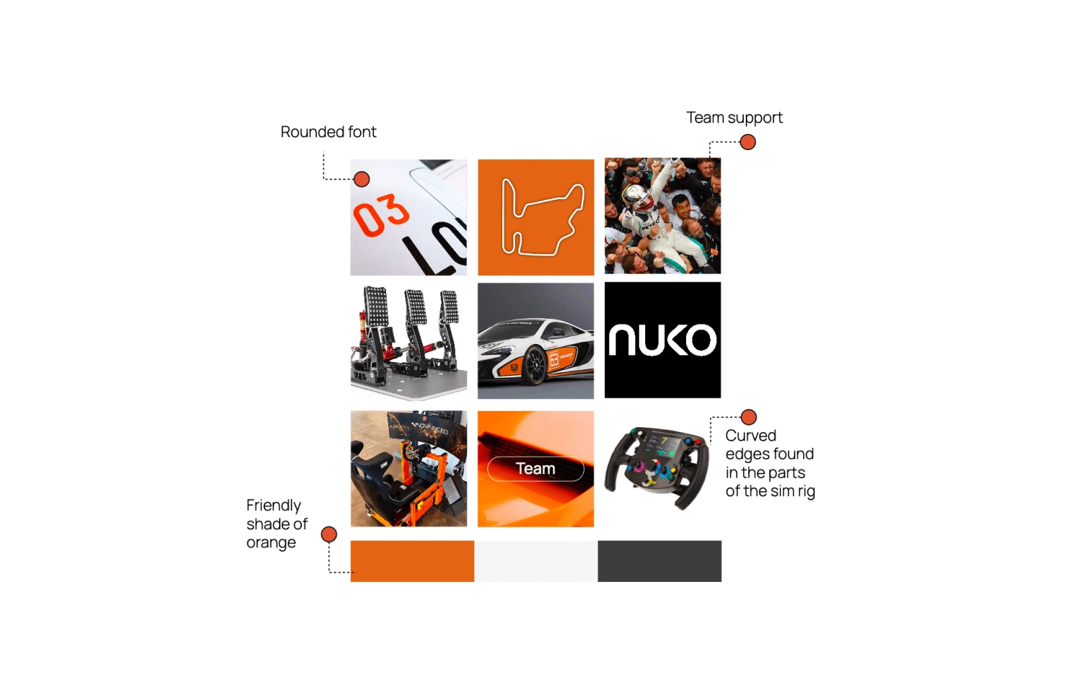
Creative Direction - Final Mood Board
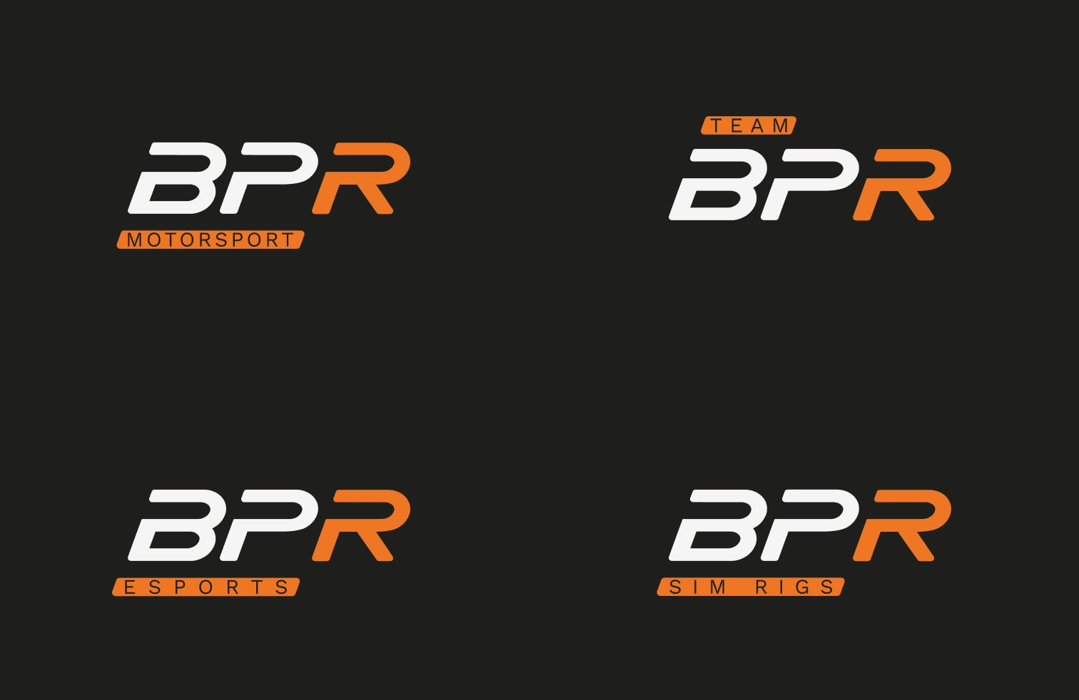
Primary Logo
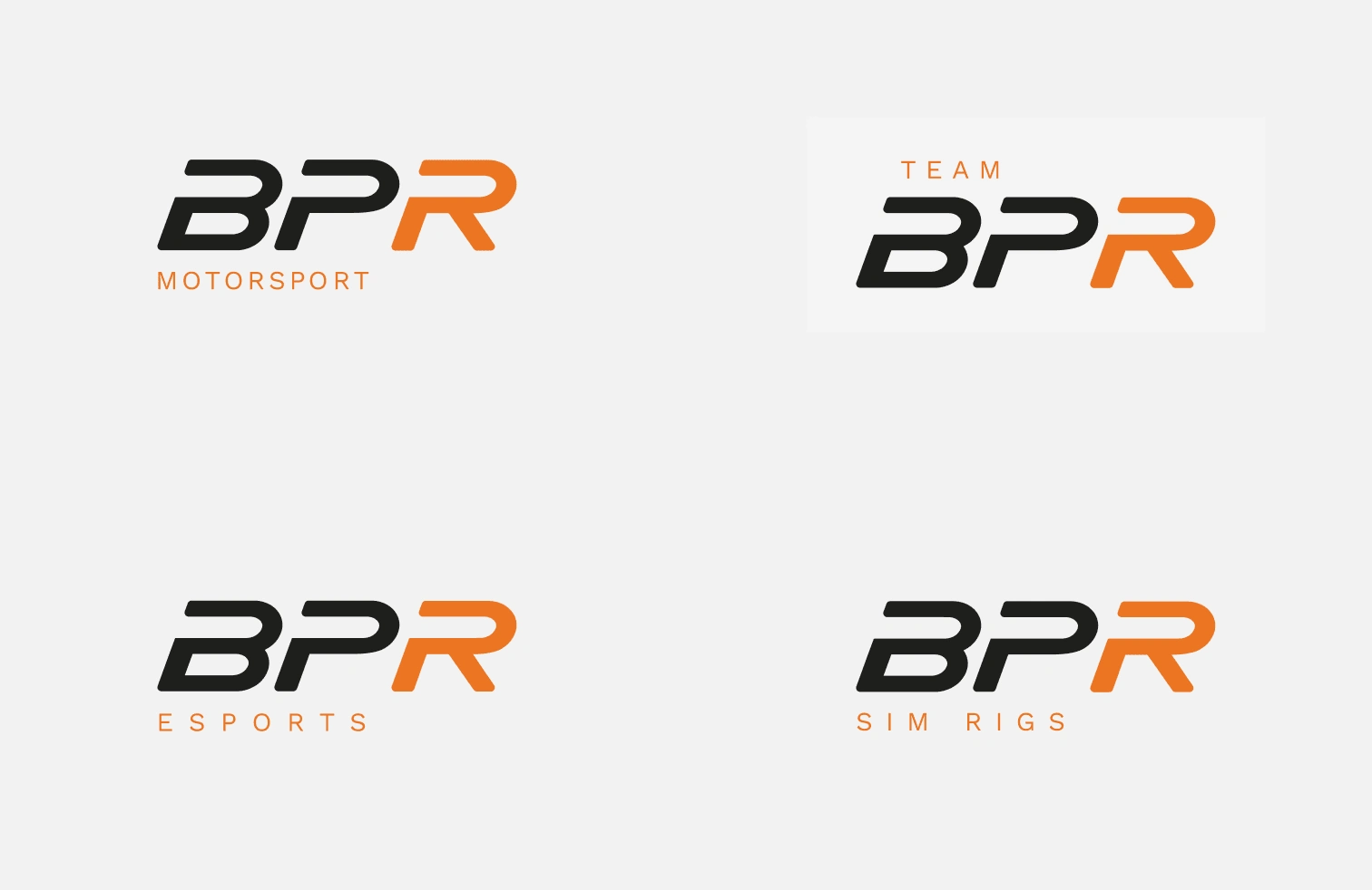
Secondary Logo
Icon Logo
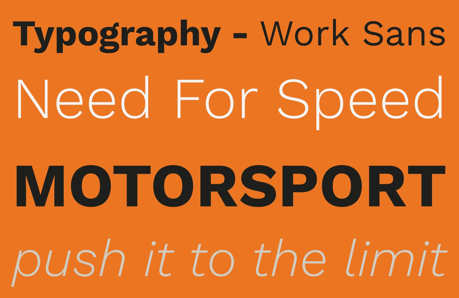
Typography
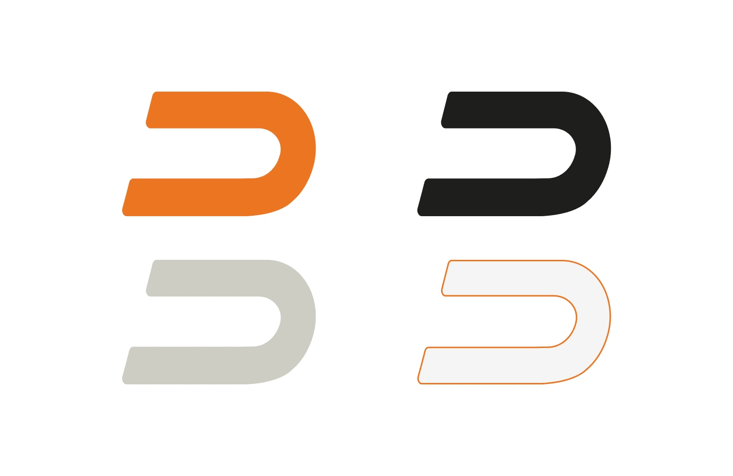
Colour Palette
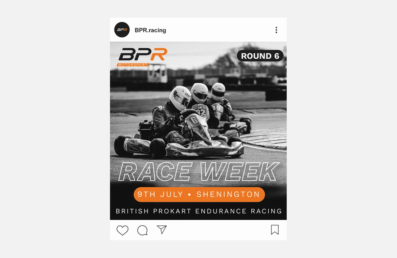
BPR Motorsport Social Media Design
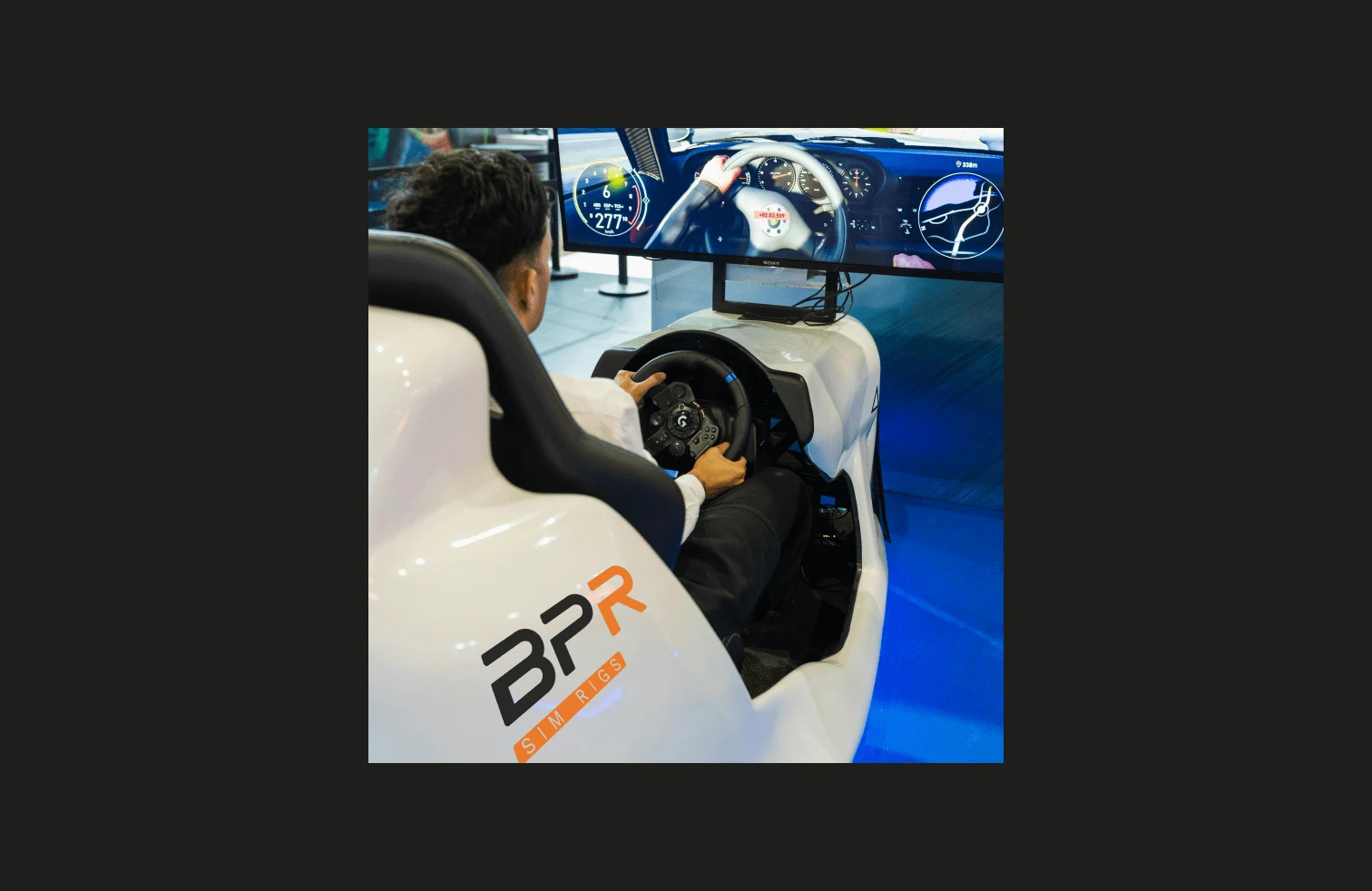
BPR Sim Rig Mock Up
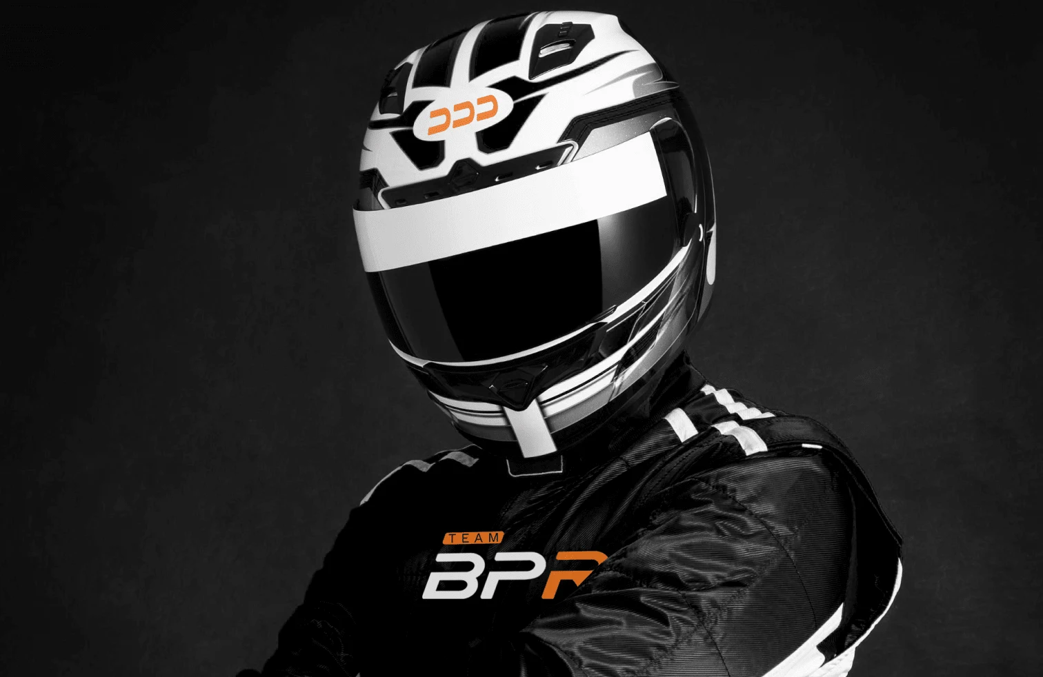
Team BPR Mock up
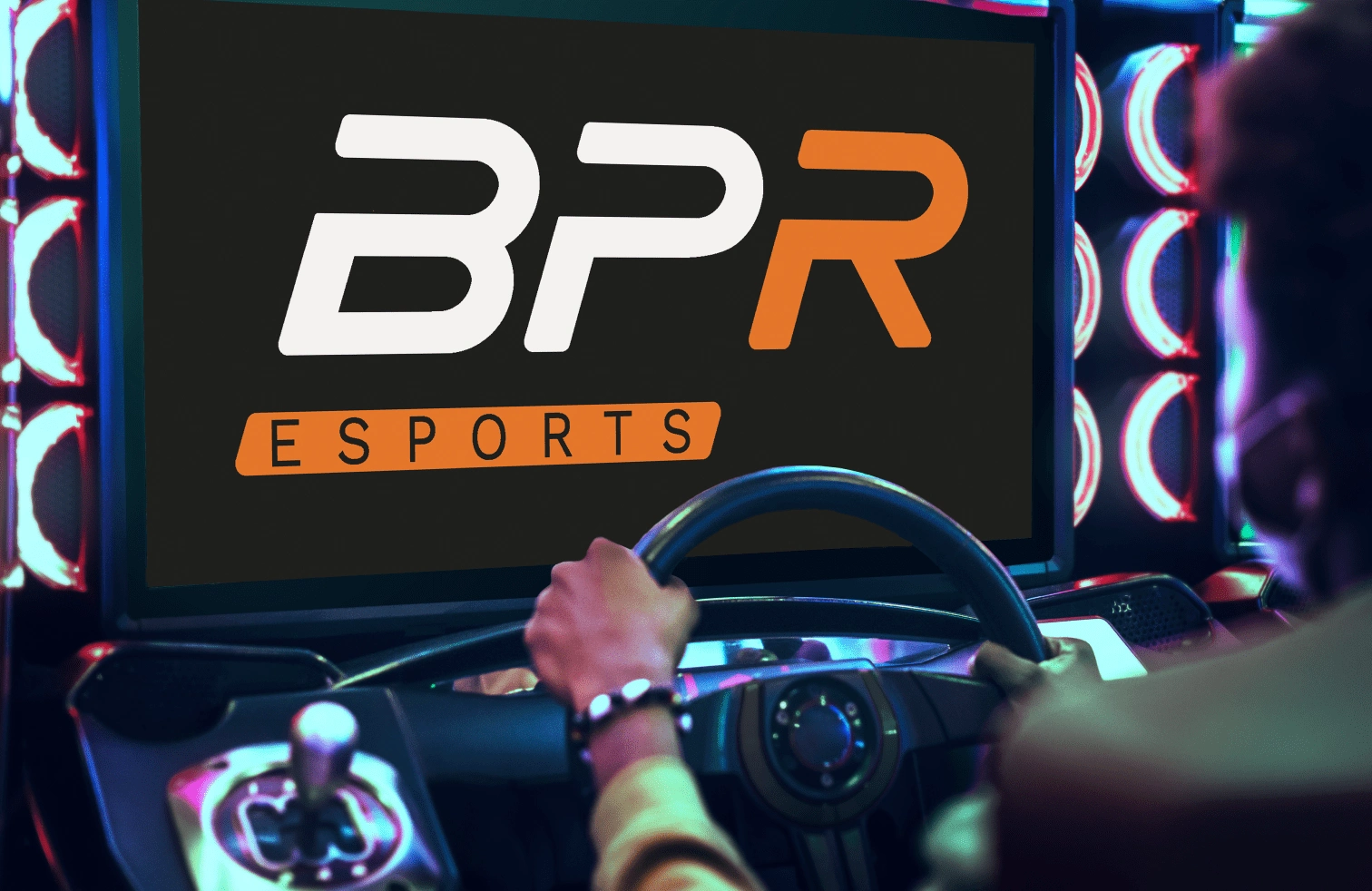
BPR Esports Variation
Deliverables
Creative Direction - Moodboards
Brand Presentation
Logo Suite
Colour Palette
Typography
Mock Ups
Brand Guidelines
Like this project
Posted Jun 1, 2024
A brand identity design for a motorsport brand which has multiple branches - racing team, esport team and sim rig business.
Likes
0
Views
3

