Vibrant Supplement Label Design for Food For
Rosalba Porpora
1 collaborator
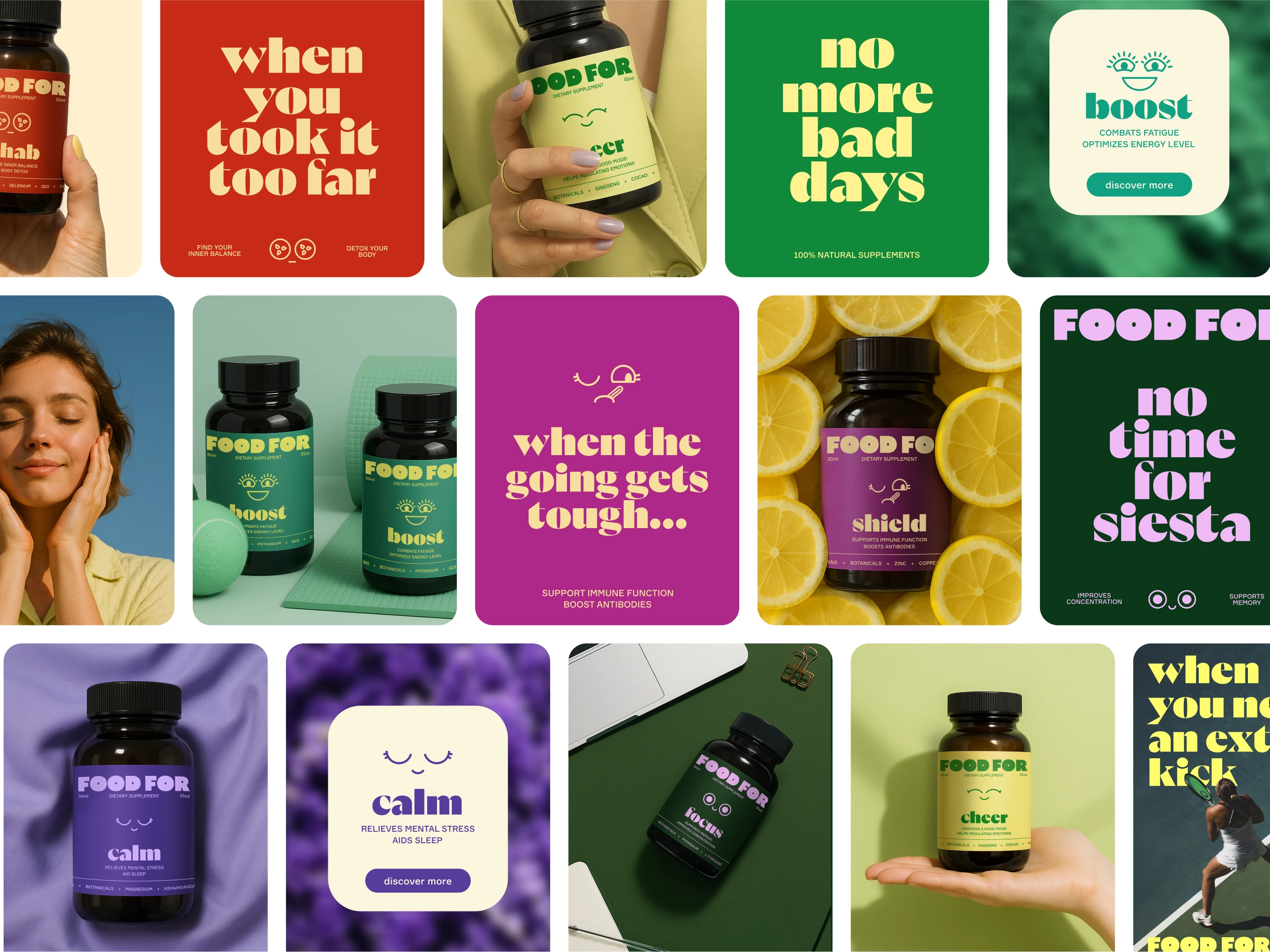
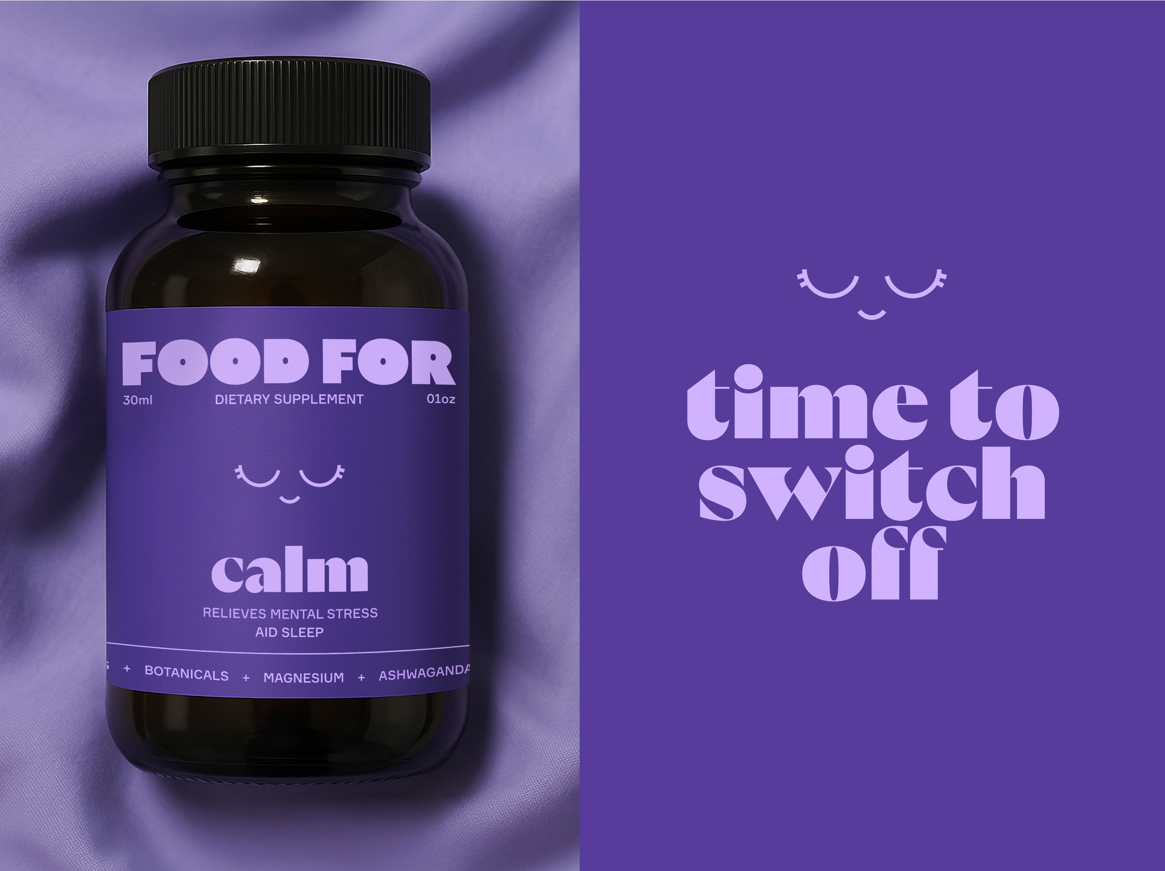
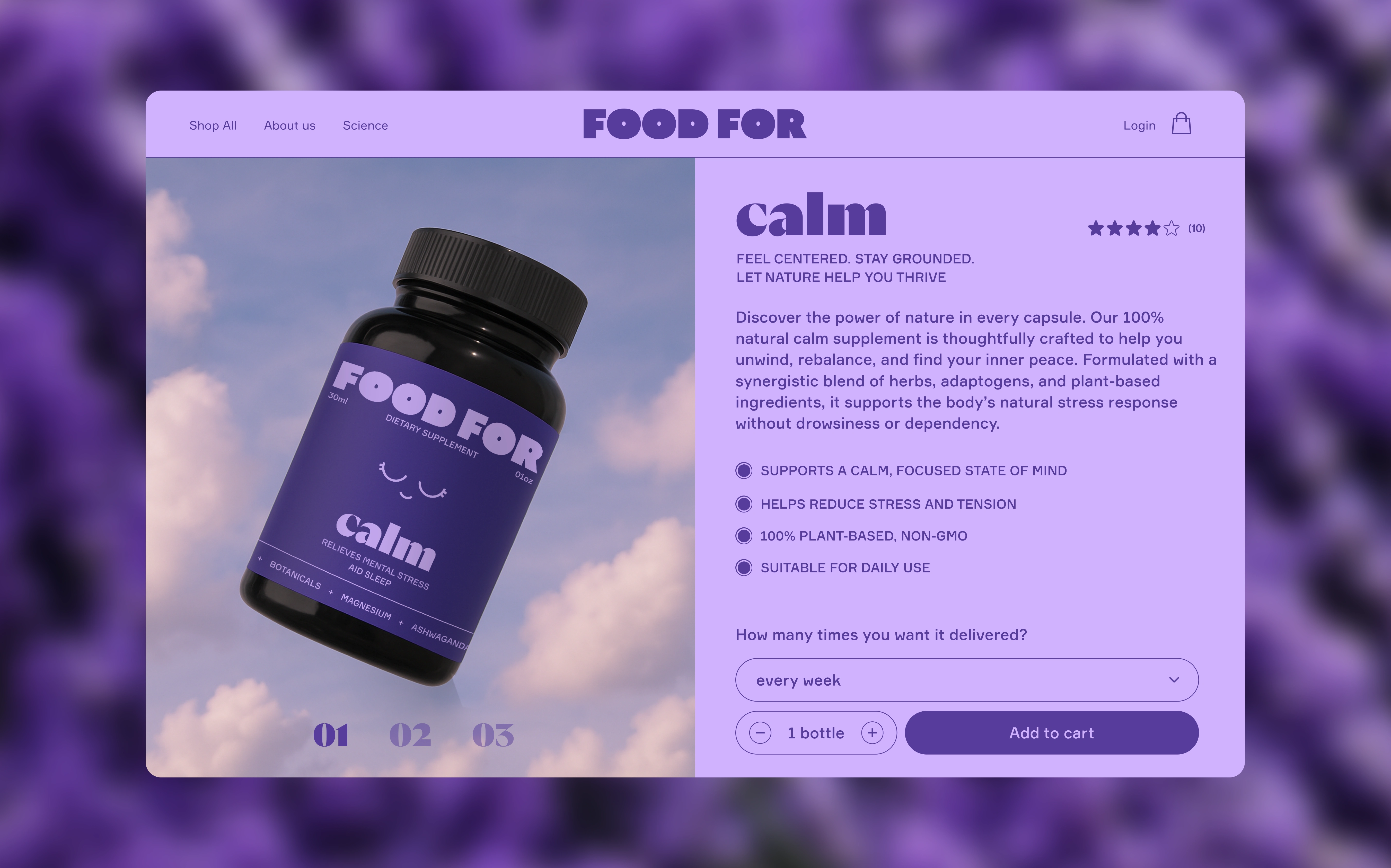
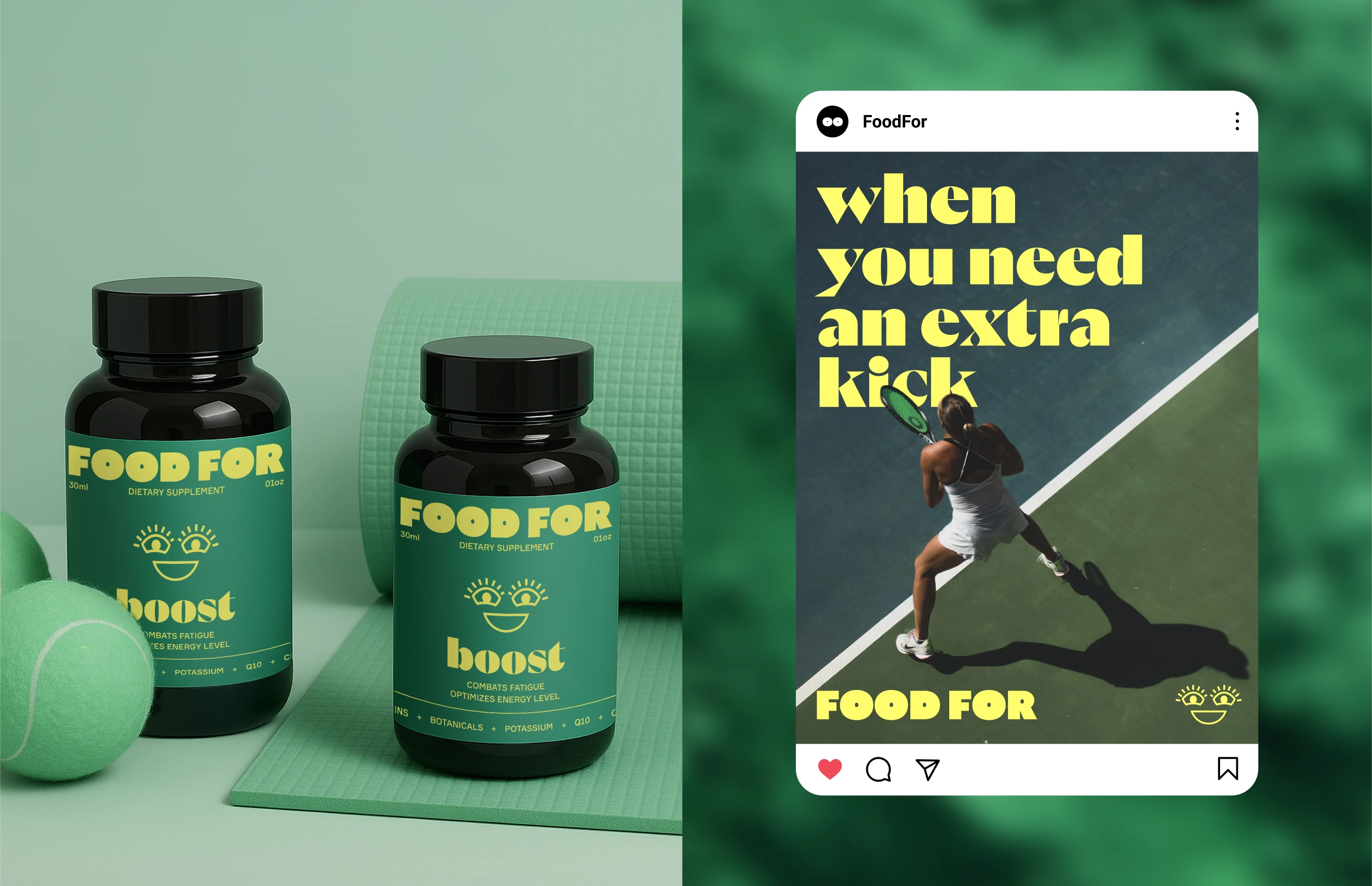
Food For supplements
Food for is your daily ally for your well-being.
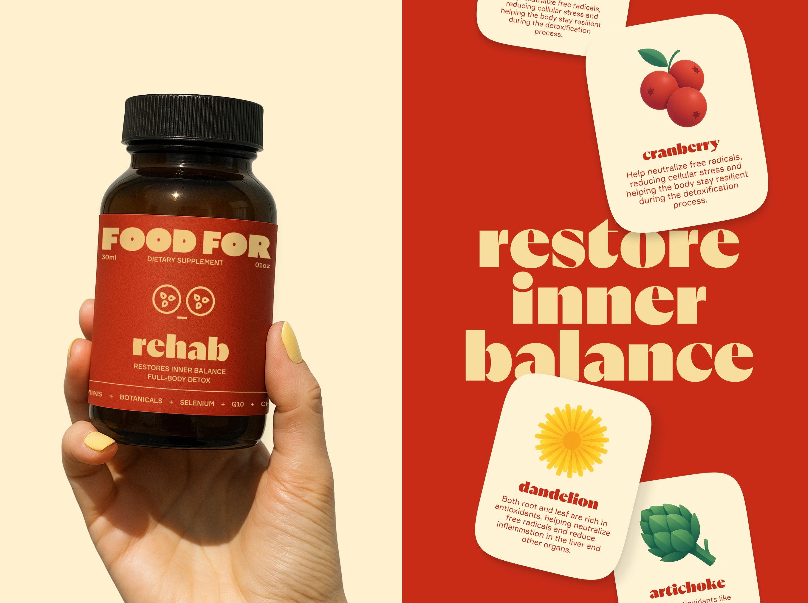
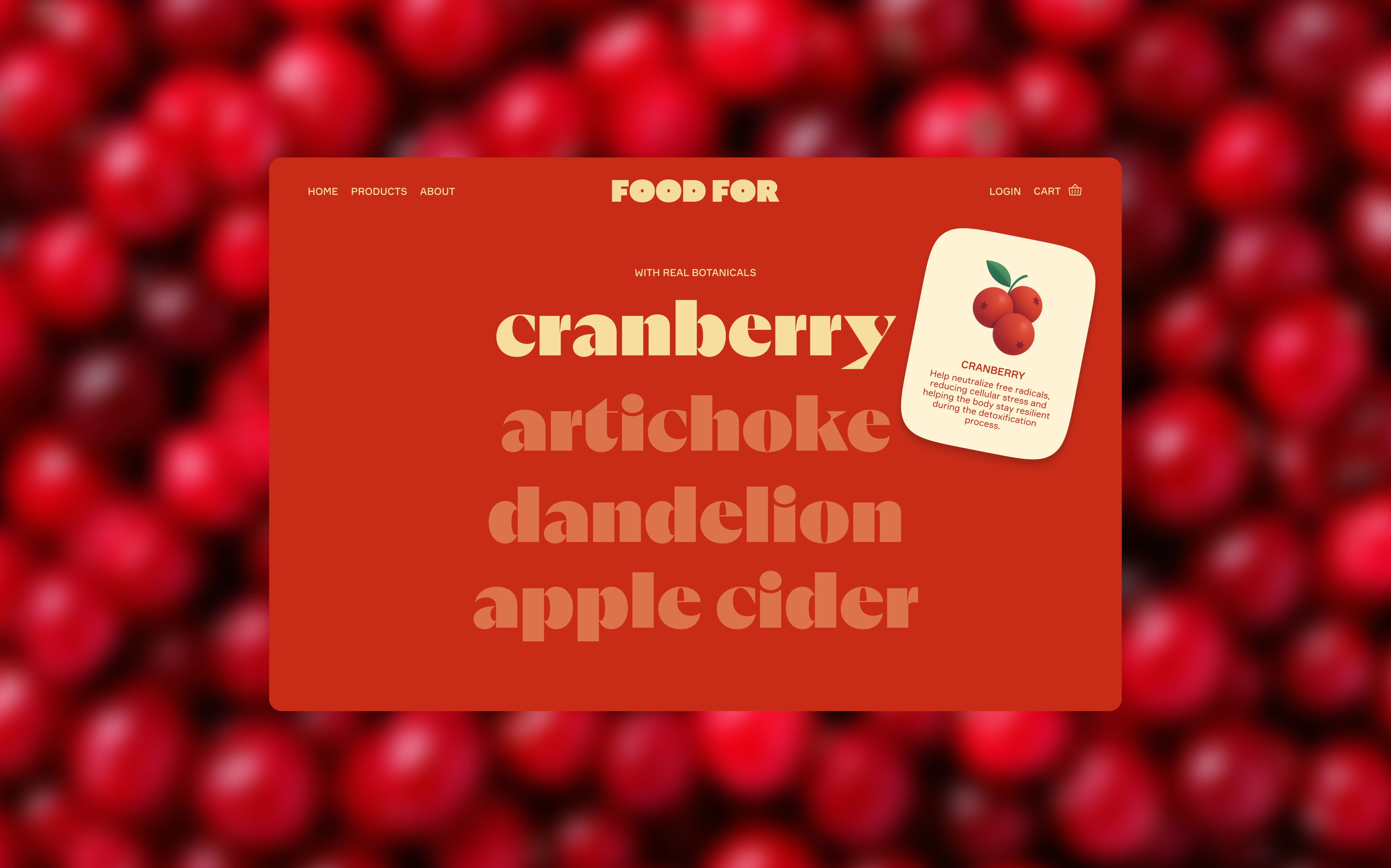
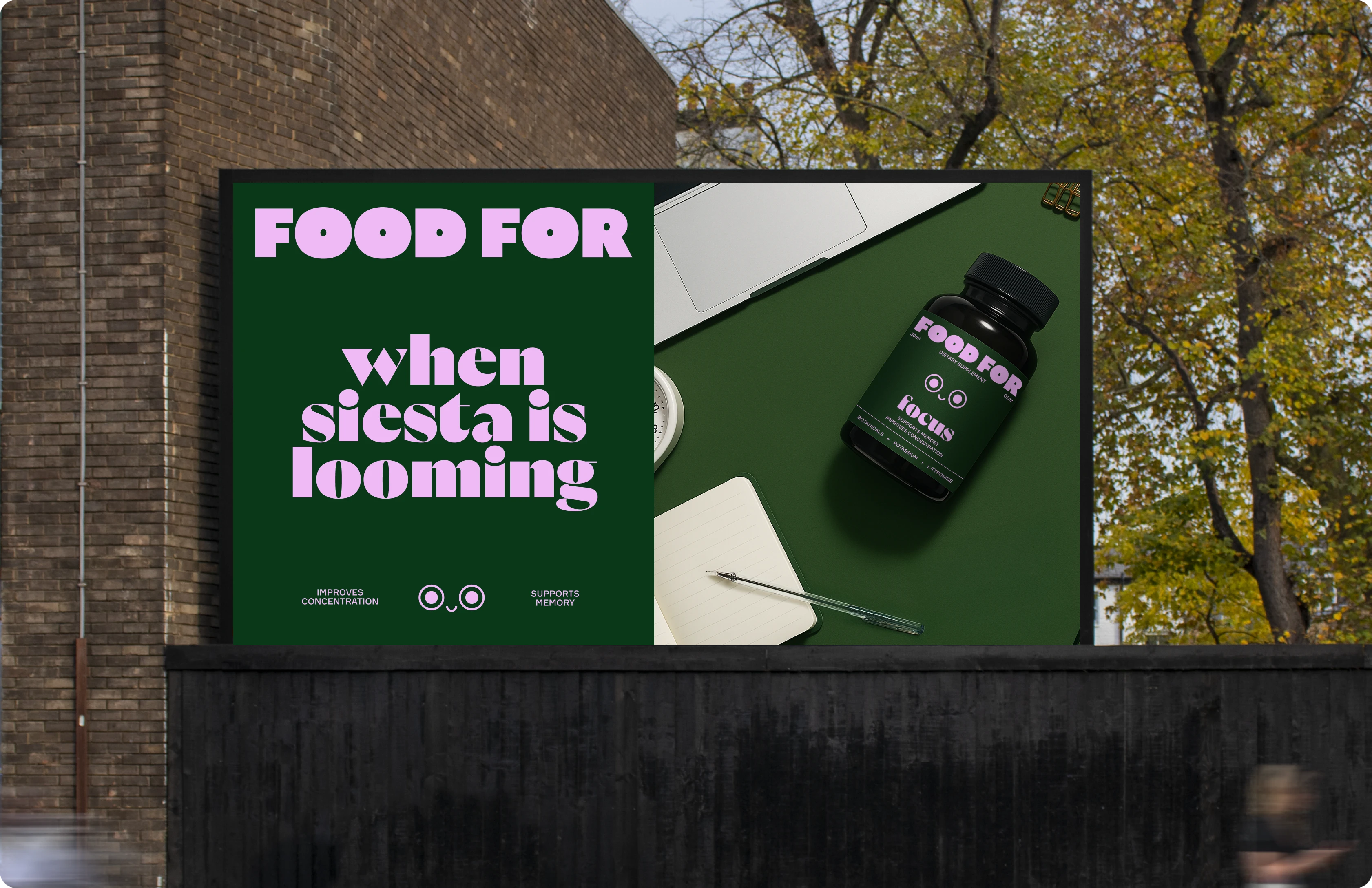
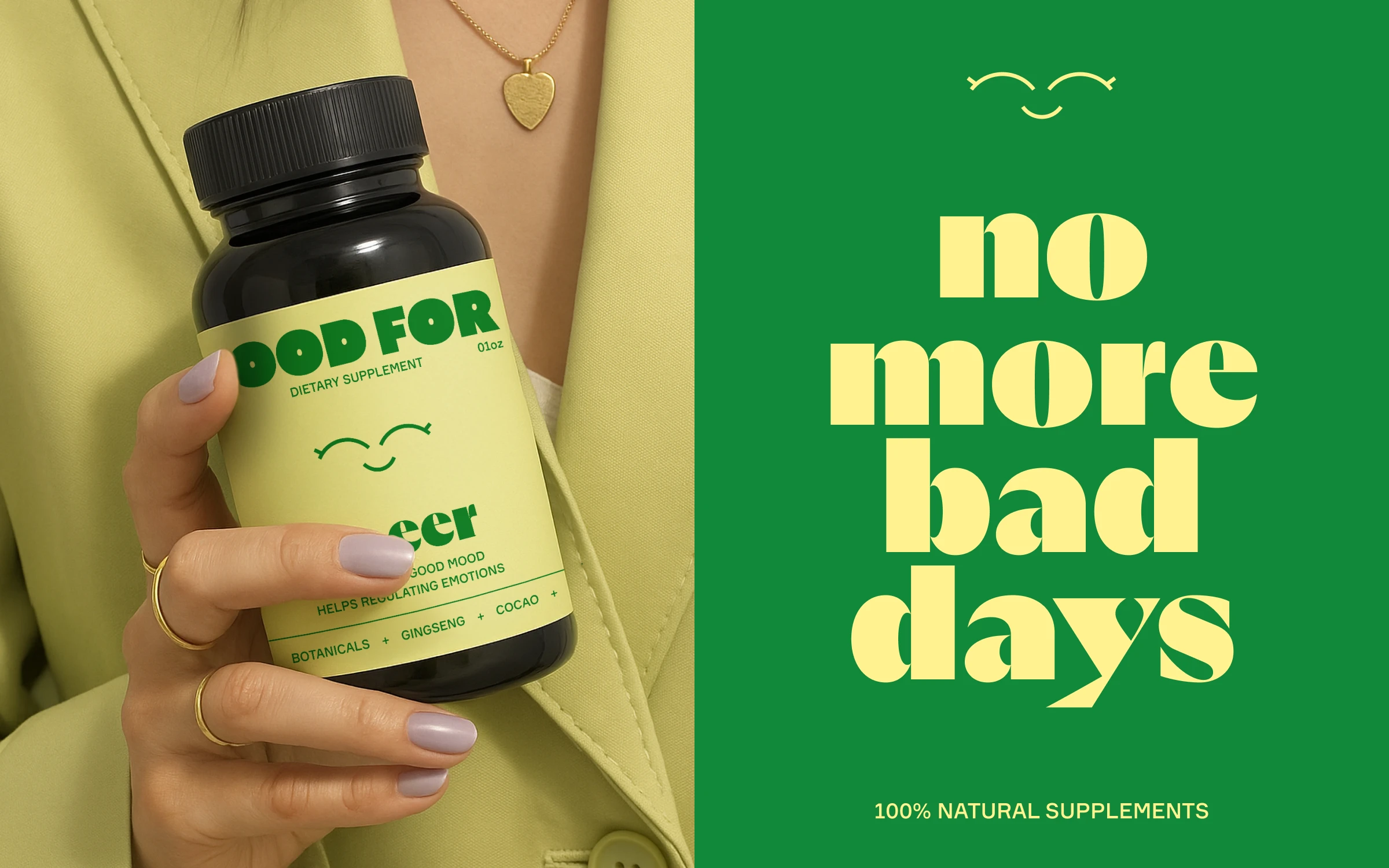
Each product has a main goal, which is highlighted with the use of typography and facial expressions illustrations, which are used very dominant on the labels in order to quickly catch the attention of the users.
The logo is bold and uses the two central “O” to recall the eyes, as a link to the use of facial expressions on the labels.The products are 100% natural and each of them takes the colors directly from the main ingredients.The target is a young audience, there for the overall art direction and communication is very fresh, vibrant and unapologetic.
Faces illustrations and animation: Mary Delaney
Like this project
Posted Oct 10, 2025
Designed labels with facial expressions for Food For supplements.
Likes
8
Views
105
Collaborators