Lazy Food Branding and Packaging
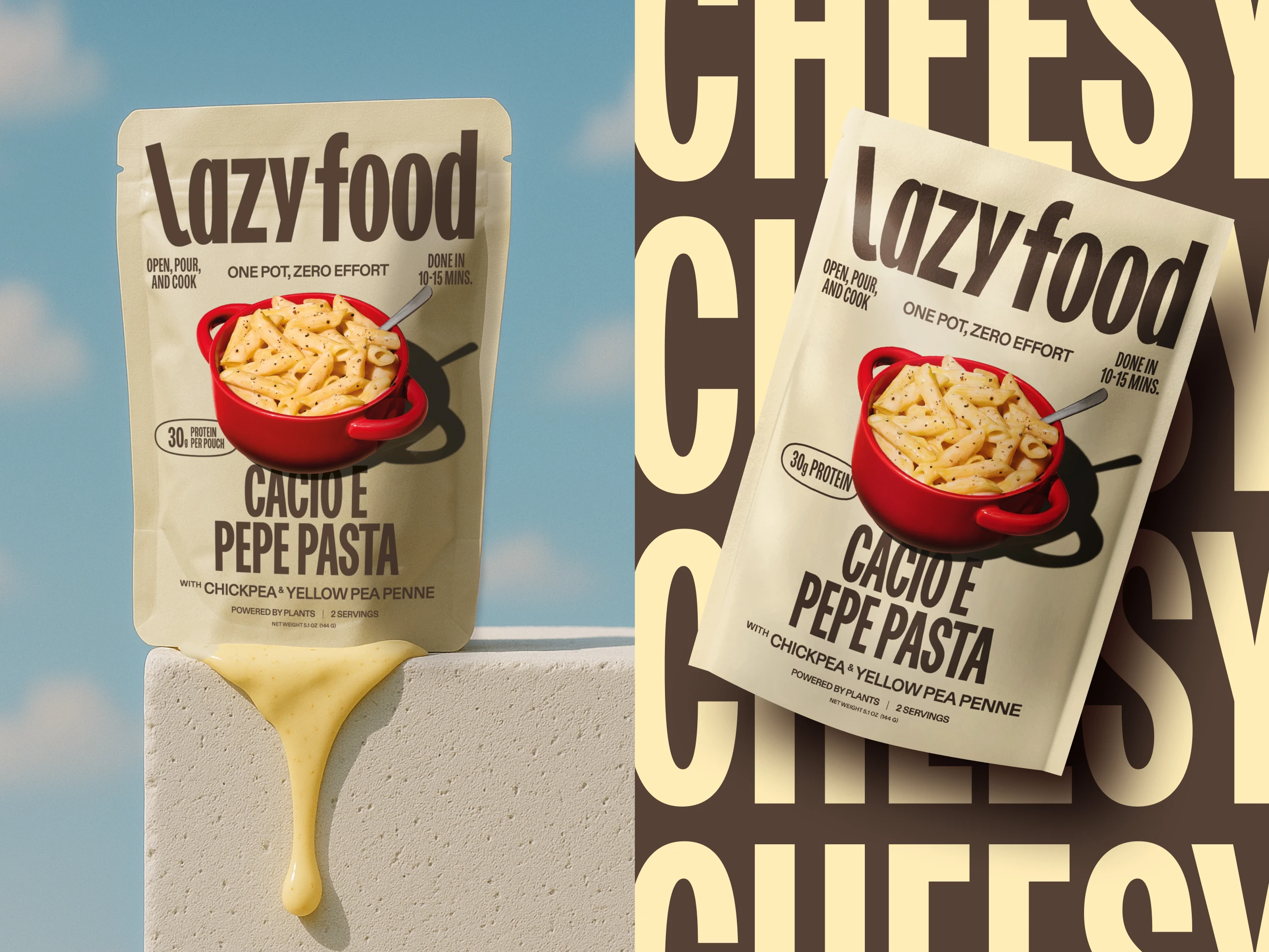
Lazy food - for the days you can't be bothered
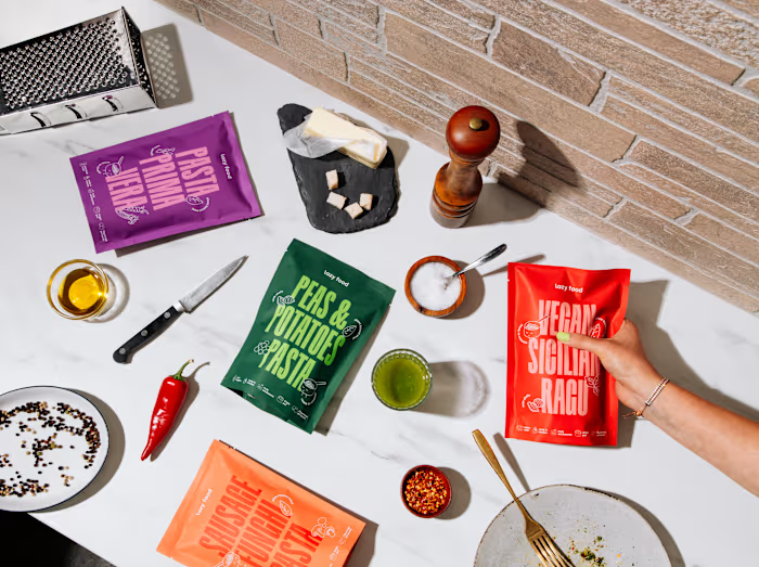
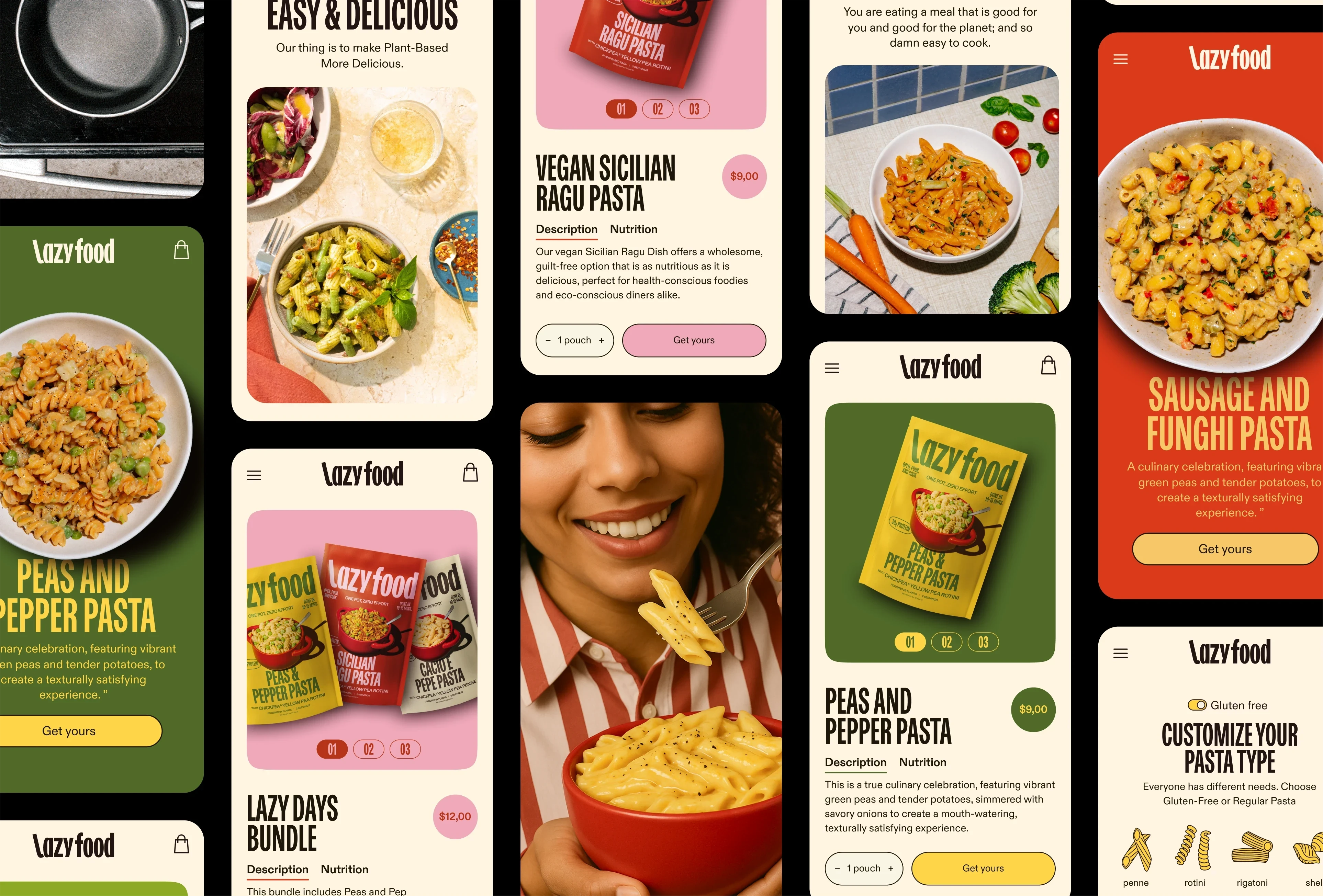
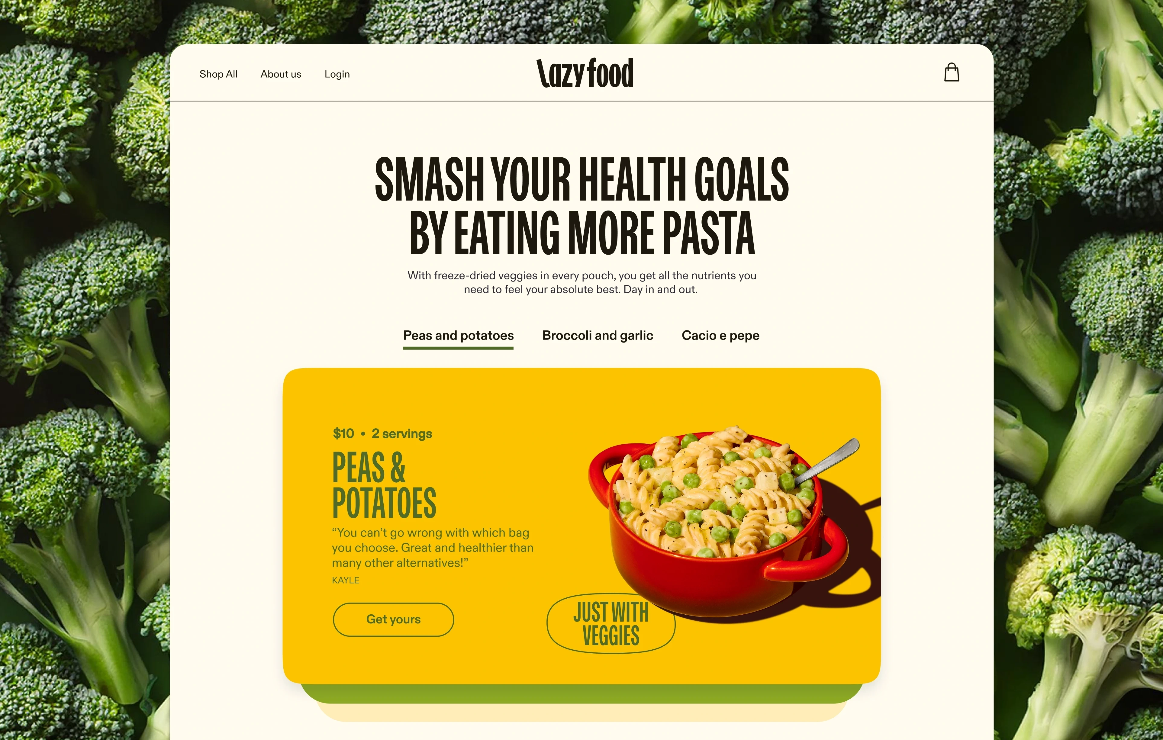
lazy food is a brand focused on creating healthy, environment friendly, time-convenient meals. All the recipes are created by an italian chef and are fully gluten free and plant-based.
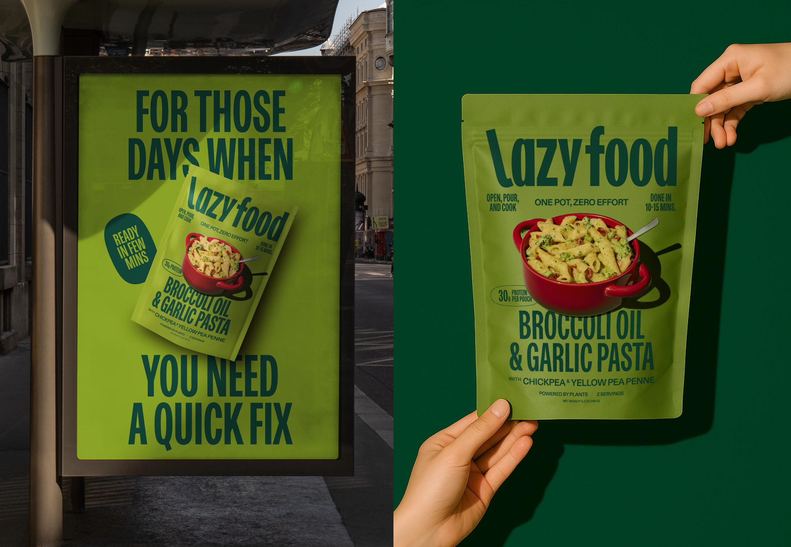
The lazy logo
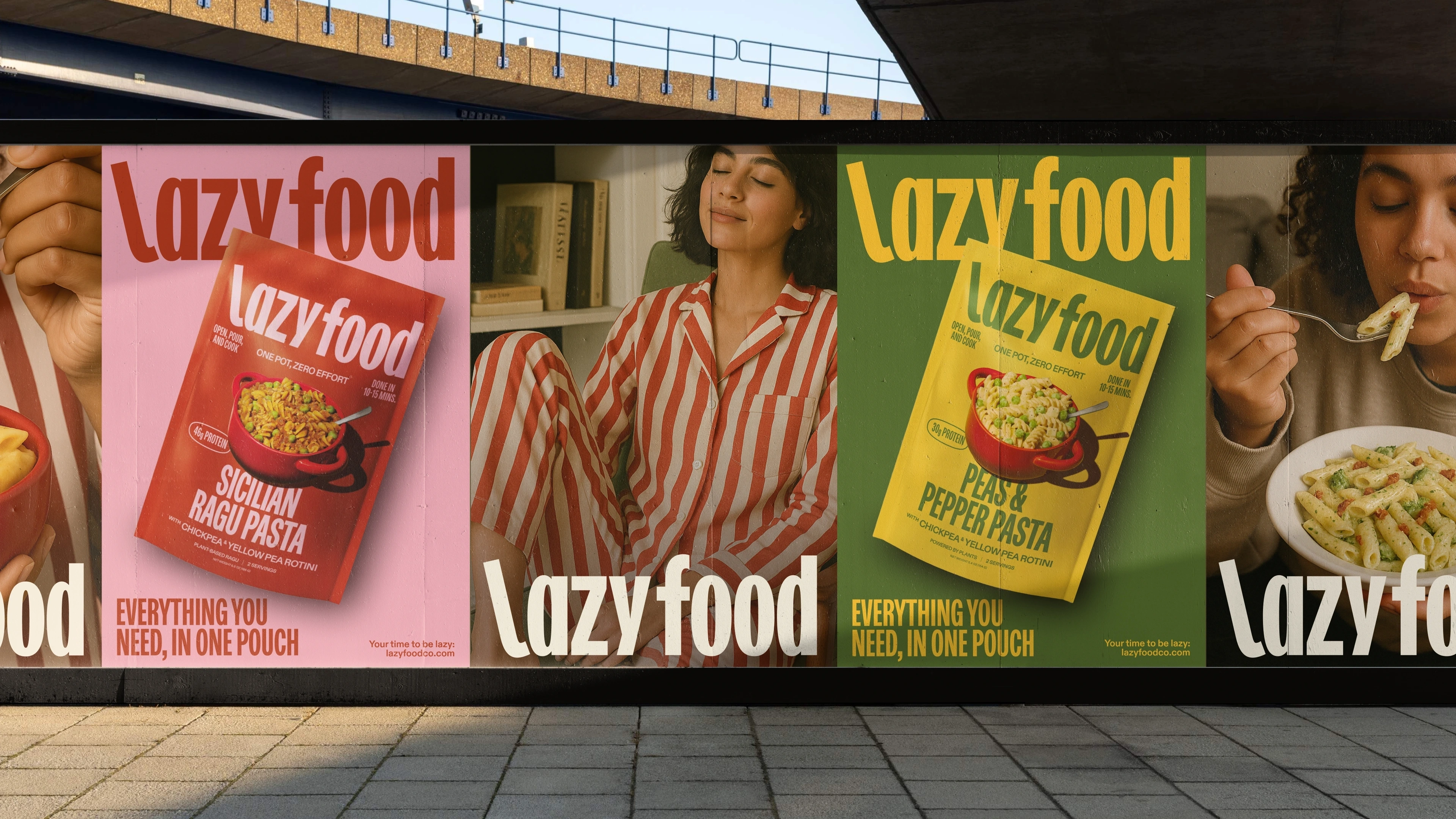
Lazy food wants to empower people to enjoy their lazy moments therfor the logo has a "relaxed L". The L, leaning back, symbolize the gesture of a person chilling and enjoy a well-deserved moment of relax.
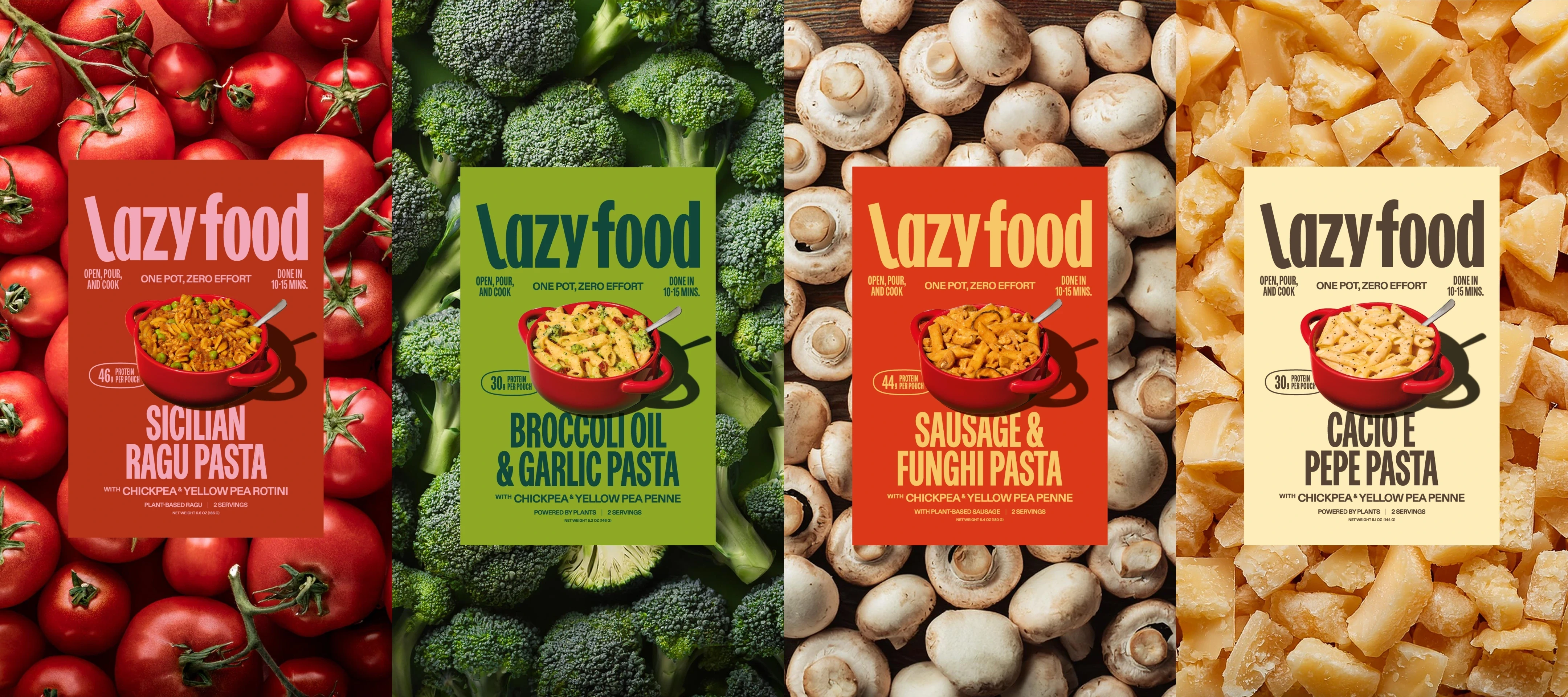
The packaging
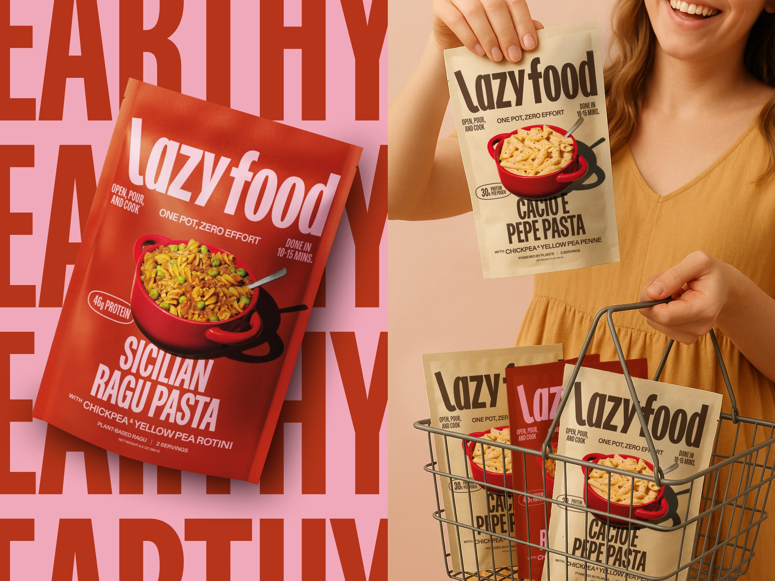
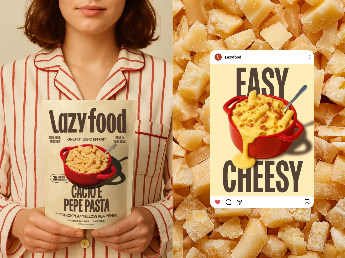
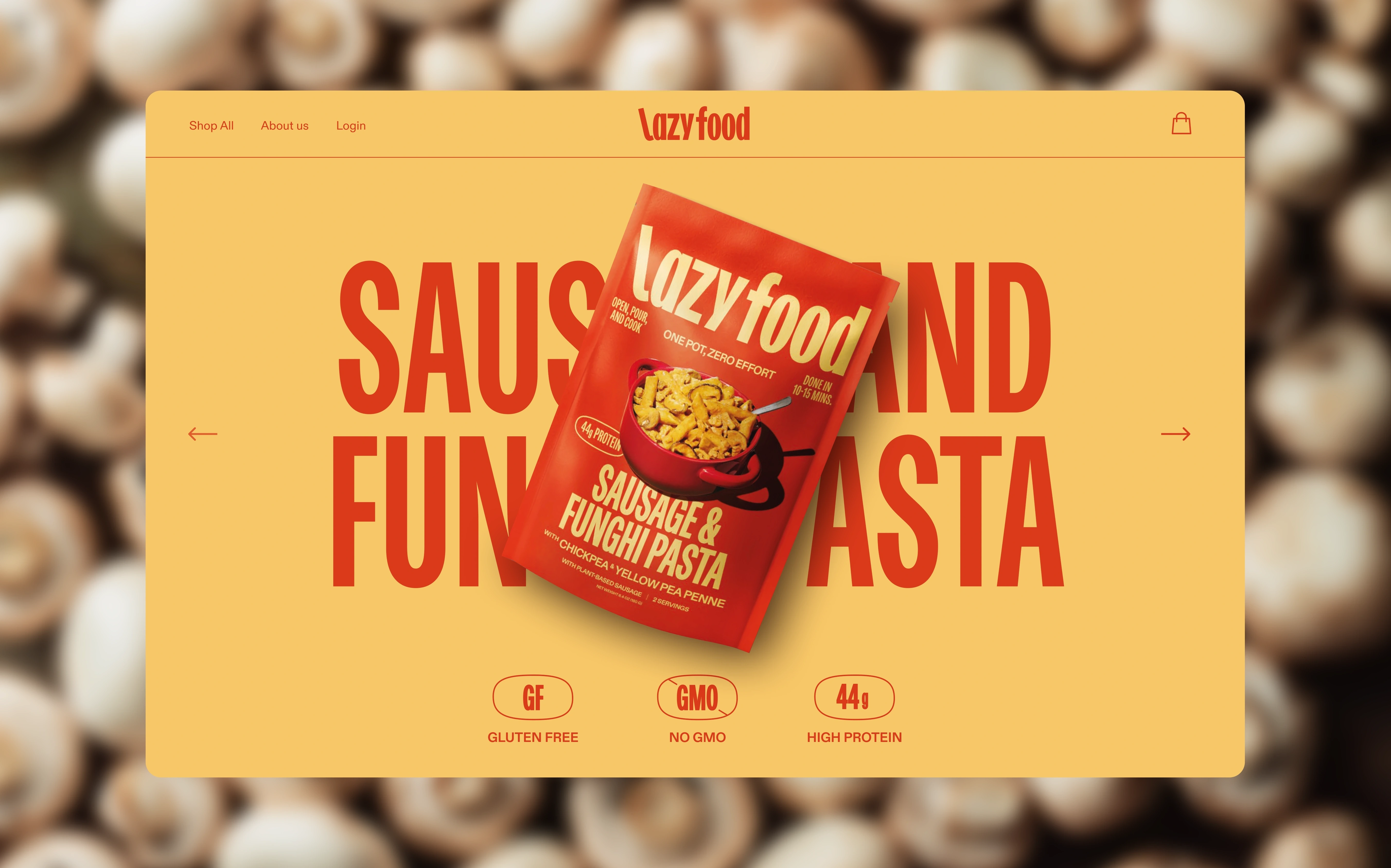
Being the brand focused on convenience, and considering that one of the main USPs is "one pot, zero effort", the dish is presented instead of in a plate in the pot - to reinforce the brand value.
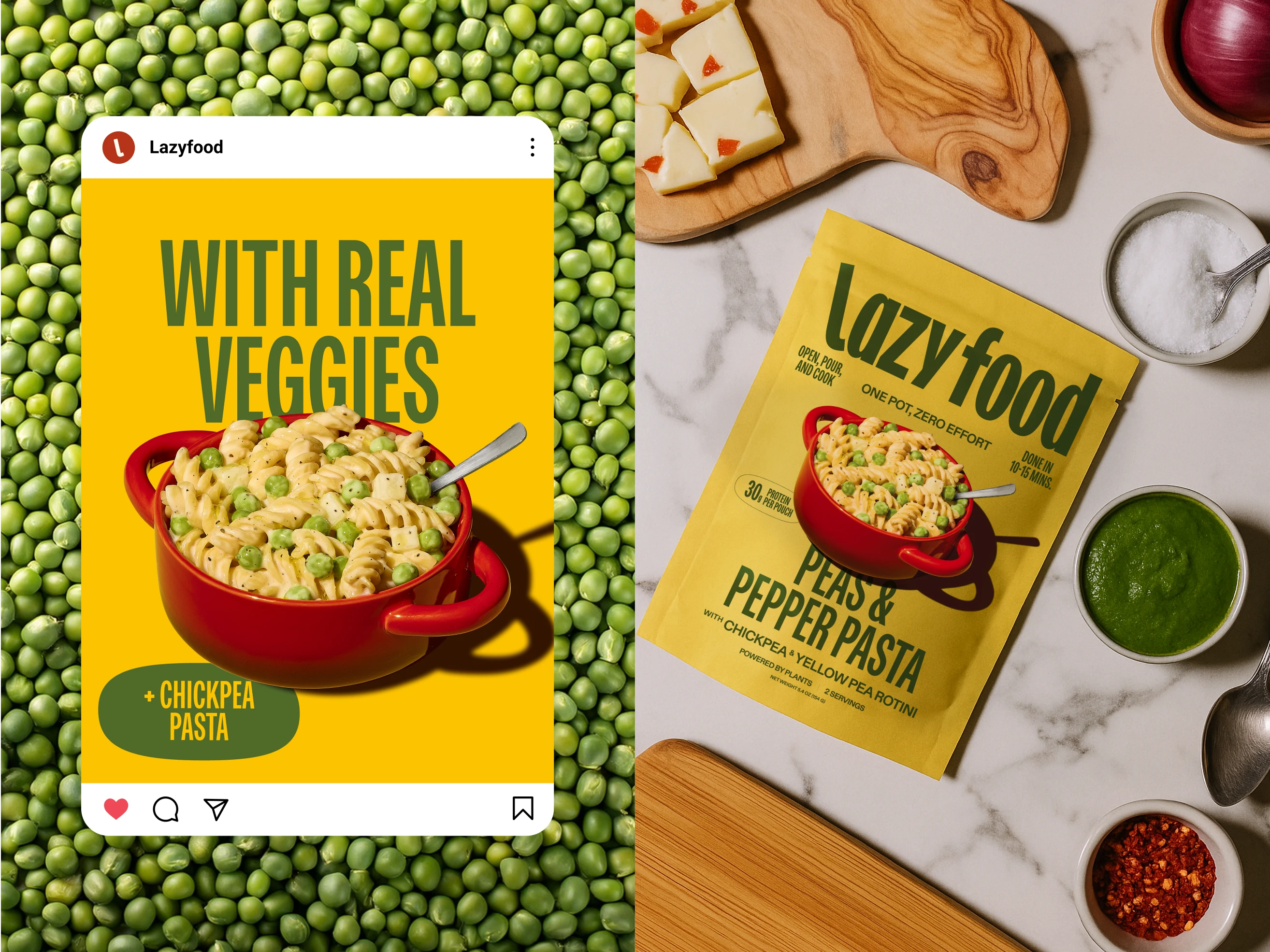
The colors are bold and are coming from the main ingredients of each dish. Typography is bold, in order to catch the attention of the user while walking in the supermarket
Like this project
Posted Oct 7, 2025
Lazy Food is a convenience meal at Whole Foods Market. Bold, simple typography with an “L” curl that suggests relaxation: loud, legible, and effortless.

