Acheron Trading
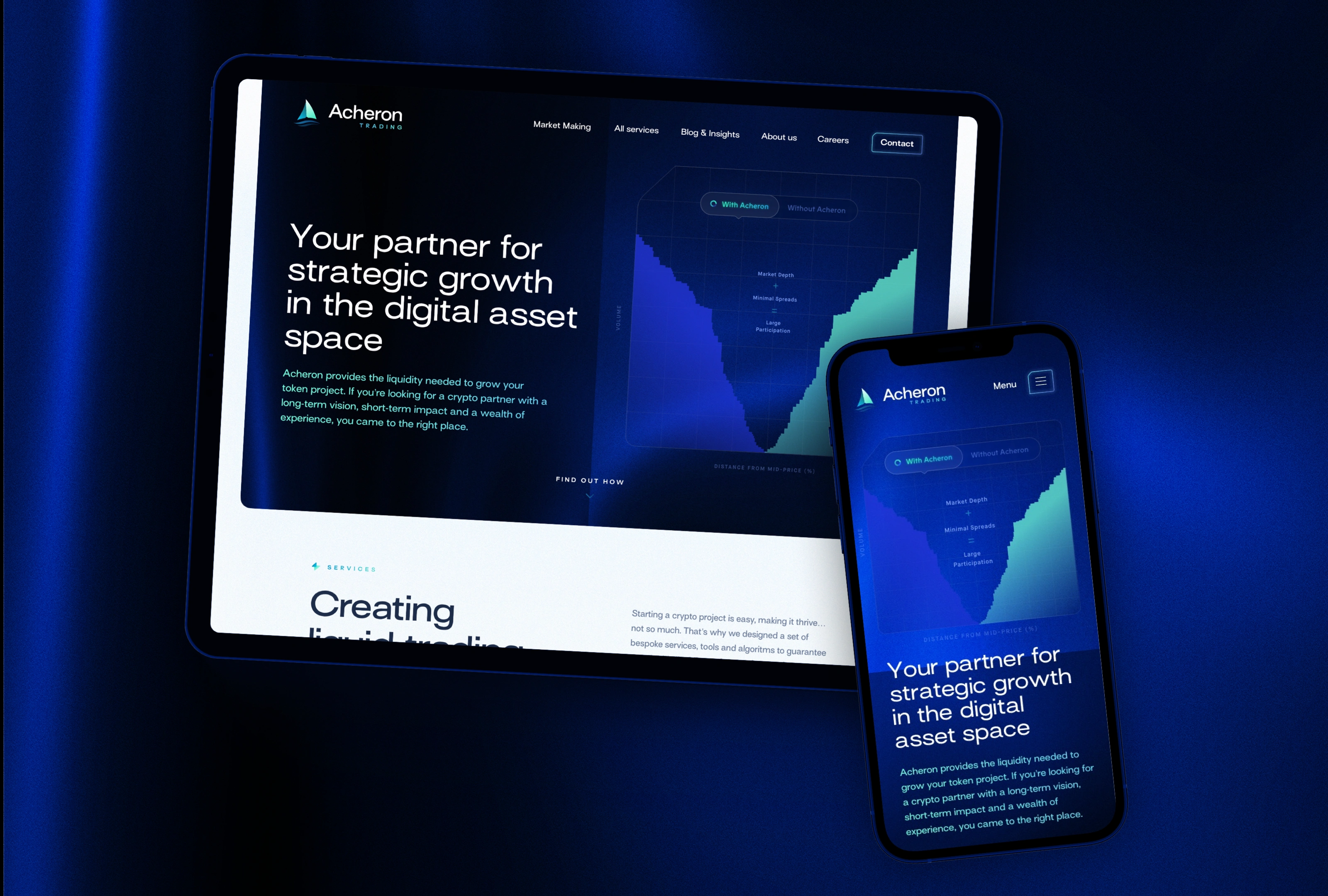
Crypto is the next big thing, at least in my inbox. After helping out the Tomorrowland team with the launch of their first NFT collection, another crypto project quickly came my way. Acheron Trading is a market maker for token projects. If that sounds like gibberish to you, no worries, so it did to us at first. They were looking for a complete overhaul of their digital appearence and needed help visualing their services in an understandable yet fancy way. Sounds like my cup of tea.
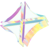
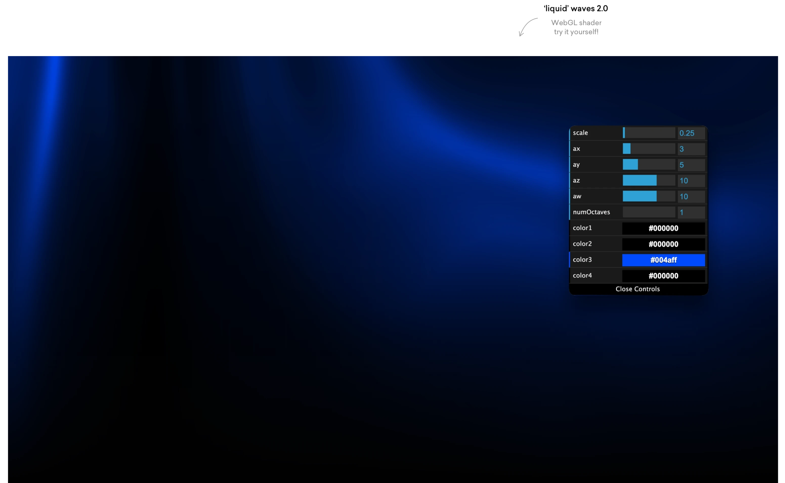
Every web project should start with wireframes, right? Well, not really. We knew finding a good visual metafore for their ‘market making for liquid assets’ would be key, so that’s where our branding excercise began. After stumbling upon this cool WebGL — instant Web3 vibes — the tone was set for the rest of the project.
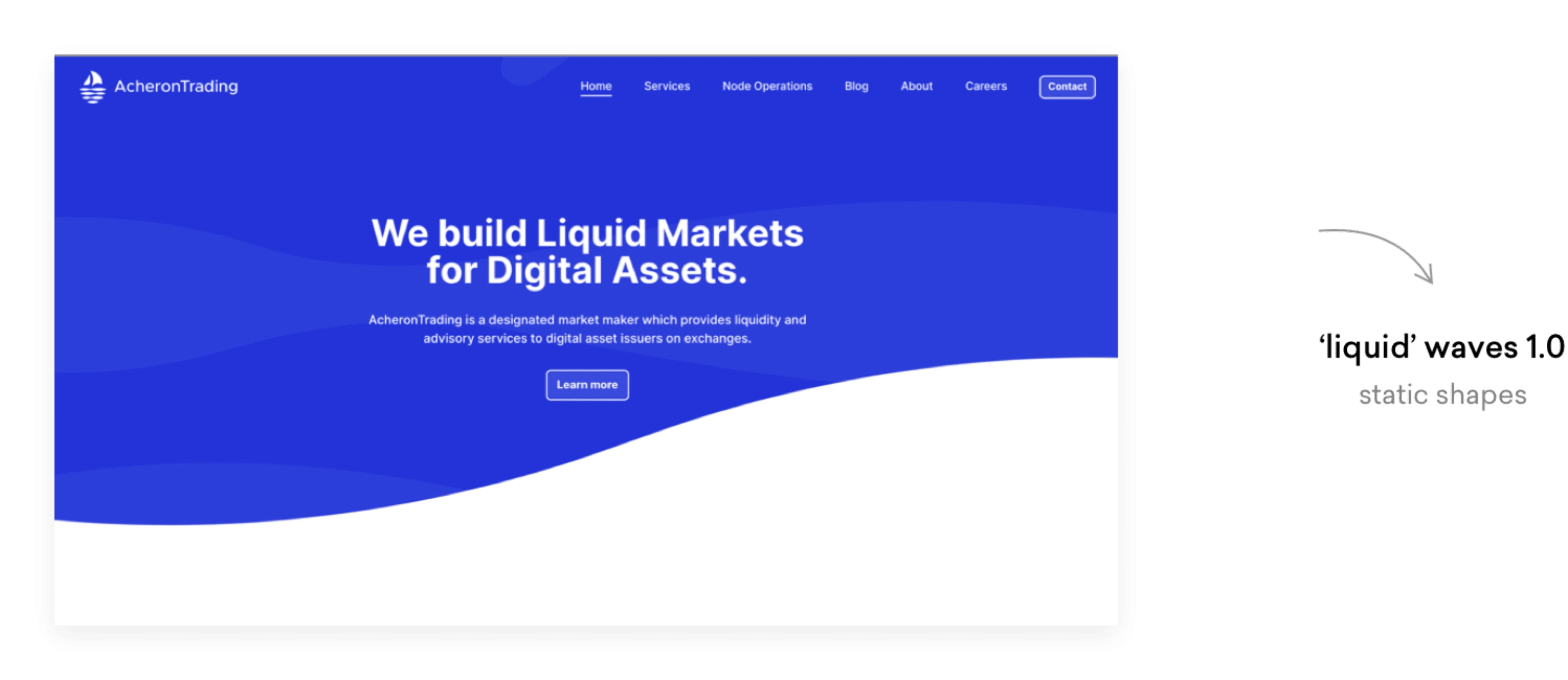
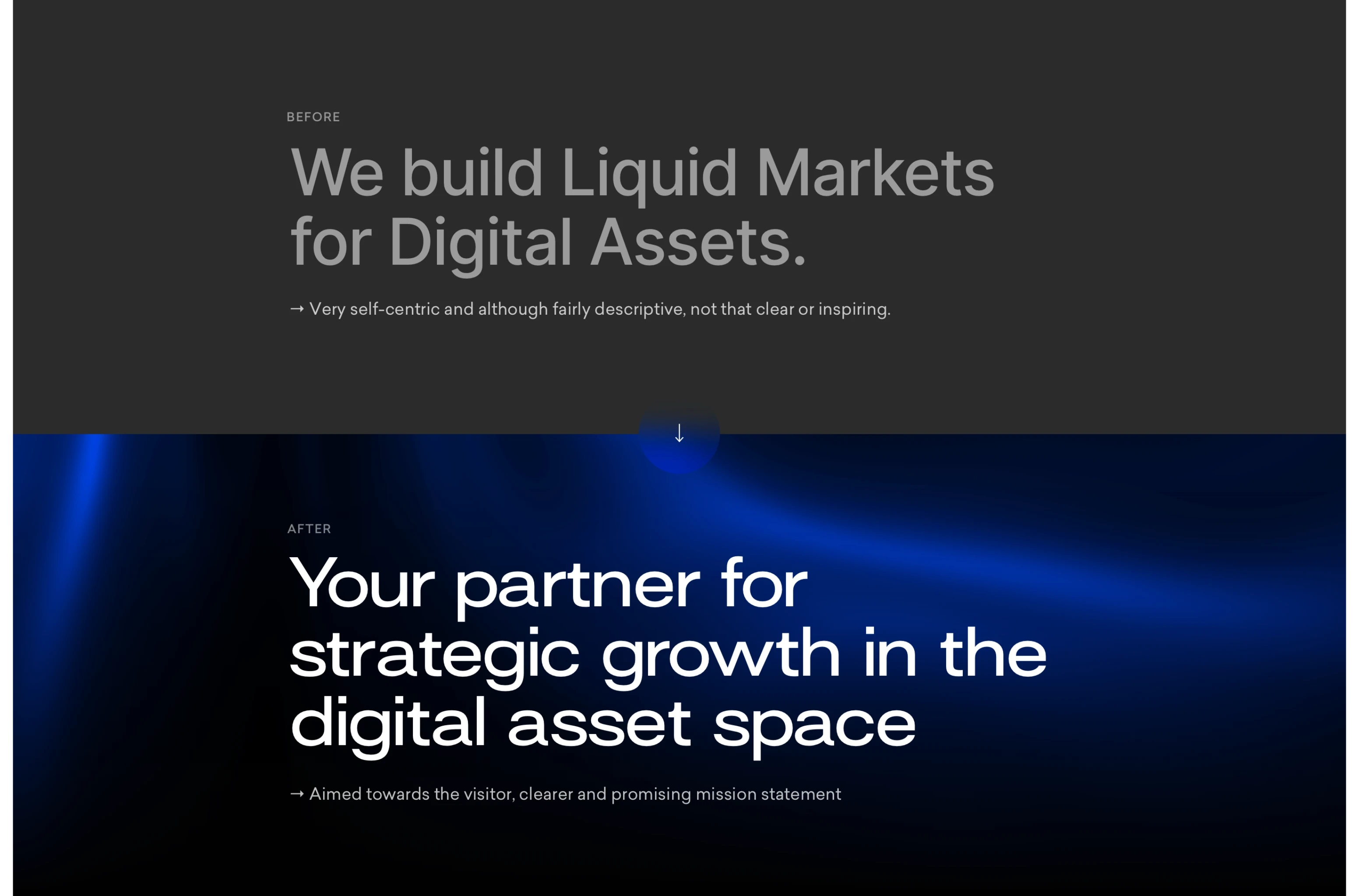
Before:
After:
That ‘aha!’ moment when you find the perfect typeface for your project… Surt Expended hits the sweetspot between adding that ‘digital’ feeling without compromising on readability.

When building a visual language, we like to go all out. We found inspiration in how corners are shaped in Sci-Fi movies, and carried that element into basically every frame, box or button.
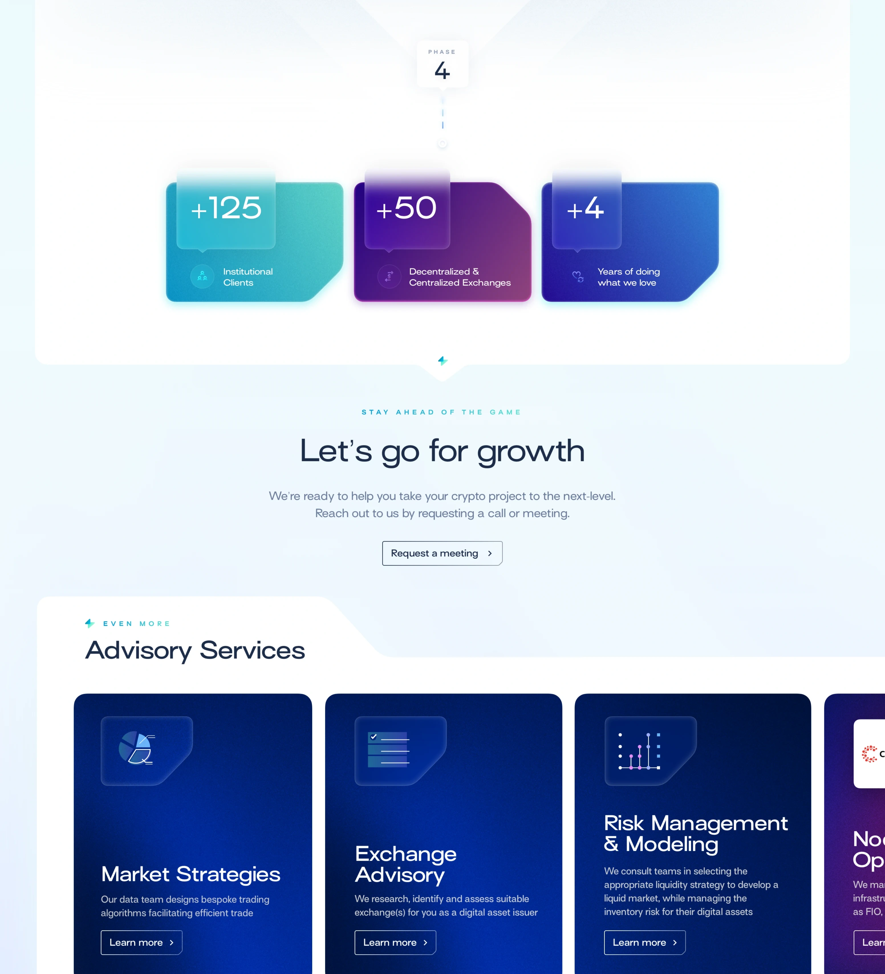
Now that we have a visual concept, it’s content time. Here’s how we improved their homepage with copy, visuals and the right conversion nudges at the right place:

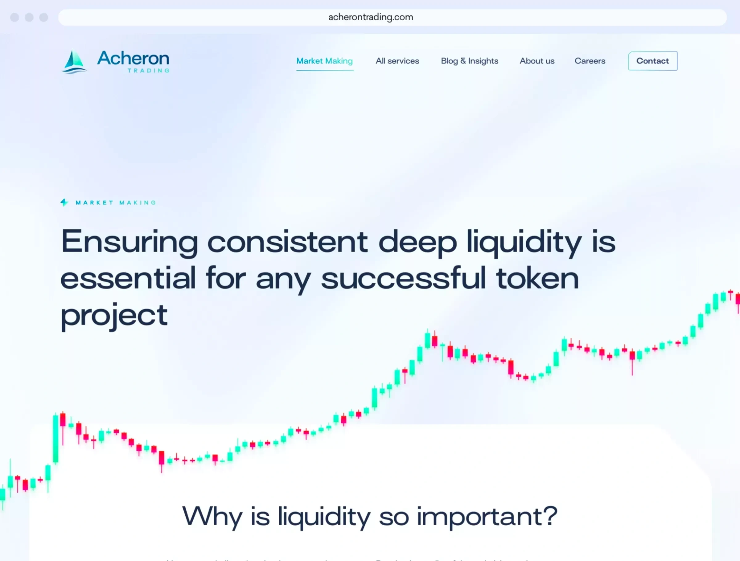
The old Acheron Trading website actually didn’t have product/service pages. Hooray, carte blance! We went all out in terms of copy and visual elements, and here’s how these product pages ended up being structured:
A relevant header illustration grabs your attention immediately
First , we provide general context on the aspect of crypto the service applies to
Than we frame the potential challenges and problems
Next, an illustrated grid explains how Acheron’s services counters these issues
An interactive visual show a clear comparison of a scenario with vs. without Acheron
Each product page gets its specific CTA
Related services keeps the reader engaged if he/she is hungry for more
The footer contains yet another, more general CTA
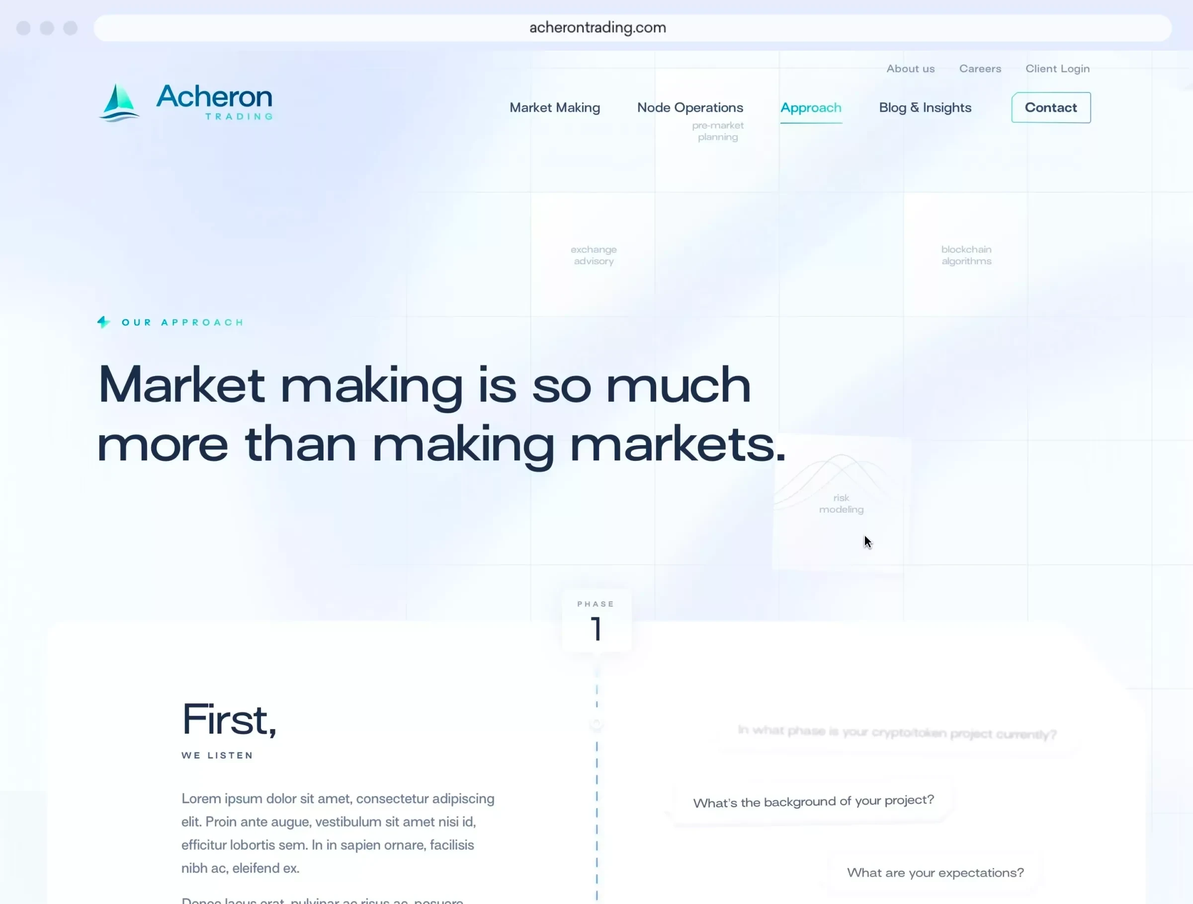
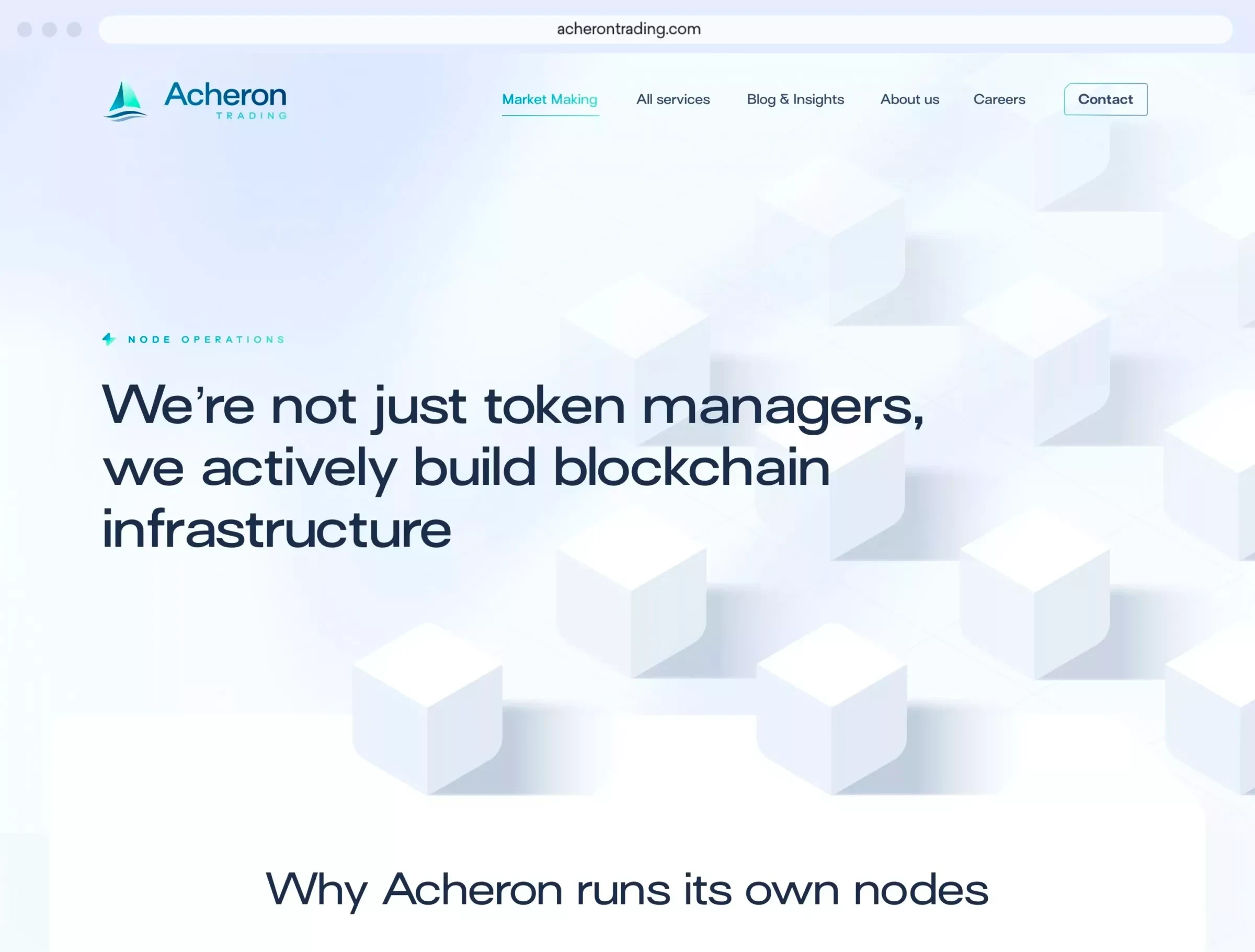
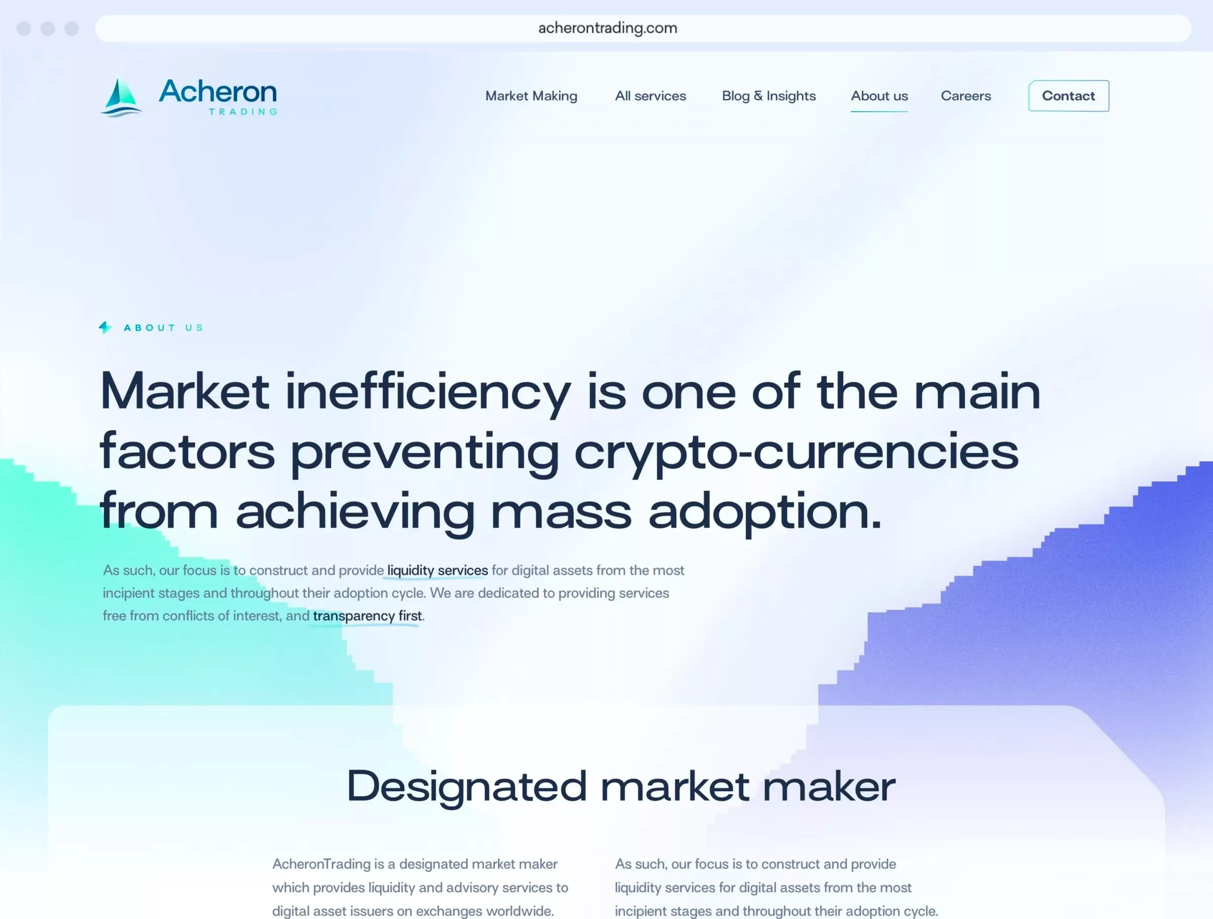
It’s Crypto. It’s new, it gets technical really fast. We wanted to make the copy sound a bit less technical and a lot more welcoming. Every sentence was written with “what’s in if for the customer” in mind, completely changing the tone of voice compared to the old website.
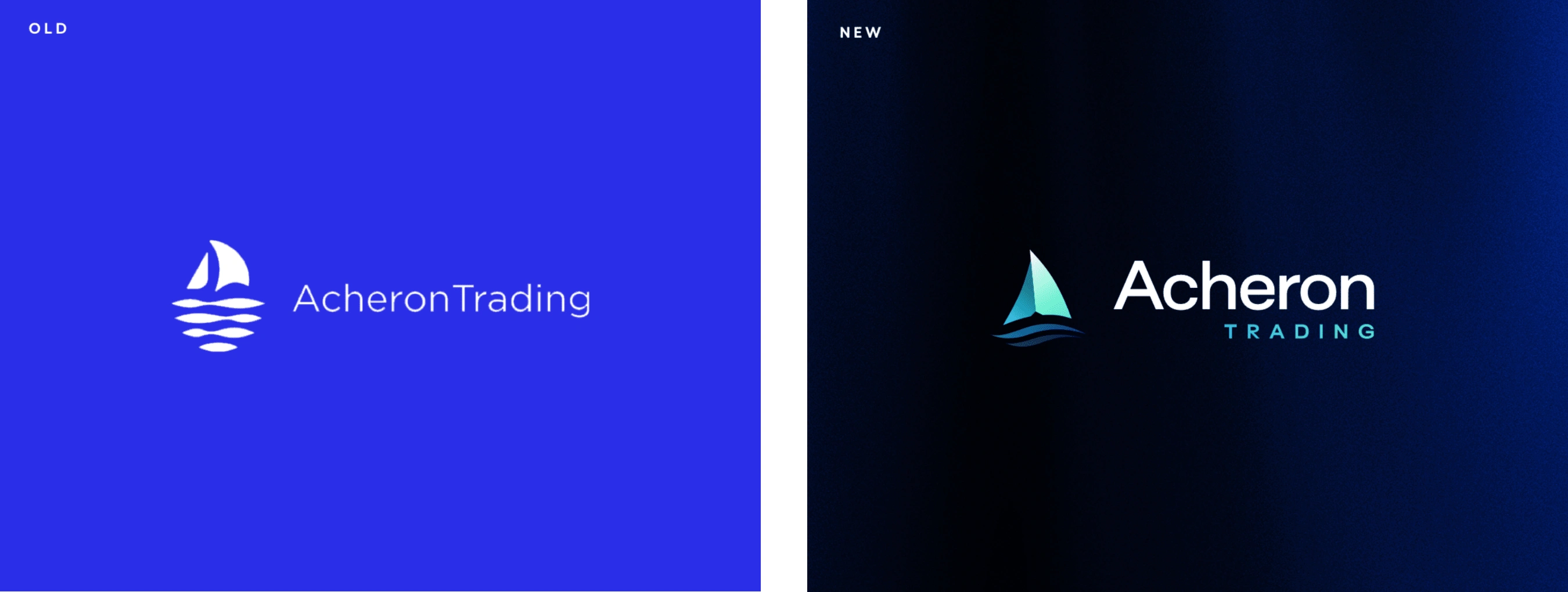
Aaah, the logo. The elephant in the room. During the kick-off meeting, our client gave us the classic “we’re happy with our logo, you can suggest something different but we’ll probably stick with what we have”. And in classic Digital With You fashion, the rest is history.
The original ship reference (from Master and Commander: The Far Side of the World) was kept, but the contours could use some refinement. Using gradients gave it way more depth, and it matched beautifully with the rest of the design language on the website.
Like this project
Posted Jun 28, 2023
Rebranding and website redesign for a global crypto pioneer
Likes
0
Views
34


