Ohdear.App monitoring tool
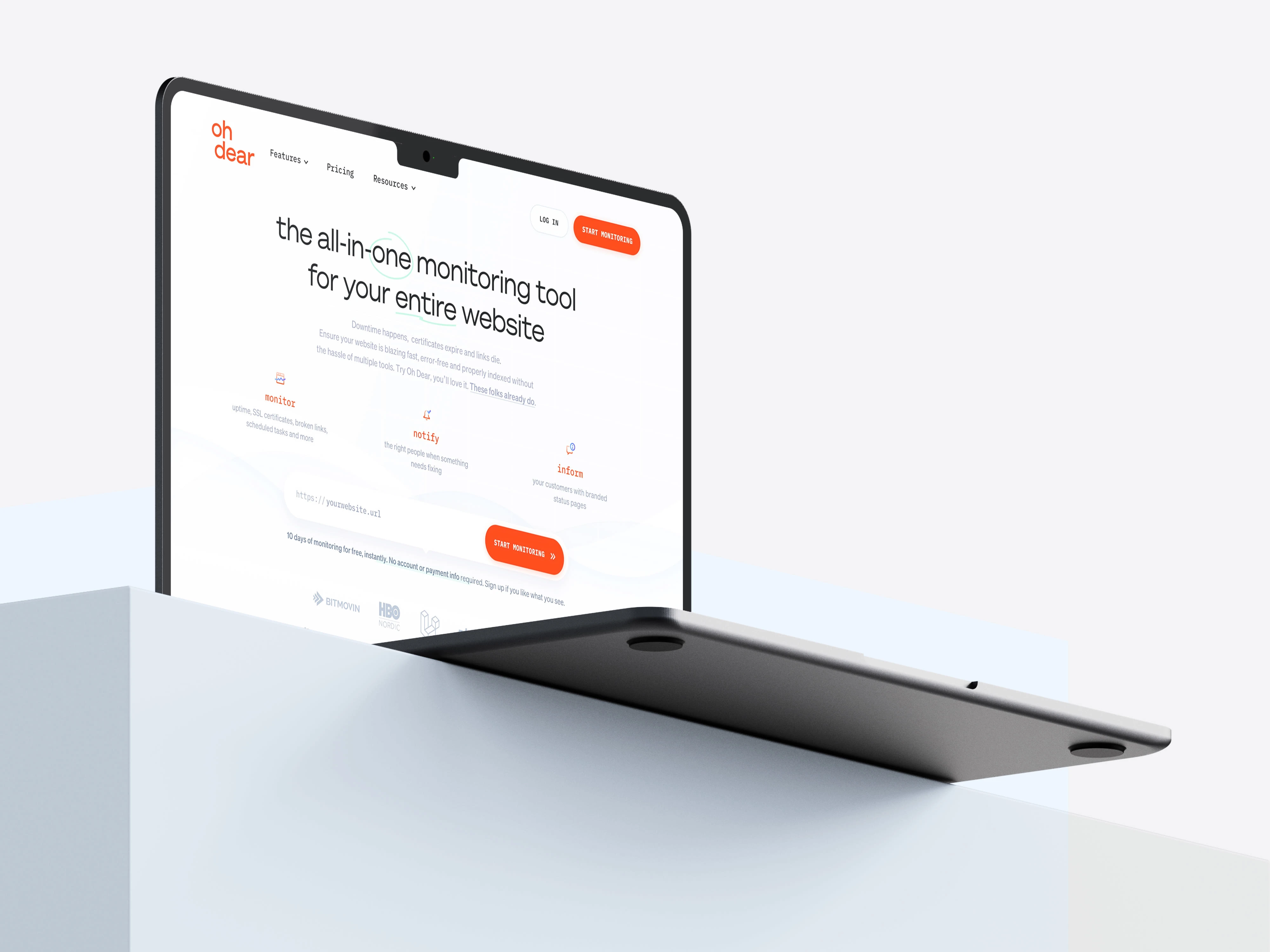
Sometimes, websites go down. There are a myriad of tools out there that merely ping the homepage and display a percentage of downtime. But Oh Dear is so much more than that. It's essentially an all-encompassing 'health checker' with nine different core features. Many of these features are quite technical, so the Oh Dear team approached me with the challenge of creating a website that explains these features in a more human, relatable, and visually appealing way. And, as the cherry on top (pun intended), I also got to do a full visual rebrand! In this case study, I'll provide a detailed breakdown of what went into creating this complete overhaul.
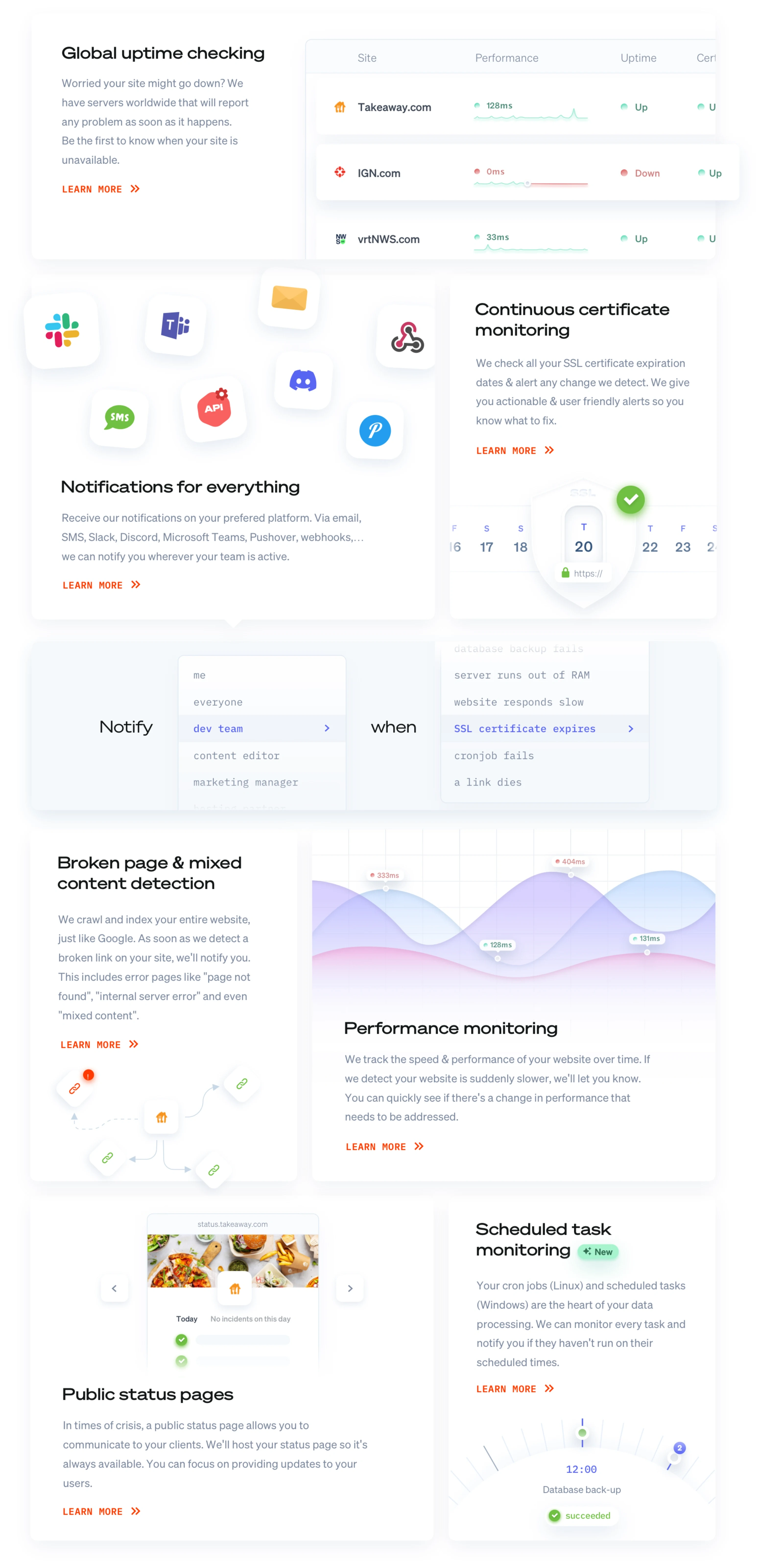
A logical starting point in a design process like this would be to start wireframing. Truth be told, we rarely do ‘logical’. The crux of this redesign was rethinking the way features could be explained and visualized. Their previous site simply used vague blown-up icons as an easy page filler. We needed to go beyond that, but there wasn’t a lot to work with. Sure, we could literally show screenshots of the product but that would A) look really boring to look at since a lot of screens look 80% the same B) it lacks a lot of additional contexts.
Our solution: a combination of interface snippets, visual metaphors, and subtle animations. In terms of page composition, Apple’s iconic feature grid served as great inspiration.
Designed for conversion
Yes, the fold is a myth. That doesn’t mean what you show in the upper viewport isn’t really, really, really important. Especially with a SaaS product like this, where users decide in a split second whether they want to use your product and sign up for a trial or not.
We’ve got a couple of tricks up our sleeves to make that happen:
THE HEADLINE
The old headline (‘Don’t just monitor your homepage, monitor your entire website’) assumes you know how an uptime monitor technically works. However, the product has evolved to a broader audience than developers alone, so we broadened that up to ‘The all-in-one monitoring tool for your entire website.’
Before:

After:

Sure, that’s not the most creative headline. But it’s a big claim non of their competitors make (because they can’t), and secondly, we obviously back that up below immediately.
SUBHEADING
Again, the old copy was very technical. Our recipe for a good subheader:
Defining a pain / agitate the visitor / show a potential frustration
Provide the solution / explain the value
Reassurement + social proof / testimonial
Before:

After:

NOT SHOWING THE PRODUCT
On the old website, your eye is instantly drawn to the screenshot of the product interface. It feels like a logical thing to do when designing a SaaS website. For a fancy app this can be really sexy, but you can’t just fit the complete OhDear story in one screenshot.
We figured it would be fitting to show visitors that, as the headline suggests, OhDear really is an all-in-one solution. If you divide OhDear’s nine main features into categories, you get 3 pillars: monitoring stuff, notifying people, and informing customers.
Before:
After:

CALL-TO-ACTION
‘Get started’ isn’t necessarily a bad CTA. But it’s kind of vague. What are you actually starting? In this case, you’ll start monitoring your website. So why not just make the button copy ‘Start monitoring'?
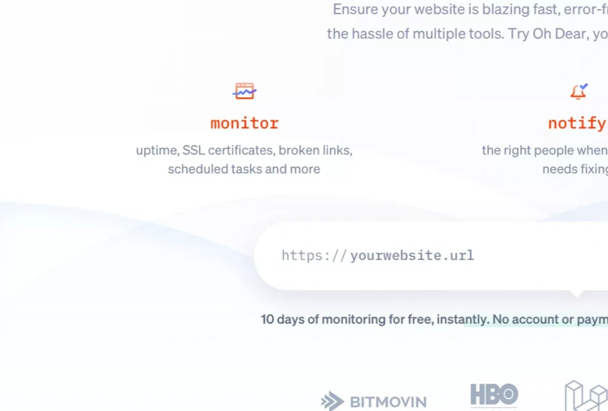
Taking away potential objections by explaining the trial is free and you don’t need a credit card is already great. We added some extra spice by already showing the URL field. Small nuances like ‘instantly’ and ‘no account required’ take away any remaining objections.
Before:

After:

MORE SOCIAL-PROOF
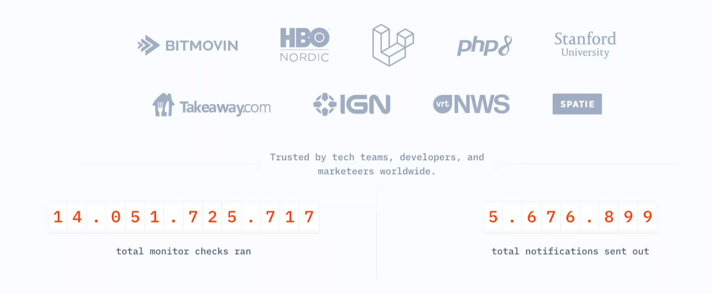
We expanded the social proof with some impressive numbers. Adding the target groups (developers, marketers,…) further plays into our mission of making OhDear appealing to a wider audience.
Before:

After:
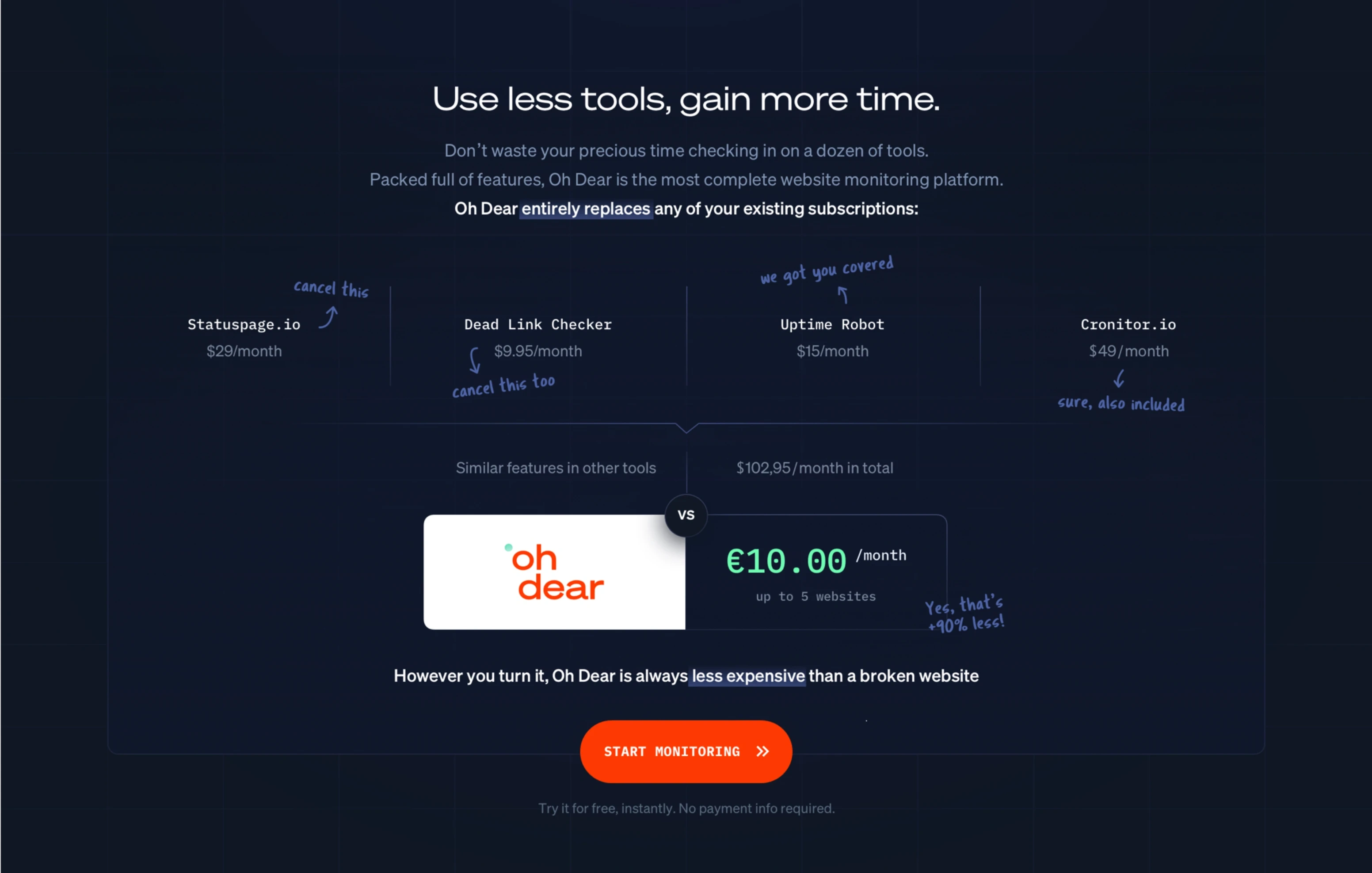
DOING THE MATH FOR YOU
As an all-in-one tool, OhDear completely replaces at least four separate tools. That’s a huge cost saving and obviously way more practical. By simply calculating the difference in cost for you, this becomes ultra clear. Little hand written comments add a welcome wink of playfulness.
Rebranding
“So can we change the logo?”
Always an interesting question to ask. 9 times out of 10 the answer is no, but this time we hit the jackpot. The Oh Dear team basically gave us carte blanche. From a brand perspective, it would be confusing and unnecessary to do something completely different. So we made sure to create an evolution rather than a revolution. The typeface is still sans serif. The ‘error red’ got some orange added to it and the blue hues are slightly more purple.
Old branding:
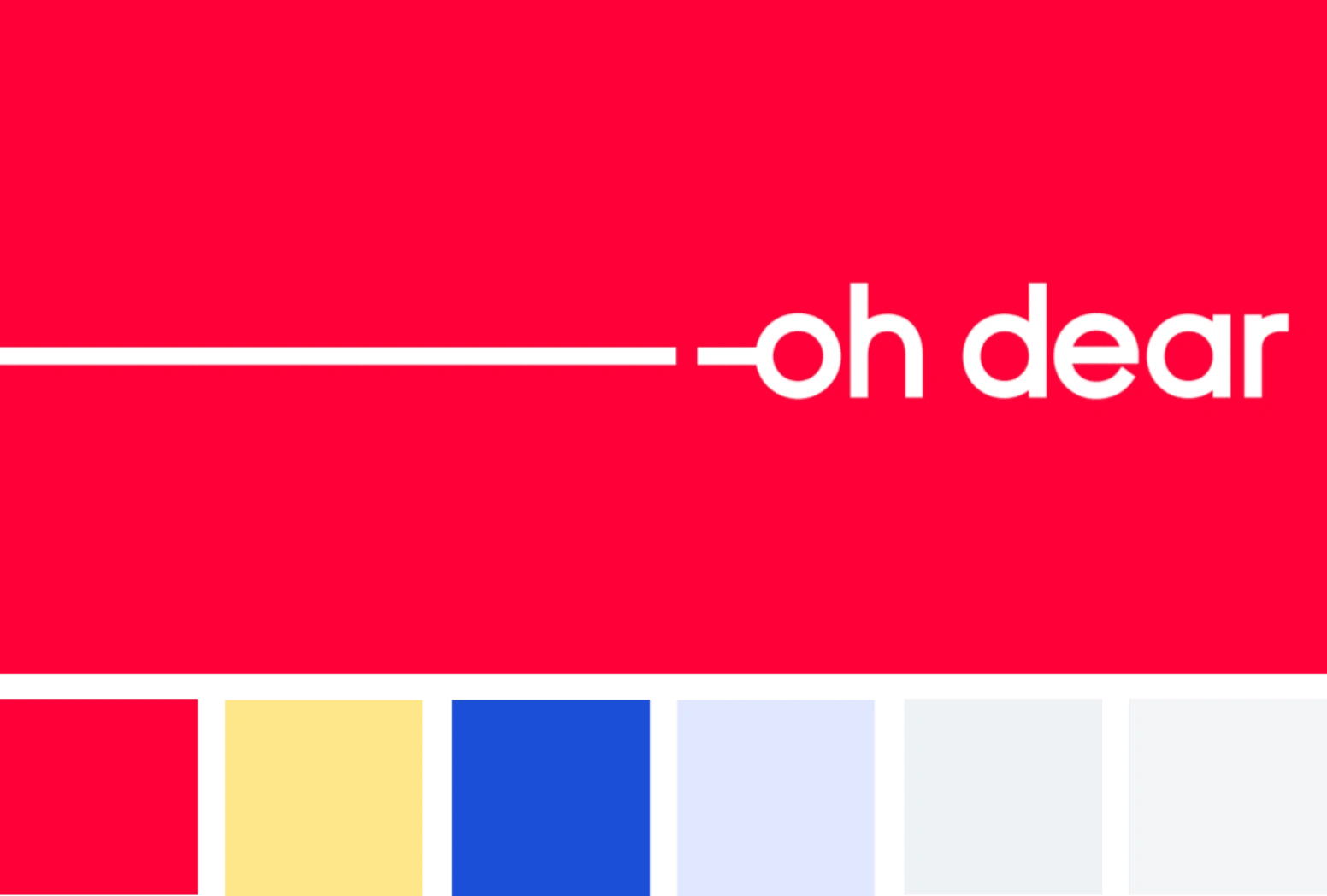
New branding:

Introducing new style elements
A digital design language is more than just a typeface or a color palette. We like to go deep into the details, with multiple layers of design elements creating one big coherent story. Here are some of those shenanigans:
Response time graph as a recurring background element
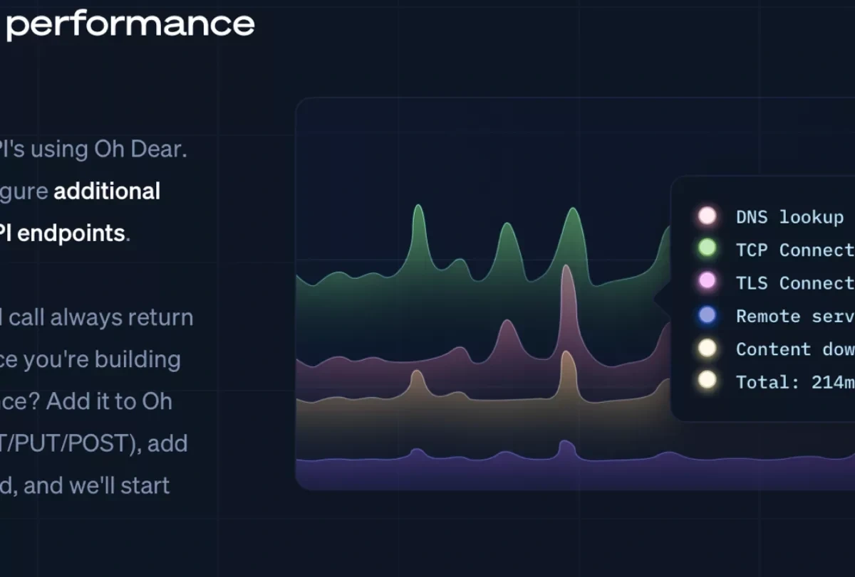
Darker 'grid paper' layout: switching up the styling for really technical content
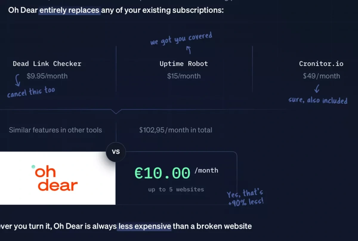
Handwritten annotations with a slightly humorous tone of voice
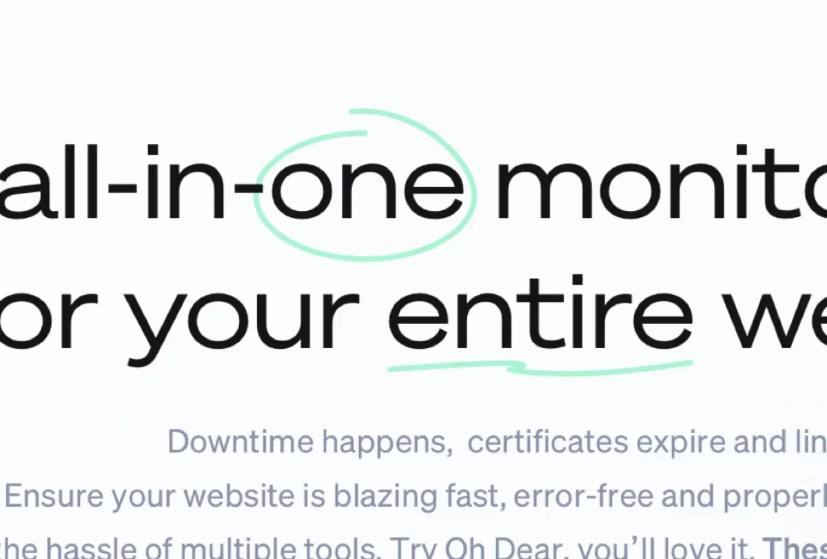
Playful pen marks as a creative highlight
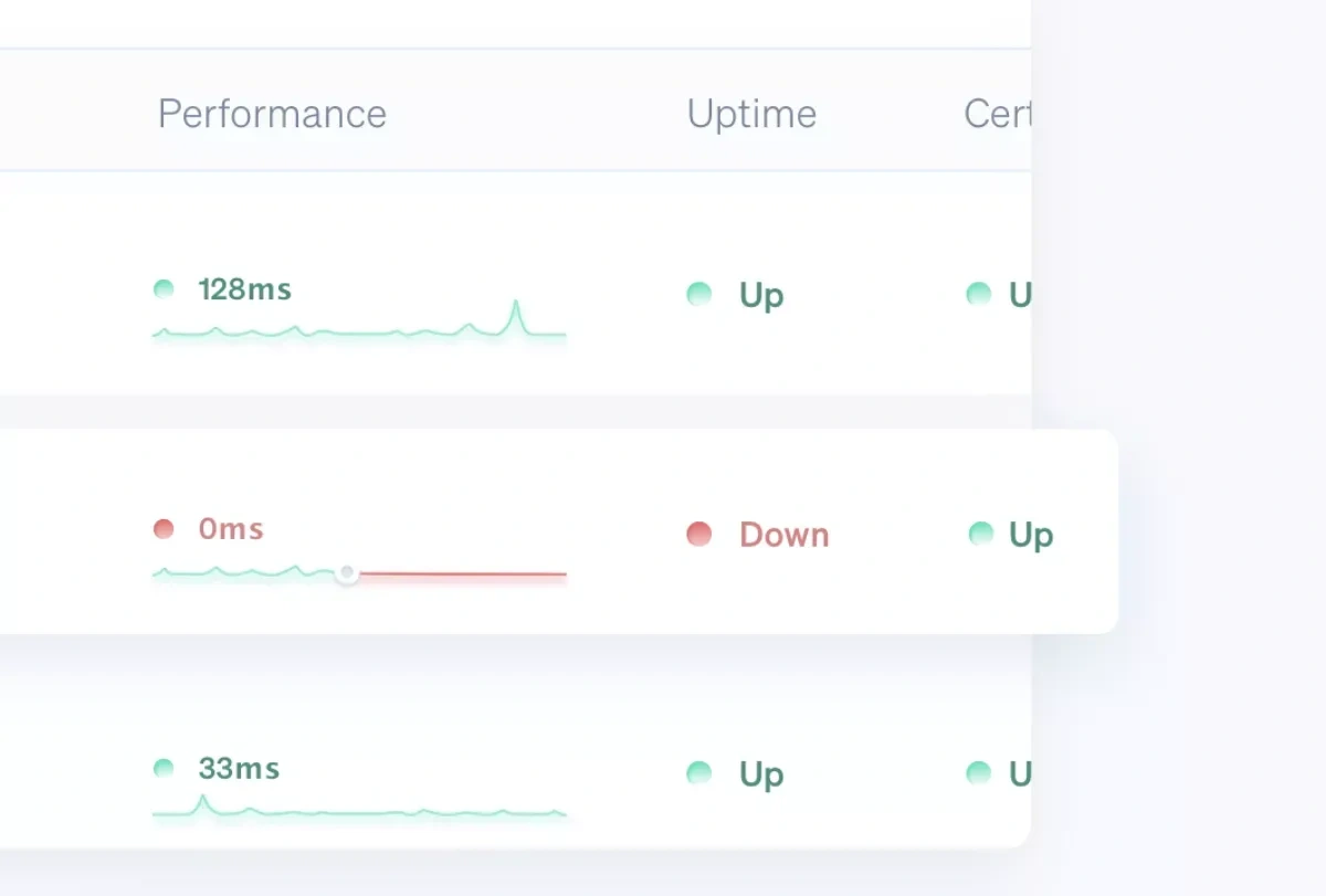
Creating depth with overlaps and shadows
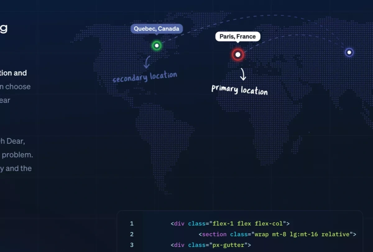
Custom illustrations explain features in a visual way
Final result:

Switch off the lights
Did we mention we implemented a full dark mode? Your eyes will thank us. We detect your browser setting, but you can also manually switch it in the upper right corner.

The actual product
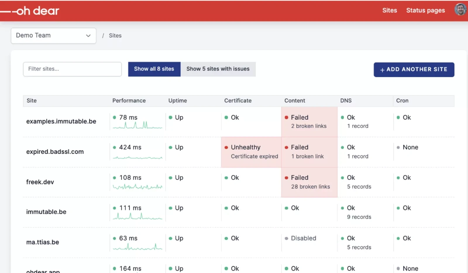
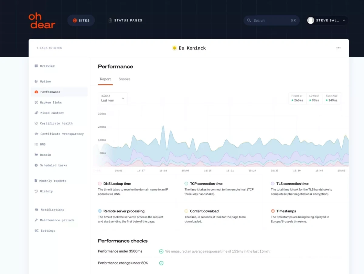
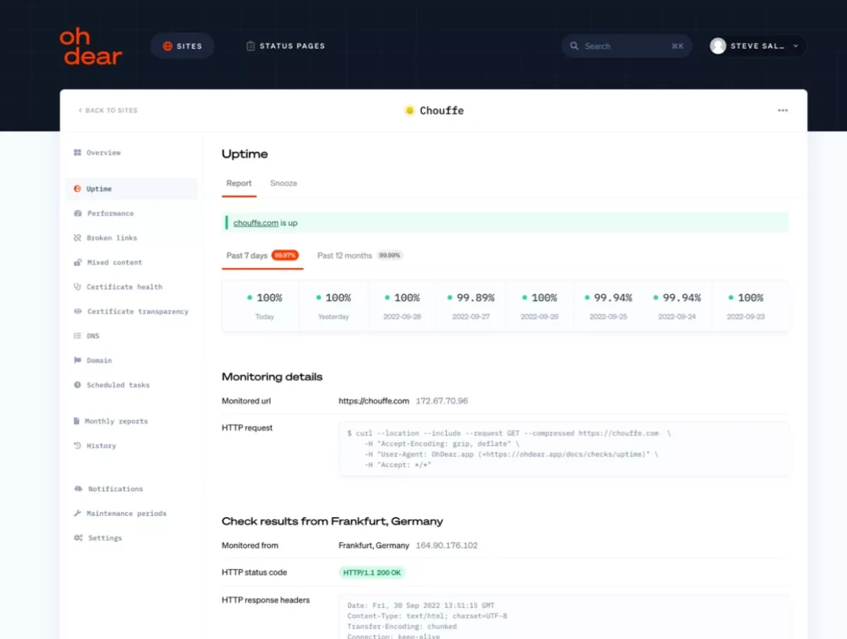
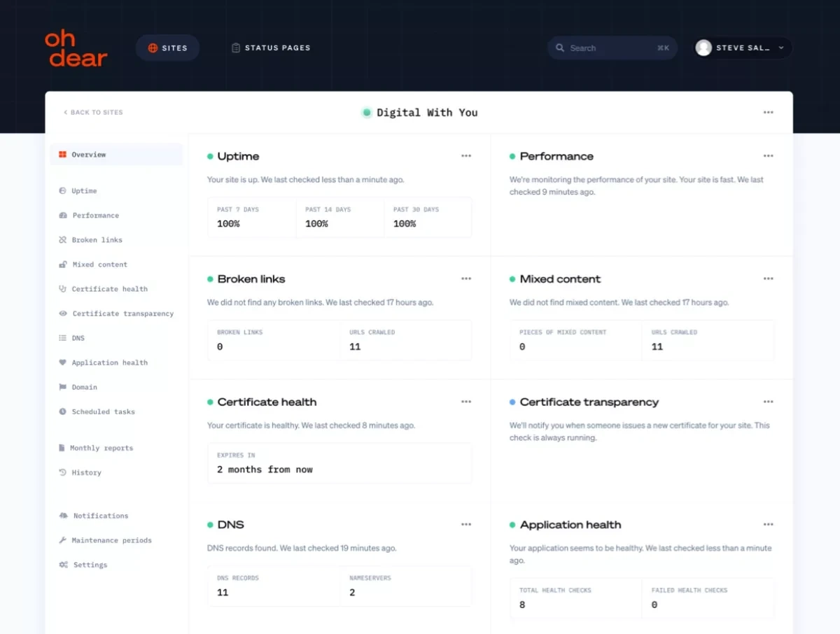
And for dessert, we gave the actual product a facelift as well. Aside from updating the look and feel to match the new branding, lots of small UX tweaks were implemented.
Changed the site overview screen and feature screens to show some relevant data and stats instead of just toggle switches or numbers and timestamps
Made it clearer which site you are actually monitoring
Fully responsive design

Documentation
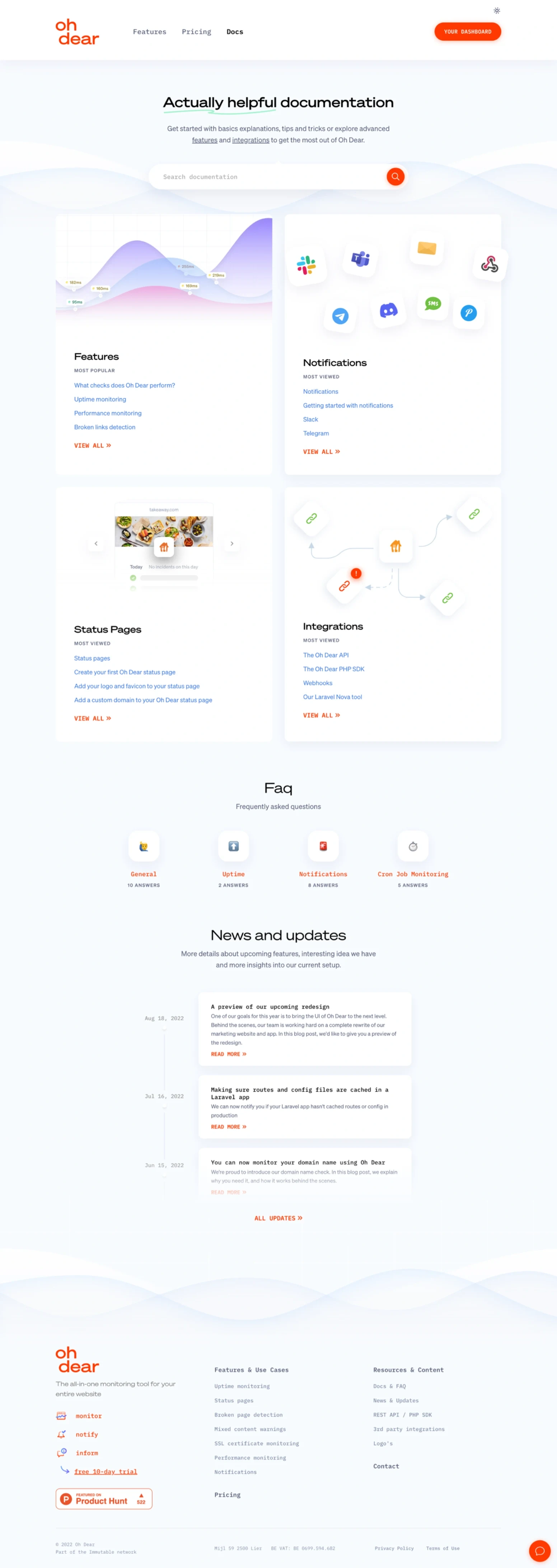
If you’ve made it this far down this case study, you’ve probably realized redesigning a digital product + its marketing website is a lot of work. Well, there’s even more. We also redesigned the documentation subsite to feel way more mature and welcoming.
Instead of a dry welcome page, a well-structured overview page shows popular questions, an FAQ section, and the latest news and updates.
Like this project
Posted Jun 28, 2023
Conversion-centered redesign for an all-in-one monitoring tool
Likes
0
Views
14


