Flare Laravel Error Tracking
Attention, fellow Laravel developers! You've likely stumbled upon Ignition, the default error page in Laravel created by Spatie. But, have you been introduced to its 'live' version, Flare? This enhanced version of Ignition comes packed with a myriad of management and collaboration tools that make bug fixing a breeze, and it might just save your mental peace in the process.
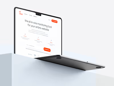
As for Spatie, they were quite impressed with the website and branding work I did for another SaaS product (Oh Dear) and felt a serious case of FOMO. They knew they had to step up their game to stay in the loop, so they approached me to revamp their online presence.
I'm incredibly thrilled to have assisted Spatie in elevating their digital presence, and I hope that their redesigned website and branding will be the new buzz in town (or at least within the Laravel community).
During the discovery phase with the client, one of my top priorities is to understand how flexible the existing branding guidelines are. Fortunately for me, my clients typically give me carte blanche to let my creativity run wild. The Flare team was totally on board for a brand evolution, but they also wanted to retain some recognizability as they've built up a loyal following in the Laravel community over the years.
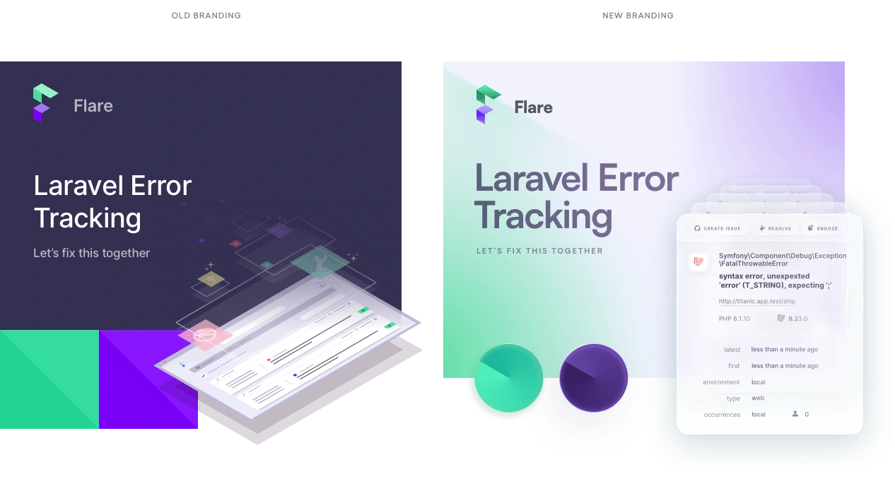
I managed to strike a good balance by maintaining the logo and the green and purple color scheme, but I decided to let go of the origami theme in favor of smooth gradients, layered blurs, and an off-white backdrop. The final outcome is a brand identity that's fresh and contemporary, without completely deviating from the Flare we all know and appreciate. I like to think of it as a stylish new outfit that still preserves the same cherished personality underneath!
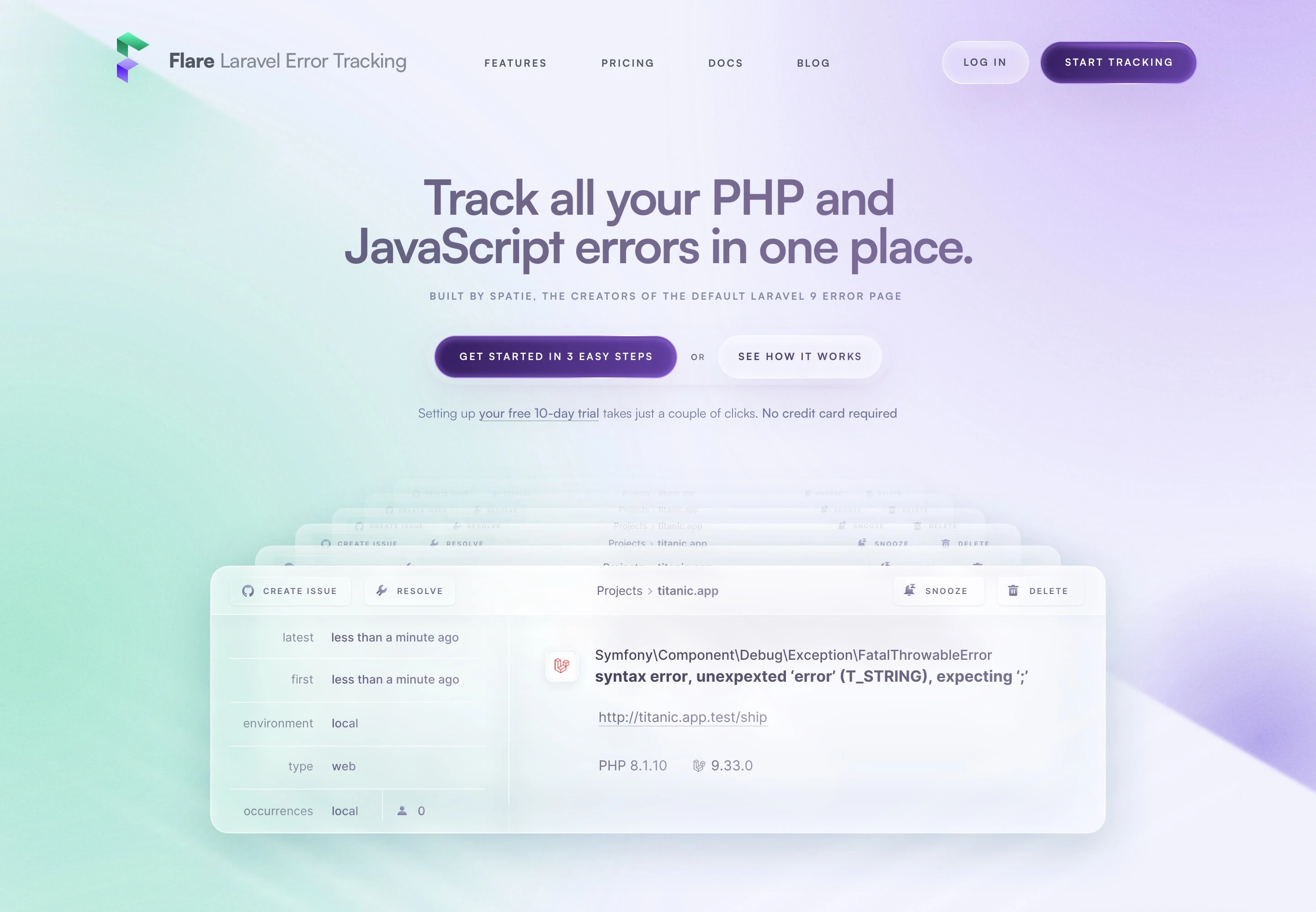
Ignition and Flare are specifically built for Laravel, providing extensive detail for any exceptions that arise. Knowing more about a bug makes it easier to solve, and the TimeMachine-like carousel in the page header sets the tone for a sophisticated user experience.
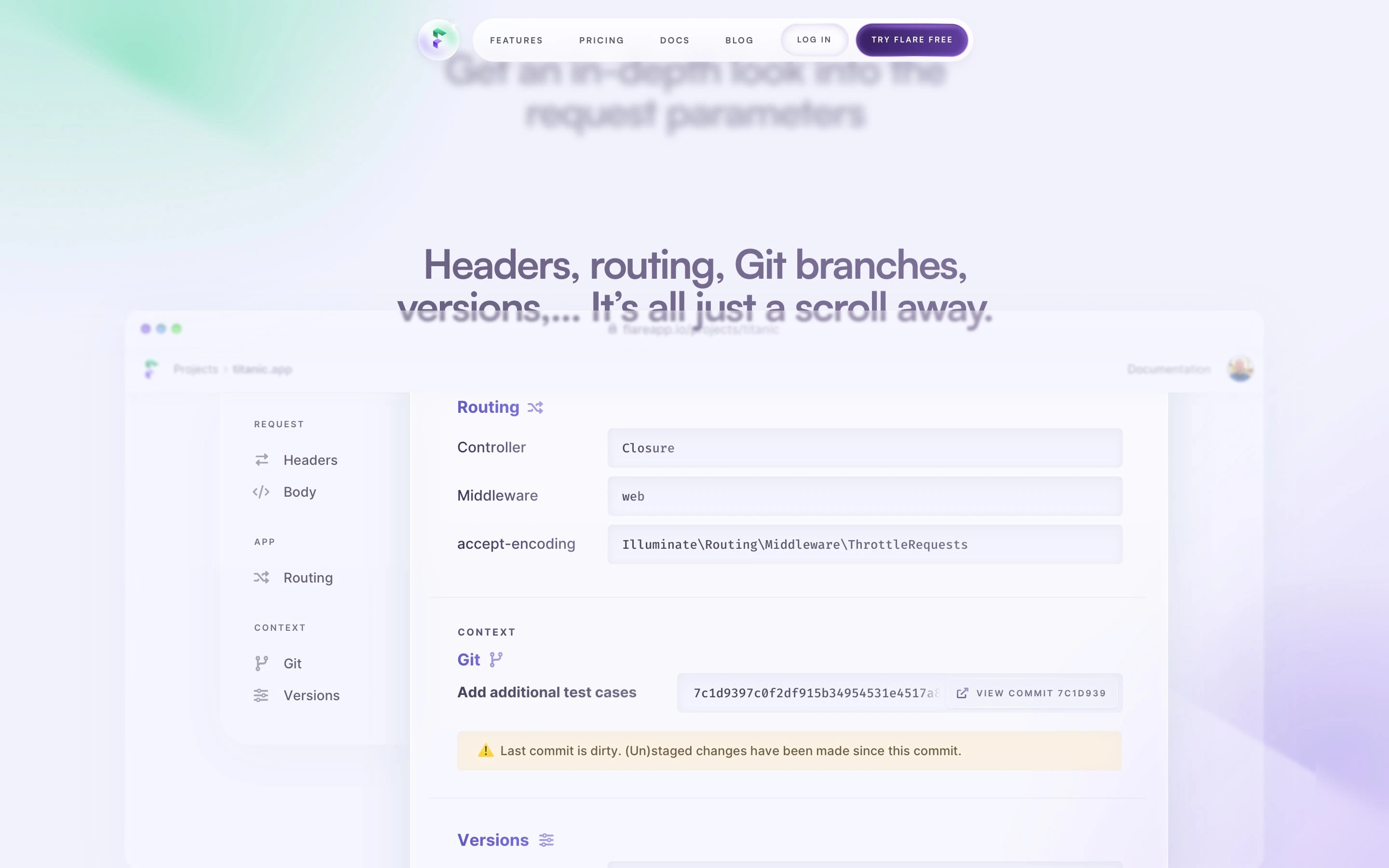
But the expanded bug view is where Flare shines, and we decided the best way to showcase it was by displaying the interface. Rather than dumping a 4000px long screenshot in the middle of the page, we gave the interface its own browser frame with powerful titles that slide along as you scroll down. This allows us to kill two birds with one stone: those familiar with error tracking can see how Flare takes it to the next level, and those without technical expertise can benefit from our clever copy.
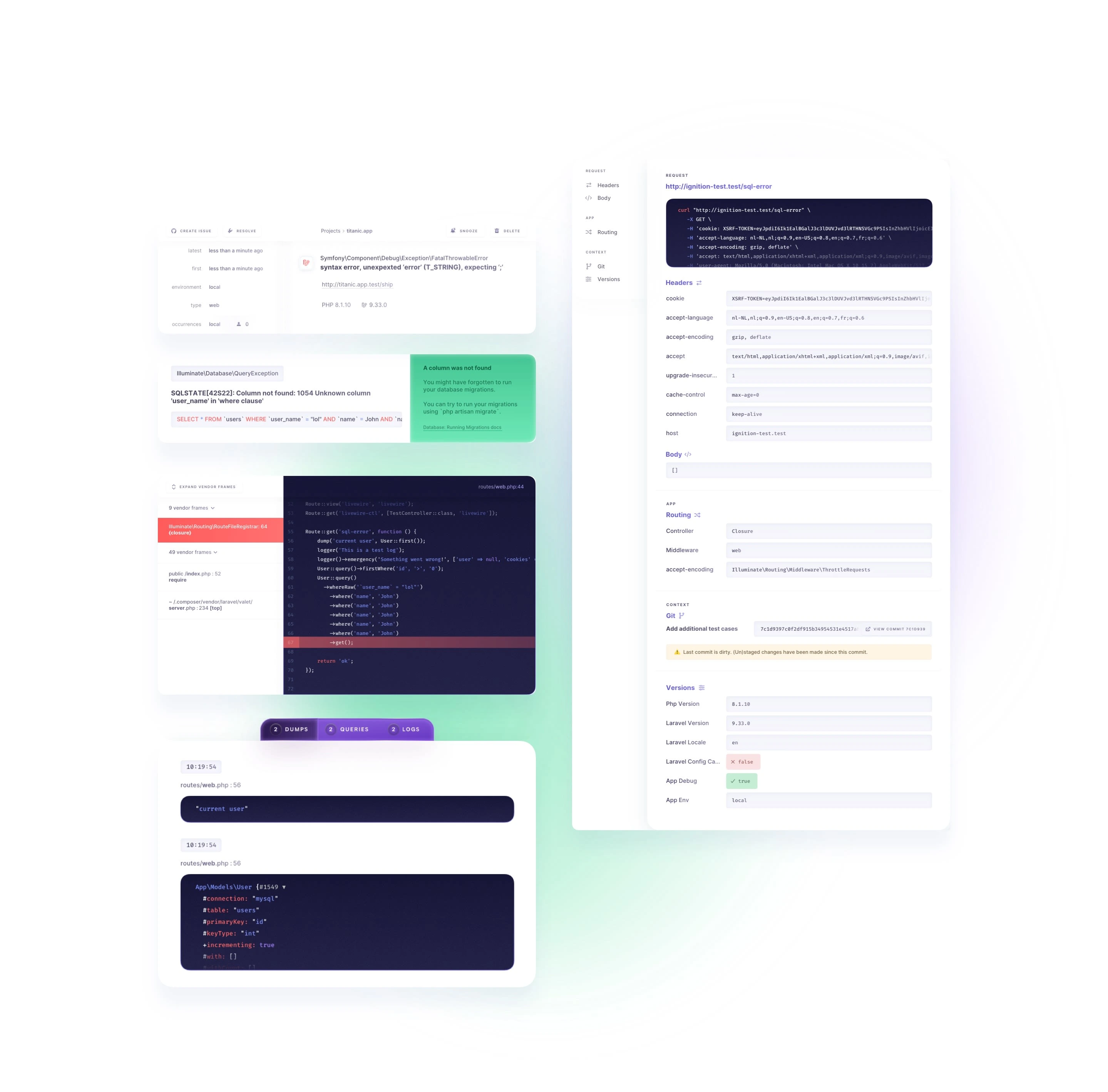
We gave the entire product interface a fresh new look to create a harmonious vibe on the whole page. And we were thrilled when the product team asked to borrow some of our design tricks for the actual product.
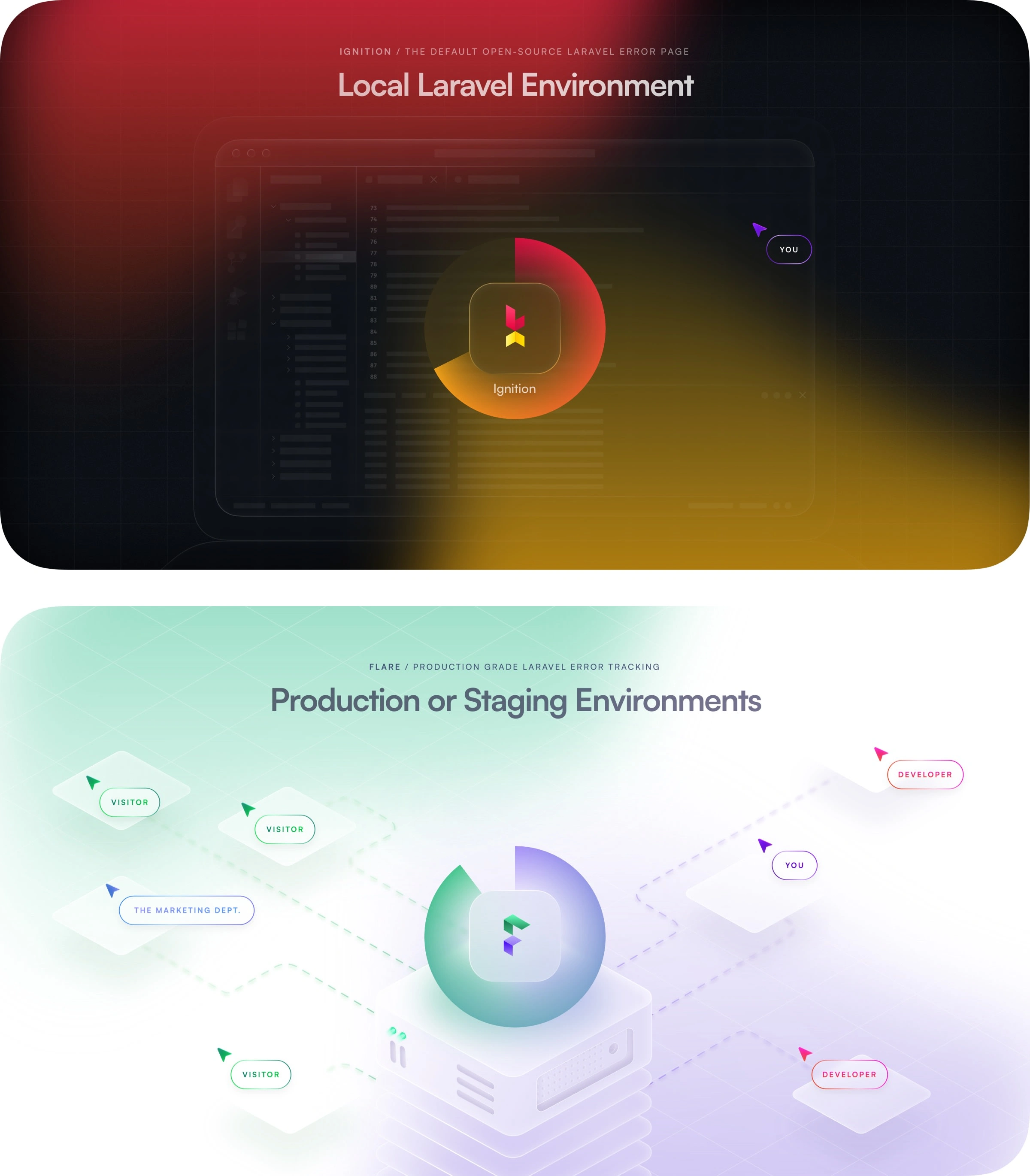
We went into great detail about the bug tracking process. However, since both Ignition and Flare offer those functionalities, when is the right time to upgrade to Flare? To make this ultra-clear, we created two visuals - one with a coding screen and the other with a server environment, one with a black backdrop and the other with a white backdrop, and one with a cursor and the other with multiple visitors. We added some slick animations and scroll transitions to make it even better.
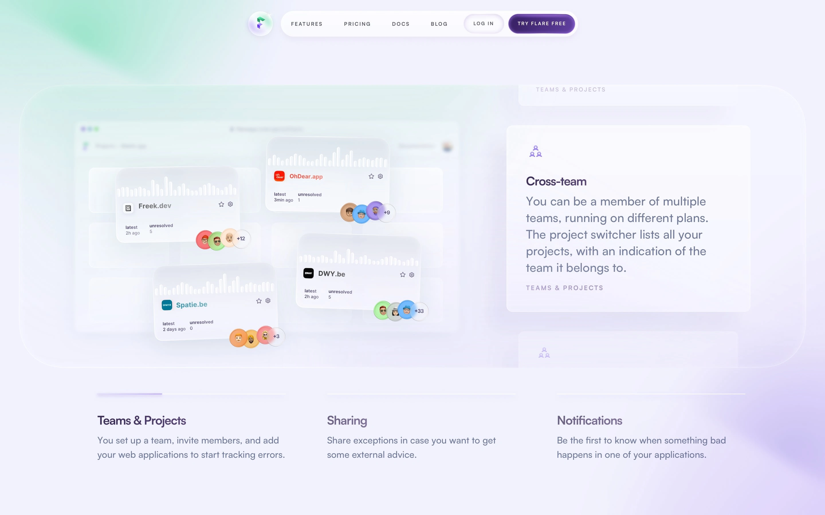
Now you know when to upgrade to Flare! Flare comes with a multitude of features, which we have distilled into nine items across three categories. Each of these features is illustrated in a classic Digital With You style. To further enhance the design, we incorporated fancy scroll animations and browser frames. As you scroll through the feature cards, the accompanying image changes, and a progress bar at the bottom gives you a quick overview.

The ultimate goal of the design is to convert visitors into paying customers, no matter how fancy it may look. To achieve this, we always strive to eliminate potential objections, hurdles, and worries. To assist with this, Flare offers a 14-day free trial, and we know that retention rates are relatively high after this period. All people need to do is install Flare and give it a shot.
To illustrate just how simple it is to set up Flare, we created a clean, slightly playful layout. The aim was to make the setup process as accessible and user-friendly as possible, prompting people to take the plunge and try Flare for themselves.
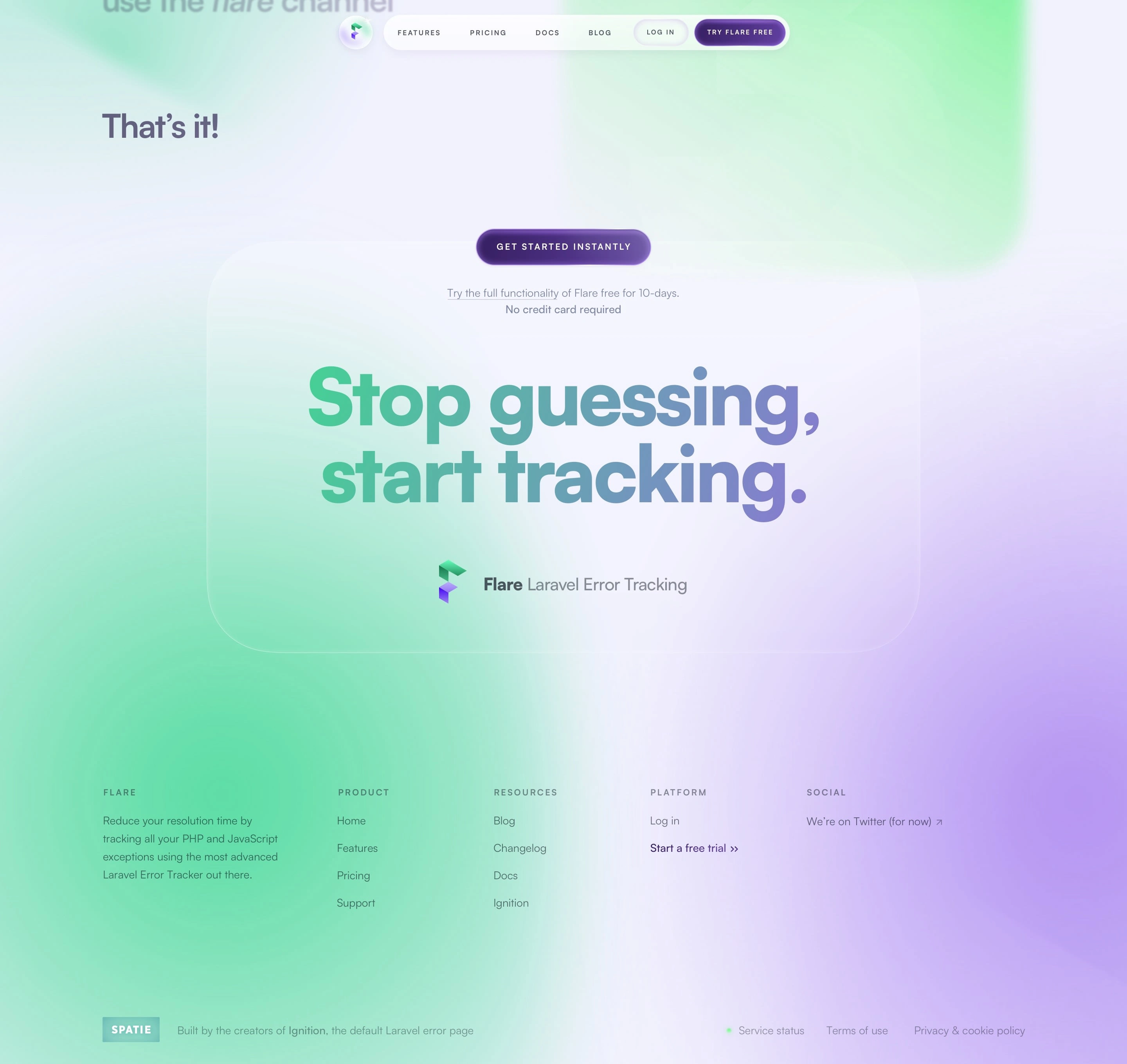
The "Get Started" call-to-action is sticky while scrolling and directs you to a powerful statement in the footer. We deliberately kept the footer minimal to avoid detracting from the main message: "Stop guessing, start tracking. It's easy, and it's free."

In contrast to all the scroll effects and animations on the homepage, we decided that the feature page should be more static, as it is much more content-heavy. We intentionally designed the feature page to function as a separate landing page. This means that when you arrive on the feature page as a first-time visitor, you should get a complete overview.
Before we dive into the myriad of features, we also explain the difference between Ignition and Flare. At the bottom of the page, three unique selling points (USPs) briefly summarize why Flare is a fantastic tool to use.
Like this project
Posted Jun 27, 2023
Rebranding for a Laravel Error Tracking Tool
Likes
0
Views
46


