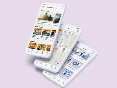
Zara E-Commerce Platform Revamp
The Problem
With a focus on website navigation and product browsing, how might we use design thinking to improve the customer experience in order to help fulfil user needs, as well as make sure the website is aligned with their core values — beauty, clarity, functionality and sustainability?
By highlighting the core value of ‘functionality’ and implementing it into the final design solution, business needs can be met.
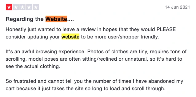
Looking at ZARA reviews from Trust Pilot (as pictured), it is clear that navigating the website, and product browsing are some of the main issues that customers are having — two key features of the online shopping experience. If designed poorly, this can quickly drive customers away, which is why it is essential to focus on having a simple and easy to use website.
In the ZARA websites’ desire to stand out and adhere to the beauty aspect of their core goals, some practices that build a good user experience may have been neglected in favour of aesthetics.
Competitor Analysis
Through carrying out a thorough competitor analysis for ZARA’s brand, I was able to collect quantitative and qualitative data about the websites beloning to their direct and indirect competitors. This helped in identifying the strengths and weaknesses, and discover what the reasons behind a competitor’s success may be.
To begin with, I researched who ZARA’s direct and indirect competitors were, before deciding to use H&M and Mango as direct competitors, and ASOS as an indirect competitor.
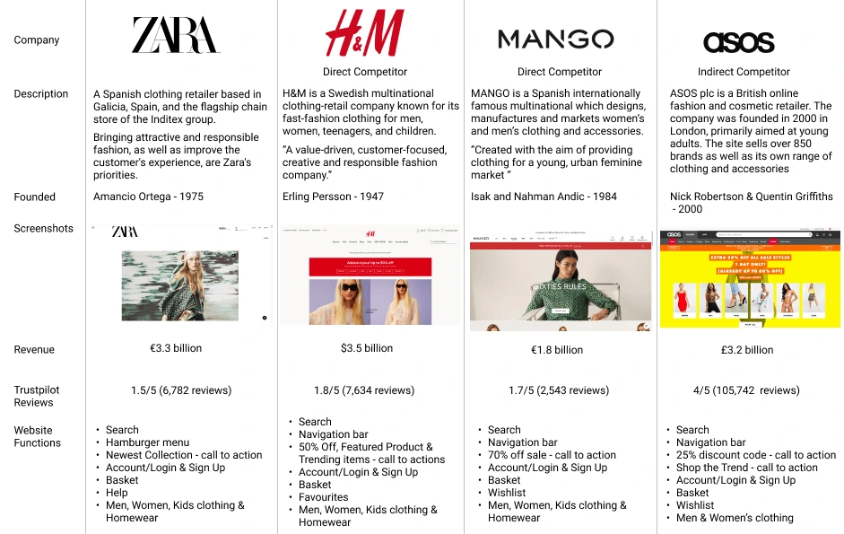
Competitor Analysis Findings
H&M, Mango and ASOS shared the most in common in terms of navigation, and general website layout. The three companies all use a navigation bar, and reserved the hamburger menu layout for their mobile sites. They all incorporated clear and engaging CTAs (call to action) to their homepages, and featured the ability to add clothing to favourites or a wish list so customers can save items they like to come back to in the future. The ZARA website does not have this feature, but it is possible to save items to a wish list on their mobile app — which gives a sense of inconsistency. ZARA as a company also has the most negative feedback on Trustpilot, with a rating of 1.5/5 stars out of 6,782 reviews. However it is important to note that although there is a lot of negative feedback, some it is directed towards in-store experiences, customer service, and issues with deliveries/returns.
Red Route Analysis
I compiled a list of features from the ZARA. H&M, Mango and ASOS websites that are important to a good fashion eCommerce website, before gathering a sample of regular shoppers to rank these features by how often they used them.By doing this, I was able to define what users consider to be of value to critical tasks within the user journey, meaning I'd be able to use real customer data to target essential features within the design.
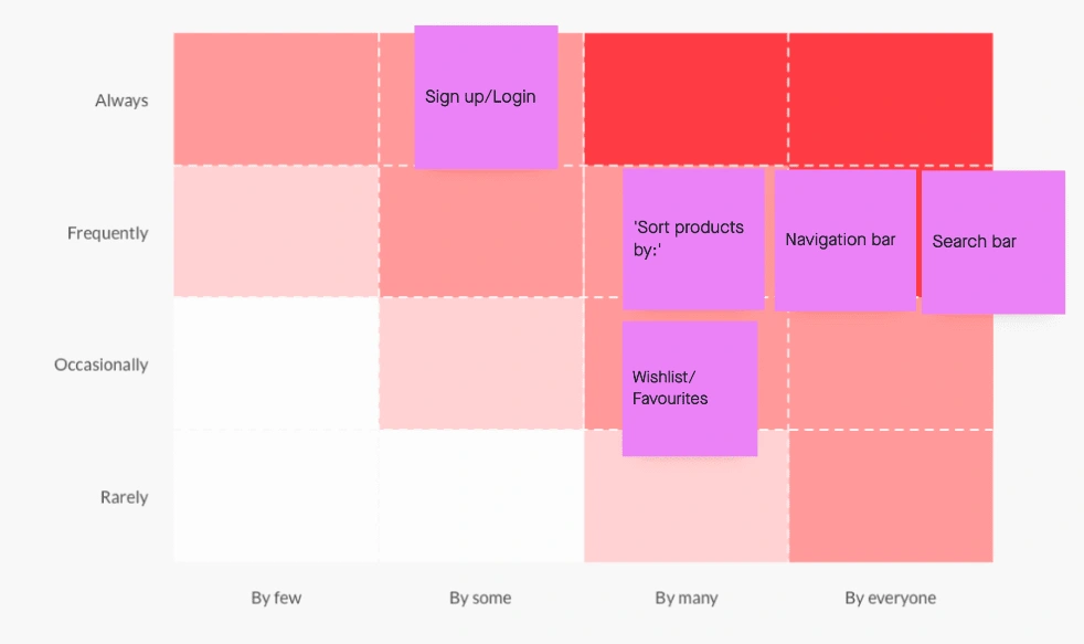
I discovered that the navigation and search bar were used by everyone on a frequent basis, which lined up with my own original assumptions. This wish list feature was only used occasionally, but by the majority of the sample which suggests that it does improve the user experience in some way. The main takeaway was that ‘sort products by’, the navigation bar and search bar were the most highly prioritised features.
Questionnaire
I carried out an open questionnaire in order to collect data to further inform me of the pain points users were struggling with, and their experiences with other online clothing stores. To get the most accurate data I could, I was careful to ensure to not make any assumptions, and that my questions were not biased or leading.
Questions
What is the first thing you do when landing an online clothes store’s website?
If you selected other, could you explain a little further?
Think to the last time you shopped for clothes online. What was the name of the store, and did you have a good experience?
If you had a negative experience, could you explain why in a short sentence?
When browsing products, what are the most important factors for you? Select 1–3 options.
Do you often shop on the ZARA website?
If you answered yes, is there anything that frustrates you when shopping on the ZARA website?
Is there anything that could be added to the ZARA homepage to improve your shopping experience?
If there’s anything you could change to improve the ZARA website, what would it be?
Findings
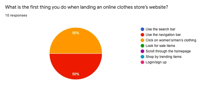
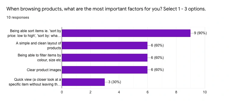
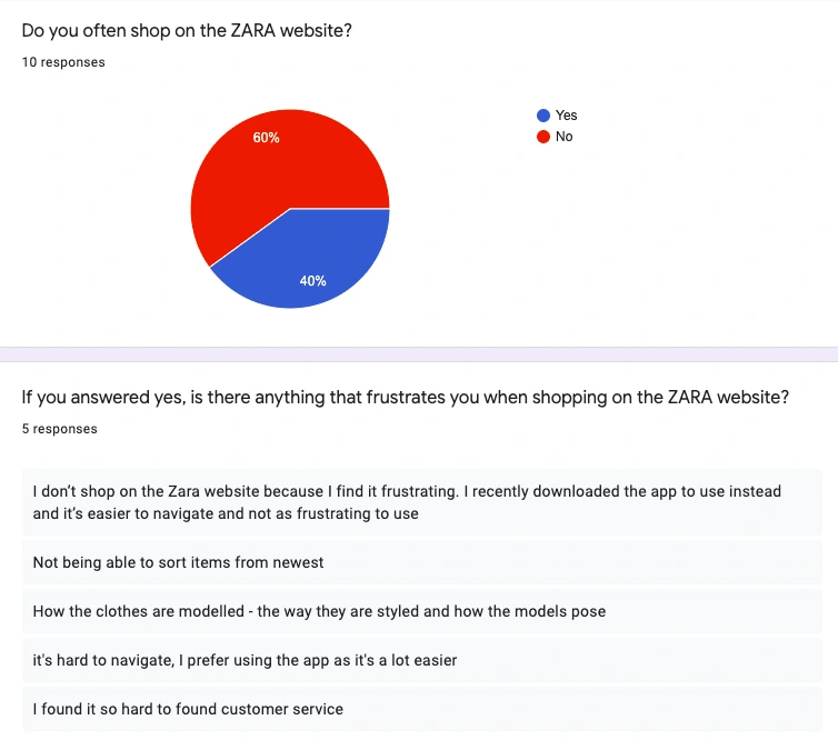
The results from my survey confirmed that many users struggled to navigate the website. 90% of the participants also valued being able to sort/filter items when shopping, so this was a high priority problem to solve.
Main Points
The site is difficult to navigate
The inability to sort items from newest to oldest
An unclear layout
Overly small font sizes
Many of the reviews seen on Trustpilot (mentioned in section 2) also support the findings I gathered from this survey. Difficulty of navigation and unclear layouts were creating a poor user experience for many of the reviewers.
Ideation
Crazy 8s
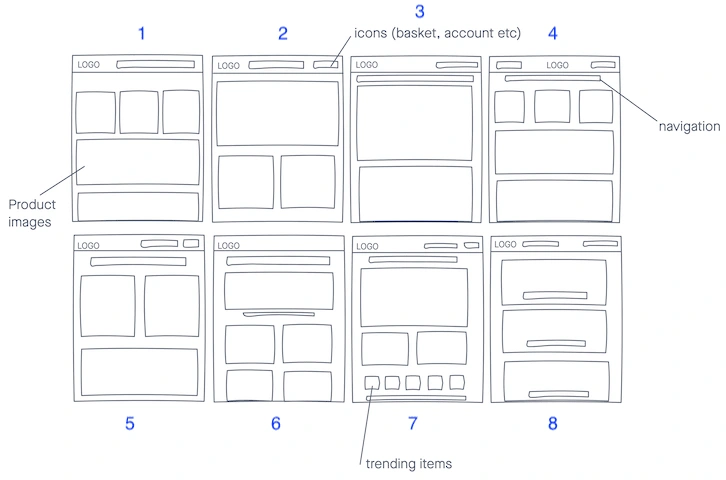
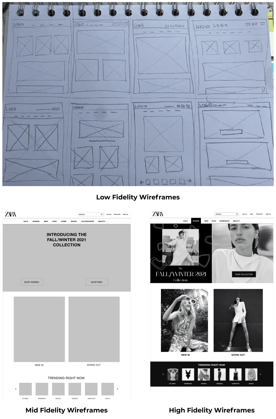
I set a timer for 8 minutes and quickly sketched 8 different design solutions — spending one minute on each one. I created 8 designs using Invision Freehand, and went on to rank the top 3.
Card Sorting
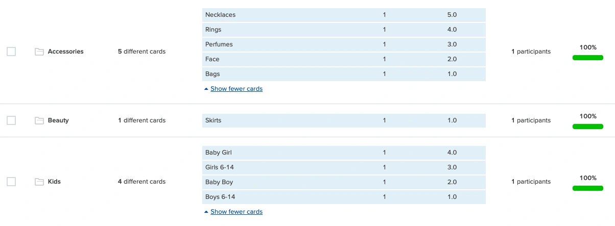
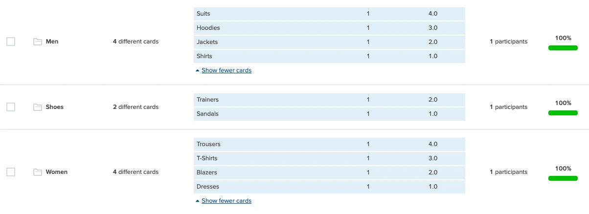
Due to not being able to do my card sorting task face to face, I used an online card sorting tool called Optimal Workshop. I created 20 cards, which the participant was then able to drag and drop under each of the 6 categories they were given. The outcomes were as follows:
Design
Wireframe Progression
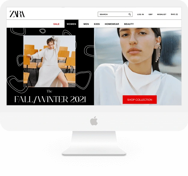
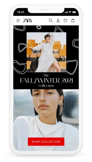
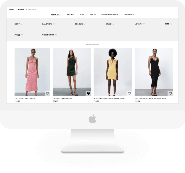
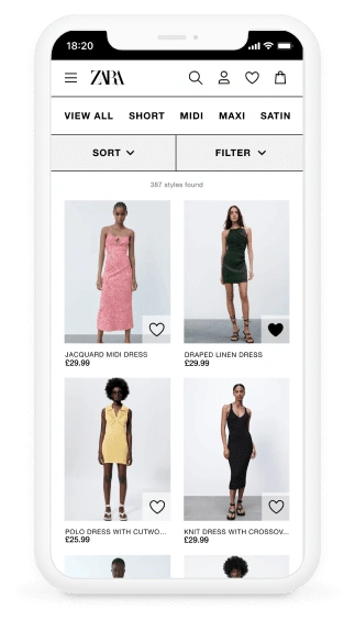
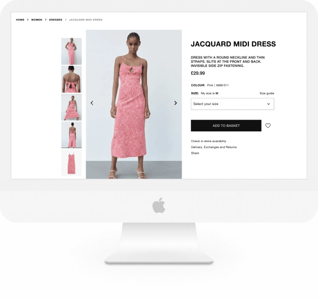
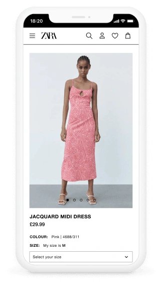
Final Interfaces
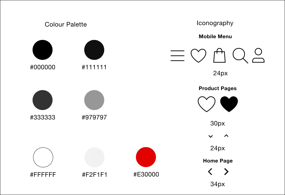
Style Guide
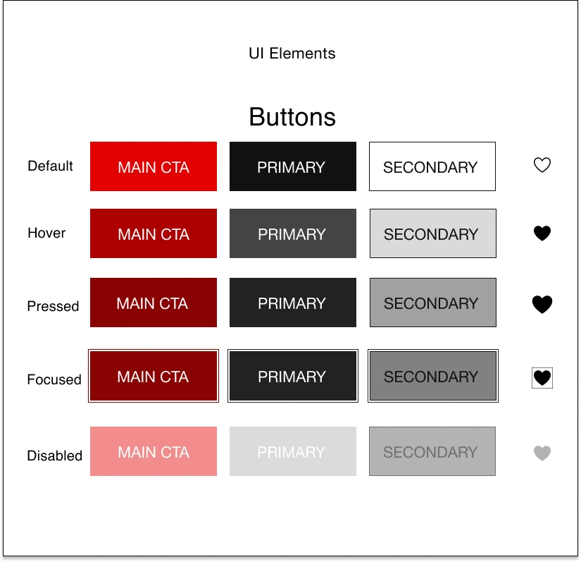
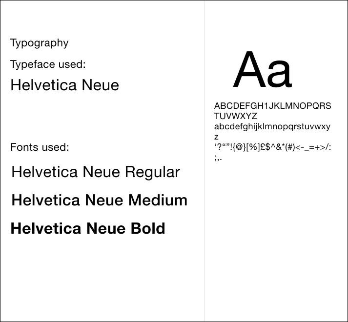
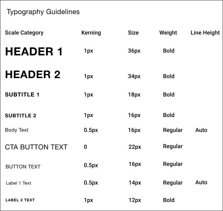
Design Principle Breakdown
Hick’s Law — To avoid prolonging the user journey by extending the time it takes to make decisions, I made sure to make sure the screen furniture being presented was minimal, and included only necessary information. This lowers the risk of potentially overwhelming users. The use of this law can be seen in the minimalist layout of each screen, and in the navigation bar.
Miller's Law — Organising content into smaller chunks is beneficial, as users are able to process, memorise and understand content more easily. To implement this law, I kept the items in the navigation to a minimum by listing the 6 main categories of ZARA’s products.
Law of Common Region — Elements tend to be perceived into groups if they are located in the same region. This can be seen in different areas of my design such as in the header — the section containing the logo and search bar, login, shopping cart etc, are sectioned off inside an element with a black border. The navigation bar is grouped together in the same way. This can also be seen in the ‘Trending Items’ section on the homepage, where the law of common region was created by adding a black background behind this section to separate it from the rest of the page.
Aesthetic Usability Effect — Users have a more positive emotional response towards any visual design, making them more tolerable of minor usability issues. This law ties into ZARA’s core values of ‘beauty’ and ‘clarity’. I took care to make use of ZARA’s brand colours of black and white, and implemented the colour white mostly through the use of white space, which can be seen throughout the designs of each screen. The overall effect is the feeling of luxury, high fashion, and a clean design.
Jakob’s Law — Users transfer their expectations from one familiar product to another, so they will expect them to work in the same or similar way. To execute this law, I included aspects from competitors such as ASOS when it came to the product pages, and sorting/filtering feature when shopping.
Accessibility
Throughout the design process, I was careful to keep accessibility guidelines in mind, as accessibility shouldn’t be an afterthought in design.
In terms of the colours used throughout the designs, it was straightforward in ensuring that there was a high enough contrast between colours so that they were accessible to users with visual impairments, due to the palette being black and white, with shades of grey in between.
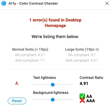
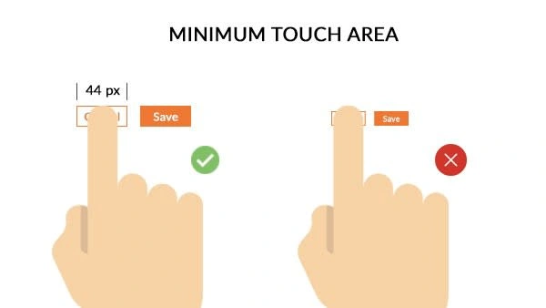
Font size was also an important factor, so I used font sizes of 14px and above on mobile, and 16px and above on desktop — with the exception of 12px which was used for small labels on mobile. As well as this, it was important to stay with the target sizes for call to actions (44px), so I tested my mobile screens using Figma Mirror to check that elements such as icons and buttons were large enough to tap on easily.
Conclusion
Overall, I am happy with the final outcomes from my research and my final design solutions, as I feel I was able to learn how to design for the user rather than myself, whilst keeping the businesses needs in mind and without compromising on ZARA’s core values and brand identity.
I enjoyed working on this case study, as it allowed me to fully delve into the research side of things and focus on the UX in detail. I think some aspects of my research stages went well, such as my survey and initial background research — however I would have liked to have been able to spend more time on card sorting with more participants so I could work more on the information architecture. Interviews would have also helped me to gain more qualitative data compared to a survey, as I would have been able to see things that qualitative data doesn’t reveal, but due to the time constraints I had, that wasn’t possible for this project. However it is a research method I would like to use in my next case study.
If I had more time or the ability to launch this project and collect user feedback to support my hypothesis, I would like to use A/B Testing and Data/Web analytics, as seeing the user’s journey, where users fell off, and how much converted are great ways of realising and confirming what pain points may exist and are causing a problem for users.
Like this project
Posted Jun 7, 2023
Improved the overall usability and accessibility of a fashion e-commerce platform through redesigning its UX and UI.
Likes
0
Views
332


