Helping Hand App Design
The Problem
People experiencing homelessness, or have just been released from care/prison/hospital, and have moved into new accommodation need a way to ensure successful local community integration.
The outcomes I hope to achieve are:
A user friendly and engaging app
A smooth user journey
A platform that is educational and provides support/helps users to access real life support
An app that is accessible to users with visual, auditory or any other disabilities
Competitor Analysis
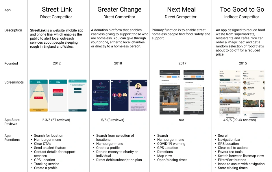
I was surprised to realise how challenging it would be to find competing apps, as there aren’t many apps out there to help the homeless. After researching, I found 3 apps designed for the homeless that would be direct competitors — Street Link, Greater Change and Next Meal. I then chose Too Good To Go as my indirect competitor. The reason I chose this app was due to its map feature and the feedback it provides to users when carrying out actions.
Competitor Analysis Findings
In terms of design, all four of the apps share a lot of common. They all make use of clear call to actions and have simple, clean layouts. This especially makes sense in terms of the apps designed for rough sleepers, as the functions are for helping people who may be in dire situations. Making sure that the user journey is simple and easy to follow is critical.
Street Link, Greater Change and Next Meal all made use of hamburger menus, whilst Too Good To Go has a fixed navigation bar at the bottom of the screen; which supports discoverability by informing users of the available functionalities/features without them having to click and navigate through a drop down menu. Another important feature that all of the apps (apart from Greater Change) contain is the use of GPS and Geo Locators. Users of Street Link can send out an alert with their location, Next Meal provides users with a list of support services in their nearby vicinity, whilst Too Good To Go provides users with a list or map view of nearby cafes/restaurants/shops based on the users current or chosen location.
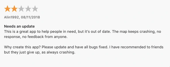
Excluding Too Good To Go and Street Link, none of the apps have enough reviews in order to gain user feedback. This could be due to the lack of updates — the Greater Change IOS app was last updated in 2019, whilst the Street Link app had its last update in 2018, and has since developed a lot of bugs and issues. The lack of updates has meant that the app has become outdated, is no longer fully compatible with newer versions of IOS, and improvements are not being made to the usability of the app. All of these factors may contribute to a poor user experience. The app has a 2.3/5 rating from a total of 57 reviews.
Too Good To Go however, has a 4.9/5 rating from a total of 99.4k reviews. The majority of reviews concerning the usability of the app were positive as seen in the example below.

User Research
I decided to gather and use secondary data to gain a more detailed understanding of the problems people who are homeless face, as it was not possible to collect primary research for this case study.
One of the personal problems that people experiencing homelessness often face is getting access care.
“Why does everything have to be about accommodation? Full-time job? Help with mental health? Can’t get that because I’m not in full time accommodation, I can’t get accommodation because I’m not in a full-time job. It is always back and forth. And I’ve got to the point where I’m like, what’s the point?”
— Patient story, Healthwatch West Berkshire
Local Healthwatch across England spoke to 1,200+ people experiencing homelessness, and found three common issues were:
Difficulty accessing services due to not having an address, suitable identification, or don’t have enough phone credit to call to make an appointment. It can also be difficult for them to attend appointments or stick to health advice.
Difficulty registering with GP services. An address is not legally required in order to become a patient however, despite this, some GP surgeries will not allow people to register if they don’t have a fixed address. Local Healthwatch heard from at least 5 areas that were turning people away which was having a huge impact on those who were in need of healthcare support.
Difficulty getting holistic support. The organisation discovered that “people don’t feel their circumstances are understood by medical professionals, so they don’t get the full level of support they need. People want holistic support with their health, housing and employment all in one place.”
Apart from issues accessing healthcare, other problems those experiencing homelessness can face are food and shelter insecurity, income insecurity and basic need insecurity. Shelter, food, and basic needs (such as warmth, dry clothes, water and food) aren’t always guaranteed everyday. This makes it more difficult for for those experiencing homelessness to overcome their situation when their basic needs aren’t being met.
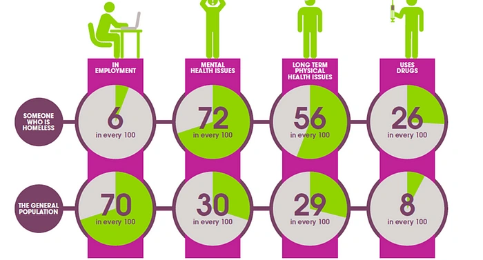
The infographic below by Homeless Link displays the experience of homeless people compared to the general population.
"With people often experiencing feelings of isolation, homelessness can also increase your chances of taking drugs or experiencing physical or mental health problems. Evidence suggests that the longer someone is in this position the more difficult it can become to get back on your feet. As someone’s problems become more complex, anti-social behaviour, involvement with the criminal justice system and acute NHS services become more likely.”
I discovered that the navigation and search bar were used by everyone on a frequent basis, which lined up with my own original assumptions. This wish list feature was only used occasionally, but by the majority of the sample which suggests that it does improve the user experience in some way. The main takeaway was that ‘sort products by’, the navigation bar and search bar were the most highly prioritised features.
User Persona
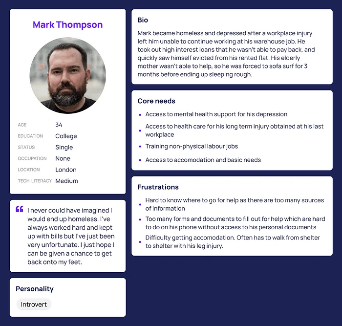
By using the secondary research I had collected, I was able to create a persona that will allow me to make better design decisions based on the user’s behaviours and needs.
Ideation
Mind Map
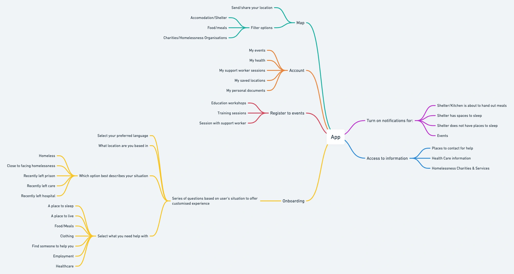
For my first stage of ideation, I decided to create a mind map. Mind maps are great for creating a visual representation of thoughts, concepts and processes during the early phases of projects. In my case it was particularly useful as it helped me to understand what the scope of my app would be, as well what the core mechanisms would be and ideas for features to include within the app.
User Flow
After creating a mind map, I had a much clearer idea of what services I wanted my app to provide. Moving on to the next stage of ideation and using the ideas I had come up with in the previous stage, I was able to design a user flow for the onboarding process, and a site map detailing the features that would exist with the app.
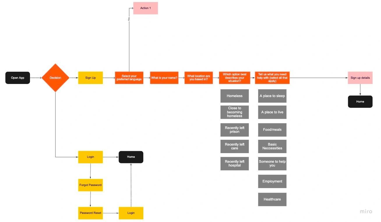
User flow for onboarding — created in Miro
Crazy 8s
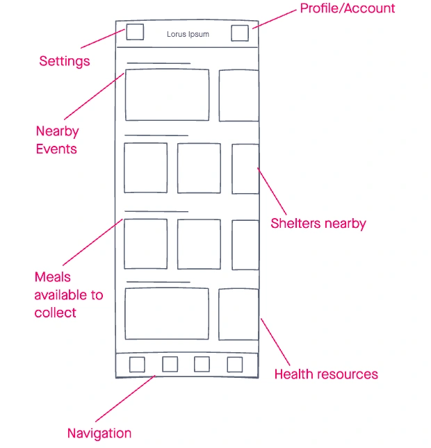
After sketching these quick designs, I found I was unsure of what content would fill some of the boxes I had drawn. As a result, I decided that carrying out the Straw Man Proposal method would help me to refine my ideas into a more clear and organised layout.

Crazy 8s Sketches
Strawman Proposal
The method works by gathering colleagues and carrying out a 10 minute iteration on designs independently. After the time is up, everyone gathers and discusses the disadvantages of each design. In my case, I sketched a design for the home screen and spent 10 minutes refining it.
Design
Wireframe Progression
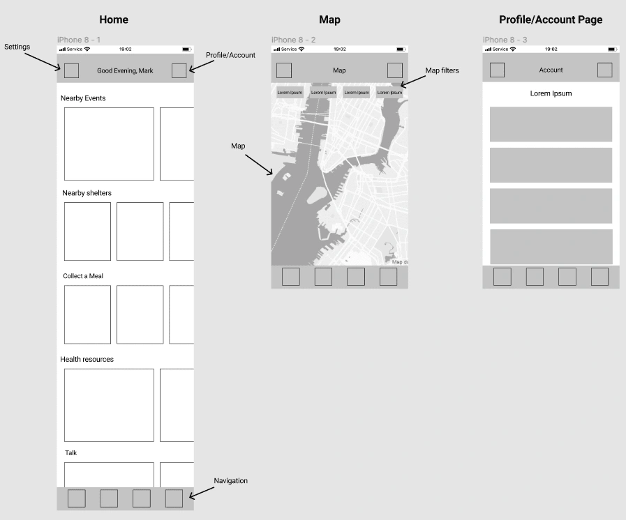
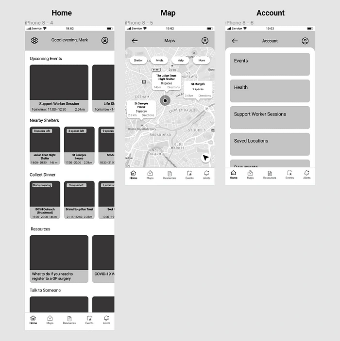
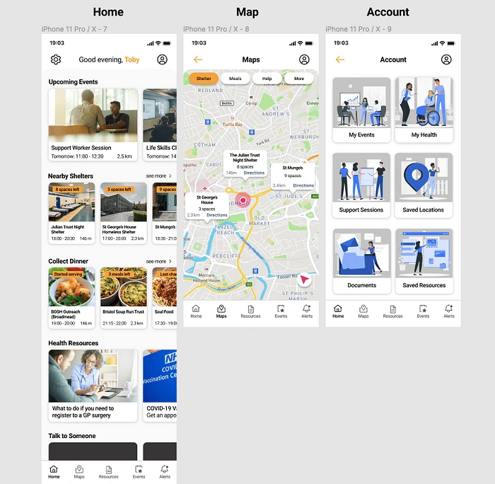
For this stage of the project, I designed the screens on both iPhone 8 and iPhone 11 frames, as I needed to keep in mind the fact that people who experience homelessness may not necessarily have access to the newest and latest smart phone models, but this shouldn’t be an assumption as people’s situations will vary.
Final Interfaces
Style Guide


Design Principle Breakdown
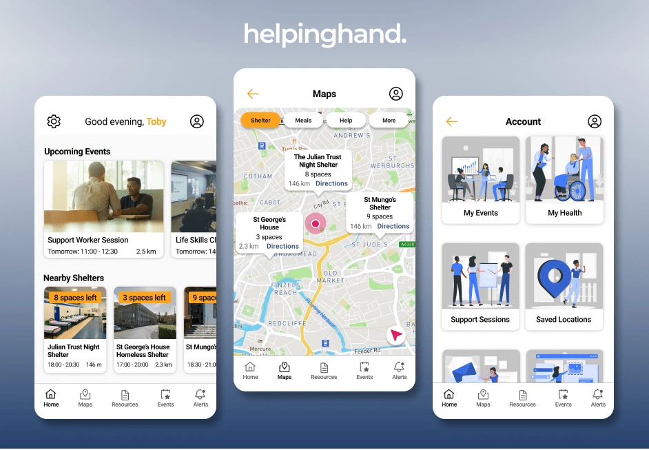
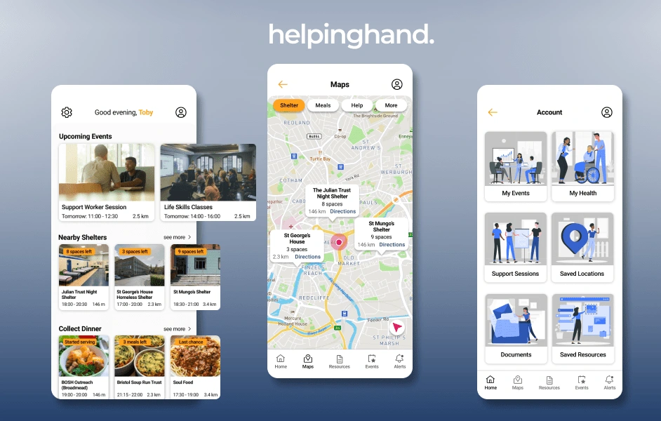
Hick’s Law — The use of this law can be seen in the minimalist layout of each screen, where only the necessary information is presented the user.
Law of Common Region — The use of this law can be seen all throughout each screen — each category of information is broken down and grouped together in sections that can be scrolled through horizontally (on the home screen). Borders and background colours are utilised to make it clear which piece of information belongs to which group.
Aesthetic Usability Effect — Users have a more positive emotional response towards any visual design, making them more tolerable of minor usability issues. The colours, imagery and icons I selected for my app help it to look clean and visually pleasing.
Jakob’s Law — To execute this law, I looked at the layout used by the app Too Good To Go. Despite not being a direct competitor of my app, it is an app that the homeless could potentially use due to the low costs of food being given away by restaurants/shops at the end of the day. The layout is similar in terms the ability to scroll horizontally.
Typography
I decided to use the Roboto typeface (a san-serif) as it is free, and very easily readable in all of its various font styles. It is also transferable from IOS to Android, which prevents an alternate font from having to be selected if this app was to be built on Android as well as IOS. This was important to keep in mind, as not all people who are homeless would necessarily have access to an iPhone.
I used a range of different font styles as seen in the typography guidelines below — specifically ‘Regular’, ‘Medium’ and ‘Bold’. Alternating between font styles and adding kerning allowed me to create hierarchy where needed on different sections of the designs.
WCAG, Accessibility, and Inclusive Design
Accessibility guidelines were particularly important for this project, as according to the Independent, new figures show that “the number of ill and disabled people becoming homeless has surged by 53 per cent as local councils are increasingly unable to provide them with support”. This means that an increasing amount of disabled people are being made homeless, so it was important to take steps to ensure that my design solution was accessible.
I selected colours with a high contrast so that they were accessible to users with visual impairment, and used font sizes of 14px and above, with the exception of 12px which was used for small labels. As well as this, it was important to stay with the target sizes for call to actions (44px), so I tested my mobile screens using Figma Mirror during the design process to check that elements such as icons and buttons were large enough to tap on easily. Another solution I had in mind was to allow the user to select font sizes during the onboarding process (which could later be changed in the app settings if needed) to allow for flexibility.

Conclusion
Overall, this case study was a big learning process. I learned the importance of iteration — it’s rare to reach the final design solution on the first go. By going back to my research and ideation phases, I was able to realised that my original idea (to create a food collection app) wasn’t solving the original problem. Once I had realised that, I was able to get past my block, and proceed to design a solution that does solve the problem stated. I am happy with the final outcome from my research and my final design solutions. On further reflection, the app could be developed even further. In my research I discovered that many people who are homeless are declined by GP Surgeries — this was also the case with banks until fairly recently. HSBC now allow those without a fixed address to open a bank account — so money/finance management resources could also be something to include with the app.
If this were a real app I was designing, it would be good to collect primary research by interviewing the people or charities who provide care and assistance to the homeless. Interviews would have also helped me to gain more qualitative data, as I would have been able to see things that qualitative data and secondary research doesn’t reveal. I would also like to design the app for android too, as they can be a more affordable option for many in comparison to iPhones.
If I had more time or the ability to launch this project and collect user feedback to support my hypothesis, I would like to user test with the target audience of the app. This would provide the opportunity to go back and reiterate some aspects of the app to ensure the user journey is as smooth as possible, whilst also helping the people it was designed to help.
Like this project
Posted Jun 7, 2023
Create an app that aims to eliminate pressures associated with homelessness.
Likes
0
Views
10


