Zíro Credit Mobile App Design
Fabio Torres
Zíro — Credit Mobile App (MVP)
Contra Setup Fields
Title: Zíro — Credit Mobile App (MVP)
Cover Image:
MOBILE-01-cover.pngDuration: 2025
Organization: Zíro
Roles: Product Design, Design Leadership, Accessibility Design, Mobile Design
Tools: Figma, Ant Design Mobile, React Native
Skills tags: Product Design, Mobile App Design, UX Design, Accessibility, Inclusive Design, Prototyping
Industry: Fintech, Mobile
Body Content (copy below into Contra's editor)
Context & Challenge
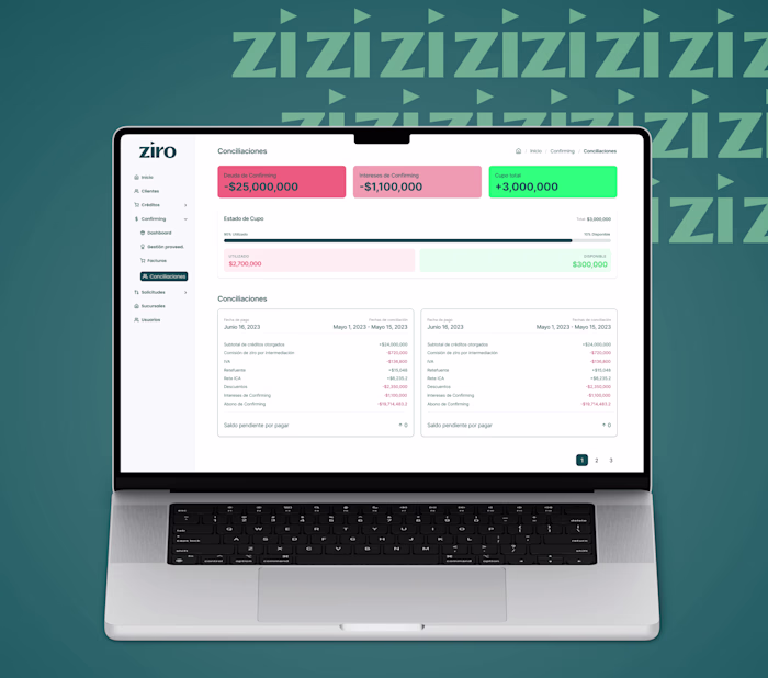
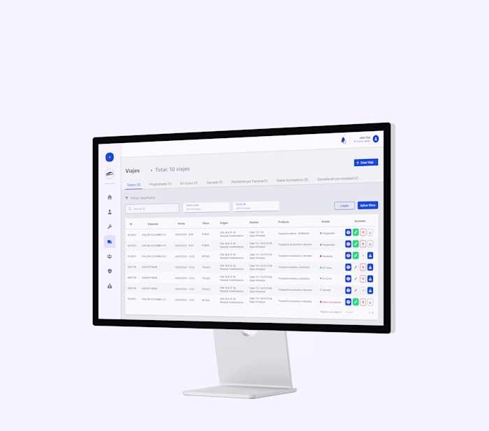
Zíro provides credit and BNPL solutions to small merchants and distributors in the traditional trade channel. While Zíro's web dashboards served back-office teams, a large segment of end users — small shop owners — continued to rely on in-person processes.
Many of these users:
Have low digital readiness
Have limited reading ability
Are 50–60+ years old
Are accustomed to face-to-face interactions with sales reps
Use low-end Android devices as their primary (and often only) digital tool
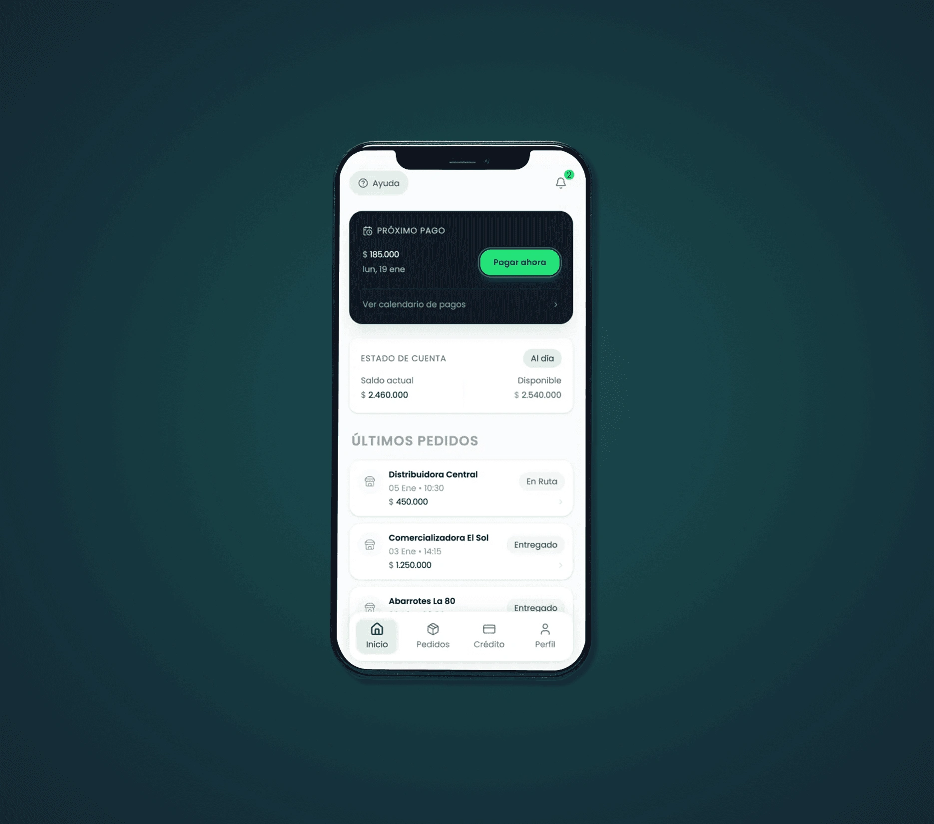
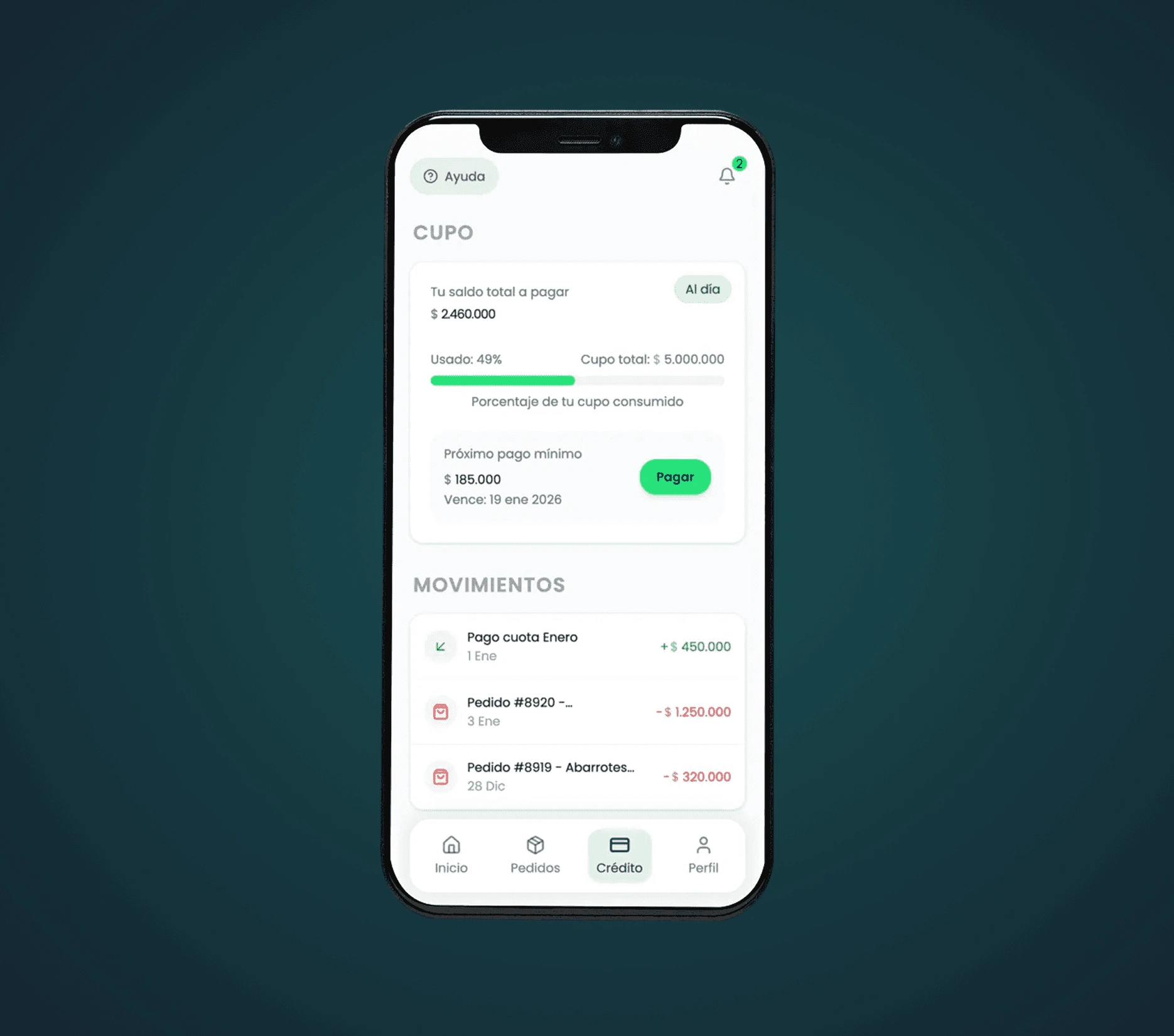
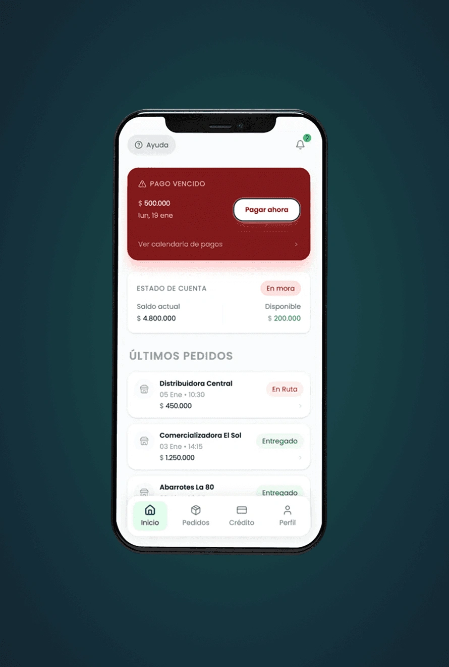
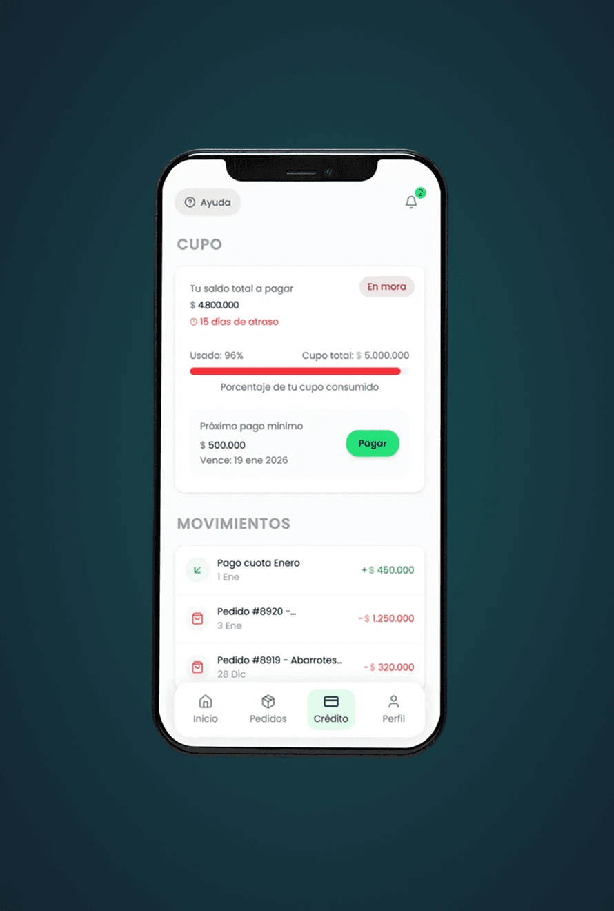
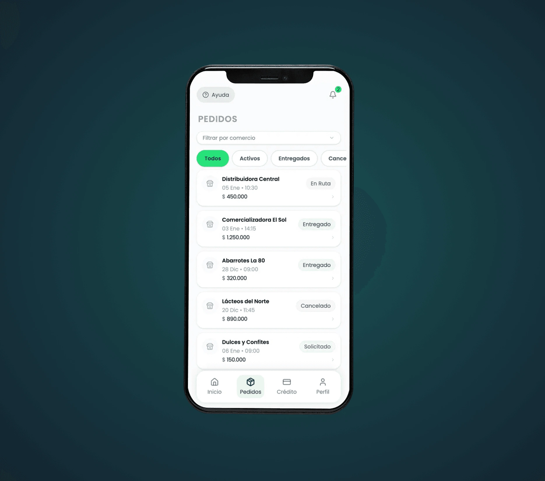
Core challenge: How do we design a mobile app that enables self-service without overwhelming users who are not comfortable reading complex interfaces or navigating dense digital products?
Design Goals
The primary goal of this MVP was not feature richness, but clarity and usability.
Key design principles:
Extreme simplicity over density
One primary call to action per screen
Clear visual hierarchy with minimal text
Redundant communication (icon + color + label)
Large tap targets and strong contrast
Progressive disclosure of information
Designed for low-end devices and real-world conditions
The app needed to feel intuitive even for users who had never used a financial app before.
Users & Accessibility Constraints
The app was explicitly designed for users with low literacy, older adults (50–60+), users unfamiliar with digital banking concepts, and users who often rely on others to "explain" apps to them.
This directly influenced typography size and weight, color contrast and status signaling, CTA placement and prominence, reduction of financial jargon, and avoidance of hidden or secondary actions.
Accessibility and usability were treated as first-class design constraints, not as an afterthought.
Process
Understanding real usage behaviour
Users want clear next-steps rather than deep financial breakdowns. They look for immediate cues (visuals, confirmations) rather than text explanations. Design therefore prioritises action clarity over exhaustive information.
Defining a minimal, action-driven flow
Core tasks: check credit status, review recent orders, re-order or pay. Every screen was assessed by asking: "Is it obvious what the user should do here?" This kept the experience lean and focused on essential actions.
Component-first UI design
Built on an Ant Design foundation customised for Zíro's look and feel. Ensured consistent interaction patterns, predictable behaviours, and faster iteration. Typography, colours and spacing were tuned for accessibility and clarity.
AI-assisted prototyping & build
Used AI tools to prototype interactive components quickly, not just static mock-ups. Early testing focused on hierarchy, spacing and call-to-action clarity rather than pixel-perfect visuals. This sped up validation of real-world usability in an MVP context.
Key Design Decisions
Removed unnecessary navigation elements to reduce cognitive load
Emphasized primary CTAs using color, size, and placement
Standardized status communication using color + text (never color alone)
Prioritized readability over brand expressiveness when needed
Designed screens to work even if users only glance at them briefly
Outcomes
Demonstrated a mobile app tailored for low-readiness and older users
Showcased strong usability and accessibility decision-making
Validated a component-driven, system-aware approach and AI-accelerated prototyping
Provided a realistic fintech MVP built under real-world constraints
Illustrated how inclusive design, system thinking and modern prototyping can coexist in a production-oriented product
Like this project
Posted Mar 3, 2026
Designed a user-friendly credit app for low-readiness users.
Likes
0
Views
3