SecuRE Properties

Ken Shew


Project Overview
SecuRE Properties, a leading investment platform specializing in single-tenant commercial properties, sought to elevate its brand identity to reflect its sophisticated, institutional approach and commitment to growth. The rebranding initiative, developed in collaboration with Hayden Commans, aimed to create a visually compelling and emotionally resonant brand that would differentiate SecuRE Properties in the competitive real estate market.
Challenge
The primary challenge was to develop a brand identity that conveyed trust, sophistication, and versatility while avoiding the clichés often associated with the real estate industry. The new brand needed to resonate with a diverse audience, including investors, partners, and tenants, while maintaining a sense of professionalism and credibility.
Solution
The journey to revitalize SecuRE Properties' brand began with a deep dive into the company's core. Through extensive discussions with the leadership team, I gained a clear understanding of their vision for the future, the values that drive them, and the unique attributes that set them apart in the competitive landscape of commercial real estate investment.
Armed with this knowledge, I developed a comprehensive brand strategy that emphasized SecuRE Properties' unwavering commitment to providing secure, stable, and lucrative investment opportunities in single-tenant commercial properties. This strategy formed the foundation for a visual identity that would resonate with a diverse audience, including seasoned investors seeking reliable returns, potential partners looking for trustworthy collaborators, and discerning tenants in search of premium commercial spaces.
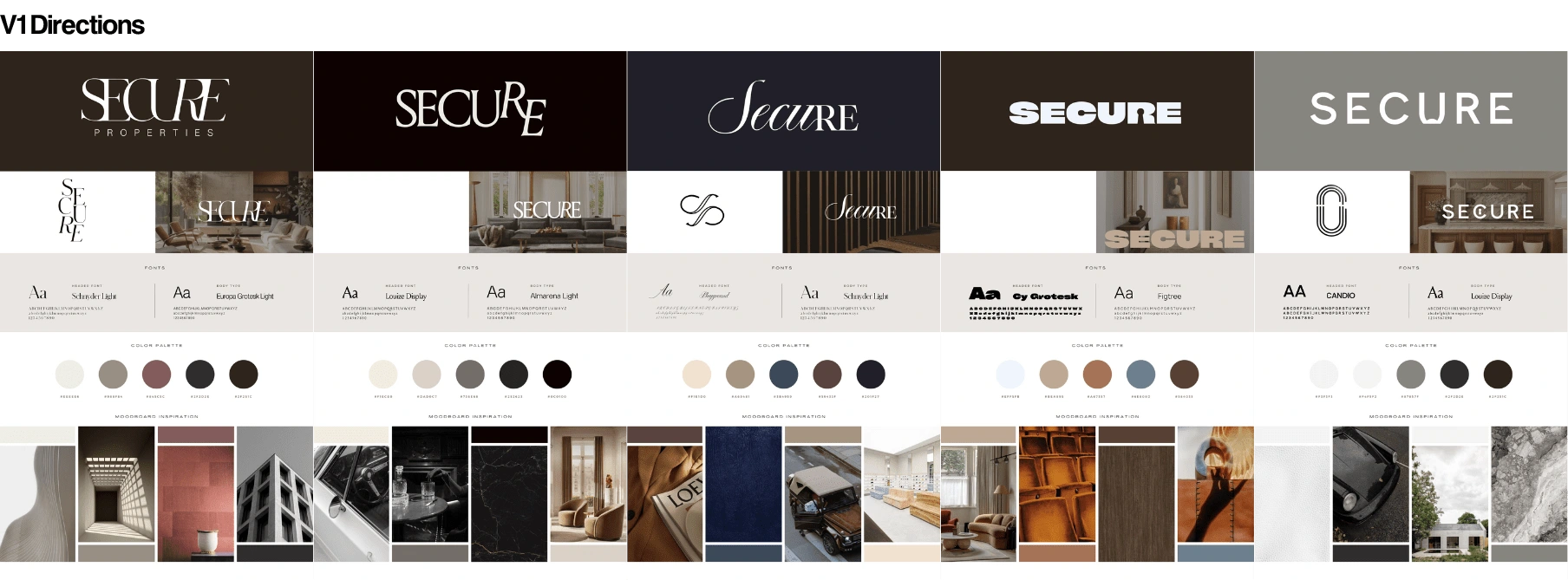
The design process was an iterative journey of exploration and refinement. I experimented with various concepts, carefully considering the balance between established industry conventions and the need for a fresh, modern aesthetic that would capture attention and inspire confidence. Through meticulous attention to detail, I honed the visual elements, ensuring that each component – from the stylized "S" in the logo to the curated color palette and typography choices – conveyed the brand's core values of trust, sophistication, and growth.
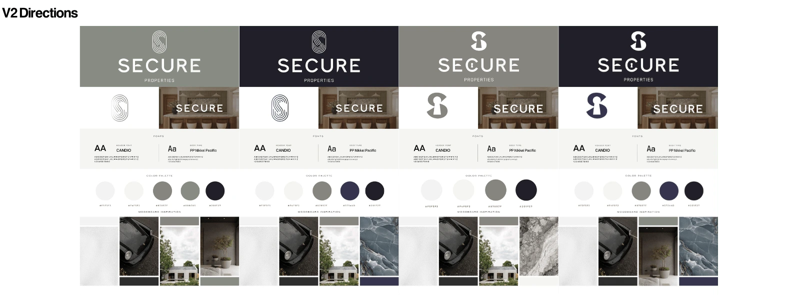
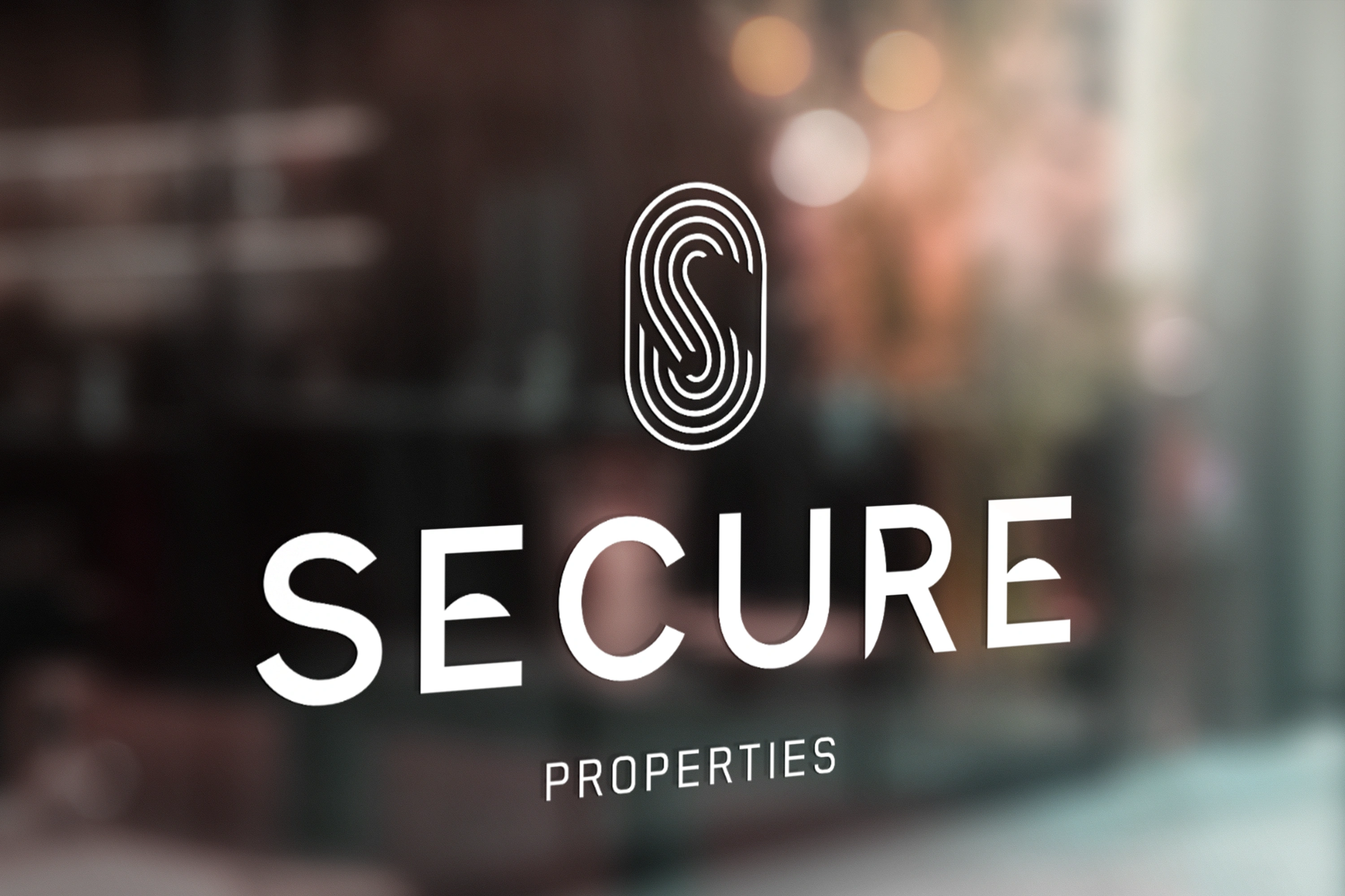
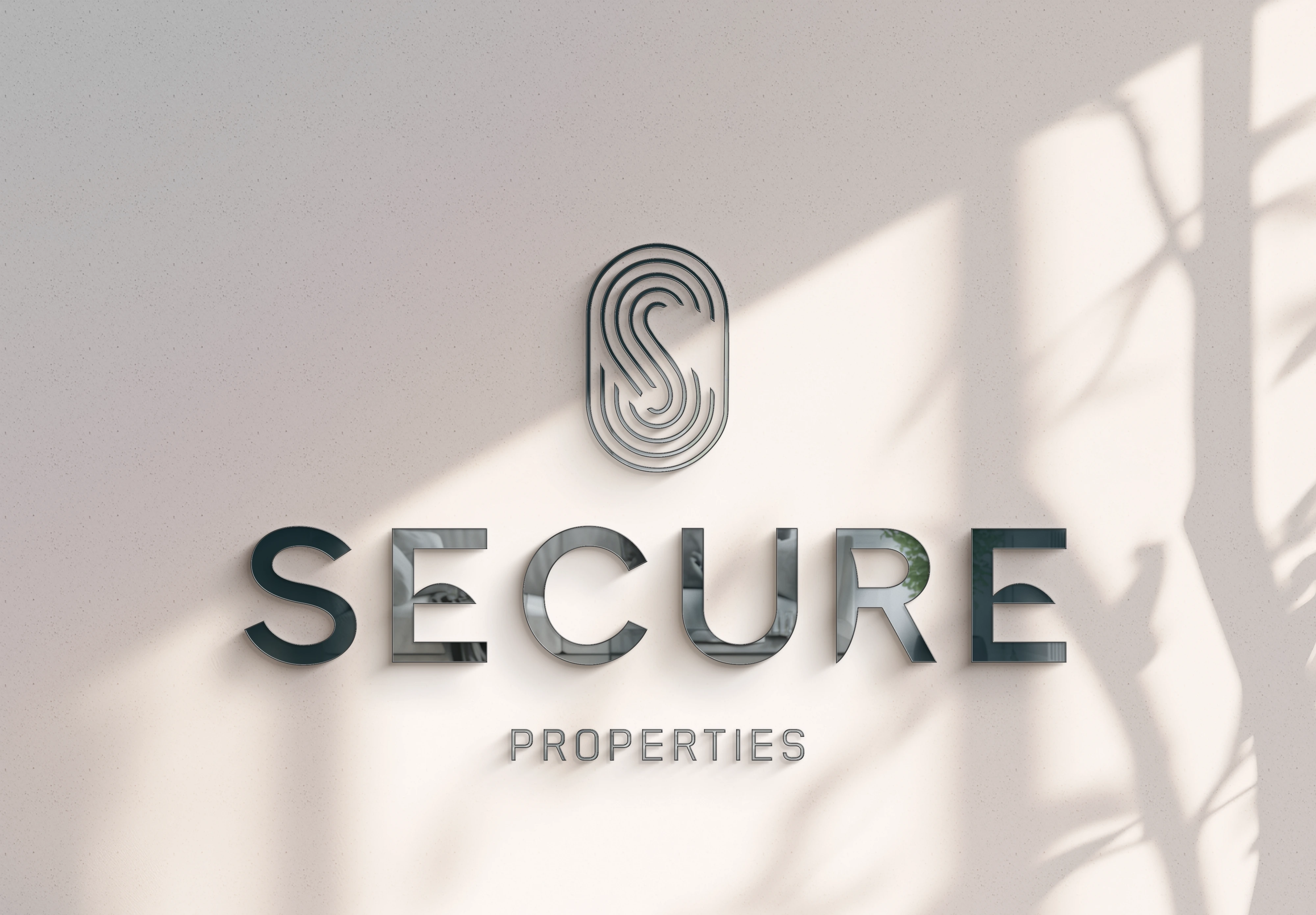
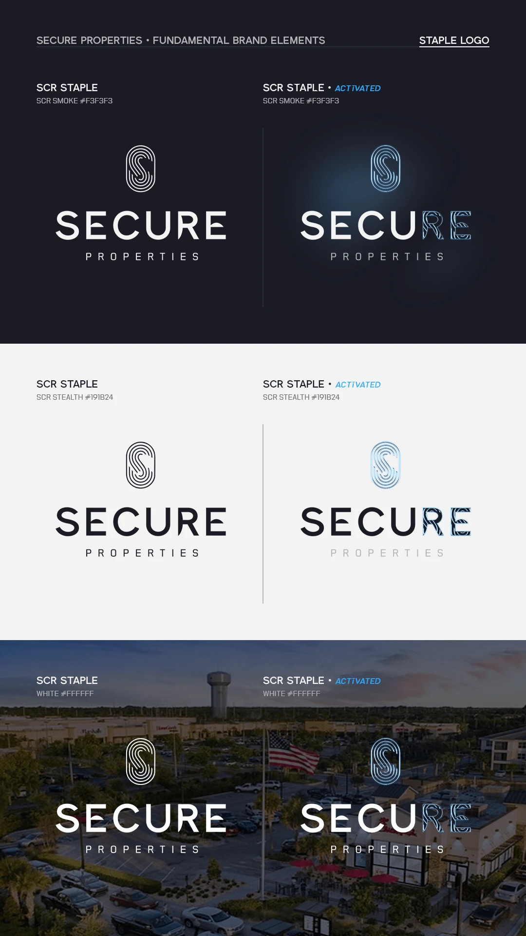
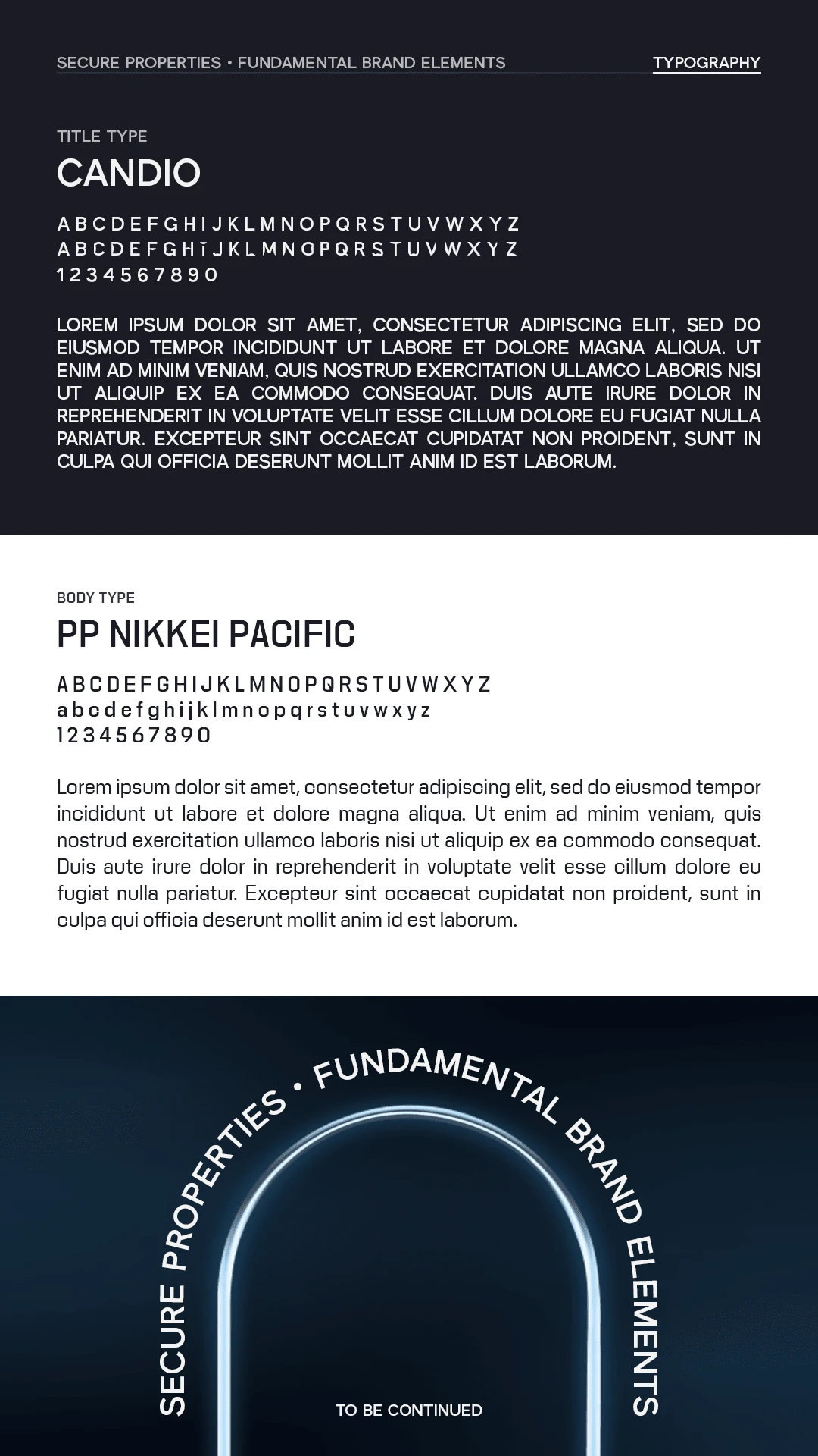
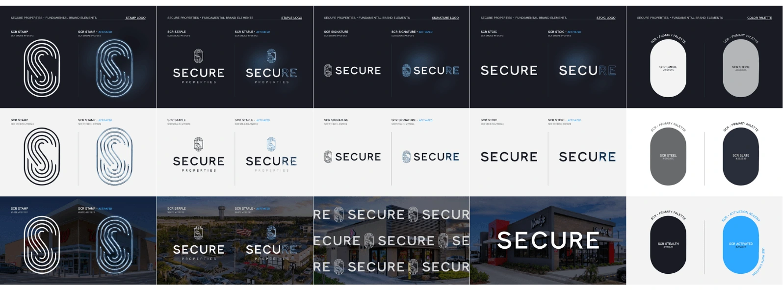
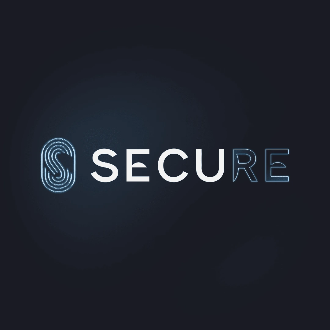
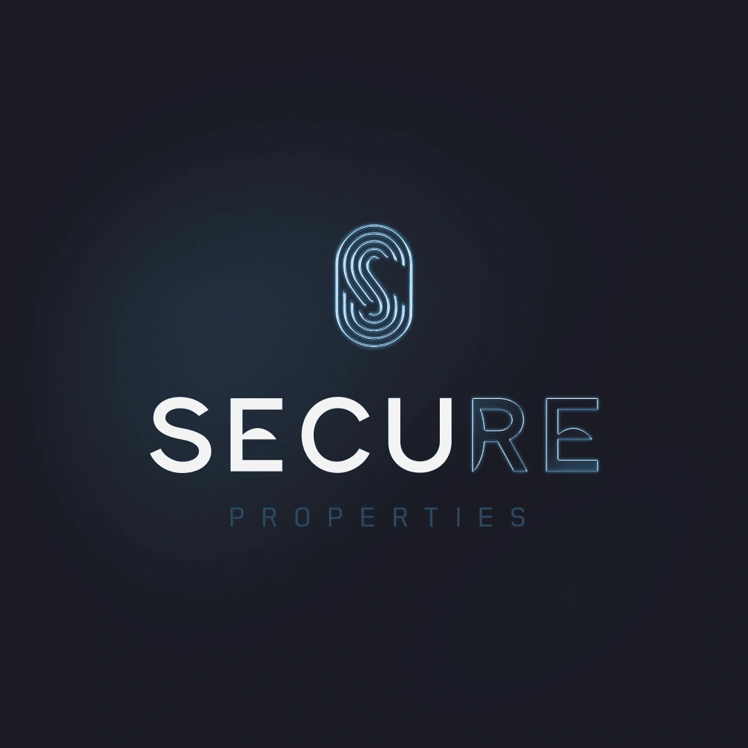
The result is a cohesive brand identity that seamlessly blends classic elegance with contemporary sensibilities. The minimalist logo, featuring a subtly curved "S" reminiscent of a fingerprint or modern security element, symbolizes SecuRE Properties' dedication to safeguarding investments and fostering a sense of security for all stakeholders. The muted color palette, consisting of smoke, stone, steel, slate, and stealth, exudes a sense of understated sophistication and timeless reliability. The typography, a harmonious blend of the modern sans-serif CANDIO and the elegant serif PP Nikkei Pacific, strikes a balance between approachability and refinement, reflecting the brand's commitment to both innovation and tradition.
Design Process
The design process was a collaborative journey of exploration and refinement. Initial concepts ranged from classic elegance to modern streetwear, reflecting the diverse tastes of SecuRE Properties' target audience. After presenting a curated selection of these concepts to the client, we collectively identified a direction that emphasized simplicity, sophistication, and a modern aesthetic.
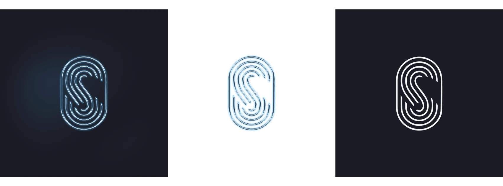
During the refinement phase, the client initially expressed interest in incorporating traditional security symbols like locks or keys. However, recognizing the potential for cliché imagery, I proposed a more contemporary approach. Inspired by the inherent security connotations of the letter "S" itself, as well as modern biometric technologies like fingerprint scanning, I experimented with incorporating subtle line details that evoke the impression of a fingerprint or "Touch ID" icon. This innovative approach allowed me to maintain the integrity of the "S" while infusing it with a sense of modern security, aligning perfectly with SecuRE Properties' forward-thinking ethos.
This collaborative approach, combined with a willingness to push creative boundaries while respecting the client's vision, resulted in a final logo design that is both distinctive and highly relevant to the brand's core values. The sleek, minimalist design not only captures the essence of security but also positions SecuRE Properties as a modern, innovative leader in the commercial real estate investment landscape.
Final Design
The final design elements include:
Colors
Primary:
Smoke: #F3F3F3
Stone: #B4B6B8
Steel: #686A6C
Slate: #292E39
Stealth: #191B24
Secondary:
Activated: #2FA9FF
Styles
Logo:
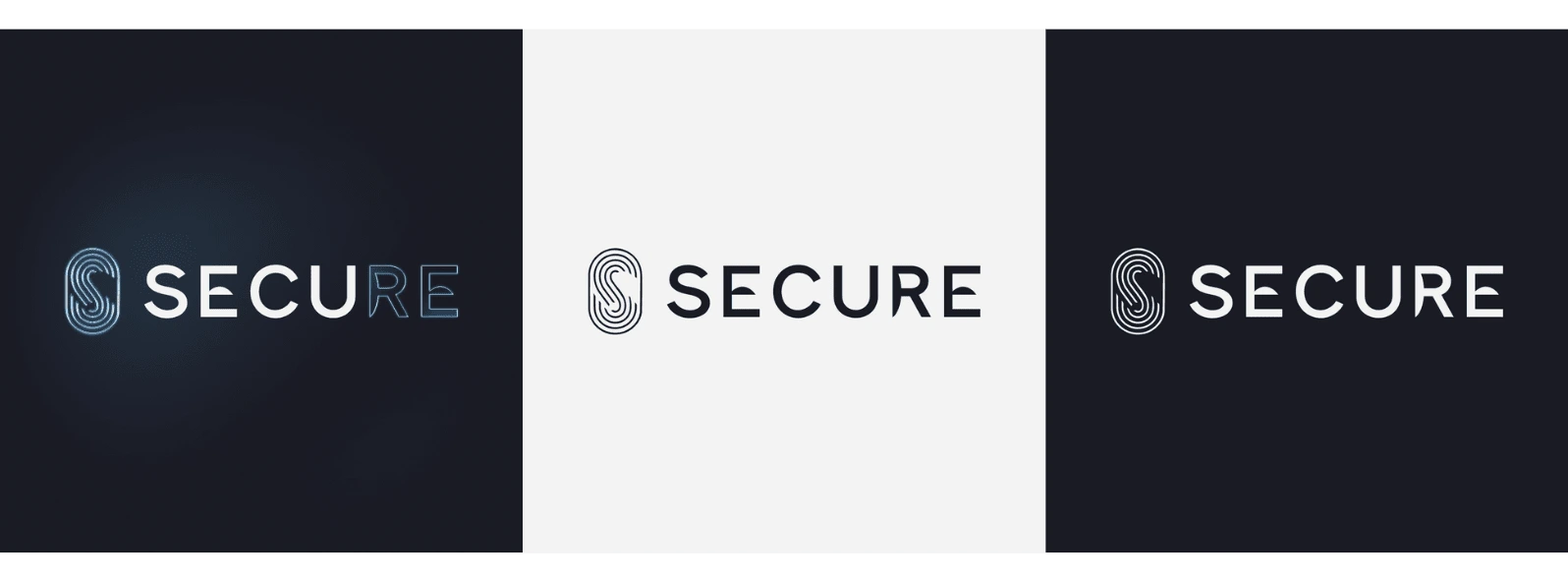
The logo is a wordmark, featuring the company name "SecuRE" in a custom-designed typeface.
The "S" is stylized with a subtle upward curve, suggesting growth and stability, resembling that of a fingerprint or modern security element.
The typeface is a modern sans-serif with clean lines and geometric shapes.
The logo is versatile and can be used in various sizes and applications.
Typography
The primary typeface for headlines and body copy is CANDIO, a modern sans-serif font that complements the logo.
A secondary serif font, PP Nikkei Pacific, is used for accentuating specific text elements, adding a touch of elegance and sophistication.
Overall Aesthetic
The overall aesthetic is one of understated elegance and modern professionalism. The clean lines, minimalist approach, and carefully selected color palette create a visual identity that exudes confidence and trustworthiness.

Conclusion
The final branding for SecuRE Properties successfully embodies the company’s values of trust, sophistication, and versatility. The modern and minimalist design, combined with a thoughtful use of color and typography, positions SecuRE Properties as a leading, credible player in the commercial real estate market.
Like this project
Posted May 31, 2024
Designed a modern, sophisticated & innovative brand identity for a new brokerage, featuring a unique fingerprint-inspired logo that conveys security and trust.


HYOU | Brand Design
Twin Coves | New Development Branding
Album Covers & Single Covers
Lime Orchard | Property Branding + Website