Built with Framer
Twin Coves | New Development Branding
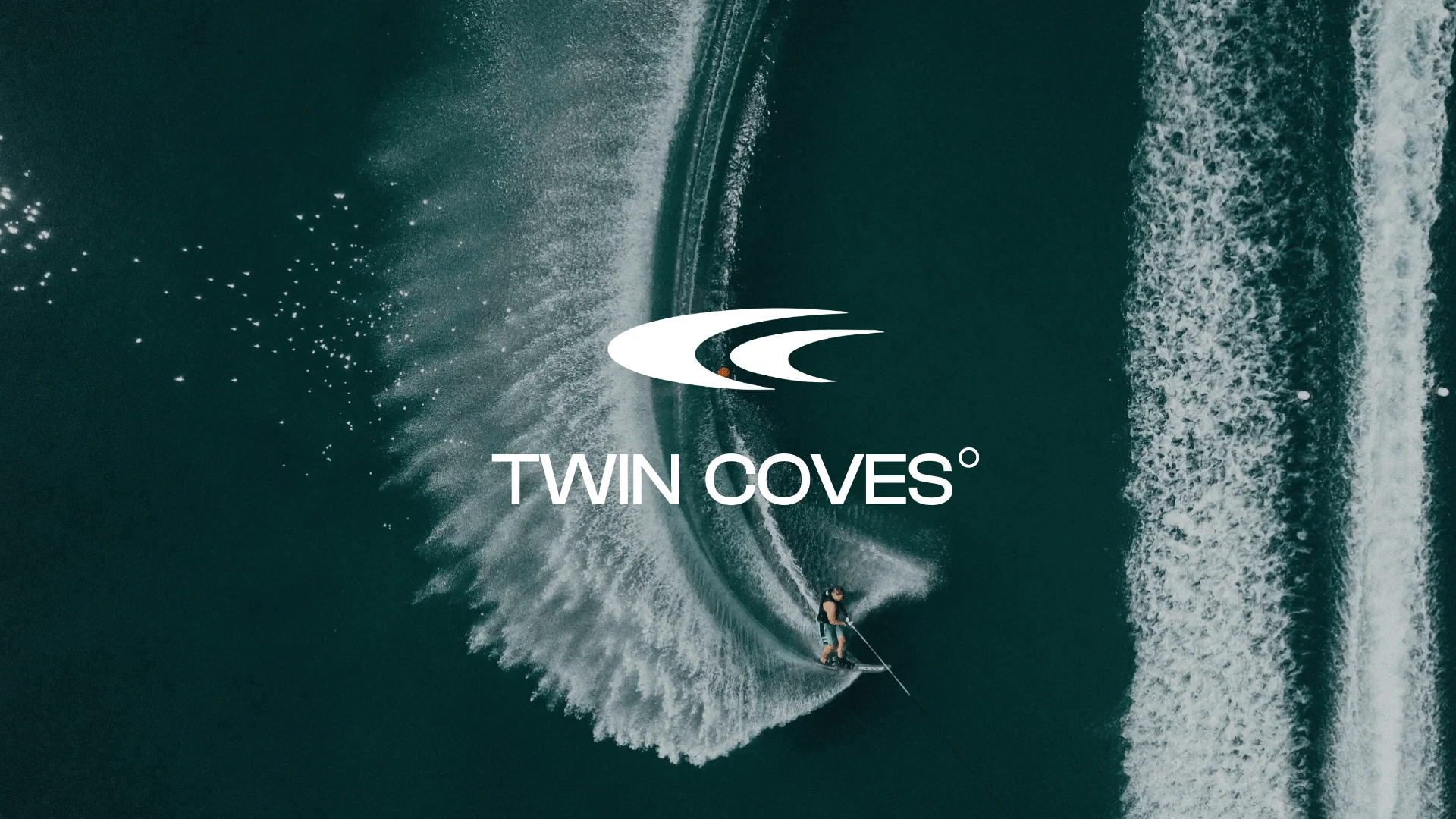
Twin Coves: Lakeside Living Reimagined
Nestled amidst the rolling hills of Northwest Arkansas and sparkling waters of Beaver Lake, Twin Coves emerges as a visionary lakeside community. Envisioned for those seeking a modern haven intertwined with nature's beauty, this development offers 20 thoughtfully designed homes overlooking the pristine waters. As one of the creative directors and brand designer, we embarked on a journey to capture the essence of this unique project, crafting a visual identity that reflected its clean aesthetic, embrace of lakeside sports, and strong family-oriented values.
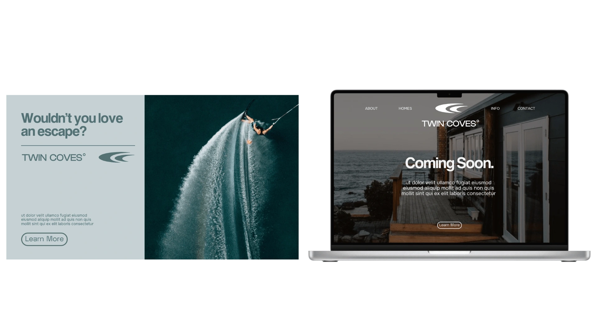
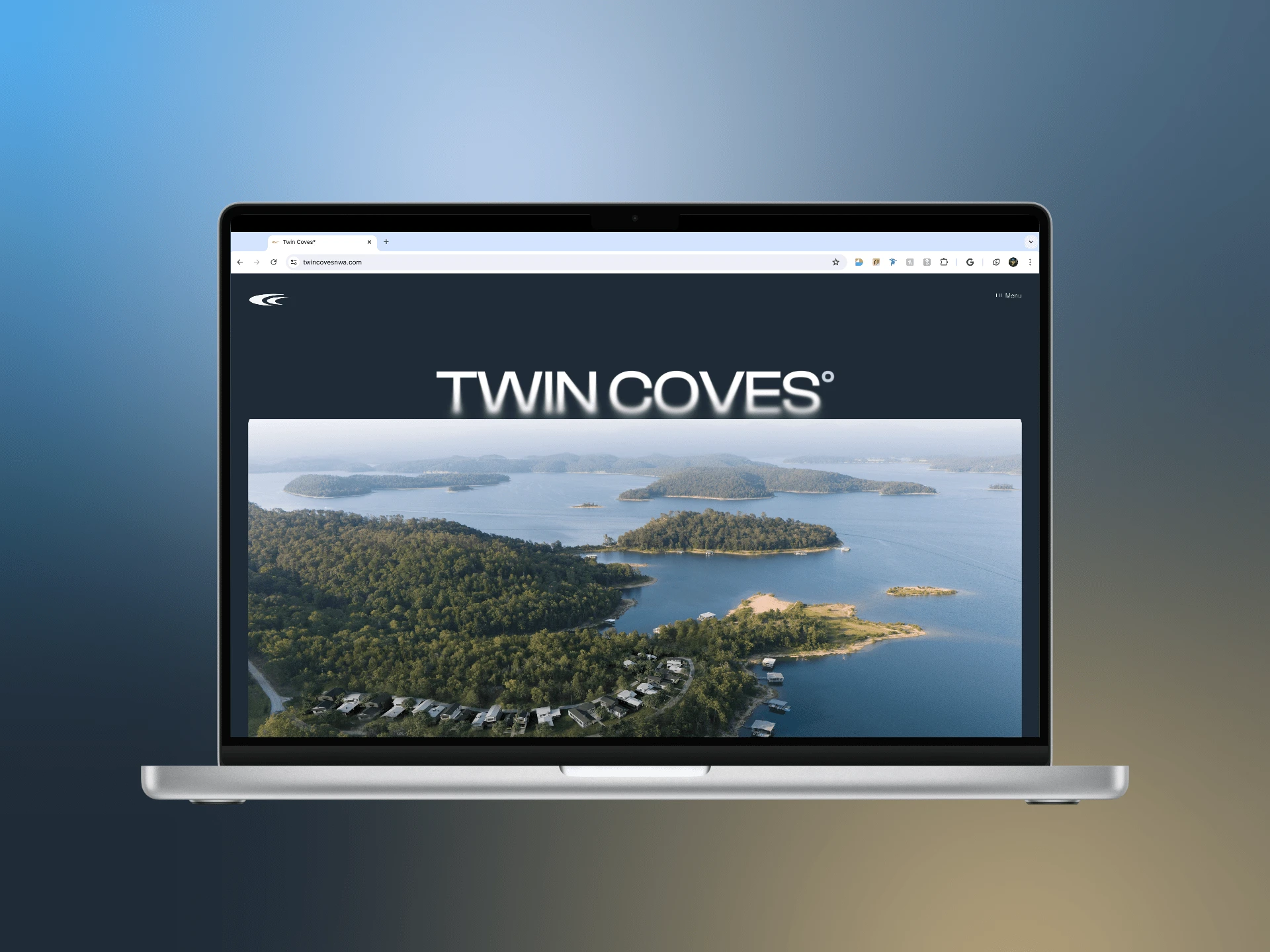
Immersive experience: The website mockup utilizes high-resolution photography and captivating videos to immerse viewers in the Twin Coves lifestyle. The clean, modern layout paired with a clear, easy-to-navigate structure mirrors the homes' design philosophy.
Font synergy: The chosen font family exudes a sense of sophistication and approachability, aligning perfectly with the target audience and the project's overall values. The subtle variations in weight and style add visual interest and hierarchy to the information presented.
Color palette coherence: Inspired by the natural beauty of the lakeside setting, the website's color palette incorporates calming blues and earthy greens, reflecting the tranquility and connection to nature that Twin Coves embodies.
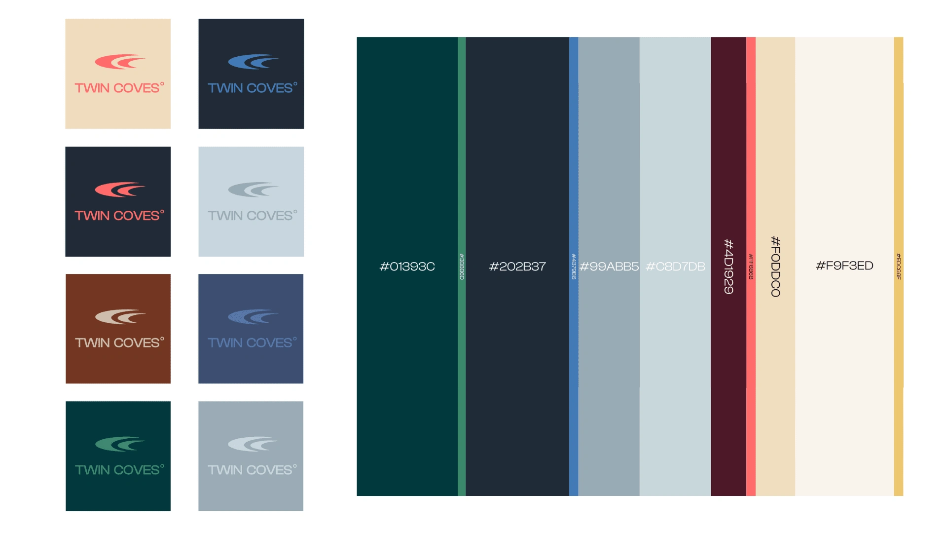
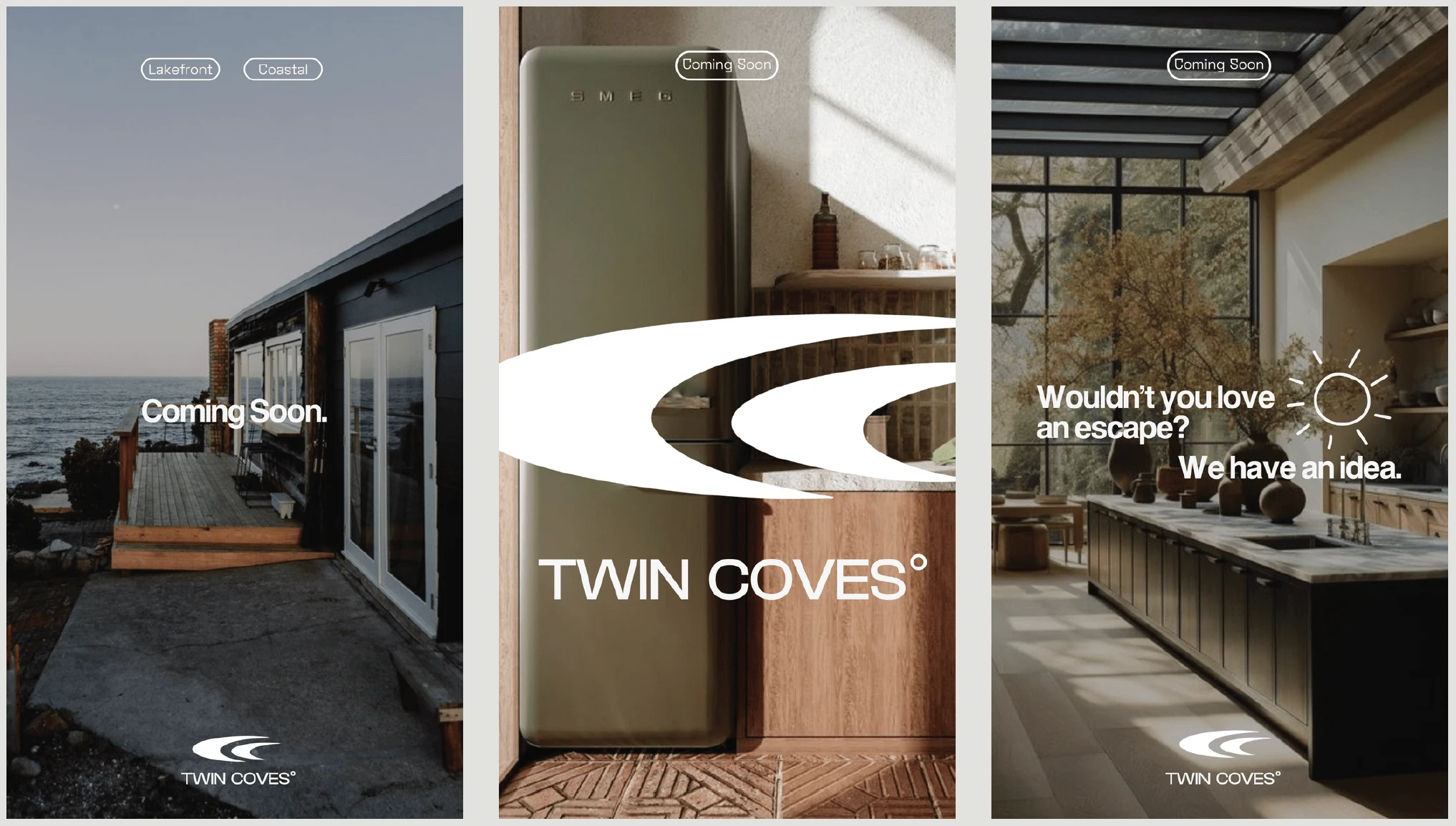
The Twin Coves logo embodies the essence of the project through a minimalist and meaningful design. At its core, the icon features two intertwining curves, symbolizing the embracing coves that define the lakeside community. These curves evoke a sense of serenity and connection to nature, perfectly capturing the peaceful environment.
Further enriching the symbolism, the curves subtly resemble the letter "C," cleverly referencing the project's name. This dual interpretation adds depth and reinforces brand recognition.
Anchoring the icon is the wordmark, set in a clean and modern typeface. Its straightforward presence reflects the contemporary design aesthetic of the Twin Coves homes.
The final touch, a strategically placed degree symbol, elevates the logo to a new level. It serves a dual purpose:
Location: It subtly references the geographic coordinates of the development, subtly hinting at its unique place nestled amidst the beauty of Northwest Arkansas.
Sun: The degree symbol evokes the warmth and sunshine enjoyed by residents, highlighting the outdoor lifestyle and recreational opportunities offered by the lake.
Through this carefully considered design, the Twin Coves logo transcends mere visual representation, transforming into a symbolic expression of the project's core values: nature, modernity, and an active, fulfilling lifestyle. It's a mark that leaves a lasting impression, inviting you to discover the perfect blend of tranquility and adventure that awaits at Twin Coves.
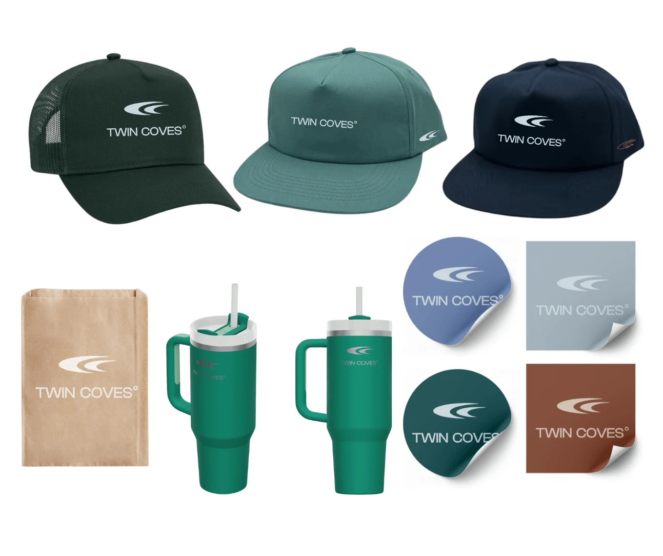
The Twin Coves brand extended beyond the digital realm, weaving itself into the everyday lives of the community. From hats and tumblers to stickers and paper bags, the logo proudly adorned everyday essentials, fostering a sense of belonging and shared identity. Each item wasn't just merchandise; it was a tangible reminder of the lakefront haven awaiting them.
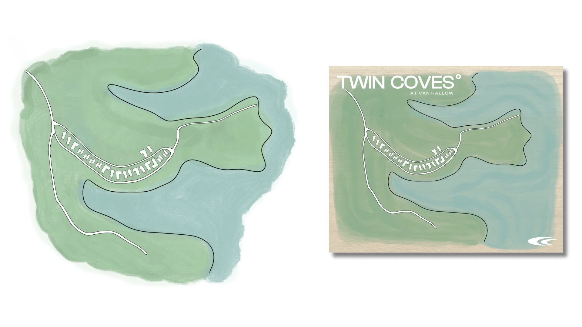
The hand-drawn site plan on reclaimed wood, presented to early adopters who reserved their homes and attended discovery meetings. This unique piece went beyond mere functionality, transforming into a cherished keepsake. Its rustic charm mirrored the natural beauty of the surroundings, while the hand-drawn details added a personal touch, making each piece truly one-of-a-kind. It served as a constant reminder of their decision, fueling their excitement for the future they were building at Twin Coves.
This diverse range of merchandise wasn't simply about branding; it was about creating a connection, fostering a sense of community, and allowing residents to proudly represent their chosen lifestyle. With every hat worn, every cup filled, and every sticker proudly displayed, the Twin Coves spirit came alive, transcending the project and becoming a part of their everyday lives.
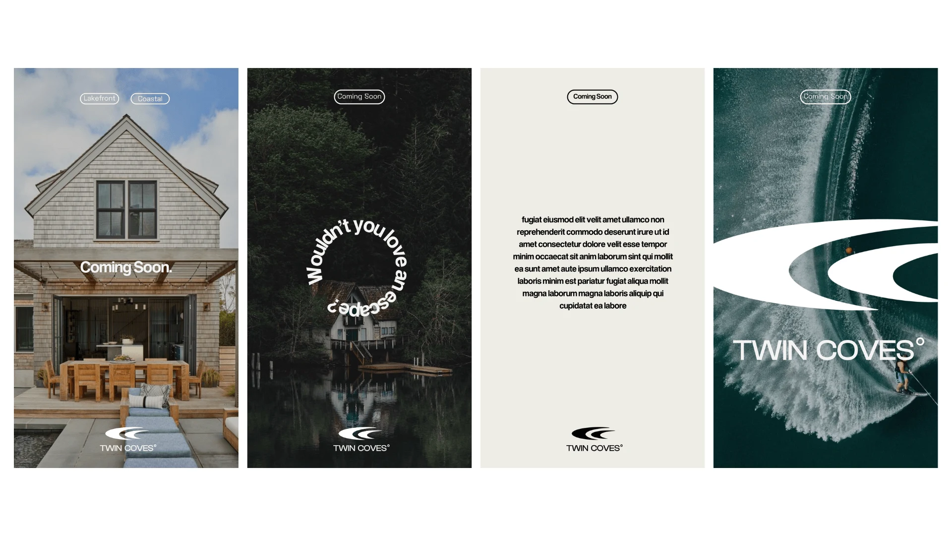
Twin Coves stands as a testament to the power of collaborative vision and design excellence. The project successfully translates a modern lakeside haven into a reality, offering residents an unparalleled blend of nature, luxury, and community spirit. From the carefully crafted logo to the thoughtfully designed merchandise, every element embodies the core values of Twin Coves, fostering a sense of belonging and connection.
Are you embarking on a branding or design project that seeks to capture a unique essence and connect with your target audience? Let's discuss how my creative direction and strategic design thinking can bring your vision to life. Contact me today to explore the possibilities.
Like this project
Posted Feb 5, 2024
From logo to launch, crafted this modern lakeside community's brand: visuals, merch, web, socials, creative strategy! Let's build yours.
Likes
13
Views
147
Clients
Martin Building Group
