Album Covers & Single Covers
Ken Shew
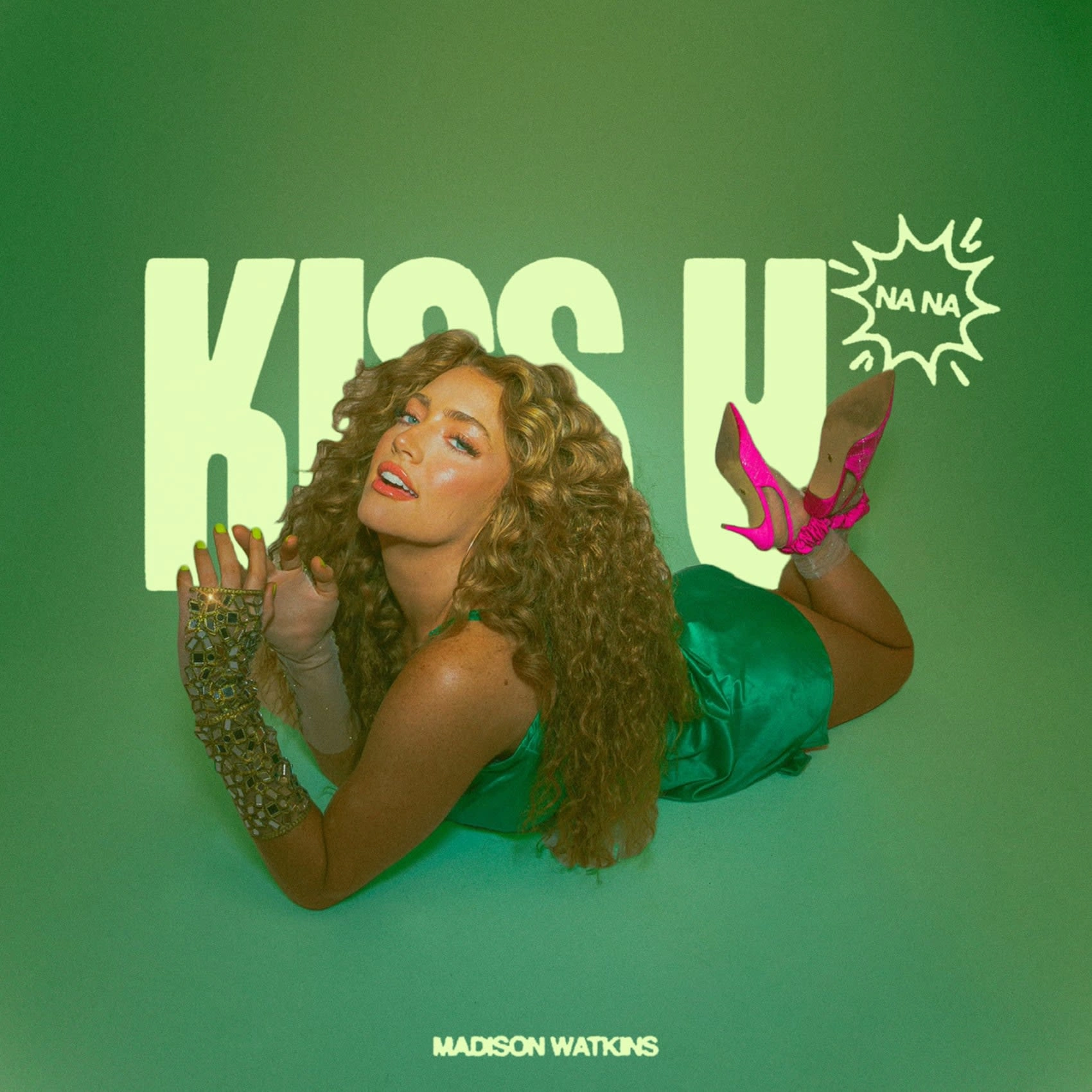
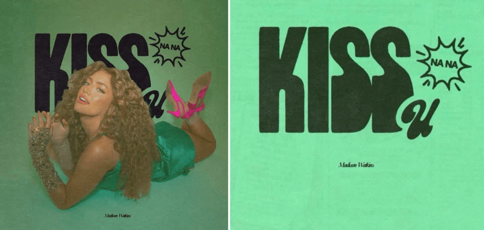
'Kiss U' Single Cover
This cover's motivation was to blend contemporary design features with vintage aesthetics, imagery, and vivid hues.
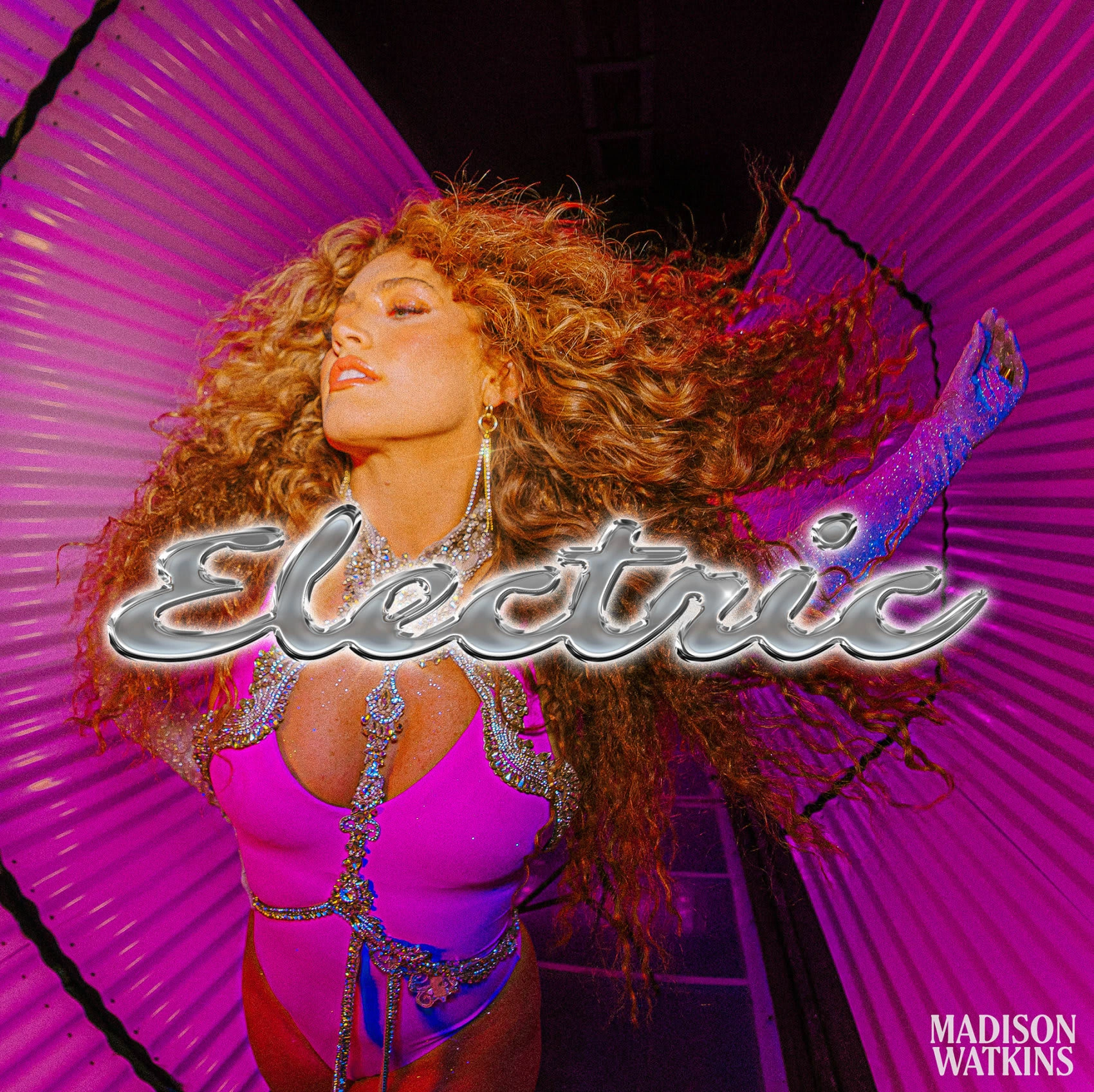
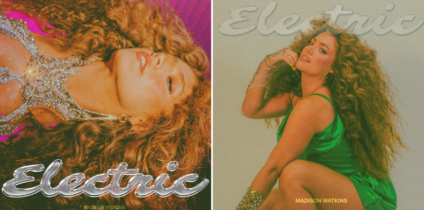
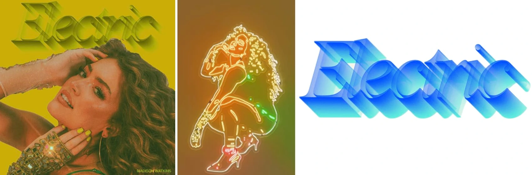
'Electric' Album Cover
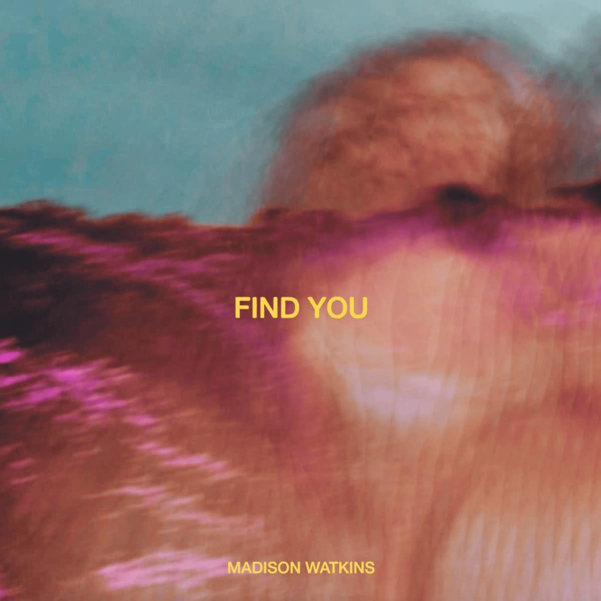
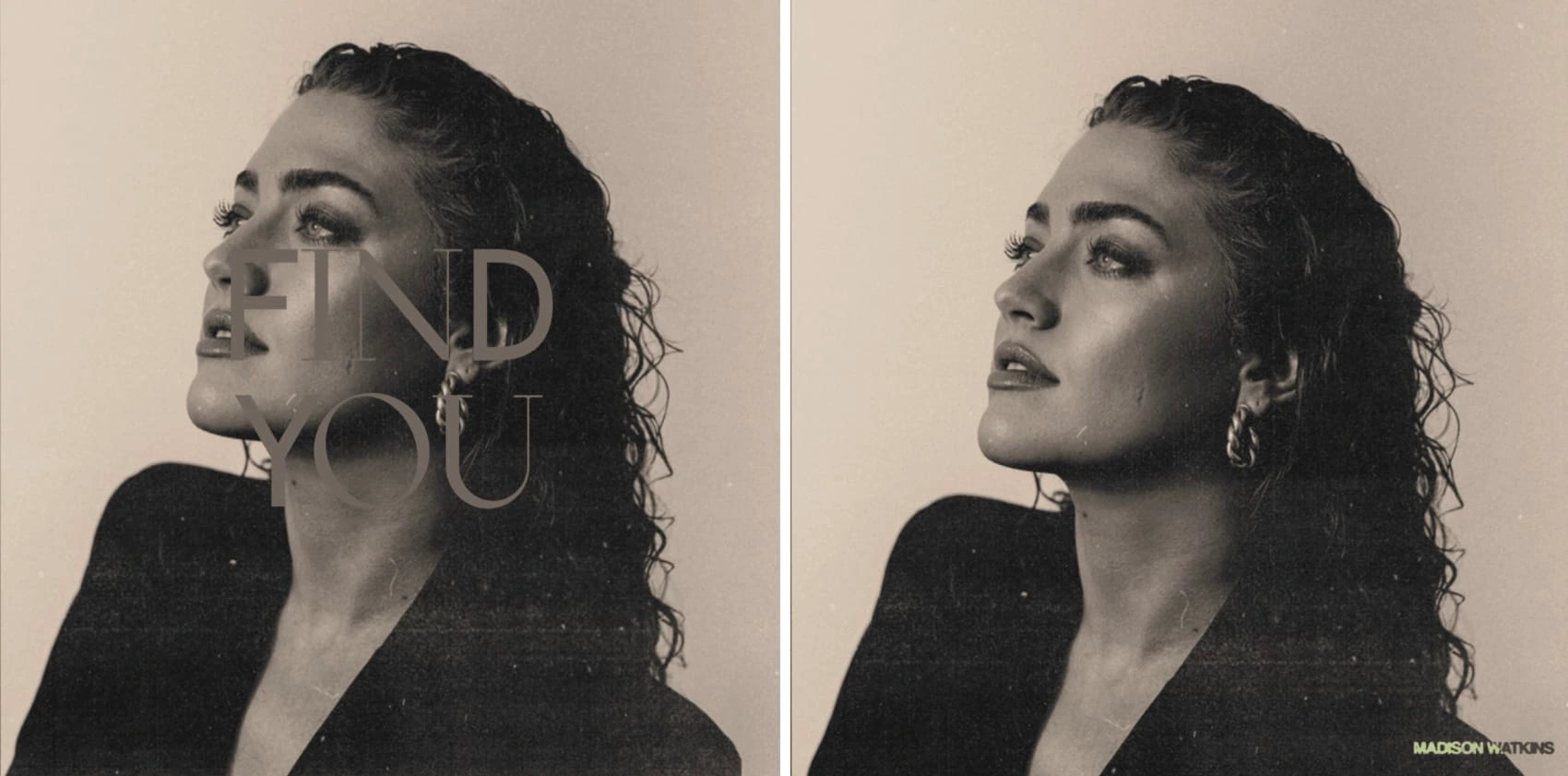
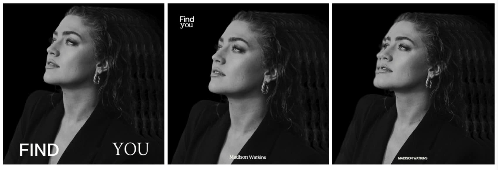
'Find You' Single Cover
Take a look at the album cover art I created for the talented singer/songwriter Madison Watkins, reflecting the spirit of her single, 'Find You.' I'm excited to share not only the final version but also the other design concepts I explored along the way. With carefully chosen elements, this presentation highlights my artistic approach, inviting both fans and professionals to appreciate the creative process.
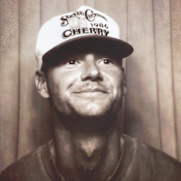
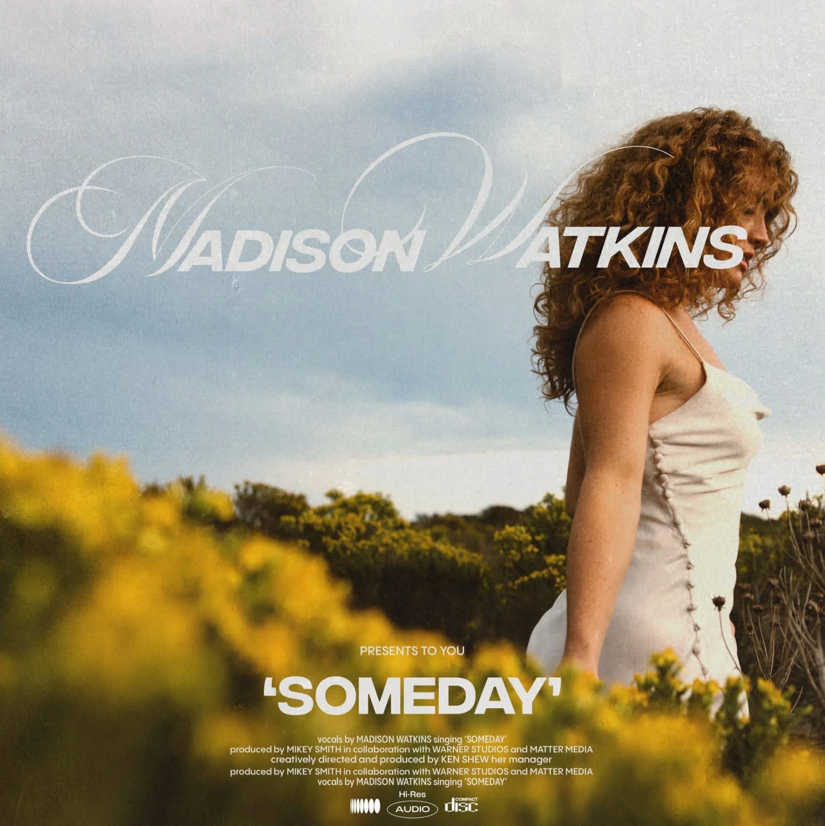
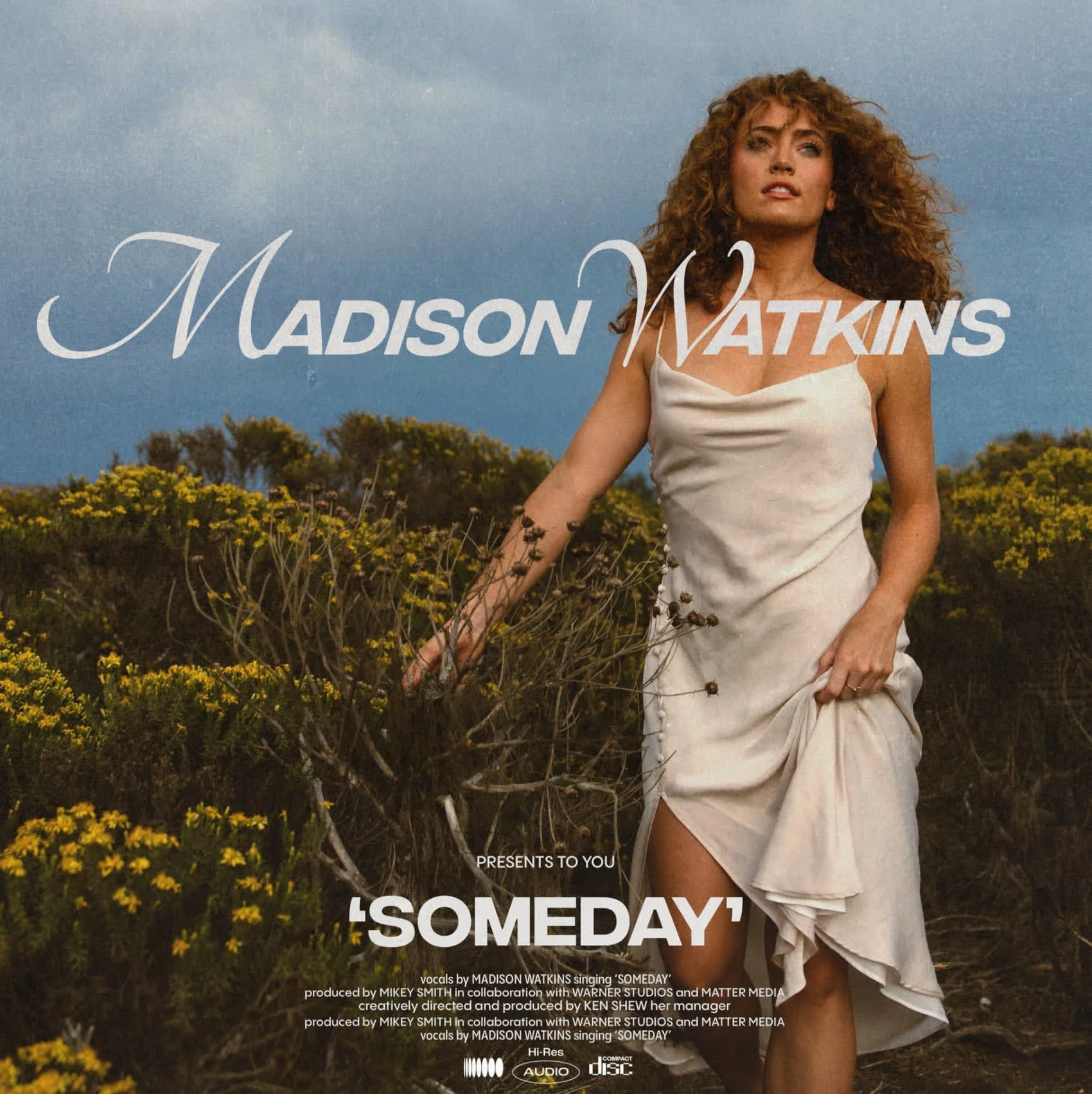
'Someday' Single Cover
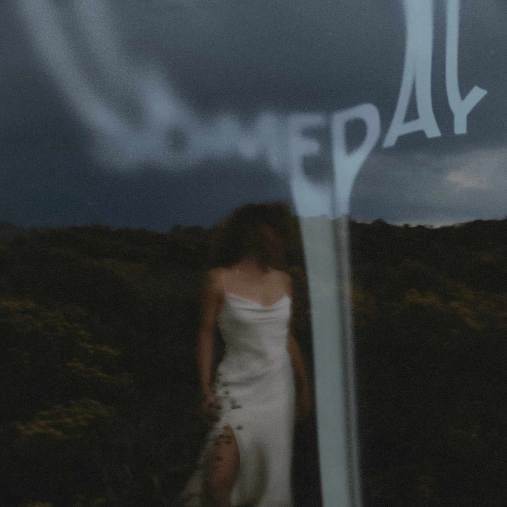
'What Day Is It?' Single Cover
For the album artwork cover for "What Day Is It?", I was inspired by some brilliant pastel-infused creations pulling from thick brush stroke acrylic paint, and abstract ocean scenes that reminded me of the artist, Olson. This captivating piece explores the different reasons behind the seemingly innocuous question, "What day is it?" Delving into the realms of euphoria and being happy in life, the grind of the music industry or burnout at work, and the hazy world of being lost in partying, these directions are a vivid representation of the complex emotions and experiences that can make us lose track of time.
In this project, I captured the complexities of time perception through creative direction and graphic design for Olson's album cover, "What Day Is It?".
Skills Used:
Creative Direction: Guided the conceptualization and execution of three distinct artistic directions—"The Joy," "The Grind," and "The Party"—each exploring a different theme related to the passage of time. The typography was thoughtfully shaped to resemble the sun, adding a unique layer of depth to the design.
Graphic Design: Utilized pastel hues, bold strokes, and abstract techniques to evoke distinct emotional states and experiences, creating an oil painted image that resembles an ocean at sunset.
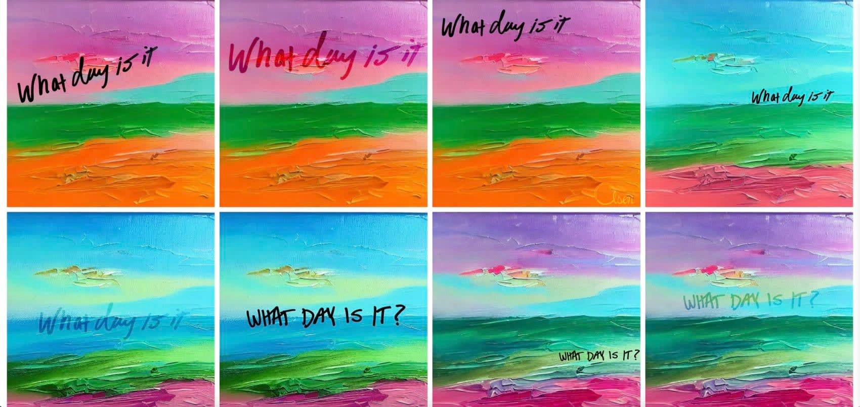
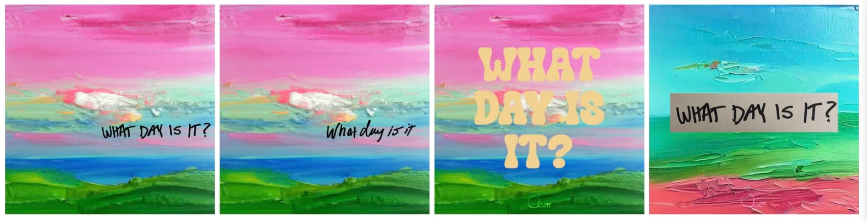
"The Joy": Produced artwork encapsulating the pure joy and bliss that can make us forget the passing of days, represented by swirling pastel hues and bold strokes. The design was inspired by Olson's consistently upbeat demeanor.
The first direction encapsulates the pure joy and state of bliss that can make us forget the passing of days. Swirling pastel hues roll across the canvas almost like an abstract beach and hillside, representing the transcendent state of euphoria. Soft, light tones evoke a feeling of blissful serenity, while bold strokes capture the energy and exhilaration that lift us above the mundane reality of daily life.
Direction 2: THE GRIND
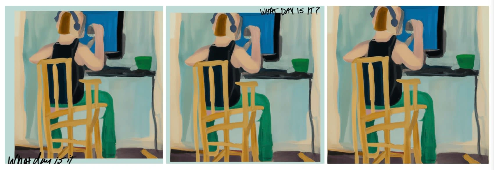
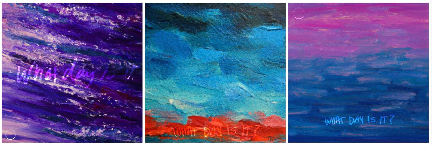
"The Grind": Created artwork reflecting the burnout and relentless grind of the music industry, portrayed through muted strokes and darker pastel shades.
In stark contrast to the first section, the second concept delves into the burnout with creative work, specifically in the relentless grind of the music industry, which can make time blur into an indistinguishable haze. The muted strokes and darker pastel shades in this section convey a sense of determination and struggle, reflecting the emotional and physical exhaustion that comes with pursuing one's dreams. Amidst this chaos, glimpses of lighter tones symbolize the hope and passion that fuels the artist to push forward.
Direction 3: THE PARTY
The final direction explores the hazy, intoxicating world of partying and living life without direction or purpose. The dark, night like colors and blurred lines depict the disorienting and thrilling sensation of losing oneself in the moment. This artwork evokes the the nostalgia of a past memory or the feeling of being in the moment can make us question what we're doing, inviting viewers to immerse themselves in this vibrant world.
Developed artwork exploring the intoxicating world of partying, using dark colors and blurred lines to depict the sensation of losing oneself in the moment.
FINAL RESULT
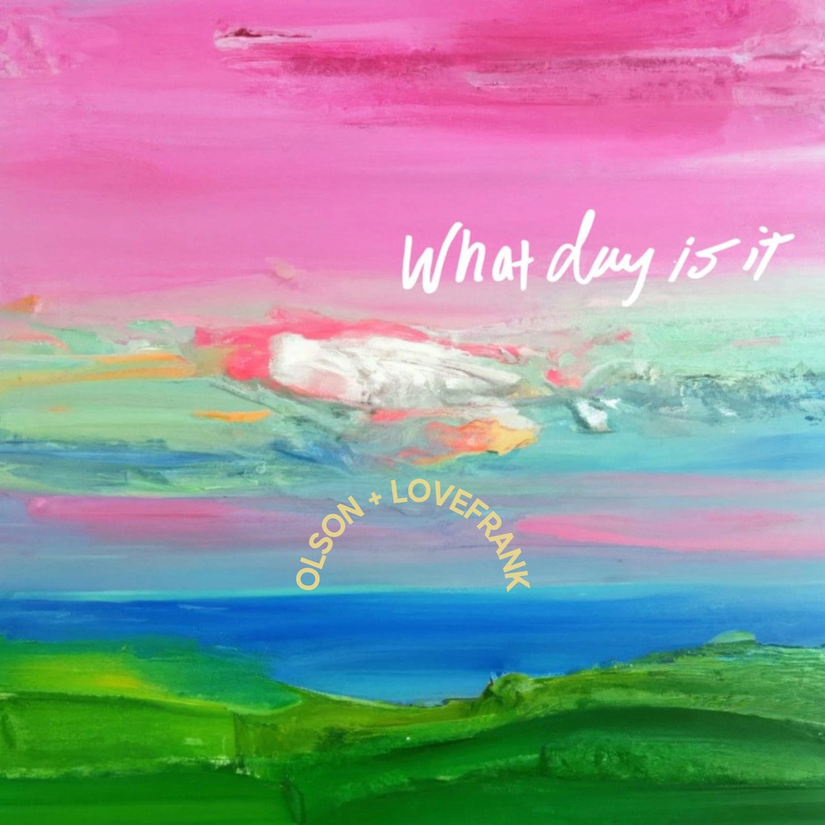
This project involved close collaboration with Olson, who is one of the happiest guys I know, and his positivity was a significant influence on the project's overall creative direction 1 . The final result was utilizing the typography to be shaped as the sun on an obscure oil painting that resembles the ocean at sunset.
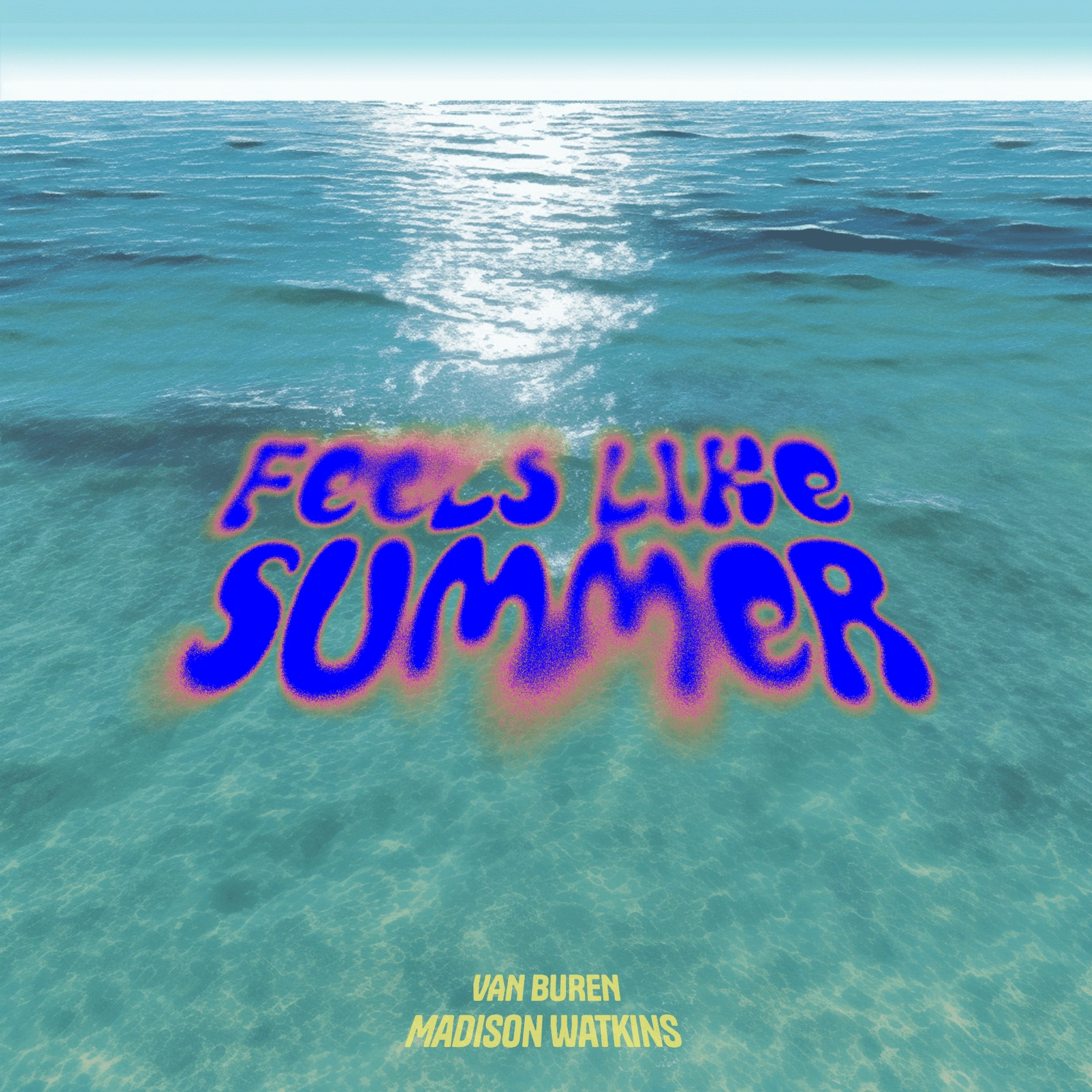
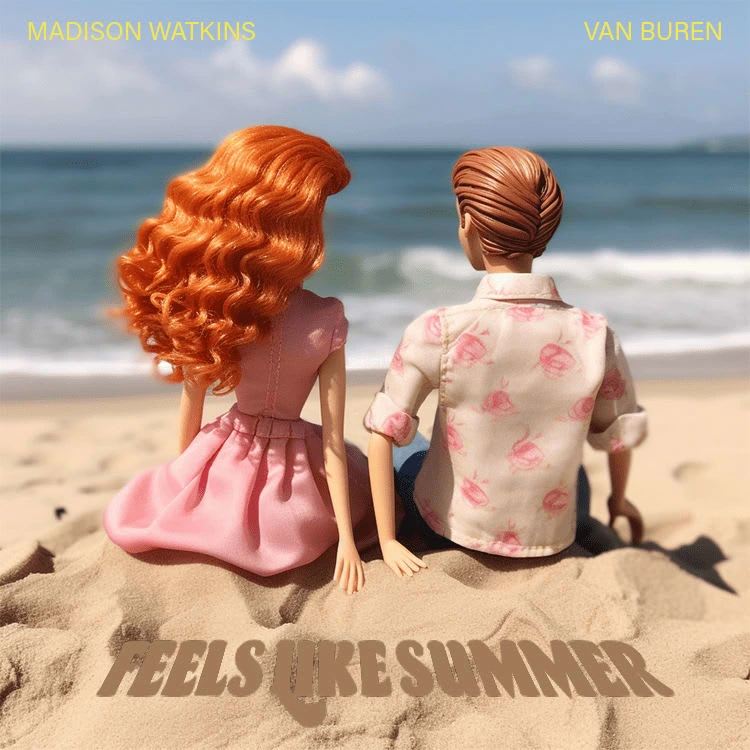
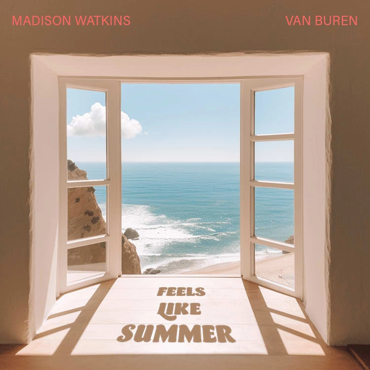
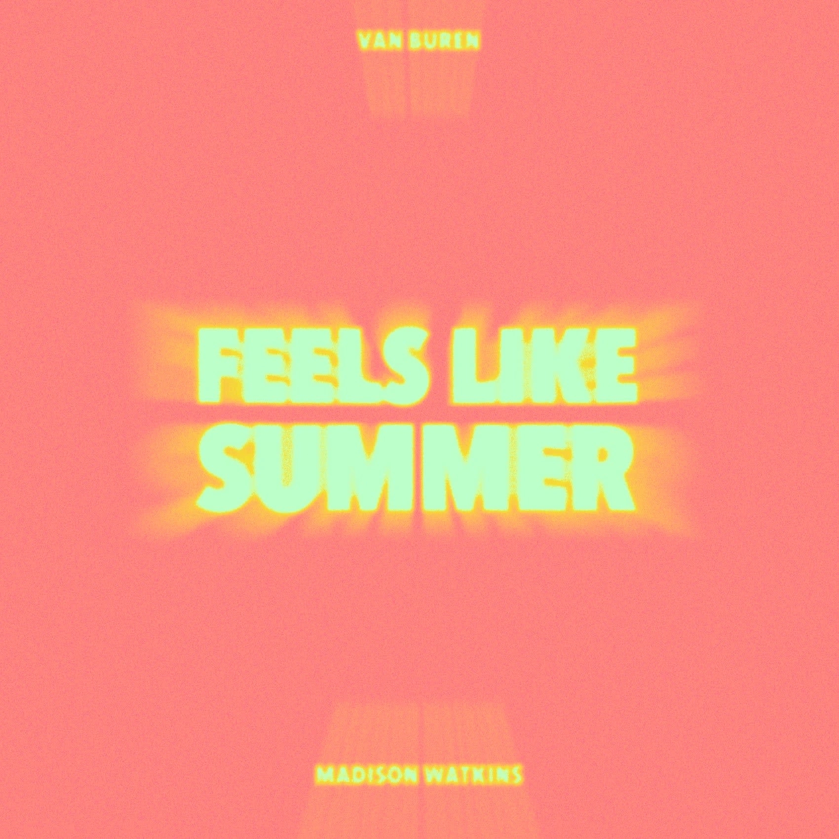
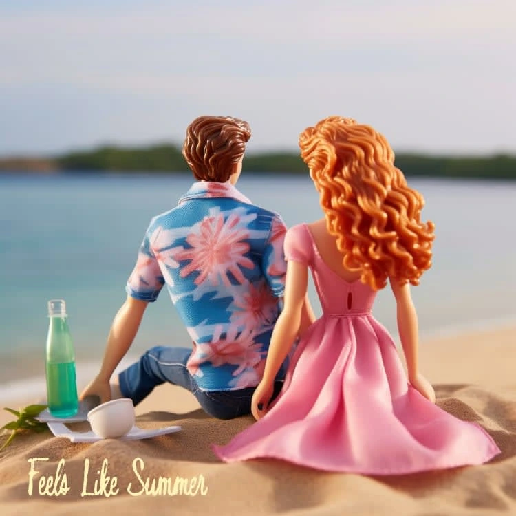
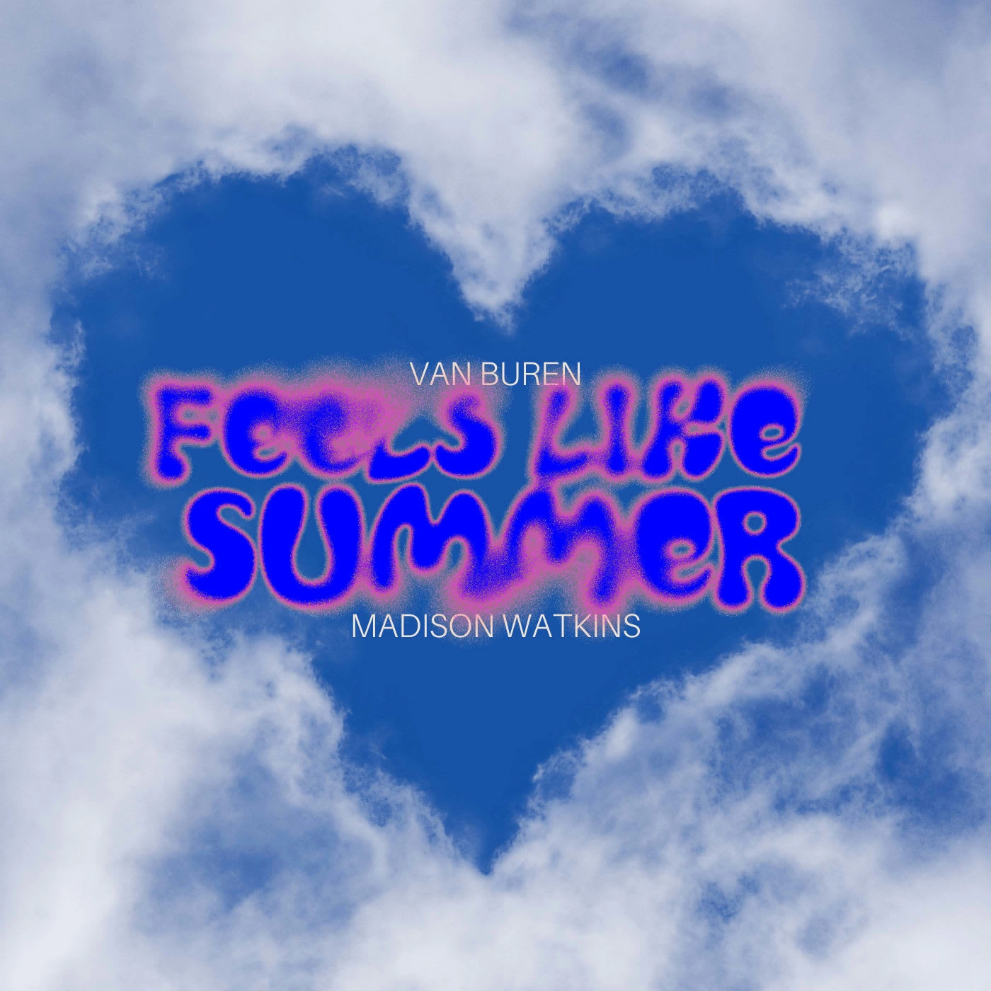
'Feels Like Summer' Single Cover
Creative Direction + Graphic Design
Incorporating modern design and a feeling of solitude and summer with the one you love, the album cover for this duet by Madison Watkins and Van Buren encapsulates that feelling you you wake up to a sunbeam on your face on a sunny summer morning in Los Angeles!
In need of an album cover, single cover, or podcast cover? Let's talk!
Like this project
Posted Feb 28, 2024
Album Covers & Single Covers designed using photography, illustrations, typography, and even AI art. Take a look at all of my projects. for the music industry!