Insurance Mobile App
👀 Overview
This project is the MVP of a mobile app to unite insurance and insurance companies in Scandinavian countries
Project goal
The goal of this project was to create an easy-to-use application with a neutral UI in order to attract investment in the project
📱Design
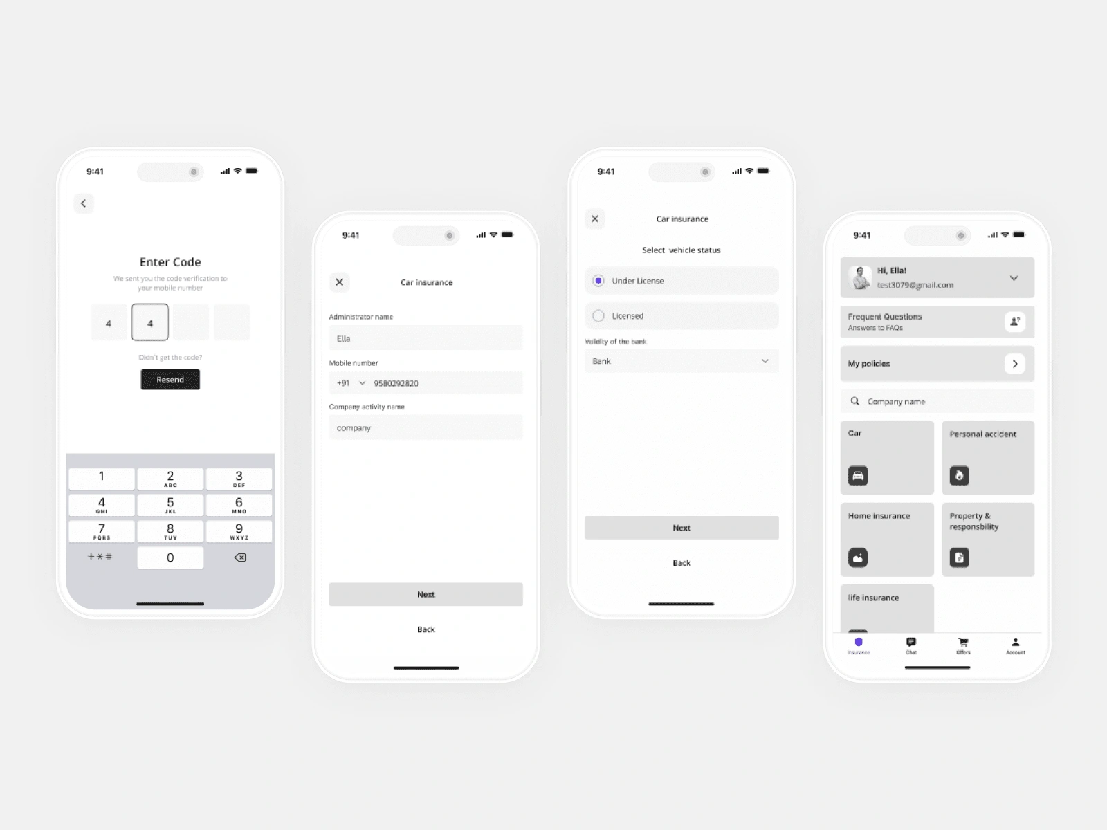
UX Design (Wireframes)
As the initial step of the design phase, I created low-fidelity wireframes that outlined the functionality and user flow. Through iterative testing and feedback, I refined the wireframes to ensure that the user path was clear and intuitive. By focusing on the fundamentals of the design early on, I was able to create a solid foundation for the project.
UI Design
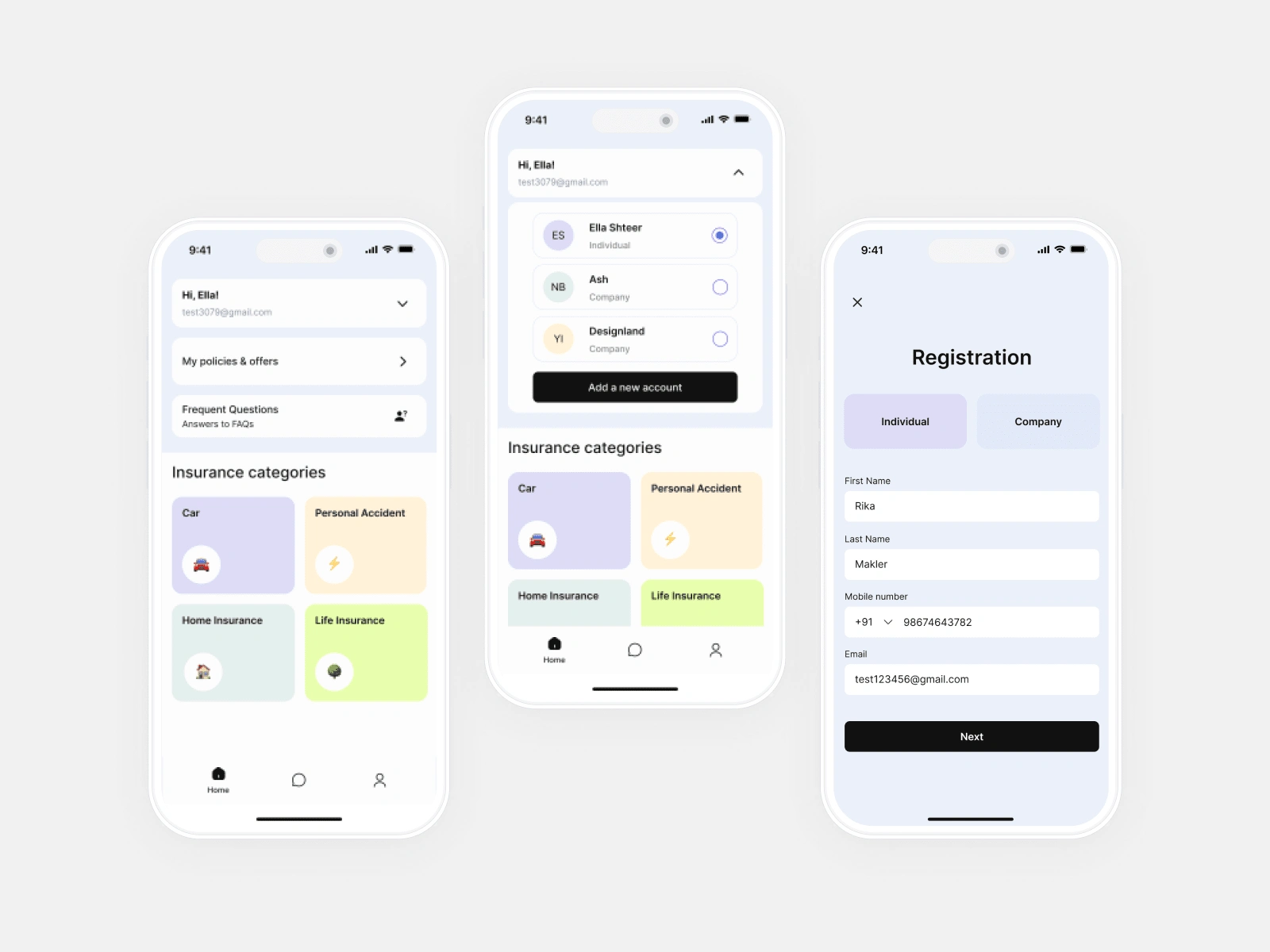
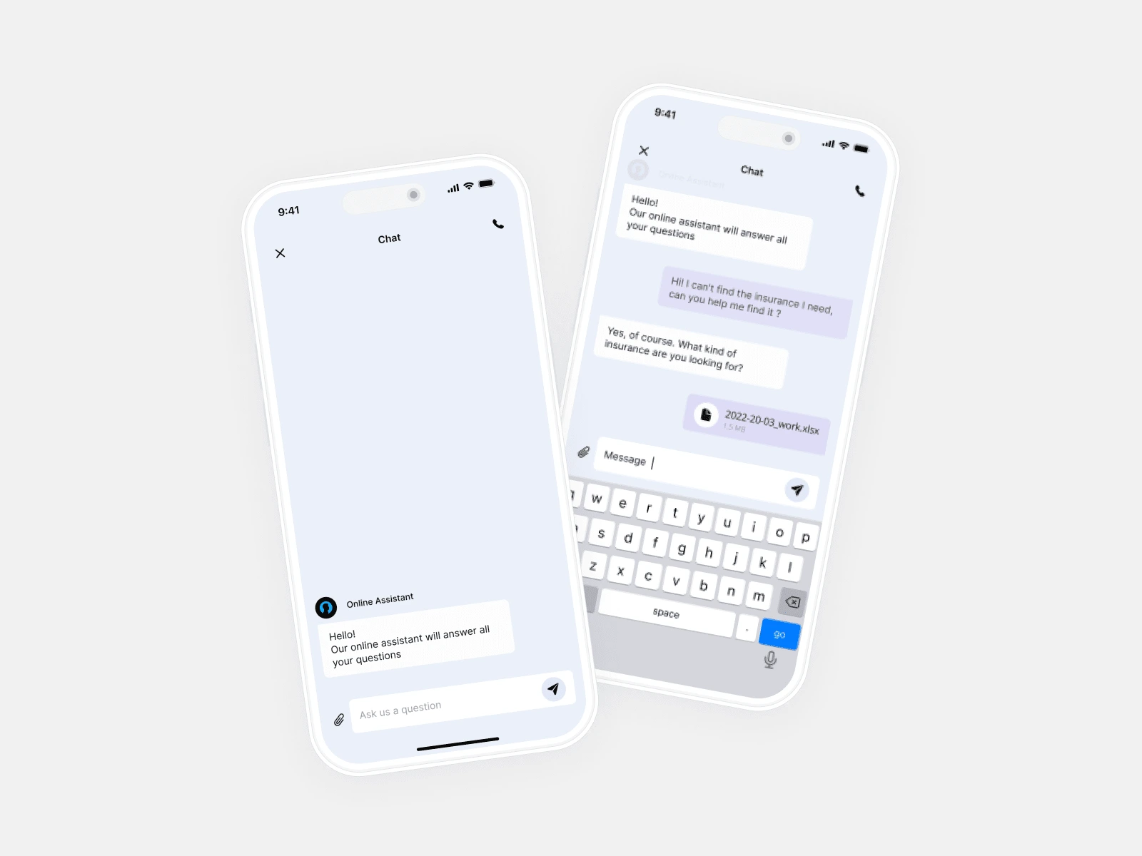
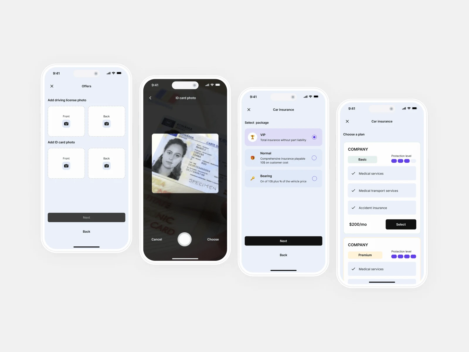
Following the UX phase, I transitioned to the UI design phase, where I focused on creating an aesthetically pleasing and cohesive visual design. By working closely with the client, I understood their desire to move away from the traditional deep blue color scheme often used in the insurance industry. To accomplish this, we chose a soothing color palette consisting of soft purples, greens, and blues, with contrasting dark gray buttons for added visual interest. By thoughtfully considering each element of the visual design, I was able to create a unique and engaging user interface that reflected the client's goals and brand identity.
⭐️ Result
In the final stage of the project, I created a clickable prototype that demonstrated the full functionality and visual design of the project. This prototype served as a powerful tool for presenting the project to potential investors, as it allowed them to interact with the product and get a clear understanding of its value and potential. By providing a tangible representation of the project, the clickable prototype helped to generate excitement and secure funding for the next phase of development.
Like this project
Posted May 8, 2023
Mobile application that streamlines the insurance experience for users by providing a convenient platform for storage, purchase, and communication.
Likes
0
Views
36

