Before vs After: How I Simplified Docwize Inbox & Compliance
Portfolio project

Verified paid workView completed work
Project Overview
I worked with the Docwize team to redesign their Inbox experience. A complex workflow engine where internal and external users interact with documents through review, approval, and data entry tasks. The goal was to make the system feel as intuitive as email but as powerful as a process engine. I also created an entire new design system using Airbnb and Google`s Material Design as a guide.
Role: Senior UX Designer
Tools used: Miro, Wireframe.io, Jitter, Excalidraw, FigJam, Figma.
Timeline: 2 months
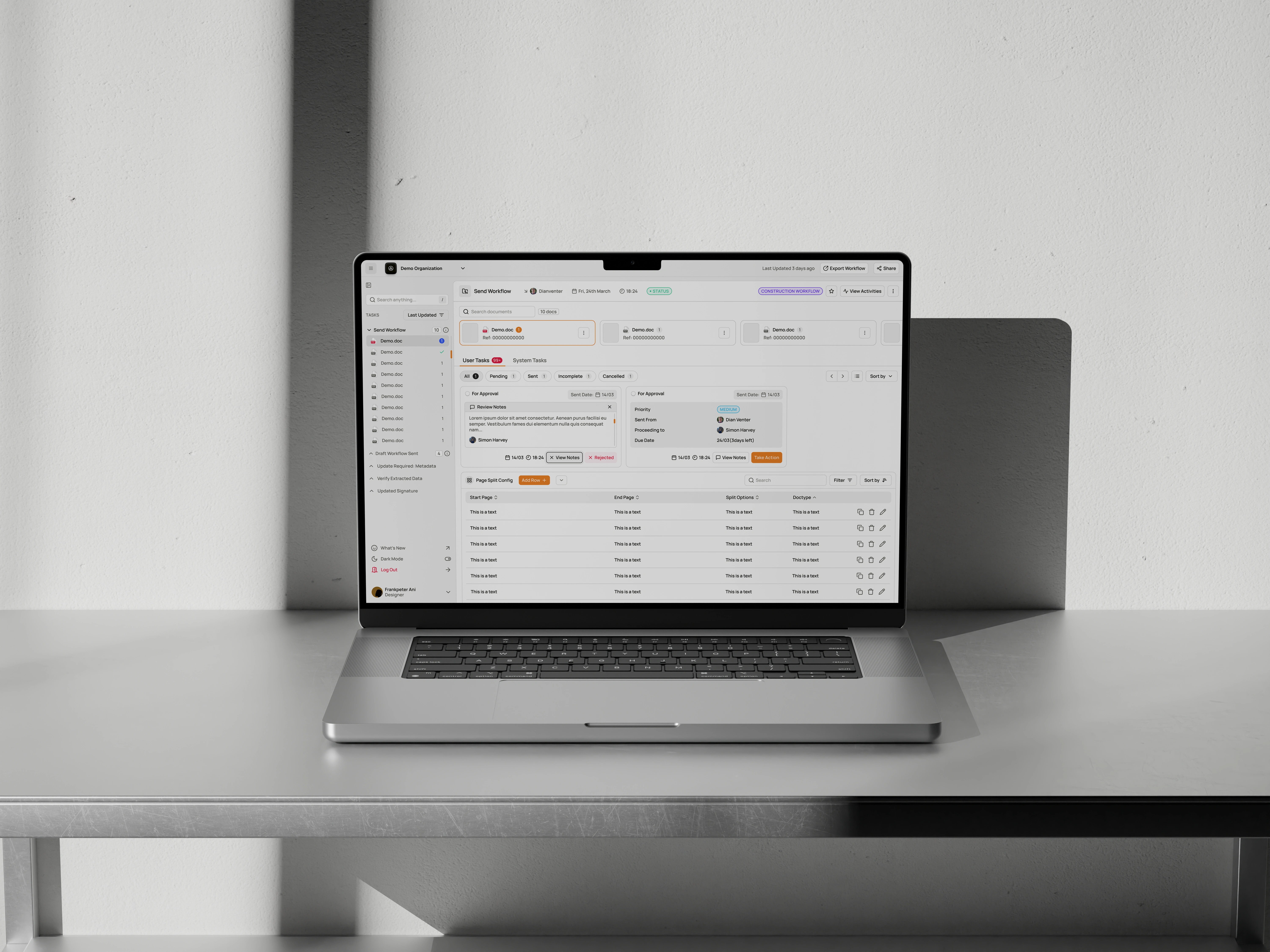
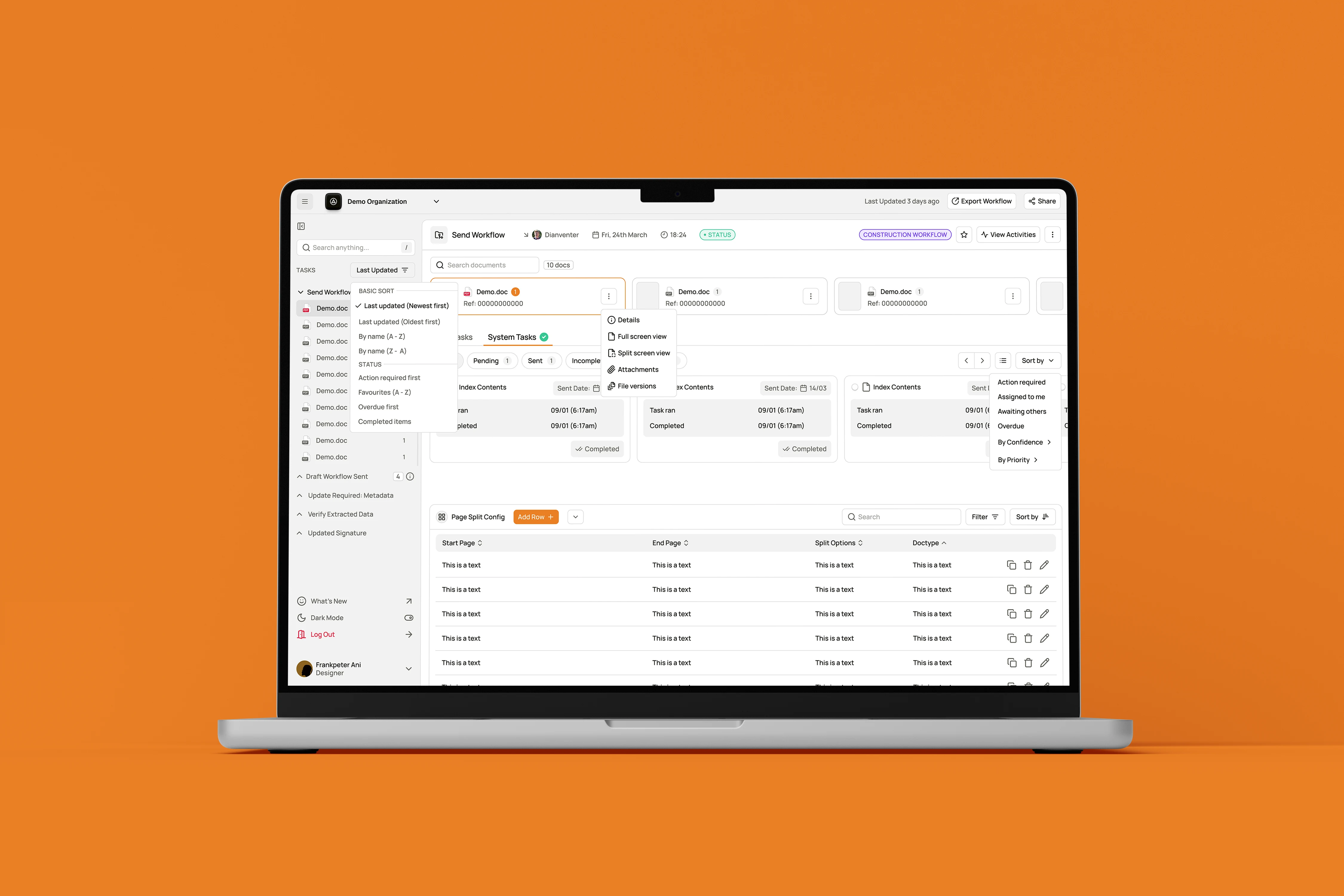
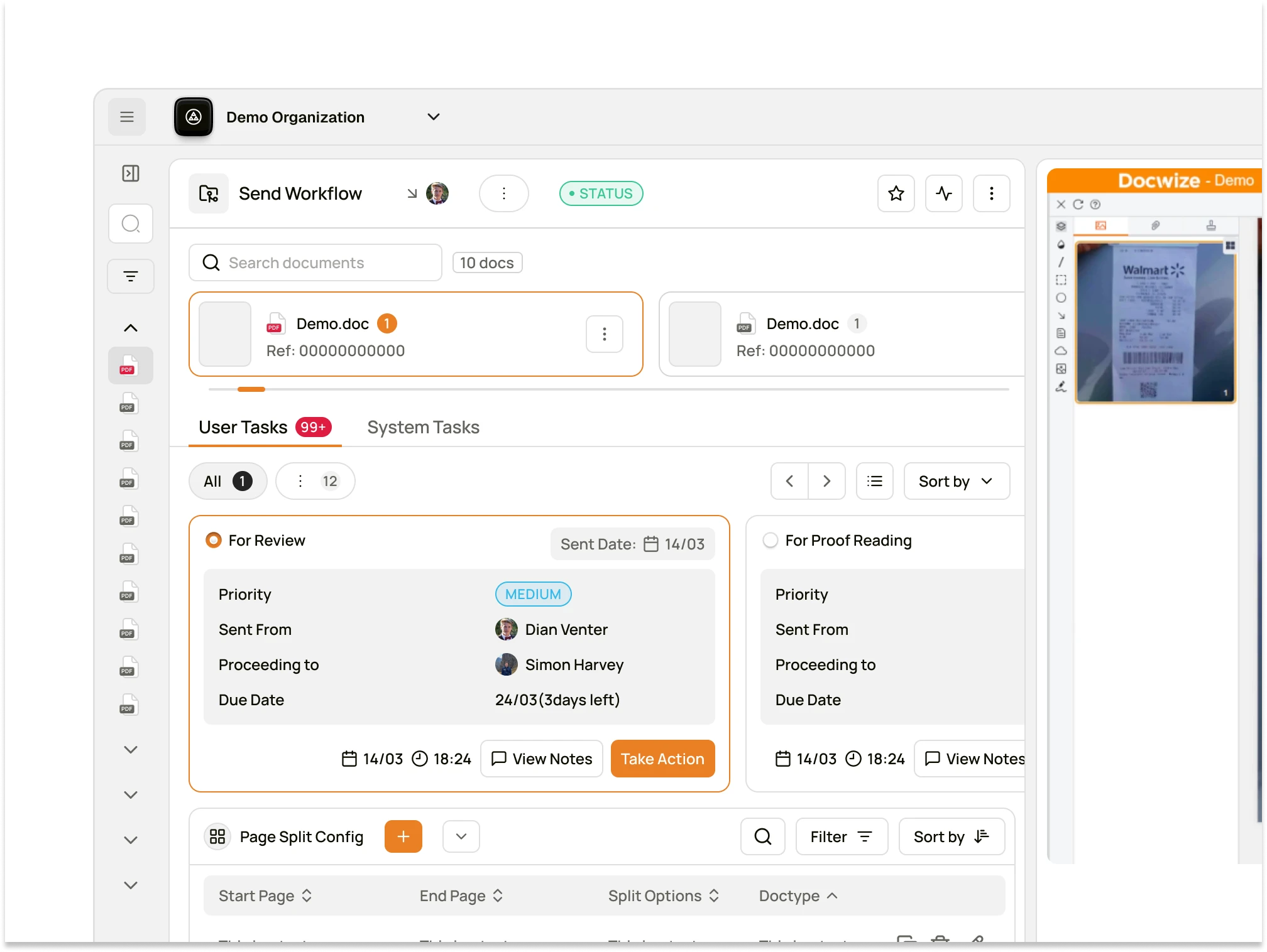
Lots of moving parts and UX interactions considered for high level experience of teams.
The Challenge
Docwize is used by diverse roles, from internal managers to external technicians down to professional teams. Each sees only a slice of a workflow but the system has to handle massive volumes (1,000+ docs, nested steps, and role-based permissions). The initial flow was functional but not intuitive.
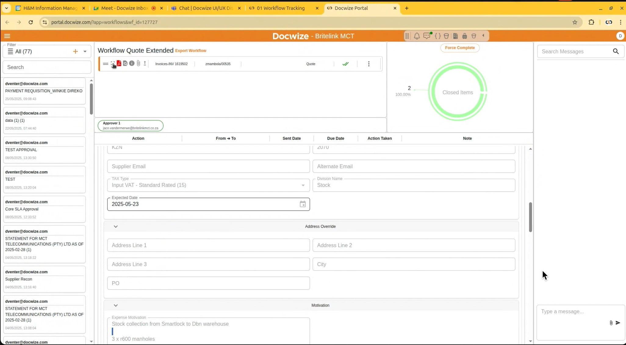
Managing multiple workflows and systems was initially a huge hassle
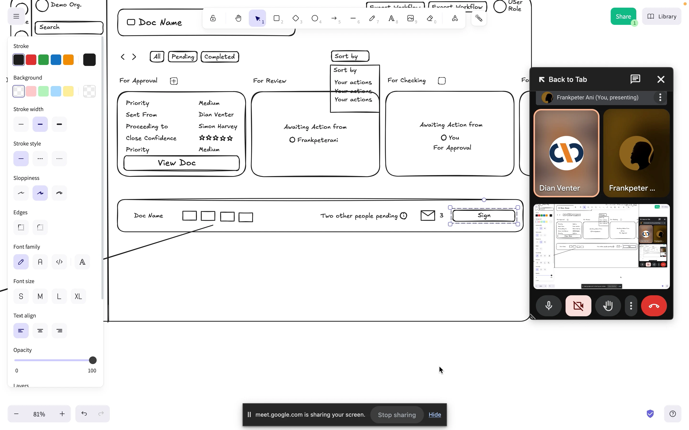
Low fidelity demo approval. Workflow using excalidraw
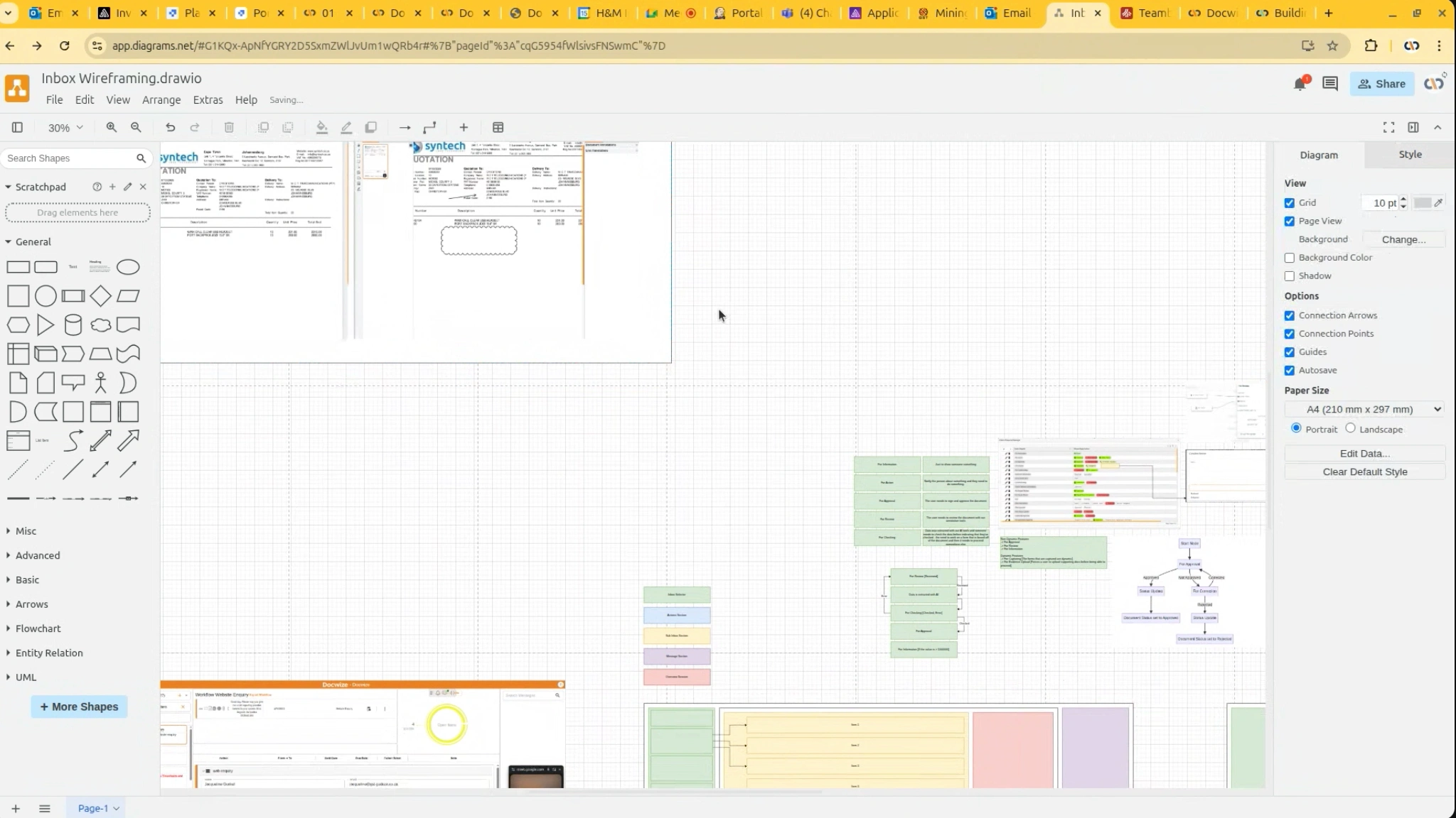
Before the pixels, I solidly had to back every action with good clarity. Mapping out every workflow touchpoint over and over.
We realized the lack of exposure to the full system created friction in some areas. This time, we want to align earlier.
I realized how passionate the founders were of this project and so I had to double down and take full ownership to make sure the inbox feature (which is their most used feature).
The UX Process
1. Information Architecture
Simplified hierarchy:
Workflow > Inbox Items > Documents > User Actions
With all my years in design currently, I have come to understand:Clarity >>> Complexity
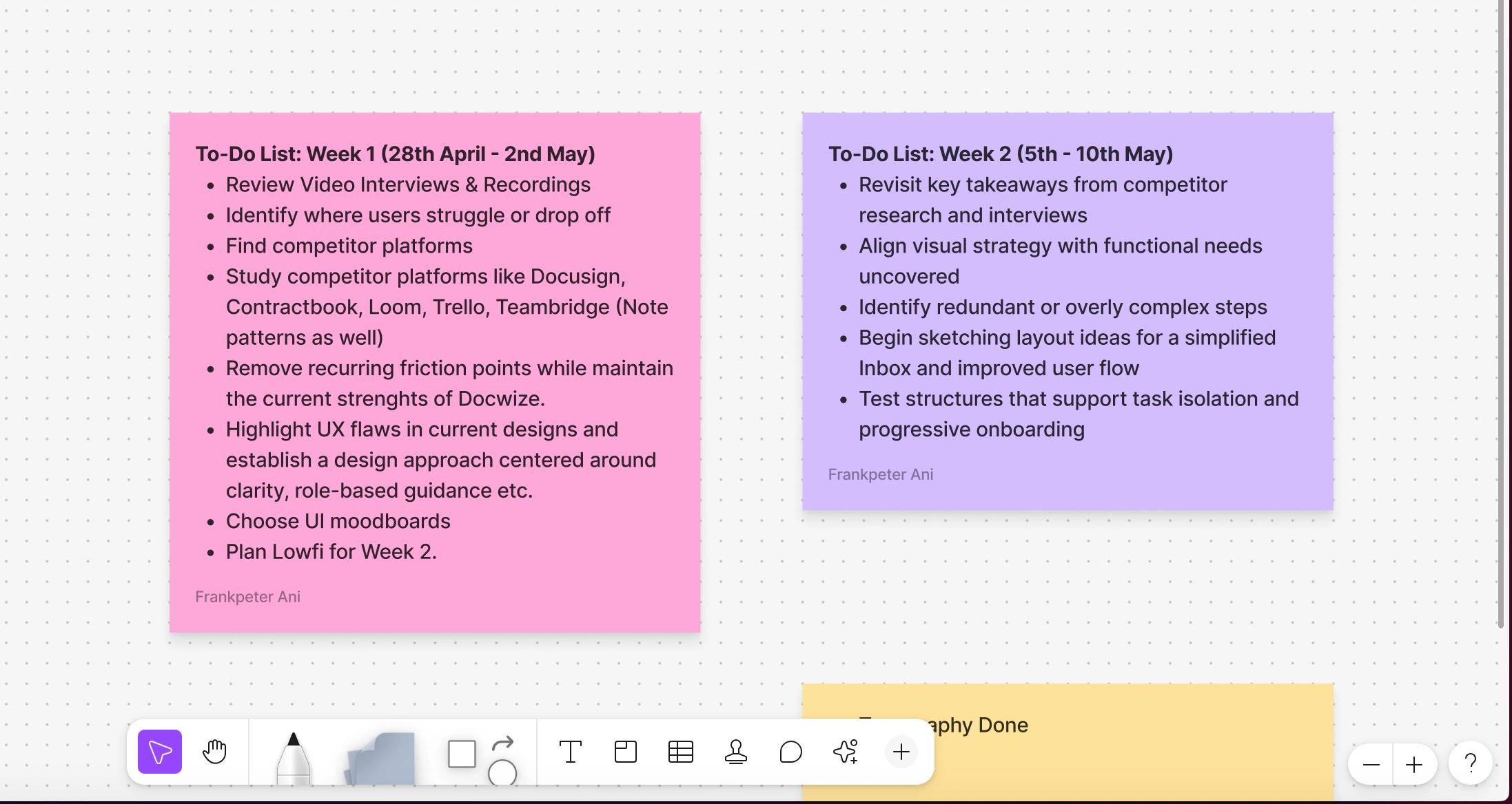
Sneak peak sample of detailed weekly plans till the completion of the project.
Component-First Thinking
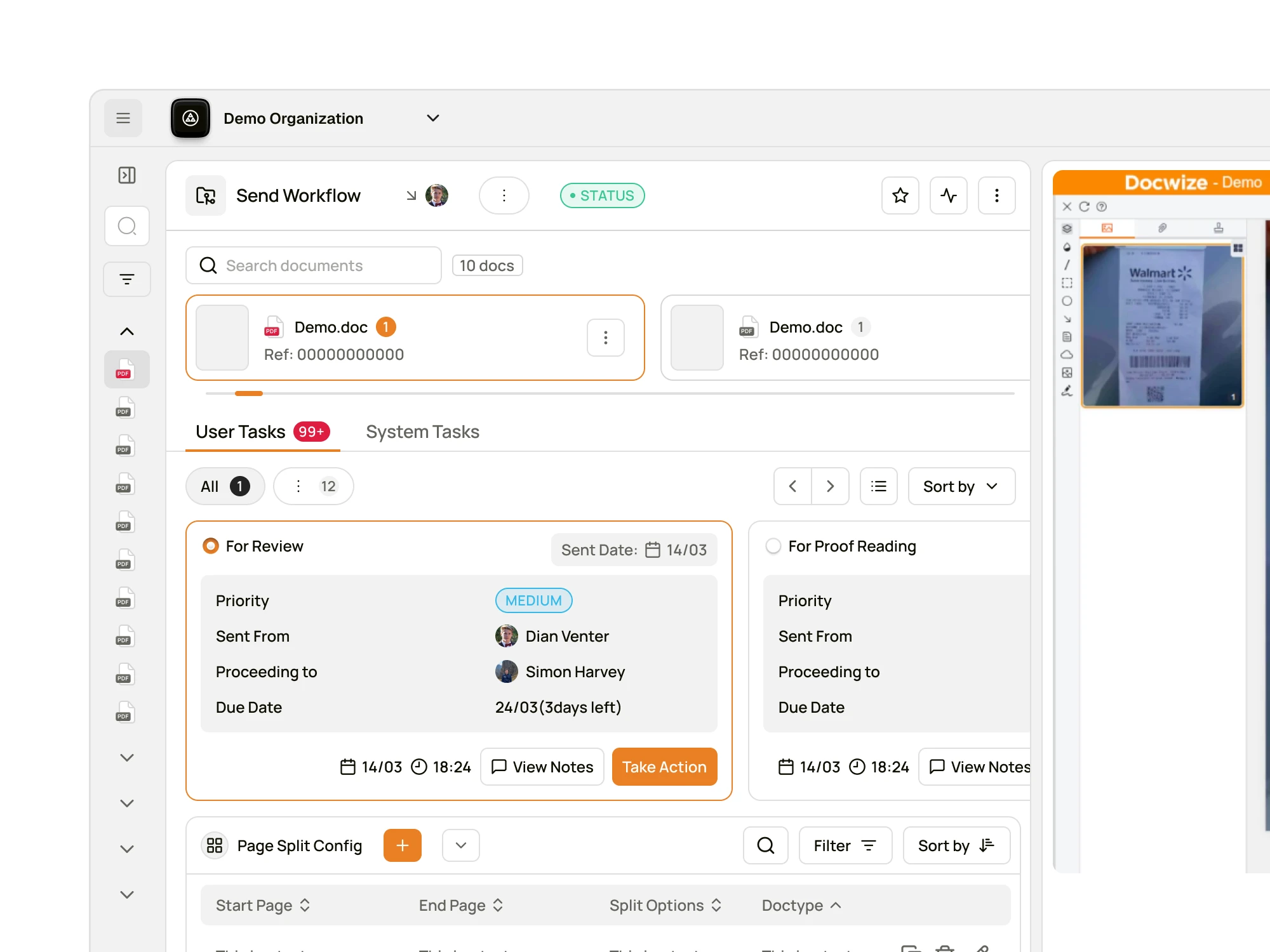
Used a system-based approach to redesign inbox cards, actions, and document previews as modular components for easy reuse.
Mobile Breakpoint Considerations
Designed a compact mobile-first version of the Inbox UI, with emphasis on empty states, toggles, and document previews.
Design Sytem
Final Design Highlights
I restructured the full Inbox experience into intuitive views. Each task now lives within a simple, guided action flow. This includes validations, real-time feedback, and a focused context per user type.
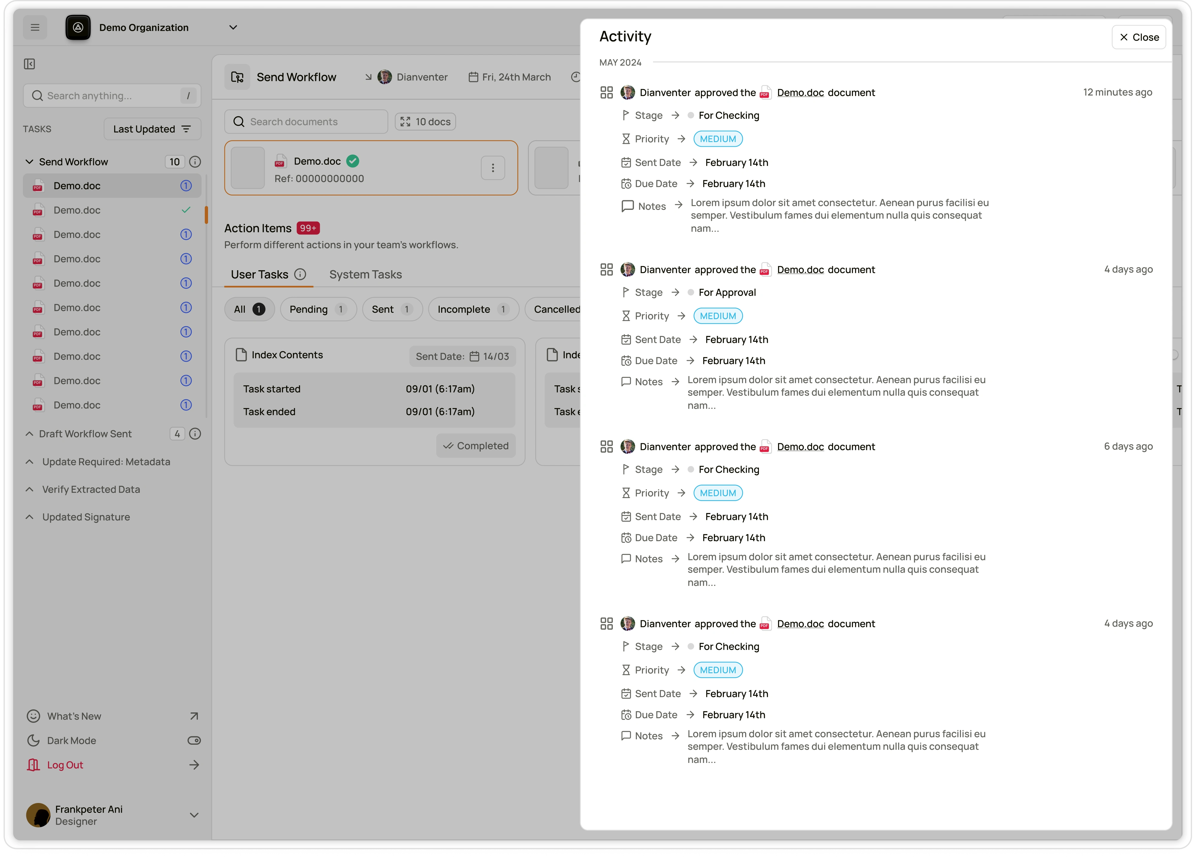
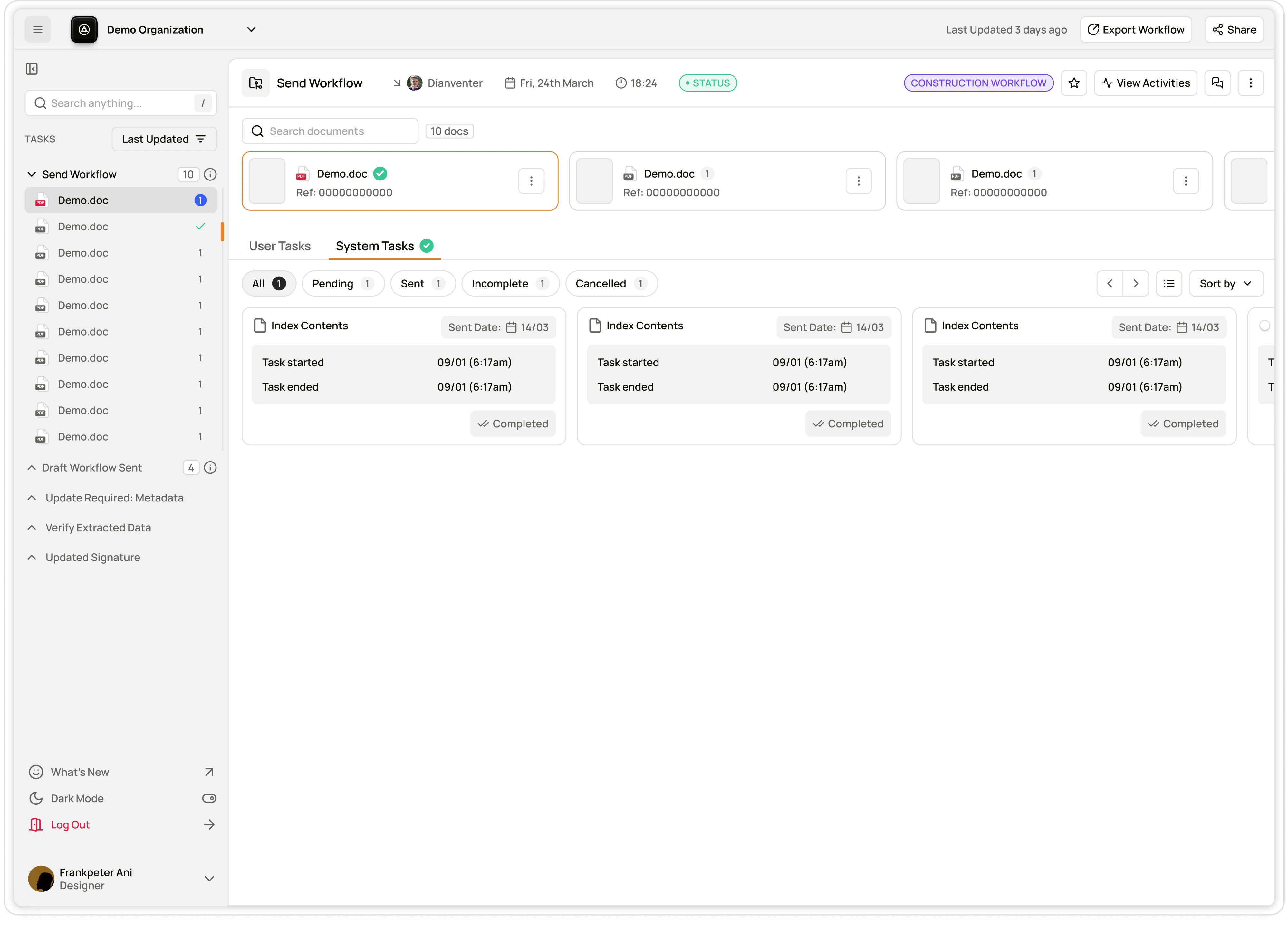
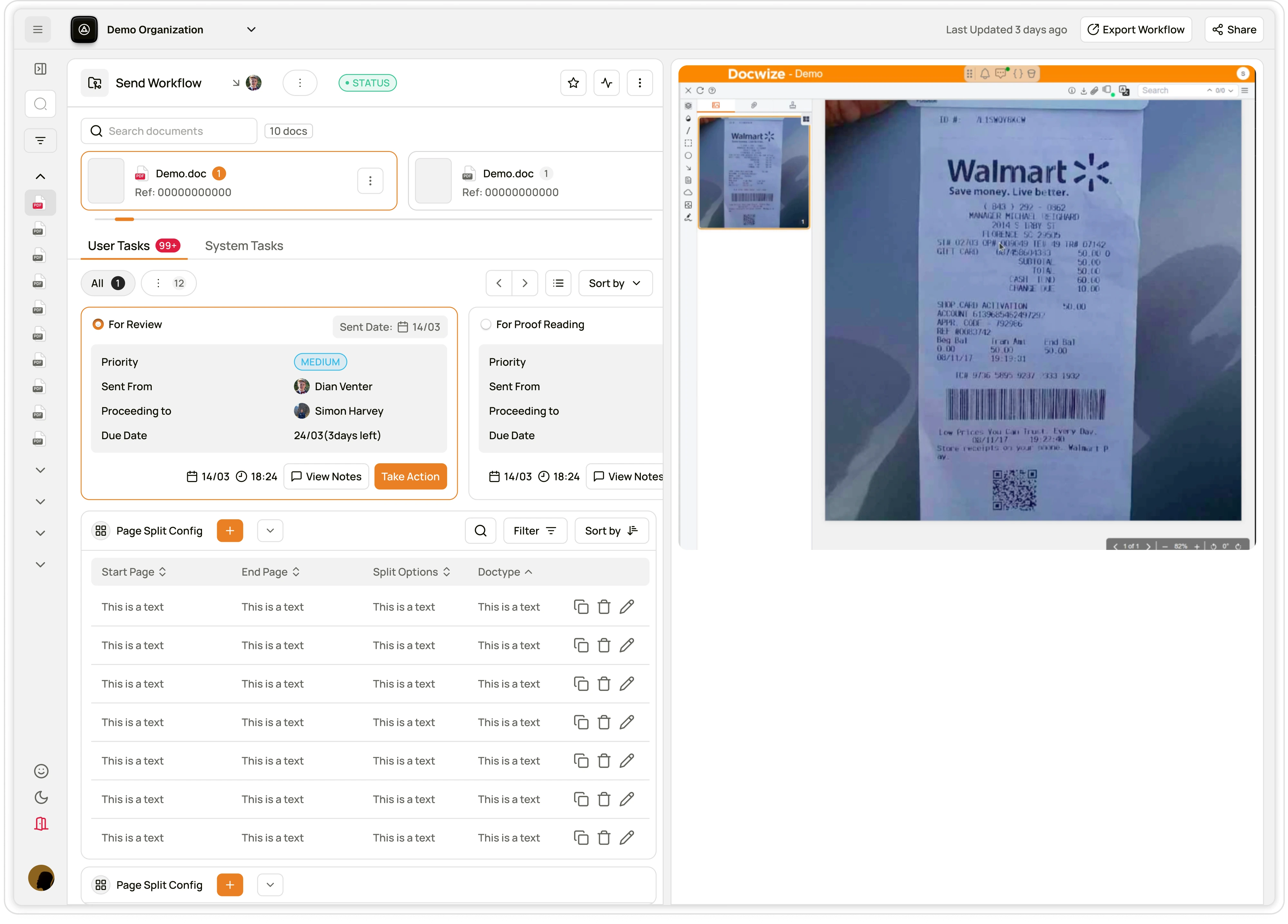
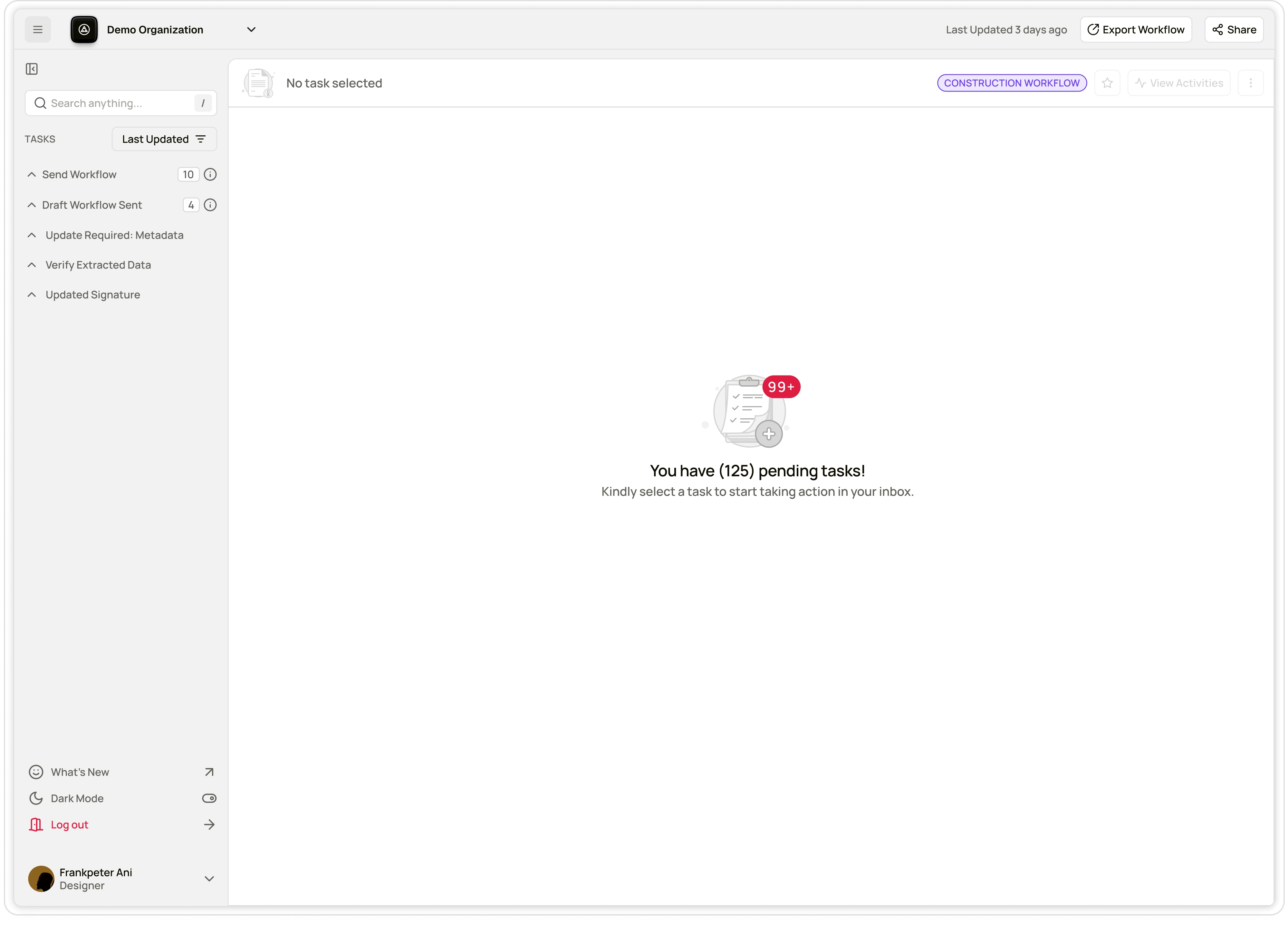
Quote:
"Show only what matters for this step." — Dian
Jakob’s UX Law: Users prefer systems that work like what they already know. I leaned into familiar interaction patterns from Trello, Teambridge, and Slack modals.
Outcome & Reflection
This project unlocked deeper collaboration with the Docwize team. I’ve since been re-engaged to work on their Search experience and help scale the design system even further. That’s a signal of trust I deeply value.
11 likes · 195 views · Aug 6, 2025
Redesigned Docwize Inbox for intuitive, powerful workflow engine. Simplified compliance-driven workflows through clarity, component thinking, and design system.
Timeline
Apr 22, 2025 - Jun 20, 2025
Tags


What the client had to say
Frankpeter is an outstanding designer who quickly grasped our complex app, streamlined its UI and flow, and delivered superb improvements. I highly recommend him for any UI/UX modernisation.


Dian Venter, H&M Information Management
Jun 20, 2025, Client