Designing an End-To-End Delivery Ecoystem

Overview
Expressbites is a food and groceries ordering and delivery service built to meet the everyday needs of remote workers and students who want fast, reliable, and seamless access to essential items. The platform spans five digital products: a Customer app, Vendor app, Rider app, Admin Dashboard, and a marketing website.
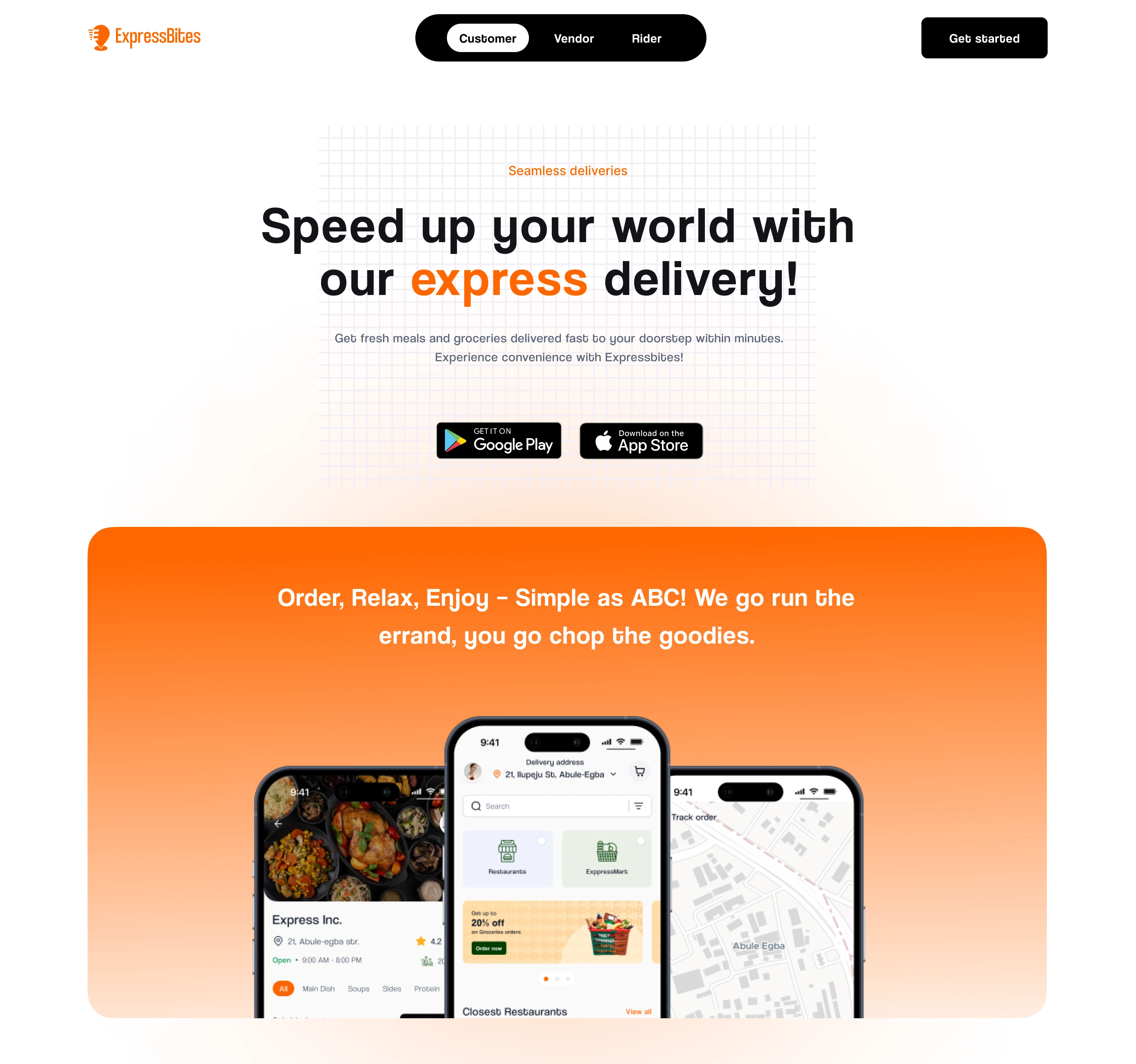
Website Landing Page Hero
Context & Problem
The pandemic and subsequent shifts in lifestyle accelerated the need for hyperlocal delivery services. Our target audience which are students and remote workers often struggled with unreliable delivery services, poor user experiences, and inconsistent communication between vendors, riders, and customers. Expressbites was created to solve this.
My Role & Responsibilities
I led the entire design process from start to finish. This included;
Defining the product direction
Conducting research and competitive analysis
Creating wireframes and prototypes
Designing the UI for all platforms
Overseeing the branding process
Liaising with stakeholders and developers
Ensuring development stayed aligned with design
While I did not create the brand identity myself, I worked closely with the branding team to ensure visual consistency across all platforms.
Research & Discovery
1. Stakeholder Interviews: I started by interviewing founders, potential users, and developers to understand the goals, pain points, and expectations. This helped align the team around a user-centric vision.
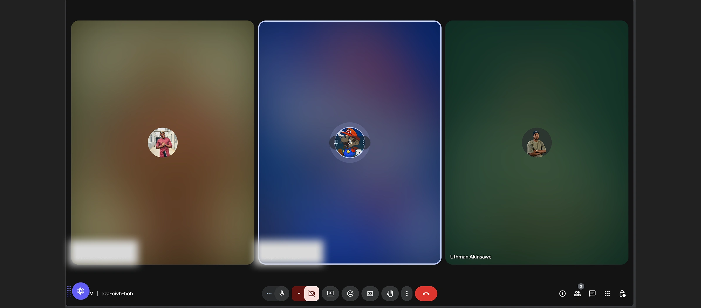
Stakeholders Meeting
2. User Surveys & Personas: I created surveys targeted at students and remote workers to understand ordering habits, frustrations with current apps, and wishlist features. I didn’t just come about these Personas through surveys alone. I had virtual interviews with 5 participants, and their stories led to the development of two primary personas: Tobi the Remote Developer and Ada the University Student.
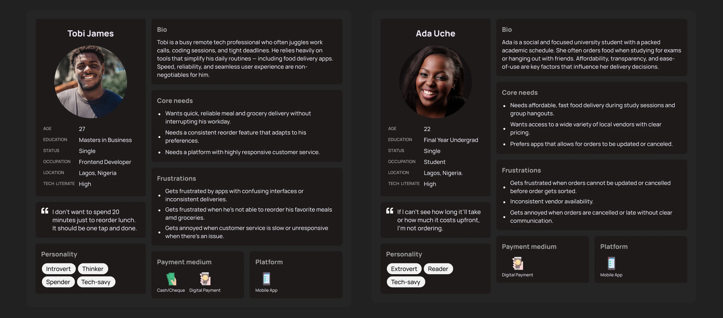
User Personas
3. Competitive Analysis: I analyzed apps like Jumia Food, Glovo, and Chowdeck to identify UX gaps and differentiation opportunities. I carefully went through each app's reviews on the Google Playstore. The insights, together with the surveys and User Interviews, which led to the Personas, guided our feature prioritization.
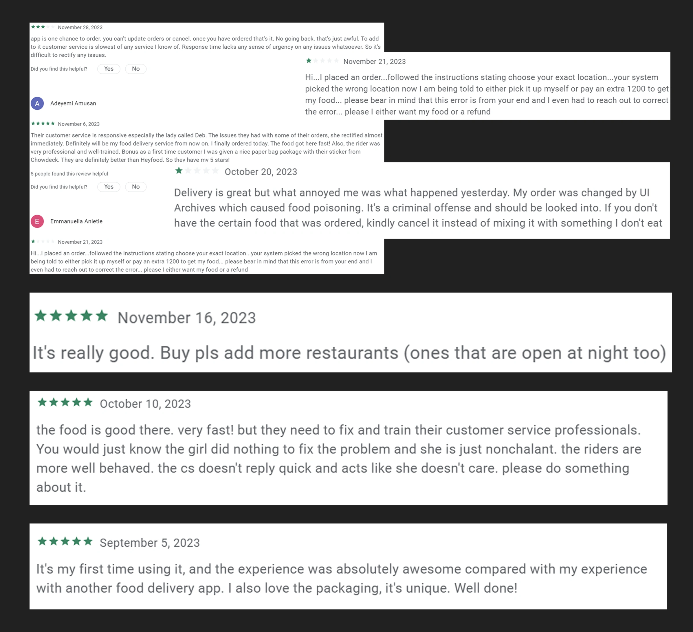
Chowdeck (User Reviews)
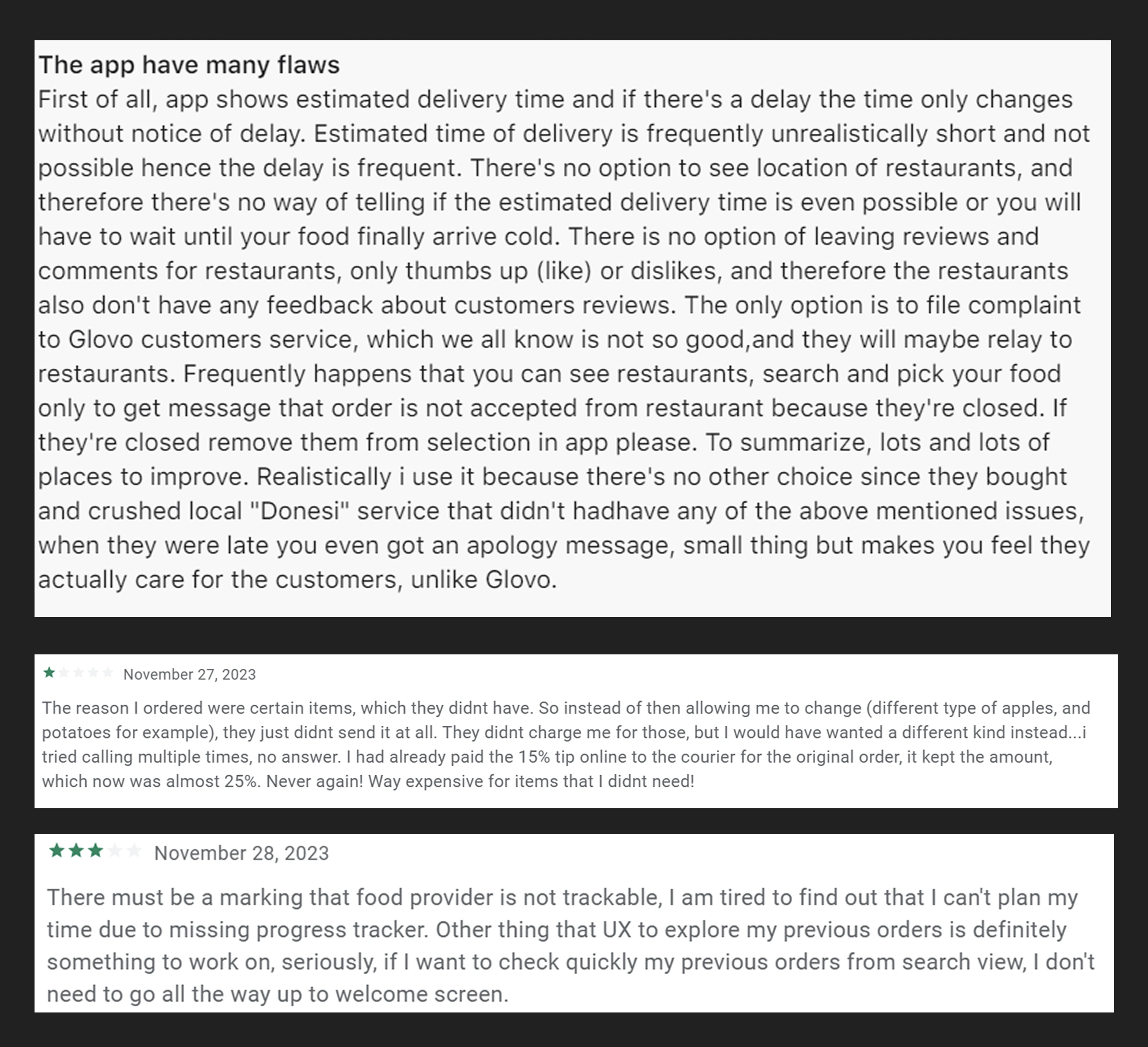
Glovo (User Reviews)
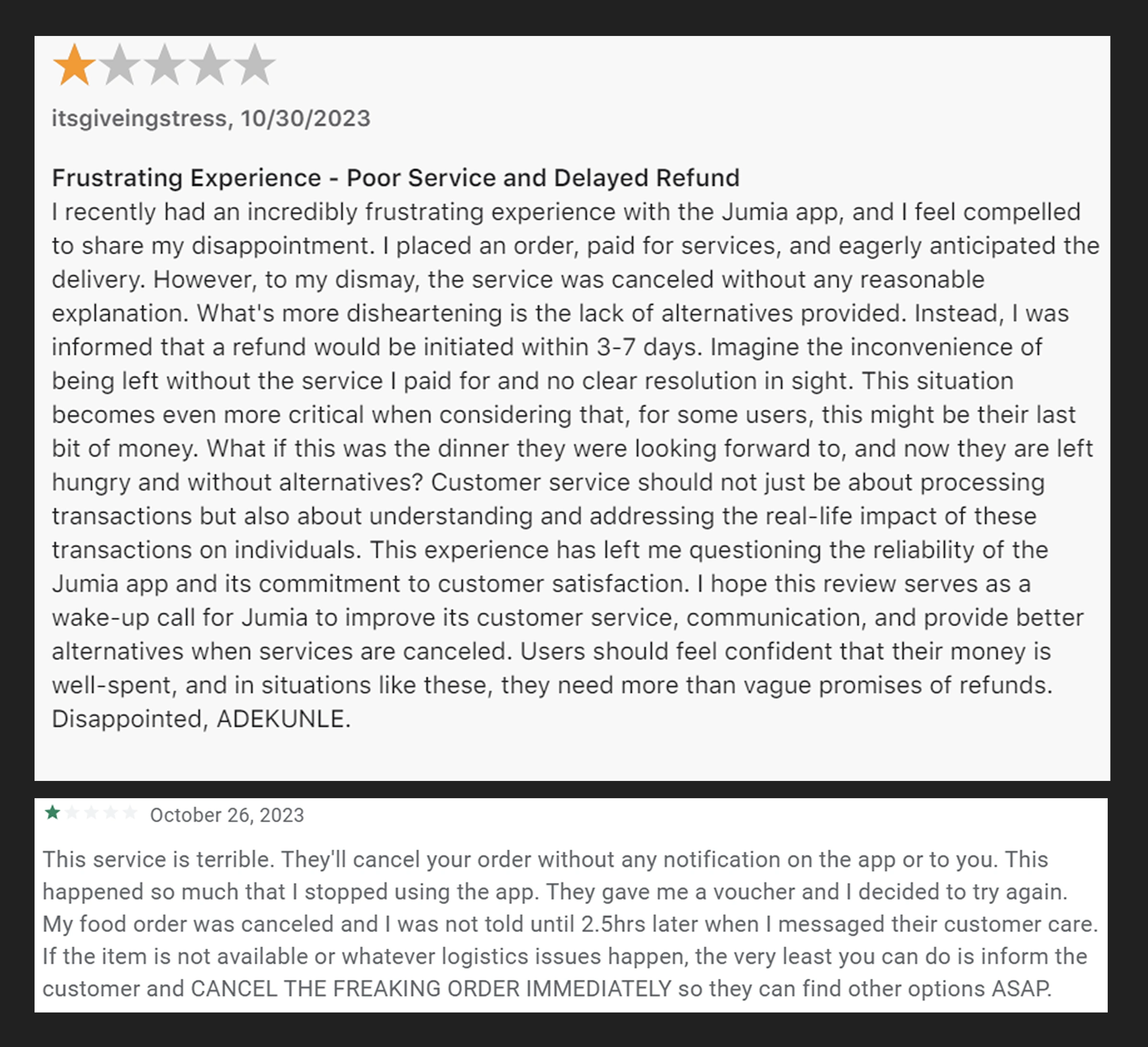
Jumia Foods (User Reviews)
Wireframing & Ideation
Using Figma, I created low-fidelity wireframes for all five products. These were reviewed with the stakeholders and used to collect early feedback from target users.
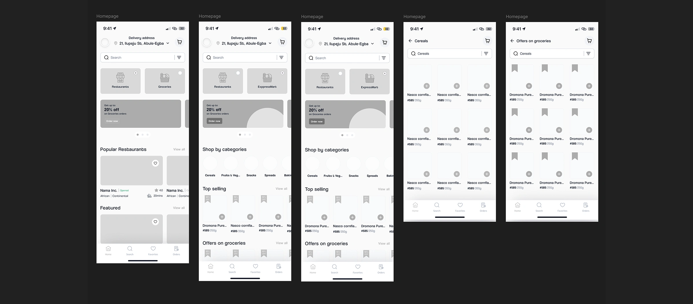
Low-Fidelity Wireframes
Information Architecture
I mapped out the entire ecosystem of interactions between customers, vendors, riders, and admins. I created flowcharts and task flows to ensure that each user journey was optimized for efficiency.
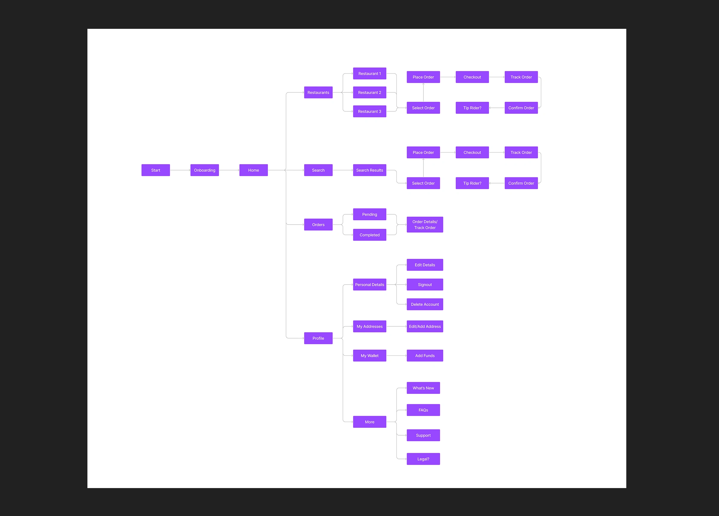
Information Architecture/User Flow
Branding & Visual Design
After validating the wireframes, I moved on to Brand Direction and High-fidelity UI design. While I didn’t work on the branding alone, I pretty much oversaw everything in order to make sure the brand’s identity is well represented. The visual identity of Expressbites was carefully crafted to feel vibrant, youthful, and trustworthy making it resonate with our core users: students and remote workers in fast-paced, high-demand environments.
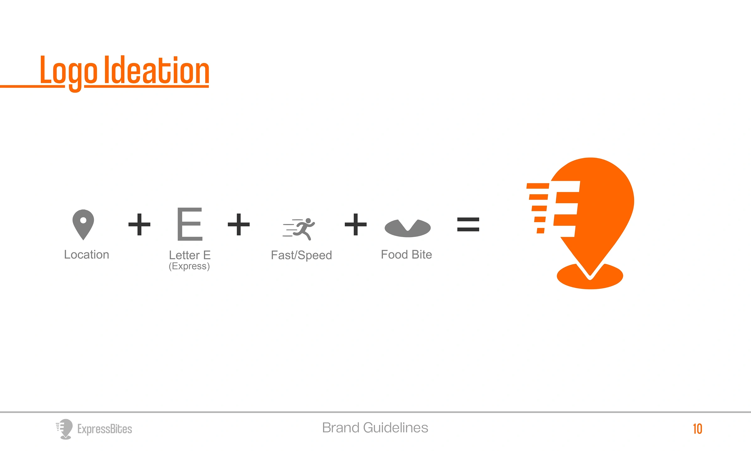
Logo Ideation
Main Logo
Color & Typography:
Primary Colors: Light Orange (#FF6600) & Pakistan Green (#023E02)
These two contrasting yet complementary colors were selected to deliver both energy and trust:
Light Orange (#FF6600) evokes excitement, appetite, and friendliness. It aligns perfectly with the food delivery context — stimulating and energetic without being overwhelming. It acts as the attention-grabbing color for primary buttons, alerts, and promotions.
Pakistan Green (#023E02) adds depth, reliability, and freshness. As a grounding shade, it’s used to reinforce structure across layouts and create a sense of trust. Green also hints at our grocery angle which echoes freshness, sustainability, and organic association.
Together, this palette creates a high-contrast, accessible, and memorable identity that differentiates Expressbites from generic delivery apps.
Why it works: Orange gets attention. Green builds trust. Together, they visually represent speed, quality, and care.
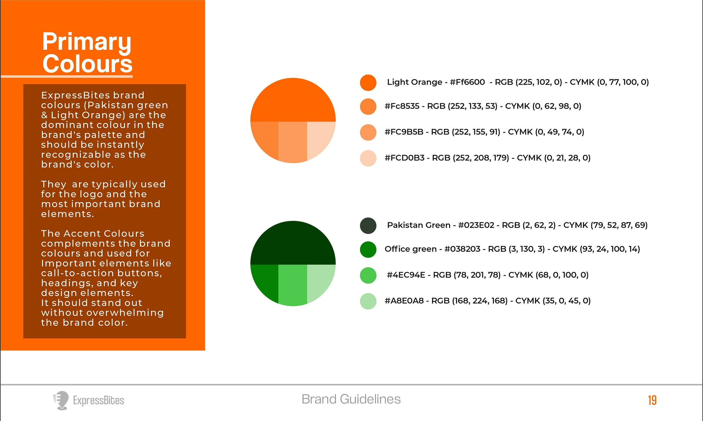
Brand Colors
Typeface: Coolvetica
We chose Coolvetica as the primary typeface because of its rounded, friendly curves and bold structure. It strikes a balance between retro charm and modern simplicity, which mirrors our goal of blending familiarity (street food culture) with a sleek, digital-first experience. The soft, geometric forms make the interface approachable and readable across devices, while the boldness gives it enough presence to stand out in CTA buttons, headers, and app icons.
Why it works: It communicates speed and ease while remaining fun and informal which is perfect for a lifestyle-oriented service like Expressbites.
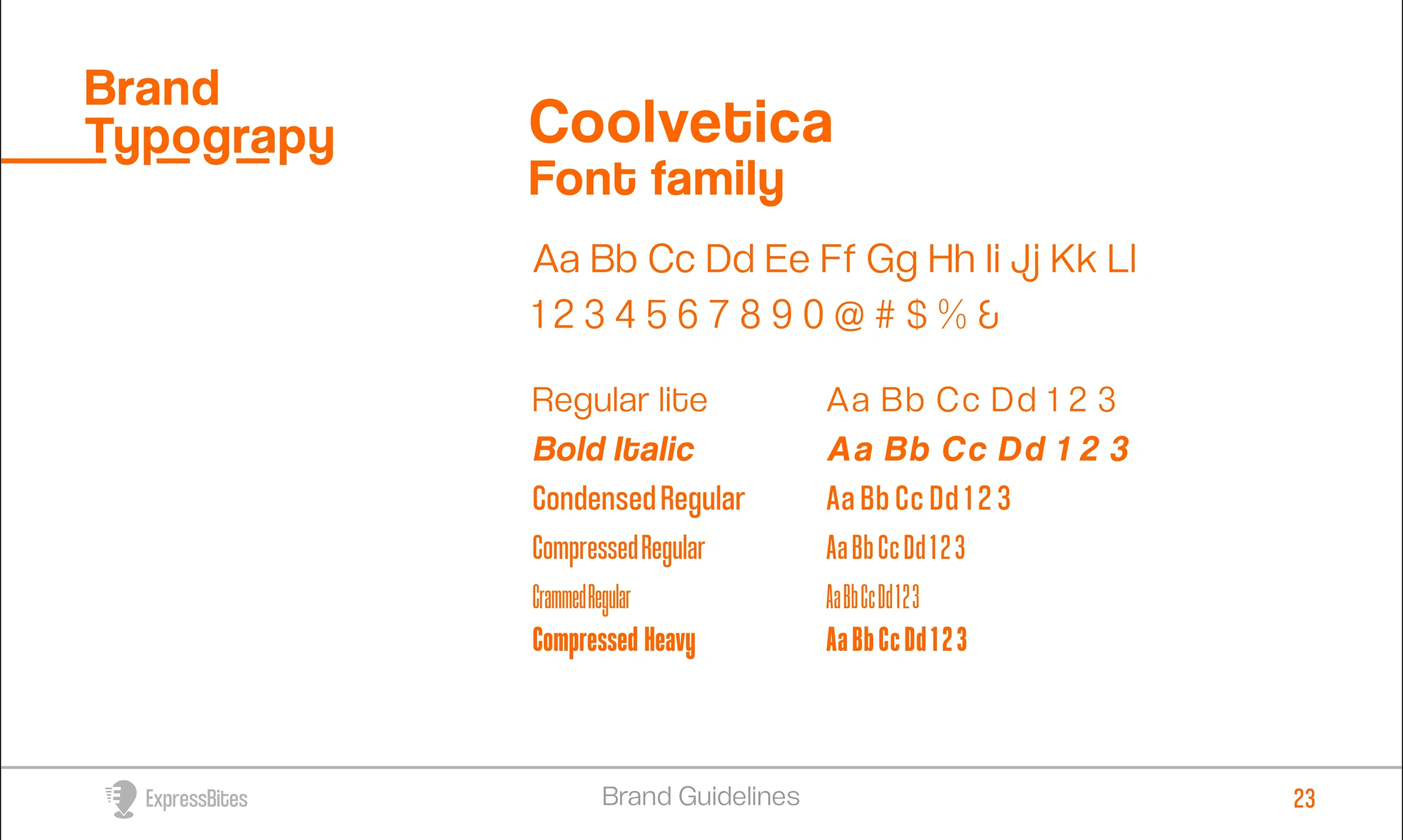
Brand Typography
Multi-Platform Design Execution
Designing Expressbites wasn’t just about building individual apps. It was about crafting a synchronized ecosystem where customers, vendors, riders, and admins operate seamlessly within a shared workflow.
Each platform was intentionally designed to serve a specific role in the ecosystem while remaining visually and functionally consistent. This ensured a unified user experience, real-time communication across roles, and fewer friction points during transactions.
I designed the entire ecosystem in Figma:
Customer App: Simple, fast checkout, location-based vendor browsing, real-time order tracking.
Vendor App: Order management, live updates, inventory tools.
Rider App: Optimized delivery routing, task queue, and GPS tracking.
Admin Dashboard: User management, analytics, app content updates.
Website: Marketing site with vendor onboarding CTA.
Mobile Ecosystem
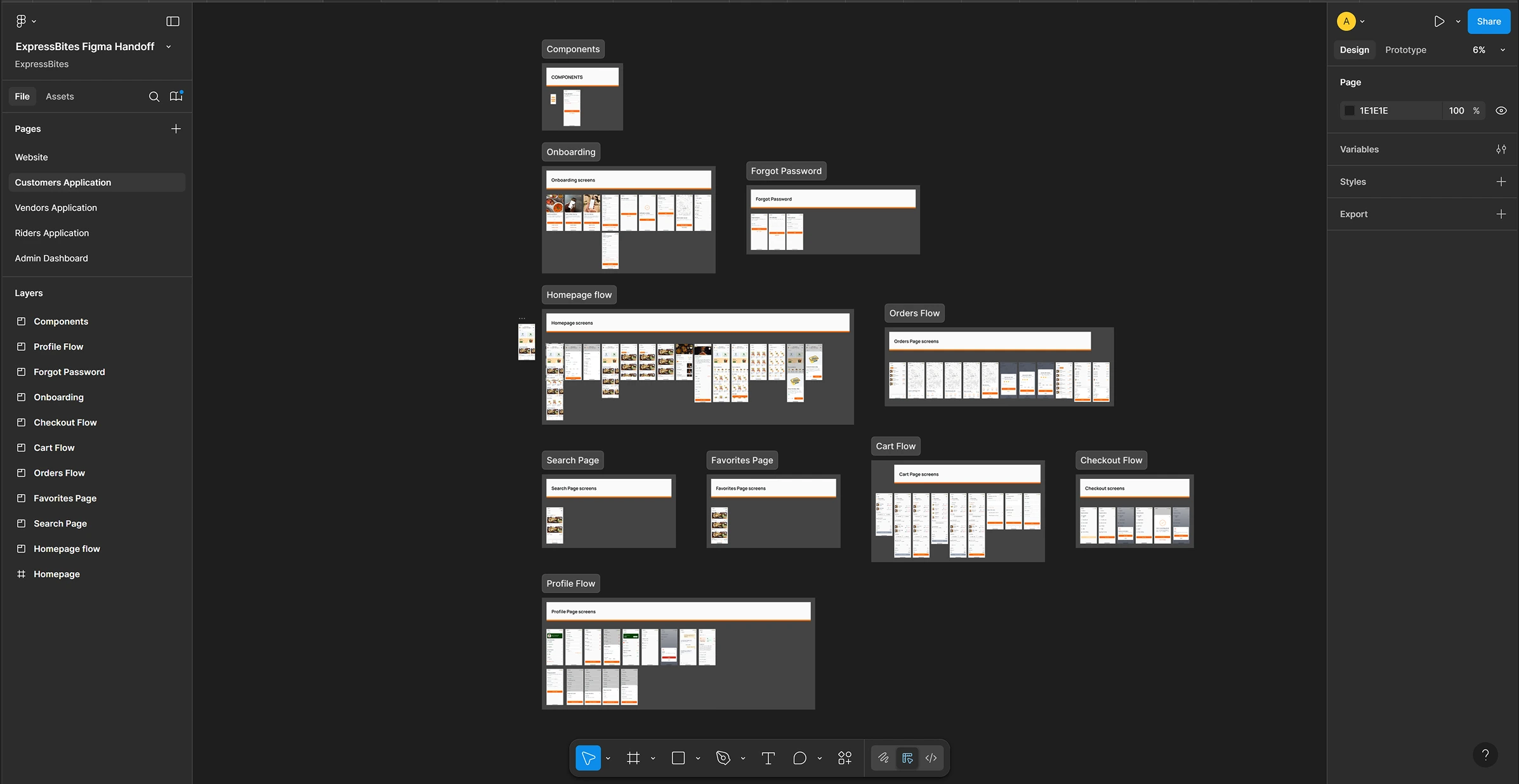
Snapshot of Figma Handoff File
How the Ecosystem Works Together
Customer App
The journey starts here. Users browse nearby vendors, add meals or groceries to their cart, and place orders. Once an order is confirmed:
Vendors are notified instantly through their own dashboard.
A rider is auto-assigned or notified via the rider app.
Customers can track their order status in real-time (from vendor acceptance to delivery).
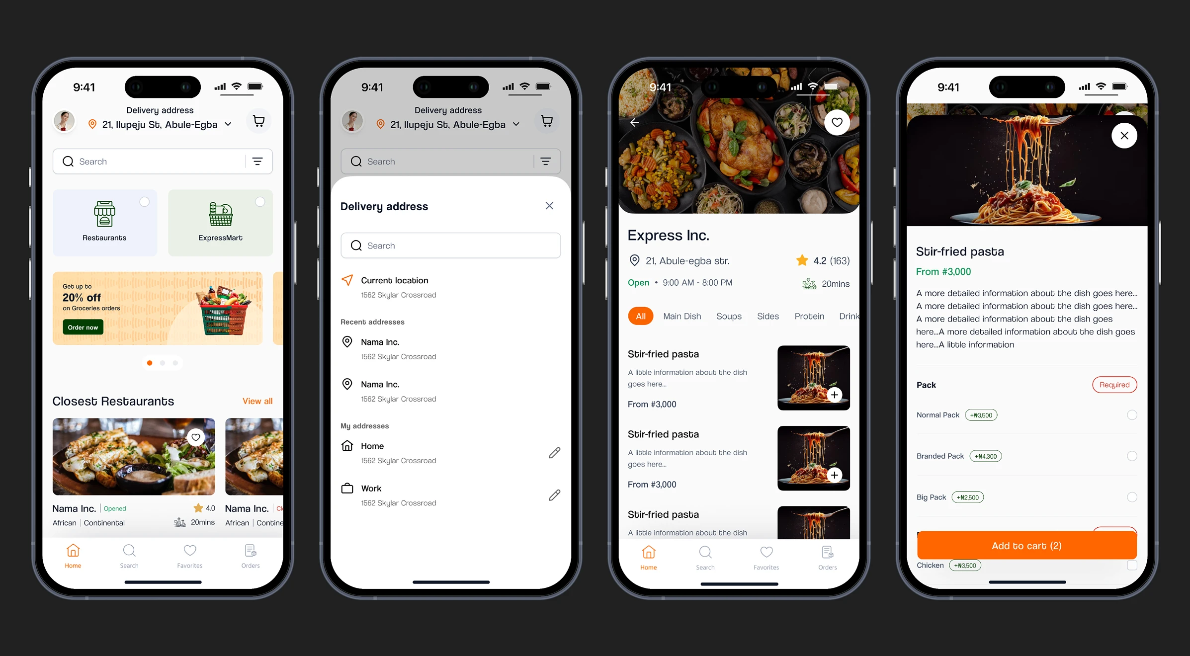
From the home screen (frame 1), users can set a delivery address (frame 2), select a vendor of their choice (frame 3)—from where they can select their preferred menu from the vendors page and add to cart.

The first frame shows how to add groceries to the cart by a single click from the homepage, whereas the second frame shows the #cart where you can edit or remove items, give instructions to either the Vendor or Rider (as shown in Frame 3), and choose to send the order to someone else (#Gift Someone - which prompts you to set a different delivery address from the one on the homescreen) and easily select a payment method from the varieties of options for convenience (Frame 4) at checkout.
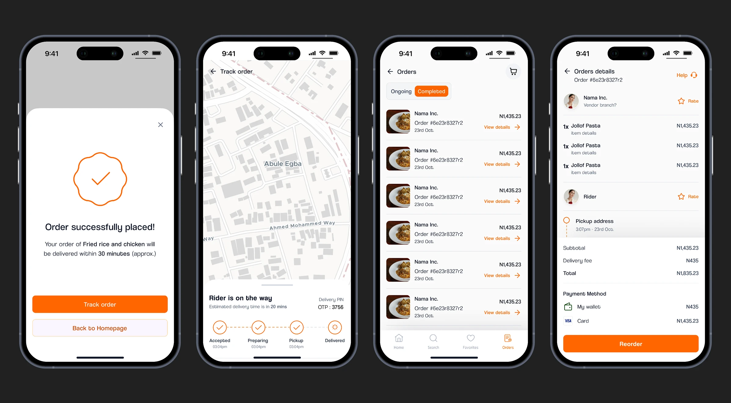
After a successful payment (Frame 1), users can either opt to #Track their order (Frame 2) or go back to the home-screen. From the #Orders screen (Frame 3), users can view ongoing and completed orders while also getting the option to Reorder a particular order from the #Order details screen (Frame 4).
Vendor App
Vendors receive orders in real-time, manage their menu/inventory, and update order statuses (e.g., "preparing", "ready"). Key design decisions focused on speed and clarity:
Clear task segmentation (New, In Progress, Completed)
Inventory controls to prevent customer-side issues with unavailable items
Status updates that immediately notify both rider and customer

From the Home screen (frame 1), #Vendors with multiple outlets can easily switch between individual outlet branches (frame 2) and view the summary of the day’s/week’s/month’s sales count. They can also view latest orders easily and check notifications. Frame 3 depicts how #Vendors receive notifications for a new order and they can expand (view order button) to either Accept or Reject the order in #Frame4.
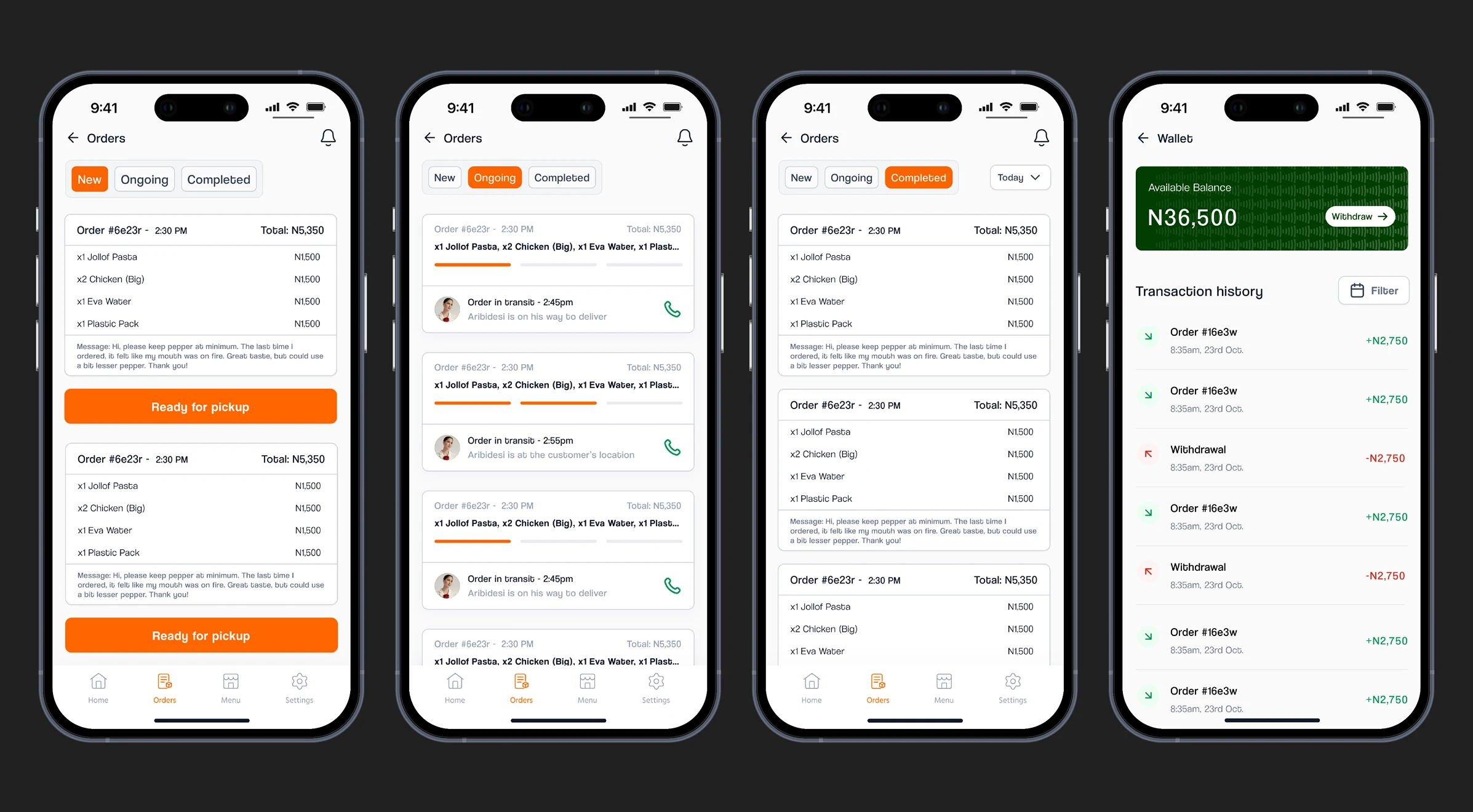
After accepting an order (Frame 1), it updates on the #Customer end and when the order’s ready for delivery, #Vendors use the CTA button (Ready for Pickup) to notify the closest #Rider, who picks up and confirms the order details before setting out for delivery which also sends a notification to the #Customer that the order is on the way. I also gave #Vendors the opportunity to track the order status in the Ongoing screen (Frame 2) while #Frame3 shows a list of completed orders. #Frame4 shows the Wallet screen--where #Vendors can manage their finances--which is accessed from the #Settings page.
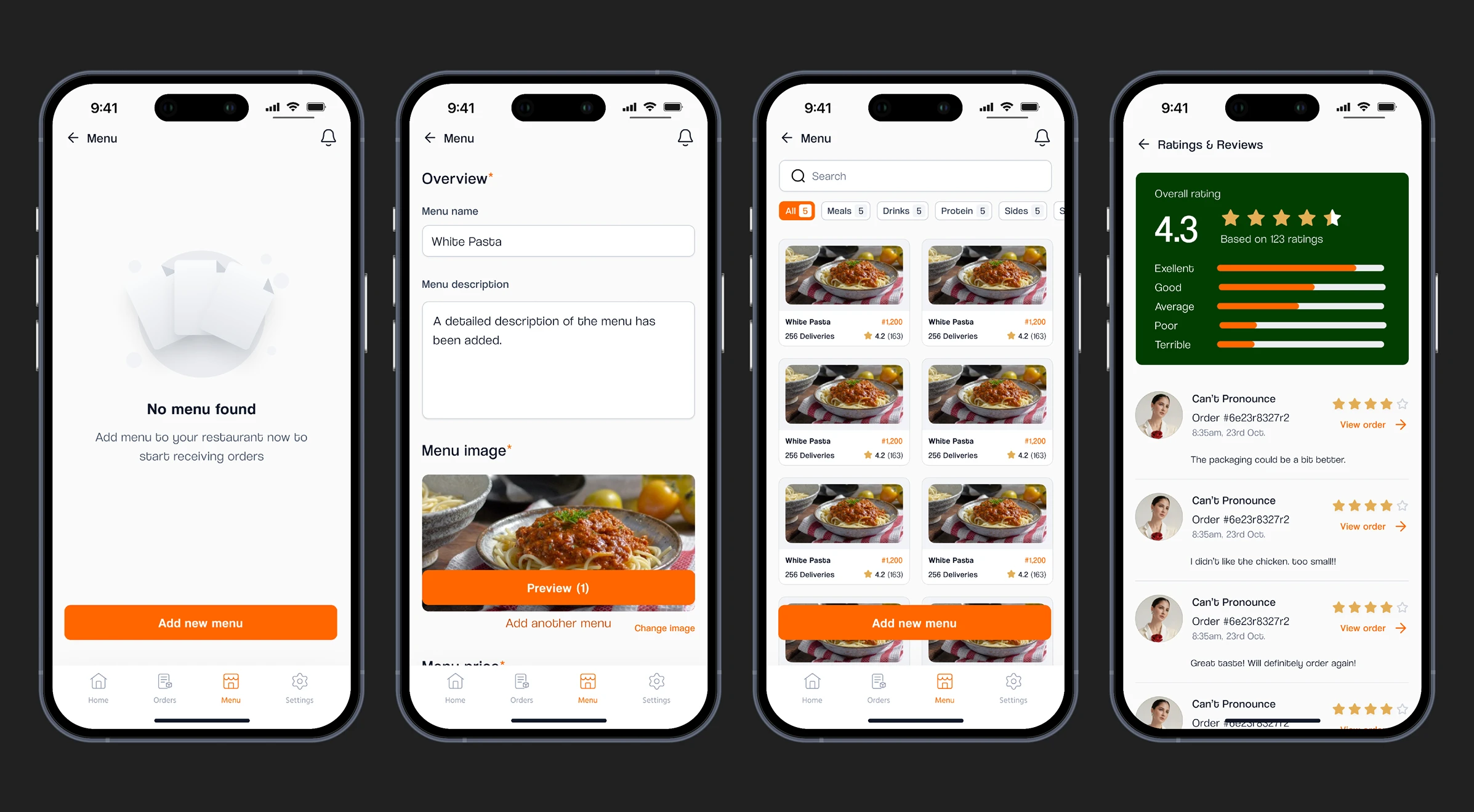
For new #Vendors, the Menu screen (Frame 1), allows them to add new menu to their catalogue (Frame 2) which is populated to the #Customer end after publishing. #Frame3 shows where #Vendors can edit or unpublish a menu from their catalogue by clicking on it, and I also brought real reviews and feedbacks from #Customers to them (Frame 4) which can be accessed from the settings page.
Rider App
Once a vendor marks an order as ready, it becomes visible in the assigned rider’s queue. The rider app:
Provides GPS-powered routing to vendor and then to the customer.
Offers real-time delivery tracking that updates both customer and vendor apps.
Uses a simple swipe/tap interface for task updates like "Picked Up", "On the Way", "Delivered".
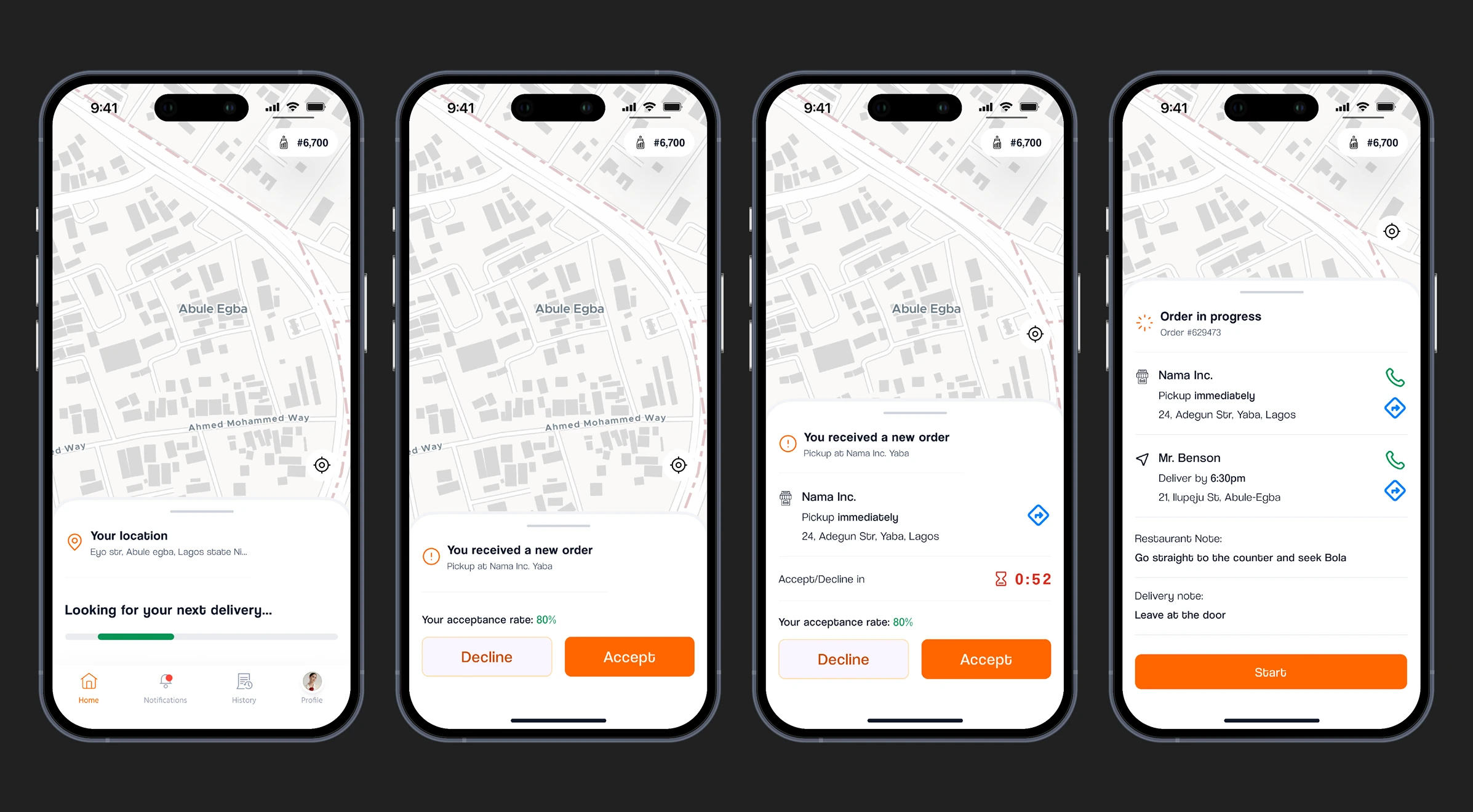
From the Homescreen (Frame 1), #Riders have a waiting area where they await a new order/delivery notification (Frame 2) which they can expand to see more details of the order (Frame 3) and also the countdown to either accept/decline the delivery. Accepting the order shows them more details like contact and location details of both the pickup and delivery locations, and also delivery instructions from #Customer and #Vendor with a CTA button to start the deliver which updates on both the #Customer and #Vendor ends (Frame 4).
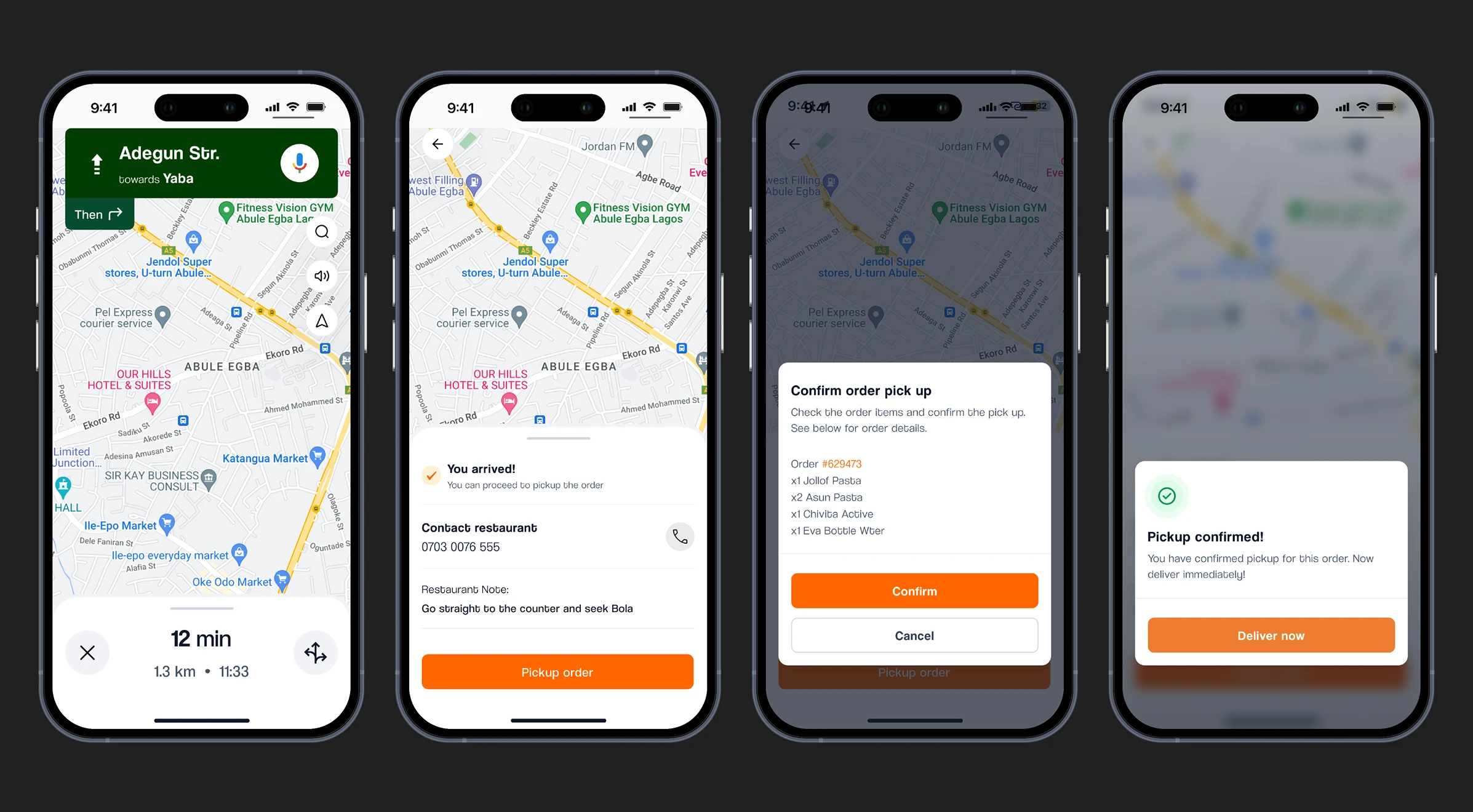
Google maps has been integrated for easy navigation (Frame 1) and after arriving at the pickup location they have the option contact the #Vendor and a CTA button to pickup the order (Frame 2) which brings up the full order details from the #Customer to confirm (Frame 3), and only after which the first part of the delivery can be concluded, which immediately initiates the second part with a CTA button (Frame 4).
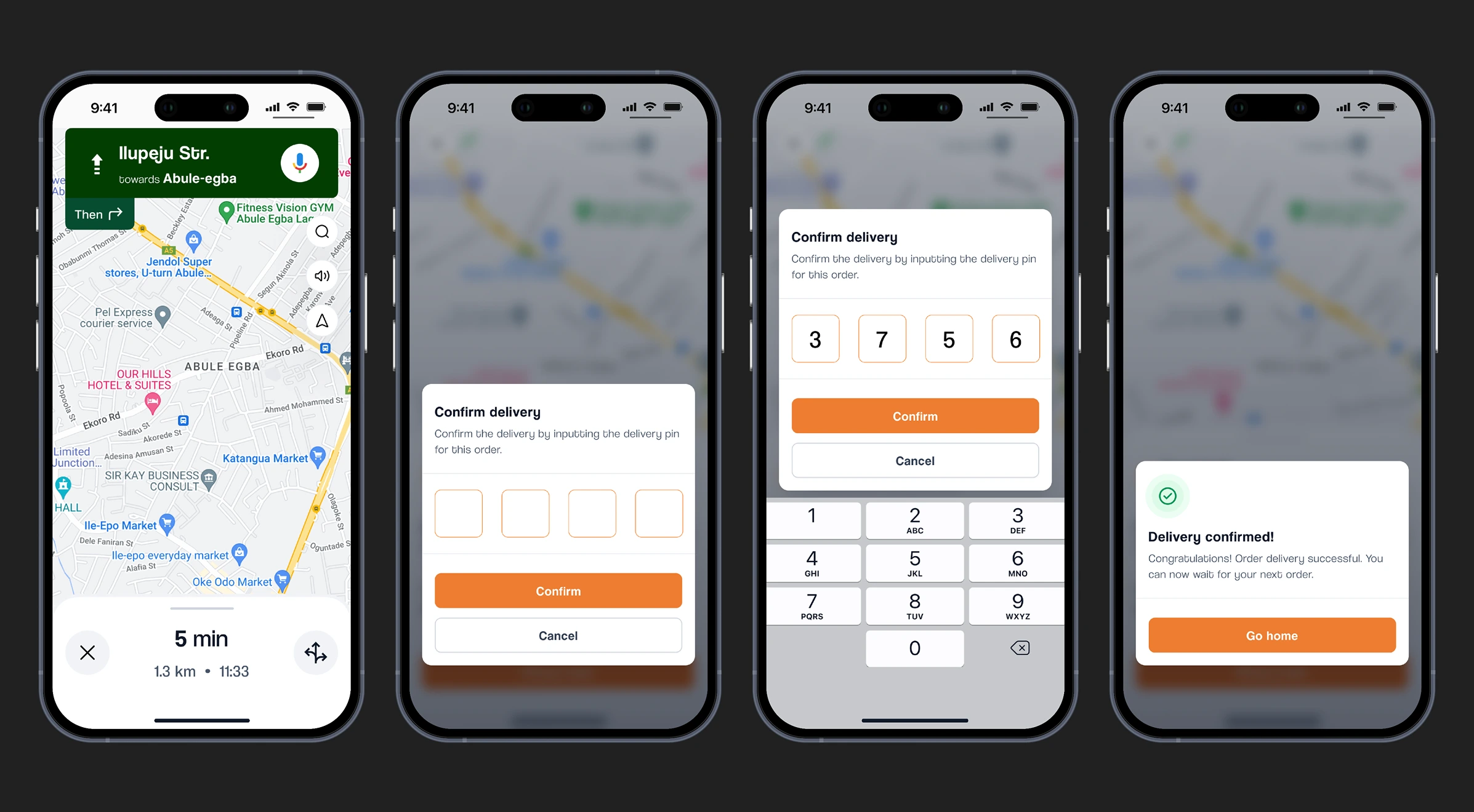
Delivery navigation is also handled with Google maps (Frame 1) and after arriving at the delivery location they’ll be prompted to input a delivery pin which is provided by the #Customer (Frame 2). Only after inputting the correct pin (Frame 3) can the delivery can be concluded, which means it’s gotten to the right person.
Admin Dashboard
The backbone of the operation, this tool allows admins to:
Manage users (vendors, customers, riders).
Monitor live delivery activity across all orders.
Resolve issues, apply discounts, manage featured vendors.
Push announcements and promotions across platforms.
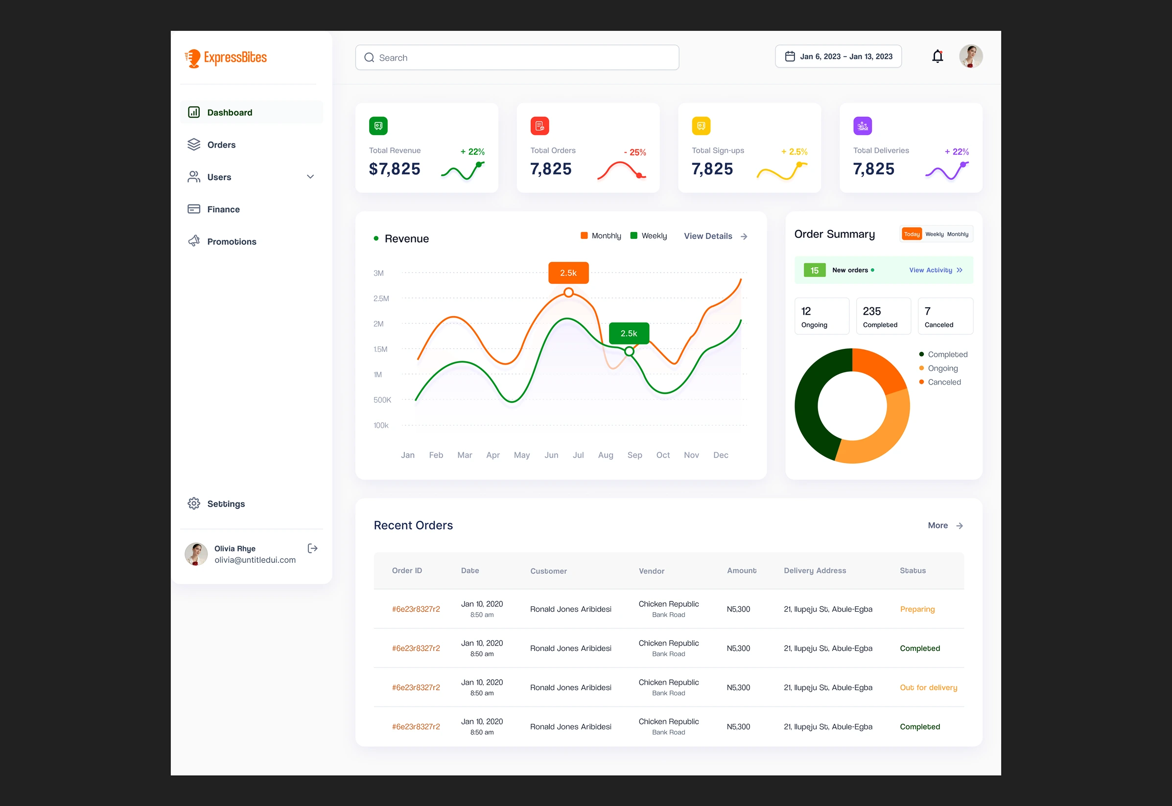
The Dashboard screen allows #Admins to see the summary of activities across the ecosystem. From Revenues to Orders to Deliveries. There’s a graphical representation of the revenue to allow #Admins have deeper insight into how the product is performing. The order summary chart shows the summary for the day/week/month and #Admins can access ongoing orders from there with a CTA button. #Admins also have a glimpse of the recent orders and could decide to expand or not.
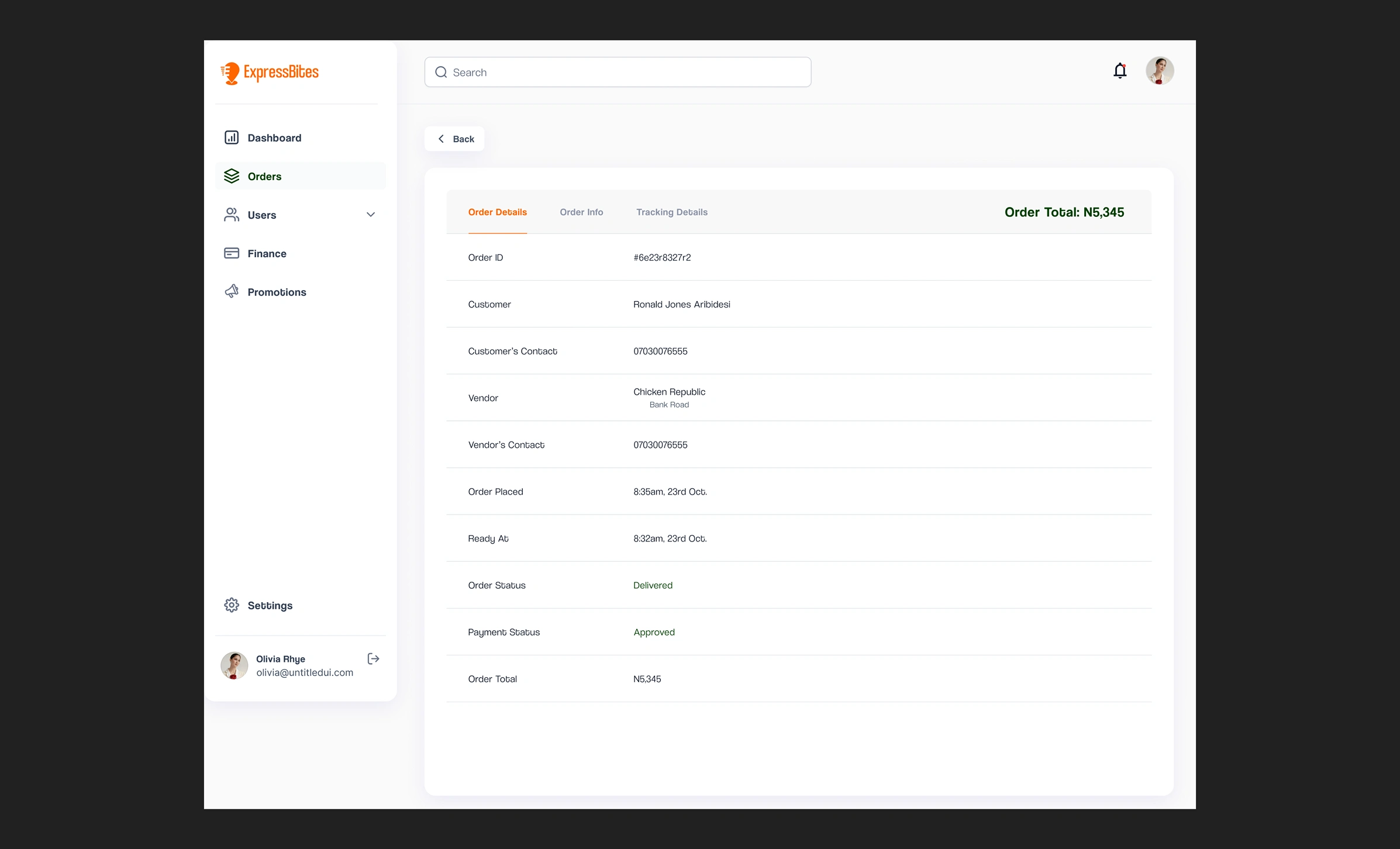
The Orders screen allows #Admins to monitor orders across the ecosystem. They have three tabs with different information and action. The ‘order details’ tab shows the information of the parties involved in that particular order across the ecosystem. ‘Order Info’ shows what the #Customer ordered and ‘Tracking Details’ is where they monitor deliveries.
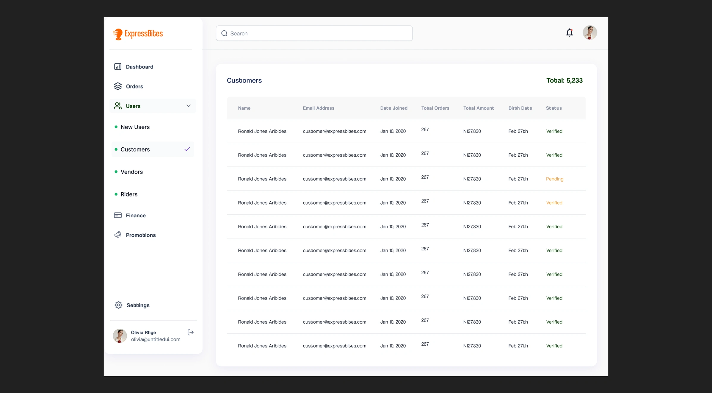
The Users screen is basically where the #Admin manages all users across all the ecosystem, from #Customers to #Vendors to #Riders. Clicking on the name of any user brings more information about the user such as the registration info and order history. For #Vendors, they have to be approved by an #Admin after all necessary review before their store can be available to #Customers.
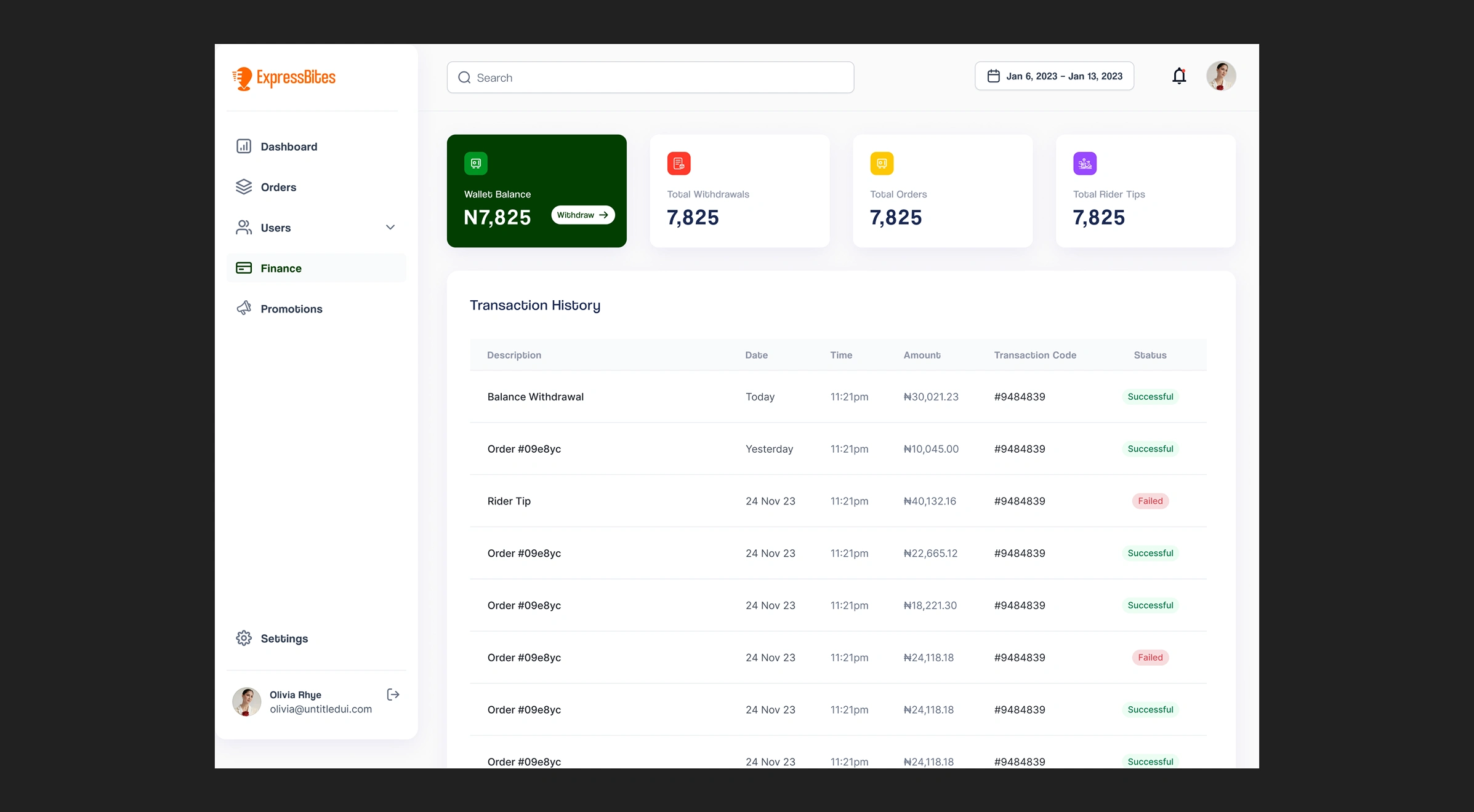
The Finance screen is where #Admins manage revenue across the ecosystem. They can monitor all monetary transactions going on and each transaction can be expanded to see in more detail what the transaction is about.
Key Interactions Across the System
Real-time Status Sync: Every stage of the order (from placement to delivery) is reflected across all platforms. This ensures transparency and reduces confusion.
Notifications System: Time-sensitive alerts keep users informed (e.g., “Order confirmed”, “Rider nearby”, “Item unavailable”).
Data Flow: The admin dashboard collects real-time analytics from all apps, allowing business teams to make data-informed decisions on vendor performance, delivery times, and user engagement.
Why It Matters
Designing this interconnected system allowed us to reduce delays, improve communication, and create a scalable architecture that mimics real-world food delivery logic. The design system used across all platforms ensured visual harmony, which helped users switch contexts (e.g., vendors doubling as customers) without a learning curve.
In short, each platform wasn't just designed—it was orchestrated to work in harmony with the others.
Testing & Iteration
After completing high-fidelity designs for each platform, I built interactive prototypes in Figma to simulate end-to-end experiences. From placing an order as a customer to fulfilling it as a rider or vendor. The goal was to validate usability, identify friction points, and ensure clarity of interactions before handoff to developers.
Testing Process
I recruited 10 users who fit our primary personas (remote workers and students) and asked them to complete core tasks on the Customer, Vendor, and Rider prototypes. Each session was observed and recorded remotely using Zoom and Maze for behavioral heatmaps and click tracking.
Tasks tested included:
For customers: Signing up, searching for a vendor, placing an order, and tracking delivery.
For vendors: Accepting an order, updating its status, and managing inventory.
For riders: Viewing assigned tasks, navigating routes, and marking deliveries as complete.
Key Insights & Improvements
Customer Flow: Users loved the clean UI but struggled slightly with understanding delivery estimates. We added clearer time indicators during checkout and emphasized live tracking earlier in the flow.
Vendor Flow: Vendors wanted quicker access to frequent actions. We redesigned the home screen to surface pending orders and added bulk inventory editing.
Rider Flow: Riders appreciated the task queue system, but GPS routing wasn’t immediately intuitive in the prototype. We refined the routing experience with clearer visuals and simplified UI during transit.
We also used feedback from admin testers to improve the dashboard’s data visualizations, making KPIs easier to scan at a glance. Ultimately, the usability testing helped us iron out friction early, validate assumptions from the persona research, and ensure each app was intuitive even to first-time users.
Challenges & Solutions
Like most fast-moving product builds, Expressbites faced several real-world challenges, which are both strategic and executional during the design and handoff process.
1. Development Delays
Challenge: The development team faced delays due to the complexity of handling five interconnected platforms. Misalignments in handoff files and backlog prioritization slowed progress.
Solution: I initiated weekly sync meetings with both frontend and backend developers to walk through flows and component logic. I also created clickable prototypes and Loom walkthroughs for complex interactions, which drastically reduced back-and-forth and ambiguity. This alignment helped re-establish momentum.
2. Scope Creep
Challenge: Midway through design, new ideas (e.g., vendor promo banners, wallet top-up features) were proposed. While valuable, they risked derailing the MVP timeline.
Solution: I introduced a feature prioritization matrix with the stakeholders to classify features as Must-Have, Nice-to-Have, and Future Scope. This gave everyone clarity and buy-in on what could realistically be launched first and what could wait.
3. Visual Consistency Across Platforms
Challenge: Designing five platforms with distinct use cases (e.g., mobile for riders vs desktop for admin) made it hard to maintain brand consistency.
Solution: I created a central design system with reusable components, typography styles, color tokens, and layout rules. This not only saved time but ensured visual harmony across platforms and reduced confusion for users who might use more than one role-based app.
These challenges were expected in a cross-functional ecosystem like Expressbites, but by staying communicative, organized, and user-focused, we were able to ship polished designs on time and aligned across all stakeholders.
Final Outcome
All five products were designed and handed off within the one-month deadline. Development was able to commence swiftly with clean, component-based files and clear documentation. Early user feedback praised the visual simplicity and ease of use.
Key Learnings
Multi-app ecosystems require a holistic view of user flows and dependencies.
AI can significantly streamline ideation and early structuring phases.
Communication is the designer’s secret weapon when timelines are tight.
Conclusion
Expressbites pushed me to design beyond screens, to architect an ecosystem where customers, vendors, riders, and admins all connect seamlessly. It was a test of systems thinking, communication, and adaptability. Leading this project not only sharpened my product thinking but also reaffirmed the impact of good design on everyday problems.
The experience showed me how thoughtful UX, strong collaboration, and iterative validation can turn complexity into clarity, and that’s a principle I carry into every new challenge.
Like this project
Posted Jun 25, 2025
Led design for Expressbites, a multi-platform food & grocery delivery service that serves 10k+ individuals on a daily basis.
Likes
0
Views
0


