Rethinking the Beat Buying Experience — A UX Study of BeatStars
Zach Bello
What if producers could sell beats as easily as shopping online—no extra steps?
I explored BeatStars, a platform close to that vision, and spotted a few areas where UX improvements could streamline the experience for both artists and producers. I redesigned key touchpoints to reduce friction, enhance clarity, and introduce new ways for users to engage with beats.
Role:
UX/UI Design, Product Thinking

1. Onboarding & User Flow
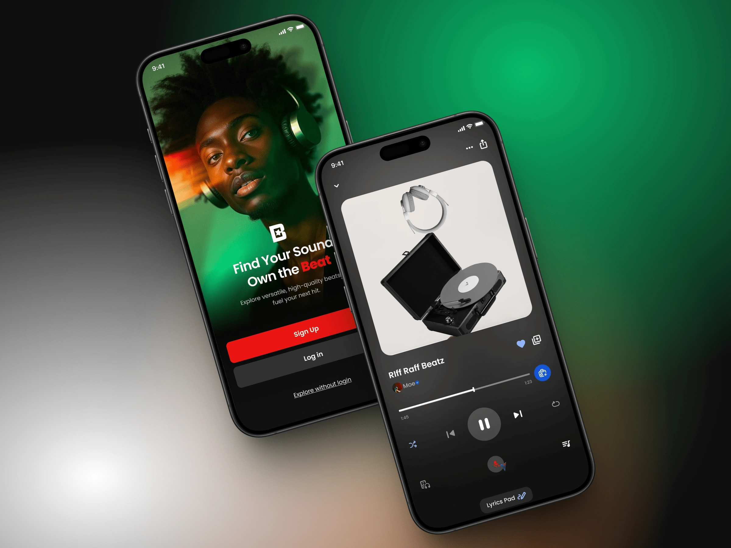
The splash screen felt visually strong but lacked context. I introduced a more engaging hero section with concise copy that sets expectations from the start.
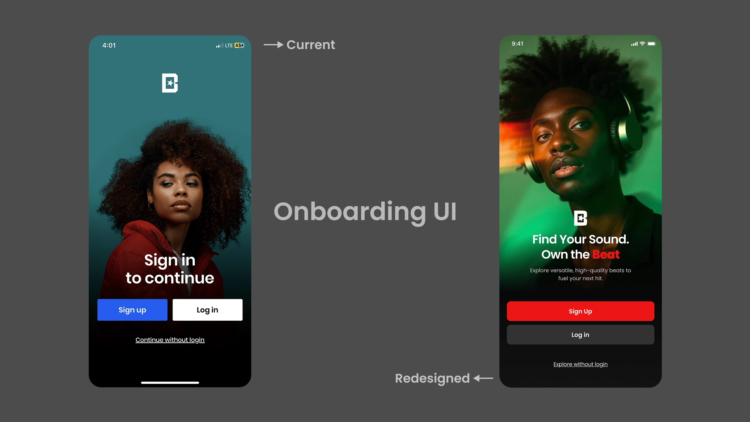
Splash Screen Redesign.
Additionally, I reduced friction by keeping login/sign-up actions within the app, avoiding unnecessary browser redirects.
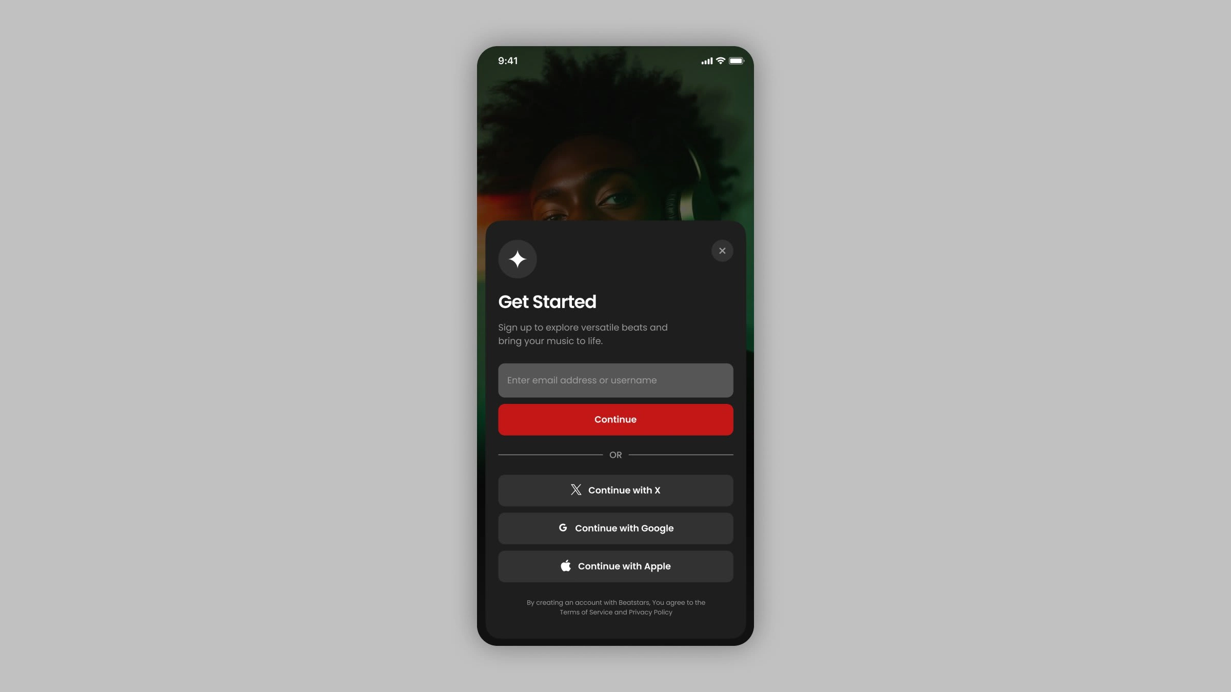
Login Modal
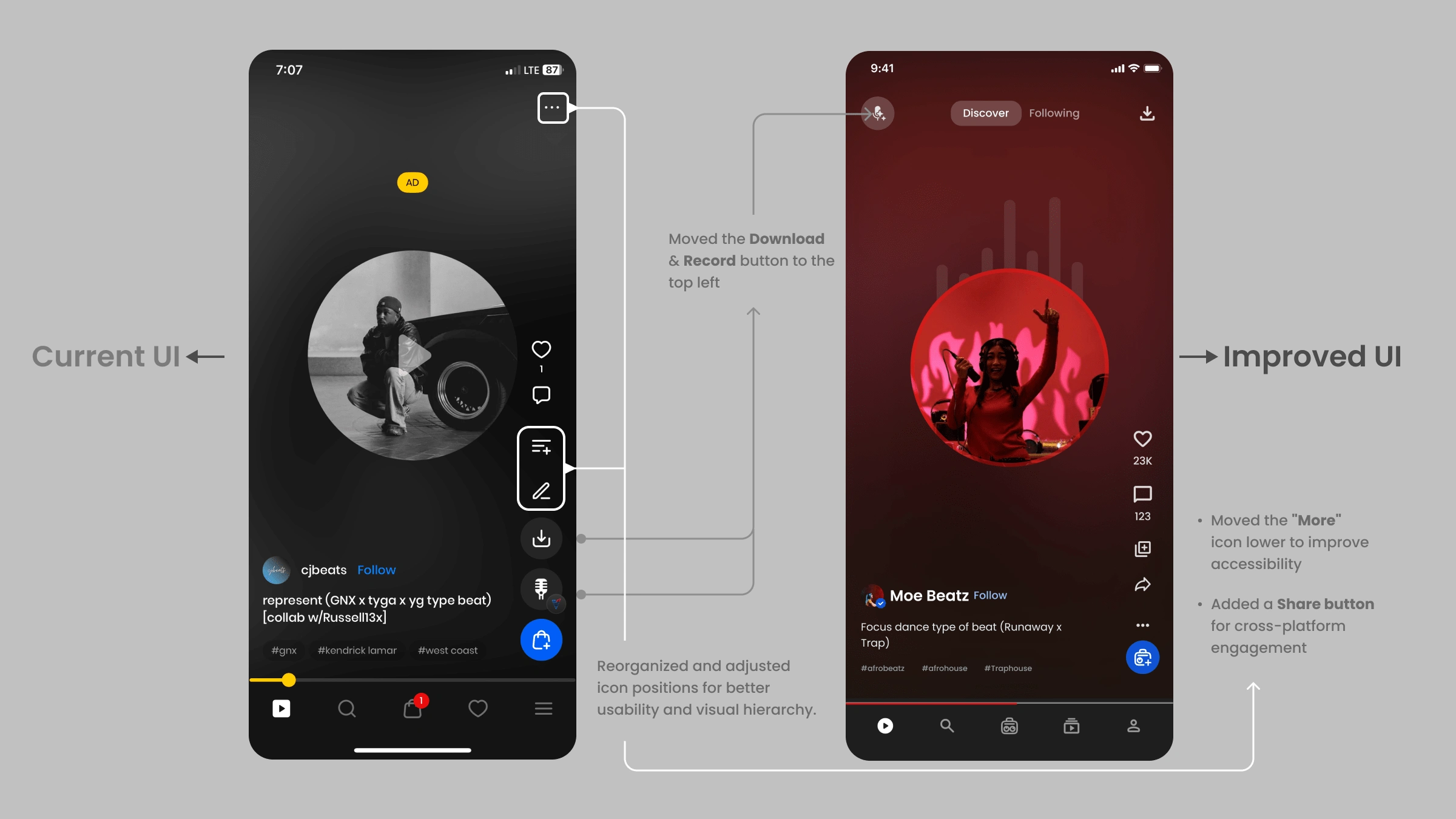
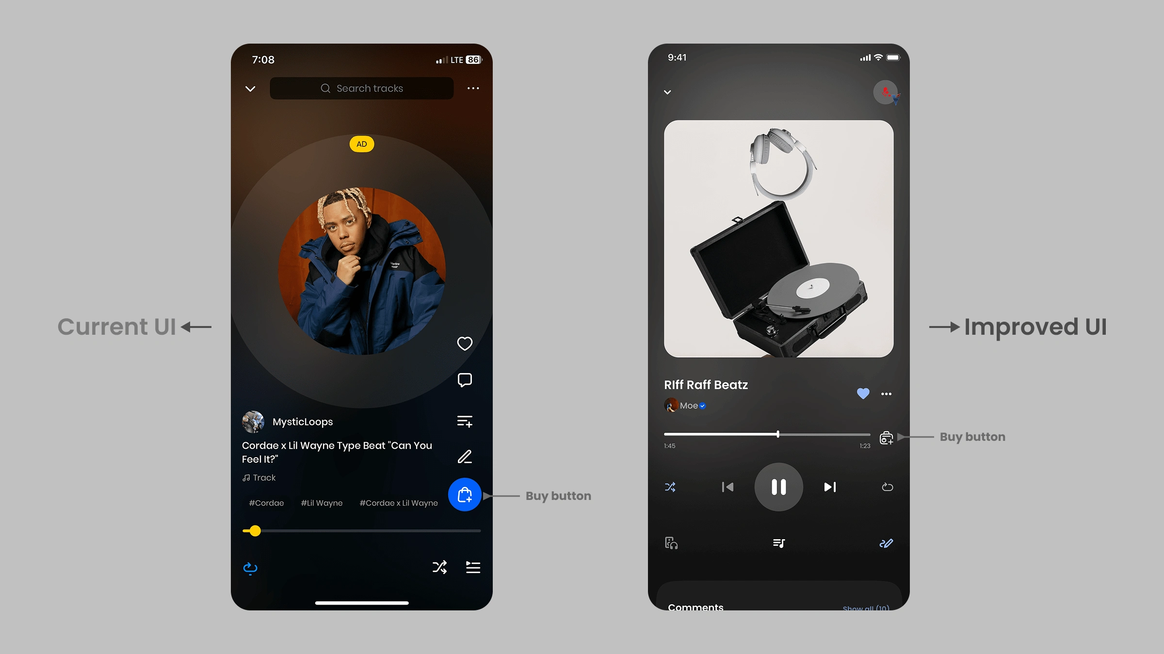
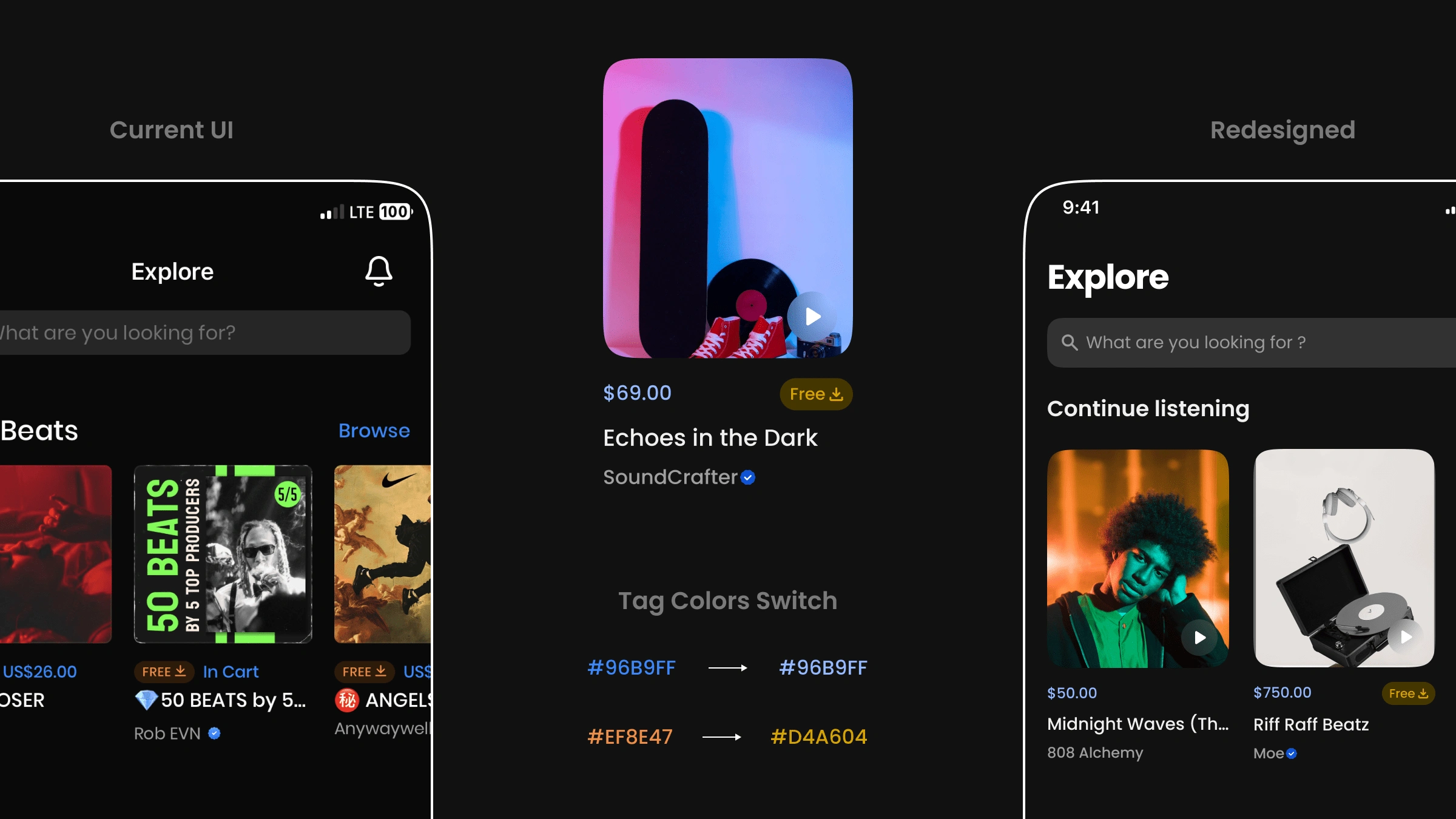
2. Clarifying Beat Playback Across Pages
The “Personalized Feed” and “Explore” pages offered similar playback experiences, which made navigation confusing.
I retained the TikTok-style scrolling for the Feed but refined the UI to reduce clutter.
For Explore, I brought back a more traditional stream-like layout with clear beat previews and easy access to purchase options.
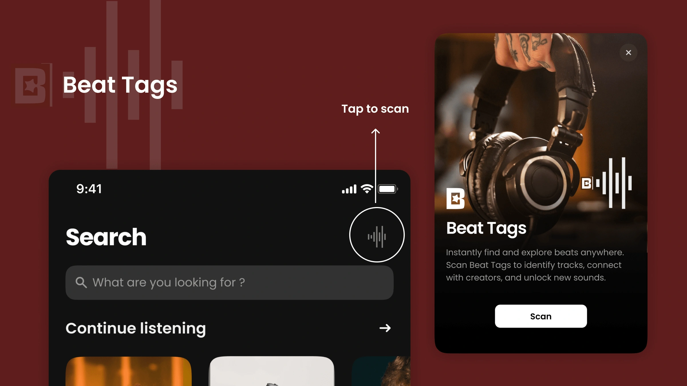
3. New Feature: Beat Tag
I proposed a new feature called Beat Tag—scannable, shareable beat playlists. This would allow producers to curate and distribute their beats more easily, increasing discoverability and potential sales.
4. Other Visual Enhancements
Improved beat card visibility with price clarity and a dedicated play button.
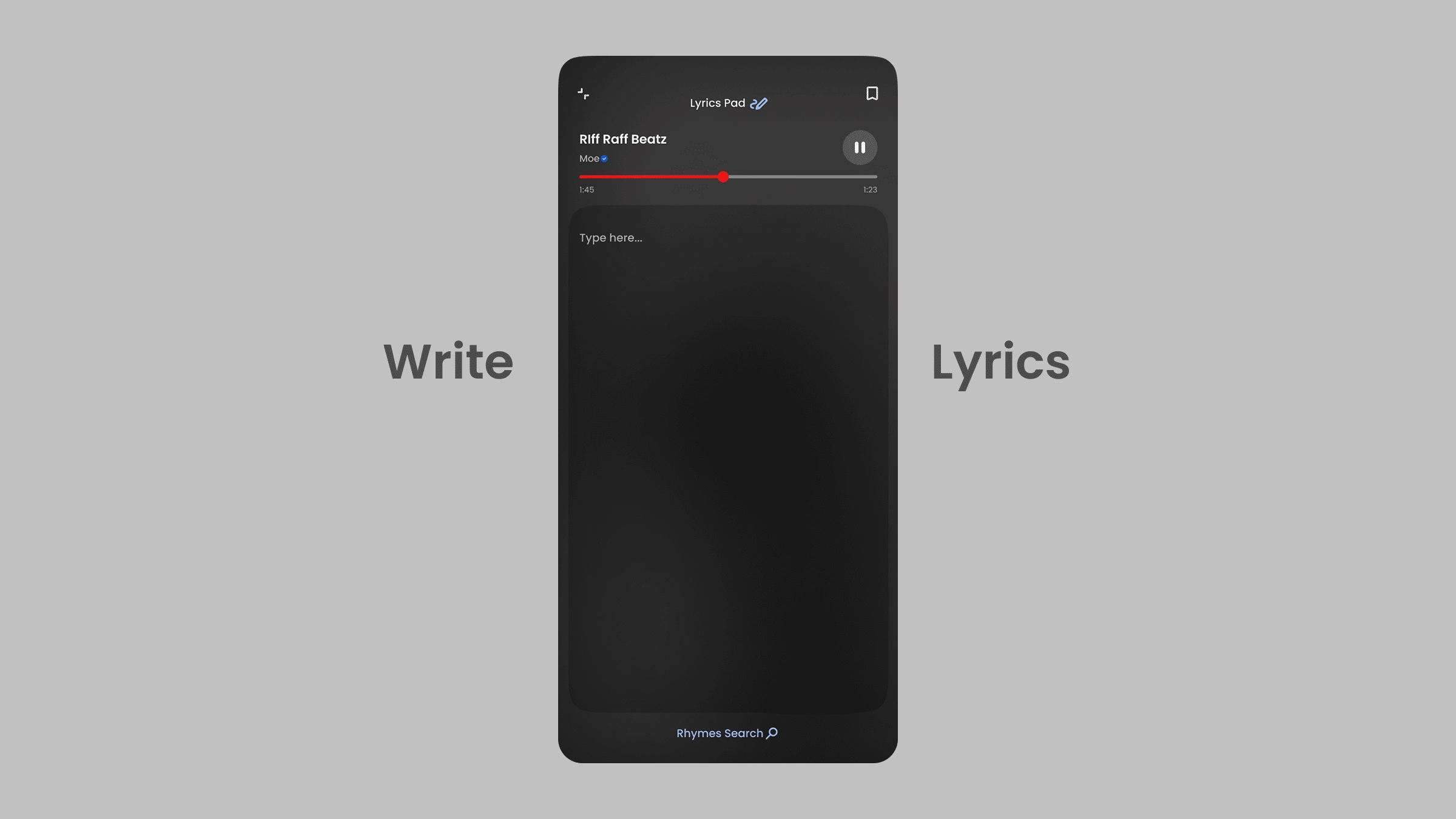
Redesigned the Lyric Pad to better align with the overall UI for a cohesive experience.
Like this project
Posted Apr 4, 2025
The redesign concept received positive feedback from creatives and producers in the community.
Likes
0
Views
9