Cravea — Clean & Calm Food Delivery App Redesign

Solahudeen Fatimah

Overview
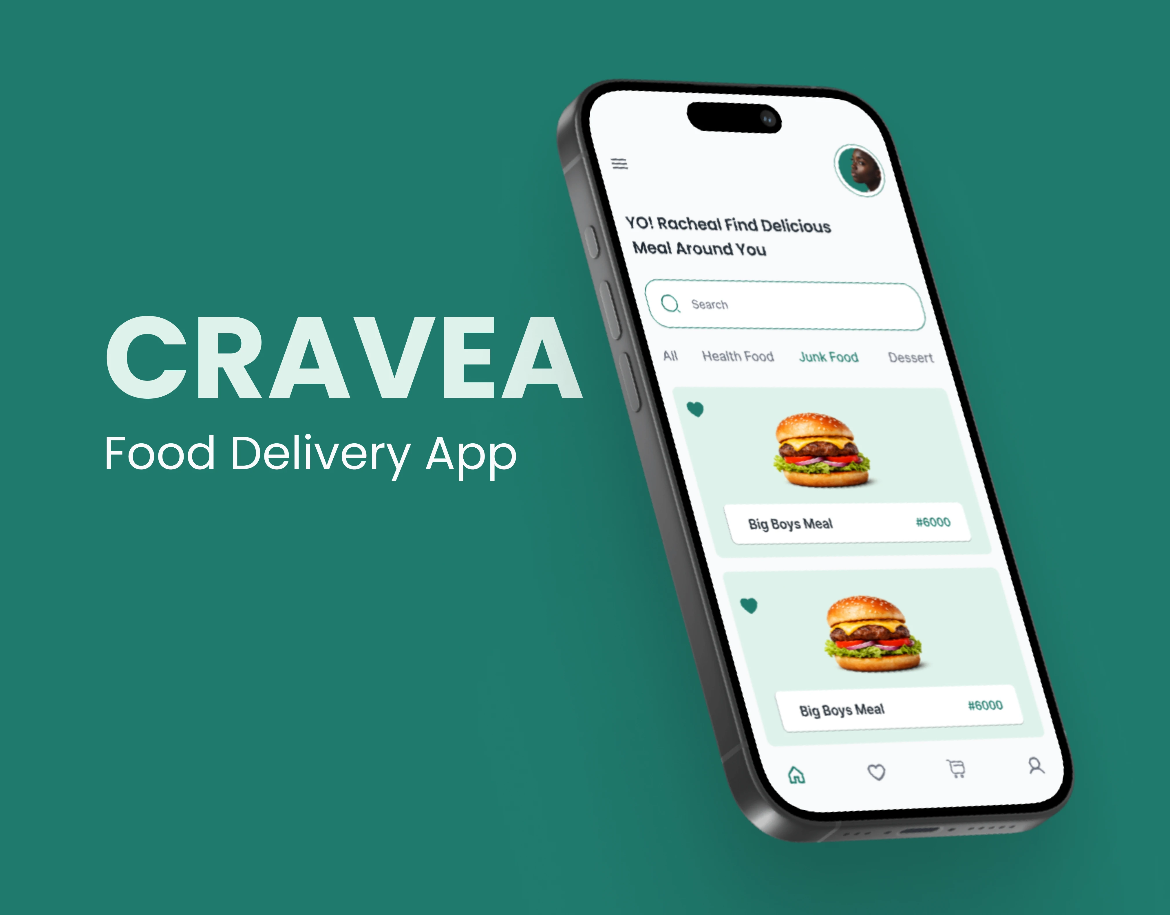
Cravea is a conceptual redesign of an existing food delivery app, focused on improving clarity, visual calm, and usability. The goal was to create an interface that feels effortless to navigate, even during the high-friction moments of browsing menus and placing orders.
The Problem
Most food delivery apps pack too much into every screen. Bright colors, competing promotions, and dense menus create visual noise that slows users down. I wanted to explore what a calmer, more intentional version of this experience could look like.
My Approach
I mapped out the core user flow (browse, select, customize, checkout) and identified where friction and visual clutter were highest. I then redesigned each screen in Figma, using FigJam for early flow mapping and wireframing. The focus was on reducing visual noise while keeping all essential functionality accessible.

Key Design Decisions
Muted, warm color palette to reduce visual fatigue
Generous whitespace between menu items for easier scanning
Simplified checkout flow with fewer steps and clearer progress indicators
Card-based layout for restaurant and menu browsing to create visual consistency
Results & Reflection
This project sharpened how I think about restraint in UI. The biggest takeaway: removing elements is harder than adding them. Every screen went through multiple rounds of stripping back before the layout felt right.
The redesigned checkout flow cut the original 5-step process down to 3 steps by combining customization and cart review into a single view. The muted palette and increased whitespace made the menu browsing experience feel significantly less overwhelming in user testing with peers.
If I were to take this further, I'd explore micro-interactions for the add-to-cart and order confirmation moments, and test the design with real delivery app users to validate whether the calmer aesthetic affects perceived speed of service.
This is a concept/self-initiated project, not a client engagement.
Like this project
Posted May 4, 2026
A conceptual food delivery app redesign focused on reducing visual clutter, improving navigation flow, and creating a calmer ordering experience through intentional spacing, muted tones, and simplified checkout.
Likes
0
Views
7
Timeline
Apr 1, 2026 - May 4, 2026