Redesigning the OCTO powerplant management dashboard
Overview
Soul Energy is a renewable energy company that recently rebranded its product system and user experience. One of its products, OCTO Admin, helps power plant owners manage their facilities more effectively by overseeing operations and maintenance.
Impacts
I successfully resolved a complex issue regarding the outdated design of power plant management. Through my efforts, it is now easier to manage these facilities. Additionally, I implemented updates to ensure our products maintain a consistent brand image.
The Problem
The problem with this dashboard was most pages consisted of complex charts and architecture and overall the design was outdated.
Researching the UX problems in the product
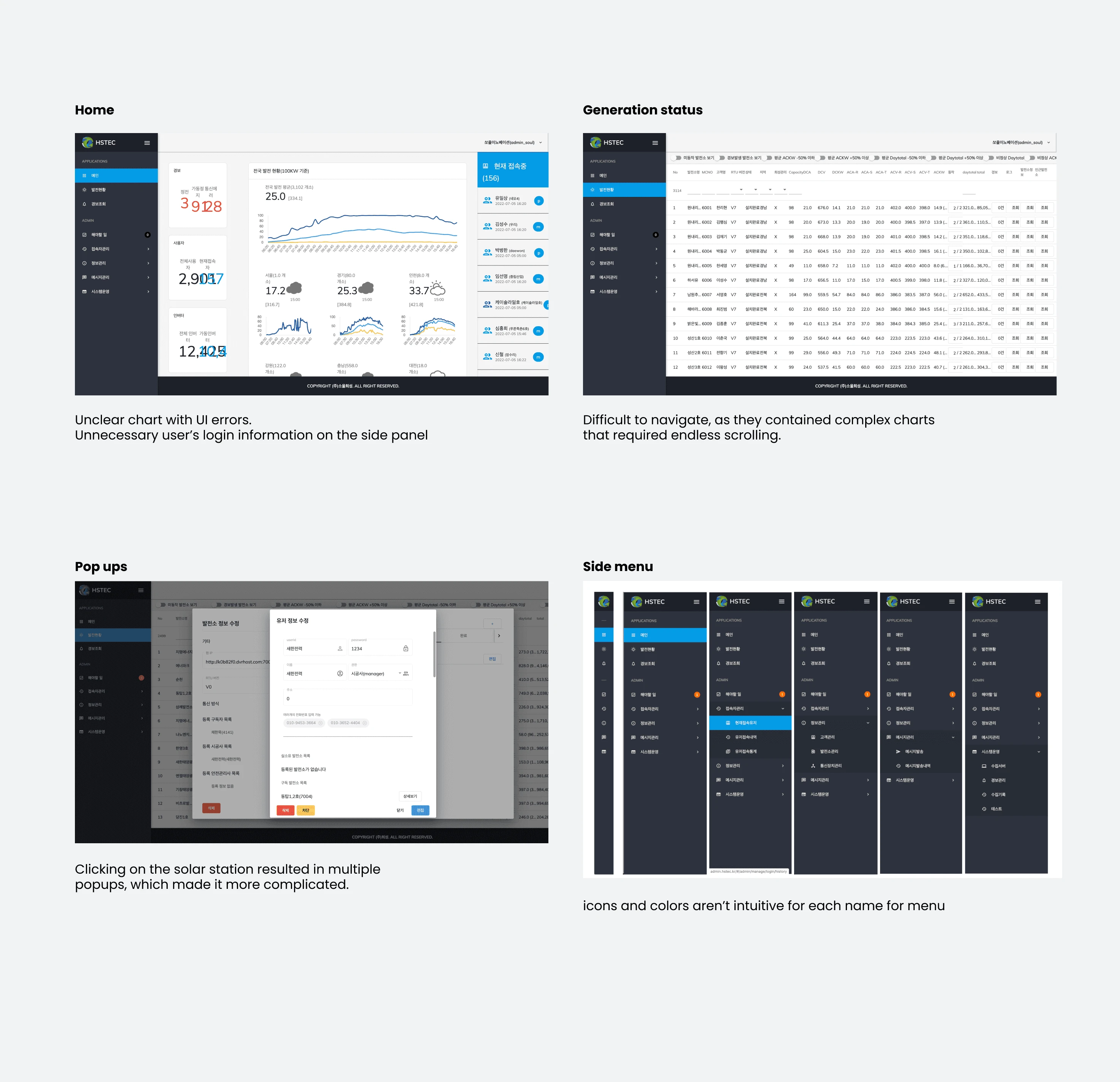
After conducting thorough research and reviewing feedback, I have identified several major issues with the current system:
1. The charts on the main dashboard are unclear and do not account for various data cases, resulting in UI errors.
2. The side panel displays unnecessary information about who is logged in.
3. The development and alert pages are difficult to navigate due to complex charts that require endless scrolling.
4. Clicking on the solar station triggers multiple popups, making the process more complicated.
5. The side menu's icons and colours are not intuitive for each name.
Ideate of IA and layout
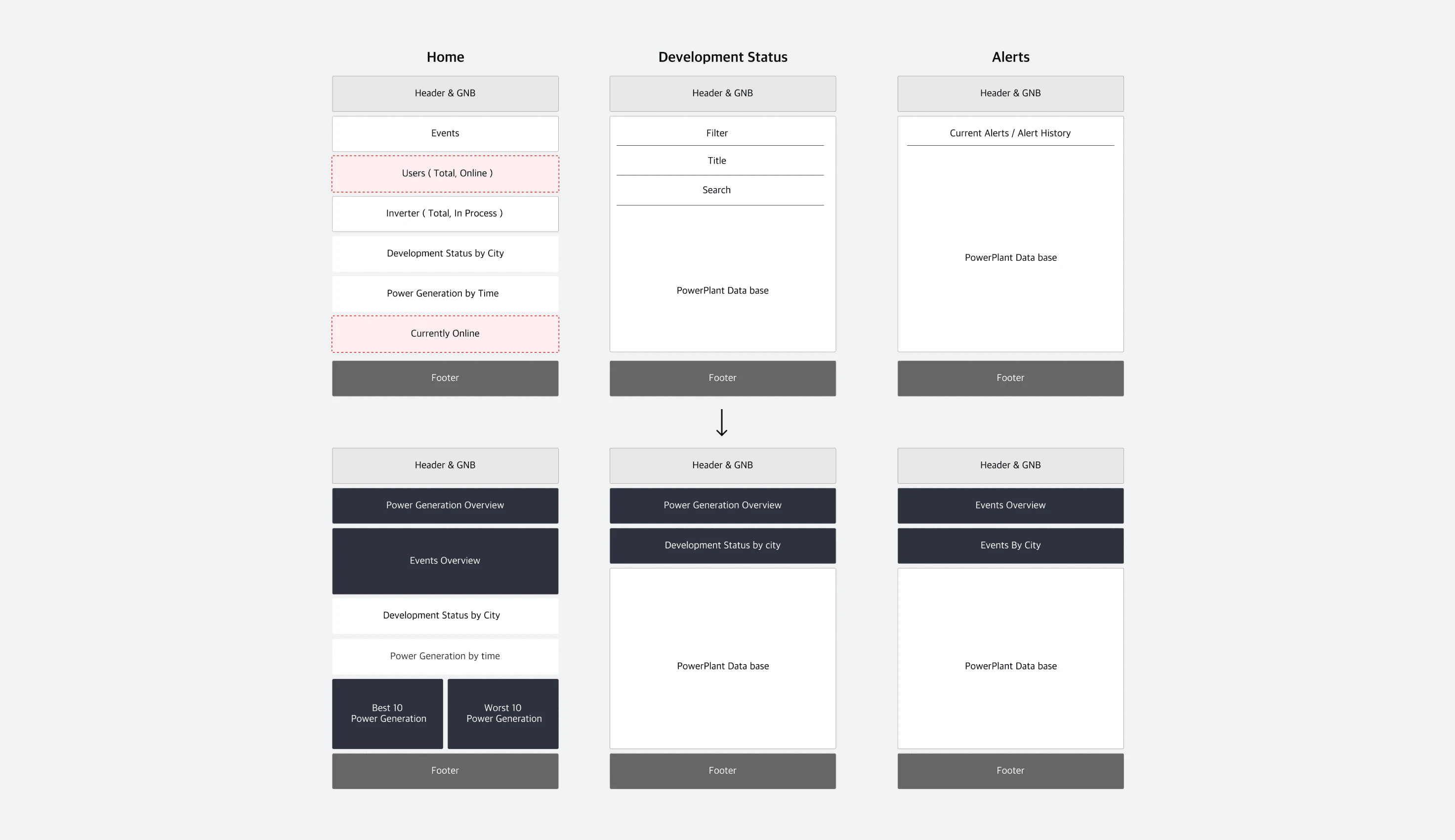
At first, I wanted to define what information we should show in the dashboard.
Creating wireframes
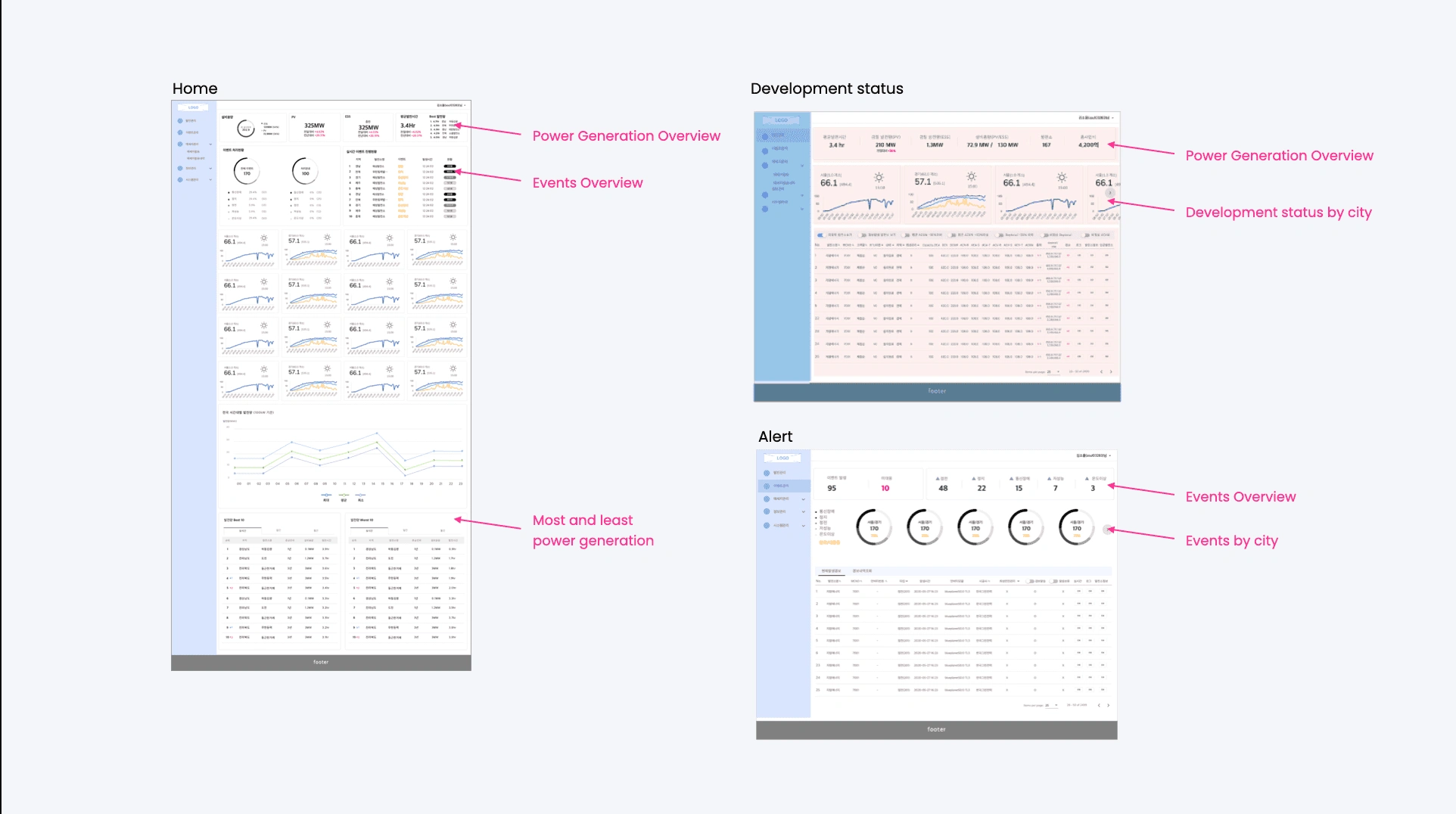
When creating the wireframes, I took into consideration the placement of the information.
Creating annotations to consider different data cases.
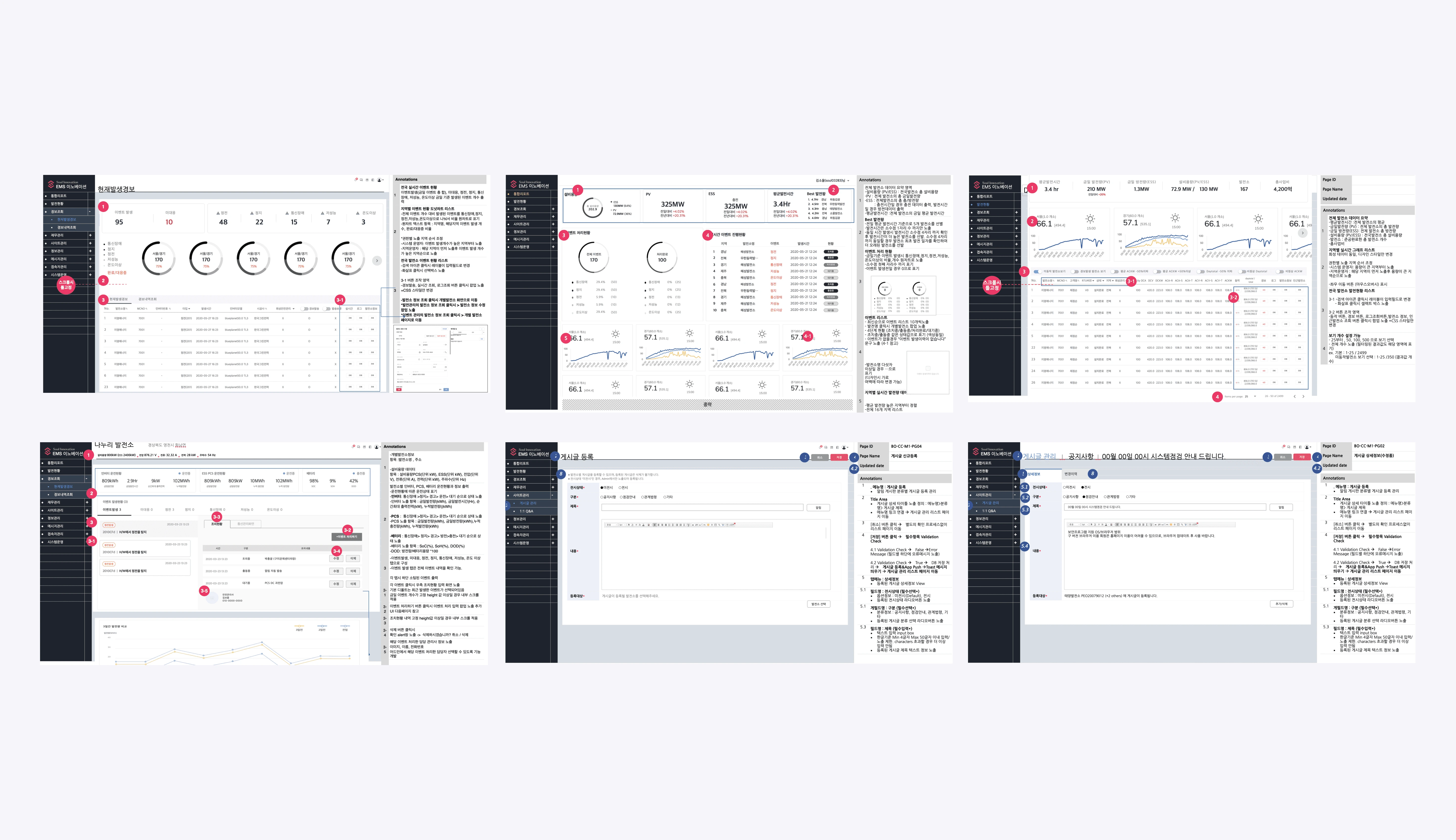
As part of my design process, I added annotations to the wireframes for the engineers. I carefully considered various data points such as maximum and minimum numbers, maximum and minimum text, and the number of different cases that needed to be considered. This helped me plan the layout before moving on to the design stage and ensured that both internal and external teams were in alignment.
Final Design
Home - Considering many cases and information
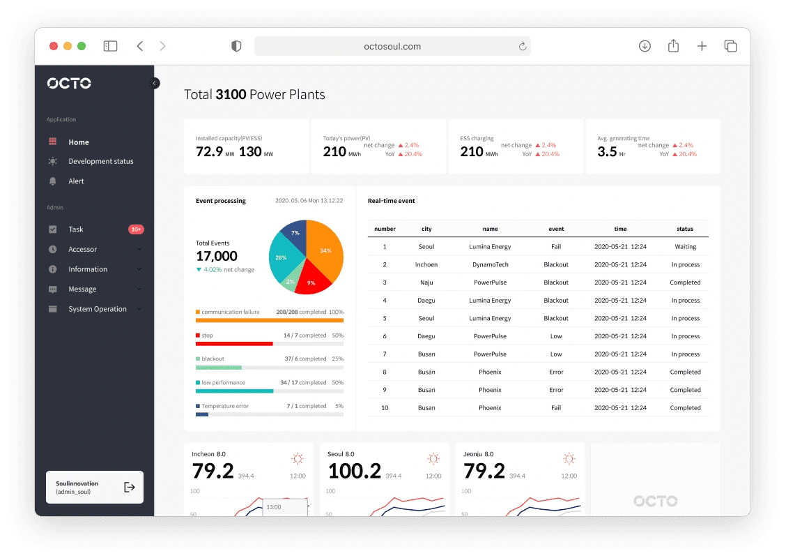
I provided a summary of the development status and events.
Development Status - Creating a prototype for a full product
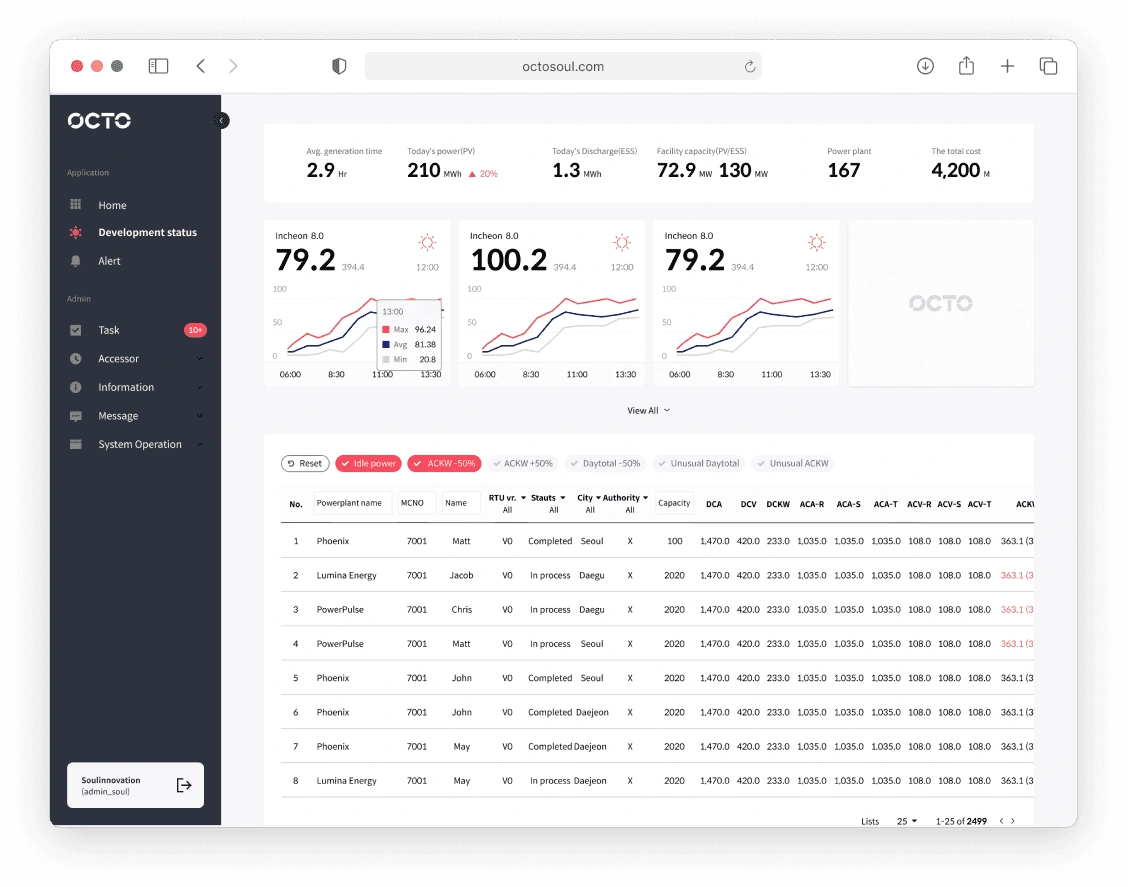
I produced various types of charts, such as graphs, bar charts, line charts, and numerical charts, to display information intuitively.
Alert - Considering many cases and information
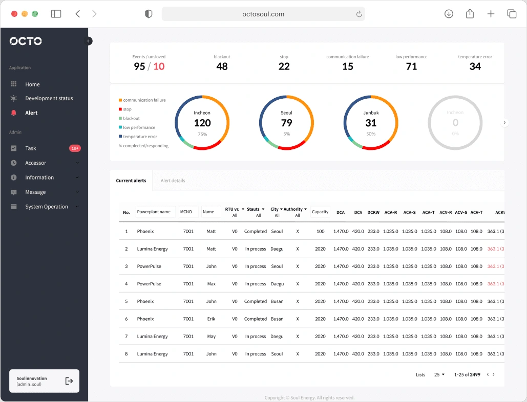
There was a lot of information to provide and the original dashboard wasn't made responsively. To make the design adaptable to different sizes, I used a card UI to display additional information and divided different types of information.
Short-Term Solution
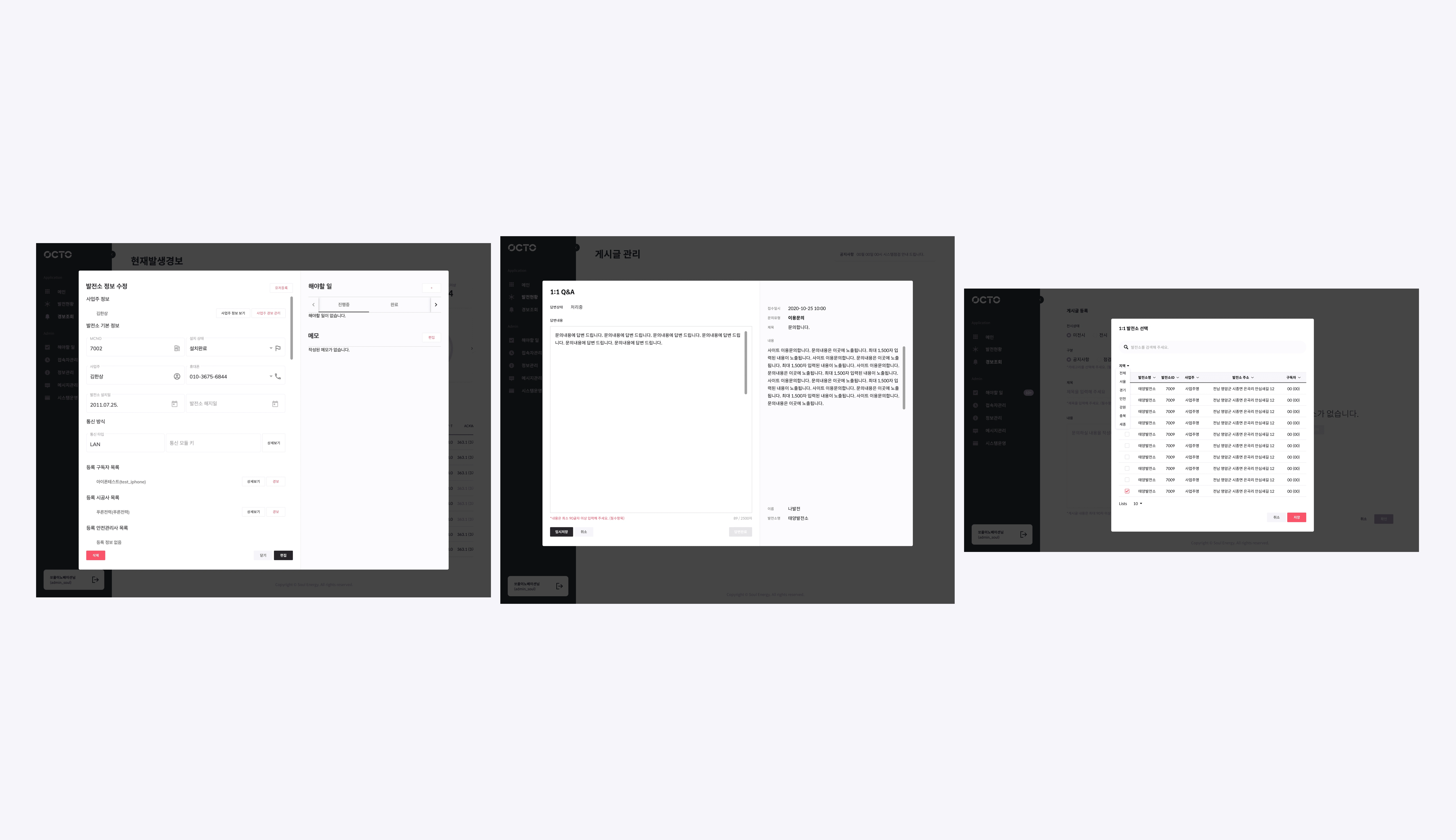
For other menus, I maintained the existing layout but implemented a new button design system for pop-ups.
Design Guideline
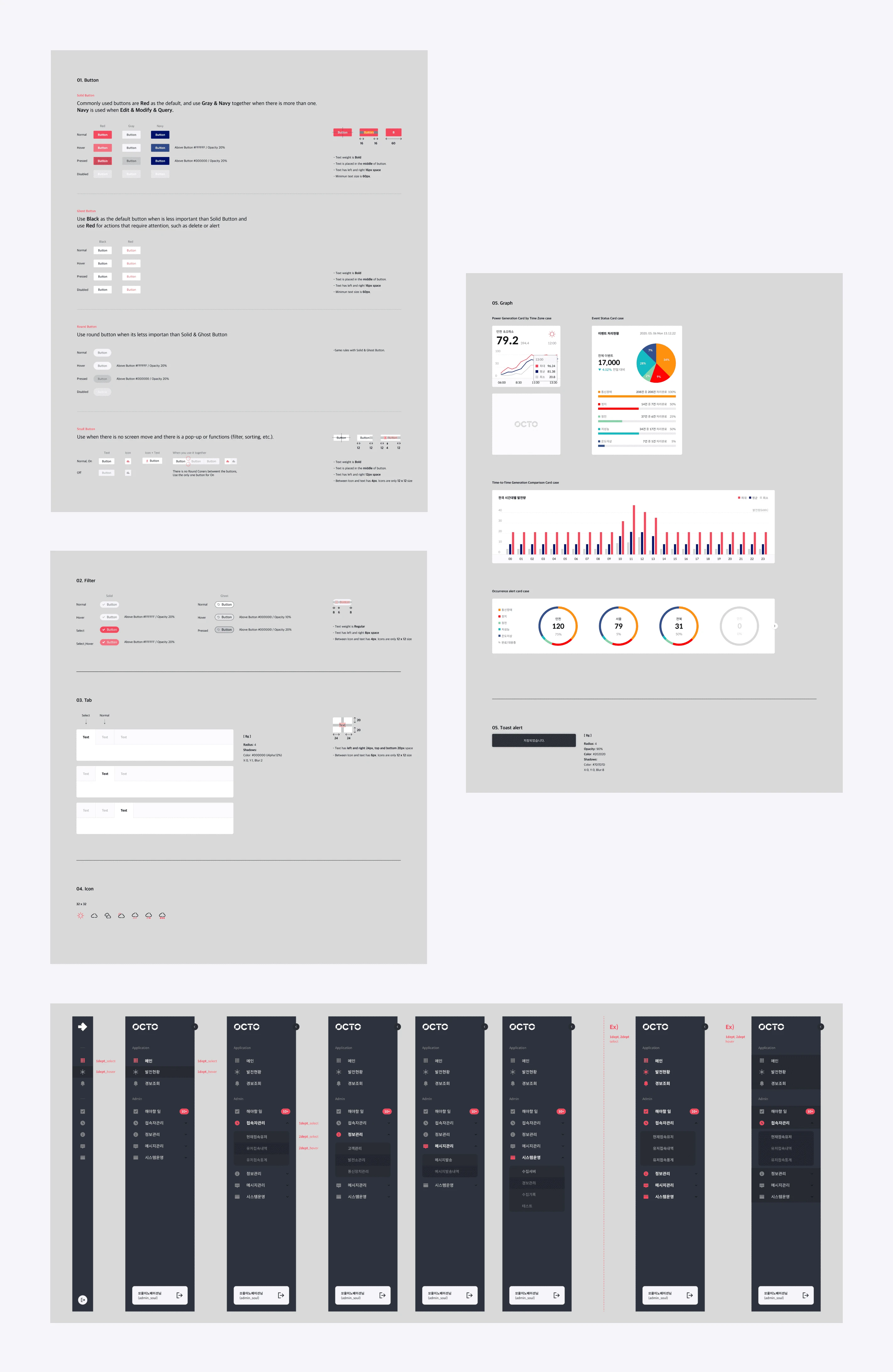
I organized the side menu, button states, hierarchy, and graphs. I have explanations for each system's rules.
Conclusion
Users can easily see the problems with solar panel
Integrate new design system
Upgrade visual hierarchy, good use of space
Remove unnecessary information
Like this project
Posted Aug 17, 2023
I successfully resolved a complex issue regarding the outdated design of power plant management.
Likes
0
Views
13

