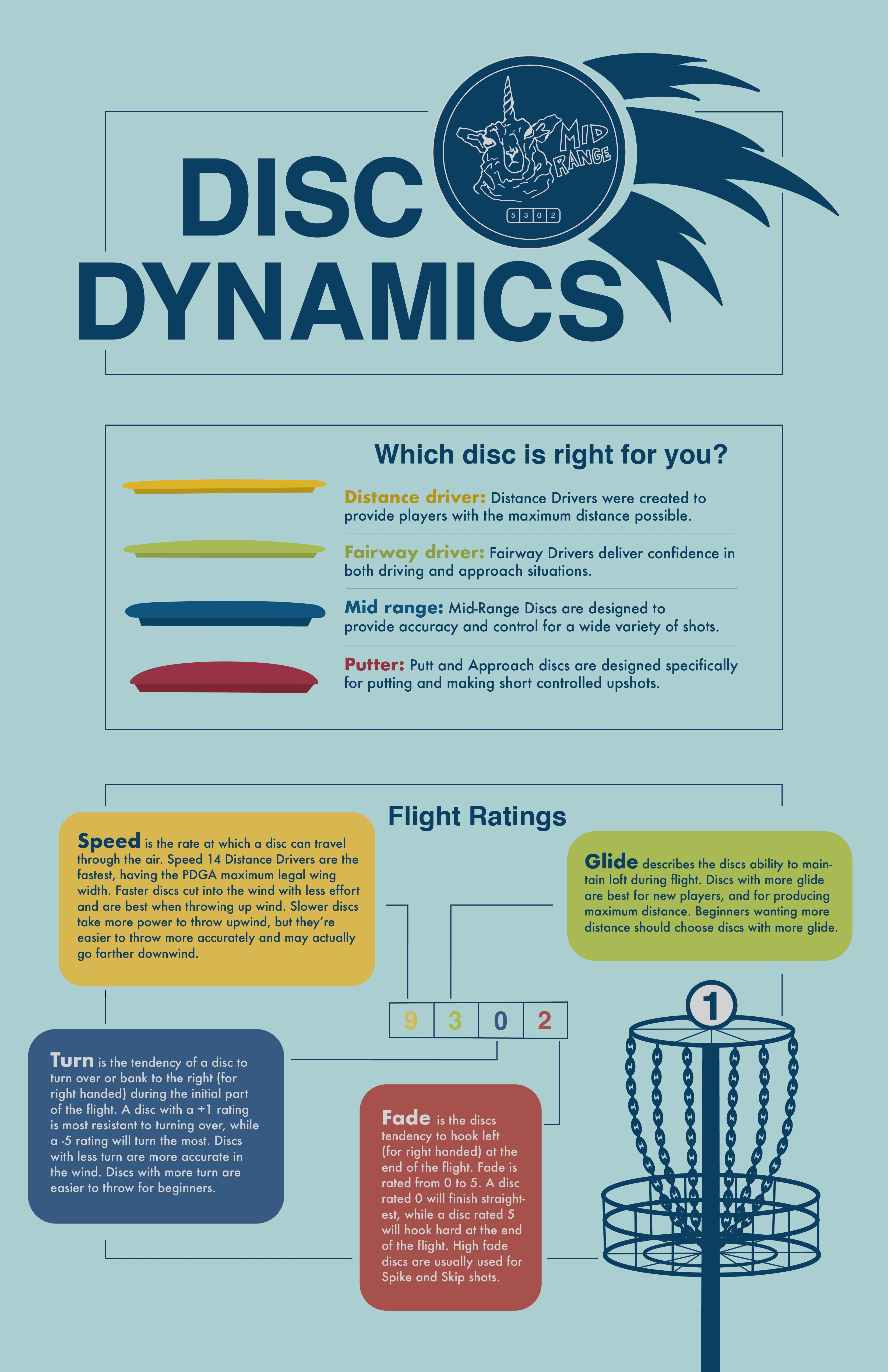
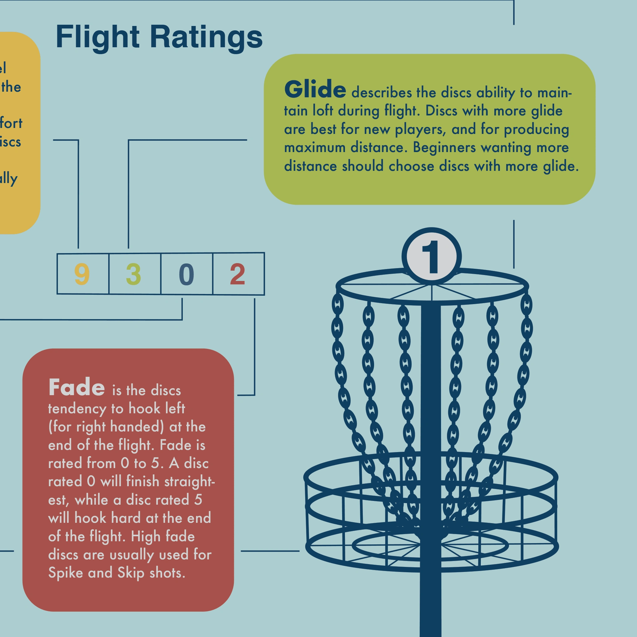
DISC DYNAMICS
Emily Rhodes
ABOUT THE PROJECT
Dynamic Discs is a company that sells discs and other products used in the sport of disc golf. This is a 11” x 17” fictional infographic poster detailing the distinct categories of discs involved in disc golf. My goal for this infographic was to create a helpful resource so that new customers could learn more about the different types of discs and their function. While analyzing the four basic disc shapes, the infographic serves as a method of educating new customers about what they need to succeed.
CHALLENGES
The challenging aspect of this project was that I needed to convey information to the viewer that was unfamiliar. Research was required in order to determine what exactly new disc golfers were having questions about. Once I fully understood the information, I then had to decide how to sum up the information without leaving out any important details. I also need to determine how to strategically divide the information so that it would be easily grasped and understood by the viewer.
SOLUTION
While designing the layout, I wanted to divide the information into sections according to the natural movement of our eyes –from left to right and top to bottom. I decided to create three sections flowing from the top to the bottom. Starting from the top and going toward the bottom, each section would present more detailed information so that the viewer could gradually gain more insight before reaching an understanding. I wanted the viewer to be able to easily navigate through the infographic, and I found that the best way to ensure that was to split the information up visually and informationally.
Like this project
Posted Apr 18, 2022
...