Data Visualization Using Power BI
Objective
Client had a CSV file with details about clients, sales, revenues, etc. per month. The client wanted to make use of this data and find insights.
Results
1. Yearly Productivity
The client was able to find out how his revenues and costs fluctuate throughout the year. In addition to that we were able to visualize the productivity of the employees throughout the year. There appears to be a yearly cycle where the productivity peaks during the Spring months and plummets during the Winter months.
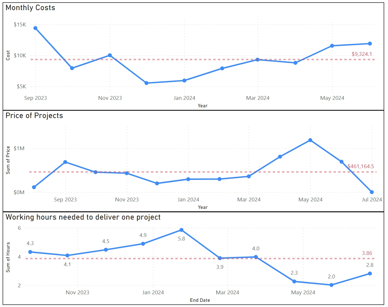
Yearly cycles of costs, revenues, and spent hours
The client now understands how to efficiently allocate resources throughout the year.
2. High-spending Customers
In addition to that the client requested to know which of his customers spend the most. Date was compiled into a pie chart with customers names (names were hidden to maintain confidentiality) and their yearly spendings.
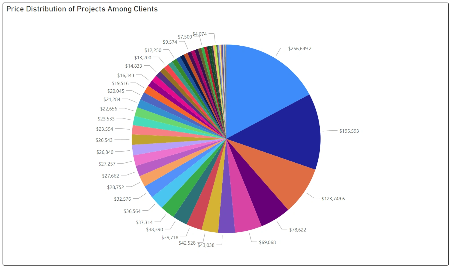
Spending per customer (names were hidden to maintain confidentiality)
A step further was taken to plot the loyalty of different customers. The plot includes the number of projects each customer engaged in with the client and the number of projects the customer engaged in with the competitor. (Names were hidden to maintain confidentiality).
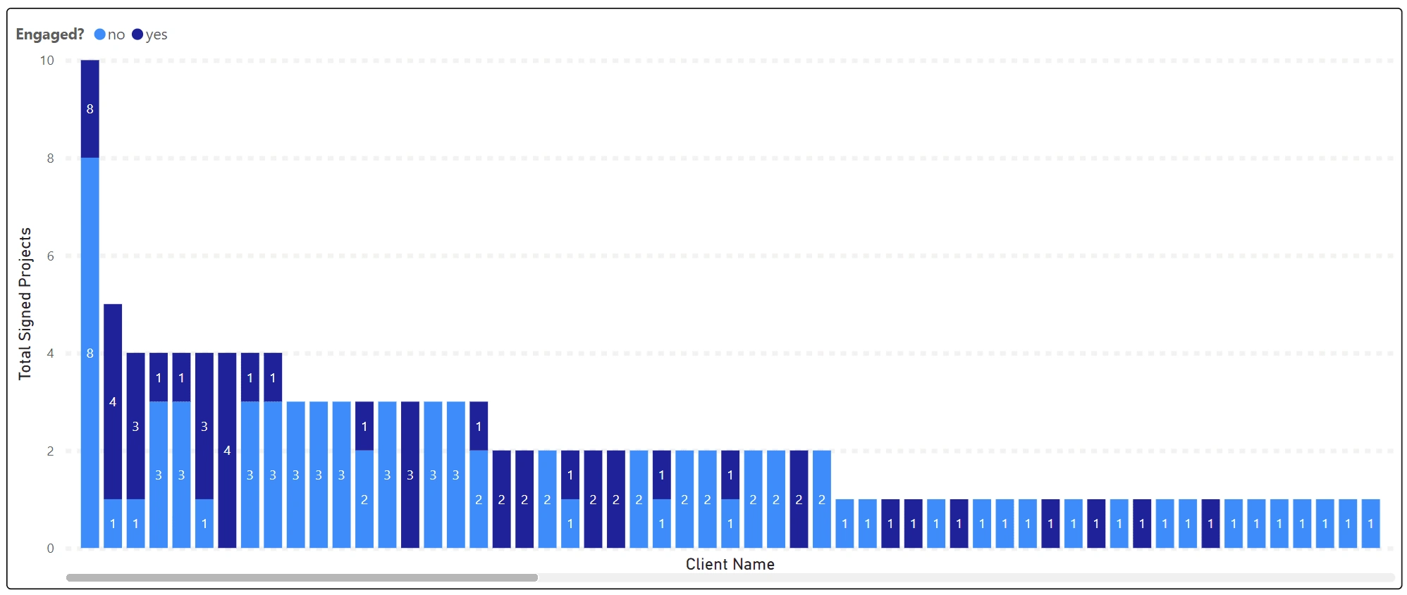
Number of engaged and not engaged projects per customer (names were hidden to maintain confidentiality)
Consequently the client has deeper knowledge on how to allocate resources throughout the year, and what customers to give more attention.
Like this project
Posted Jul 22, 2024
Created a Power BI dashboard for data visualization. Enabled client to make data-driven decisions more efficiently.
Likes
0
Views
8

