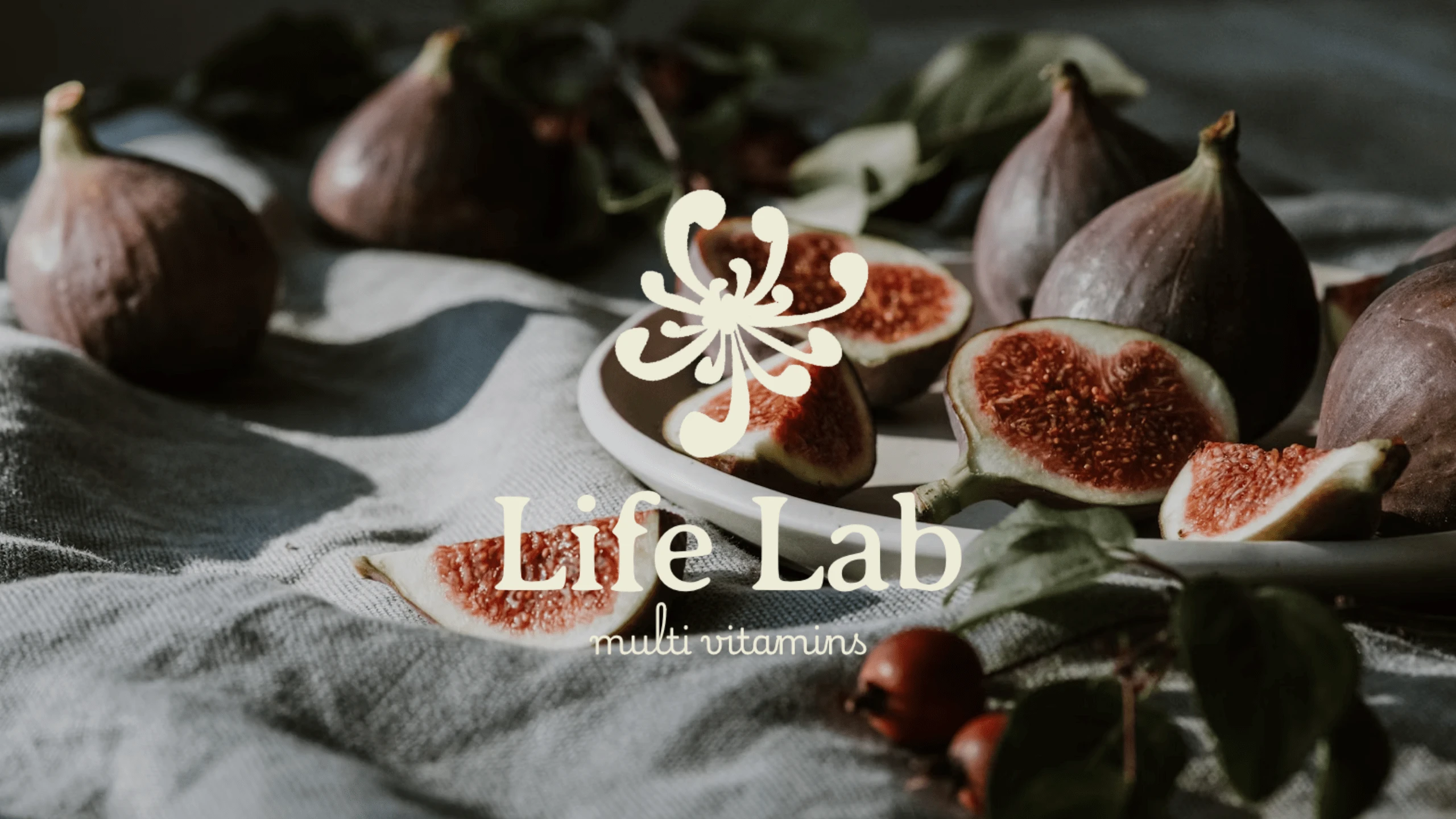
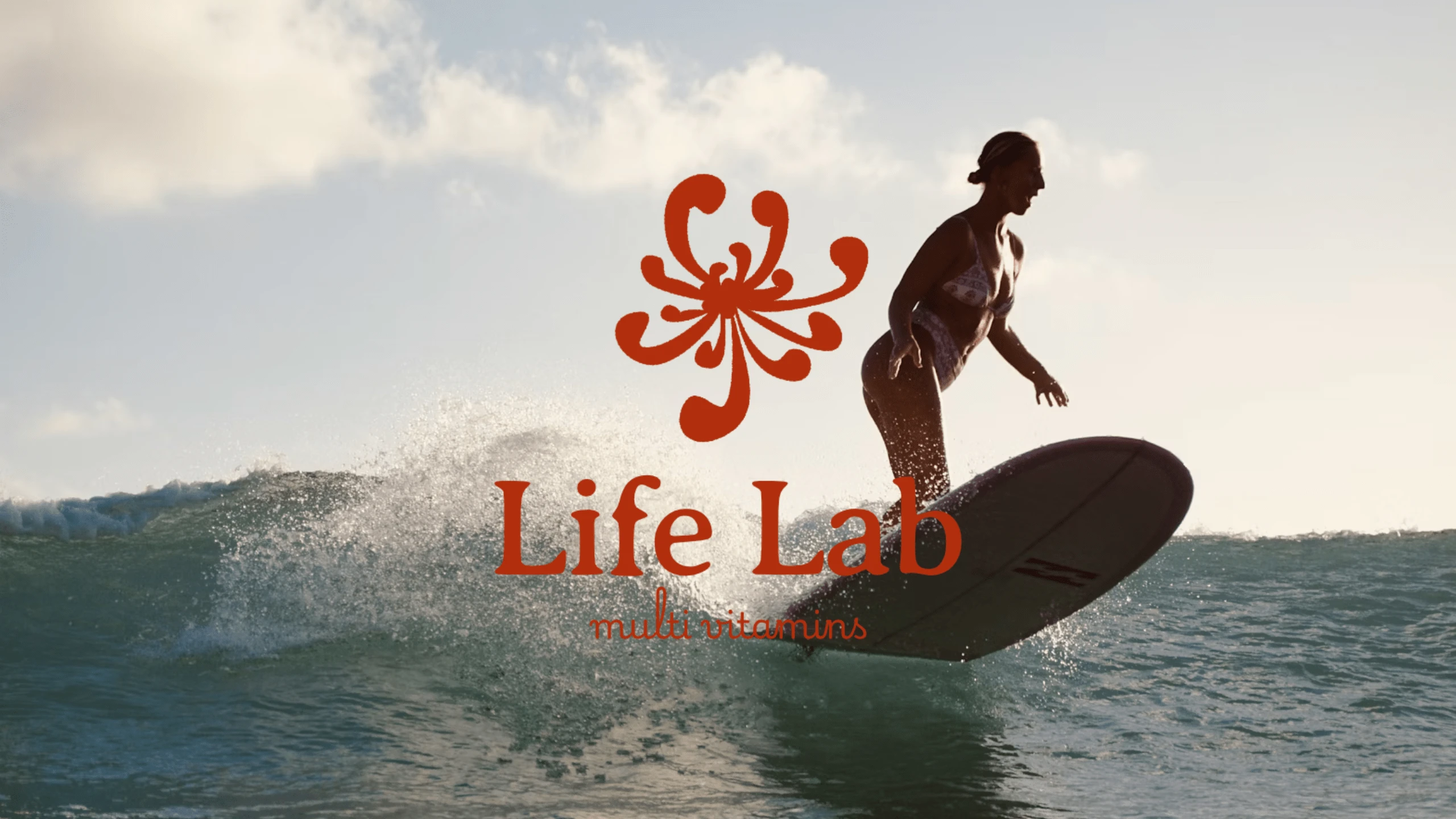
Life Lab| a multivitamin brand

Leslie A

About project
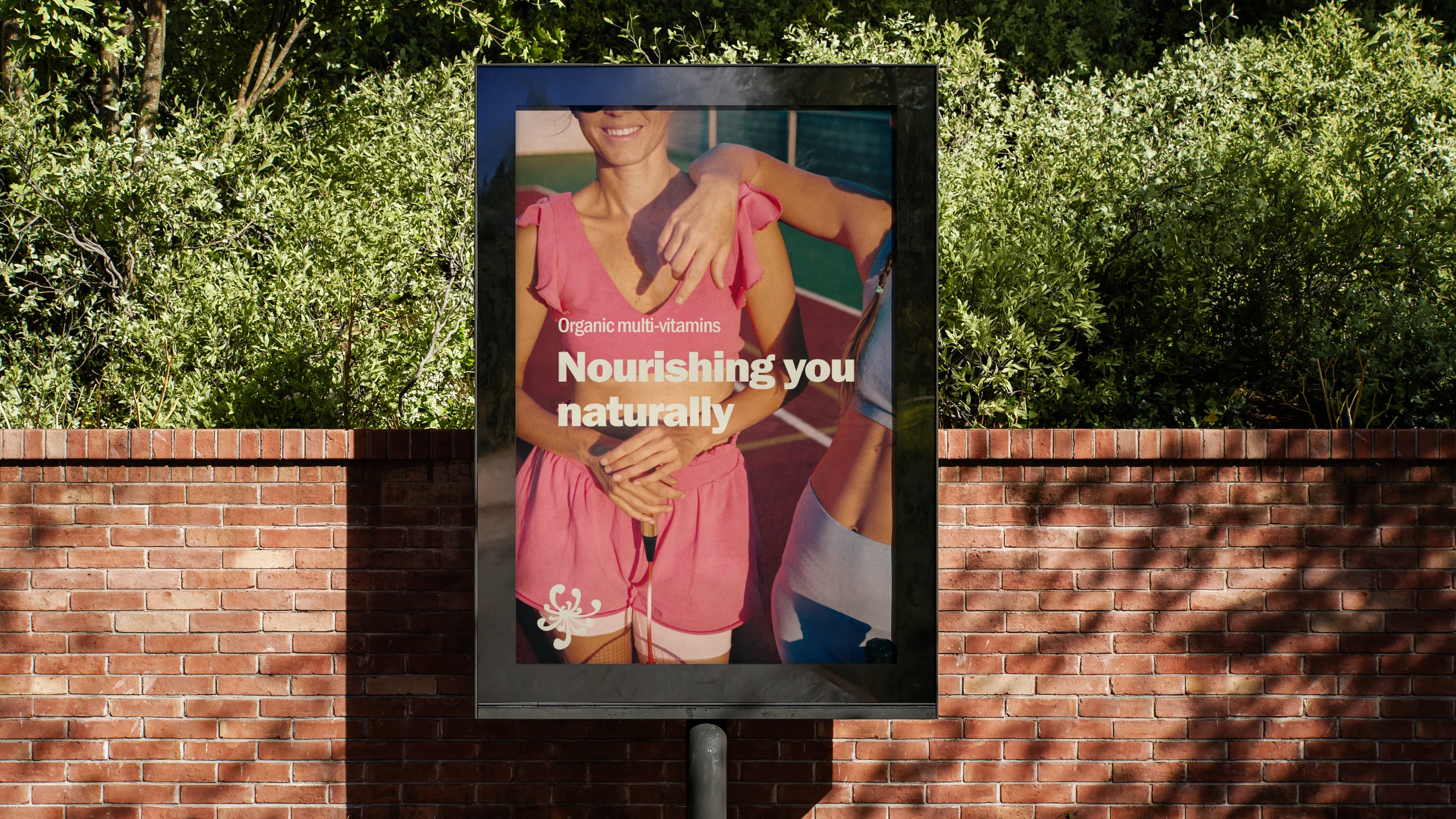
This logo identity was part of a brief/challenge. To build a cohesive identity, I gave Life Lab a brand voice; organic, trustworthy, holistic, and classic. The font choices, as well as the colors, reflected those key words. I also check the trends—both in design and online and the standards of the brand's industry. How can we be recognizable but also interesting?
Design by
Leslie A | @geminiworking
Industry
Wellness & Health
Timeline
1 week
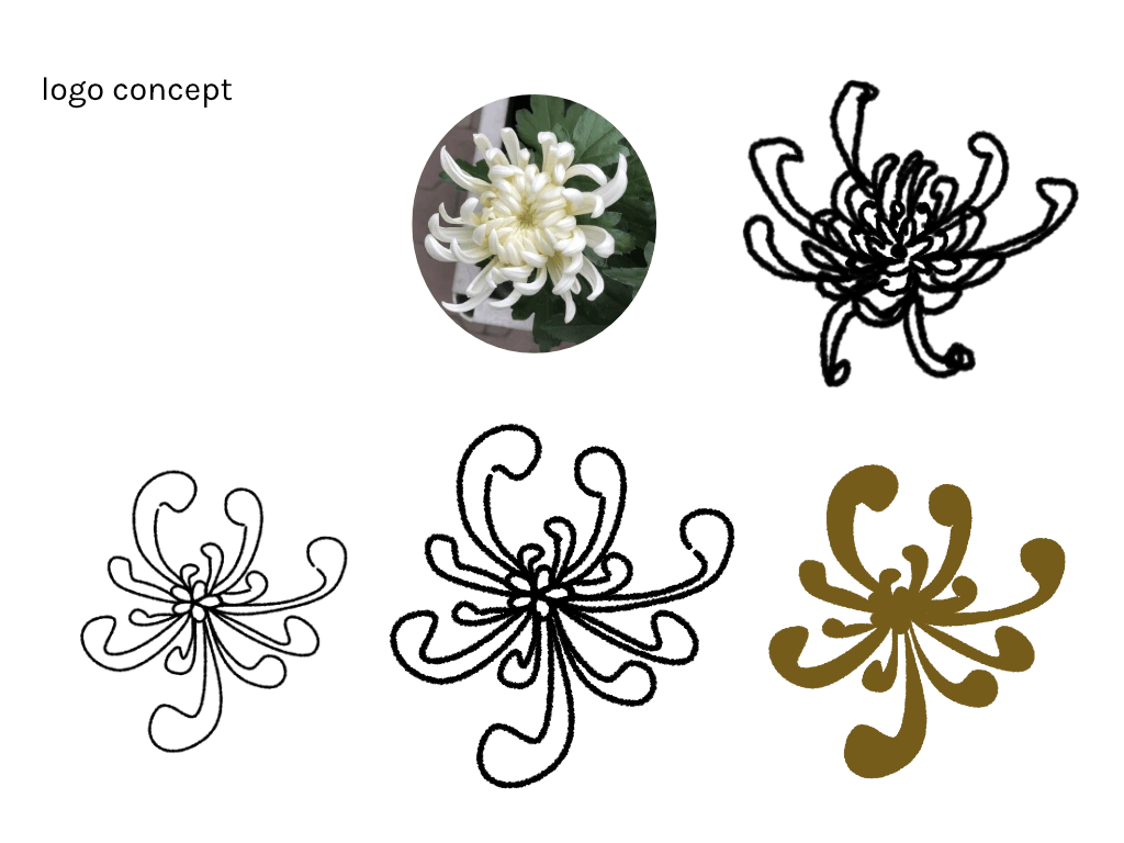
Logo concept
Behind the logo
Starting the project I already knew I wanted to incorporate flowers and nature, given the industry. The flower chosen, a chrysanthemum, is recognized as the flower of longevity and health.
Given the font's weight, a filled-in flower brought more balance. The logo also has textured edges—a stylistic choice.
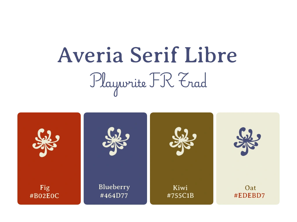
Using Averia Serif Libre brought a rustic, classic and elegant feel to the logo. Pairing it with a Playwrite FR Trad, was in effort to conserve the elegance of life lab.
The palette reflects, an organic holistic brand with a vibrant twist.

Like this project
Posted Apr 6, 2025
Brand identity for an organic, trustworthy, hollistic, and classic multi vitamin brand
Likes
0
Views
13