

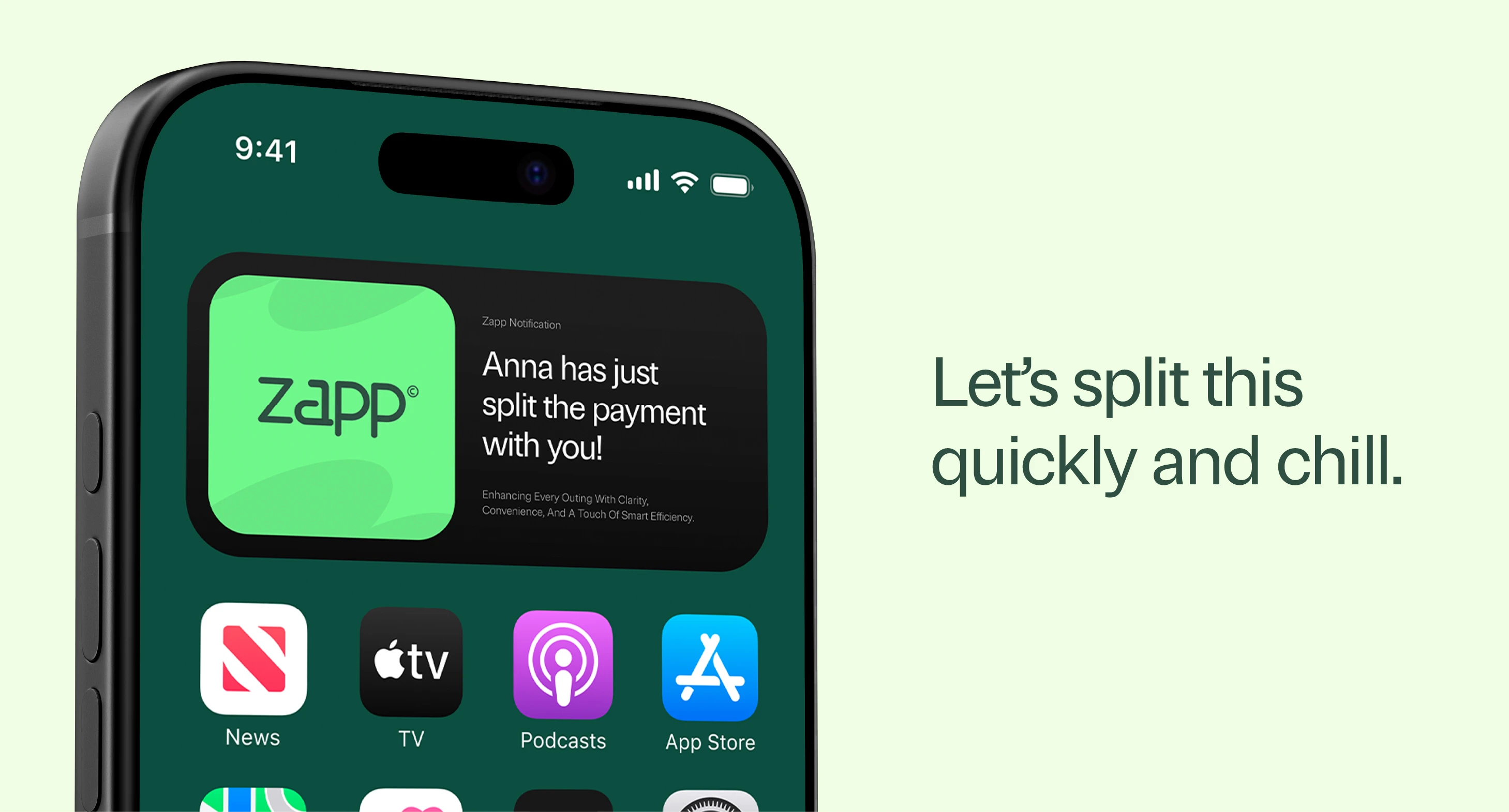
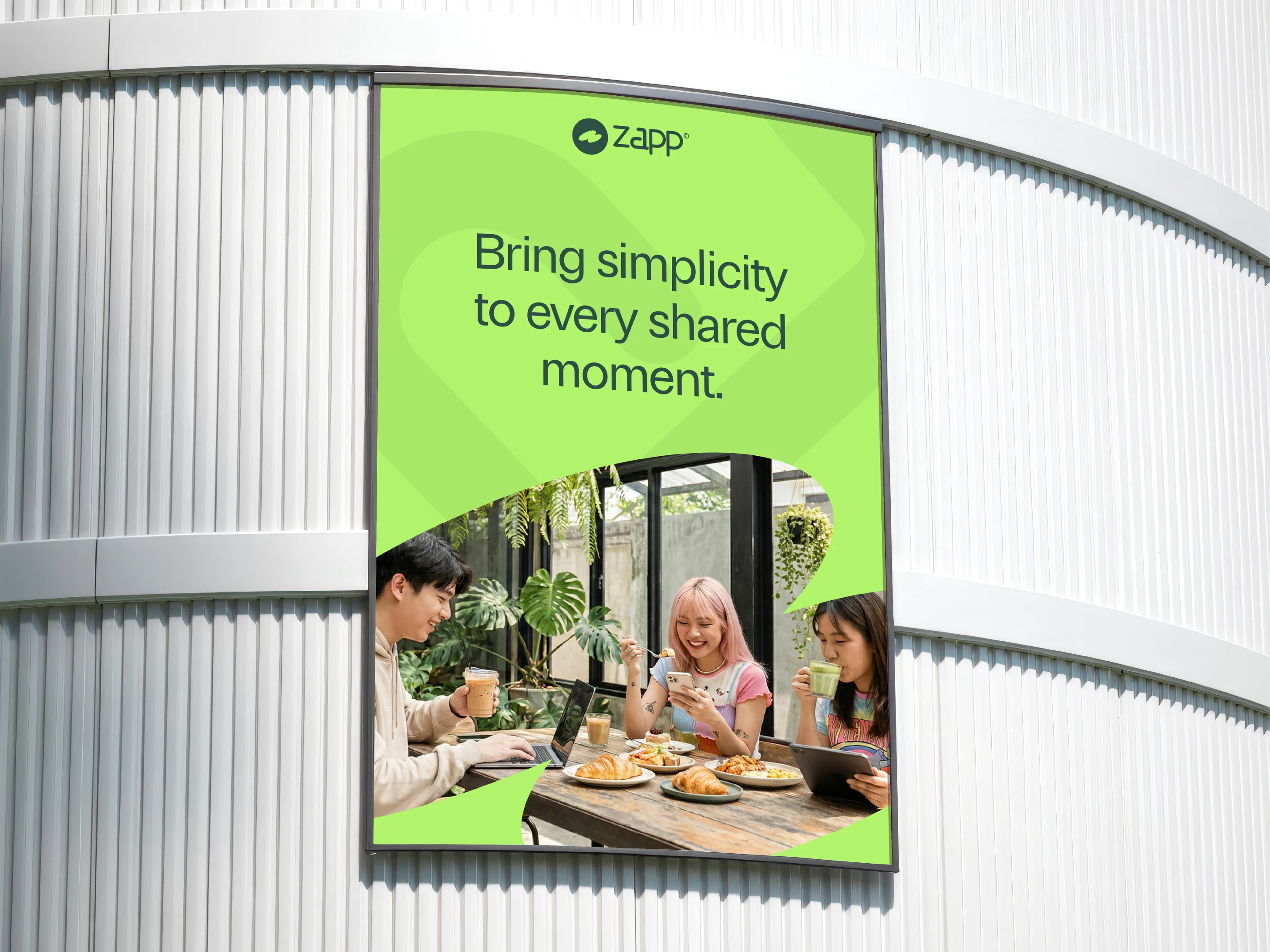
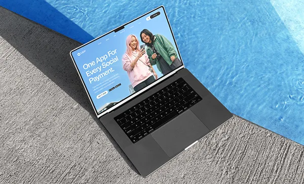
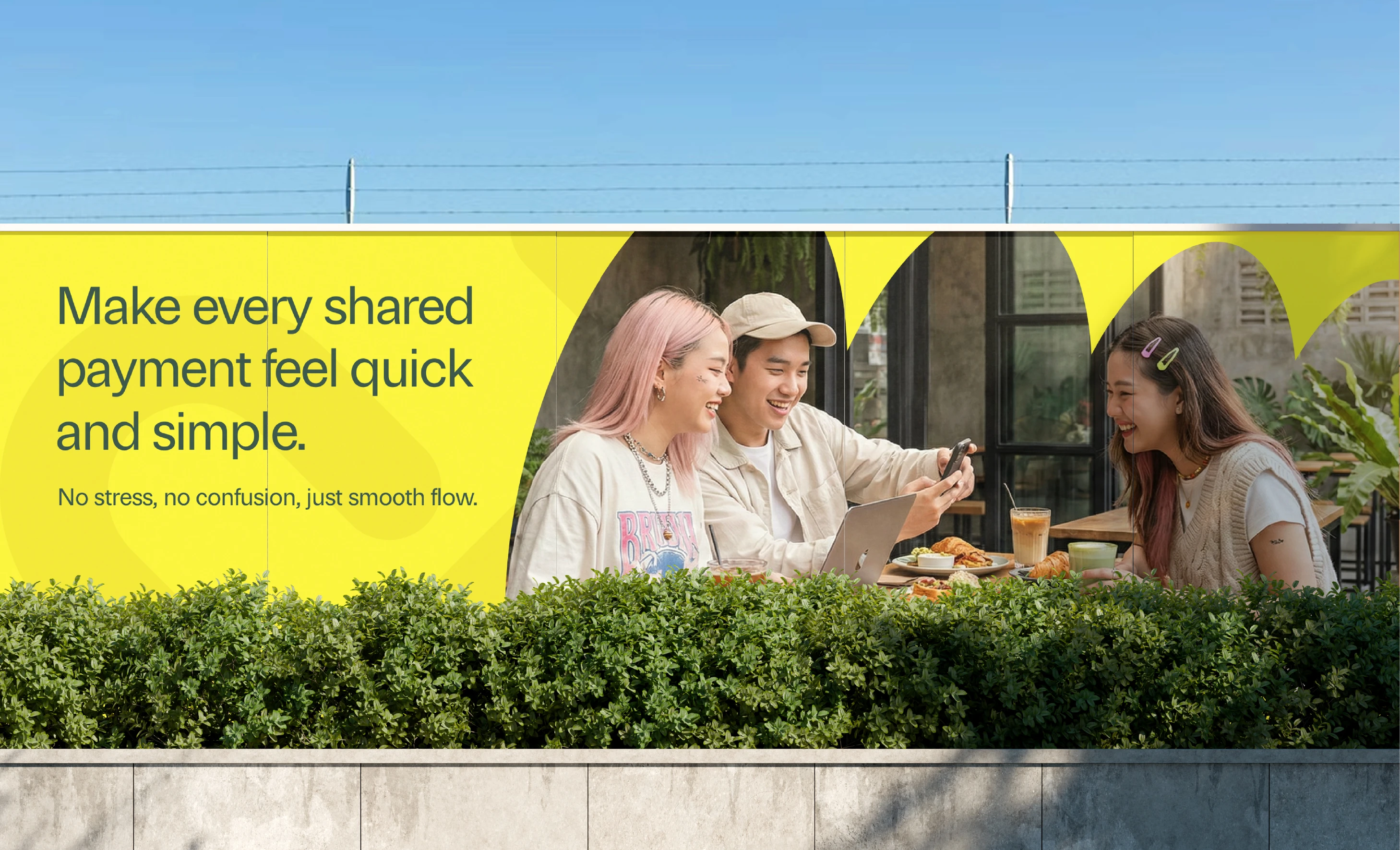
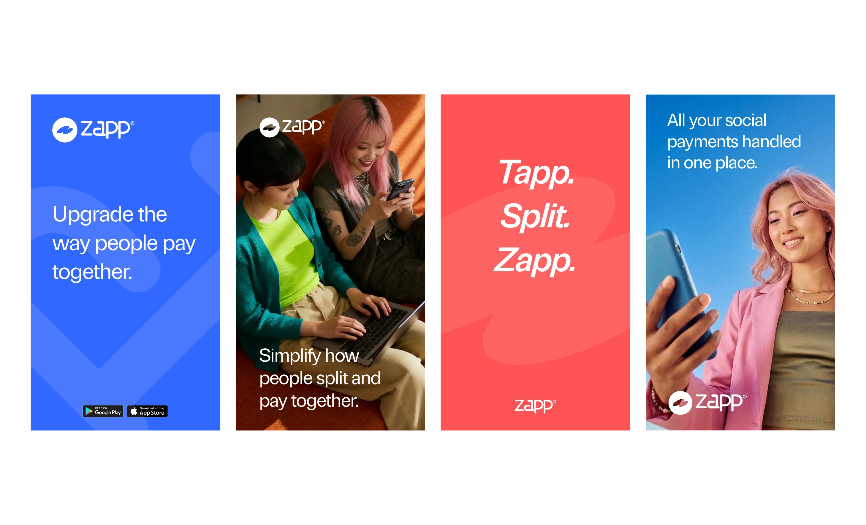
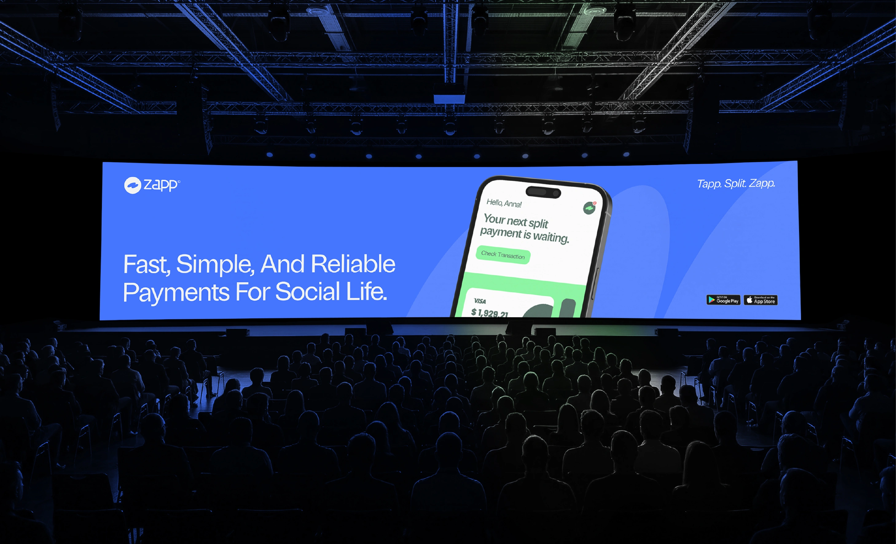
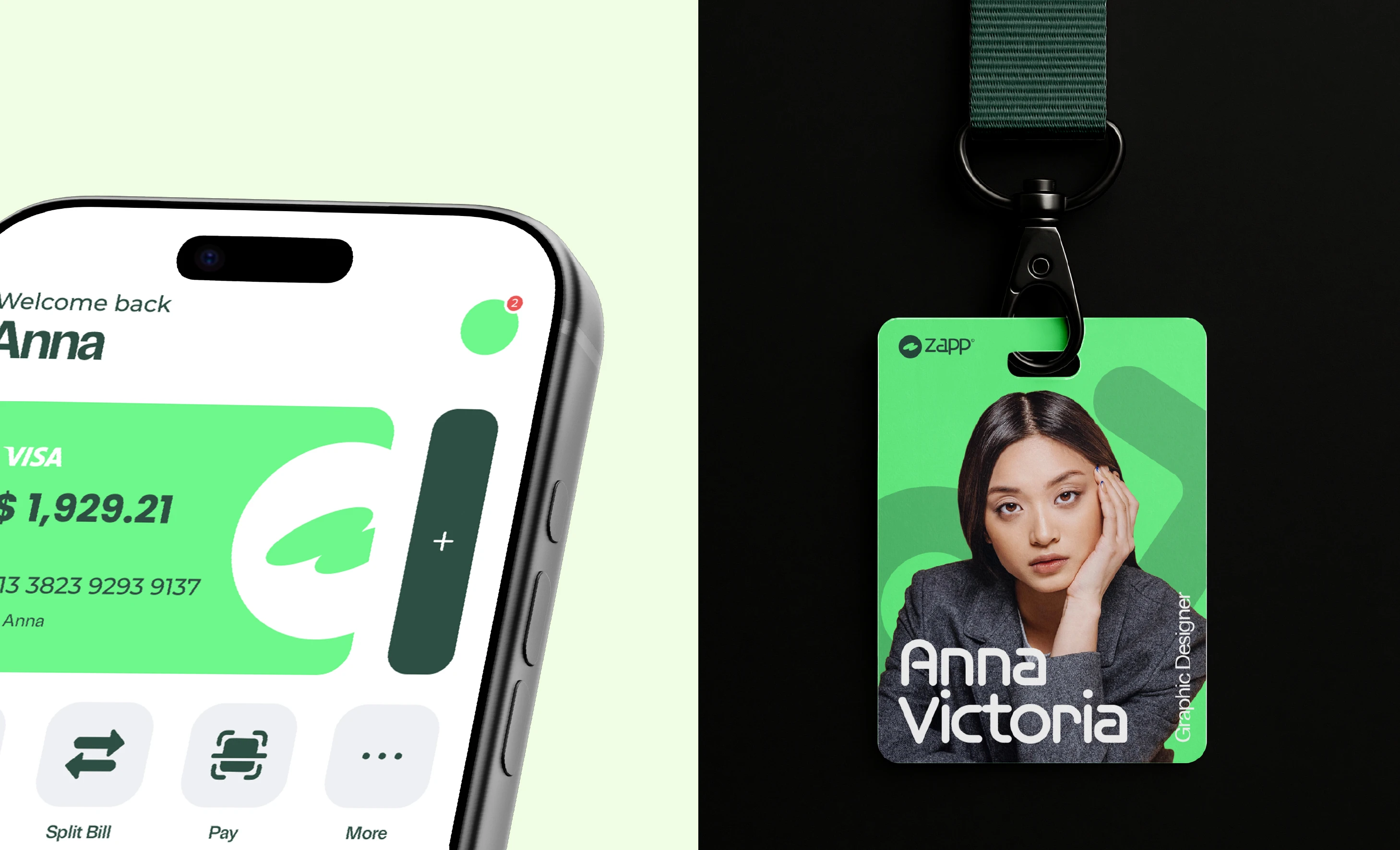
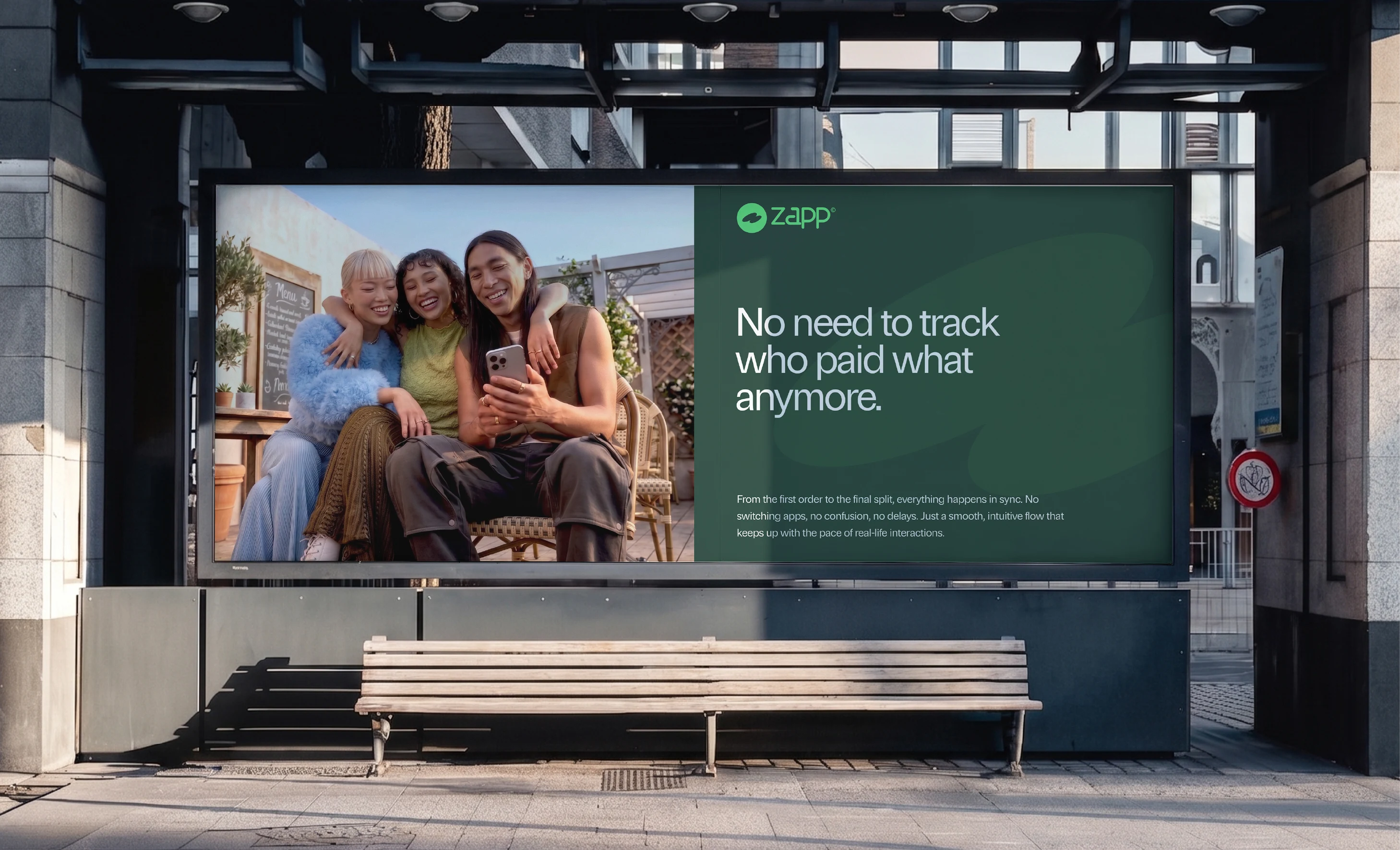
Zapp is a social lifestyle app designed to enhance the way people experience going out together. More than just a payment platform, Zapp allows users to split bills, pay seamlessly, tip, order directly from the table, leave reviews, and manage shared expenses within one integrated ecosystem.
Inspired by the word “zap,” the name Zapp represents speed, instant action, and simplicity, reflecting the app’s mission to make every interaction fast, effortless, and seamless.
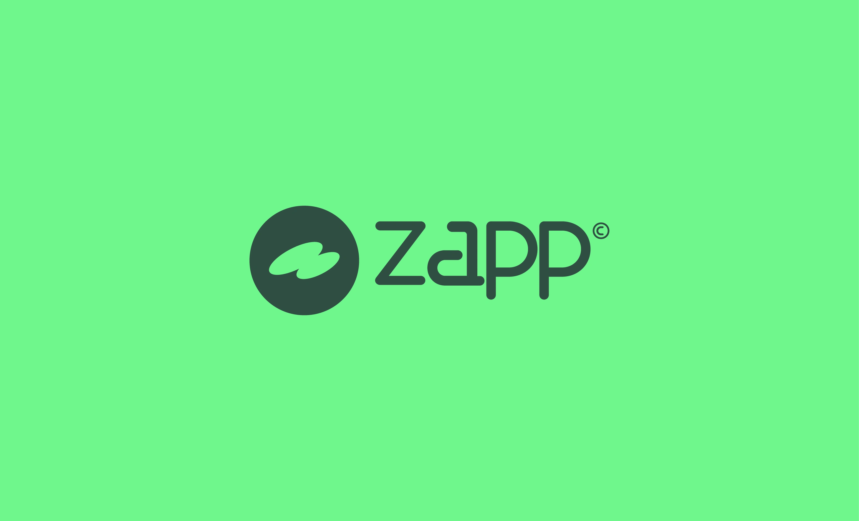
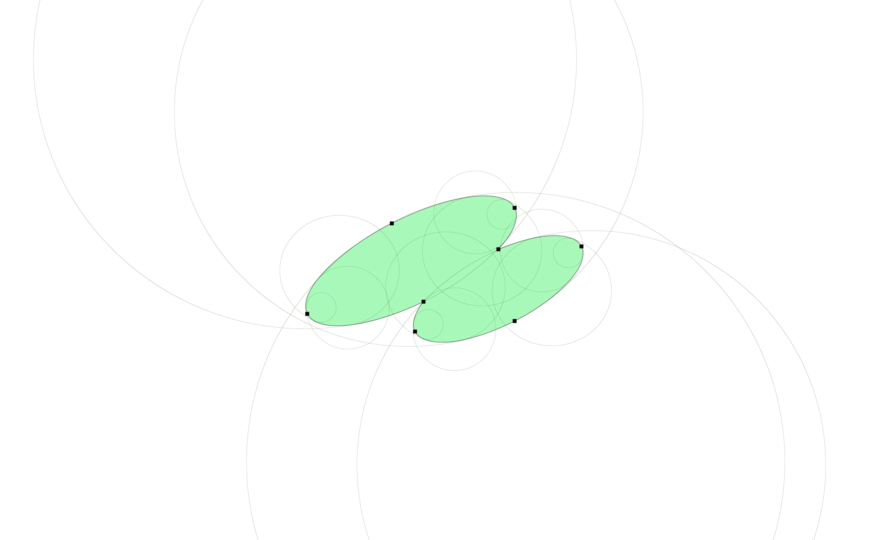
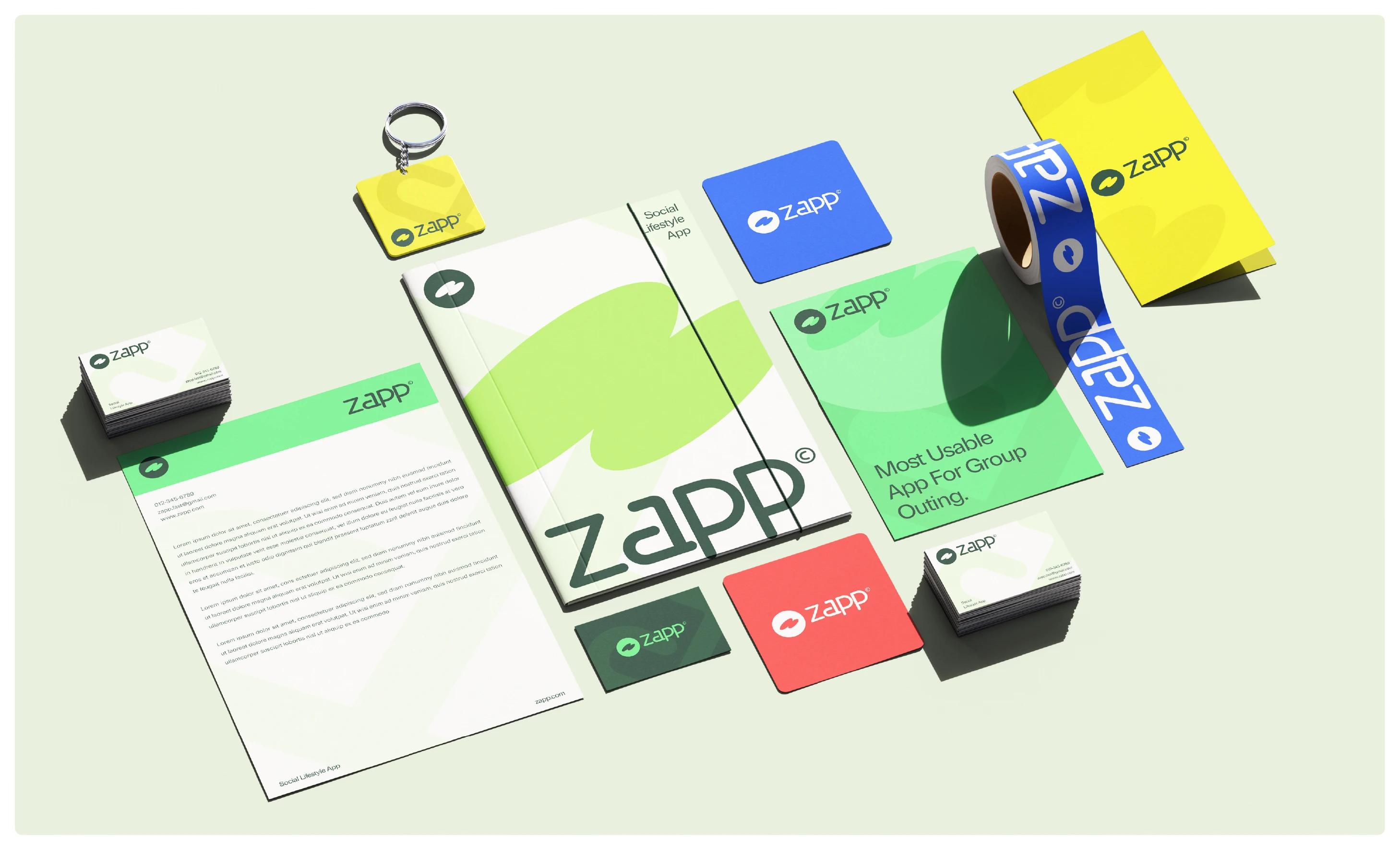
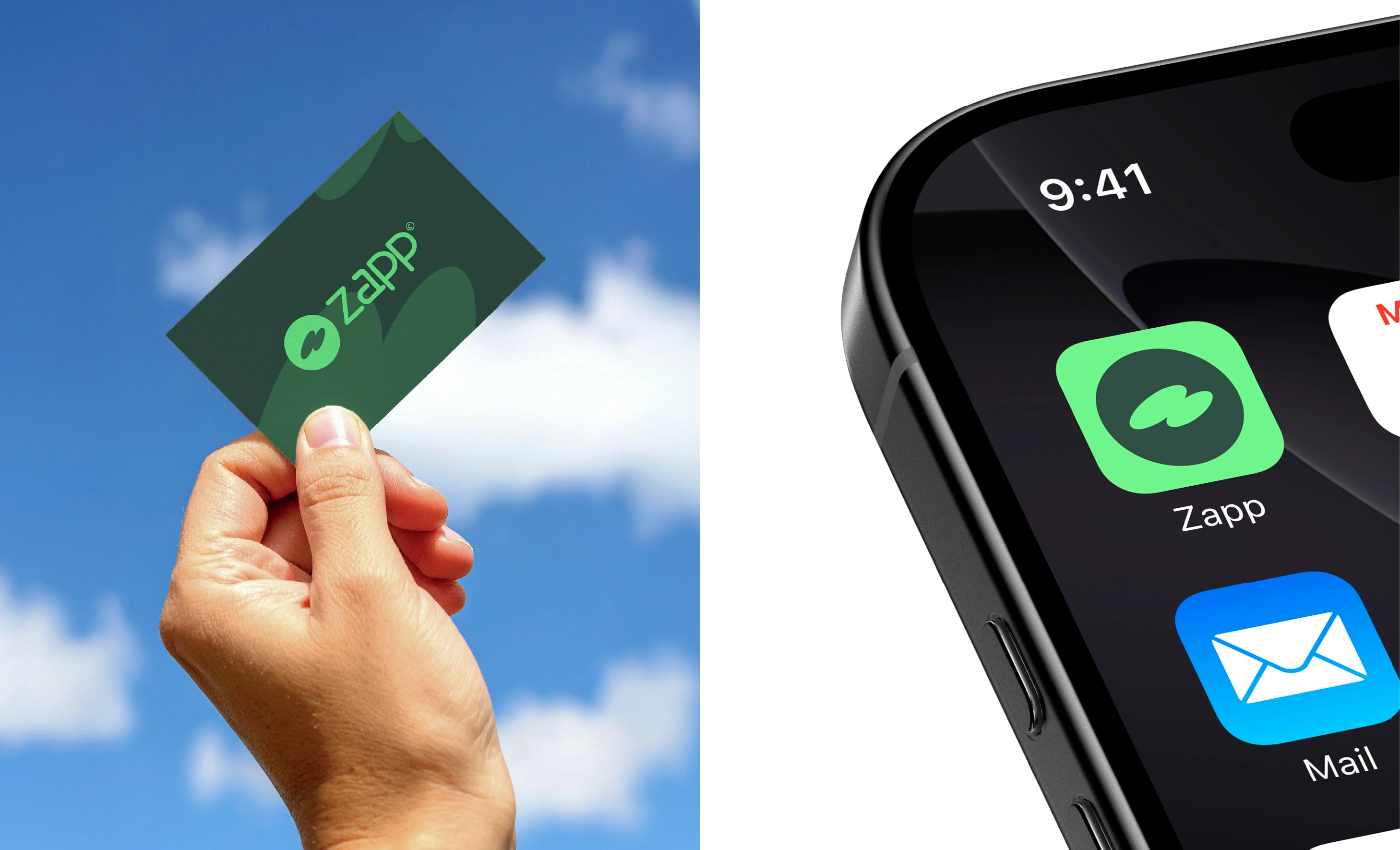
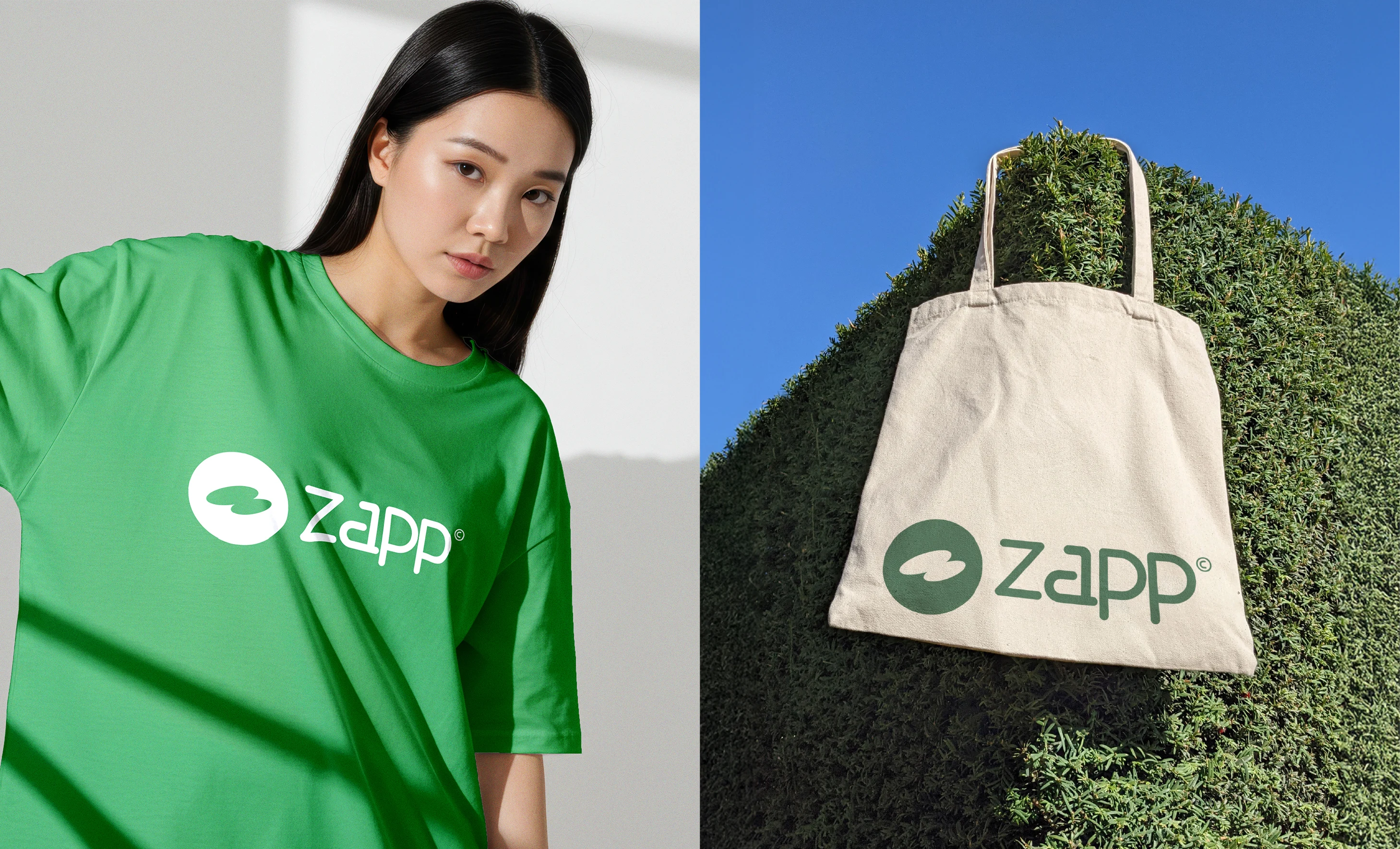
The visual identity of Zapp is built around the brand’s core characteristics: speed, connection, and seamless social experiences. The icon combines the form of a thunder bolt and the letter “Z” to represent instant action, energy, and the brand’s fast paced nature.
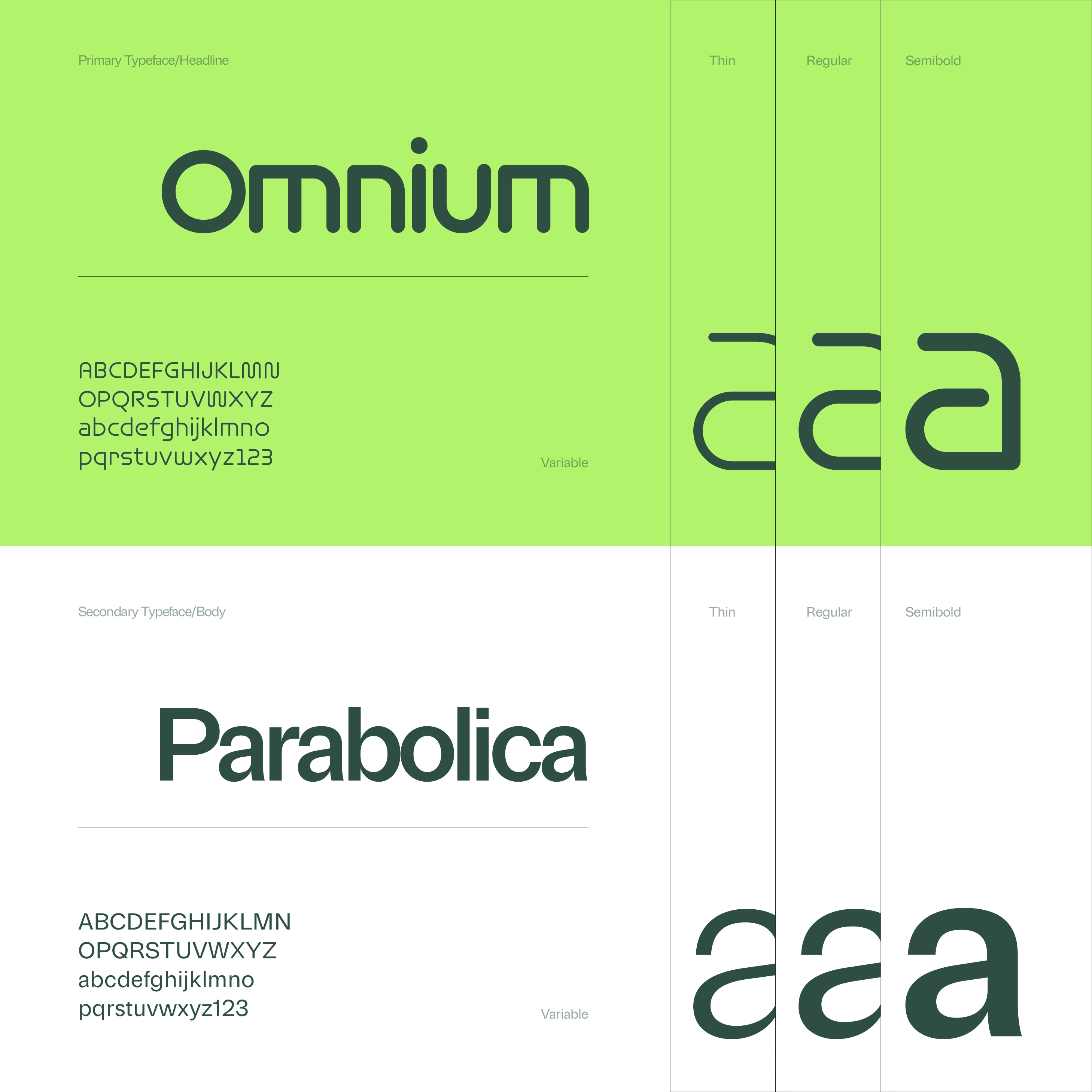
To further strengthen the concept, the letter “a” is subtly customized from the original typeface to resemble the gesture of scanning a QR code with a phone reflecting one of Zapp’s core interactions within the app experience.
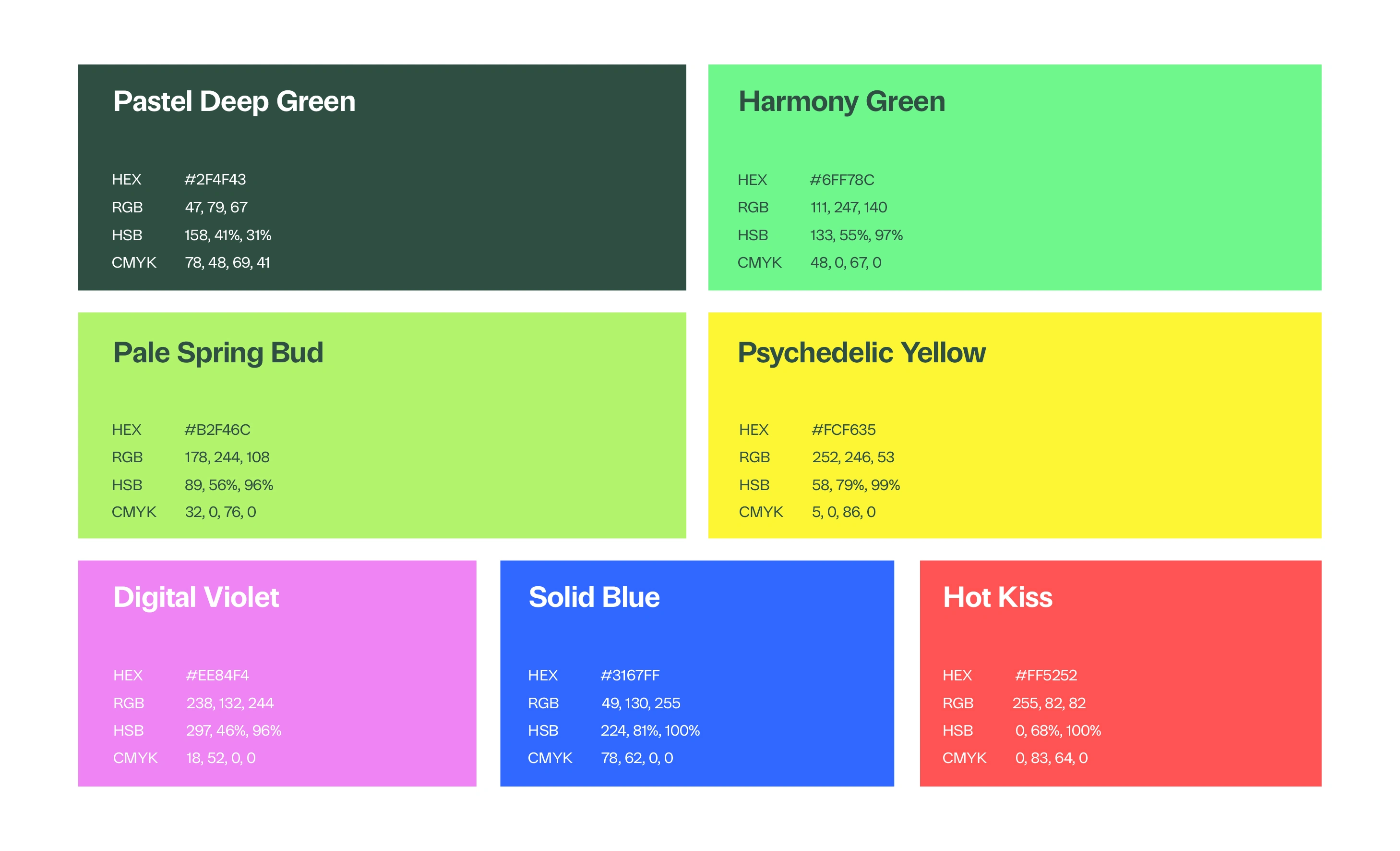
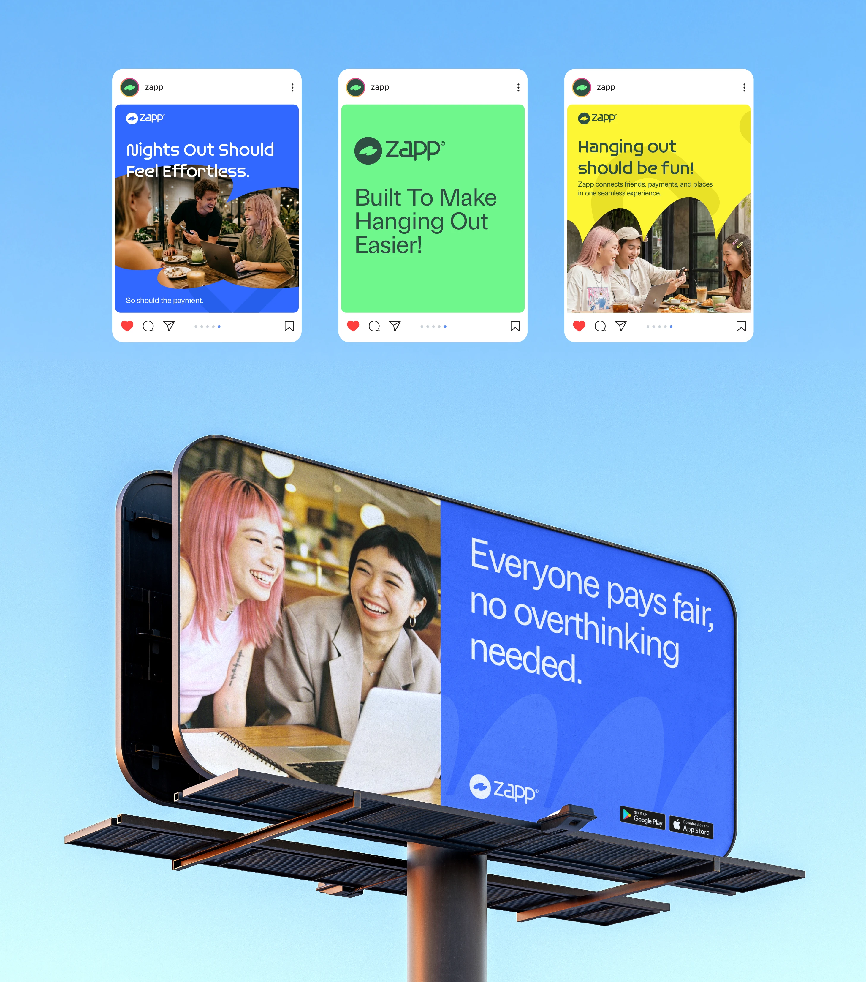
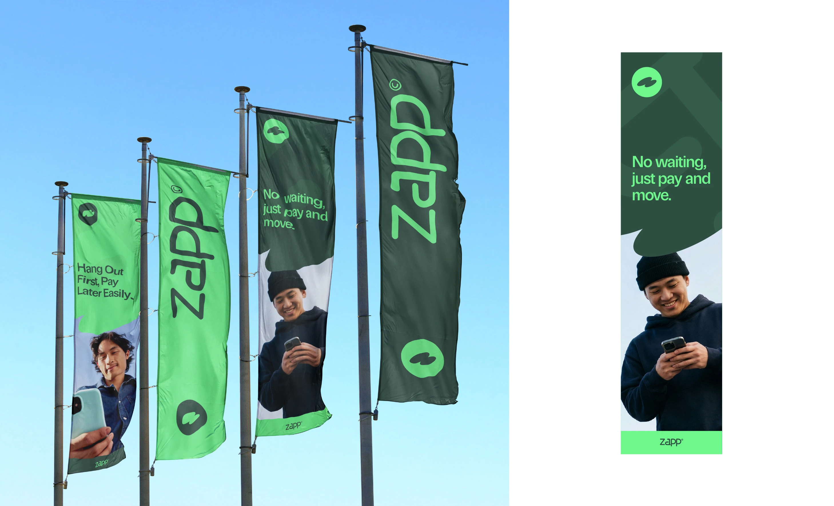
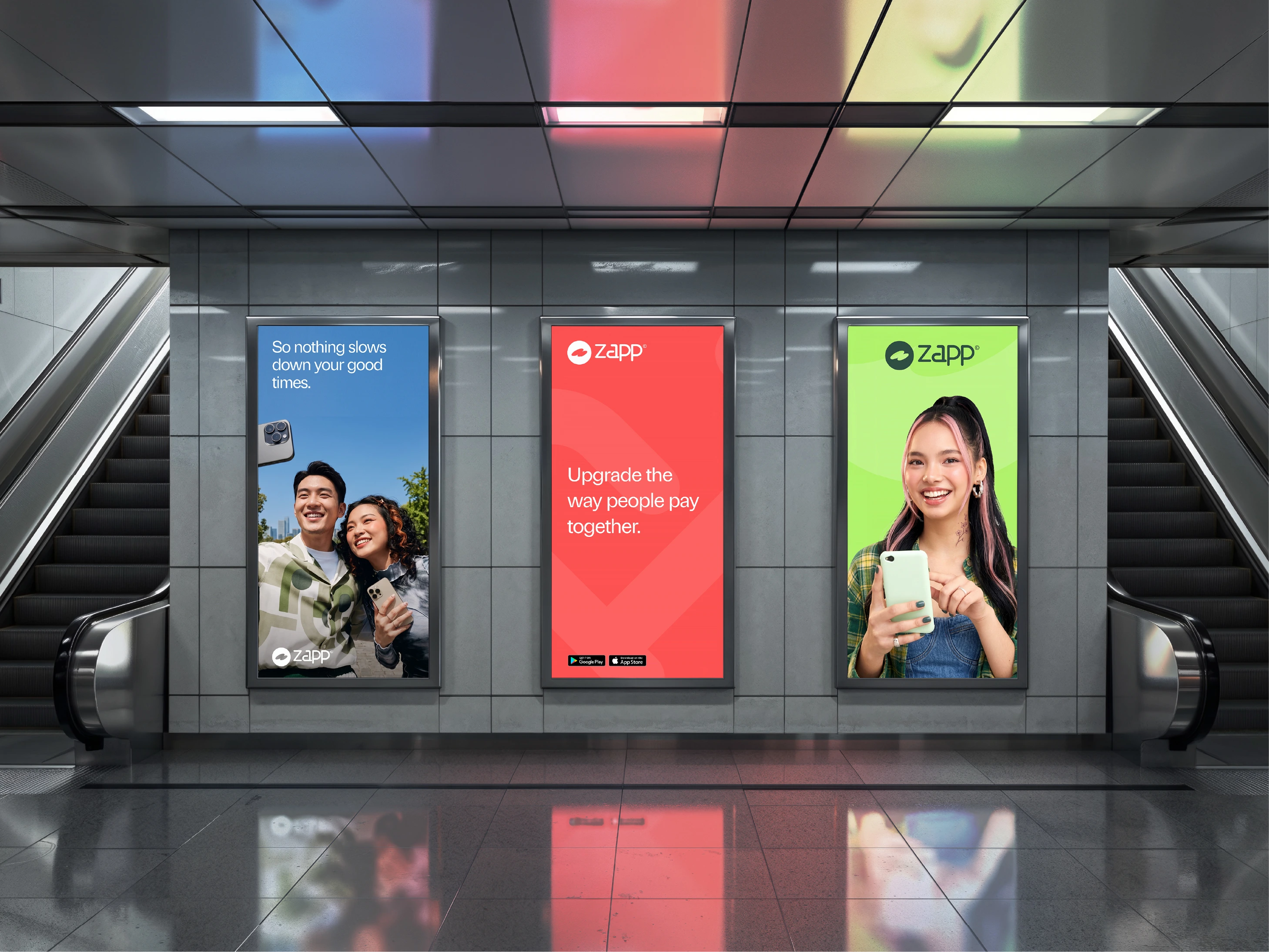
Rounded forms and bold geometry are used throughout the identity system to create a visual language that feels playful, modern, and approachable, aligning with Zapp’s vibrant social lifestyle positioning.



Thank You For Scrolling :)
Scope of work: Positioning, Tone of brand, Logo Design, Visual Identity, Collateral Design,
Project49 - Multidisciplinary Studio
Let's connect and work together.
See your vision come to life!
Project49 2026 ©
0 likes · 1 view · Oct 19, 2026
Zapp is a social lifestyle app that simplifies going out together with seamless payments, bill splitting, table ordering, tipping, reviews, and shared expenses.


