

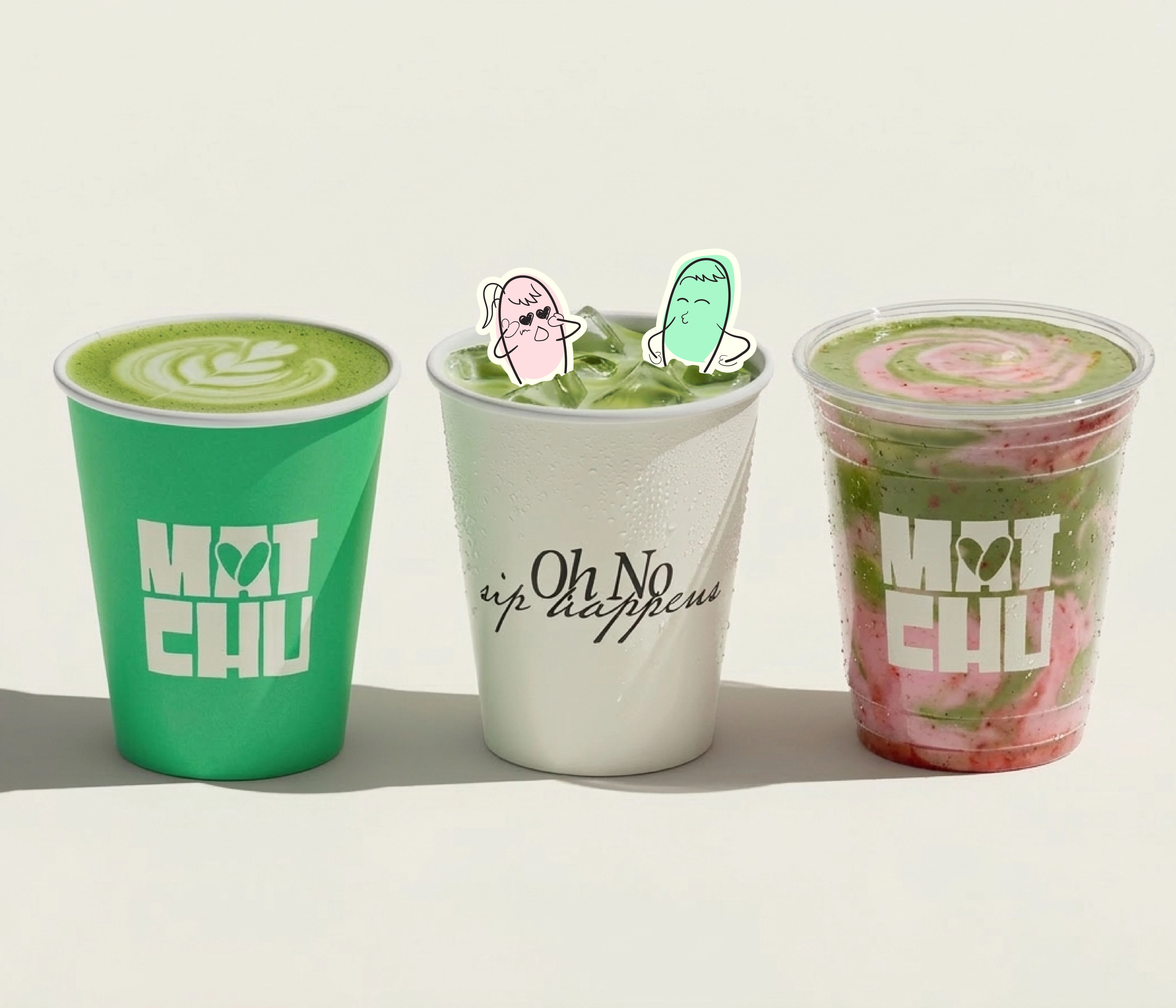
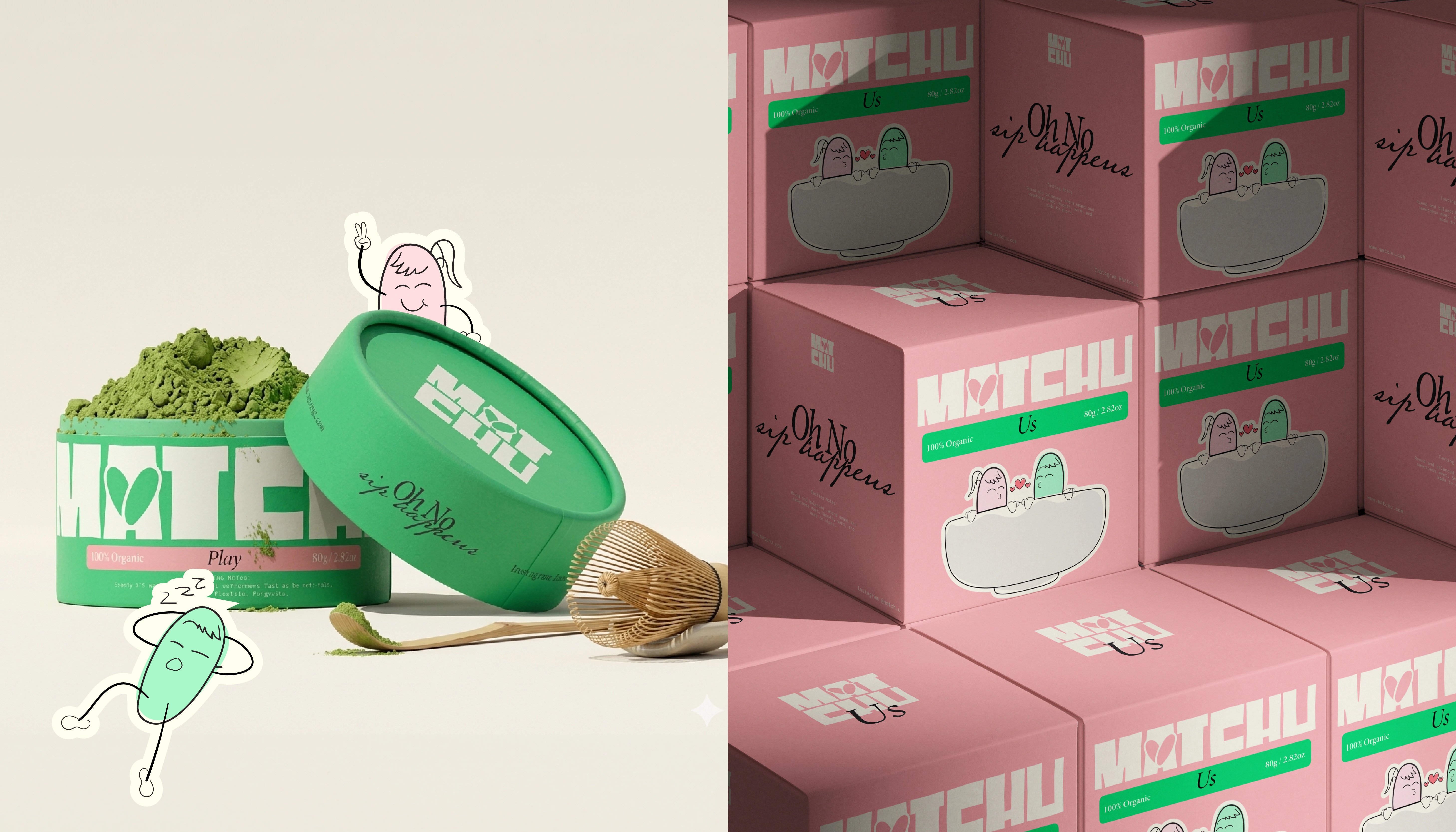
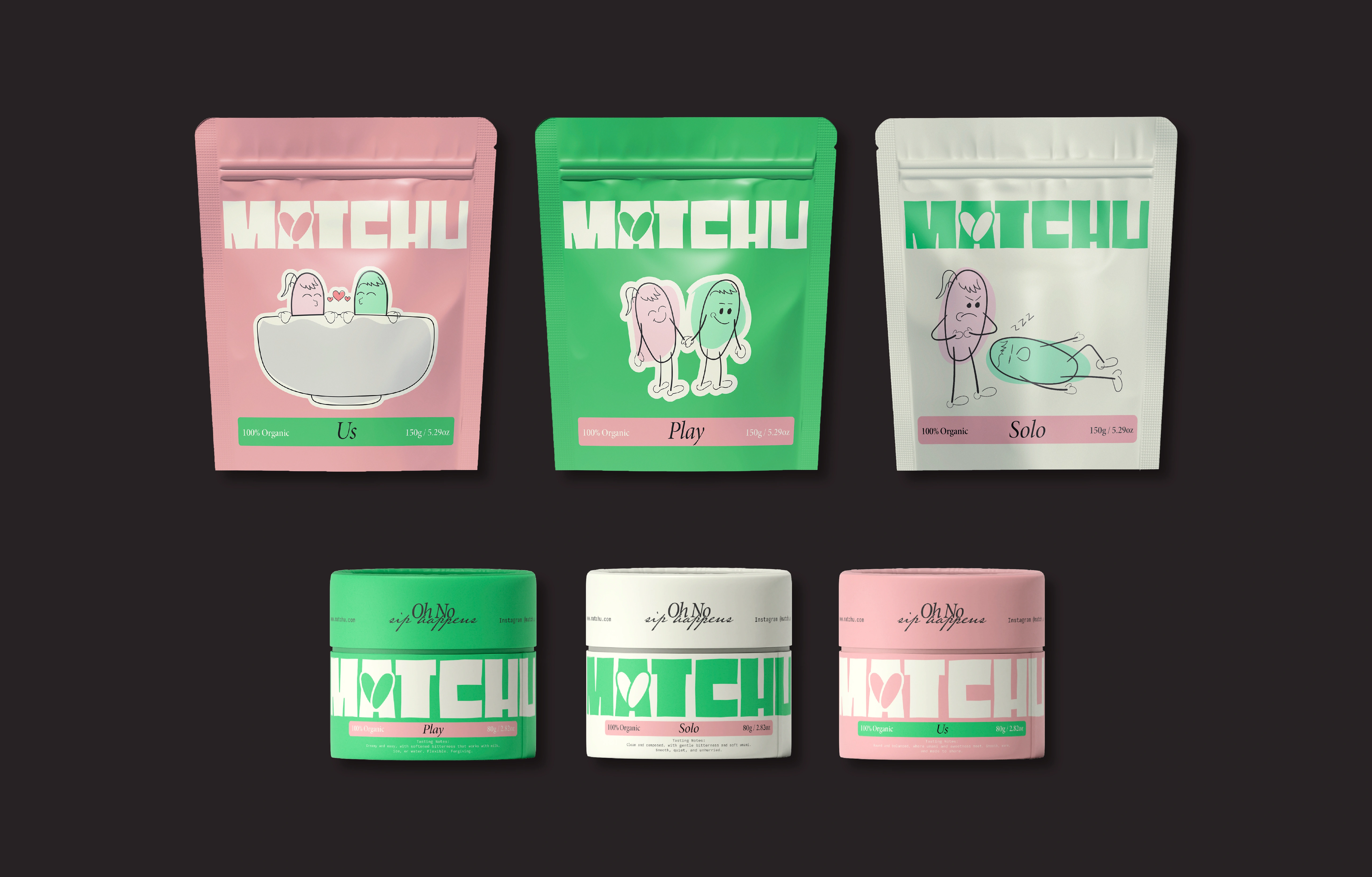
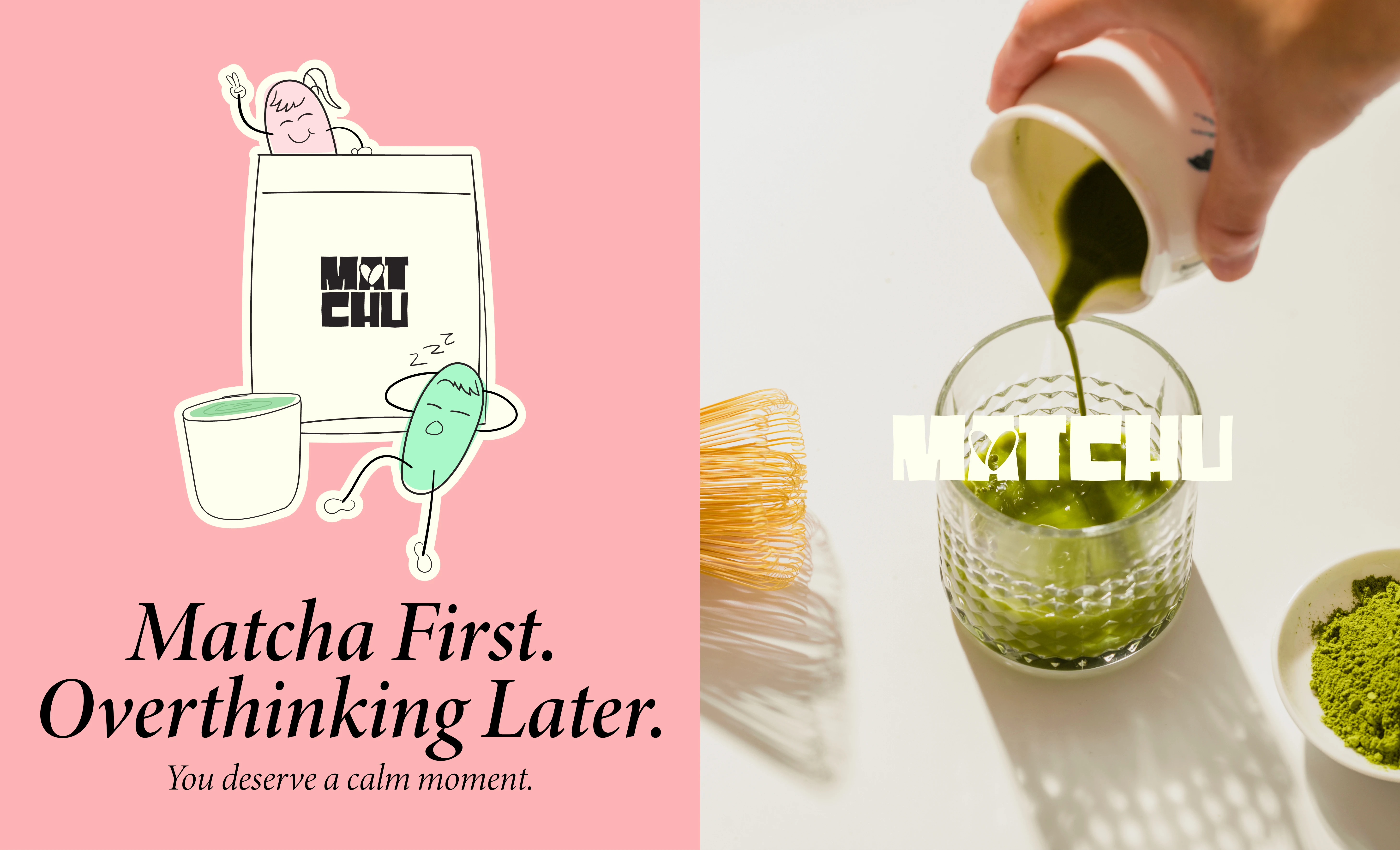
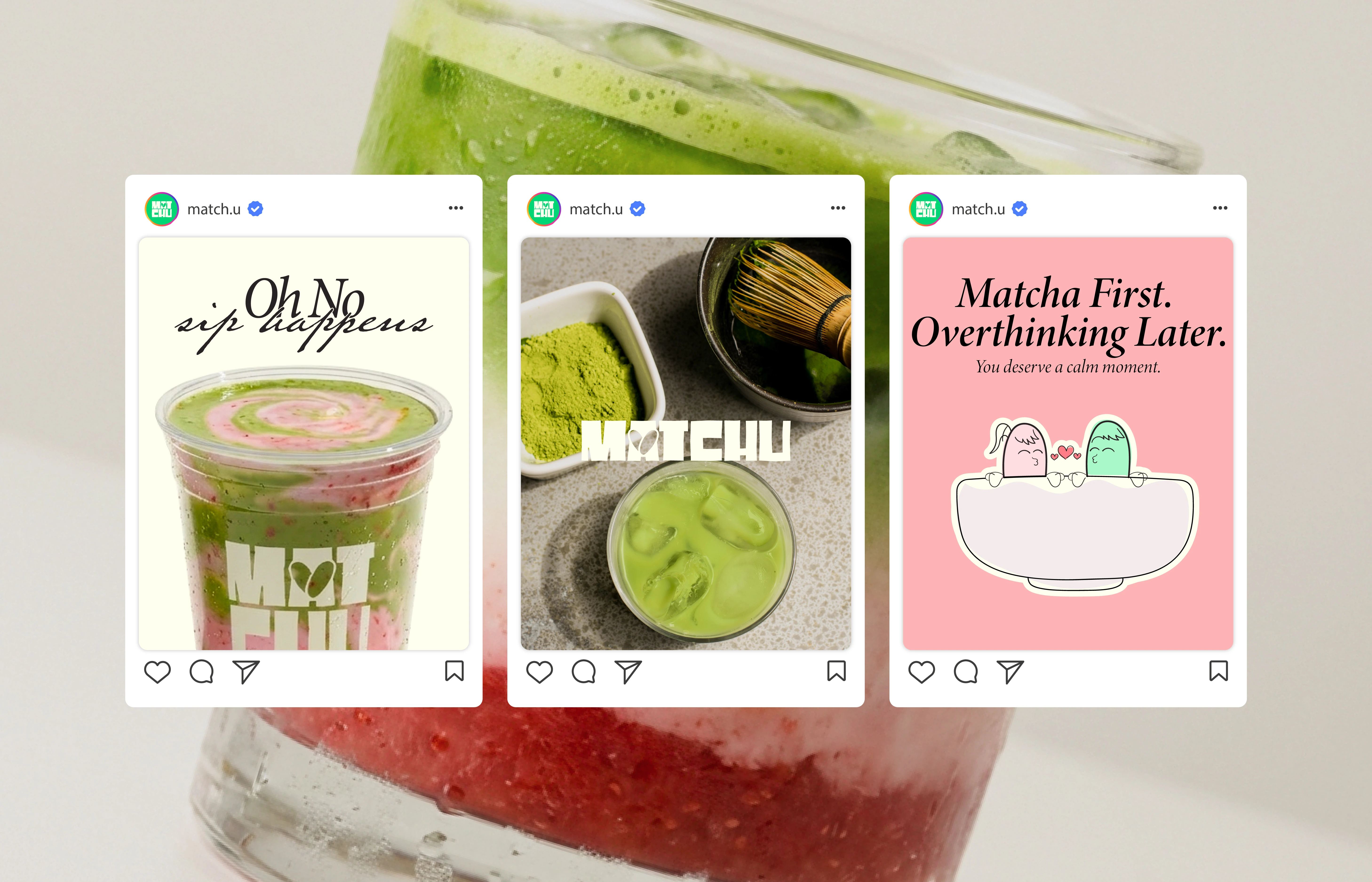
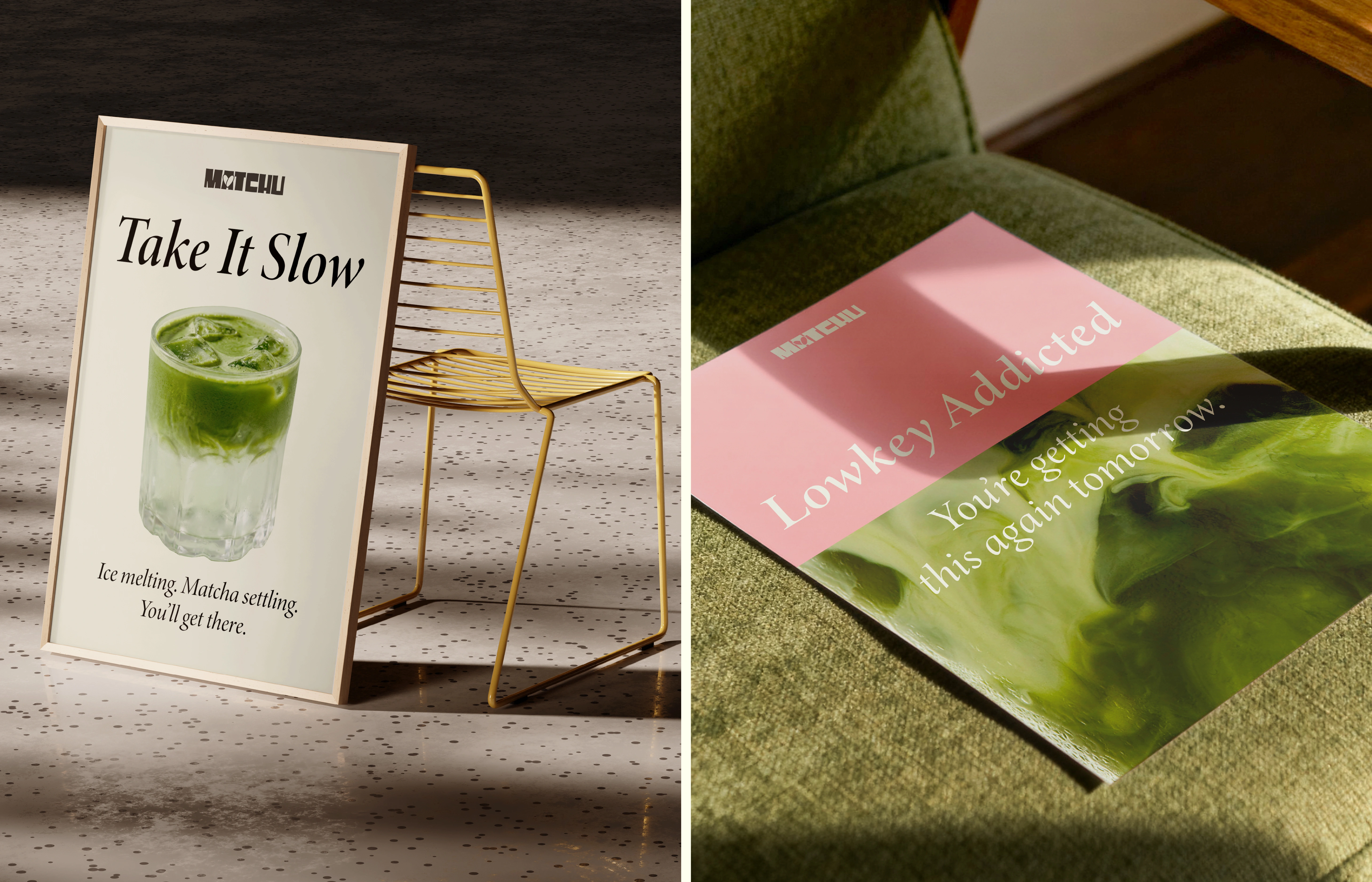
MATCHU is a matcha brand built from the idea of contrast, calm and chaos, soft and bold, different but still right. The name comes from matcha and “you,” reflecting something personal, a match that isn’t always perfect, but works.
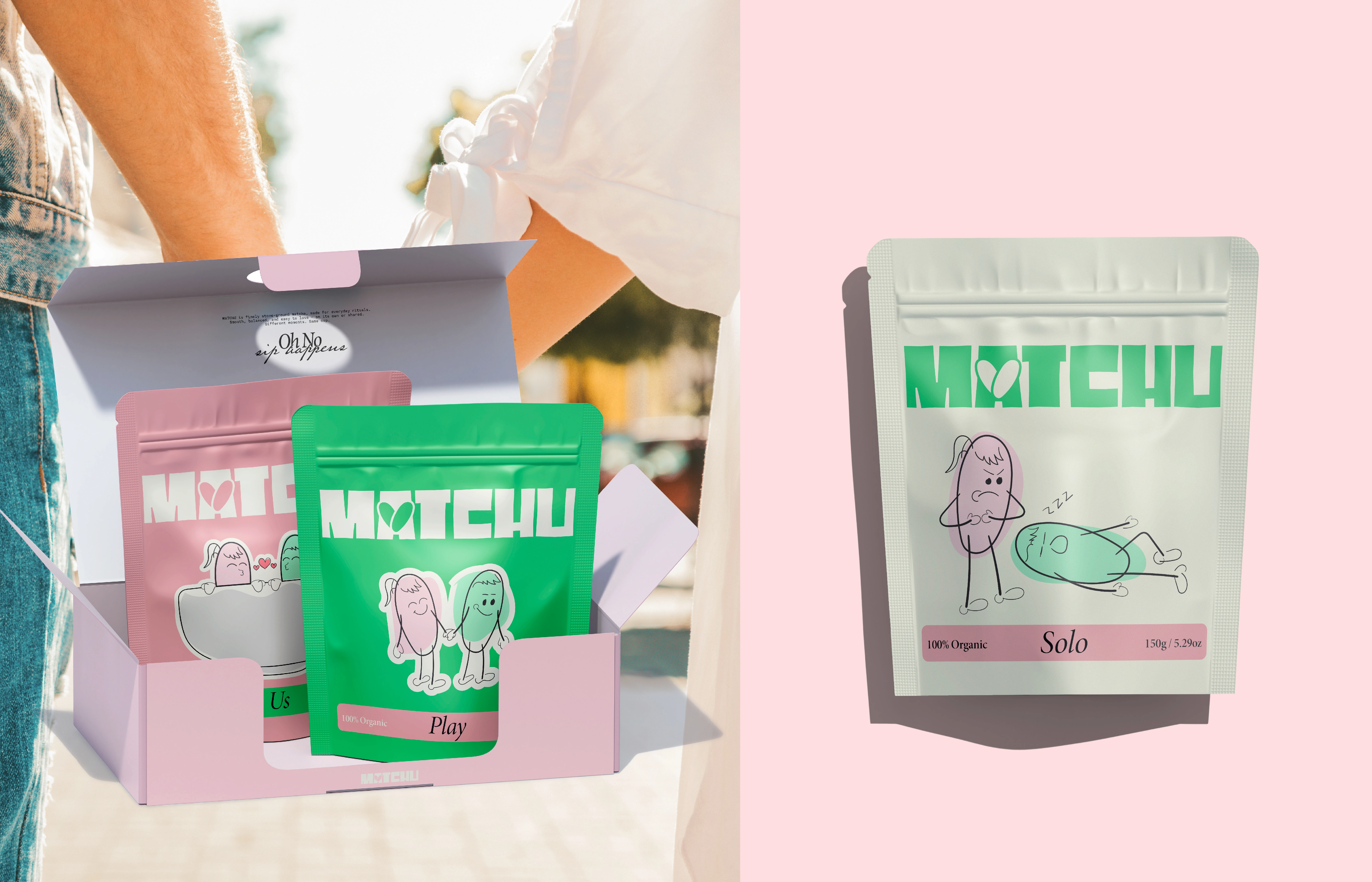
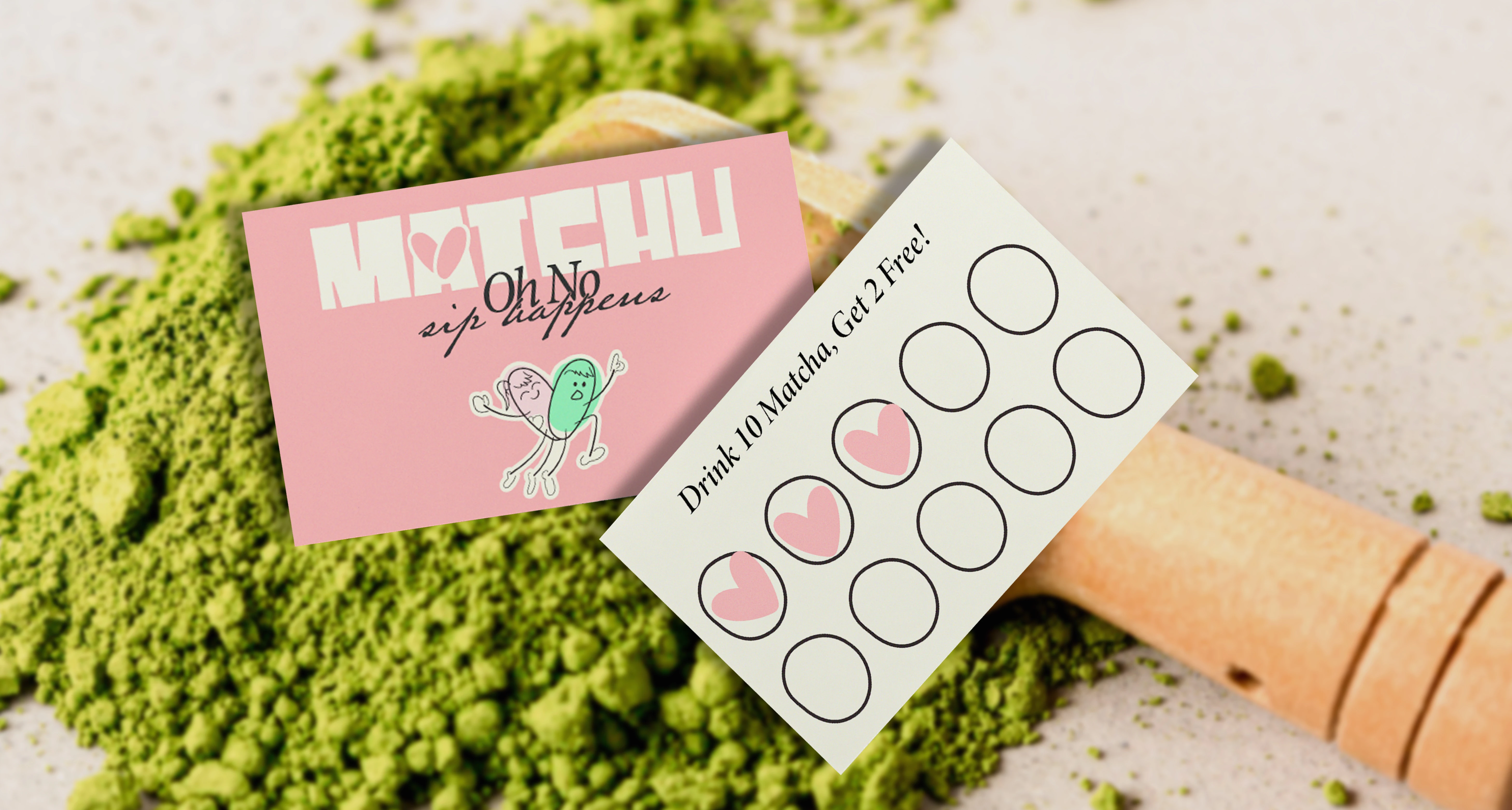
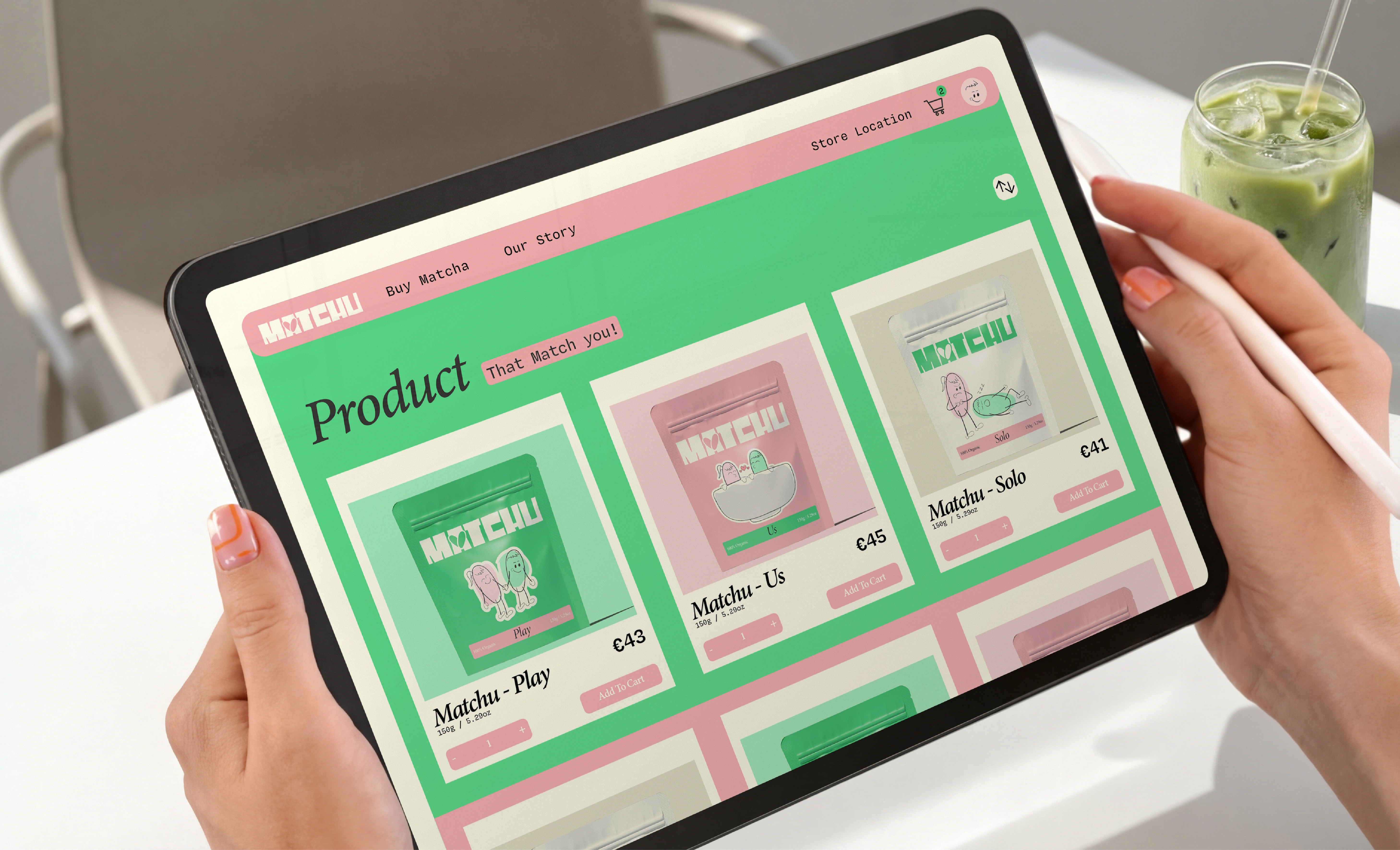
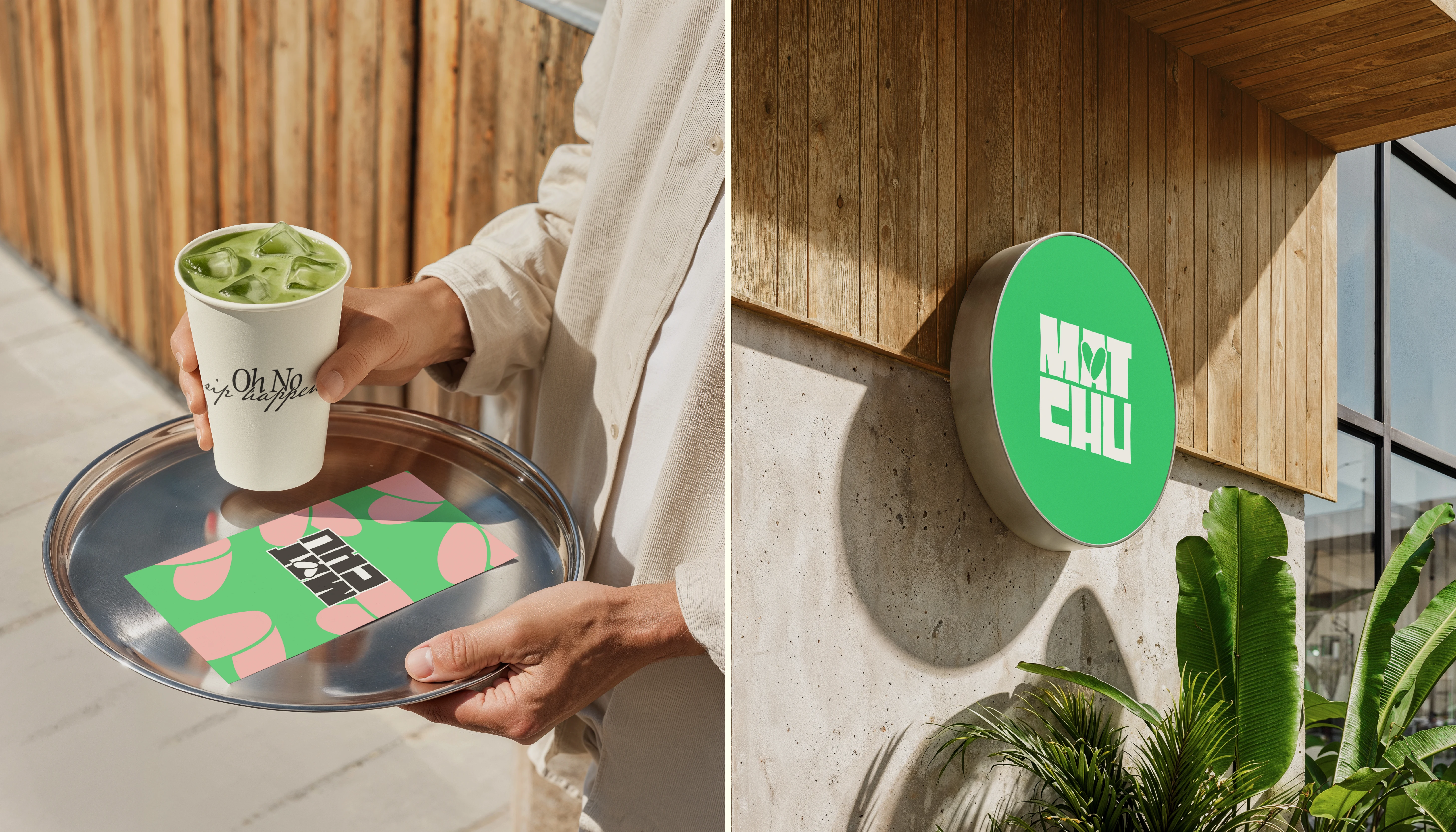
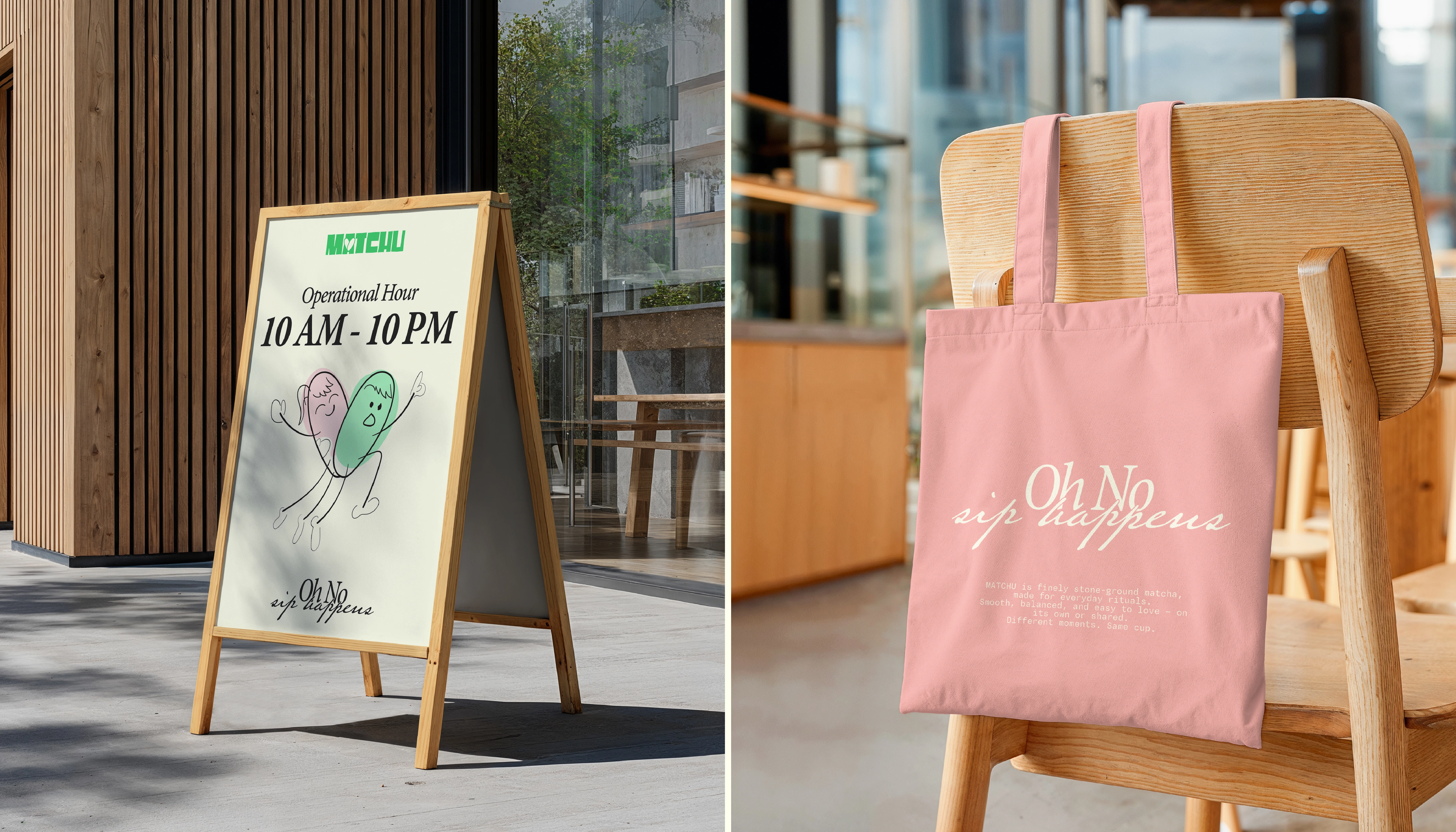
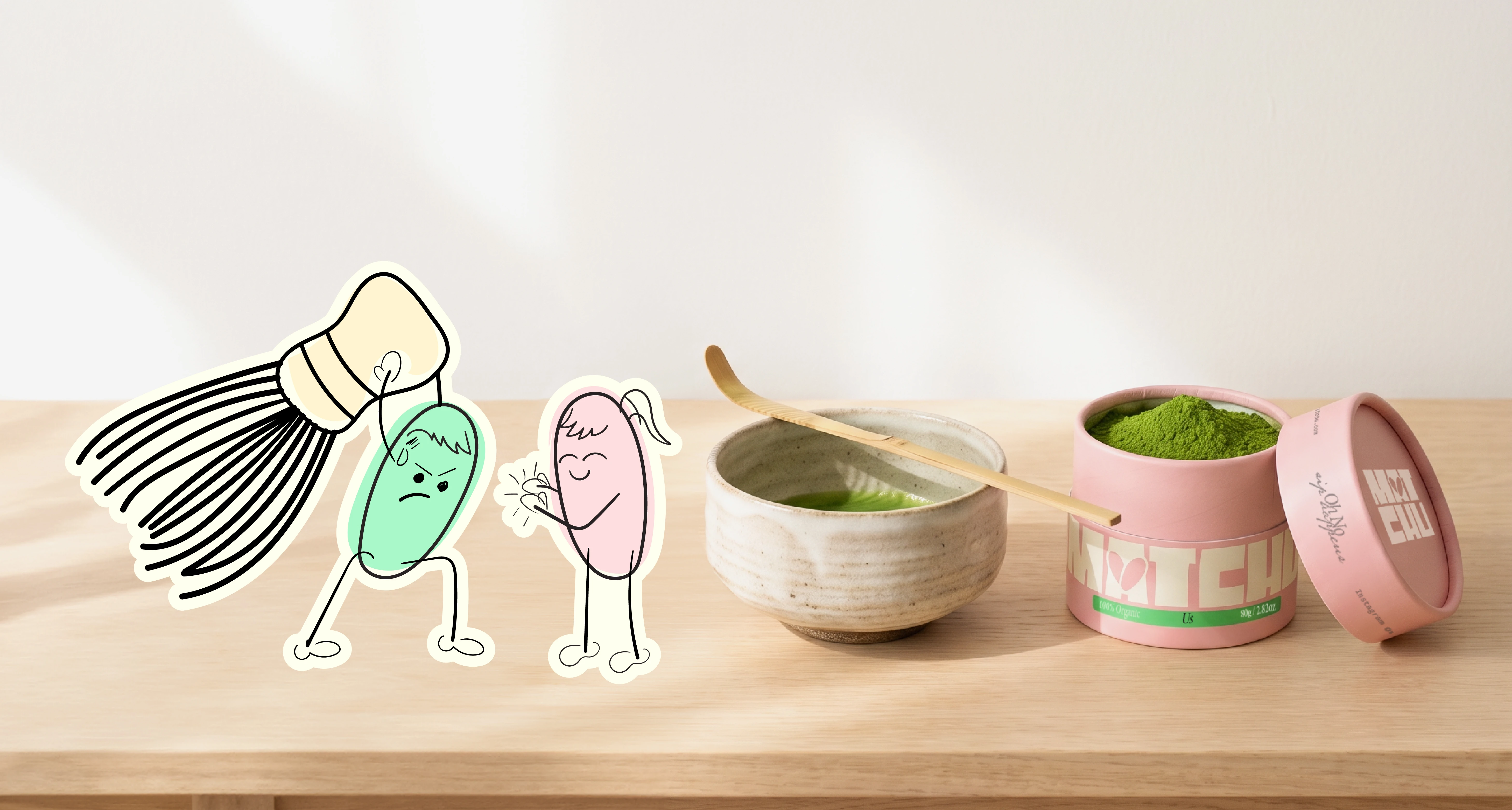
MATCHU exists in two forms: matcha powder for everyday use, and a space to sit, sip, and stay. Inspired by two contrasting personalities, the brand embraces balance through both product and experience. Not everything matches. But somehow, this does.
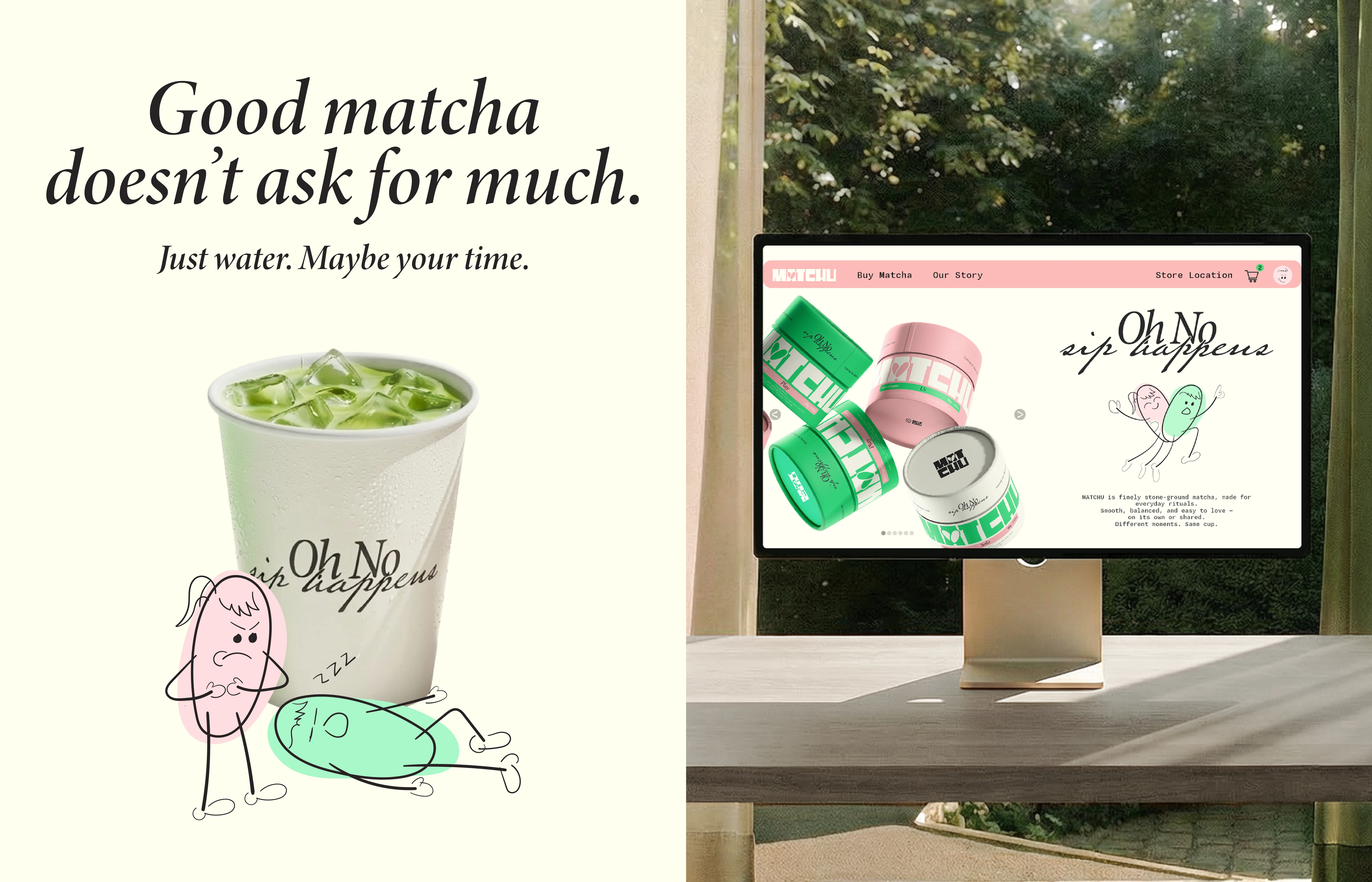
Oh no, sip happens.
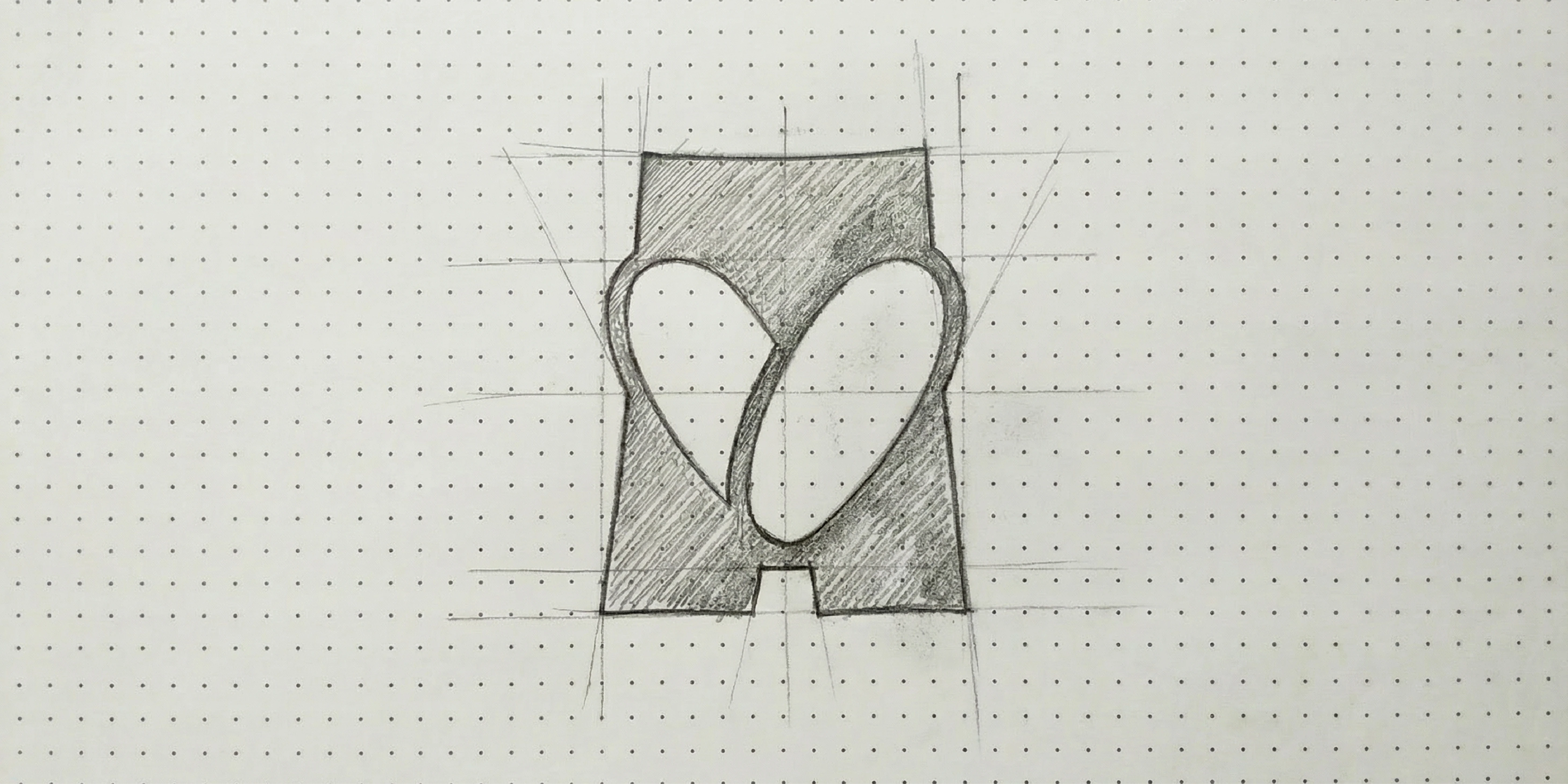
Logo Visual Approach
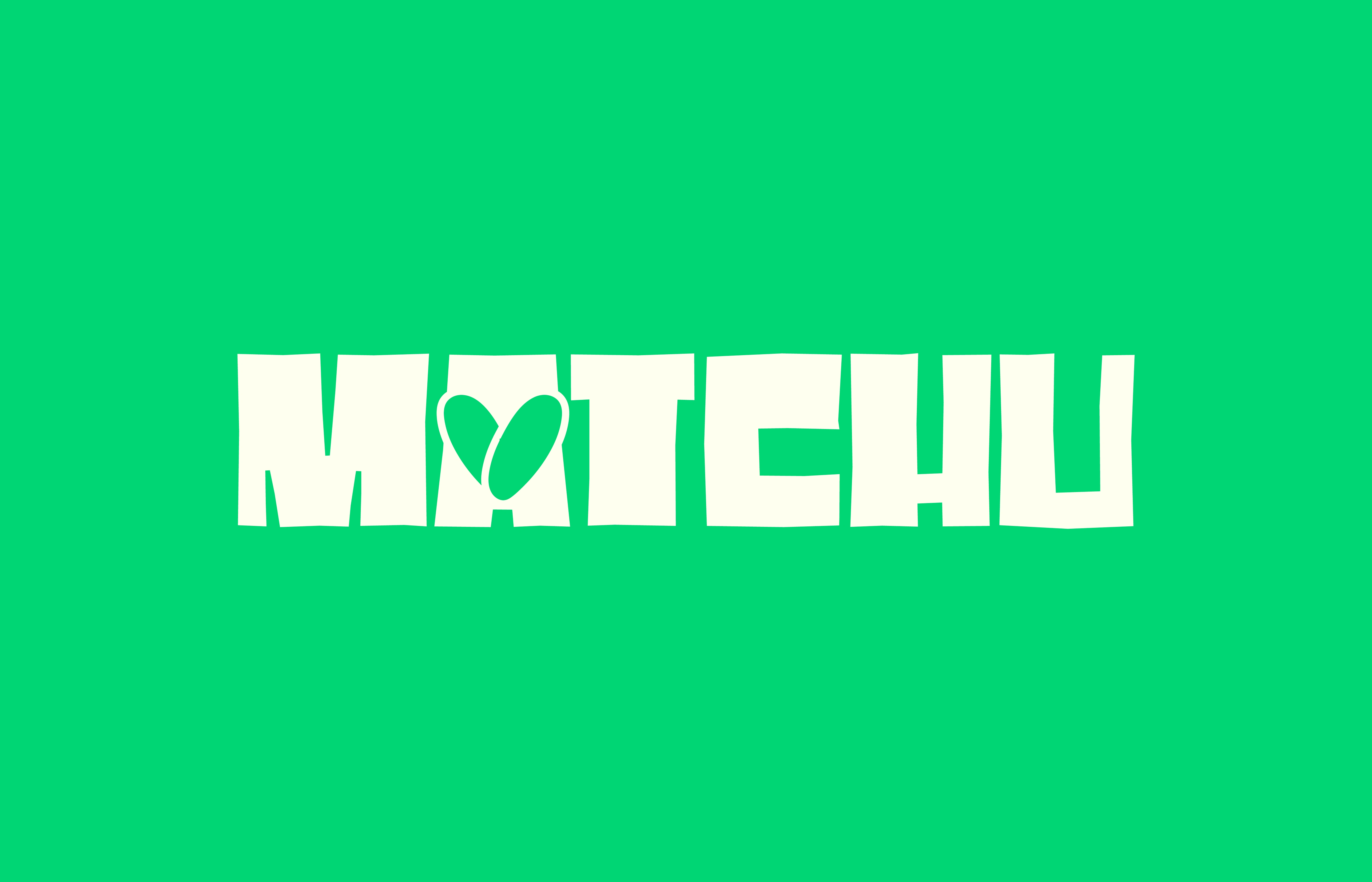
The logo is constructed from a single solid form, with two identical shapes carved within it.
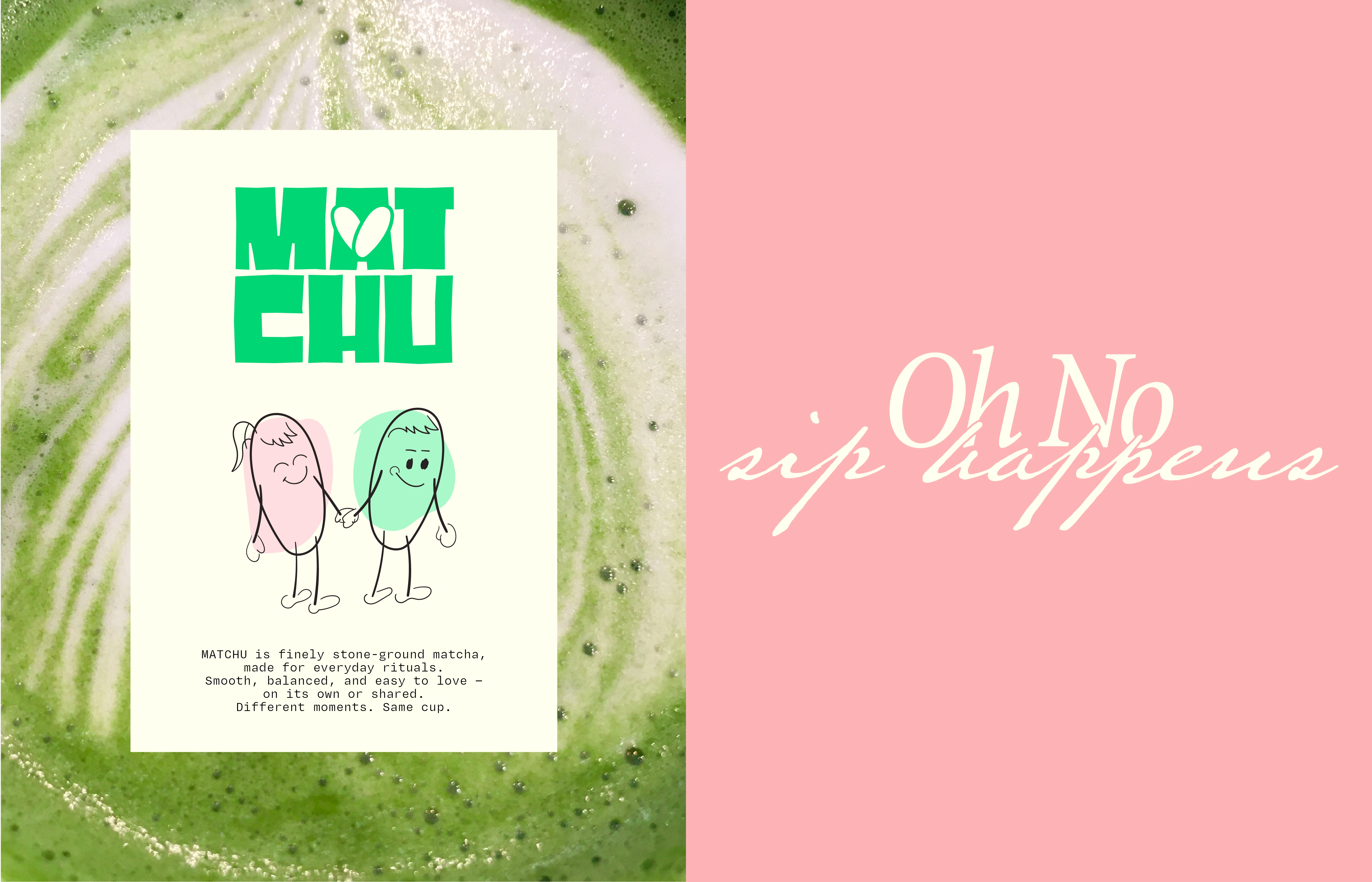
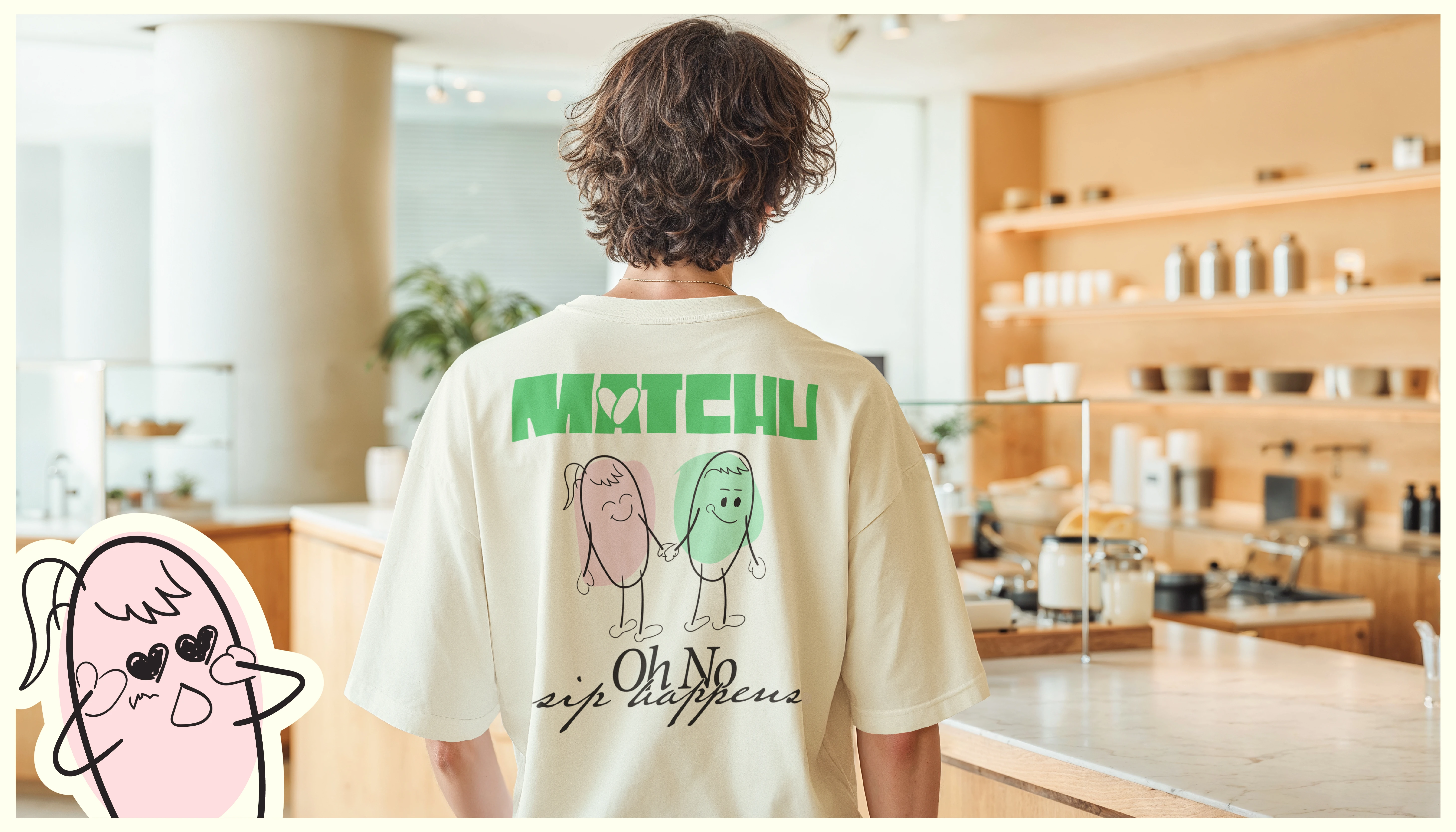
These forms are based on the brand’s characters, not different in shape, but in personality. One feels more calm and composed, the other more playful, expressed through their interaction rather than their form. As they meet at the center, they create a subtle heart through negative space. Rather than being separate elements, they exist within the same structure, suggesting connection from within.
Identical in shape, different in feel.
Together, they form something complete.

Thank You For Scrolling :)
Project49 - Multidisciplinary Studio
Let's connect and work together.
See your vision come to life!
Project49 2026 ©
0 likes · 0 views · Oct 19, 2026
MATCHU, a matcha brand embracing contrastcalm and chaos, soft and bold. Through products and spaces, it celebrates unexpected connections and imperfect matches.


