Zwoop Branding
Tiago Machado
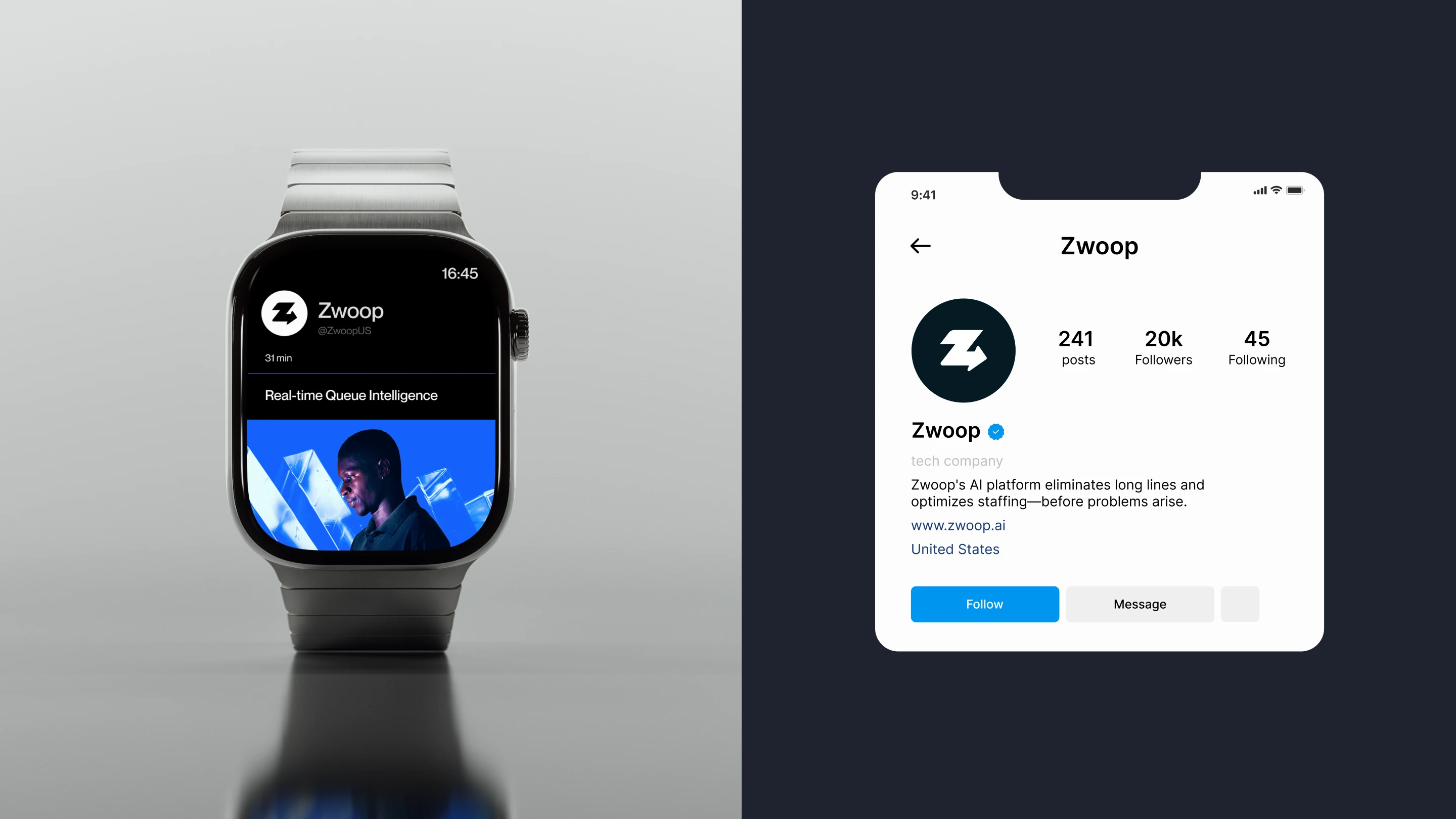
Zwoop
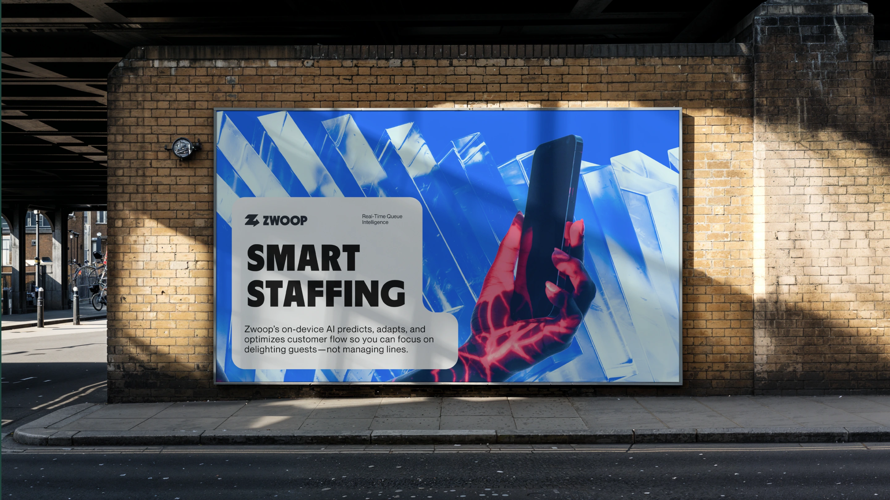
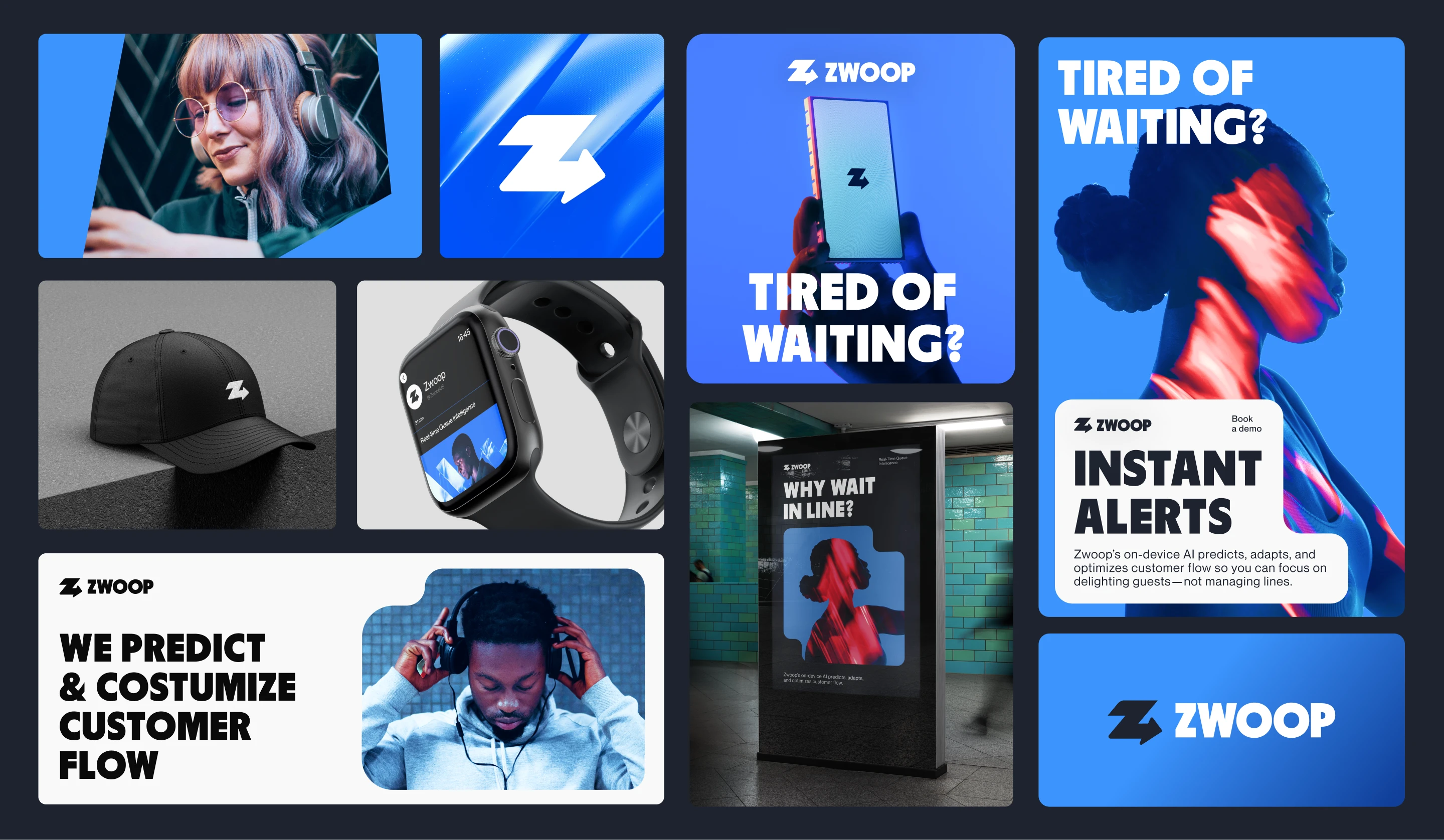
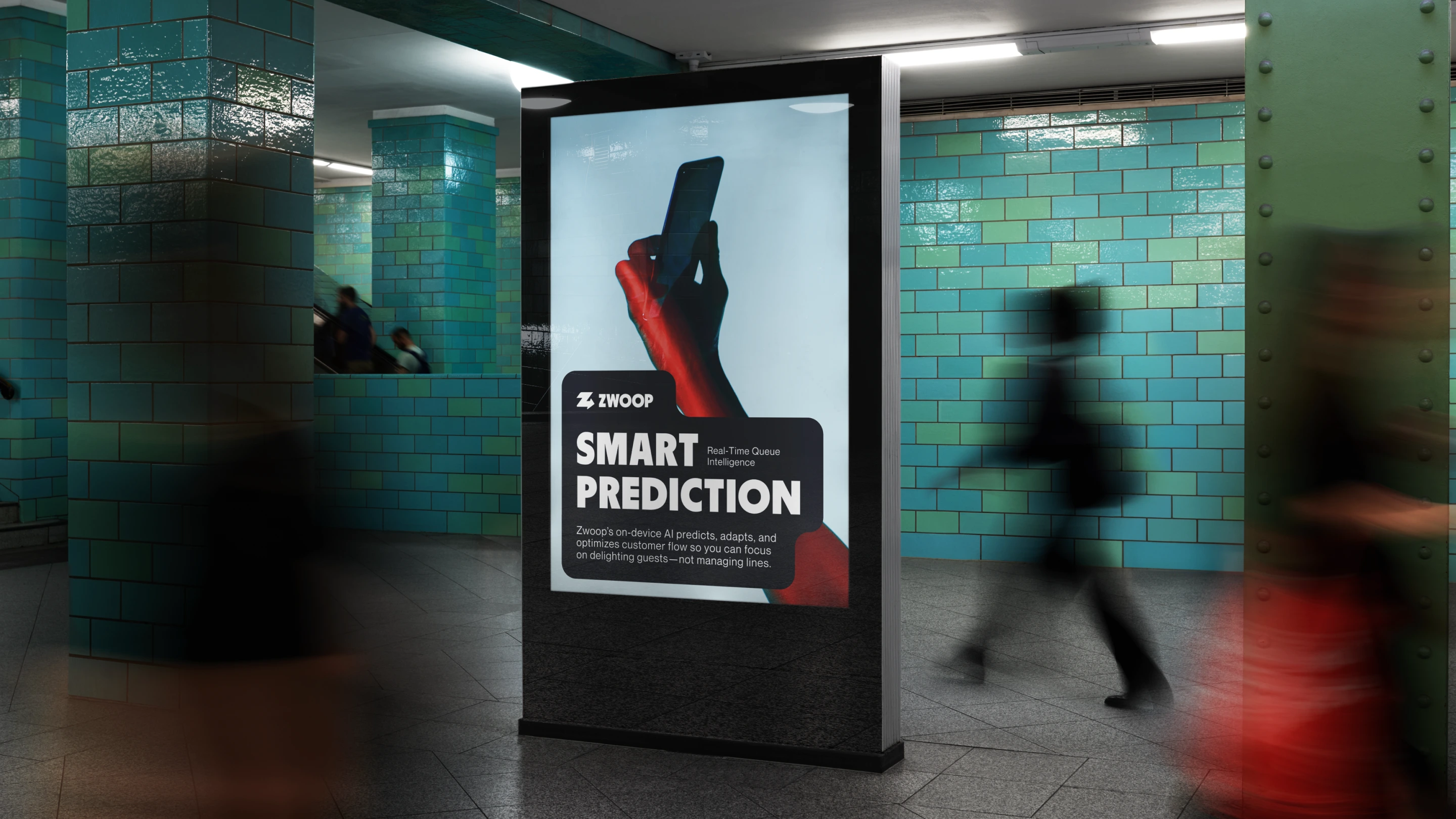
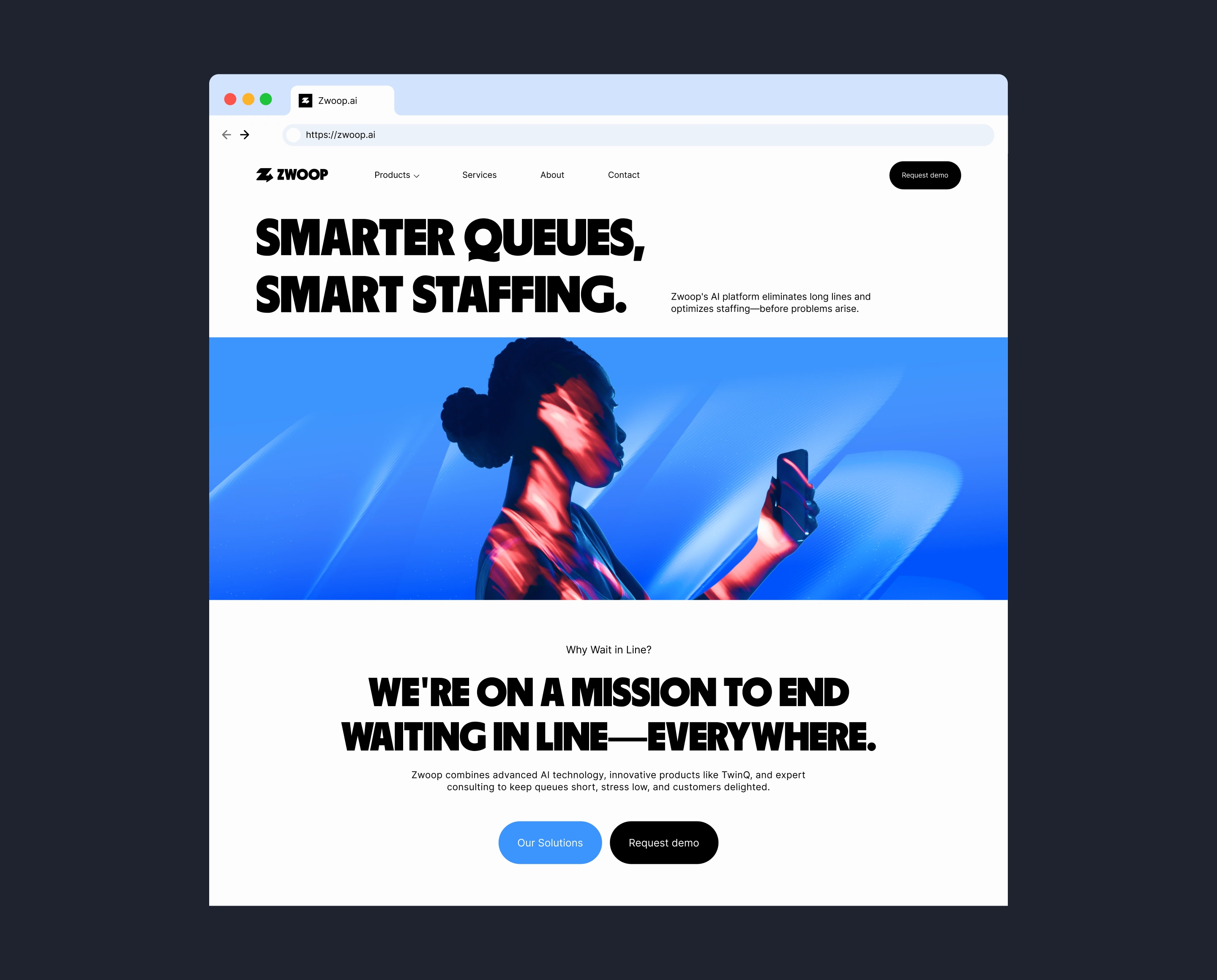
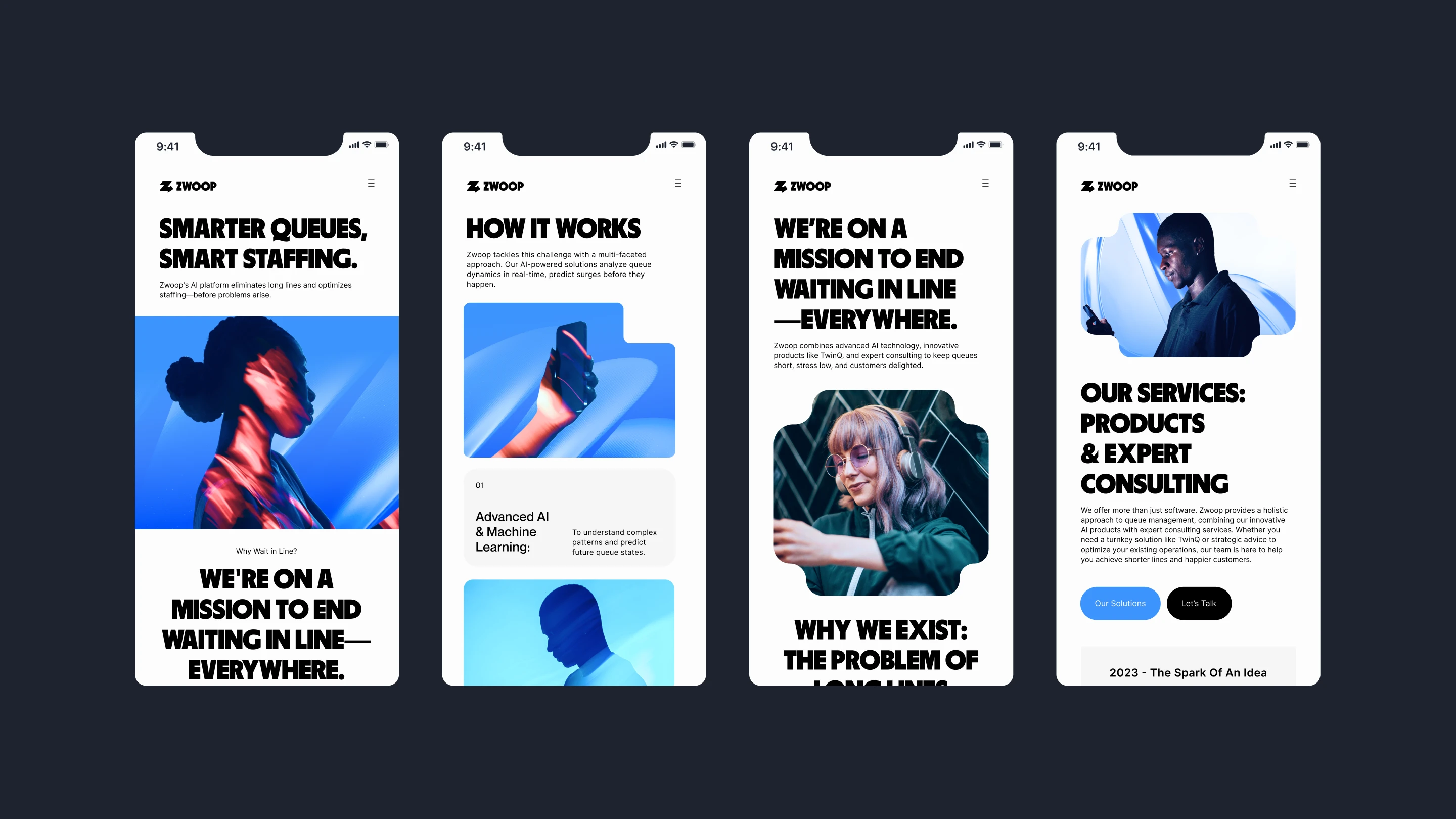
Smart prediction, smart staffing.
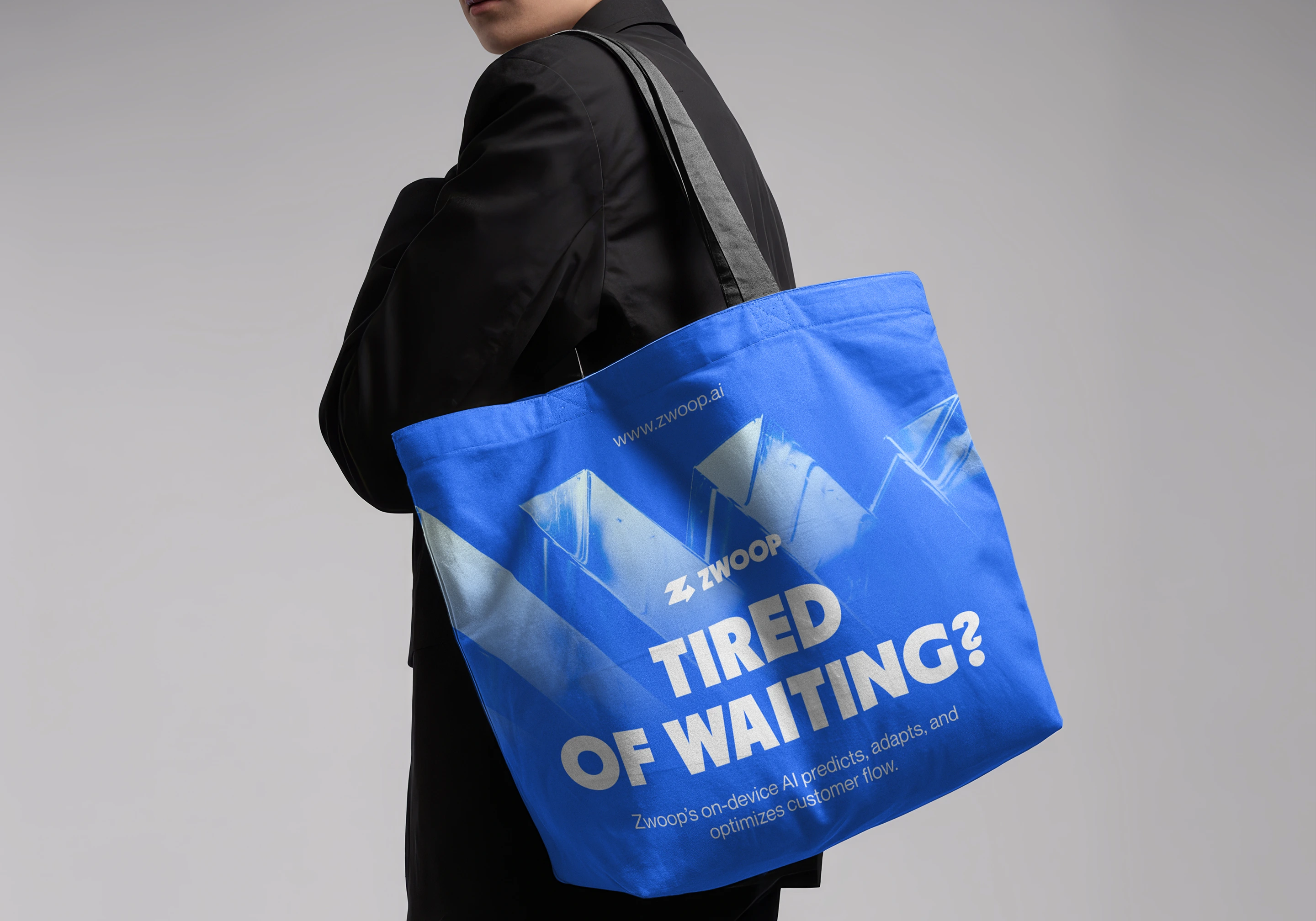
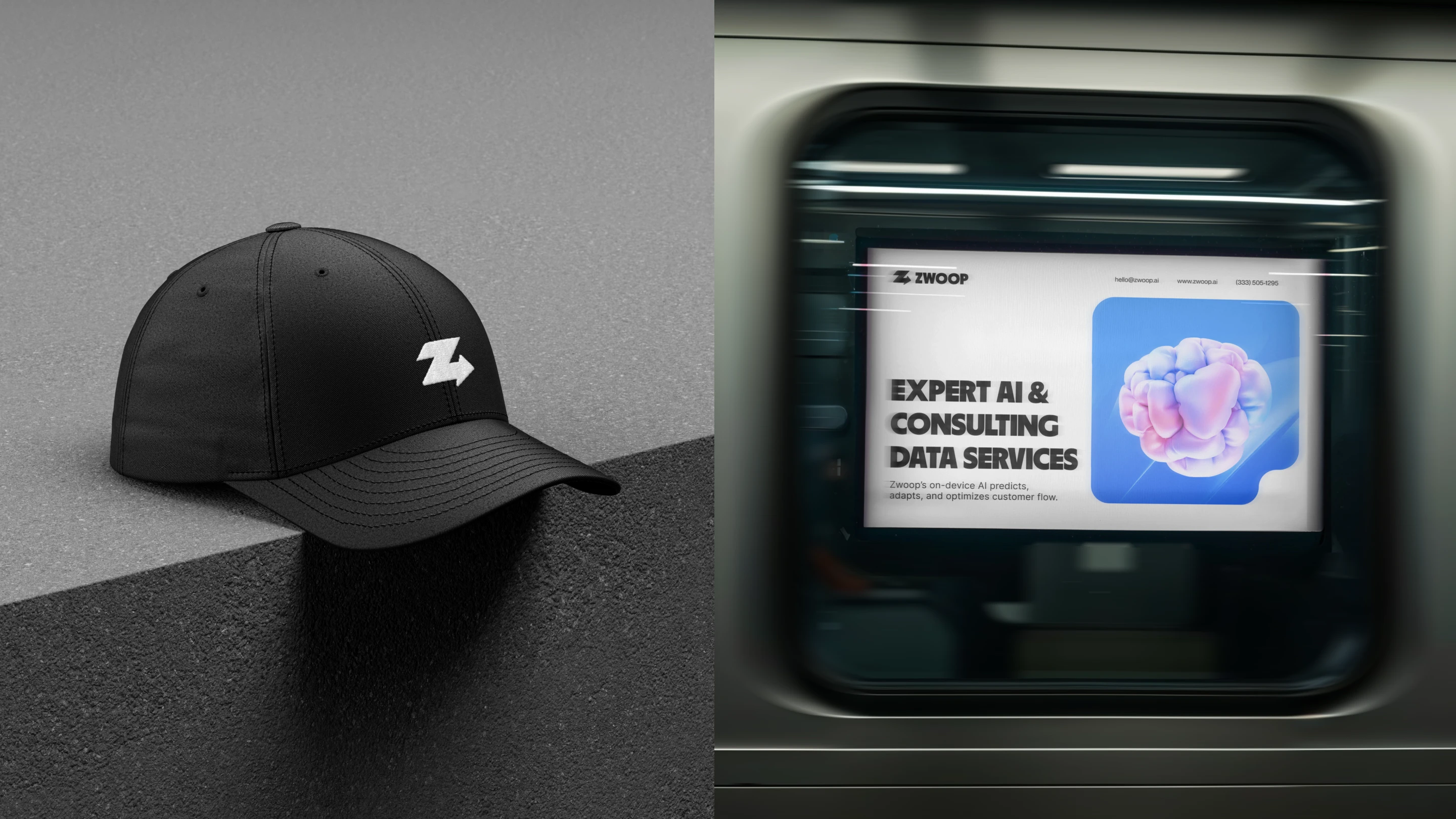
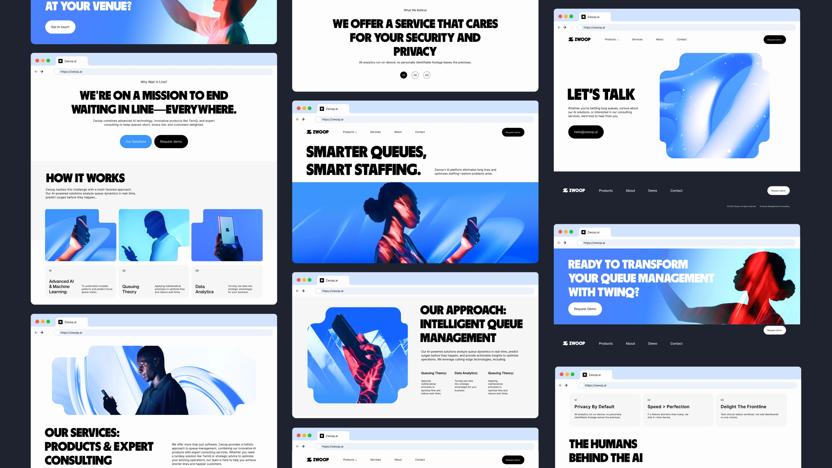
Zwoop is a new platform that eliminates long lines and optimizes staffing before problems arise. Their AI-powered solutions analyze queue dynamics in real-time, predict surges before they happen, and provide actionable insights to optimize operations.
By combining advanced AI technology, innovative products like TwinQ, and expert consulting, Zwoop can keep queues short, stress low, and customers delighted.
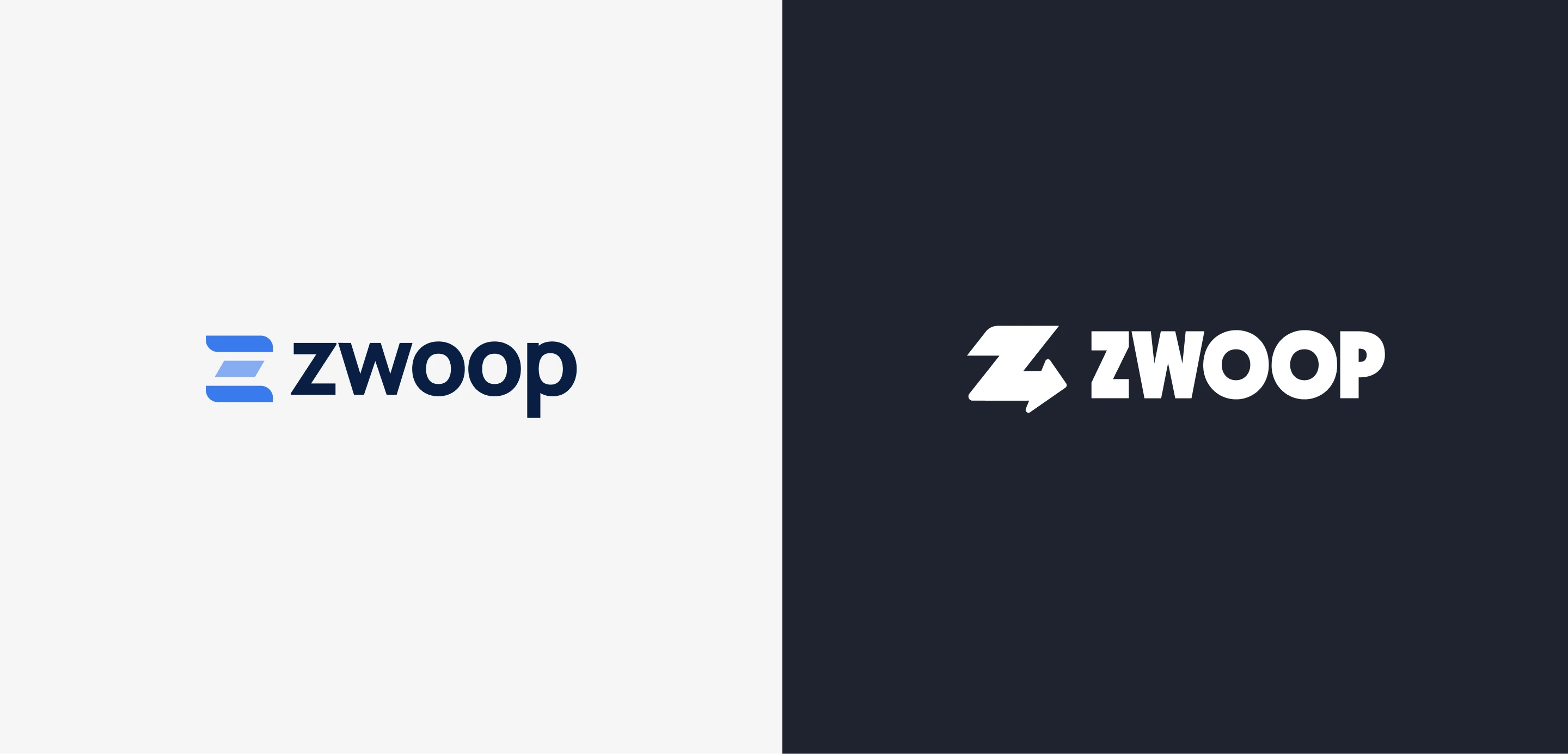
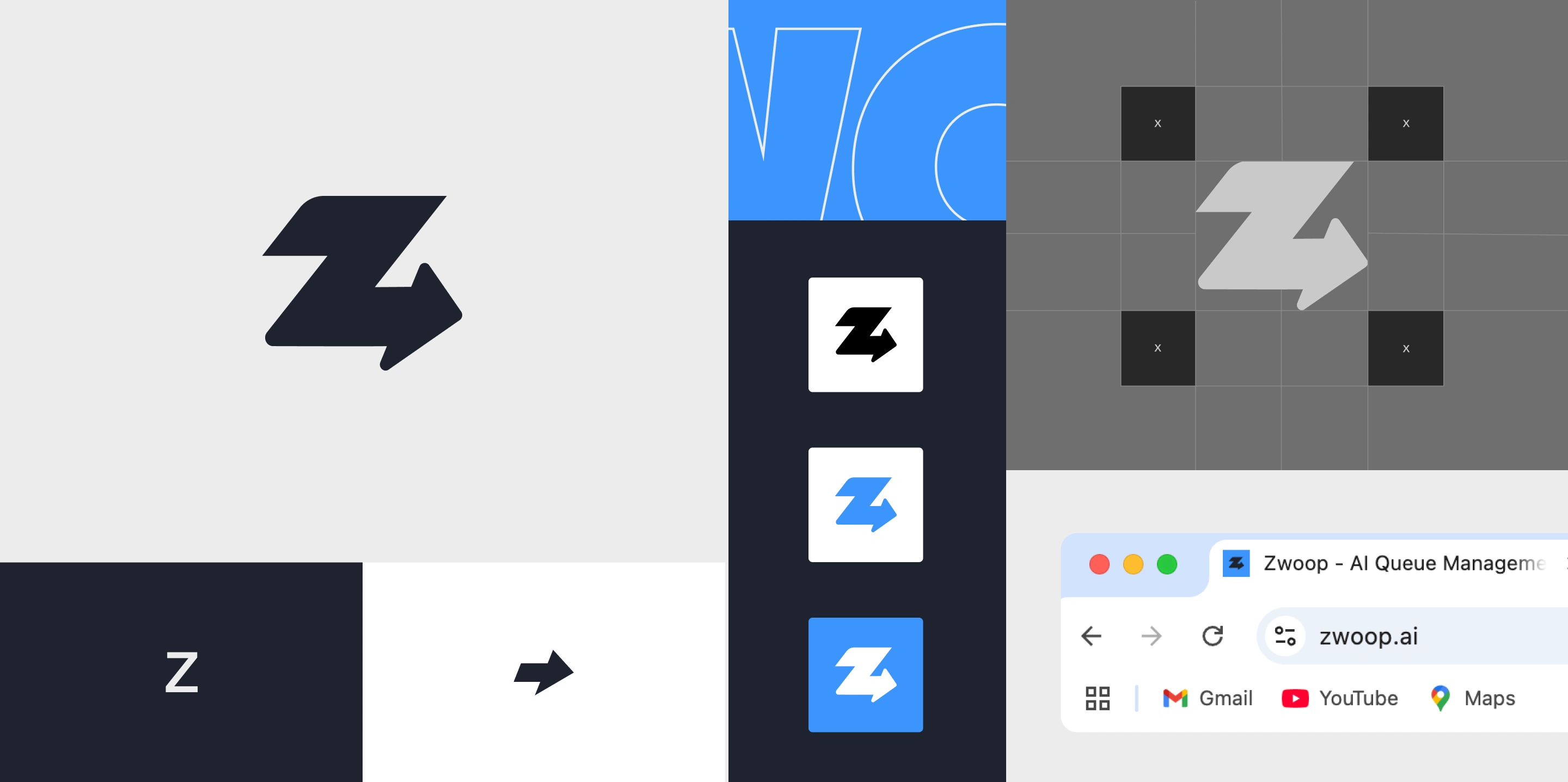
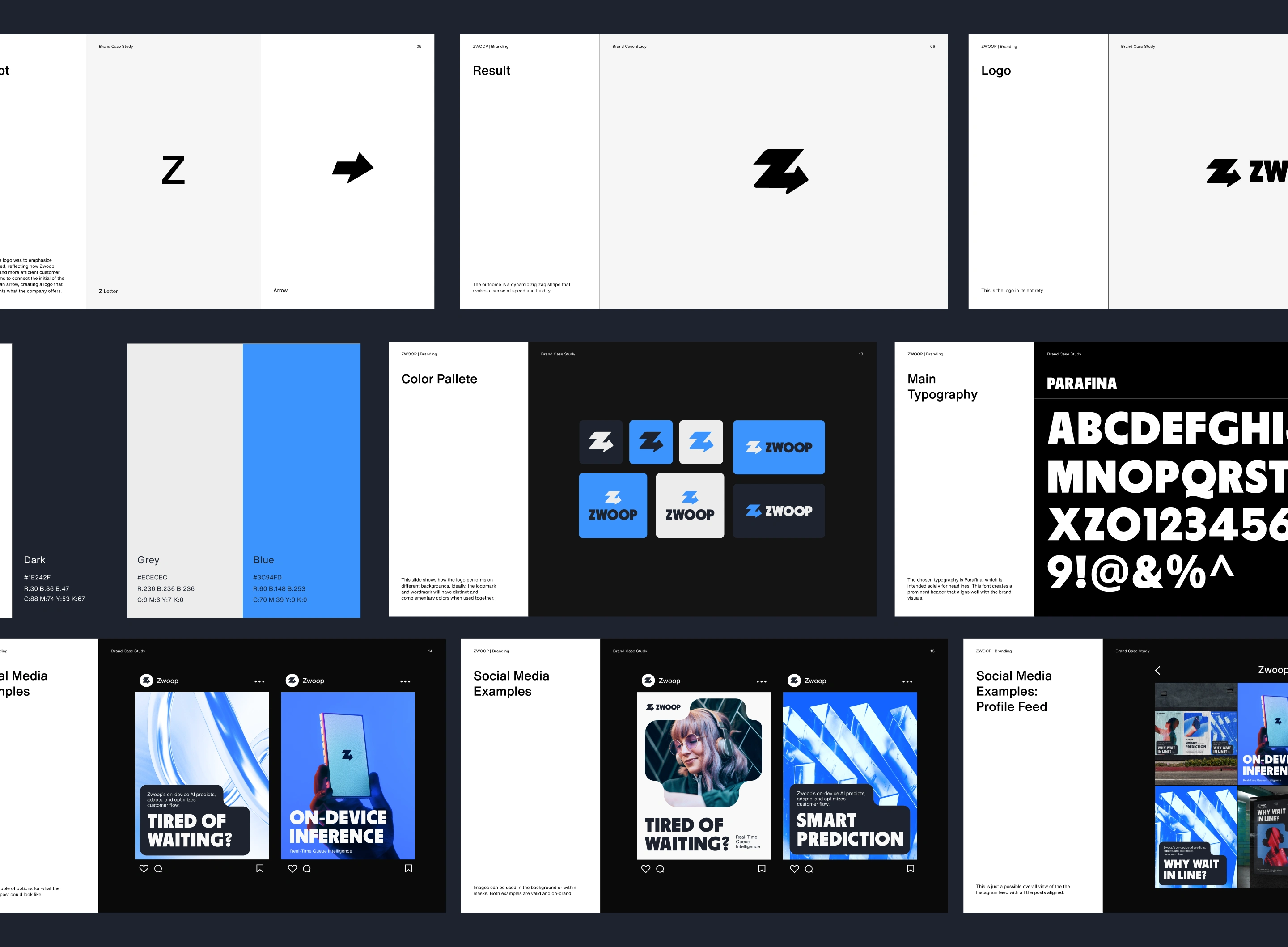
Old Logo vs New Logo
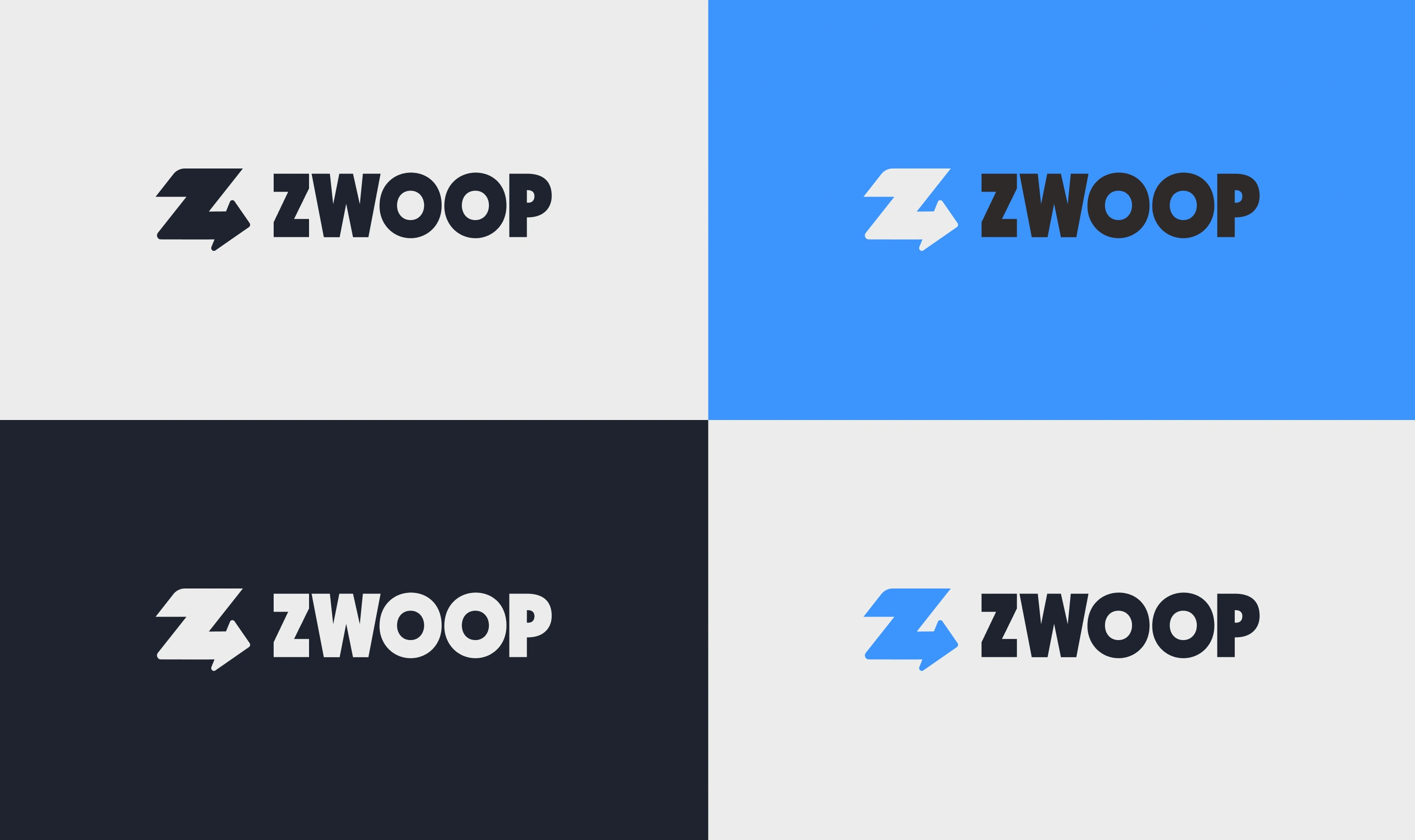
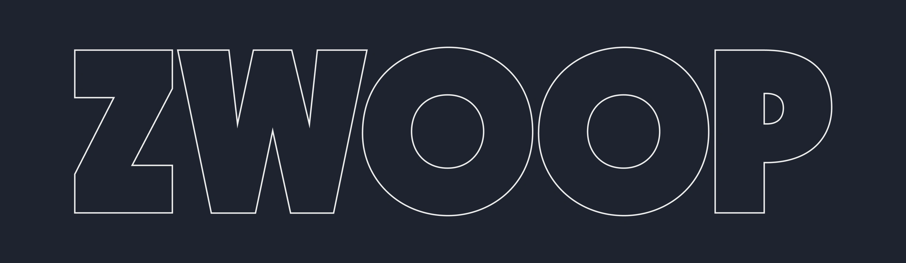
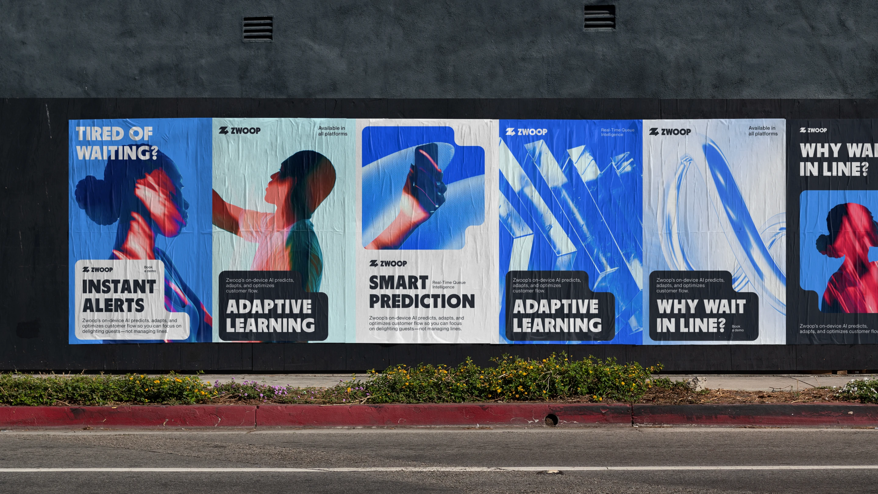
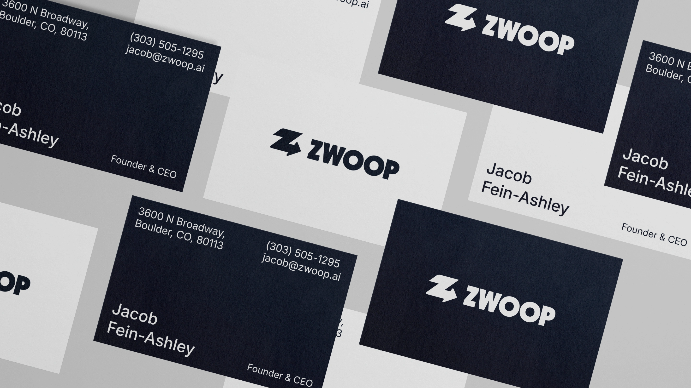
The concept for the logo was to emphasize movement and speed, reflecting how Zwoop facilitates a faster and more efficient customer flow. The design aims to connect the initial of the brand's name with an arrow, creating a logo that effectively represents what the company offers. The outcome is a dynamic zig-zag shape that evokes a sense of speed and fluidity.
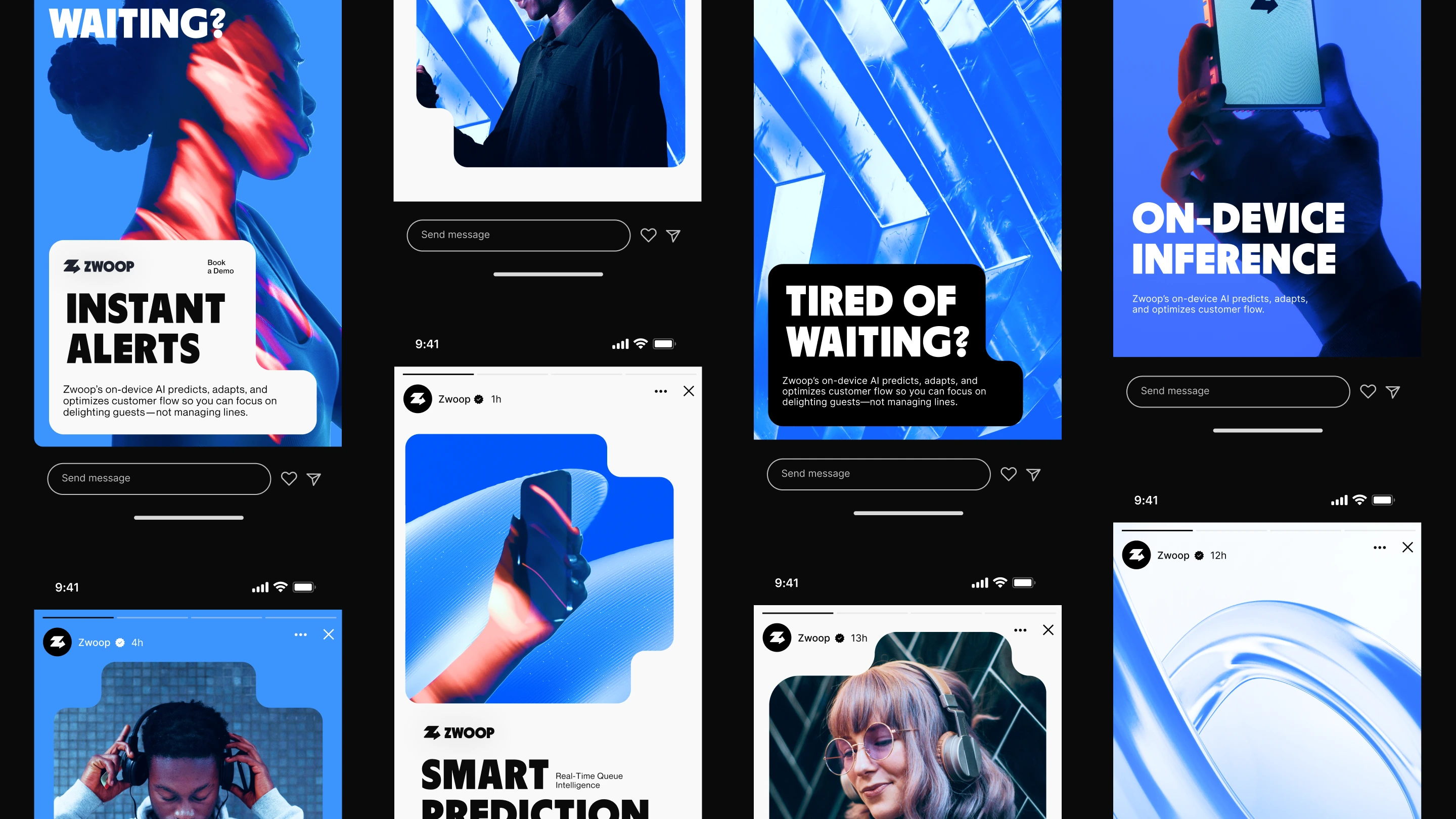
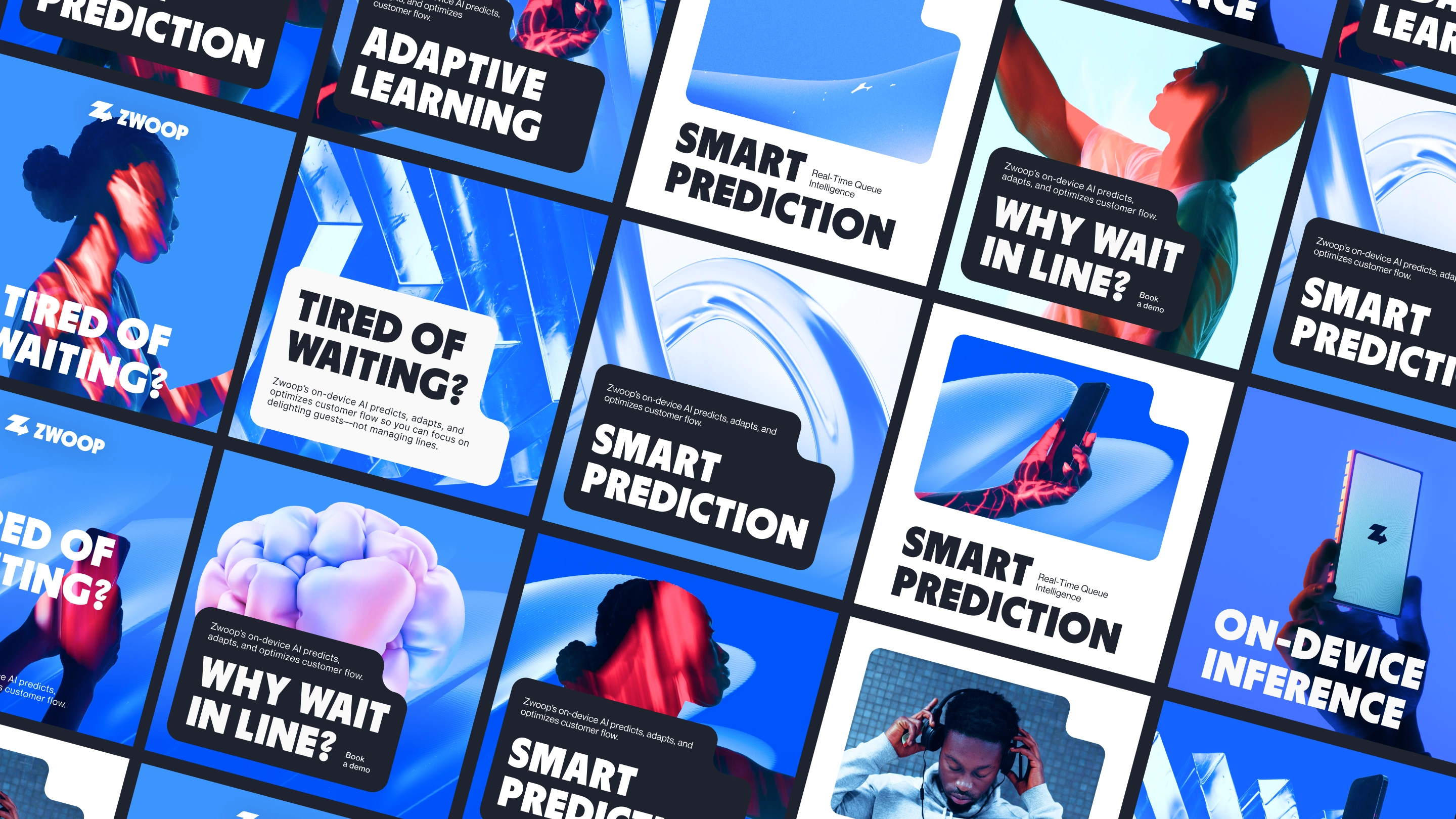
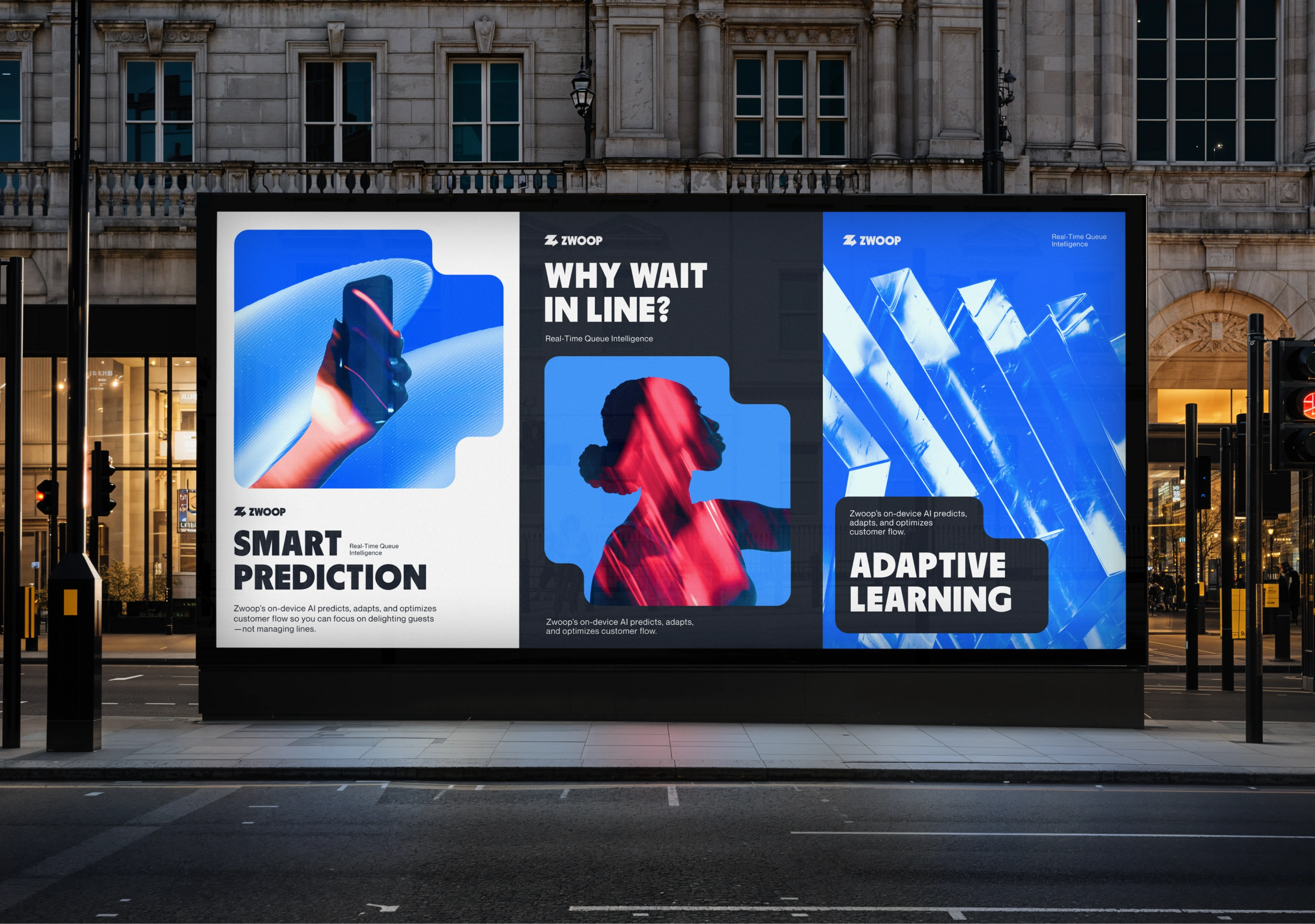
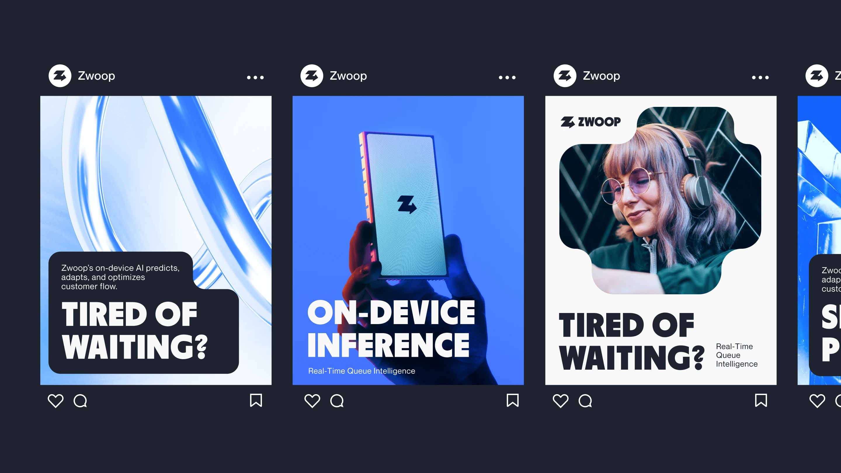
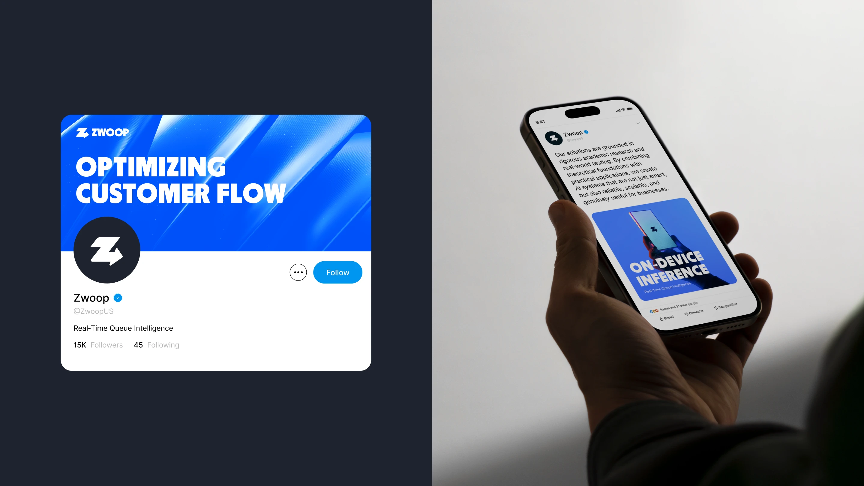
The overall application of the brand design focuses on creating a tech-savvy visual identity that resonates with the target audience. The concept is to combine images with subjects using technology, particularly conveying a sense of waiting. And contrasting that sense with abstract imagery that shows movement, segment and flow.
Like this project
Posted Jun 15, 2025
Zwoop is a new platform that eliminates long lines and optimizes staffing before problems arise. This projects showcases the process and result of their rebrand
Likes
10
Views
101
Timeline
May 26, 2025 - Jun 11, 2025
Clients
Zwoop