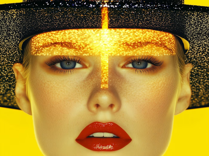
Premium Social Media Design for Women's Beauty Brand

Sharon Olusanya


Women's Beauty Social Media Design
Project Overview
Creating a Premium Beauty Visual That Feels Editorial, Feminine & Aspirational
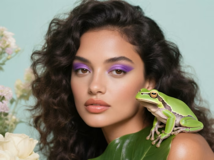
This project focused on creating a high-end social media design for a women's beauty brand, with the goal of communicating beauty, confidence, softness, and luxury through visual storytelling.
Rather than relying on a traditional product-focused beauty advertisement, I developed an editorial-inspired visual direction that allowed the models, skin texture, lighting, and floral elements to become the main storytelling devices.
The final creative combines warm neutral tones, natural skin texture, close-up beauty photography, soft floral details, controlled lighting, and symmetrical composition to create a visual that feels premium while remaining visually engaging for social media.
The overall direction was designed to make the audience stop scrolling first, then associate the brand with a sophisticated and aspirational beauty experience.
The Challenge
The main challenge was creating a beauty visual that felt luxurious and distinctive without becoming overly commercial or visually crowded.
Beauty content is highly competitive, and simply presenting an attractive model or product is often not enough to capture attention. The design needed to communicate a recognizable mood within the first few seconds while still maintaining a clean and sophisticated appearance.
I also wanted to avoid common beauty-design problems such as:
Over-editing the skin
Excessive use of text
Generic stock-photo aesthetics
Too many decorative elements
Harsh or unrealistic colors
A composition that looked more like an advertisement than a premium beauty campaign
The objective was therefore to create something that felt intentional, artistic, feminine, and brand-ready.
Creative Strategy
I approached the design as an art-directed beauty campaign rather than simply a social media graphic.
01 — Establishing the Visual Direction
I first defined the visual mood around:
Luxury • Softness • Femininity • Confidence • Natural Beauty • Editorial
I selected a warm, neutral visual palette that could complement different skin tones while giving the overall composition a sophisticated appearance.
The goal was to make the skin and facial features feel luminous without making the image look excessively retouched.
02 — Image Selection & Composition
I selected close-up beauty imagery because facial expressions, skin texture, eyes, lips, and hair create immediate visual focal points.
For the first composition, I used two female beauty portraits positioned together to create a strong editorial feel. The flowers introduce a softer, organic element while also directing attention toward the models' faces.
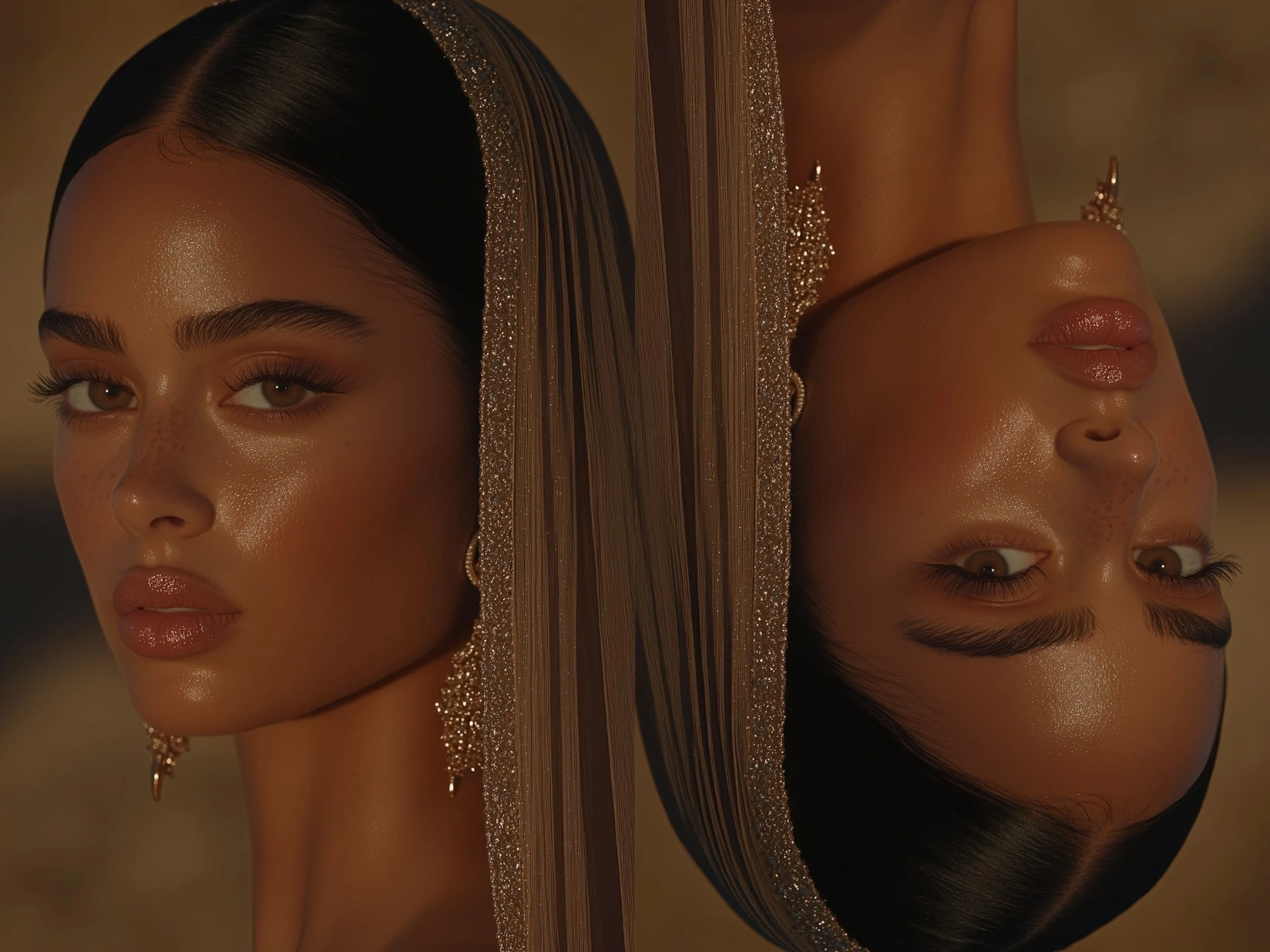
For the second composition, I experimented with a more artistic mirrored arrangement. The contrasting orientation of the portraits creates visual tension and makes the viewer look at the image for longer.
This was intentional: instead of presenting one predictable beauty portrait, I created a composition that encourages visual exploration.
03 — Lighting & Color Treatment
The lighting was kept warm and slightly dramatic to create depth across the faces.
I focused on maintaining:
Warm skin tones
Natural highlights
Controlled shadows
Soft contrast
Subtle texture
A cohesive neutral background
The objective was not to make the skin look artificial. I wanted the models to retain realistic skin texture while still achieving a polished campaign aesthetic.
04 — Beauty Retouching
The retouching process focused on enhancement rather than transformation.
I refined the overall appearance while preserving important natural details such as freckles, skin texture, facial structure, and highlights.
This helped the final artwork feel more contemporary and editorial rather than heavily airbrushed.
05 — Creating Visual Hierarchy
Because beauty audiences often respond quickly to visual cues, I kept the composition relatively minimal.
The faces serve as the primary focal point.
The flowers act as secondary visual elements.
The background and lighting provide atmosphere without competing with the subjects.
This creates a clear visual hierarchy:
Face → Beauty details → Floral element → Overall mood
Design Decisions
Why Close-Up Portraits?
Close-up portraits immediately communicate beauty and allow the audience to connect with facial expressions, skin, eyes, lips, and texture.
They also create a more intimate feeling than distant lifestyle photography.
Why Flowers?
The flowers were used as a visual metaphor for softness, femininity, freshness, and natural beauty.
They also introduce contrast against the models' skin and hair, helping the composition feel more artistic.
Why Warm Neutrals?
Warm browns, creams, skin tones, and muted highlights create a premium visual language without relying on overly bright colors.
This palette also supports the luxury/editorial positioning of the creative.
Why Minimalism?
Beauty brands can easily overcrowd social graphics with product information, promotional text, icons, and decorative elements.
For this concept, I intentionally allowed the photography to do most of the communication.
The result is a design that feels more like a beauty campaign image than a conventional promotional post.
Deliverables
Creative Deliverables
2 premium women's beauty social media creatives
Editorial beauty art direction
Image selection and composition
Beauty-focused image enhancement
Color grading and tonal adjustments
Skin retouching and visual refinement
Floral/organic visual integration
Social-media-ready compositions
Final high-resolution exports
Creative Direction
Style: Luxury editorial beauty
Mood: Soft, feminine, sophisticated
Color Direction: Warm neutrals, browns, creams and natural skin tones
Photography Style: Close-up beauty portraiture
Visual Language: Minimal, artistic and premium
Primary Focus: Natural beauty and facial features
Women's Beauty Social Media Design
Results & Impact
Because this project was developed as a design-focused beauty concept and I did not have access to live social media analytics, I have not attributed unverified performance numbers to the work.
Instead, the success of the project was evaluated through the quality of the visual solution, consistency of the art direction, and how effectively the designs communicated the intended beauty positioning.
What the Design Achieved
01 — Established a Premium Visual Direction
The final creatives developed a sophisticated beauty aesthetic built around warm neutrals, natural skin texture, soft lighting, close-up portraiture, and editorial composition.
This created a visual language that feels appropriate for a premium women's beauty brand rather than a generic social media advertisement.
02 — Created Strong Visual Hierarchy
The designs were intentionally kept minimal so the models remained the primary focal point.
Facial features, eyes, lips, skin texture, and the floral elements naturally guide the viewer through the composition without competing with unnecessary graphics or excessive typography.
03 — Balanced Beauty & Authenticity
A major focus was maintaining natural-looking skin while still achieving a polished campaign appearance.
Rather than completely removing natural characteristics, the editing approach preserved visible skin texture and details while enhancing lighting, tone, and overall presentation.
04 — Built Two Distinct Creative Directions
The project resulted in two complementary visual approaches.
The first creative uses soft floral elements and brighter natural lighting to create a romantic and delicate beauty mood.
The second uses warmer lighting, stronger shadows, symmetry, and an unconventional mirrored composition to create a more dramatic editorial feel.
Although the compositions are different, both maintain the same overall luxury beauty language.
05 — Delivered Social-Ready Creative Assets
The final deliverables provide ready-to-use beauty content that can be adapted for social media campaigns, beauty brand promotions, editorial posts, product launches, or visual brand storytelling.
How I Would Measure Success in a Live Campaign
If these creatives were published as part of a live social media campaign, I would track:
Reach and impressions to measure visibility
Engagement rate to evaluate audience interaction
Saves to measure content value and inspiration
Shares to measure visual relevance and shareability
Profile visits to evaluate interest in the brand
Link clicks to measure movement toward conversion
Follower growth to evaluate broader audience impact
These metrics would allow the visual strategy to be evaluated not only on aesthetics, but also on its ability to support actual marketing objectives.
Overall Outcome
The final result demonstrates my ability to take a beauty concept and develop it into a cohesive visual experience through art direction, image selection, composition, retouching, lighting, color treatment, and visual storytelling.
Rather than adding more elements to make the designs noticeable, I focused on making each element purposeful.
The result is a clean, feminine, editorial visual direction that allows the photography and beauty details to communicate the message naturally.
Like this project
Posted Aug 27, 2026
Created an editorial-inspired social media design for a luxury women's beauty brand.
Likes
1
Views
12
Timeline
Jul 27, 2026 - Aug 27, 2026