SaughtAndFound Brand Strategy and Identity Project

Ronnie Chan JR


About Project
SaughtAndFound is an independent strategy and design studio. They craft meaningful design stories for brand-centric products and businesses. They work on brand strategies, visual identities, design systems, product design and more.
From Middle English saughte, seihte, From Old English saht, seaht, seht (“arrangement, agreement, a peace between two powers, friendship, peace”) From Old Norse sœkja (“to seek; to trace”)
Etymology of Saught
From Middle English finden, from Old English findan, (To attain to; to arrive at; to acquire); from Proto-West Germanic finþan (To arrive at, as a conclusion; to determine as true; to establish)
Etymology of Found
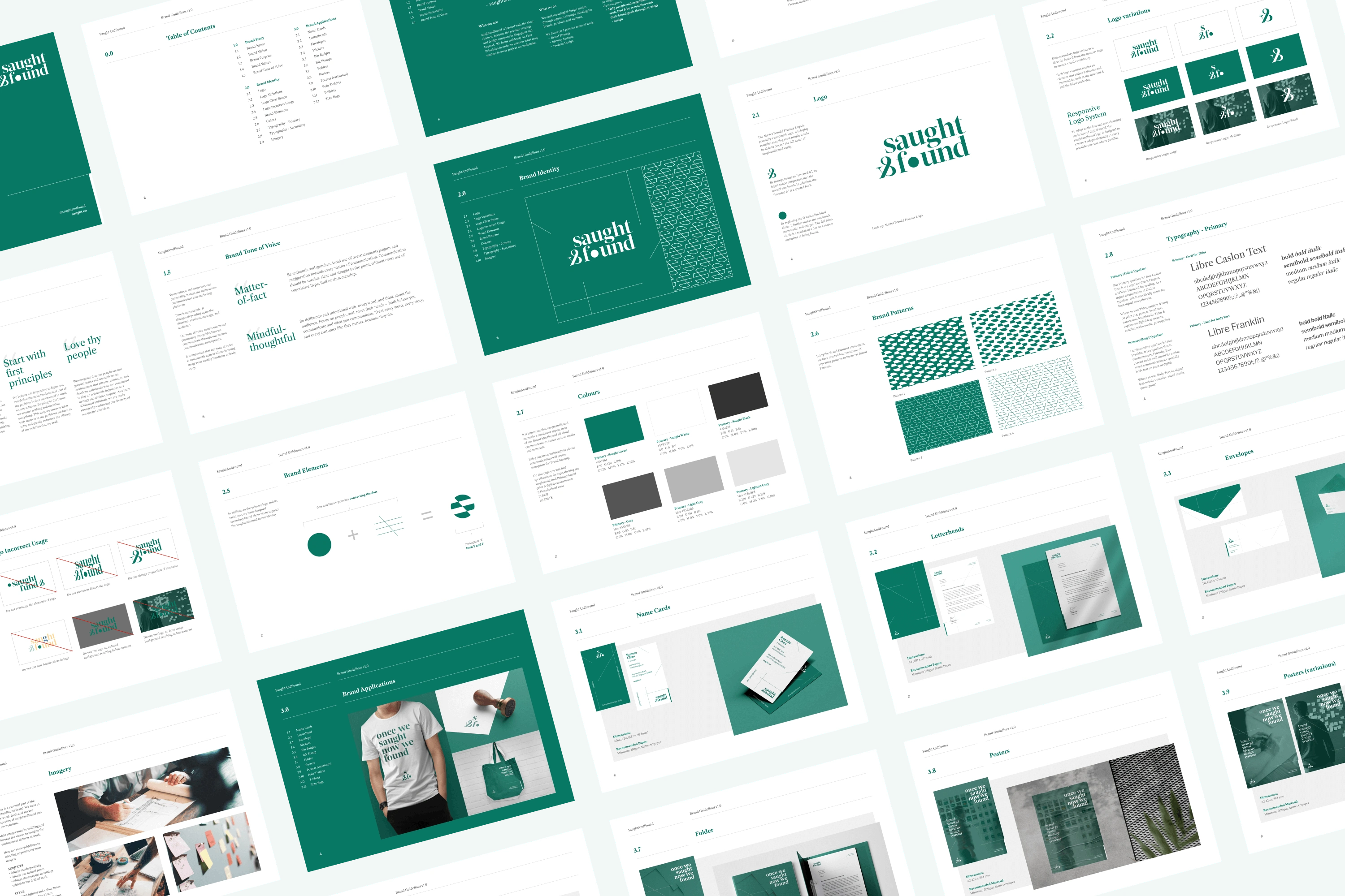

Process: Brand Strategy
Through strategy exercises, we uncovered and aligned that the true purpose of the studio is “To seek, find and realise true purpose“. This forms the basis of our Brand Naming. This allowed us to decide on saughtandfound.
Saught has a double meaning of “To seek” and “To reconcile or Be at peace” and Found further cemented our goal “To find” true purposes. Together, it represents “To seek, To find & To reconcile”
Through subsequent strategy sessions, we were then able to form the Brand Purpose, Purpose Statement which sets the Positioning for the studio. The Brand Vision helps to set a BHAG (big hairy goal) while the Brand Values help to align our behavior internally. We also developed a Tone of Voice to help extend Brand Values externally.
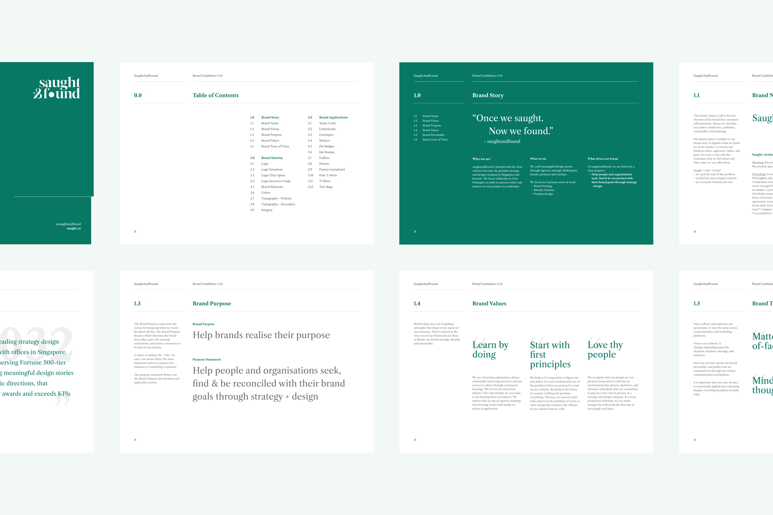
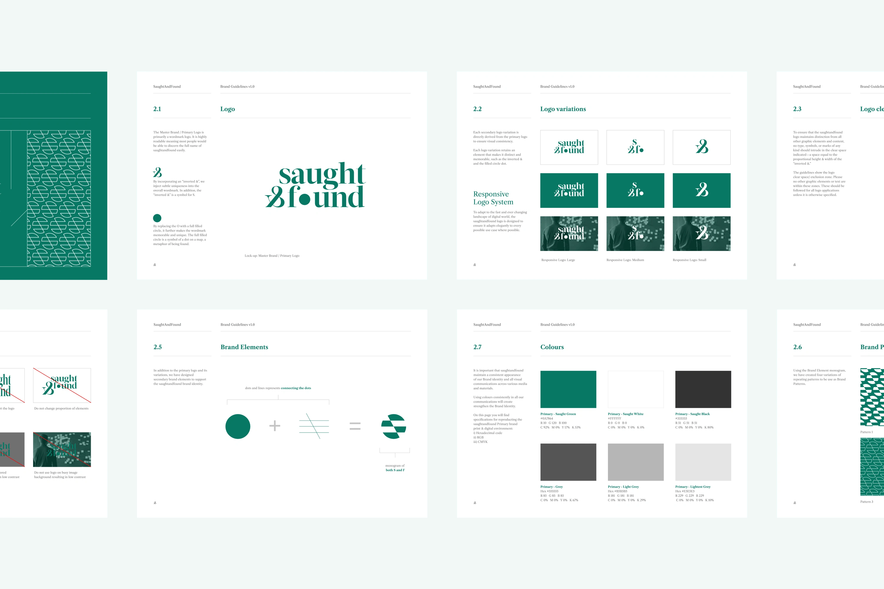
Process: Brand Identity
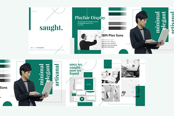
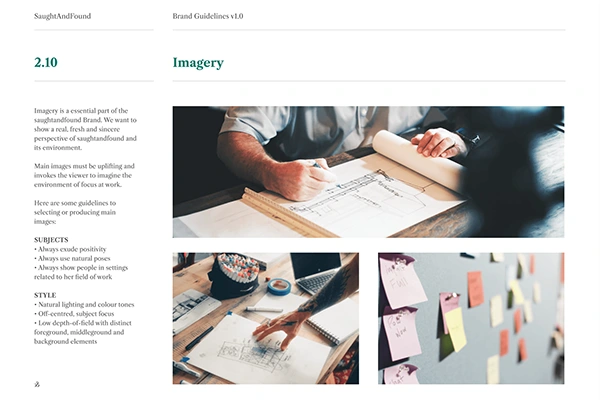
Using the Brand Story we developed earlier as the guiding roadmap, we first created Stylescapes to help visualise the visual direction for the Brand Identity. We finalise the visual mood and style that aligns with these 3 attributes:
- Minimal
- Elegant
- Artisanal
With the visual direction defined, we were able to develop the Brand & Visual Identity more effectively. When developing an effective Brand & Visual Identity, we adhere to the following best-practice pillars:
- Is it appropriate?
- Is it distinct and memorable?
- Is it simple?
- Is it responsive?
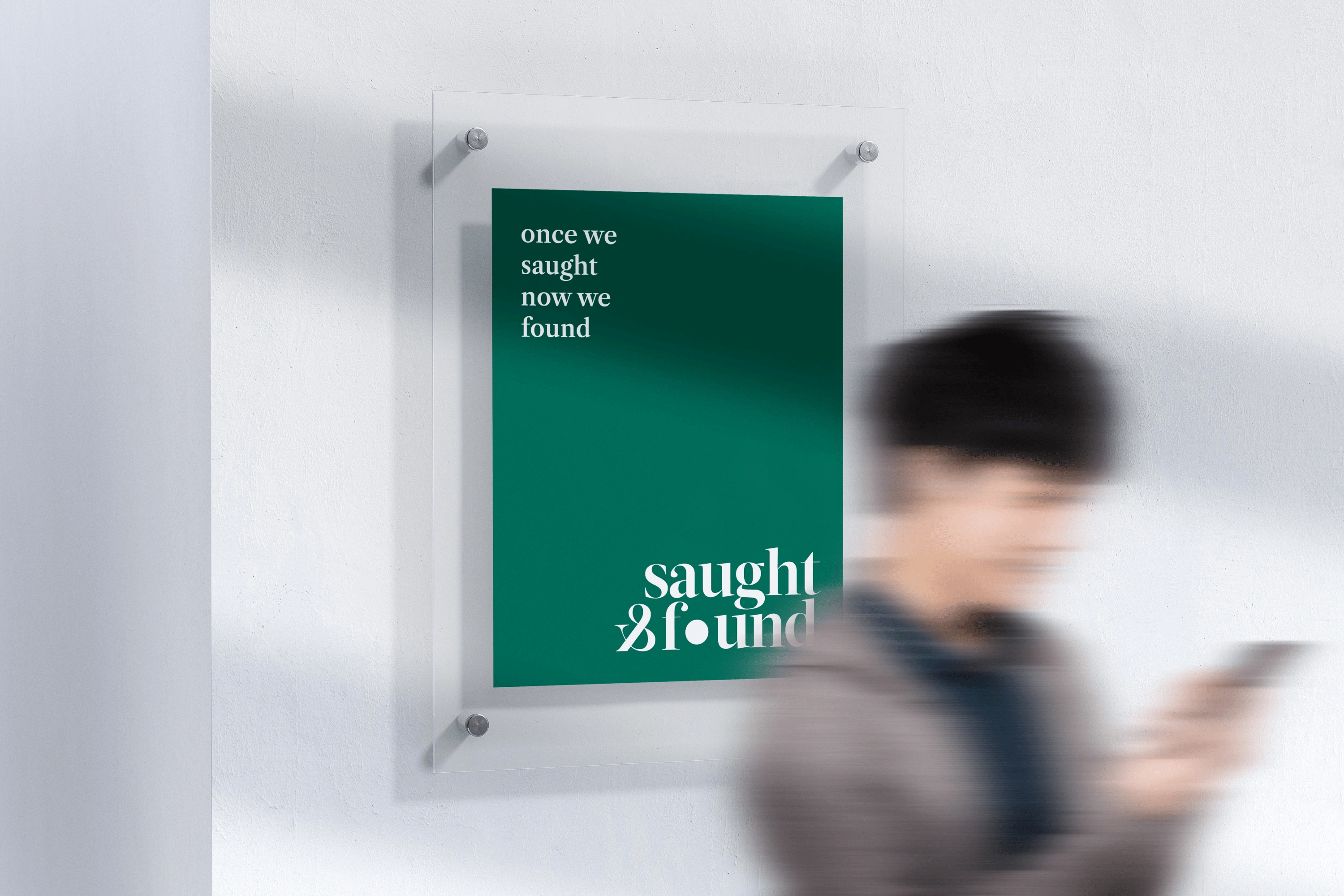
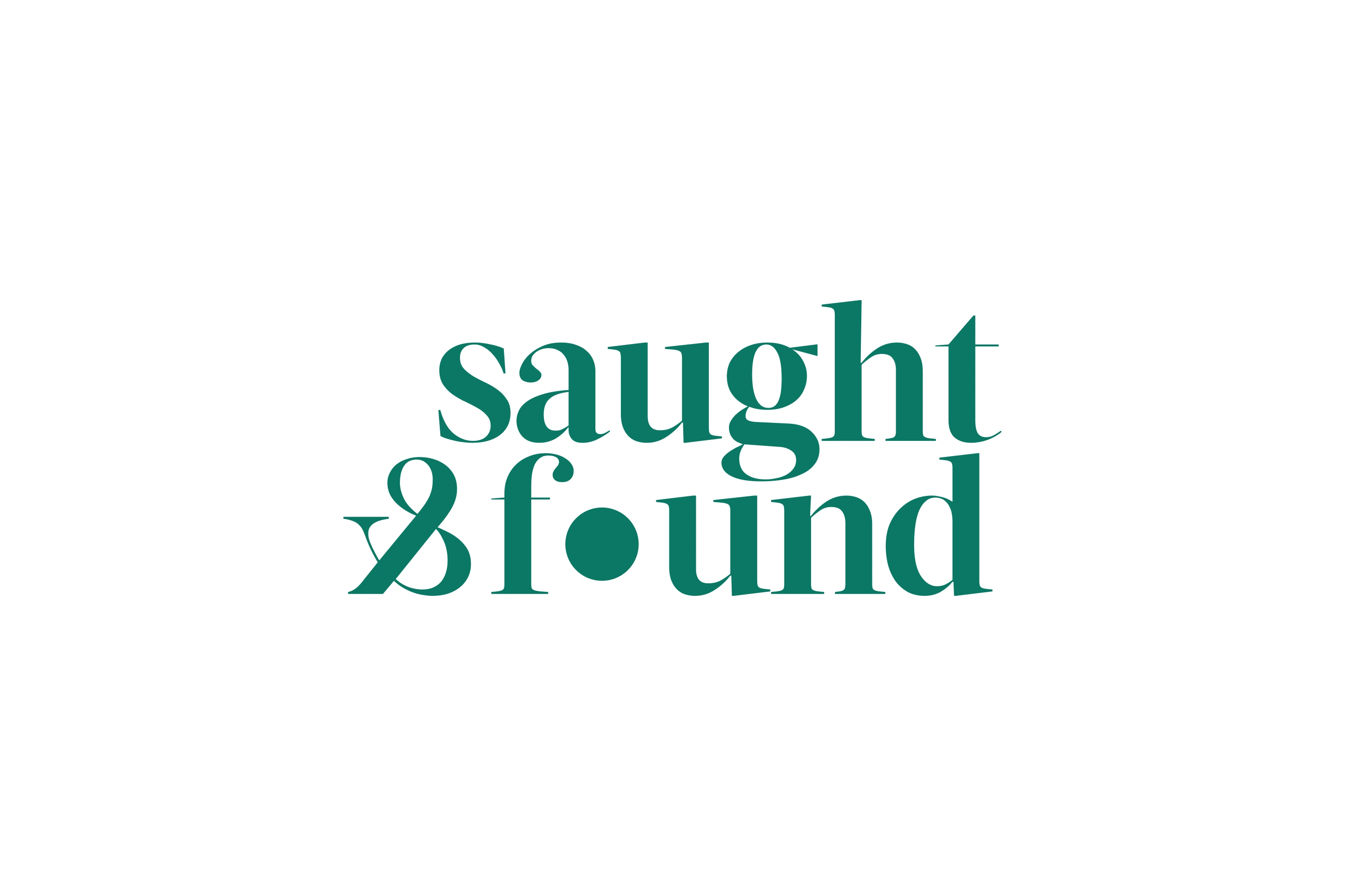
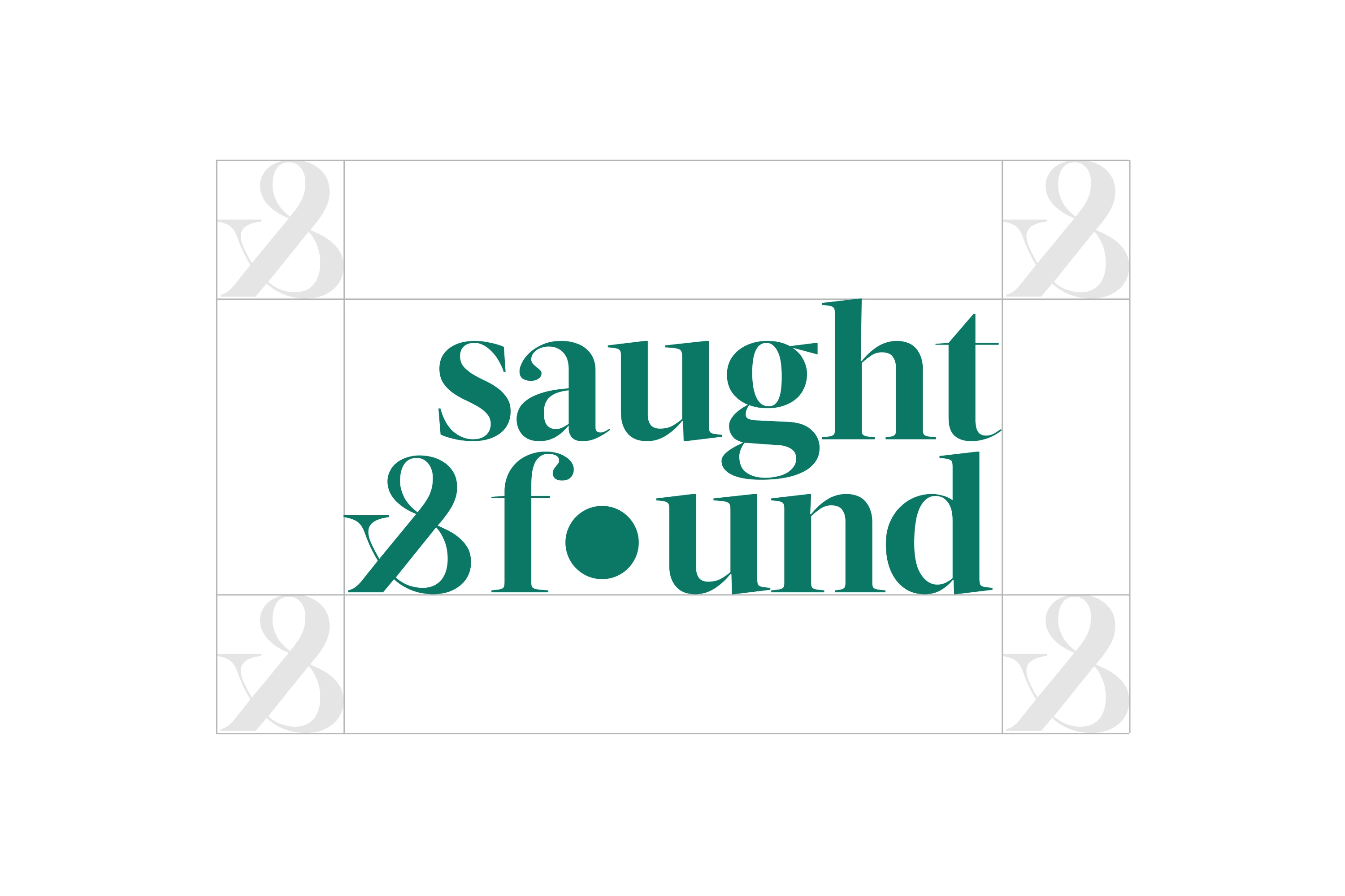
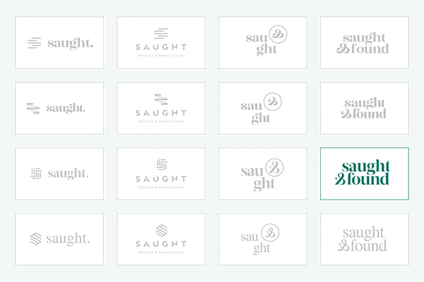
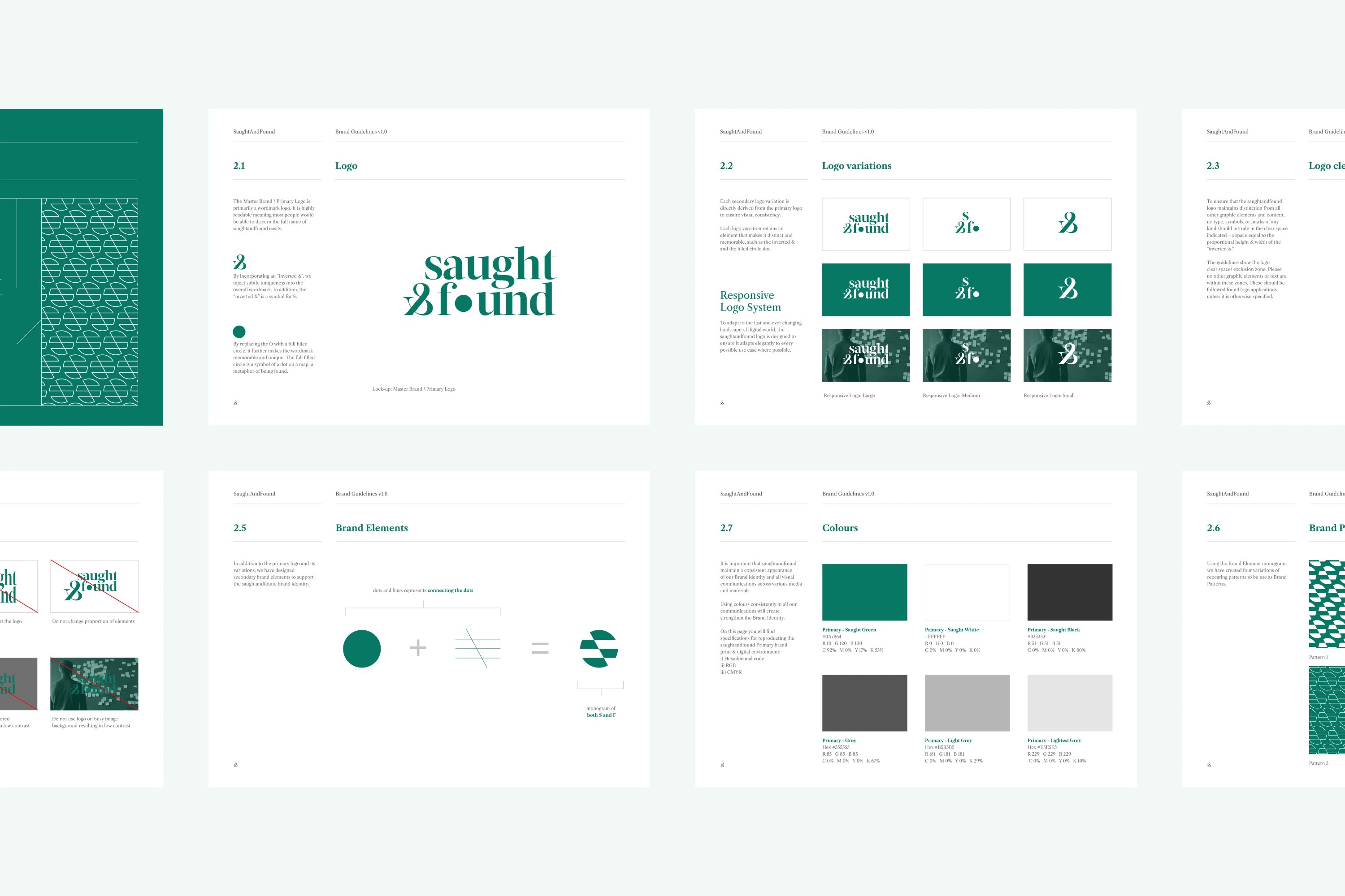
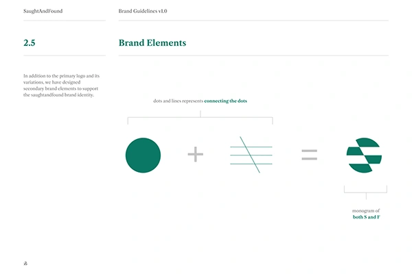
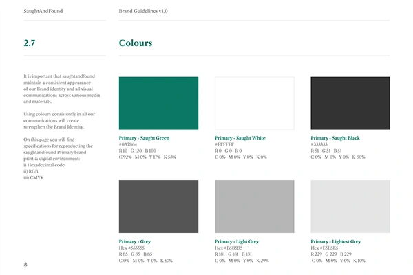
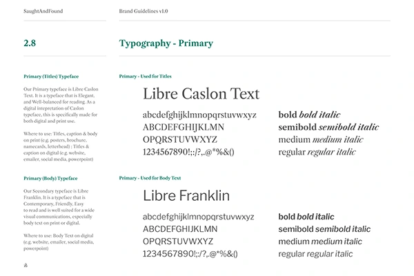
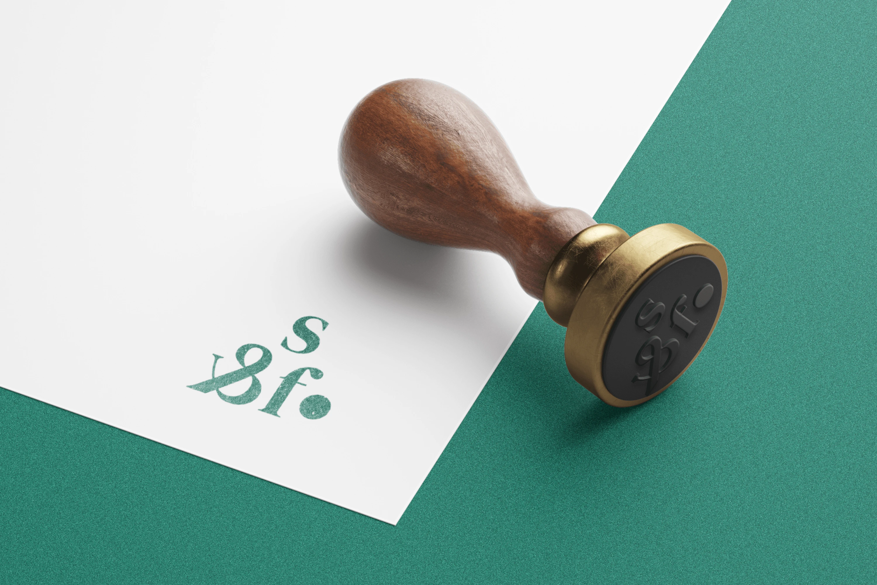
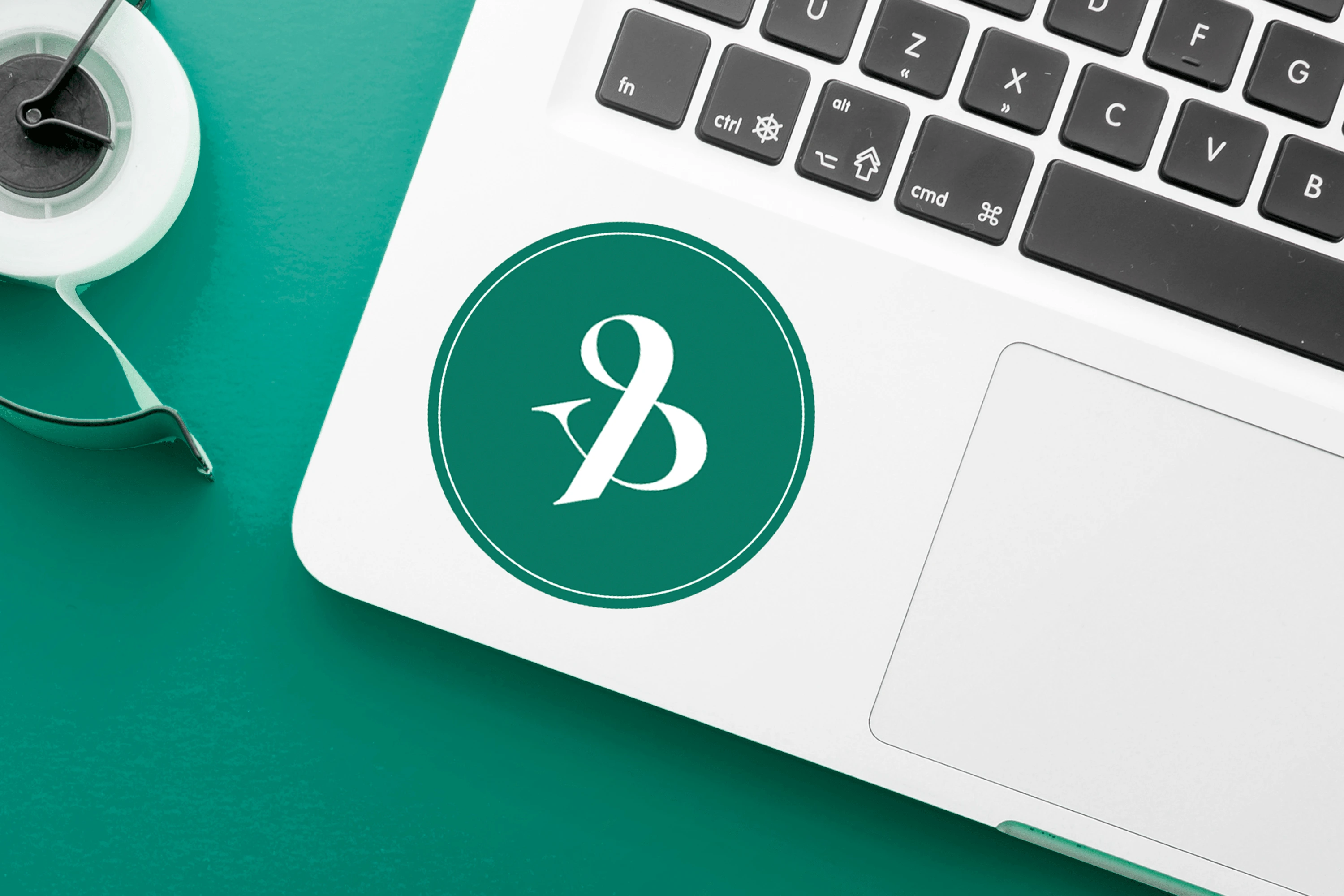
As the key capstone of the Brand Identity, the logo was developed as a wordmark, ensuring it is simple & readable while utilising unusual elements (such as the ‘inverted &’ and the ‘filled dot’), making it distinct and memorable. The overall identity uses a Serif typeface, which fulfils our 3 attributes set in the Stylescape too, meeting our pillar of being appropriate.
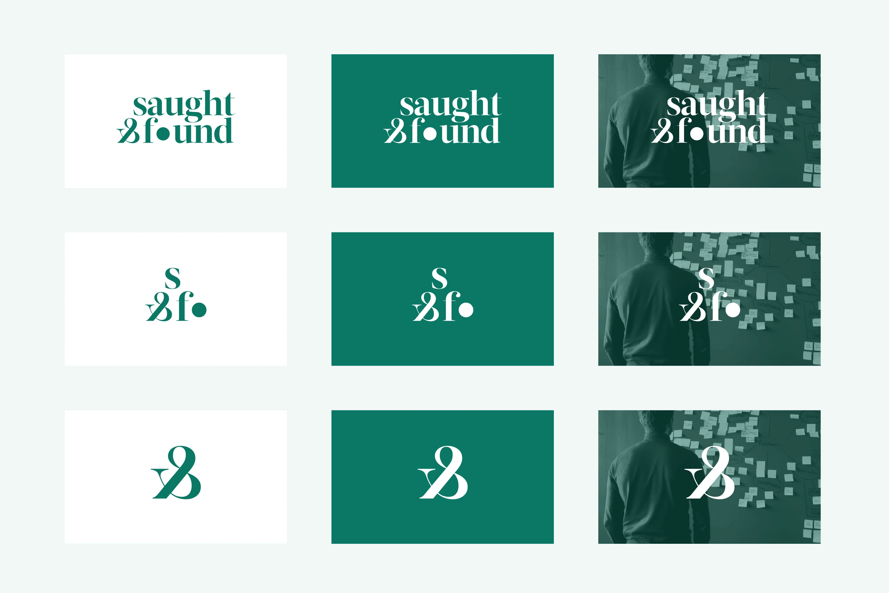
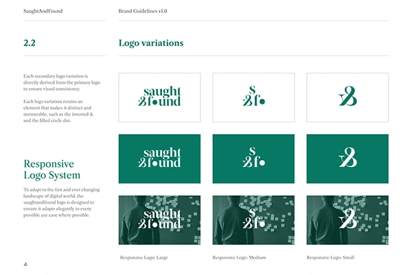
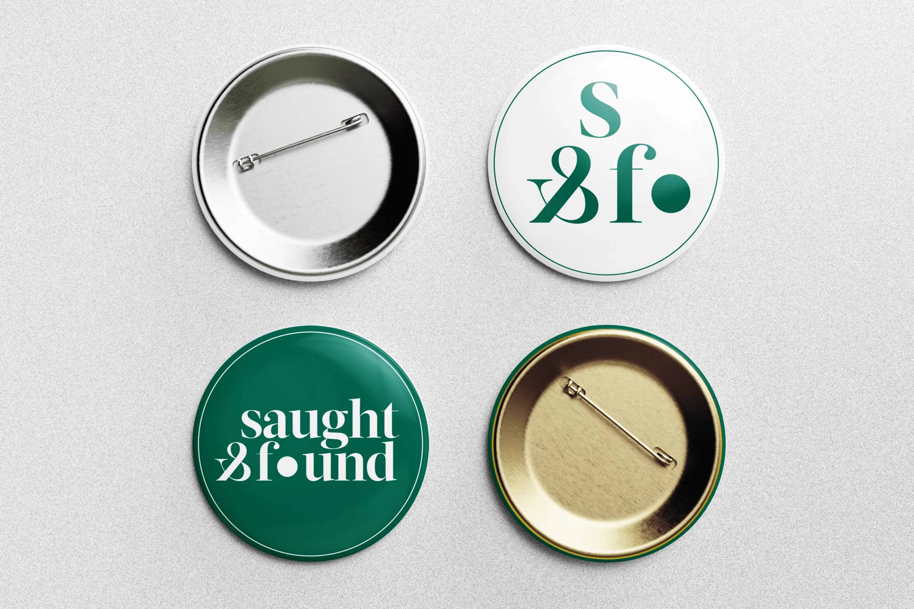
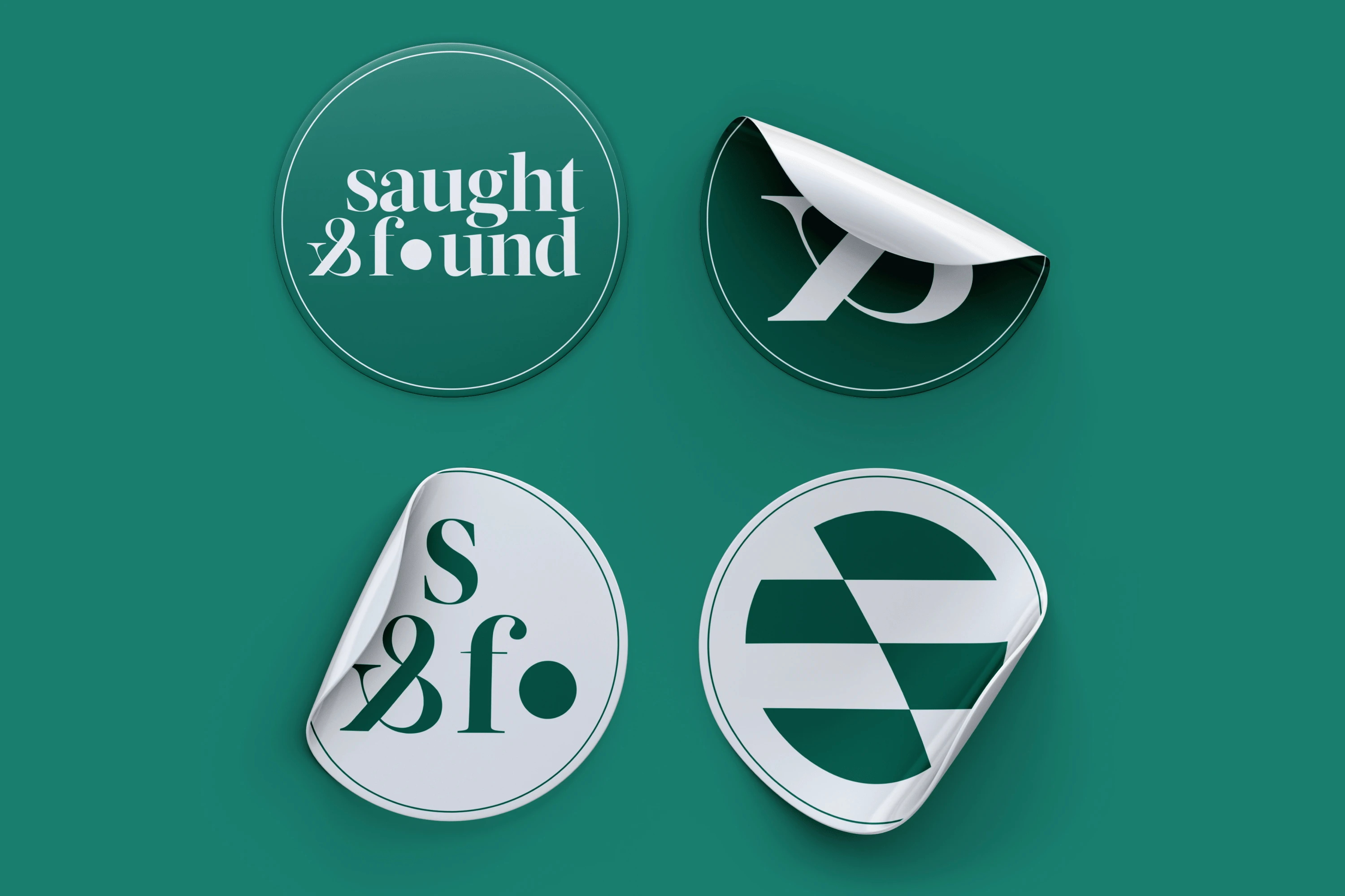
To ensure our brand identity works well in different applications and screen sizes, we made sure to craft the logo in a responsive system. The logo adheres to graceful degradation as it retains its distinct and memorable attributes even as it sheds more of its elements in smaller sizes.

Process: Brand Applications
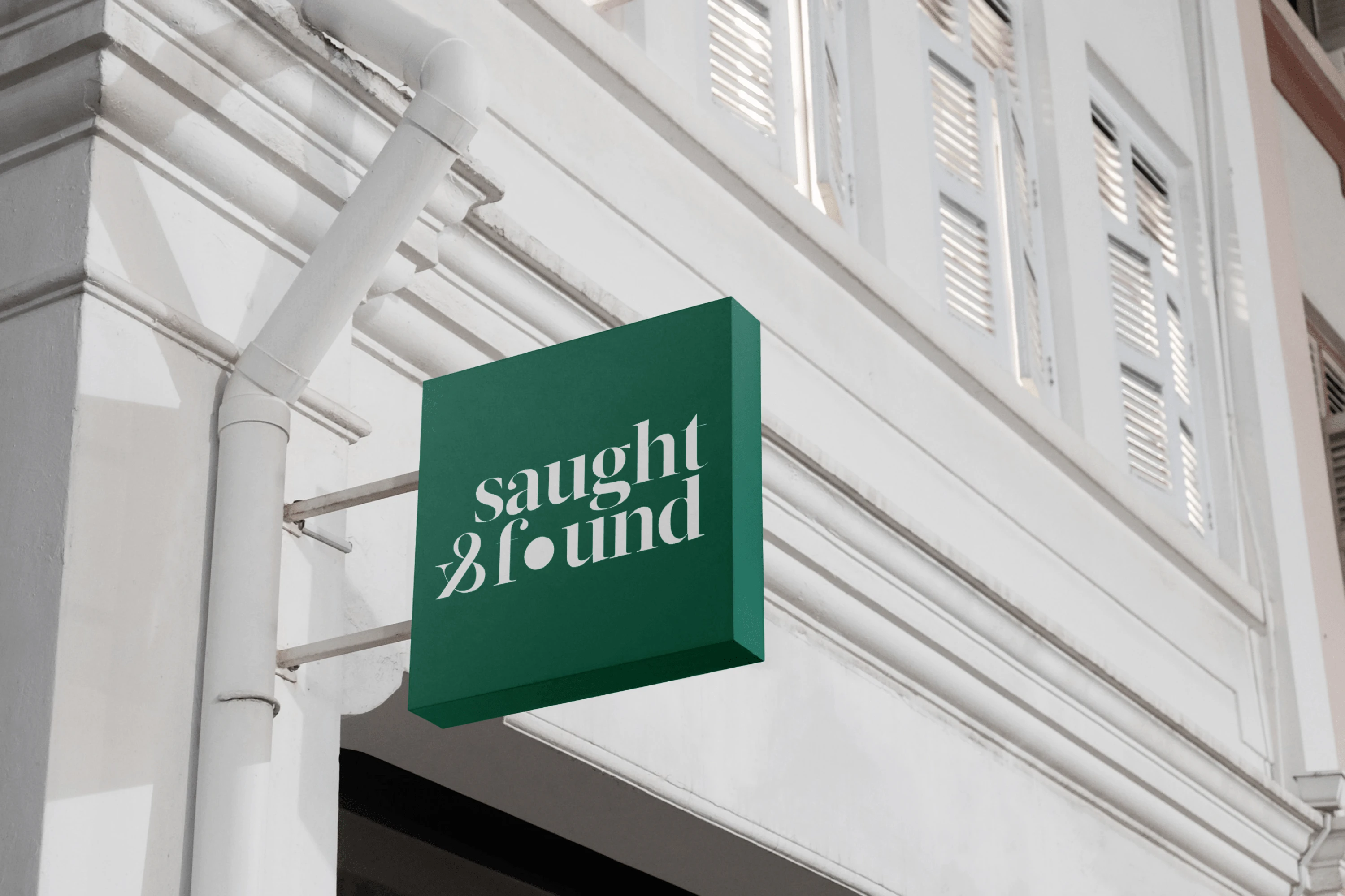
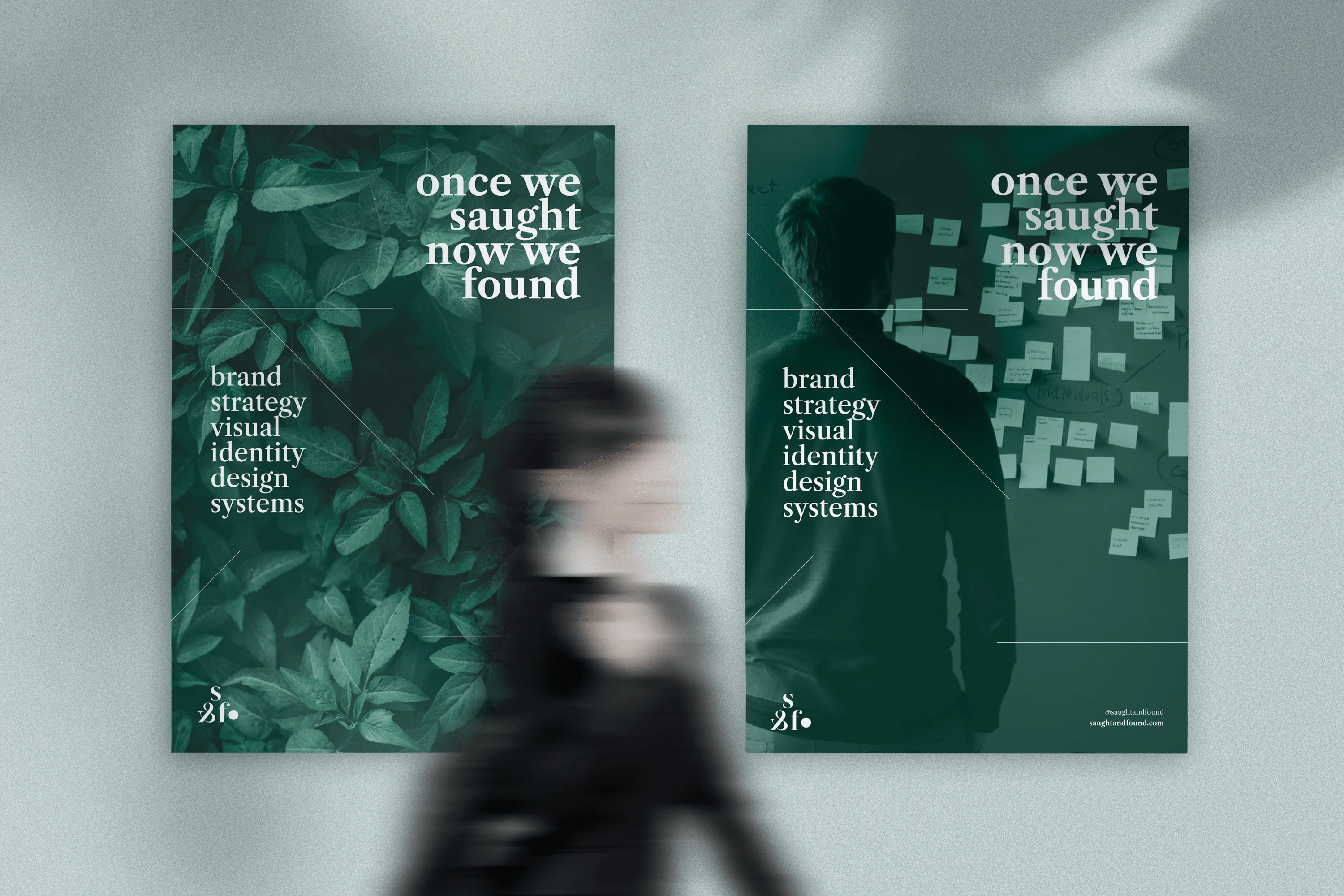
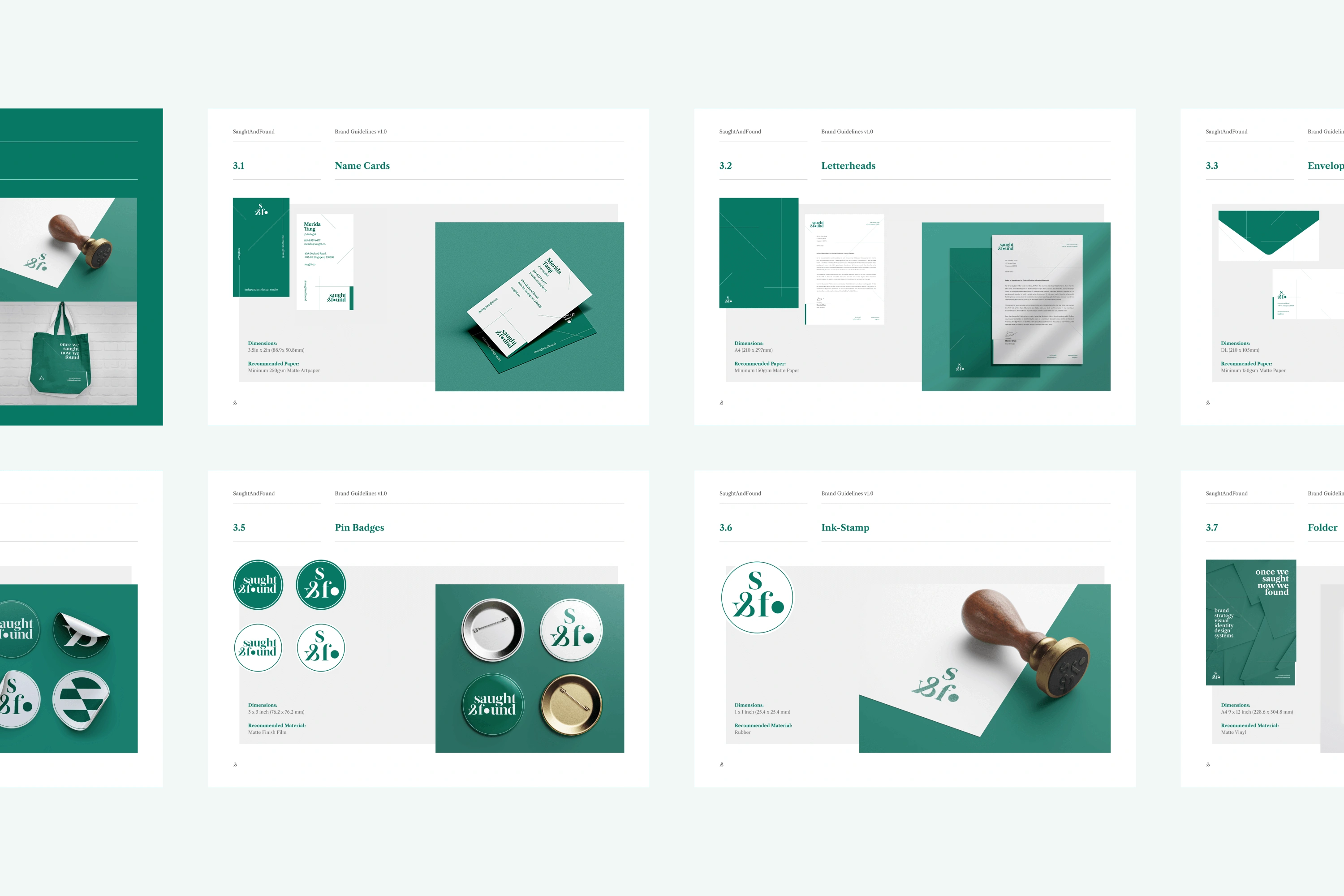
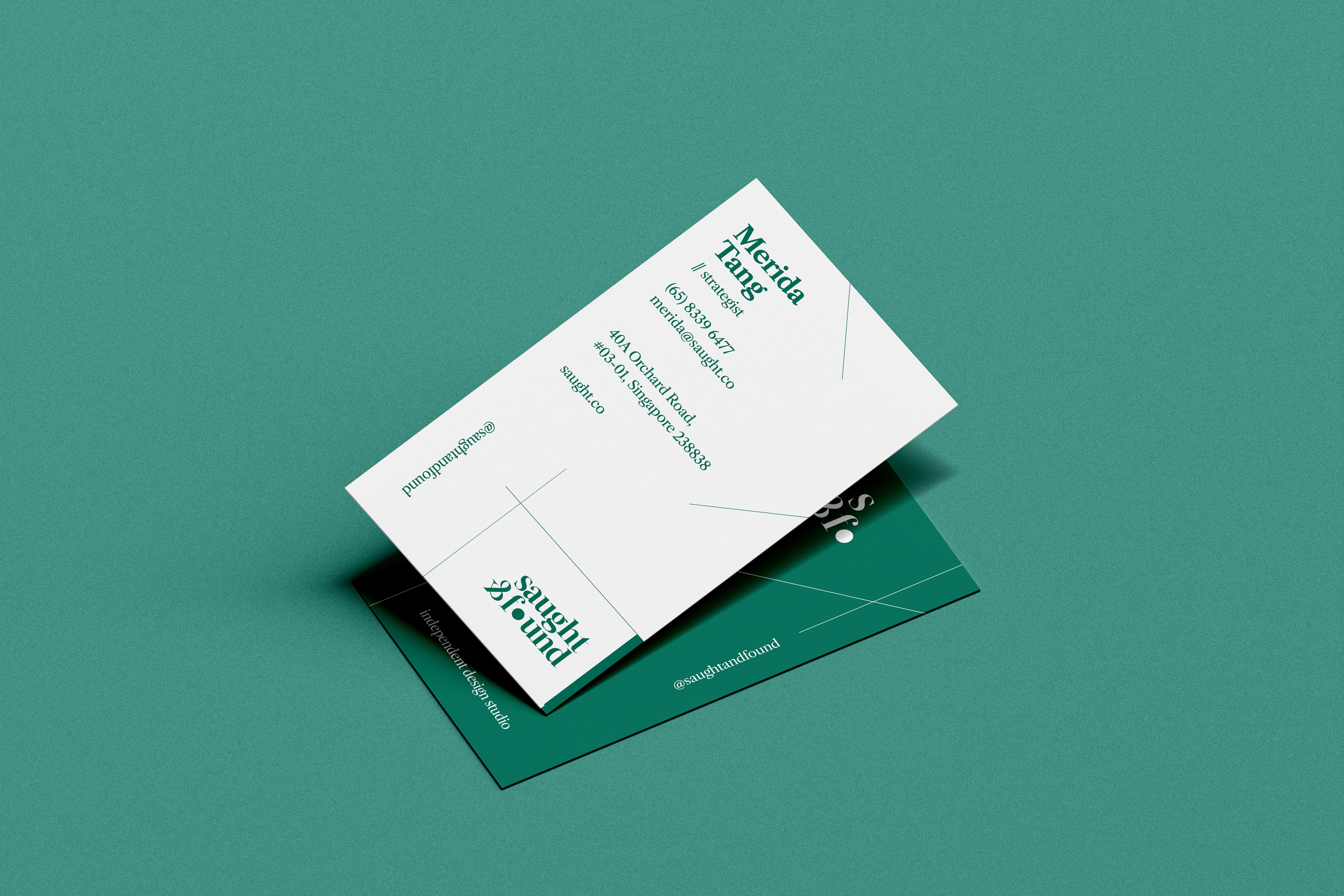
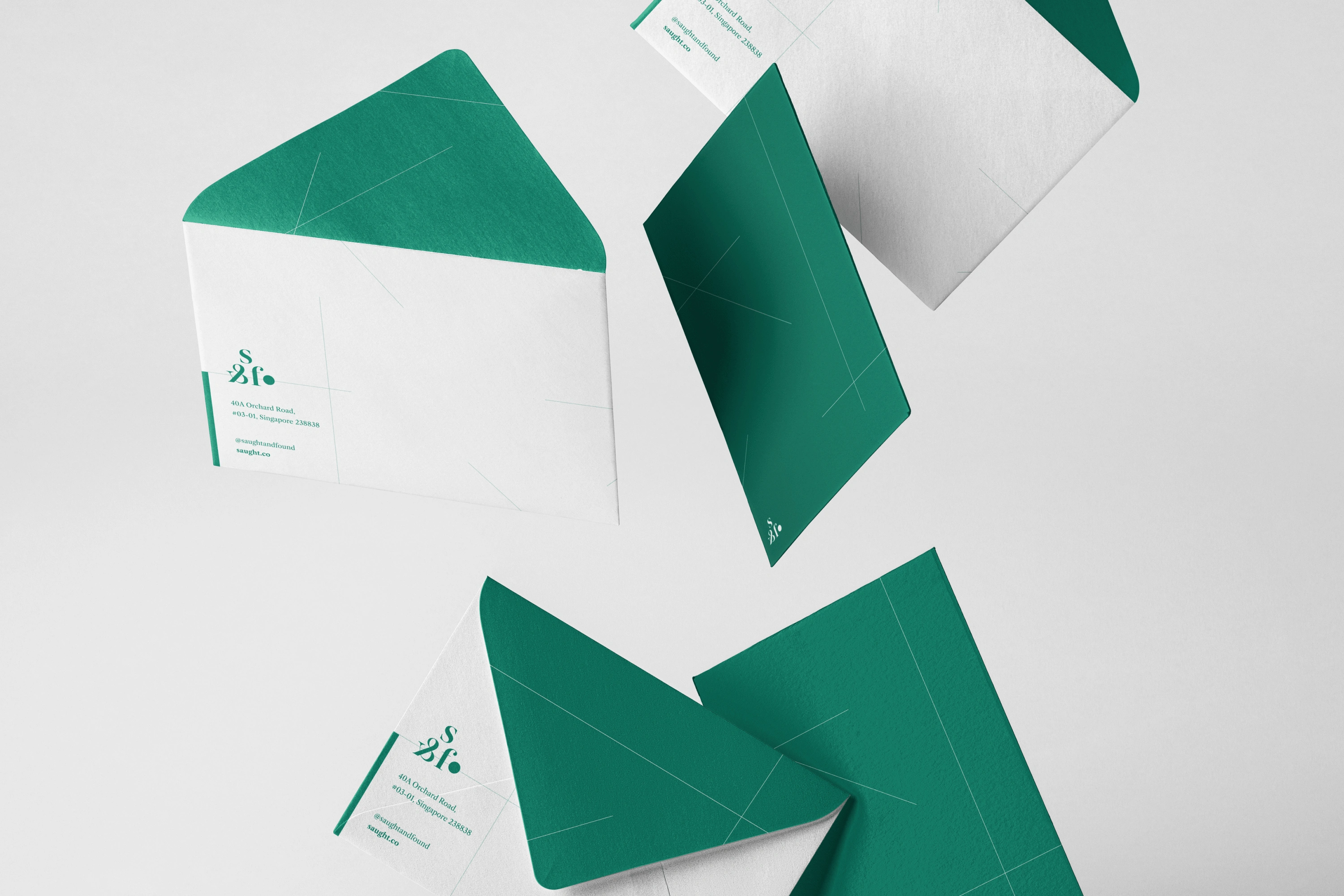
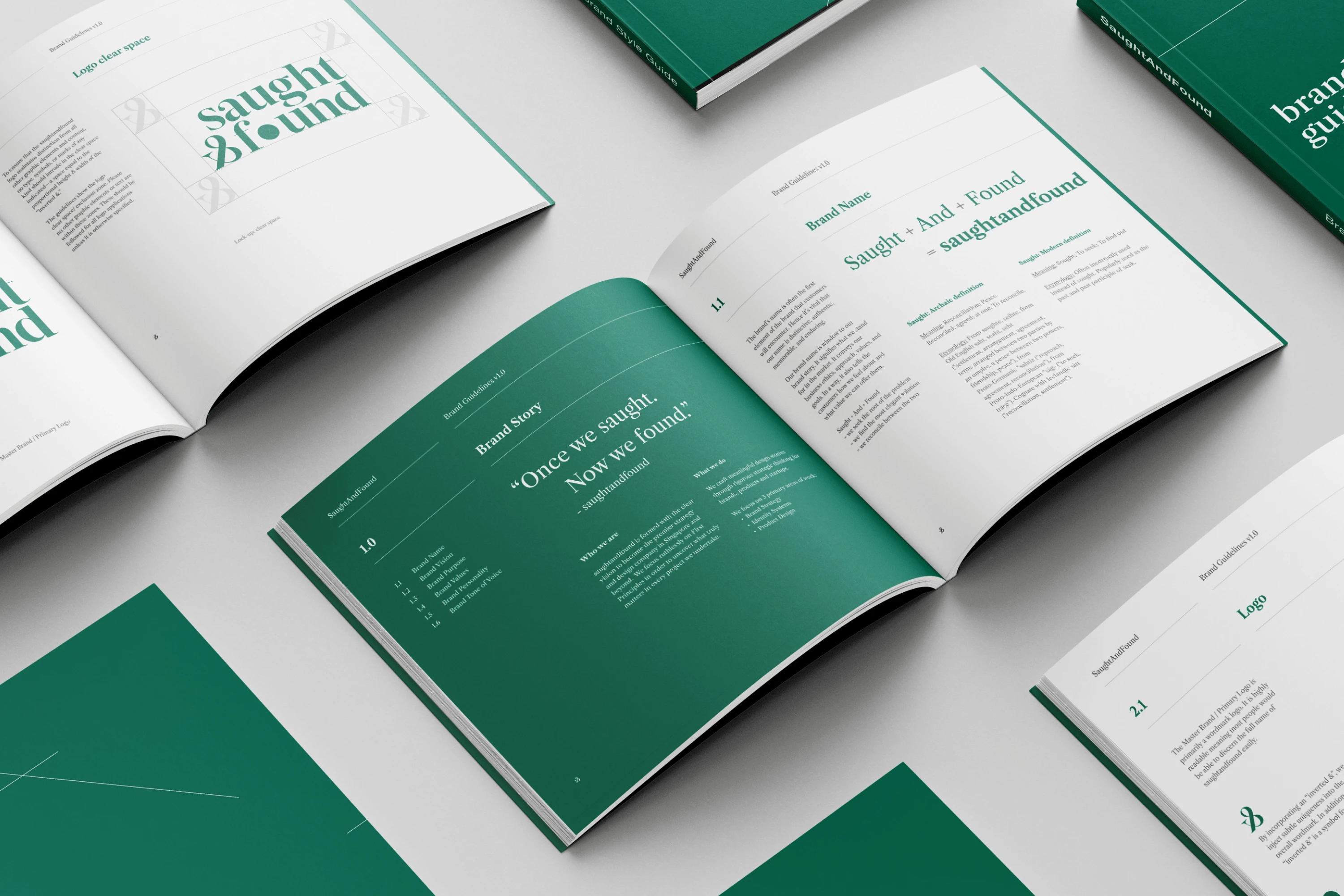
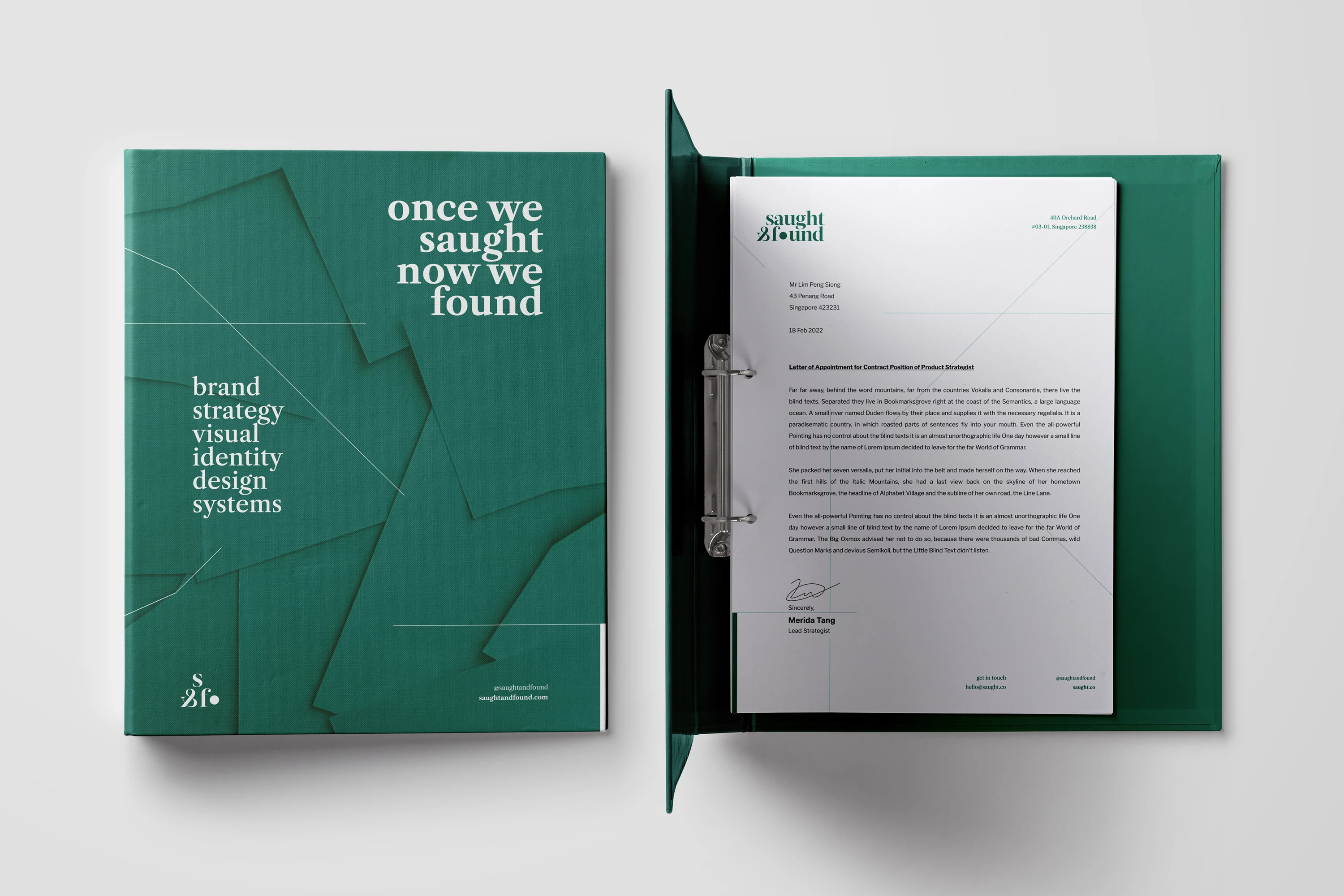
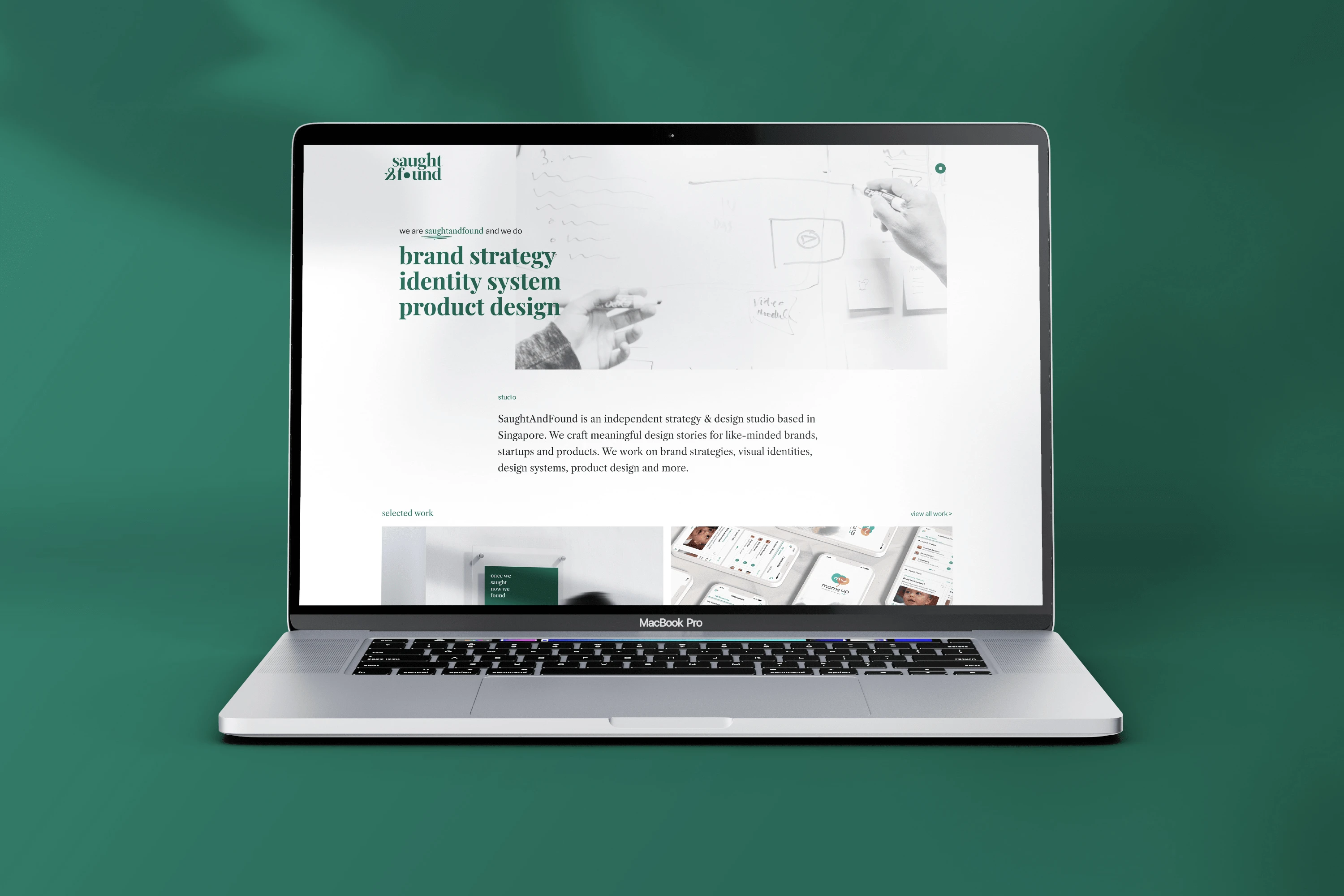
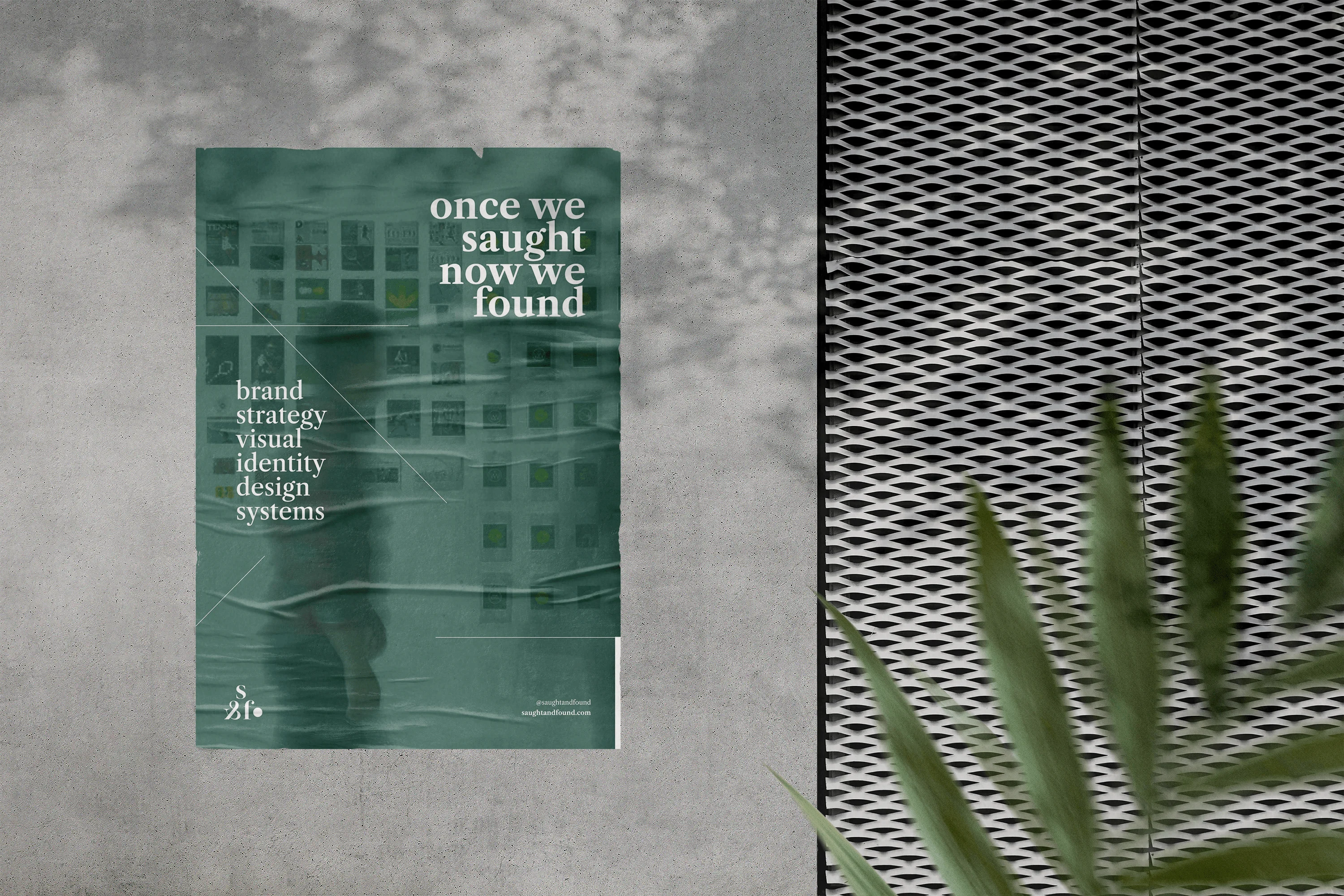
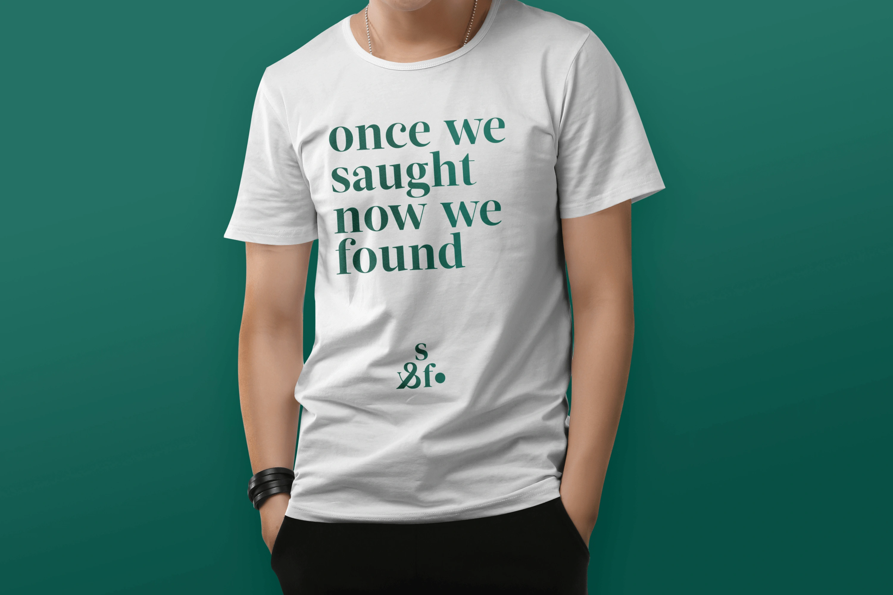
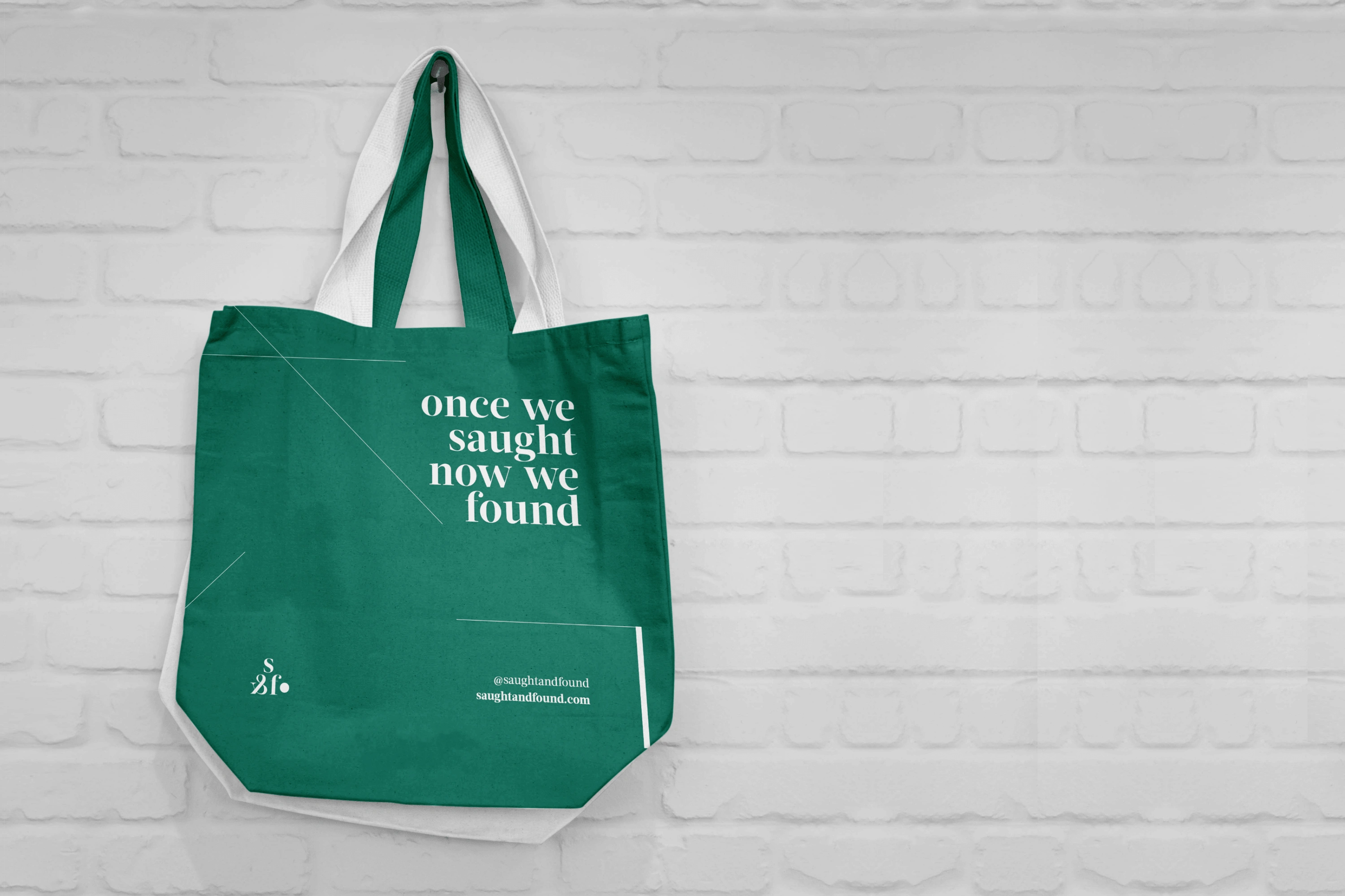
In order to visualise how the Brand Identity can be used and applied in real world use-cases, we developed a series of Brand Applications for both print and digital.
For digital, we prepared the templates in industry standard formats and sizes.
For print, we prepared the templates as production ready files in Adobe Illustrator or Indesign formats.
Thank you for watching!
I am Ronnie Chan JR, a Digital & Brand Strategist with over 15 years of experience in Brand Strategy, Digital Design and Creative Direction.
I am open for new branding, UI/UX and design projects.
Visit my personal website here
Like this project
Posted Aug 26, 2026
Developed brand strategy and identity for SaughtAndFound, a Brand Identity design firm.