Branding & Packaging Design for a Coffee Shop
The Challenge
One thing I didn't want for my own coffee brand is to look like everyone else's – brown, black, and grey tones, industrial vibes. I see why most coffee business owners gear towards this brand personality. I wanted a brand that's memorable, whimsical, and speaks true to myself..
The Solution
One thing I also like are cats. I had an idea to name my coffee blends for each one of my cats. That's when I thought a cat themed coffee would be fun. Interestingly, when you google "coffee memes", cats would always be the face of the joke. I thought, there should be a market for coffee and cat lovers alike. So, I went on to speak to a couple of people who like coffee, and found out that most of them were cat owners!
Then, I decided on baby blue, white, and black as my primary color palette. I picked baby blue because I'm selling a consumable productI wanted to convey trust. In color psychology, blue is associated with respect, trust, and dependability. Taking it a hue higher means that you can depend on us with your coffee fix, but we don't take it too seriously (in contrast with how the coffee community takes everything coffee very seriously).
The Results
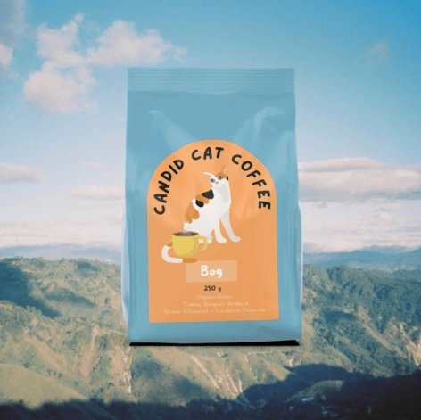
Old branding
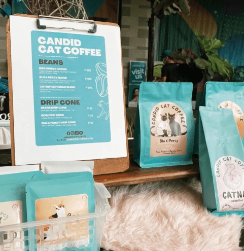
Old branding
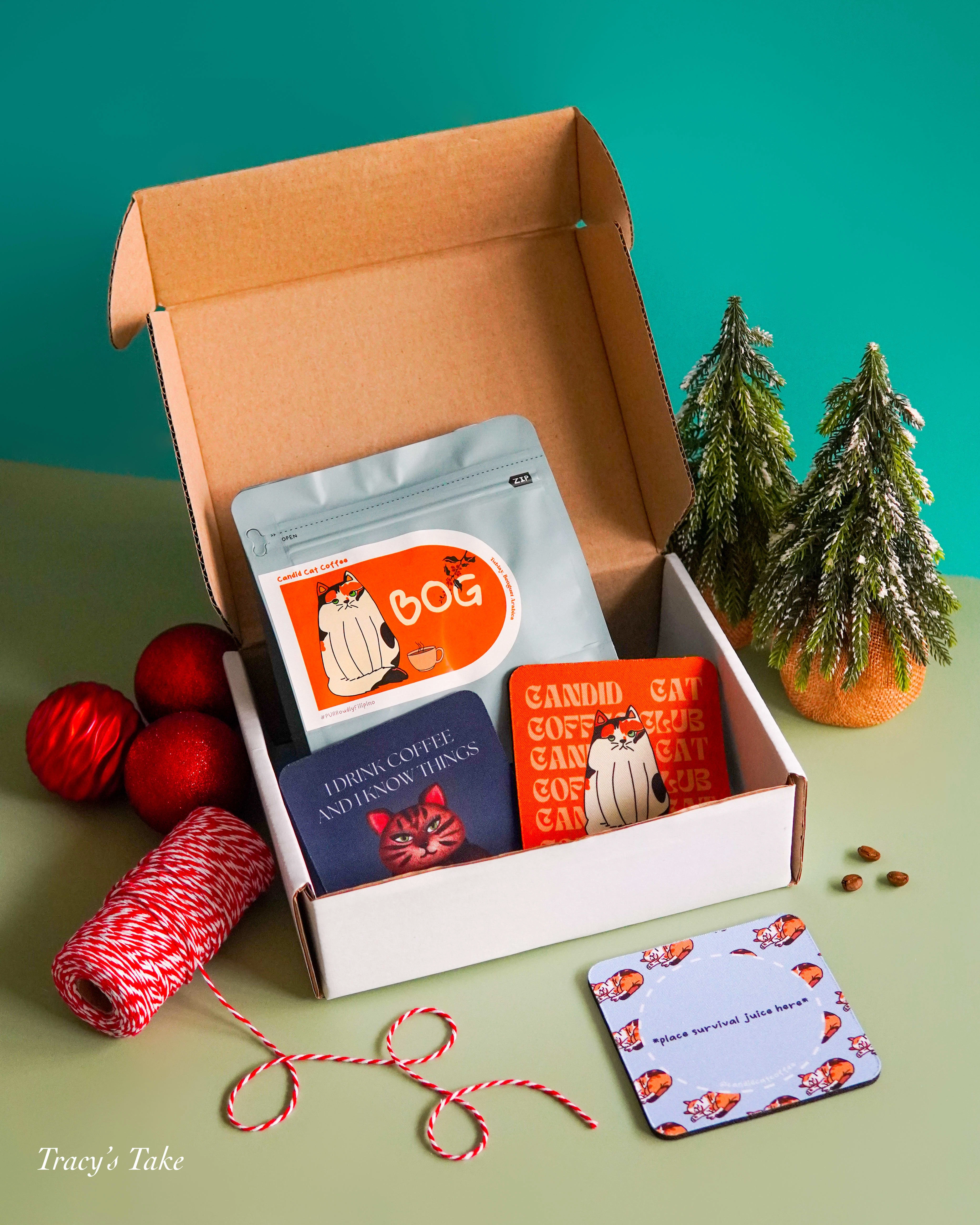
New branding
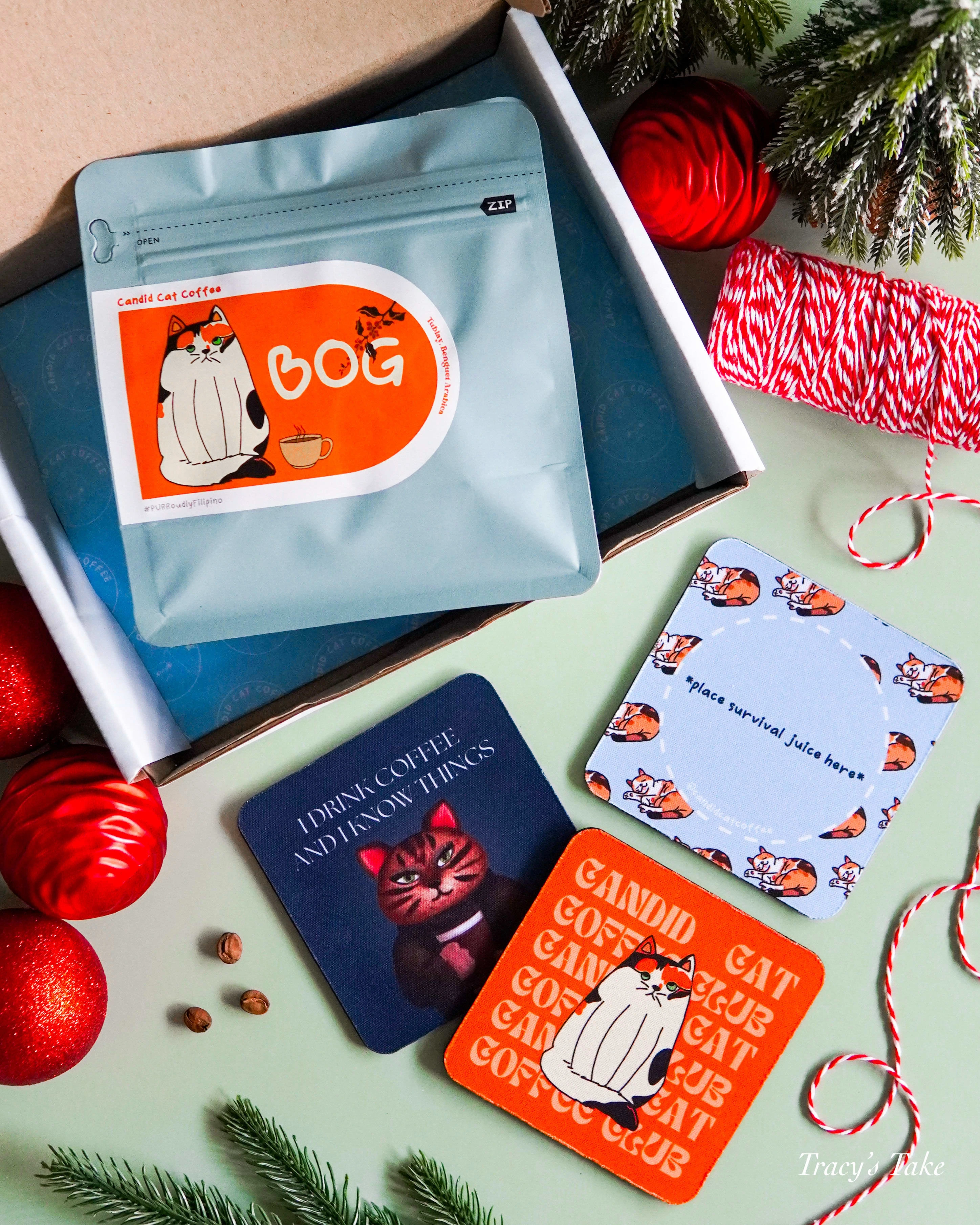
Like this project
Posted Oct 9, 2023
How I conceptualized the branding and packaging design for my coffee shop's coffee bean packages.
Likes
0
Views
13
