BuddyUp App - A Travel Buddy App finder

Oluwatobiloba Abiala


Overview
BuddyUp is a conceptual mobile app that connects solo travelers with like-minded explorers. Whether you're backpacking through Asia, planning a girls’ trip to Morocco, or hitting up music festivals in Europe, BuddyUp helps you match with potential travel buddies based on shared interests, travel dates, and vibes.
This project explored the crossroads of connection, safety, and spontaneity in travel & solving one big problem: "I want to travel, but not alone."
The Problem
Traveling solo is liberating; but it can also be lonely, unsafe, or just... meh, especially when your people aren't available to join you. The world is full of adventurers. But finding someone to share the journey with? That part’s hard.
How do we help people find real, trusted, and aligned travel buddies without turning it into a dating app?

Design Goals
I kicked things off with quick user interviews and social travel forums (like r/solotravel and FB travel groups). Most common pain points:
“I don’t want to date, I just want a buddy.”
“I hate overplanning but still want someone spontaneous like me.”
“Safety is key. If I don’t feel safe, I’m out.”
Also looked at apps like: Tandem, Travello, Couchsurfing, and Backpackr
Found common flaws: clunky UIs, too much like Tinder, or too overwhelming.
Personas
Name: Kemi
Age: 25
Pain Points: Wants to backpack through East Africa but parents worry about her safety
Name: Josh
Age: 31
Pain Point: Loves hiking but his friends always cancel
Name: Anita
Age: 28
Pain Points: Loves meeting people, hates over planning
Ideation
I mapped out a few key flows:
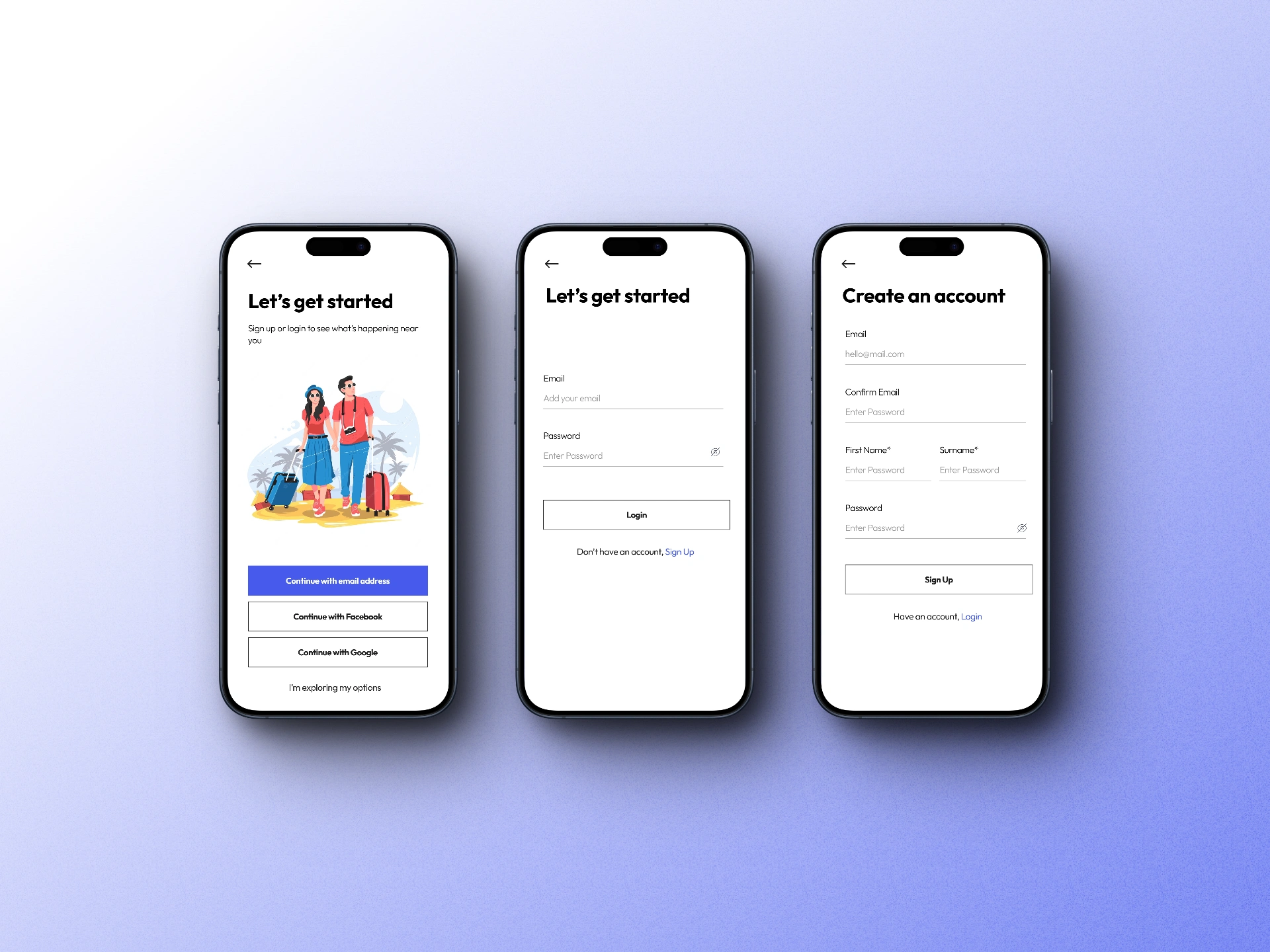
1. Quick onboarding quiz – find your vibe, define your travel personality
2. Buddy matching – filter by destination, timeline, and interests
3. Profiles that feel safe & human – no catfish, no weird DMs
4. Trip boards – plan trips, share costs, build itineraries together
Used FigJam to sketch early wireframes & layout explorations. I leaned into bold typography, playful colors, and familiar patterns for comfort.
Design Execution
🔹 Visual Direction
1. Colors: Warm pastels & pops of coral — friendly and safe
2. Typography: Rounded sans-serif fonts for approachability
3. Imagery: Travel moments, candid vibes — no stocky perfection
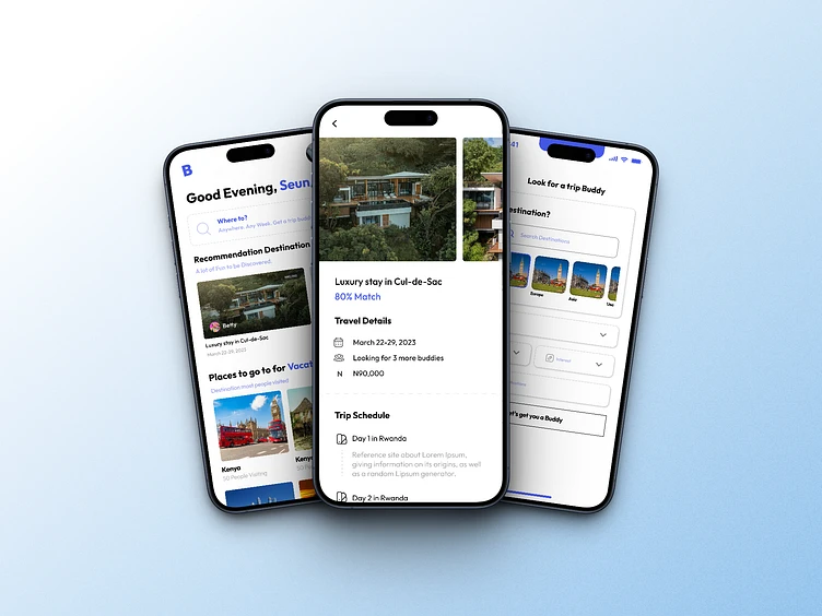
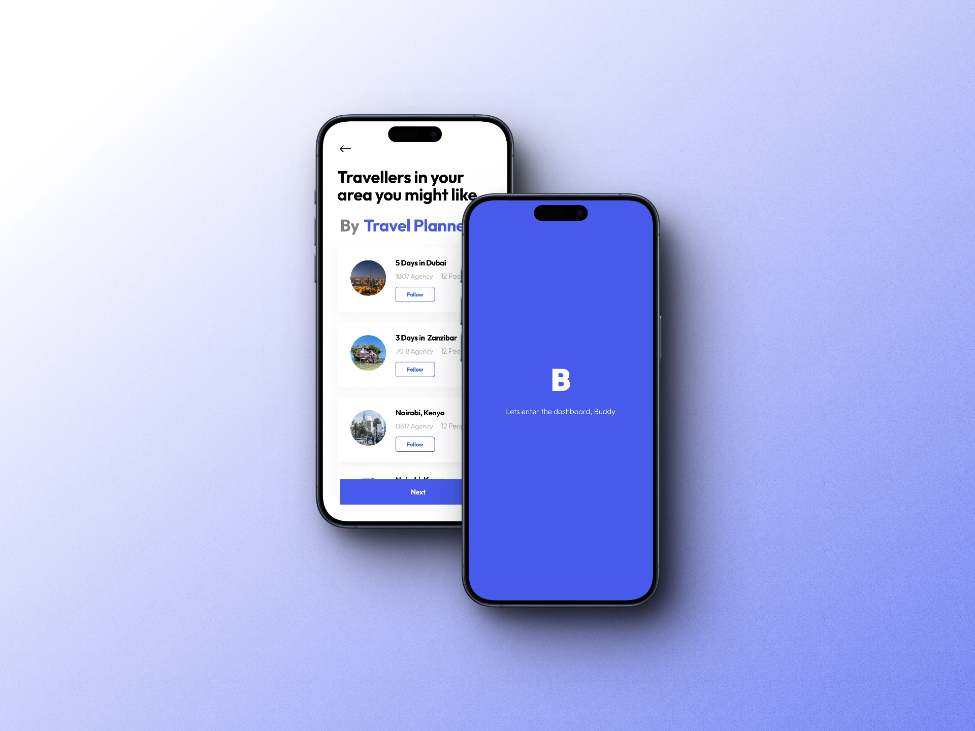
📱 Key Screens
1. Onboarding Flow Get a sense of the user’s vibe — introvert or extrovert? Luxury or hostel?
2. Buddy Finder Screen Tinder-style swipe? Nah. Grid layout with profiles and short intros.
3. Buddy Profile Name, age, countries visited, languages, mutual destinations. Verified badge = peace of mind.
4. Itinerary Builder Create trips together, split tasks, and share costs.
5. Chat (Optional) Not WhatsApp-level deep. Just quick icebreakers and safety info.
User Validation (Conceptual)
Ran quick prototype walkthroughs with 4 solo travellers via Zoom. Their responses:
Response 1: “It feels like Bumble BFF for travellers.”
Response 2: “Love how upfront it is. I feel like I can trust it.”
Response 3:“The UI is soooo clean. Would totally use this.”

What I Learned
1. People want realness more than perfection. Make features human, not robotic.
2. Safety and clarity go hand in hand. If your UI feels shady, people bounce.
3. Don’t overbuild. Guide with just enough.
Final Thoughts
BuddyUp is more than a social app — it’s about shared stories, sunset hikes, and deep convos with strangers who feel like old friends. In a world chasing solo goals, BuddyUp proves: you don’t have to do it alone.
Like this project
Posted May 15, 2025
1. People want realness more than perfection. Make features human, not robotic. 2. Safety and clarity go hand in hand. If your UI feels shady, people bounce.
Likes
1
Views
2