Brand Identity for Reboot
Clarinne Tham

Reboot: Building a brand identity for sustainable hardware solutions
Quick Stats
Role: Brand Designer | Duration: 1 month
Scope: Brand strategy, logo, visual identity, guidelines
Client: Hardware rental startup in Malaysia
Problem
A new hardware rental startup in Malaysia had a clear mission but no brand to communicate it. The founder was providing accessible technology to students, small entrepreneurs, and businesses through hardware rentals, while promoting sustainability by refurbishing old equipment. However, their initial name "Mavix" (a play on "Mavericks") felt too game-y, completely missing the mark on conveying trust and accessibility. The founder needed a brand that could balance corporate credibility with modern approachability, while authentically communicating both social impact and environmental sustainability to their target audience.
Solution
I led a collaborative brand development process, starting with a questionnaire and founder interview to uncover the company's core values and mission. Through workshopping sessions, we landed on "Reboot", a name that perfectly captured both giving people second chances and giving hardware a second life. I developed moodboards to establish the emotional direction: clean and modern while conveying sustainability, warmth, and support. From there, I explored multiple color palettes (bold, corporate, neutral) to find the right balance, then paired typography with the chosen system through website mockups. The logo concept drew from the universal tech power/restart symbol along with a play on the traditional arrow-recycle symbol. Final brand guidelines packaged everything: logo usage, color systems, typography, tone, and website mockups, giving the startup a complete foundation to launch with consistency.
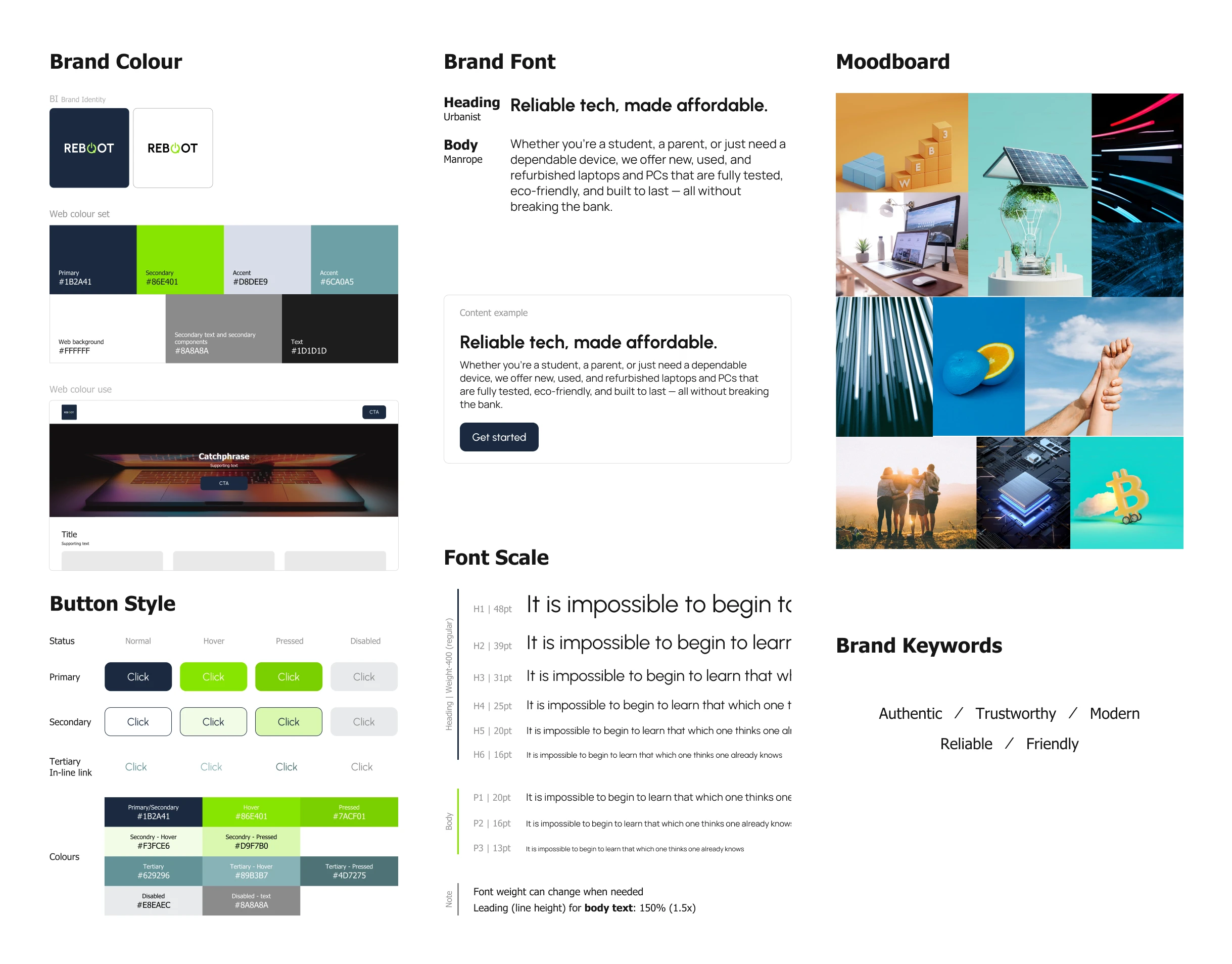
A small snapshot of the final deliverable
Brand Designer | 1-month process | Strategy to Visual Identity
Like this project
Posted Feb 7, 2026
Created brand identity for a Malaysian hardware rental startup.
Likes
0
Views
6
Timeline
Jun 29, 2025 - Jul 25, 2025