Brand Identity Design for Martins, Amaral & Associadas
Gui Abrahão

The project for the law firm Martins, Amaral & Associadas began with a rare and powerful conceptual foundation, defined by the partners themselves. They brought not only the name 'MAM' but also its core inspiration: the sound of the word 'mãe' (mother), symbolizing the essence of the legal practice they wished to build—one based on protection, support, and the uncompromising defense of their clients' interests.
The design challenge, therefore, was not to create a concept, but to translate this intimate and powerful vision into a visual identity that was simultaneously credible, modern, and highly professional. How could the archetype of care and protection be materialized without falling into sentimentalism or losing the strength and seriousness that the legal market demands?
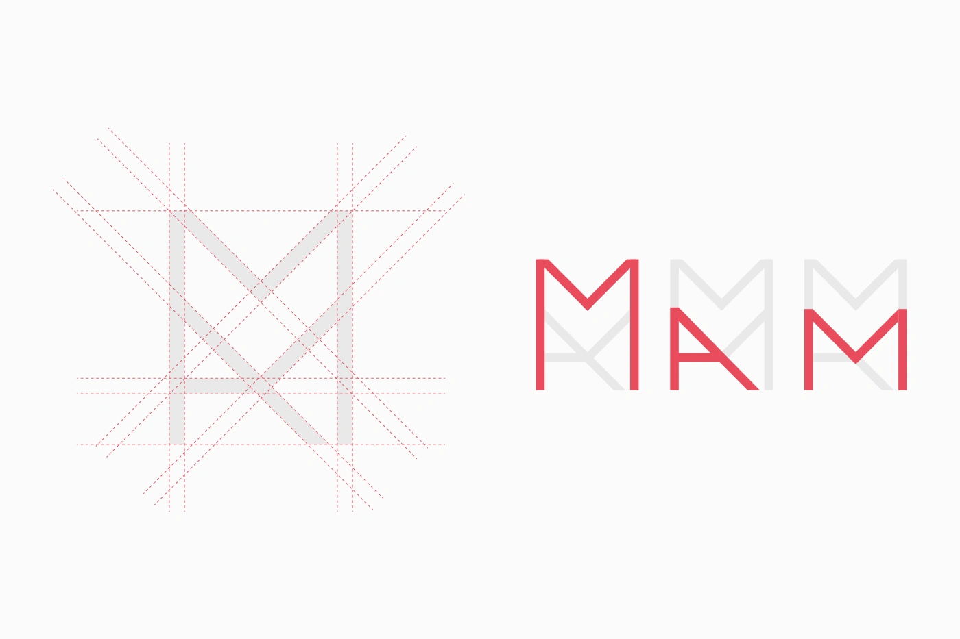
The solution was a monogram that operates on two levels. For the general public, it functions as an elegant fusion of the initials 'M' for Martins and 'A' for Amaral, creating a clear visual connection to the founders. But on a deeper level, the design executes the client's original vision: the firm and architectural structure of the 'M' supports and elevates the 'A', a direct visual representation of the support, stability, and protection promised in the name 'MAM'.
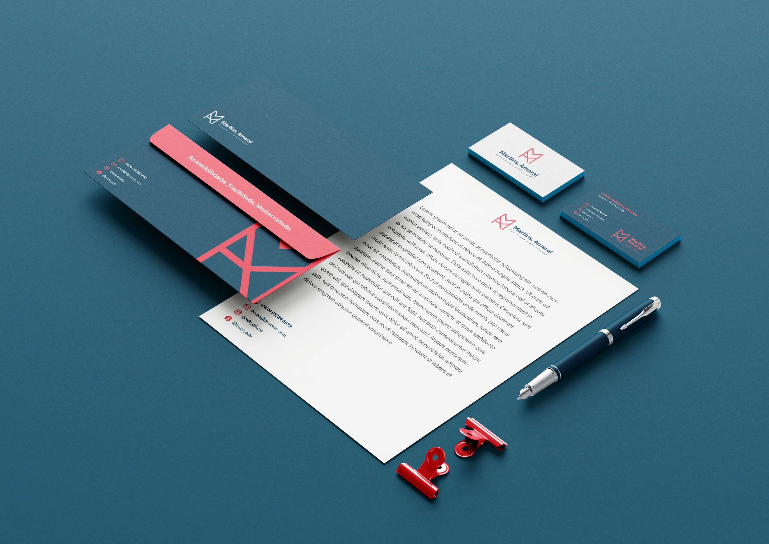
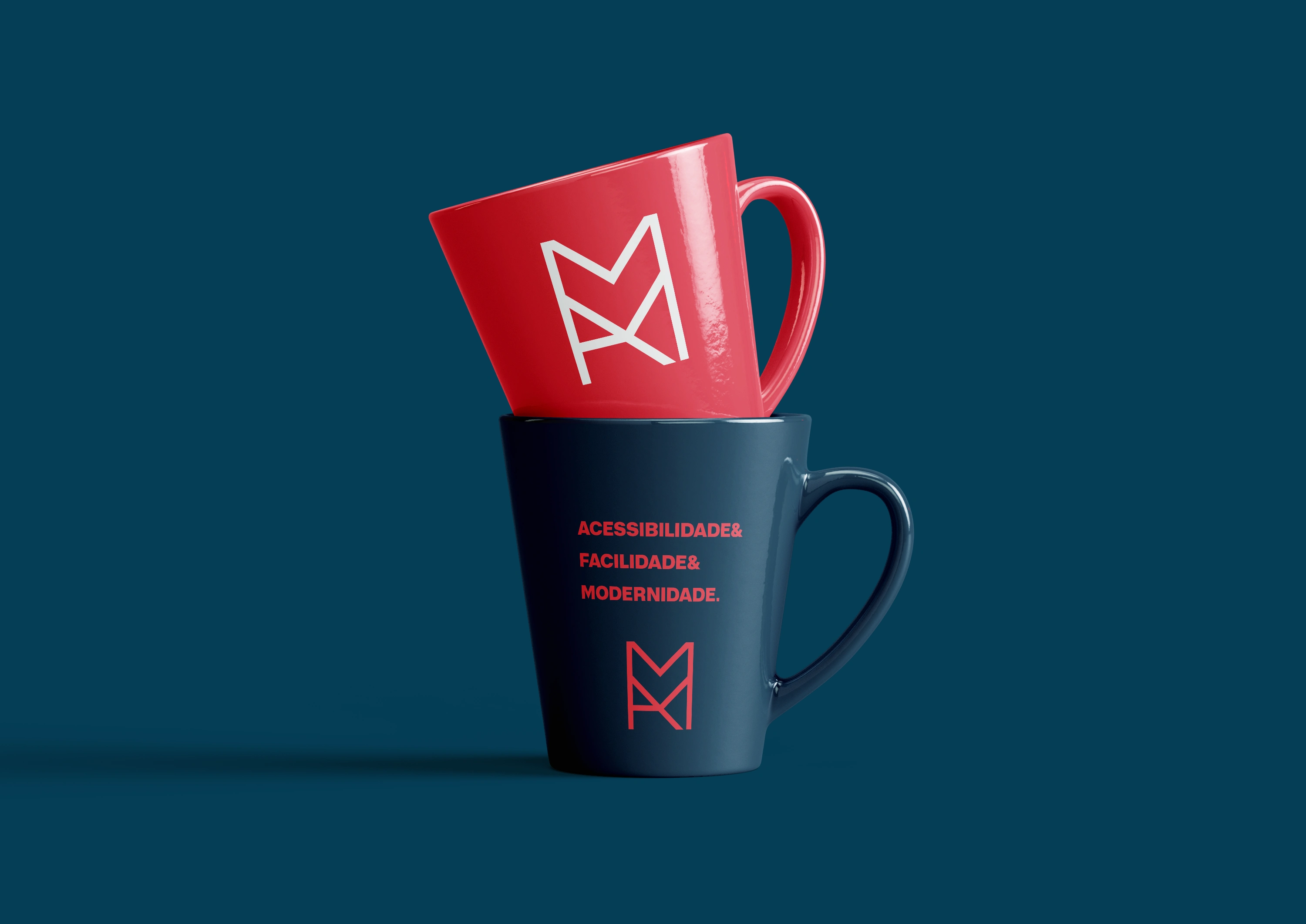
The result is a brand identity that possesses a rare combination of soul—stemming directly from the founders' authentic vision—and precise strategic execution. The brand sets itself apart not through a creative artifice, but by cohesively and professionally expressing the firm's fundamental purpose, creating a unique, memorable, and profoundly meaningful communication platform.


Like this project
Posted Sep 8, 2025
Created a brand identity for Martins, Amaral & Associadas, reflecting their core values.
Likes
0
Views
5
Timeline
Jul 20, 2022 - Aug 10, 2022