Strategic rebranding for Ruralbens
Gui Abrahão

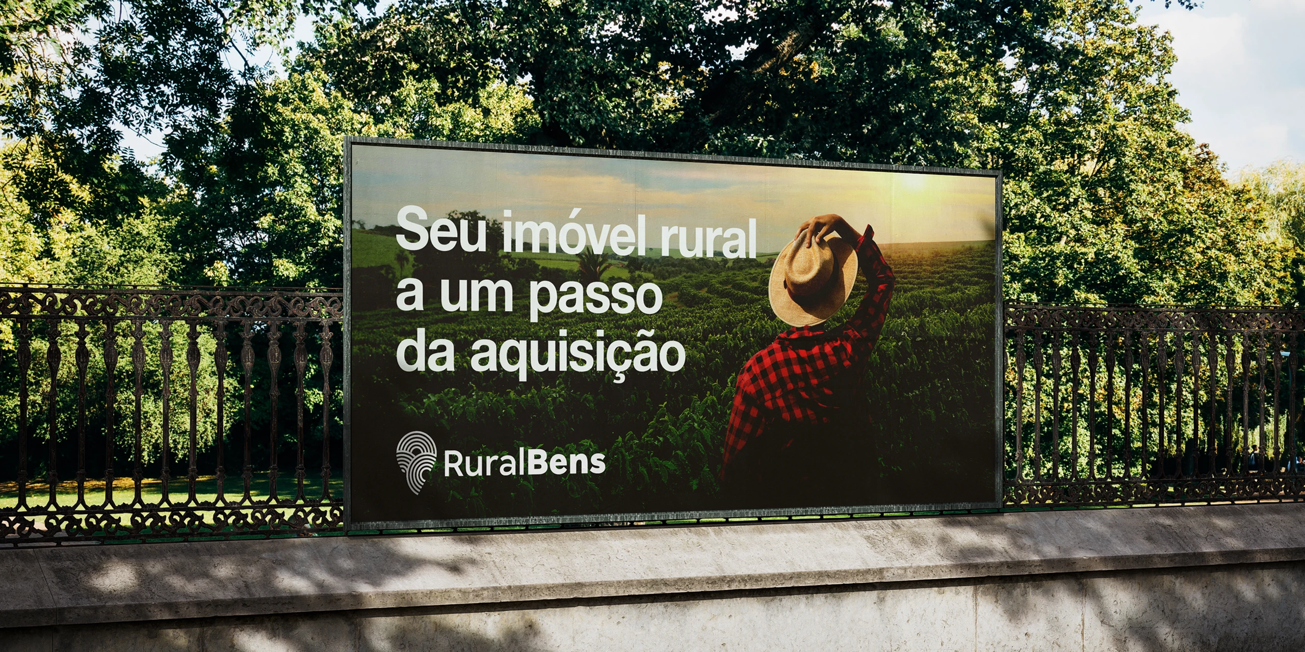
Ruralbens operates in the rural real estate sector, specializing in the strategic use of property consortia to facilitate transactions. The brand connects landowners and investors, offering market intelligence and solutions that simplify and optimize the acquisition of rural properties.

Despite the company’s relevance and expertise, its former visual identity failed to express its authority or clearly communicate what it delivers: security, strategy, and technical mastery in rural negotiations.
The challenge was clear: to visually reposition RuralBens, aligning its image with the high level of value already embedded in its services.
More than just a new logo, this project aimed to shift perception. The goal was to develop a visual identity that:
• Clearly communicates the scope of the business
• Reinforces trust in high-stakes transactions
• Stands out in a conservative and visually underdeveloped market
• Establishes a cohesive, scalable identity system for future growth

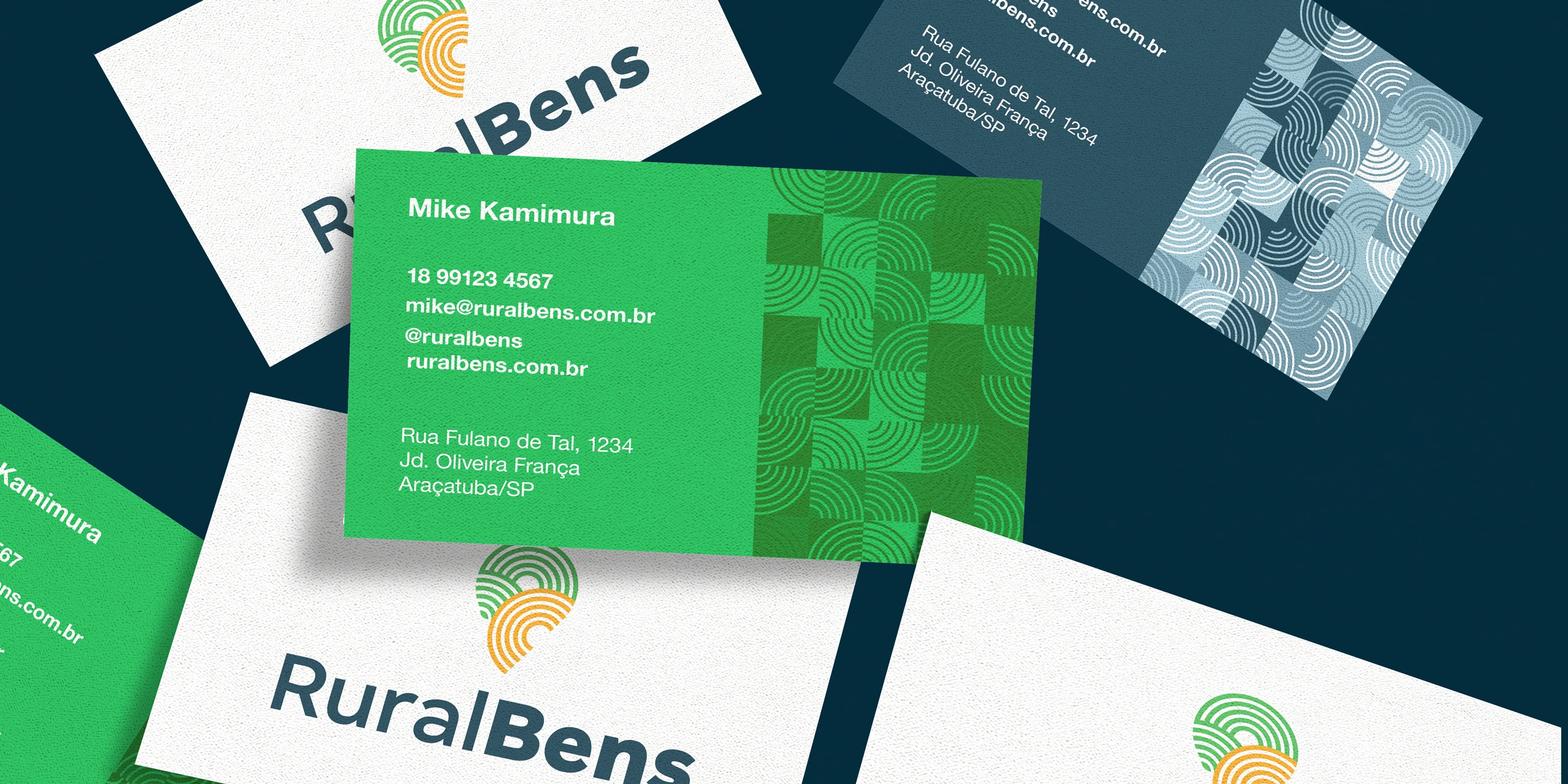
The starting point for the creation was the concept of “territorial command with strategic intelligence.”
The new symbol emerges from the fusion of two core elements: A location icon, referencing mapping and precision; Terracing lines, evoking the land, the field, and preparation.
This combination creates a visual that is both direct and impactful, synthesizing what Ruralbens delivers: knowledge, direction, and confidence in rural property transactions.

The identity was crafted to convey solidity, clarity, and sophistication, while maintaining an authentic connection to the rural environment.
Typography and color choices reinforce these values, supporting, rather than overpowering, the brand’s core message: a mature company, ready to lead with consistency.

Like this project
Posted Aug 18, 2025
Strategic rebranding for Ruralbens: a clear, impactful identity that conveys trust, expertise, and direction in rural real estate.
Likes
0
Views
4
Timeline
Aug 4, 2023 - Sep 6, 2023