Logo Design - Layers Skincare
Sameeha Raiba
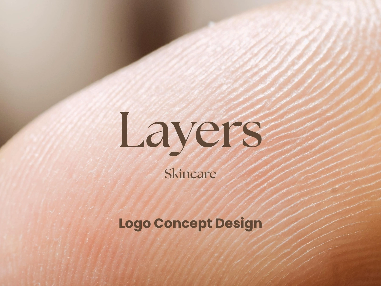
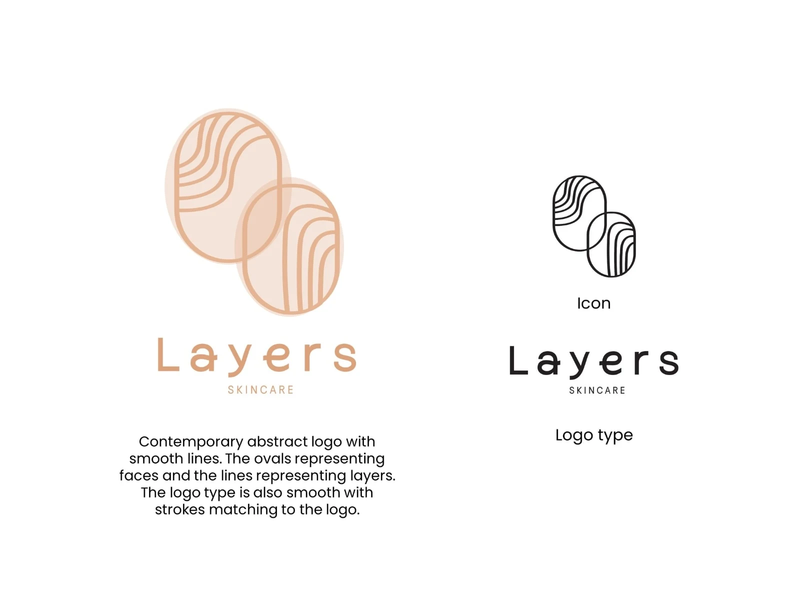
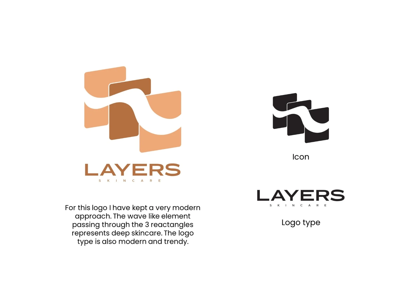
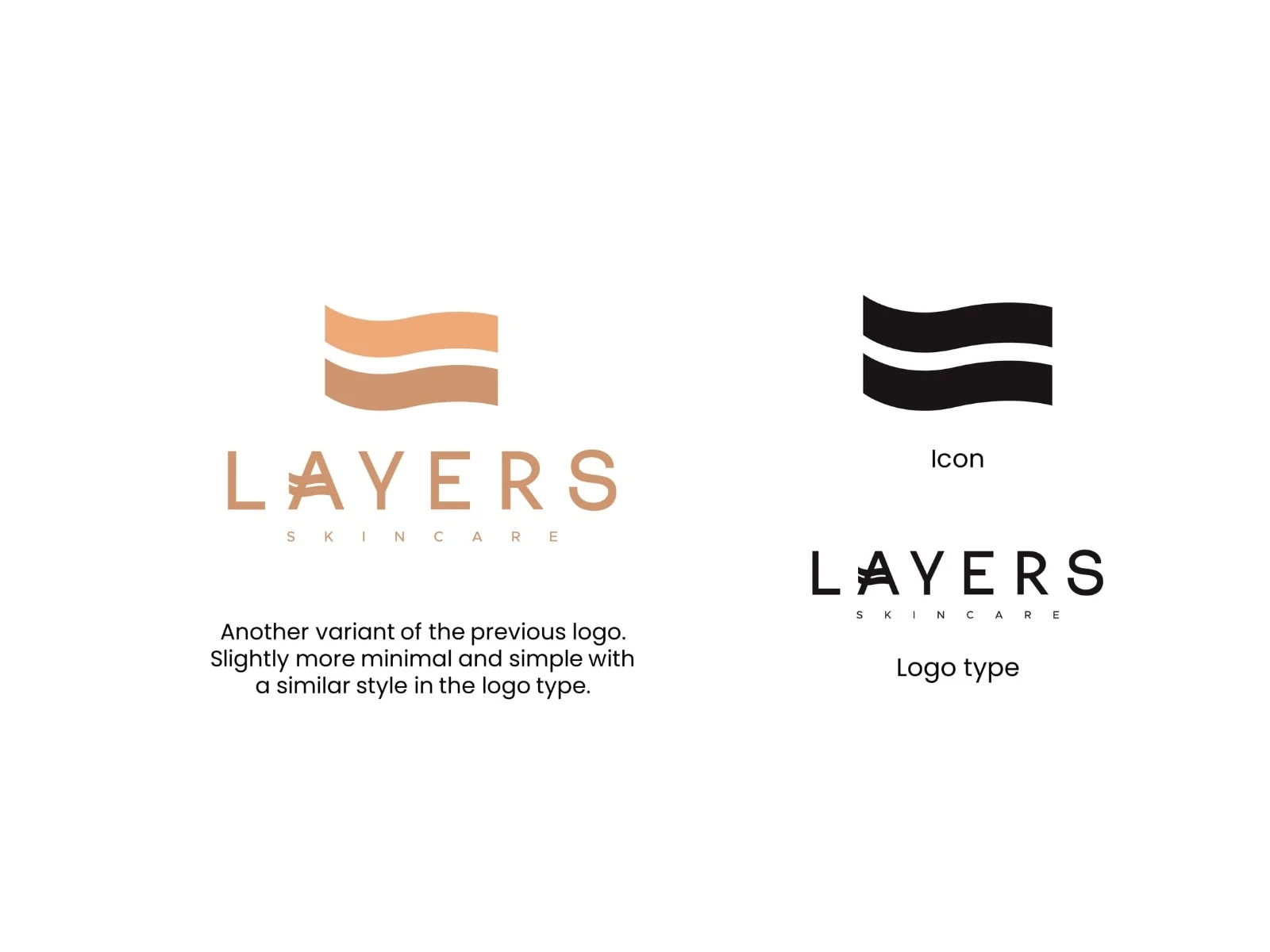
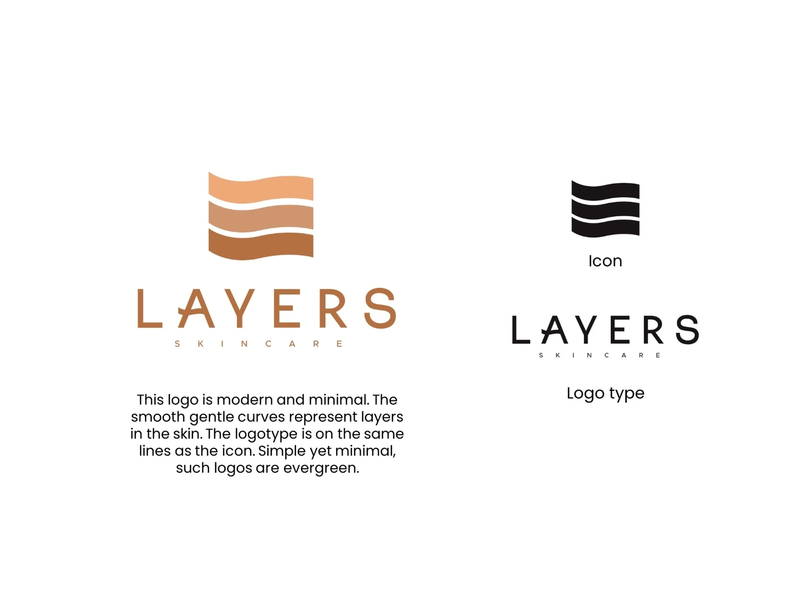
Layers is a skincare brand concept built around the idea of simplicity, depth, and the natural beauty of skin. The client approached me with a minimal brief saying they wanted the logo to feel calm, neutral, and rooted in skin tones. My task was to conceptualize a variety of logo directions that capture the essence of Layers as both a name and a feeling, gentle, natural, and refined.
I started by experimenting with type focused designs and minimal symbols, using form and texture to convey softness and sophistication. The palette stayed close to neutral and skin inspired tones, warm beiges, soft browns, muted pinks, and creamy whites, creating an organic and comforting aesthetic.
The project started with a clear goal to create a final logo that would eventually lead into complete brand development. The logo was finalized, but the project was shelved on the client’s end before the branding phase began. Even though the branding did not continue, this project shows my conceptual thinking and how I shape a strong identity starting from a simple brief. Layers represents my approach to crafting thoughtful, story driven design rooted in simplicity and emotion.
Like this project
Posted Nov 10, 2025
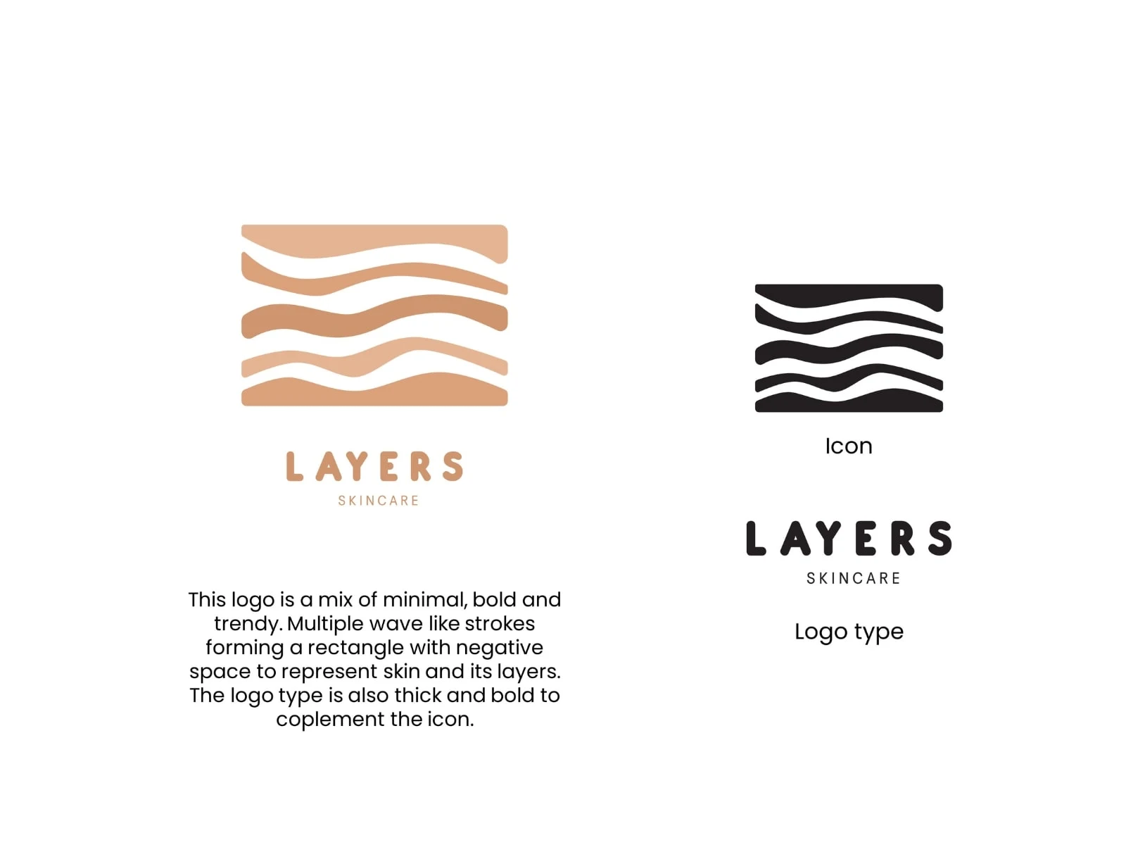
Logo design for Layers, a skincare brand focused on calm, neutral, skin inspired tones. A clean and refined identity built from a simple brief.
Likes
1
Views
4
Timeline
May 4, 2020 - May 14, 2020
Clients
Layers