Espresso It! – Branding Design
Sameeha Raiba
Espresso It! is a conceptual coffee brand I designed to celebrate self expression and creative energy. The name plays on both “Espresso” and “Express it,” tying together two things I love ; coffee and communication. I wanted the brand to feel like that moment of inspiration that hits mid sip, vibrant, authentic, and just the right amount of bold.
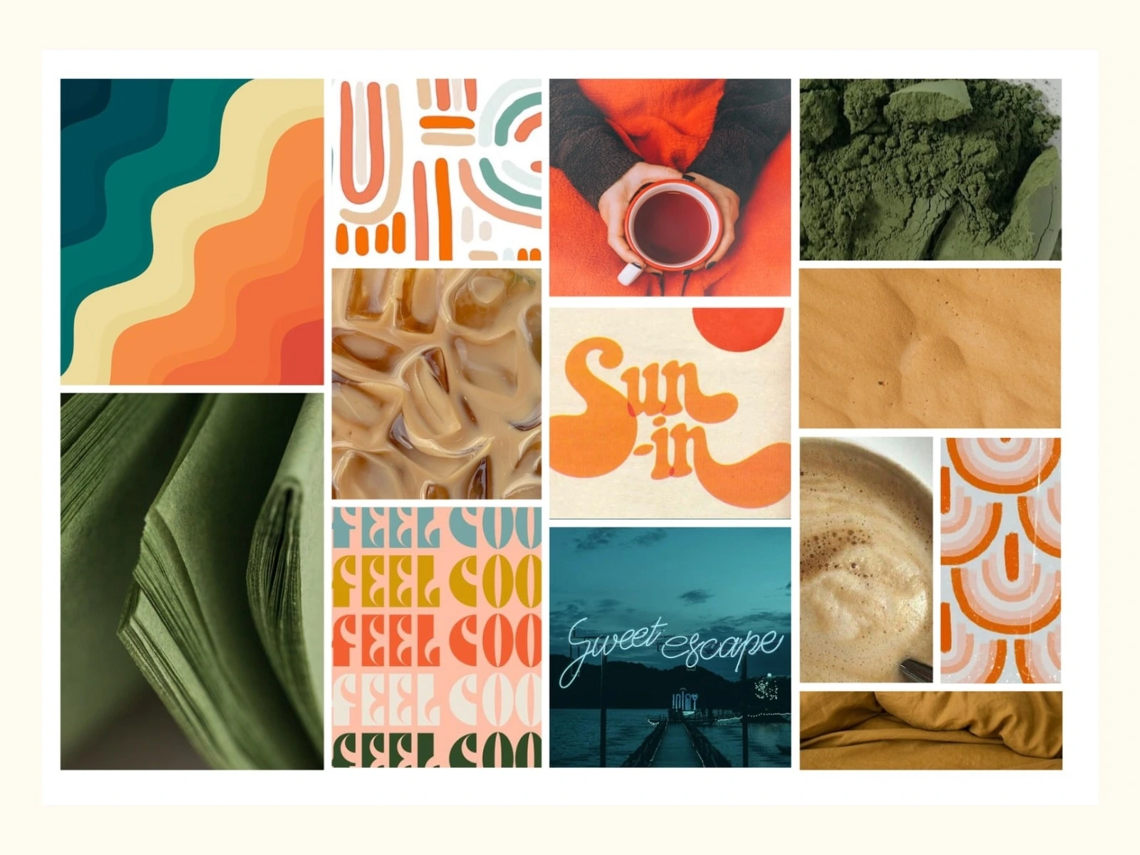
The vision was to craft a brand identity that feels approachable yet full of personality, the kind of café that invites people to connect, share ideas, and spark creativity. I leaned into a playful visual language with organic shapes, soft curves, and rhythmic typography to bring that lively, human energy to life.
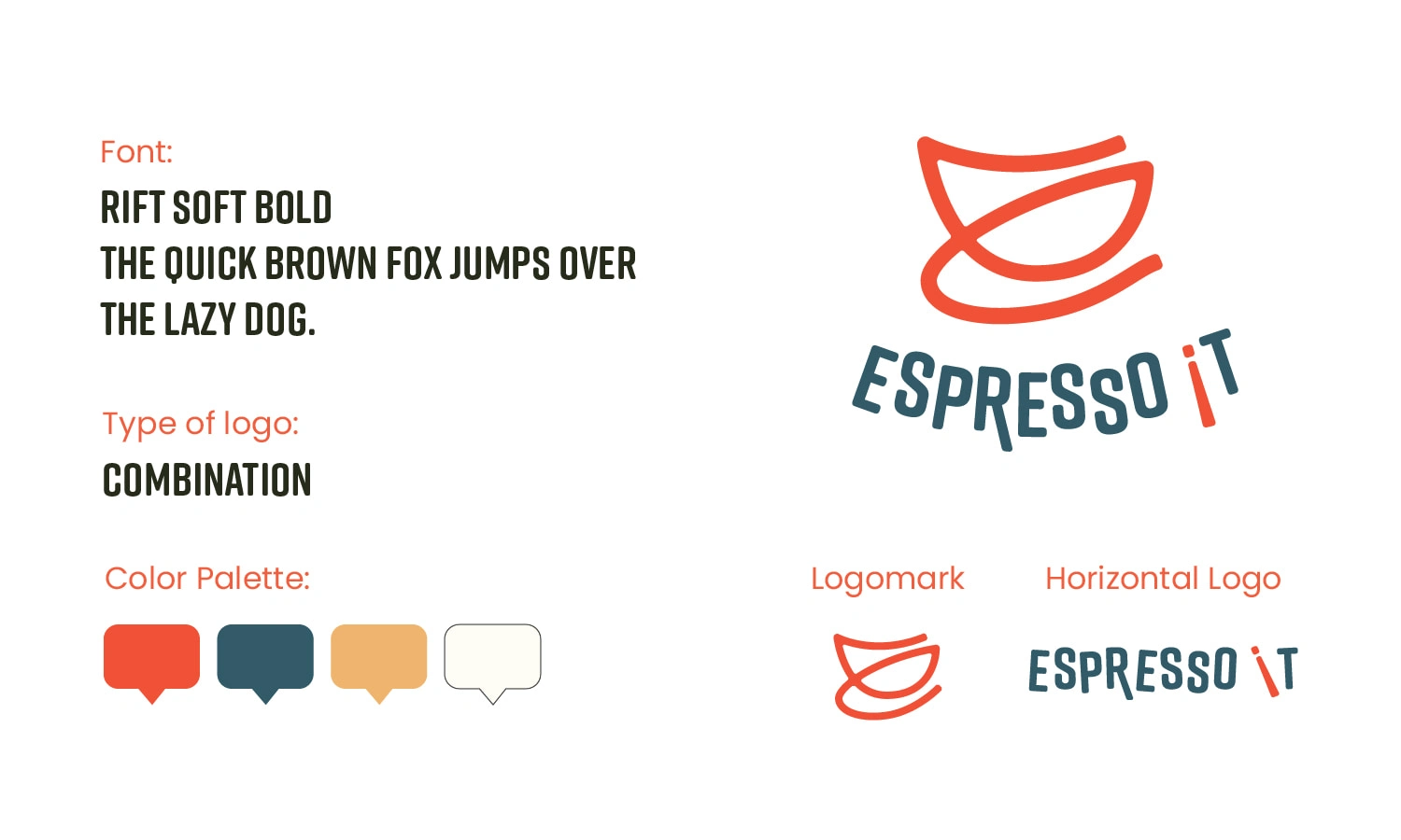
Logo Design:
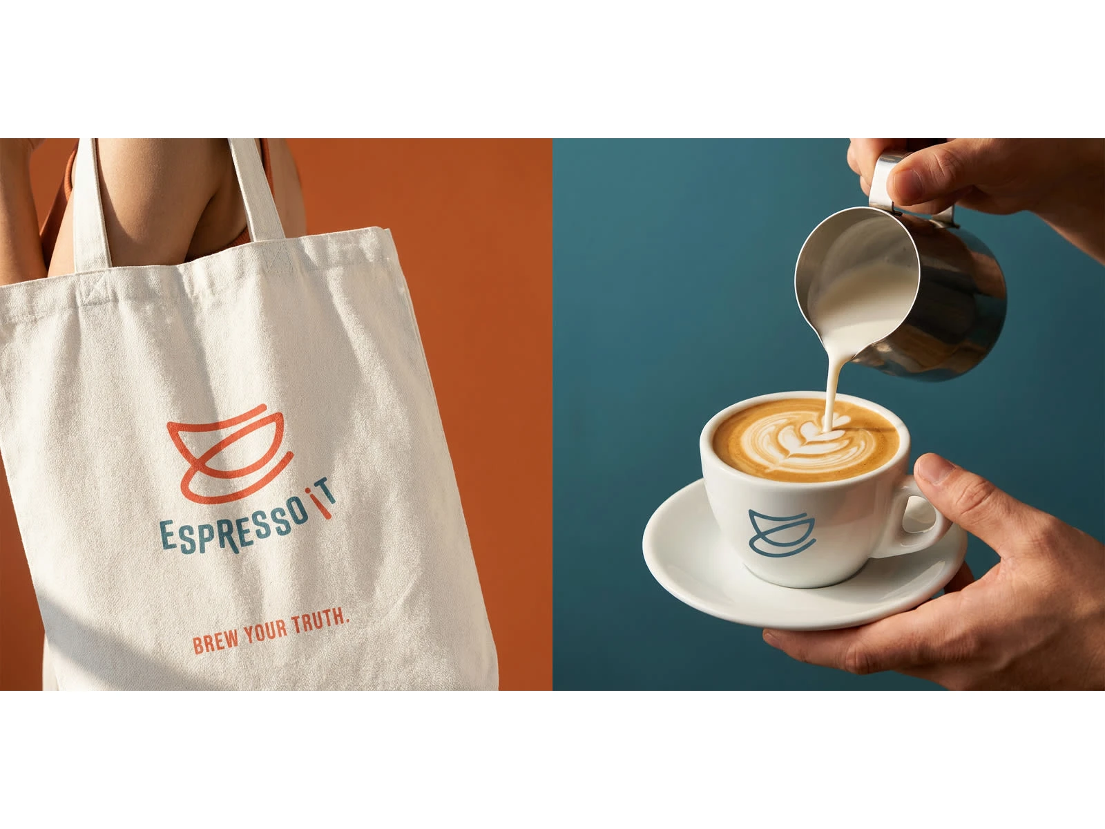
The logo is a combination mark that merges motion and meaning. The logomark, two overlapping coffee cups, doubles as a conversational symbol representing community and creative exchange. It is simple, dynamic, and instantly recognizable.
For the wordmark, I used Rift Soft Bold, a geometric sans serif with friendly edges that balance structure and warmth. I added subtle movement to the letterforms for a more human, hand crafted feel. The tilted coral “IT” gives a bold pop and an expressive twist, almost like a playful exclamation point.
Typography and Mood:
Rift Soft Bold carries the whole identity, approachable, modern, and slightly quirky. It adds personality without losing clarity, making it perfect for a brand that thrives on conversation and connection. The overall tone is friendly, dynamic, and a little bit playful, just like a great coffee chat.
Color Palette:
I curated a palette that blends warmth and modernity:
Espresso Coral for energy and creativity
Deep Teal for depth and balance
Honey Beige and Soft Cream for comfort and calm
Together, they create a cozy yet contemporary vibe that translates beautifully across packaging, social media, and in store applications.
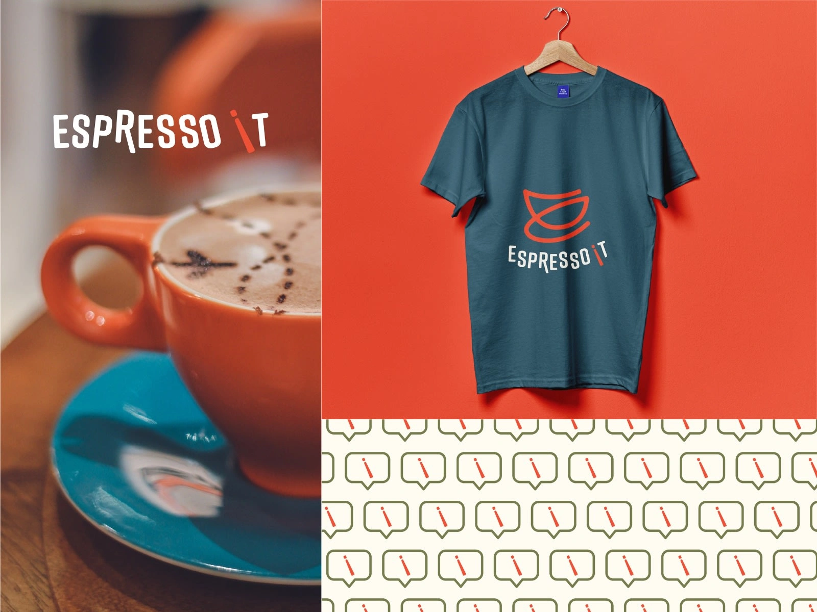
I brought the brand to life through a cohesive visual system that feels consistent across all touchpoints. From takeaway cups and packaging to posters and digital content, every element carries the same expressive energy. The coral accents and logomark add recognizable personality, while the minimalist layout keeps everything clean and intentional. The goal was to make Espresso It! instantly feel like a space you want to walk into, warm, creative, and full of good vibes!
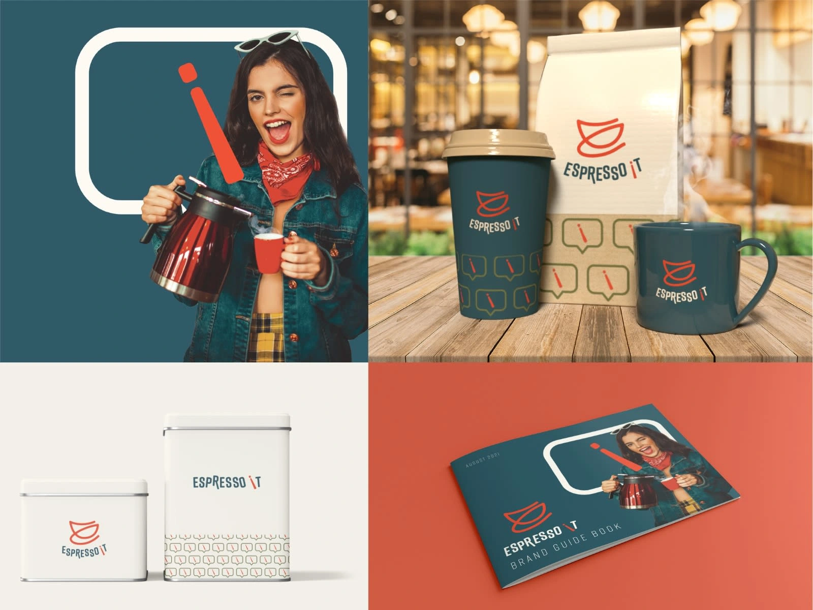
With Espresso It! I wanted to build a brand that does not just sell coffee, it sells mood, energy, and community. The final identity feels cohesive, vibrant, and full of movement from the logomark to the color palette. It is the kind of brand you can instantly vibe with, fun, social, and perfectly caffeinated.
Like this project
Posted Nov 9, 2025
A bold and playful brand identity created for Espresso It!, a concept café that celebrates creativity, connection, and self-expression.