Built with Kittl
Peppa Please - Brand Identity and Packaging Design
Chavi - Brand Designer
Peppa Please - Hot Sauce Brand
Essentials Brand Identity + Packaging Design
Keywords: Bold, Spicy, Cheeky, Fun
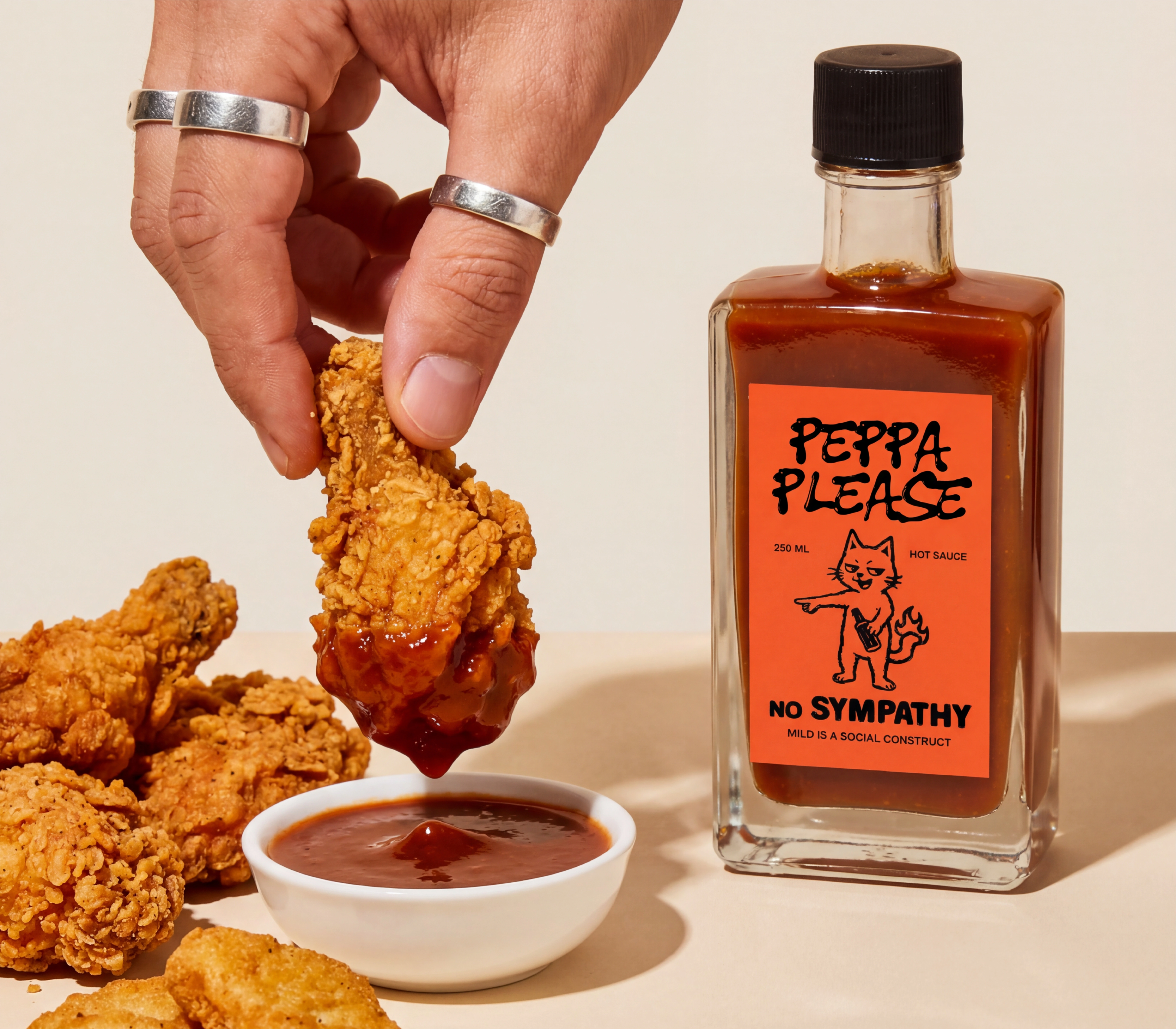
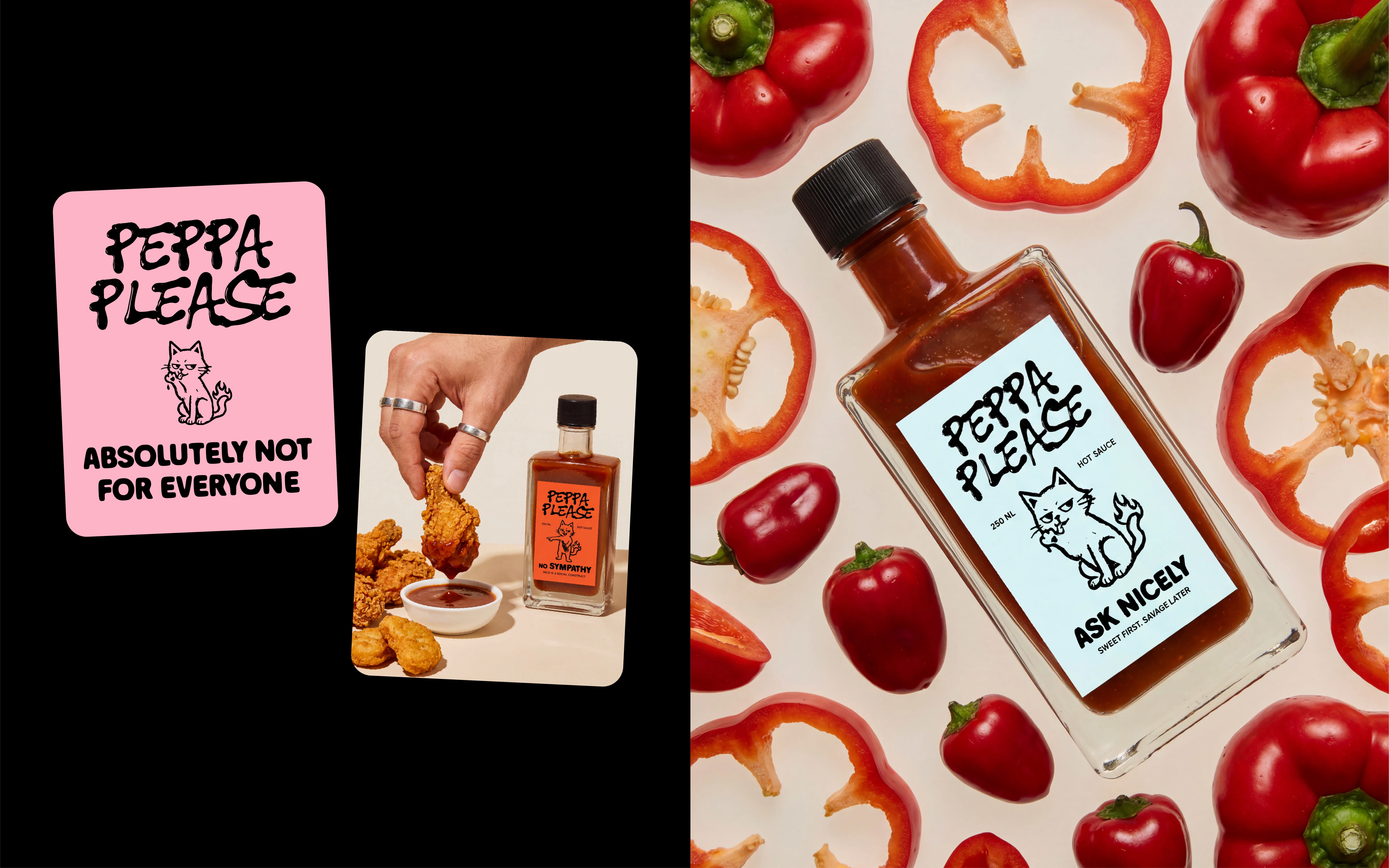
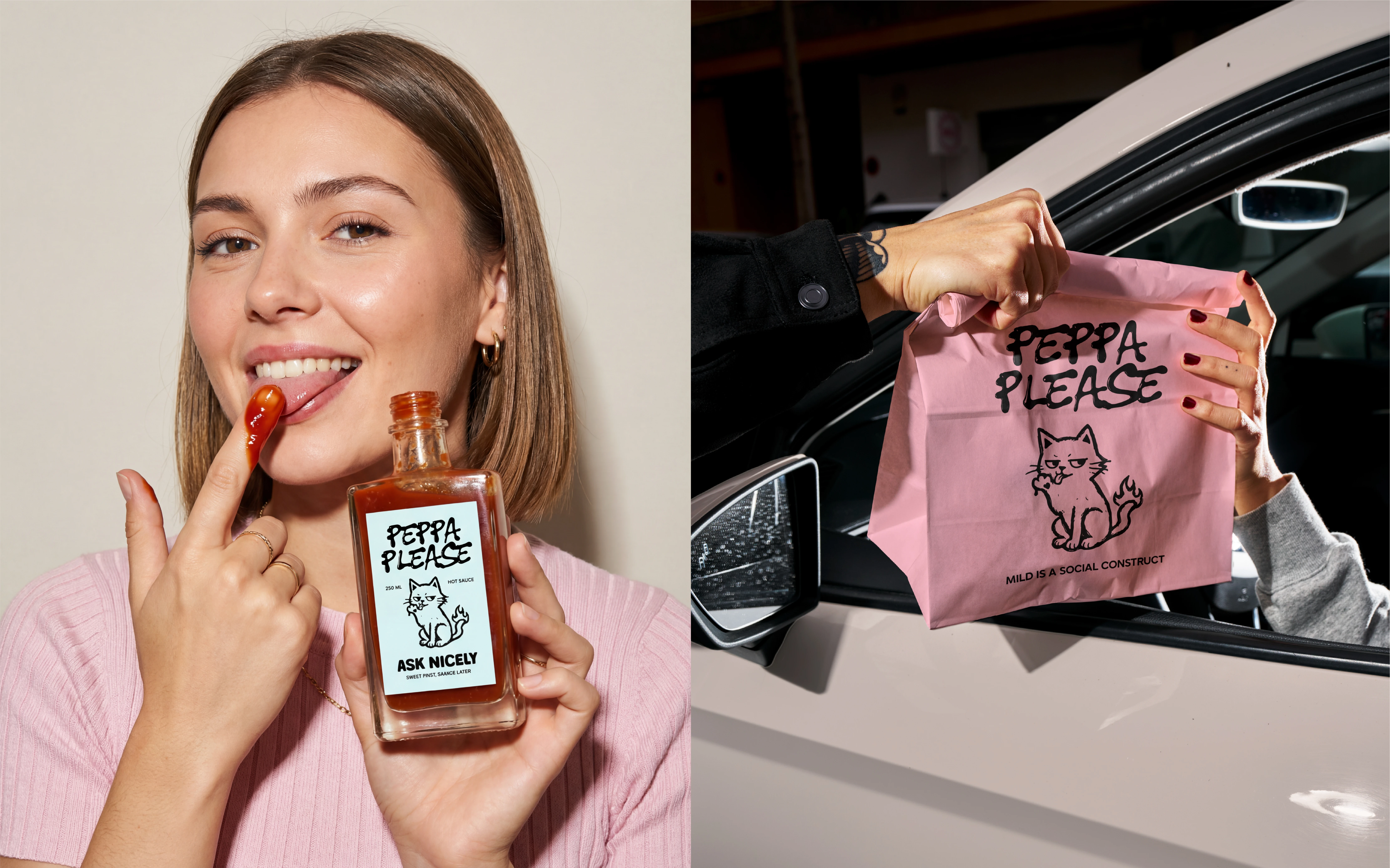
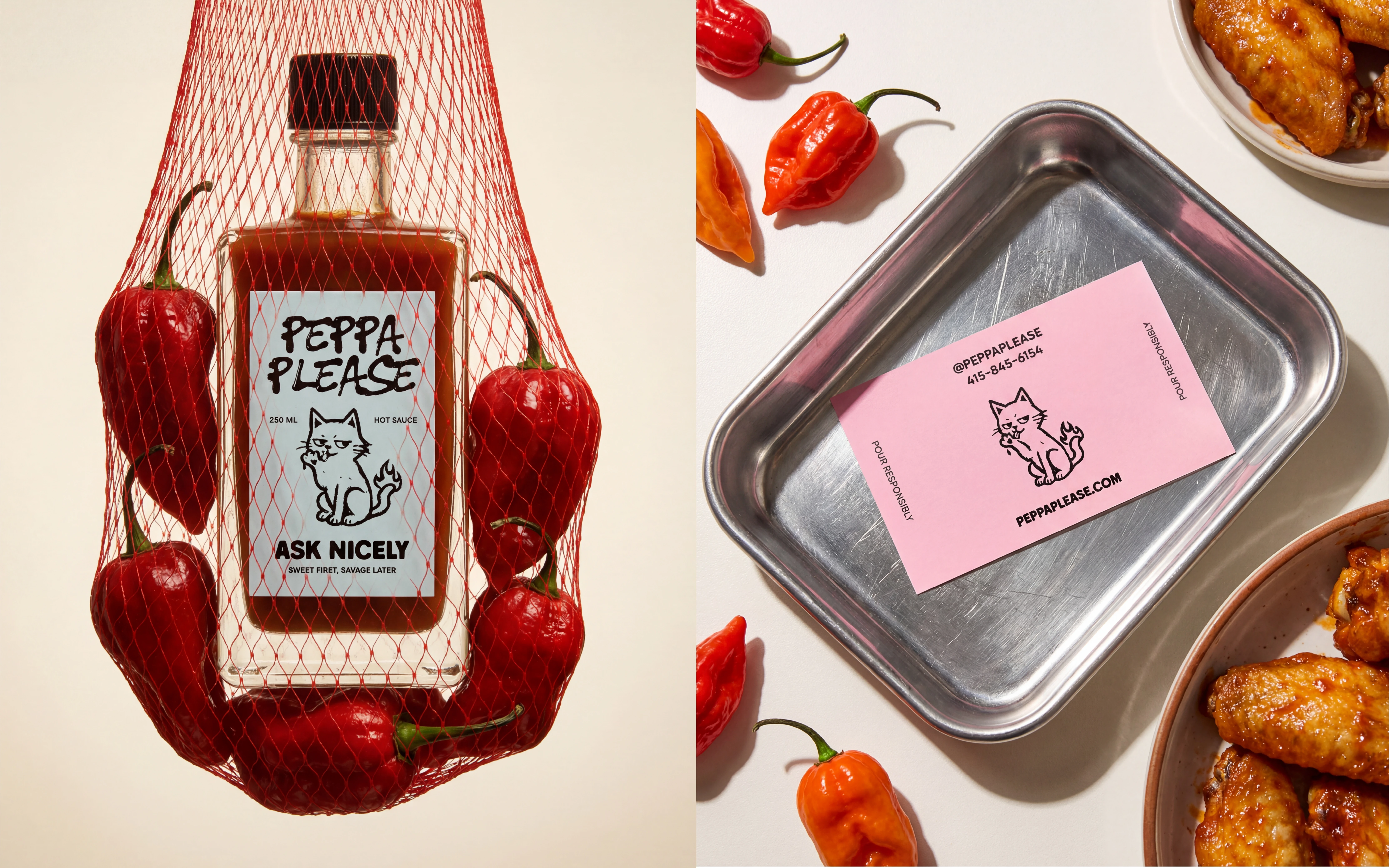
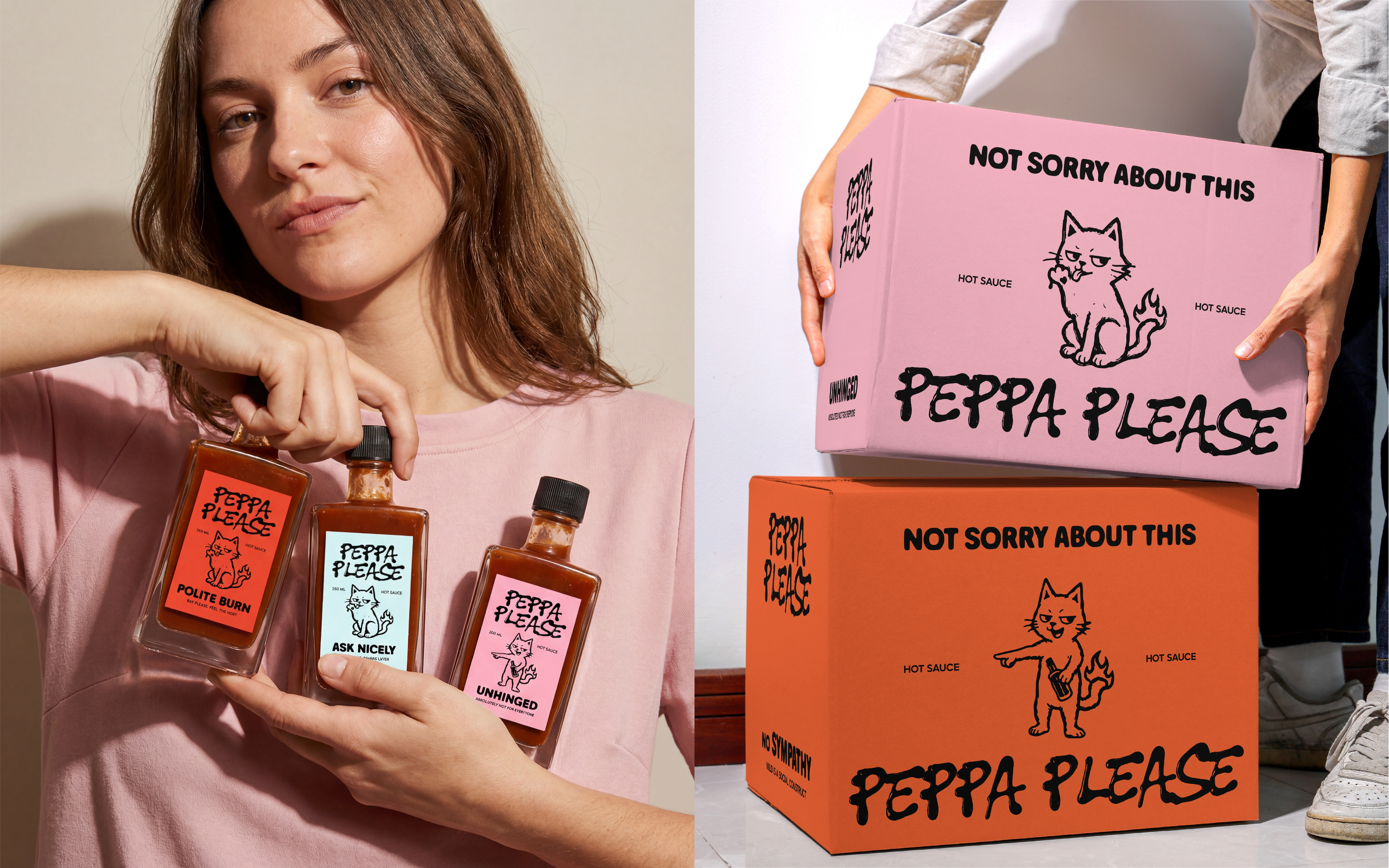
Peppa Please is a hot sauce brand that treats heat as personality, not just flavor. Irreverent, playful, and intentionally unhinged, the brand moves away from macho-spicy tropes and overly serious gourmet cues. Instead, it embraces humor, attitude, and emotional contrast. Peppa Please knows it is hot and chooses to have fun with it.
The Challenge
Most hot sauce brands rely on intensity, toughness, or seriousness to signal heat. The challenge was to create a brand that still feels spicy and credible without trying to prove anything. Peppa Please needed to stand out on shelf, feel culturally relevant, and turn heat into something expressive, fun, and collectible.
The Concept
The mascot brings a raw, DIY energy to the brand. With childlike linework and mischievous expression, it feels almost out of place on a food label, which makes it impossible to ignore. The illustration style leans more cult-zine and indie punk than mass-market FMCG, reinforcing the brand’s irreverent tone.
Packaging Design
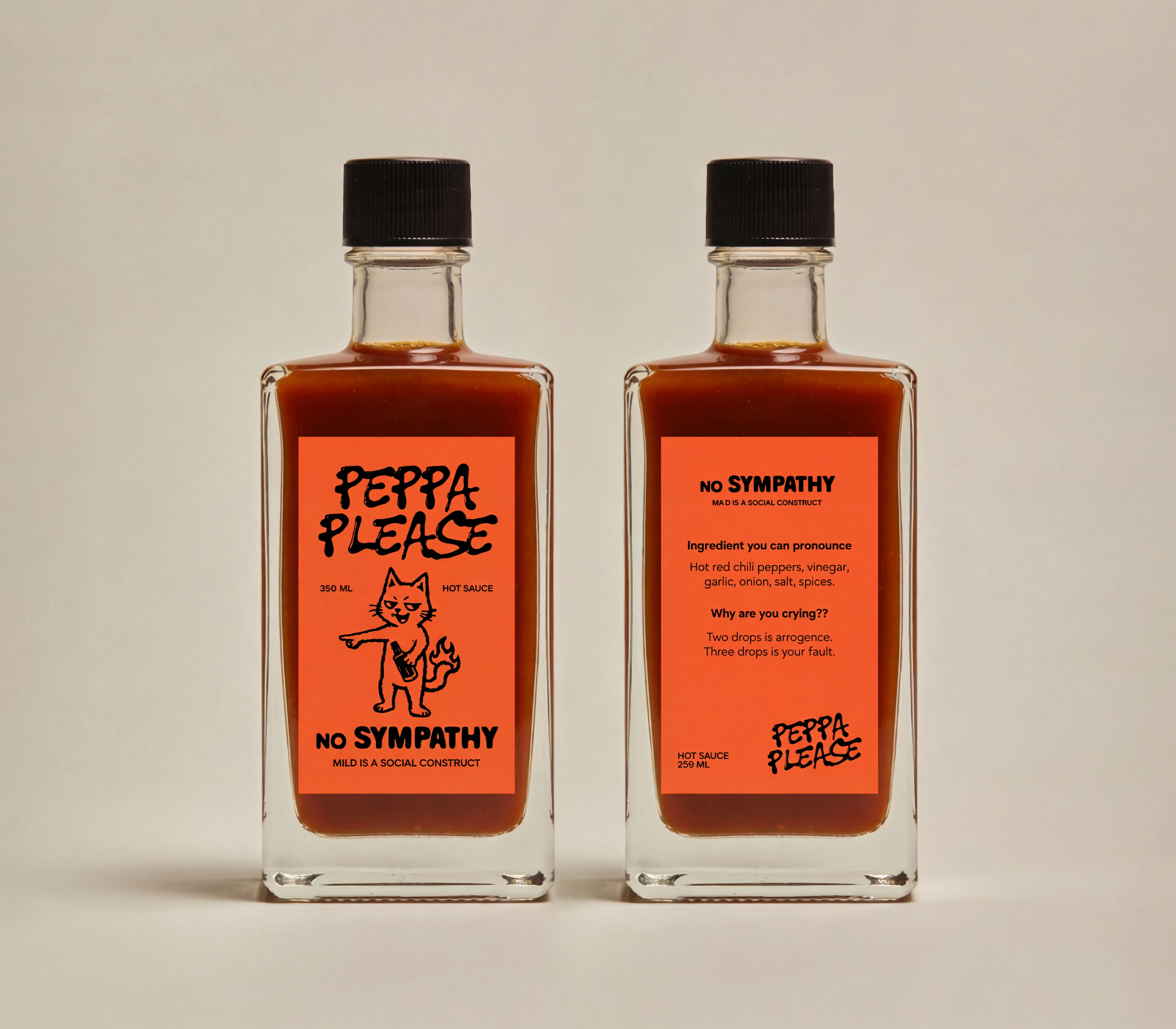
The packaging treats the label as the primary storytelling surface. Loud, emotionally charged colors soften the aggression typically associated with hot sauce, making the product feel playful and approachable. Clean layouts allow the chaotic elements to shine, while ingredient-led photography grounds the humor in real food credibility. The result is strong shelf presence and instant recognition.
Thank you!
If you want to create a brand identity that’s as unique and intentional as your business, reach out to me below. 💜
Like this project
Posted Jan 13, 2026
Peppa Please is a hot sauce brand that treats heat as personality, not just flavor. The branding moves away from macho-spicy tropes and overly gourmet cues.