Logo Concept Set for Greenblott Design
Andrei Sirbu
Greenblott Design is a boutique architectural and interior design studio known for clean lines, thoughtful spaces, and a contemporary design sensibility. When we began working together, the studio needed a refreshed visual identity—something minimal, modern, and aligned with their aesthetic, without losing the personal character behind the brand.
Project Beginning — Understanding Their Vision
The initial request from the client was clear:
“We want a GB monogram explored first.”
This direction made sense given the name and the owner’s desire for a personal mark. But the challenge was to create something that didn’t feel generic, predictable, or overly ornamental—common pitfalls with monogram-based logos in the design industry.
To do this well, I first examined their design style, portfolio, materials, and the way they present their work. Greenblott Design’s visual language is very architectural: structured forms, intentional spacing, modern finishes, and a balanced use of negative space.
This became the foundation for the first round of concepts.
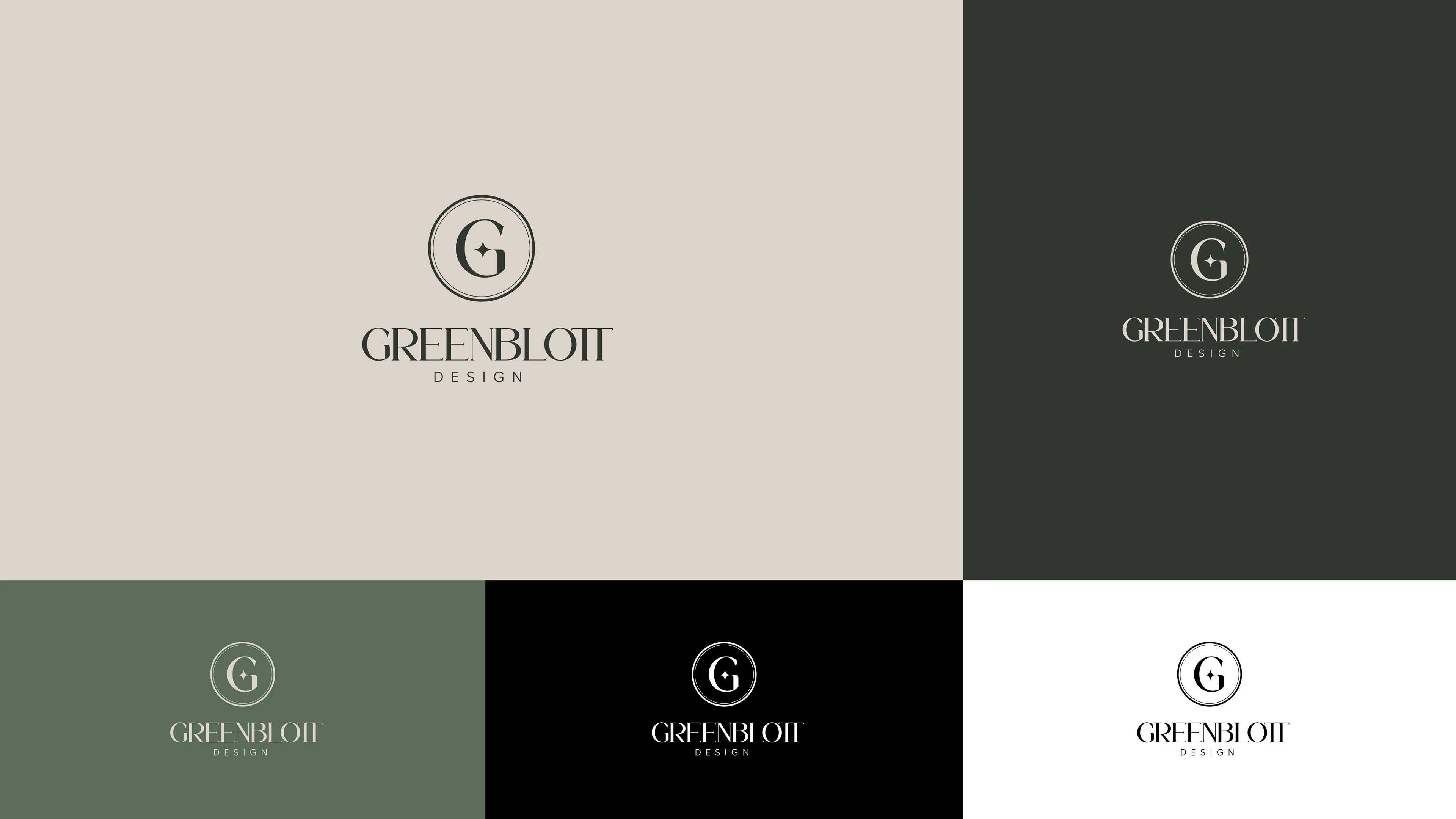
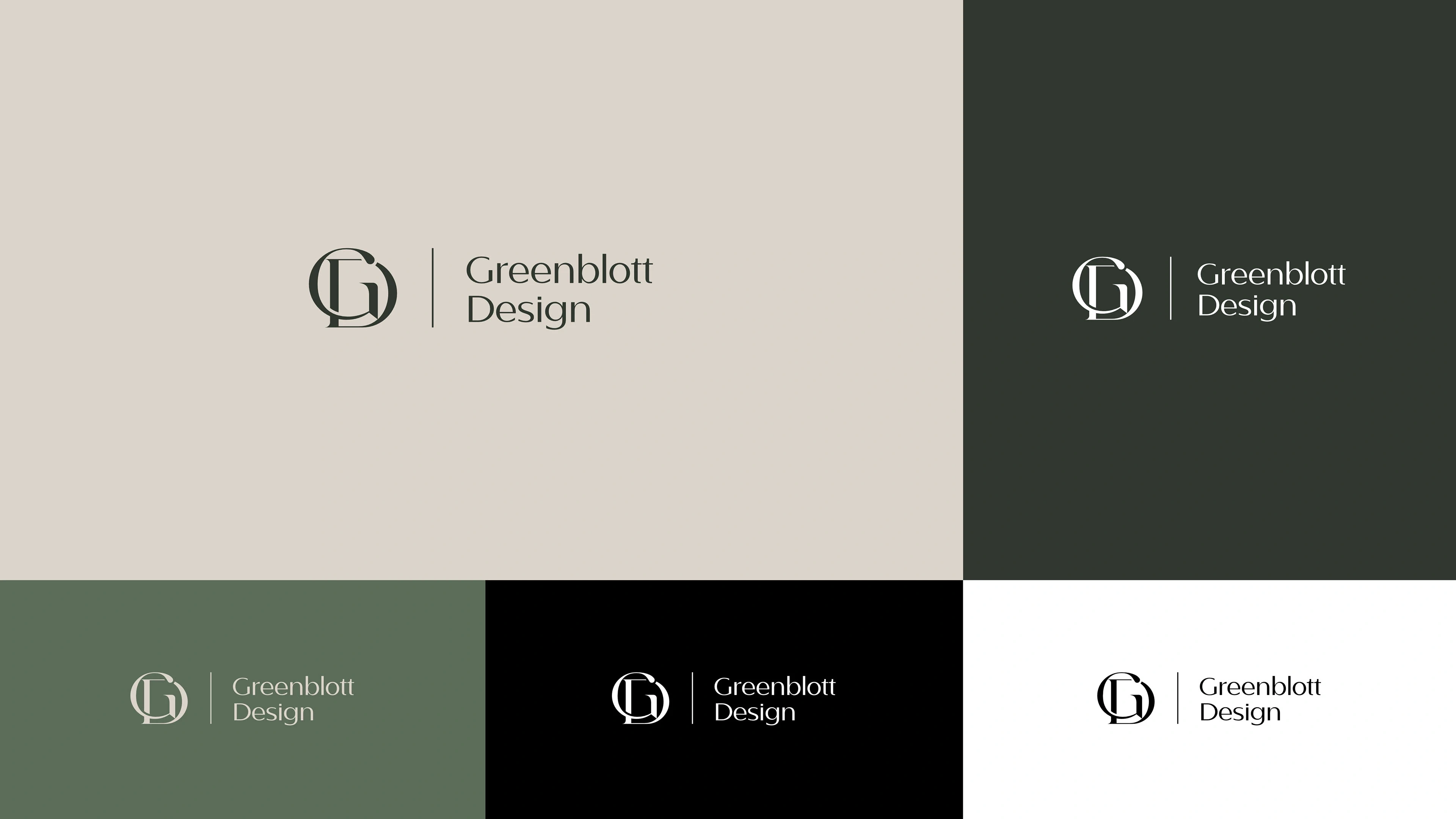
Logo Exploration — From Symbols to Structure
I created several GB monogram explorations, each based on a different angle of their brand personality.
Each direction was crafted with precision—clean edges, balanced letterforms, and a contemporary feel. Every concept was meant to reflect not just the initials “GB,” but the studio’s meticulous approach to design.
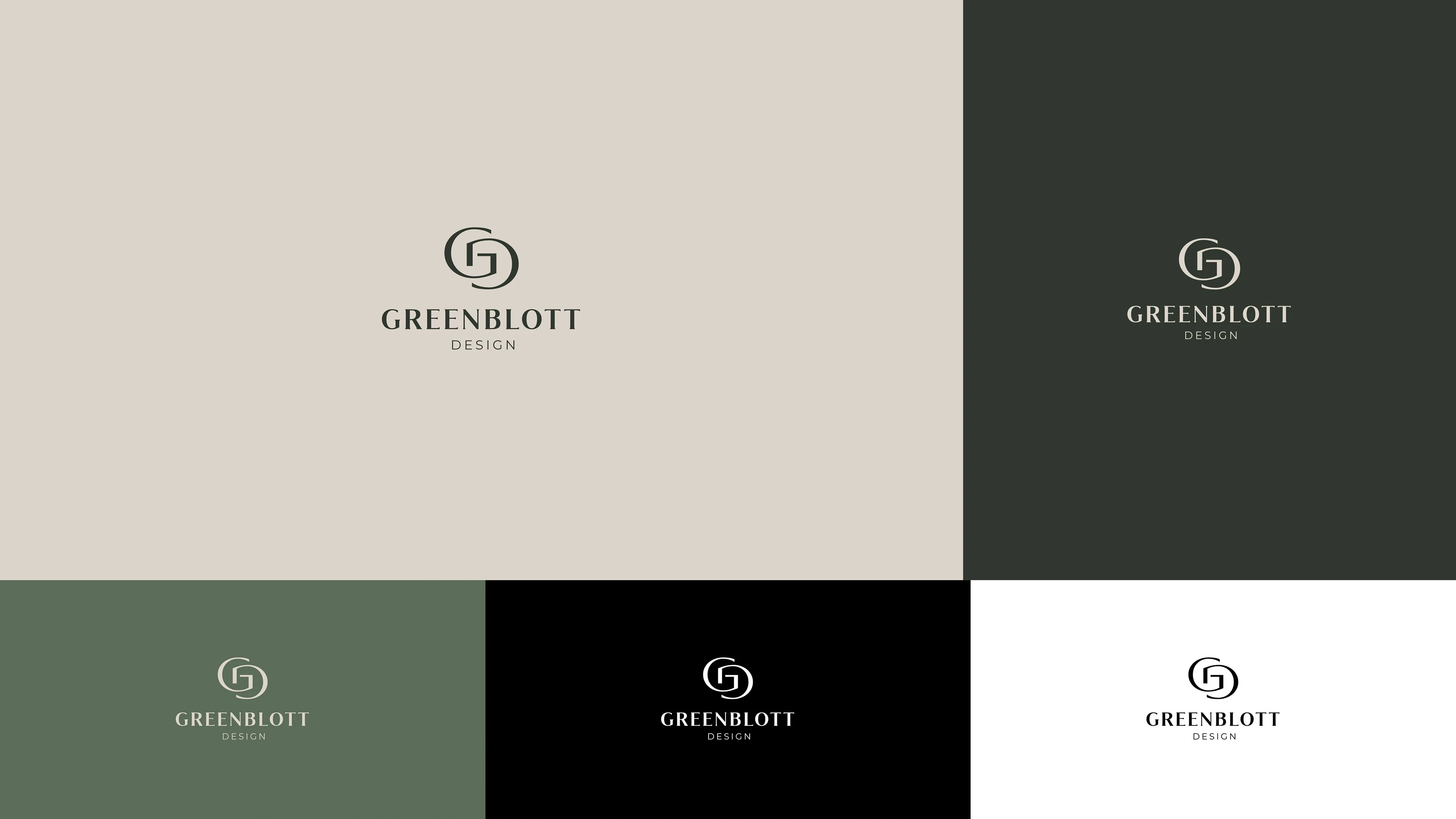
A Shift Toward Typography
After reviewing the monogram options, the conversation naturally shifted toward a cleaner, more flexible direction.
The client found themselves drawn to the simplicity and maturity of a typography-based identity.
This wasn’t just a design preference—it aligned with their studio’s ethos:
clarity over decoration
structure over ornament
modernity over trends
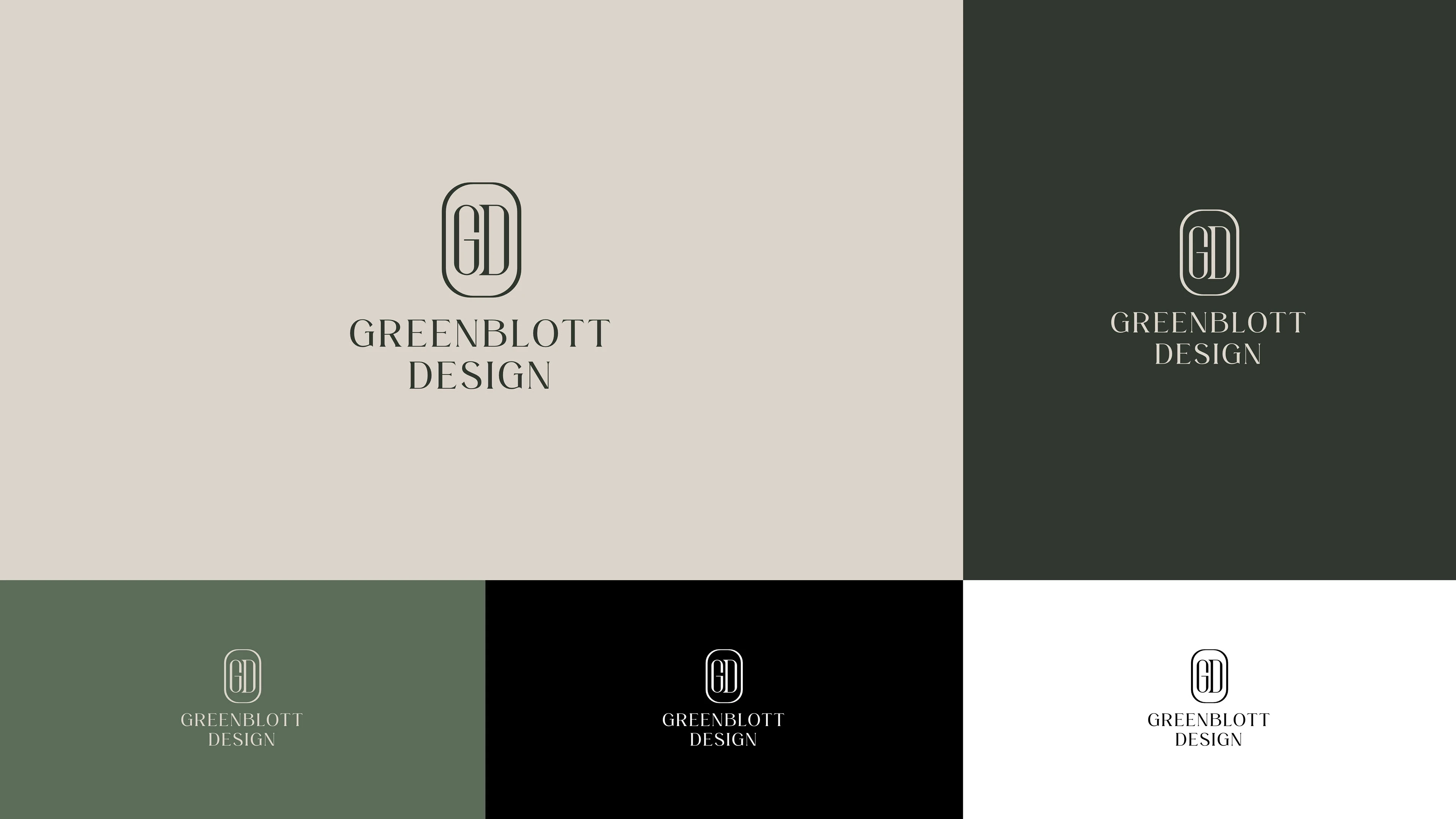
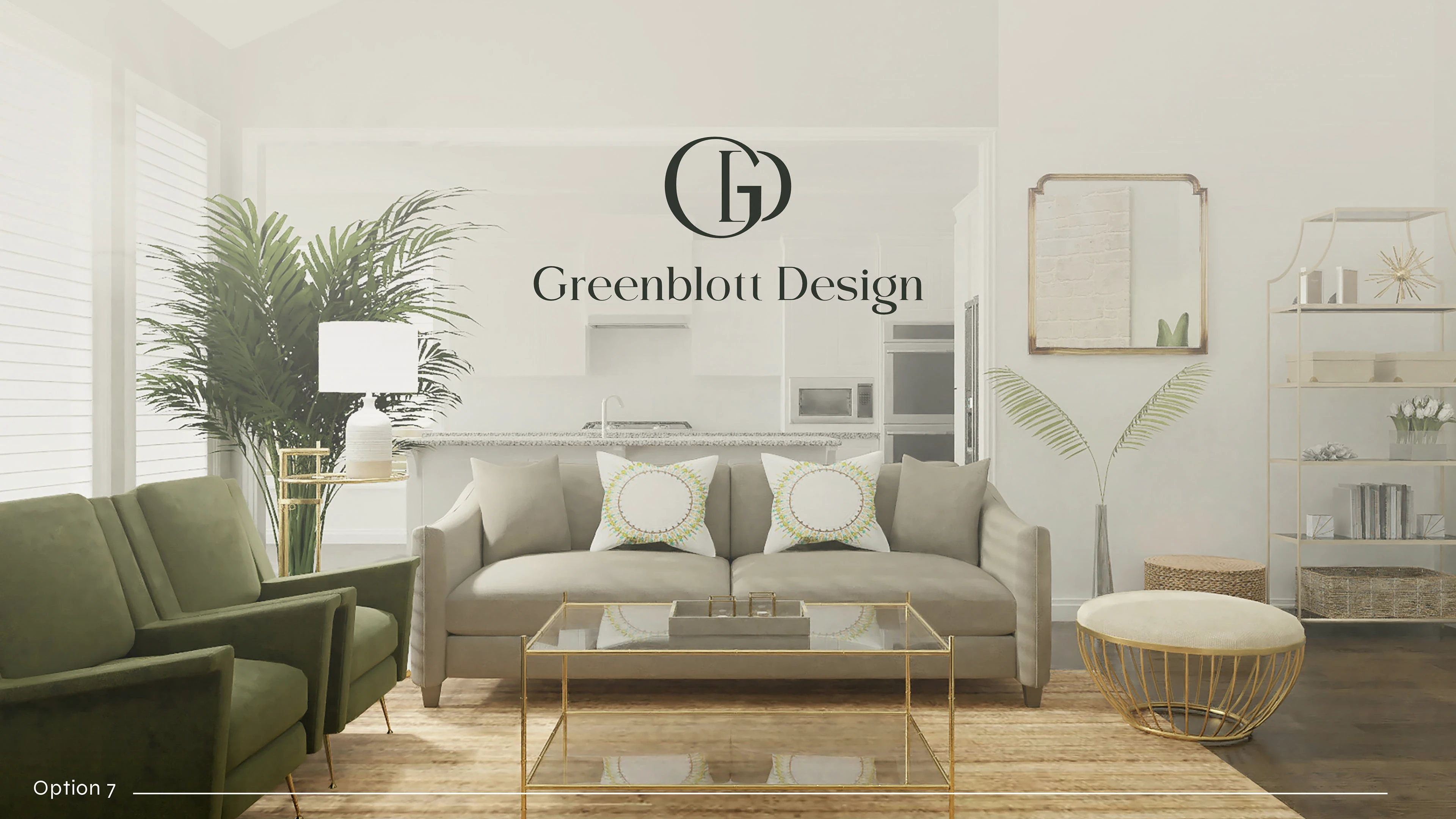
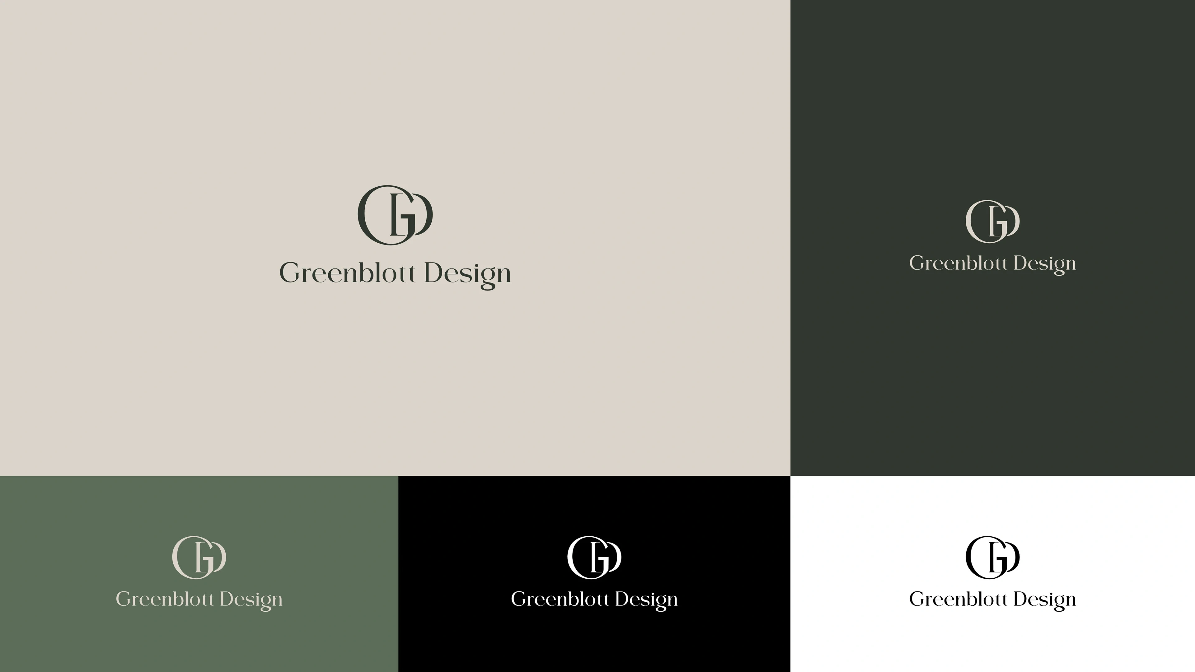
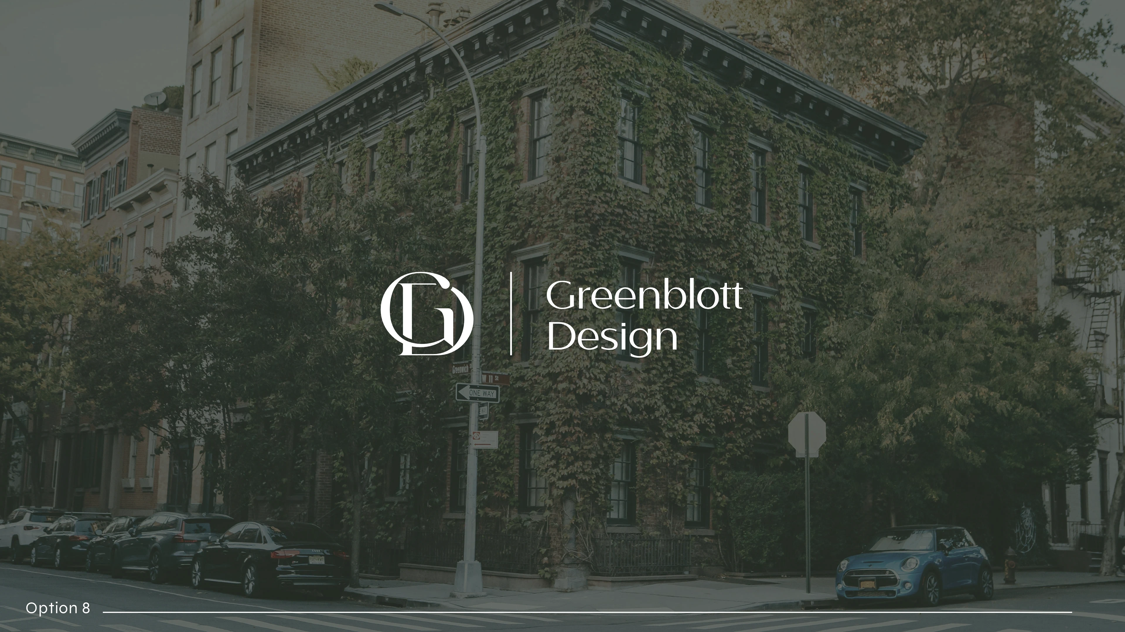
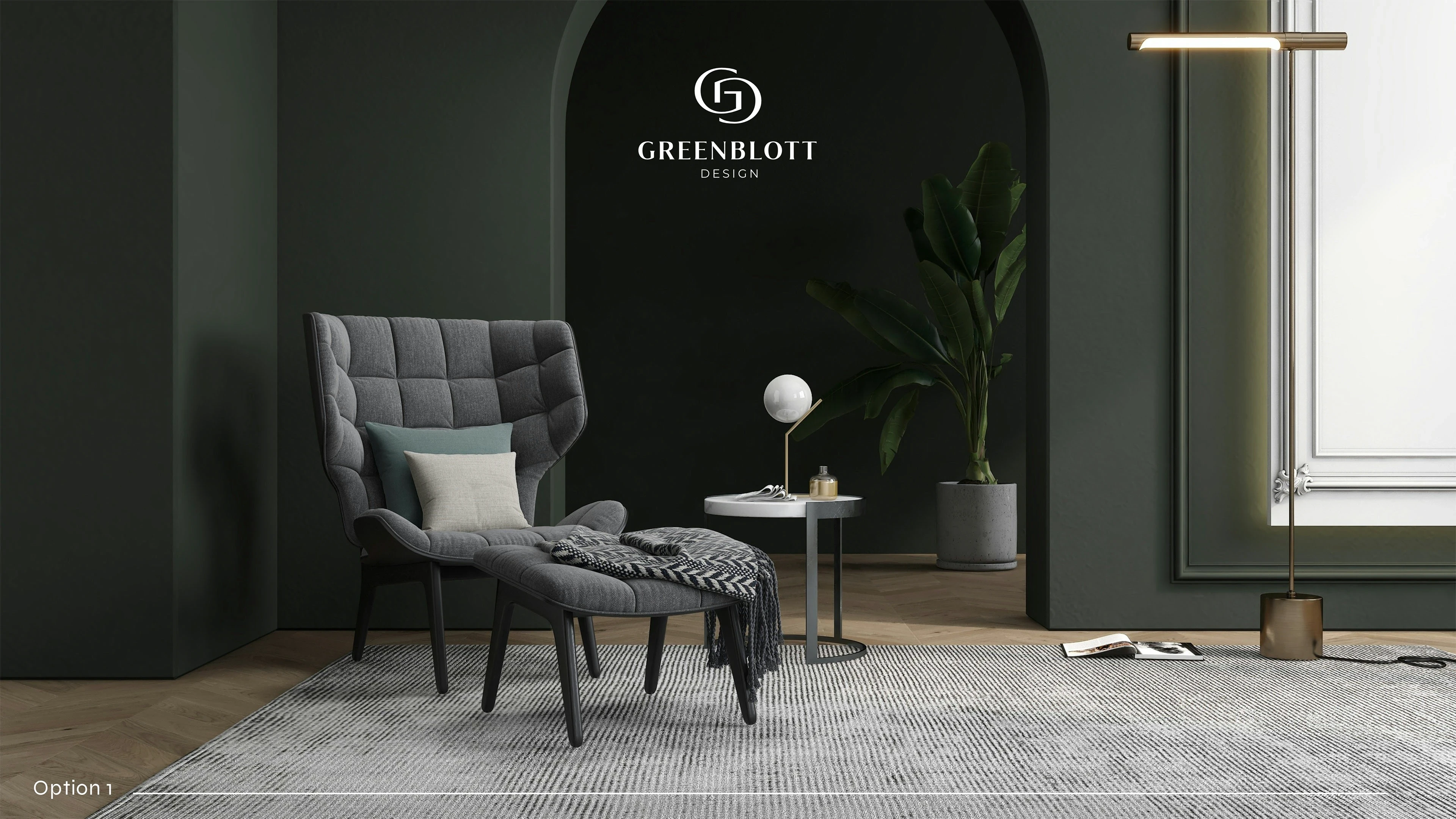
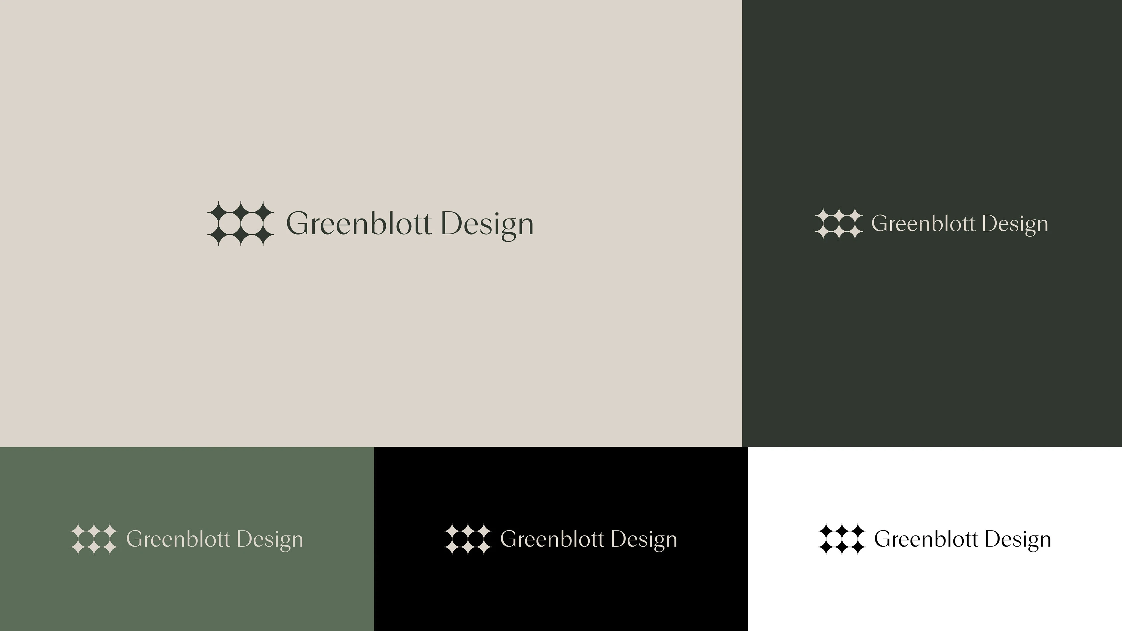
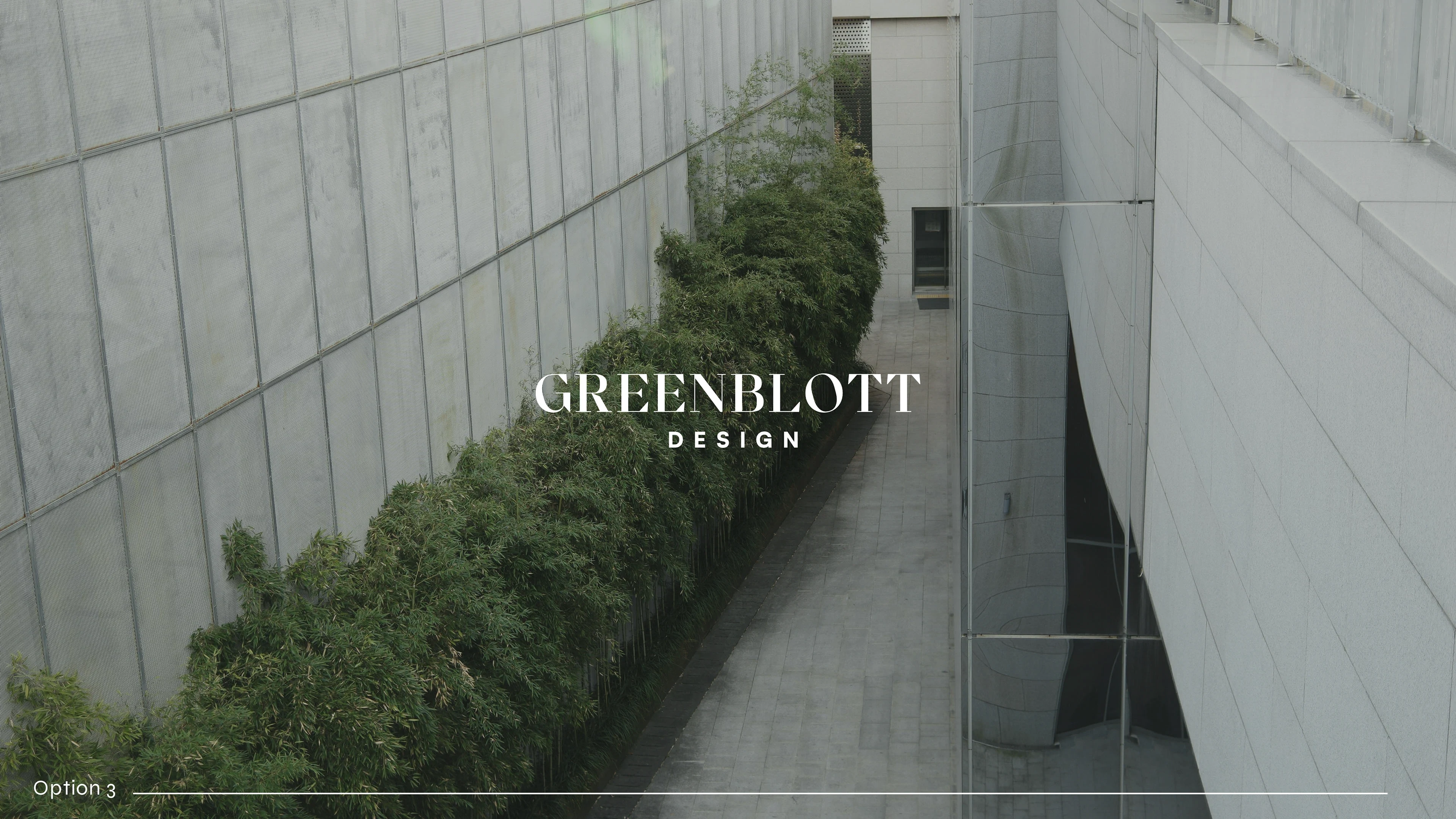
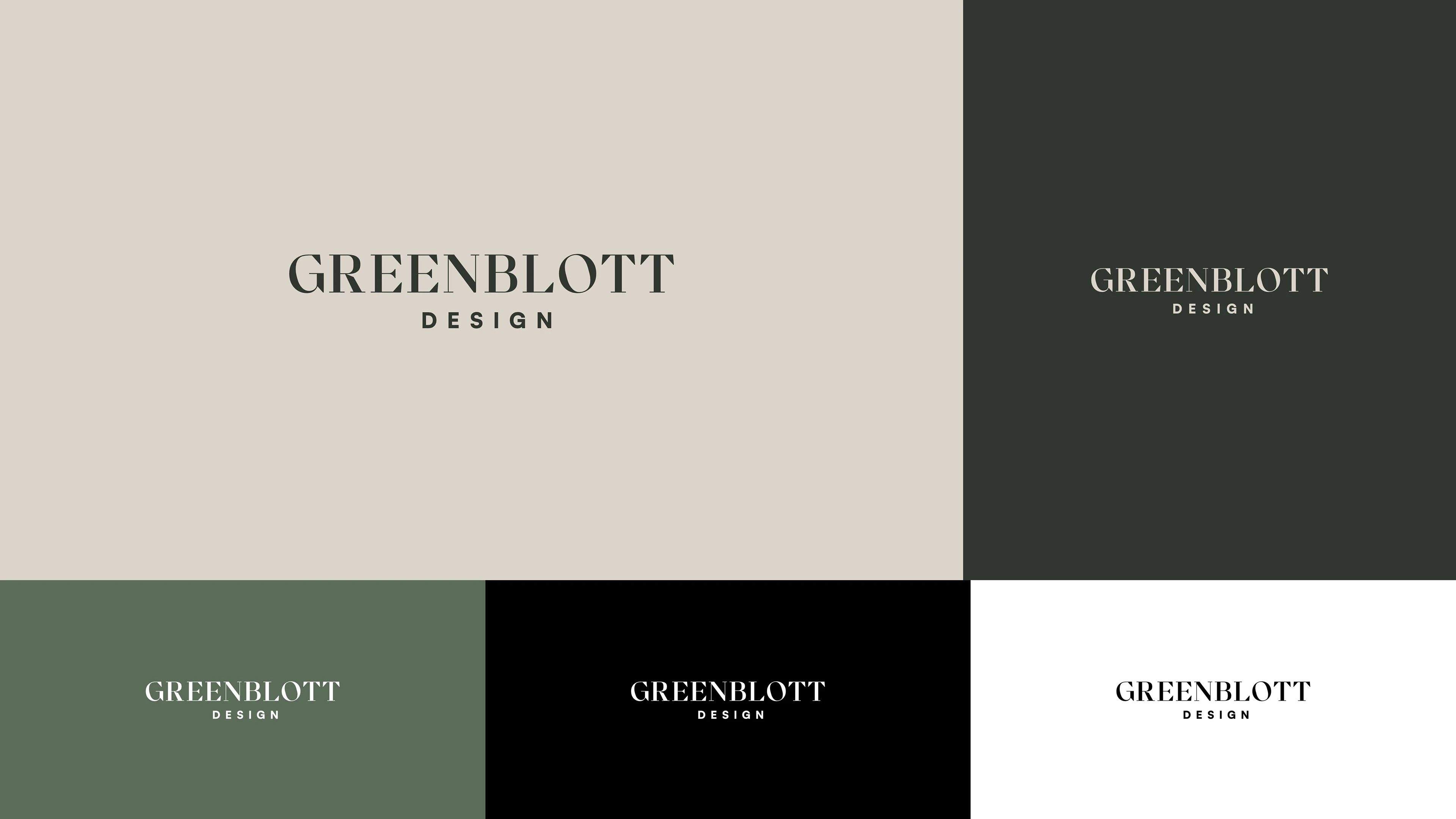
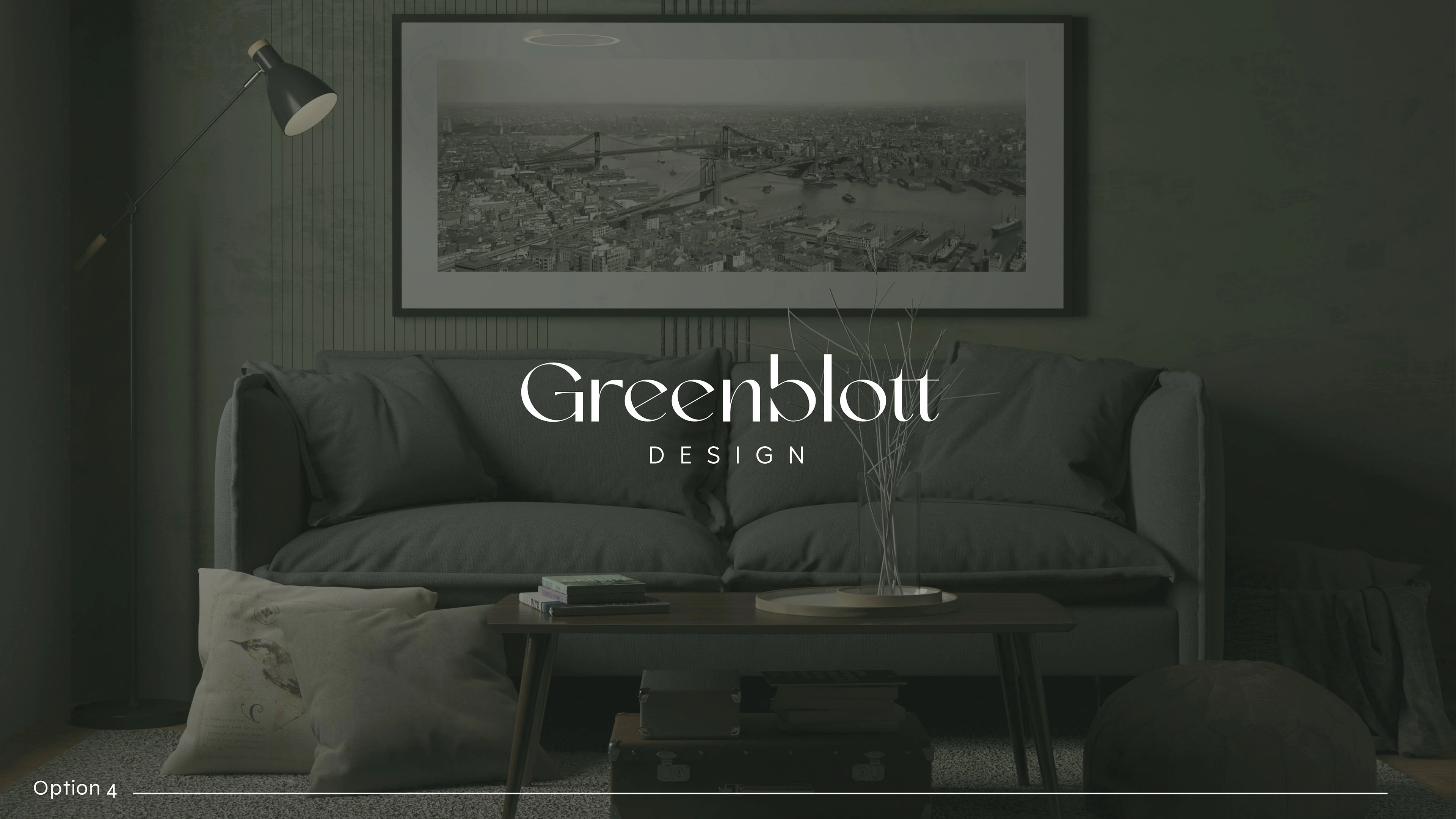
Together we refined the chosen typography direction into a logo that feels precise, confident, and timeless. The updated identity reflects the studio’s architectural mindset far better than a symbol could.
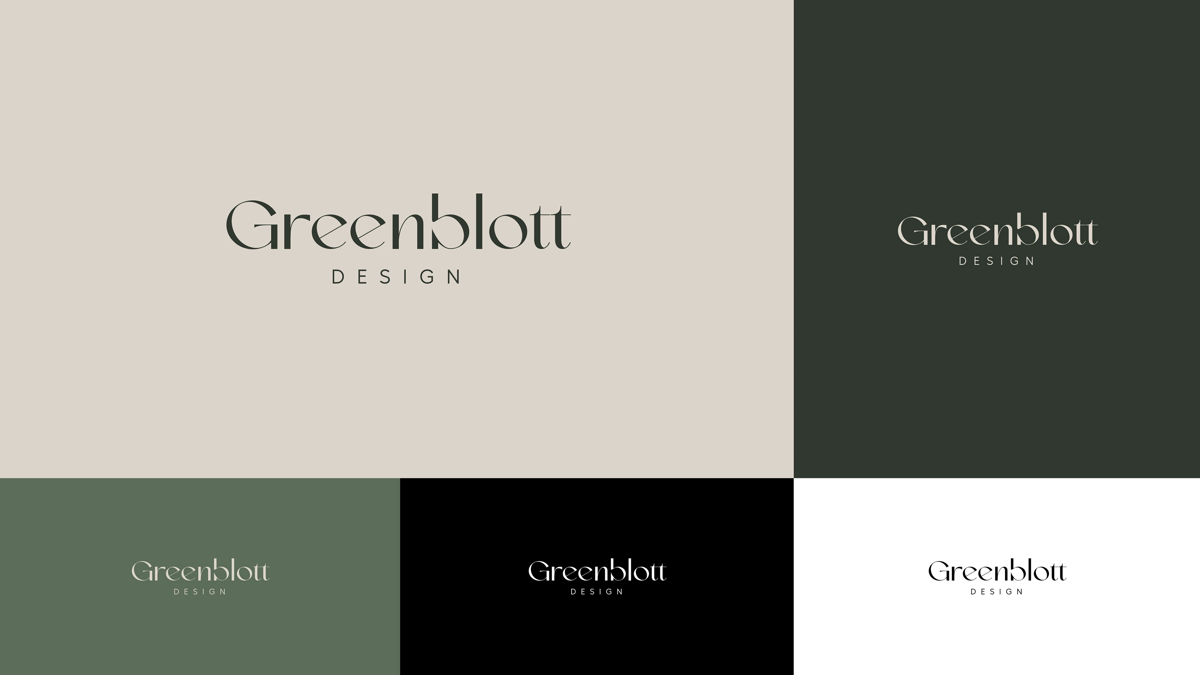
Final Result
The final logo is a typographic mark that carries Greenblott Design’s personality: clean, modern, intentional, and professional. It adapts effortlessly to digital materials, proposals, drawings, signage, and social media.
The identity feels aligned with who they are—a design studio that values clarity, structure, and purposeful creation.
My Role
Throughout this project, my responsibility was to guide the creative process rather than simply deliver options. I provided visual reasoning behind each direction, helped the client articulate what felt right for their brand, and refined the chosen concept into a polished identity that can grow with them.

Like this project
Posted Nov 19, 2025
I created several GB monogram explorations, each based on a different angle of their brand personality.
Likes
0
Views
1