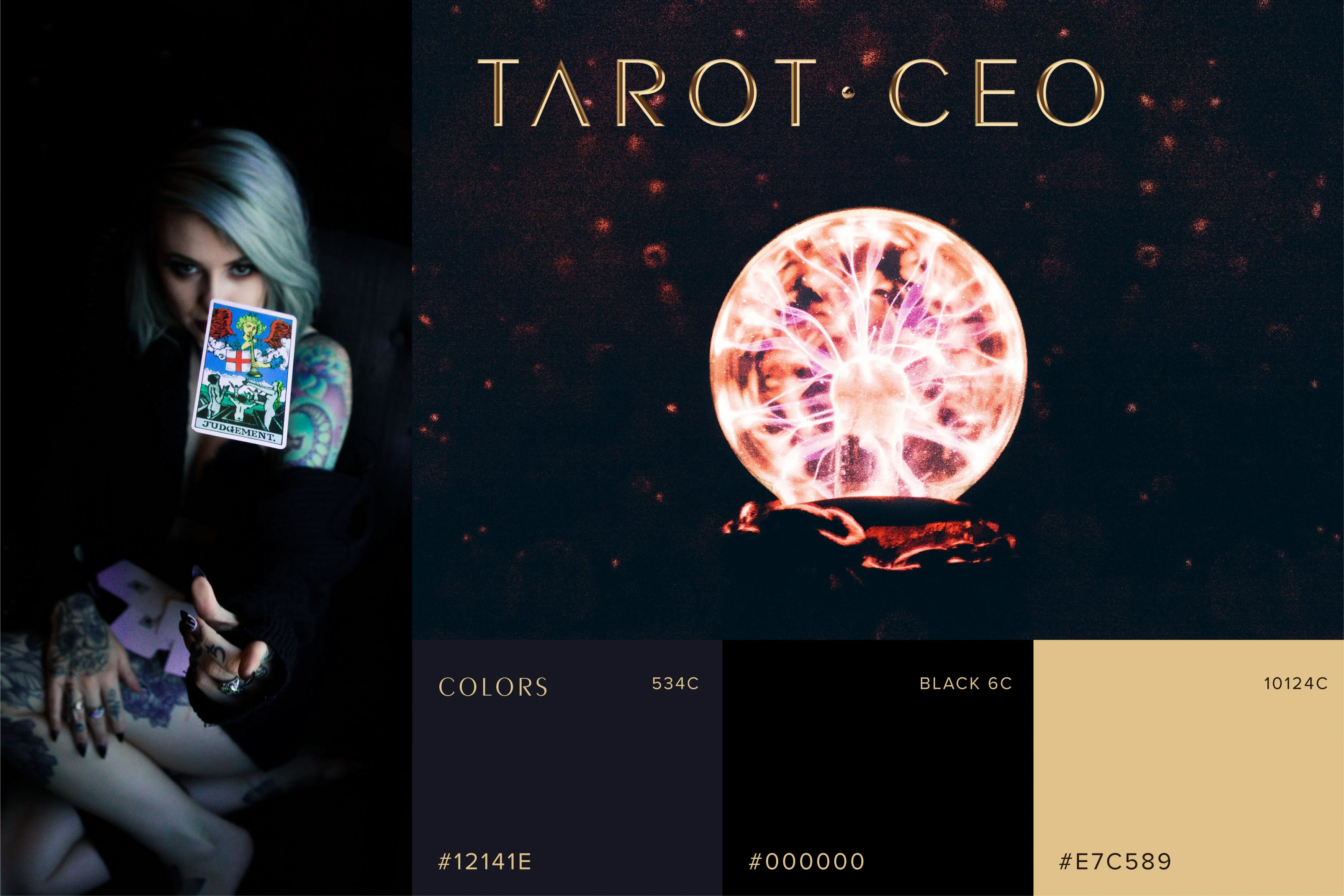
TAROT.CEO Brand and Website Design
LIUJIAYUN Studio
FAITH IS THE BIRD THAT FEELS THE LIGHT AND SINGS WHEN THE DAWN IS STILL DARK.
—ROBNDRONATH THAKUR
In tarot, the scepter symbolizes the element of fire and is the first of the four elements, representing creativity, growth, action and enthusiasm, as well as possessing infinite potential and creativity, courage to accept challenges and willingness to interact with others.
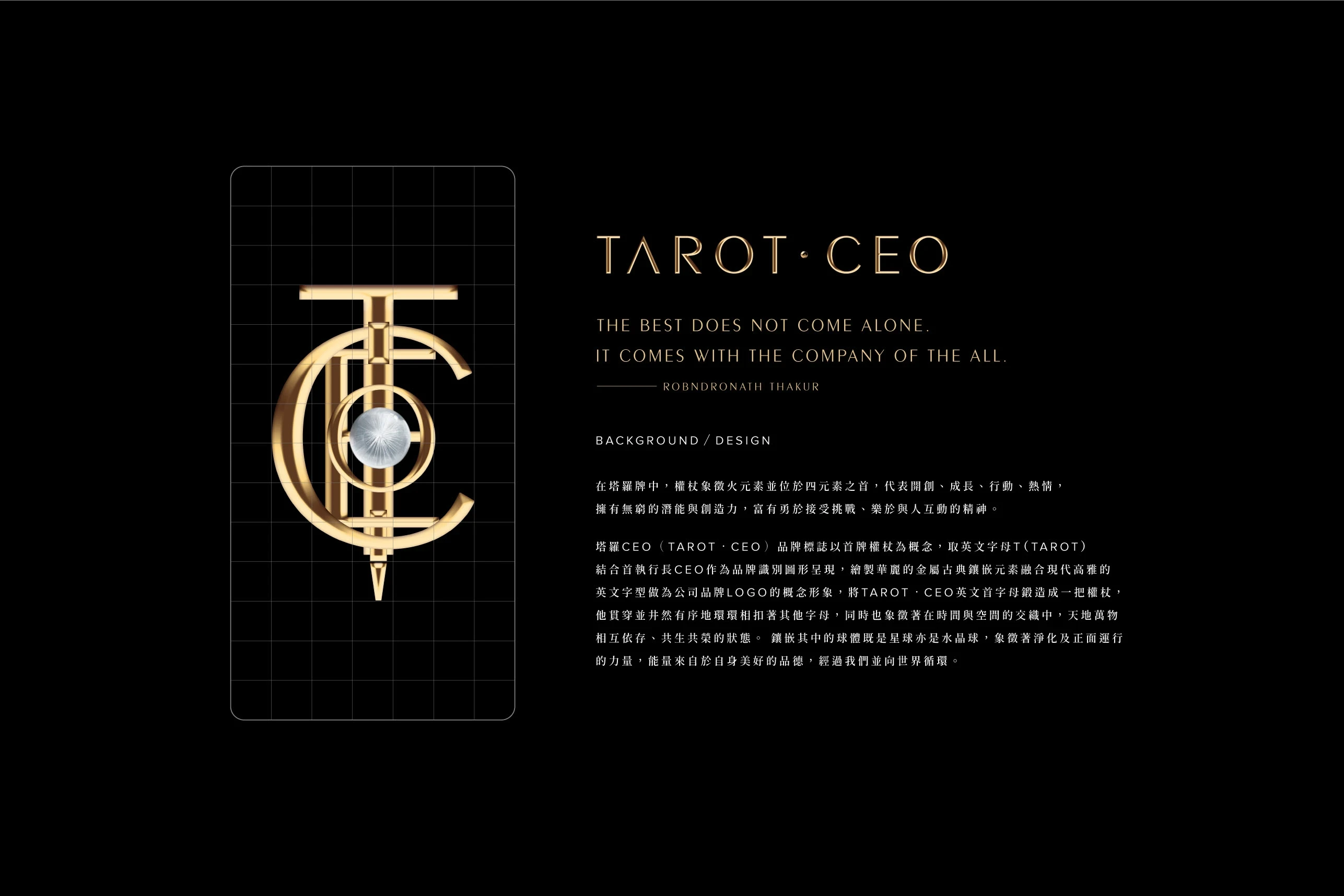
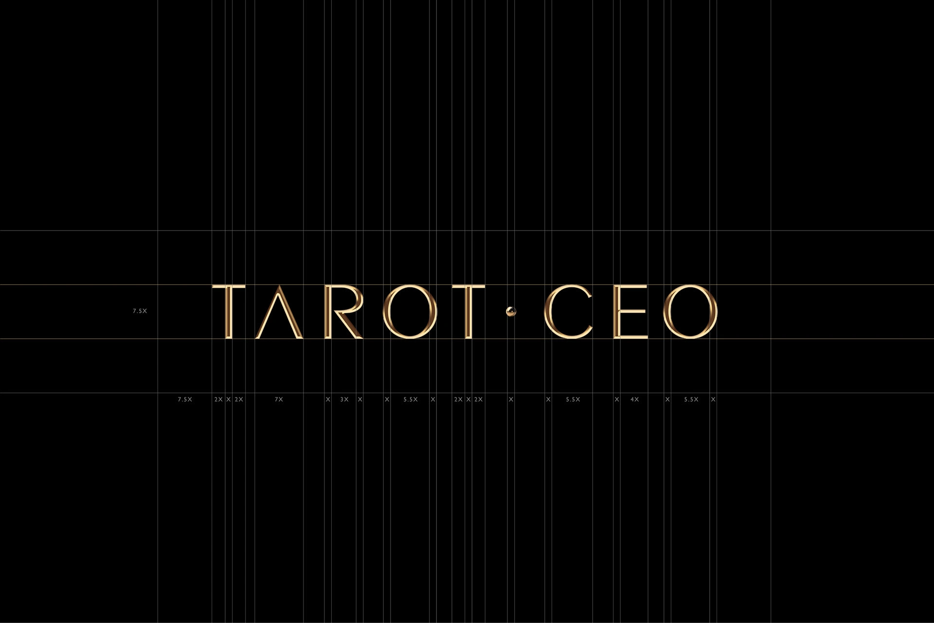
The TAROT.CEO brand logo is based on the concept of the first scepter card, taking the letter "T" (TAROT) and "CEO" as the brand identity. The gorgeous classical metallic inlay elements painted with contemporary and elegant alphabetic font encapsulates the desired concept image of the company logo.
The letters TAROT CEO are forged into a scepter, which is intertwined and interlocked with other letters in an orderly manner, symbolizing the interdependence and co-prosperity of all things in heaven and earth in the intertwining of time and space.
The inlaid spheres are both planets and crystal balls, symbolizing the power of purification and positivity. Energy is derived from our own good virtues and circulates through us to the world.
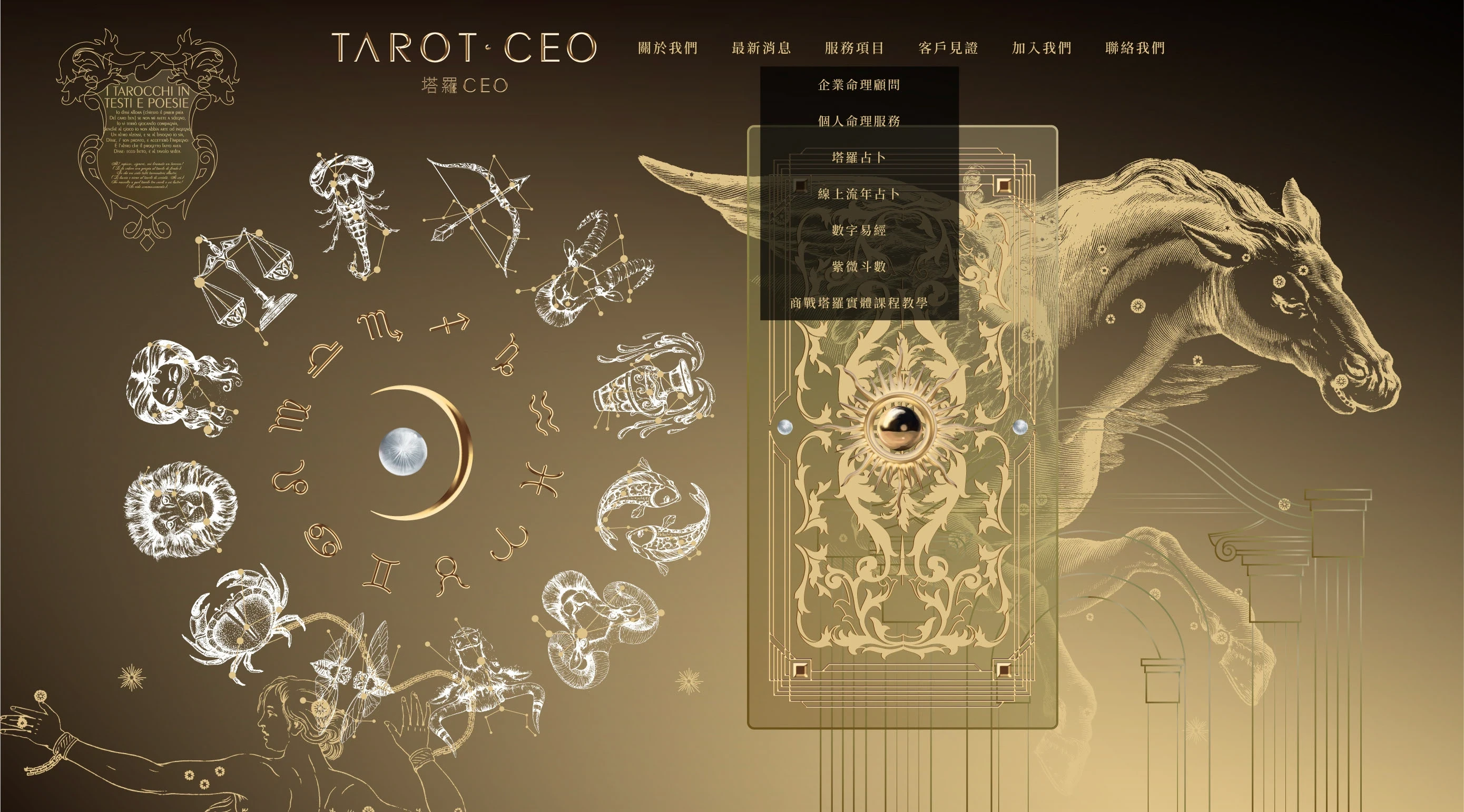
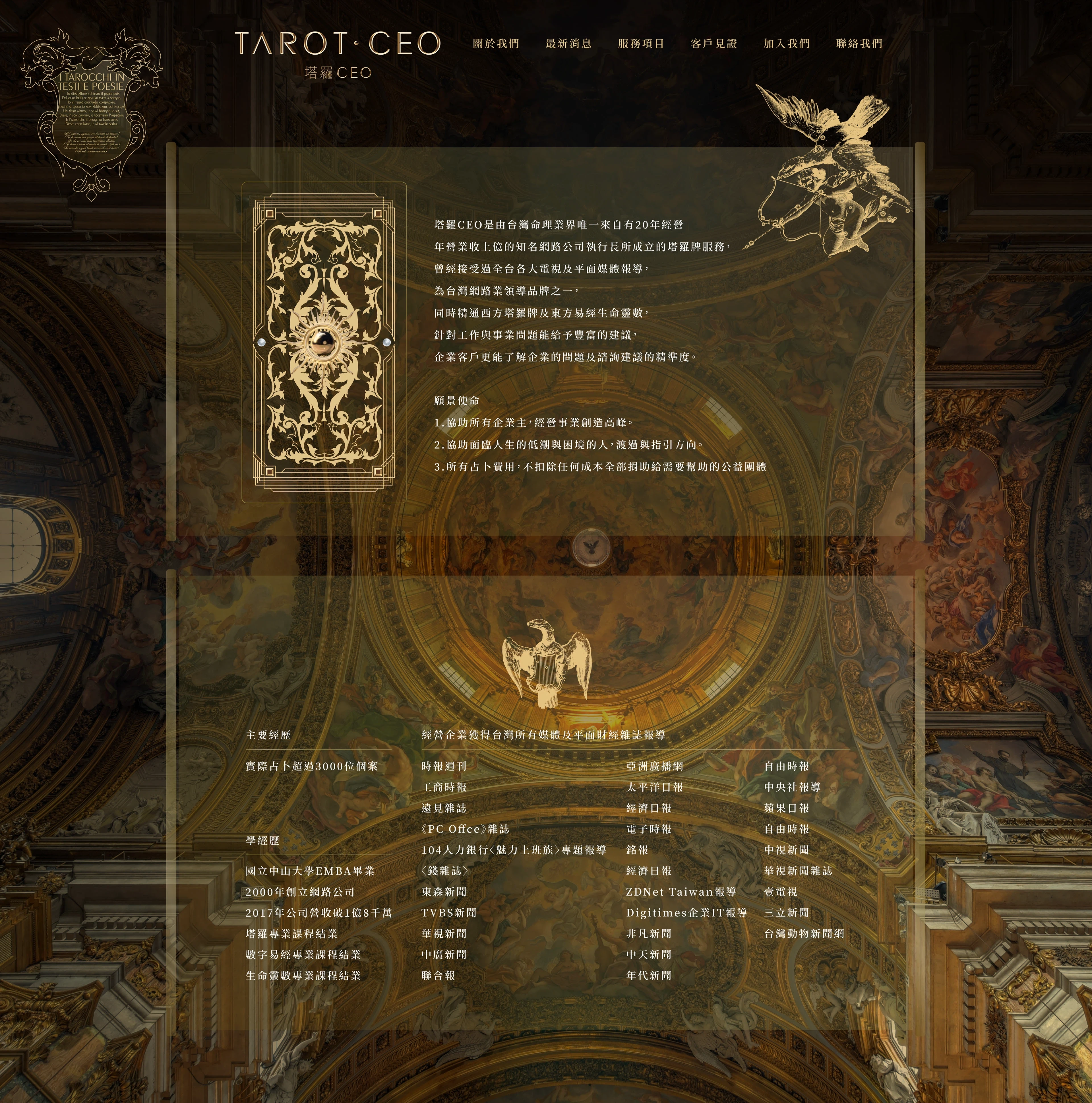
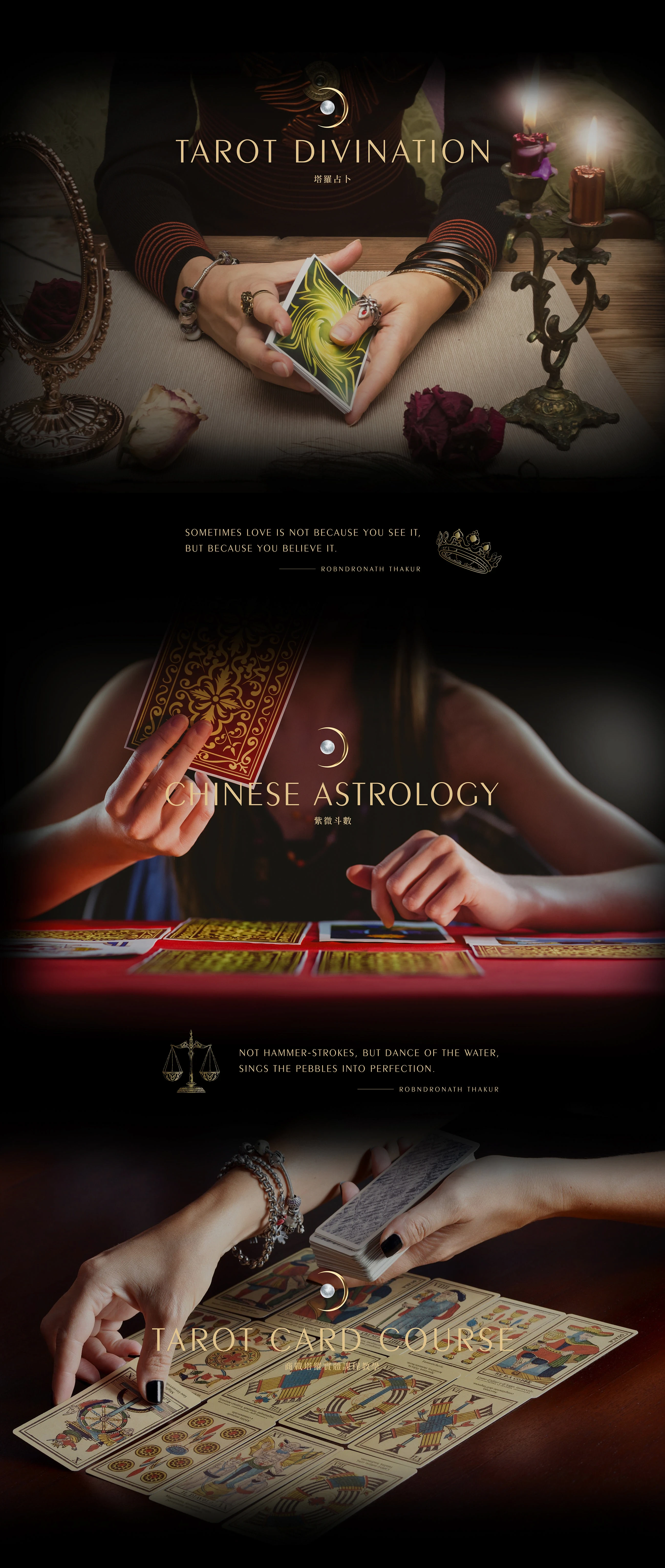
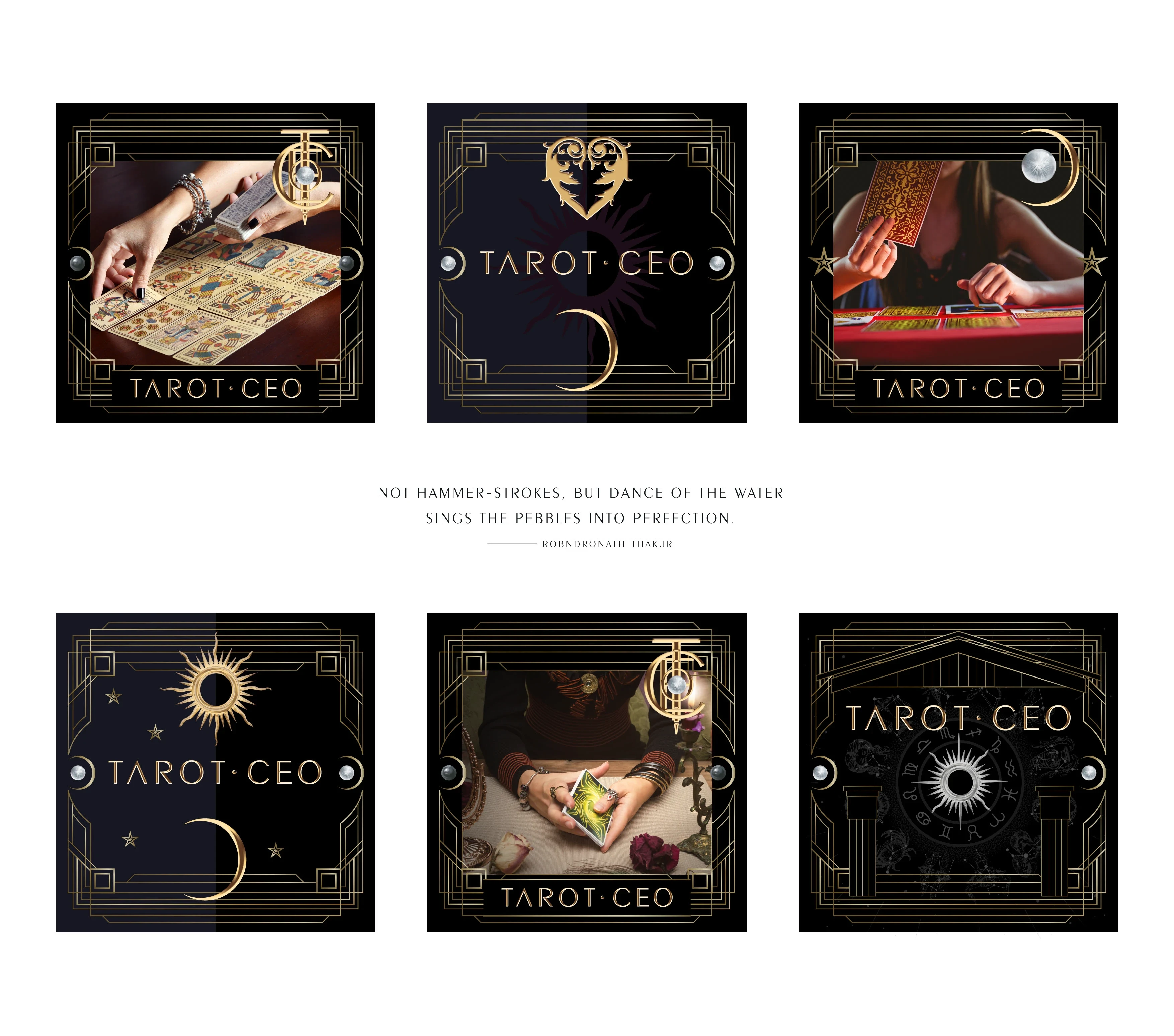
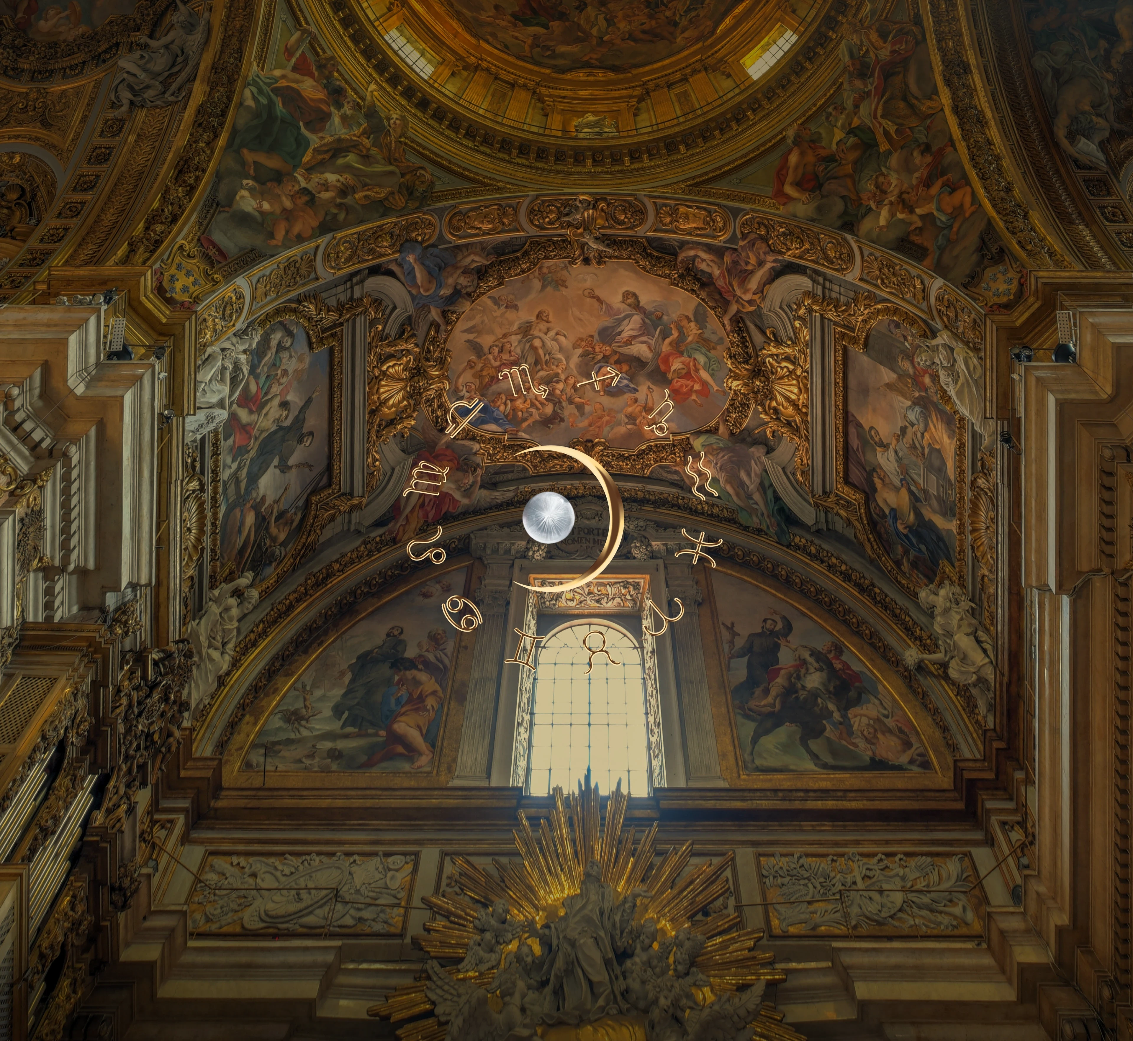
The design of the website is based on the concepts of occult, astrology, Pegasus and mythology, and the brand concept and visuals are exquisitely designed to strengthen the professionalism of TAROT CEO, showcasing the details and the overall image of the company.
Like this project
Posted Feb 6, 2026
Designed the brand logo and website with an occult theme. Centered on the Tarot "Ace of Wands," the logo fuses classical metallic inlays with elegant typography