Perplexed Pharaohs NFT Landing page
Perplexed Pharos NFT
Perplexed Pharos was an ambitious NFT project with a beautiful visual identity that stems from it's core concept
Wireframes
It all started with an idea, capture the attention of the masses.
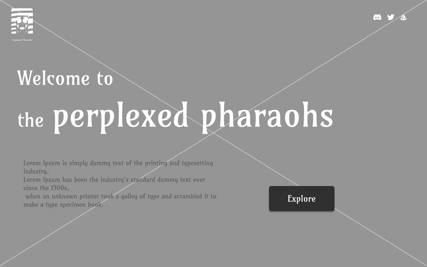
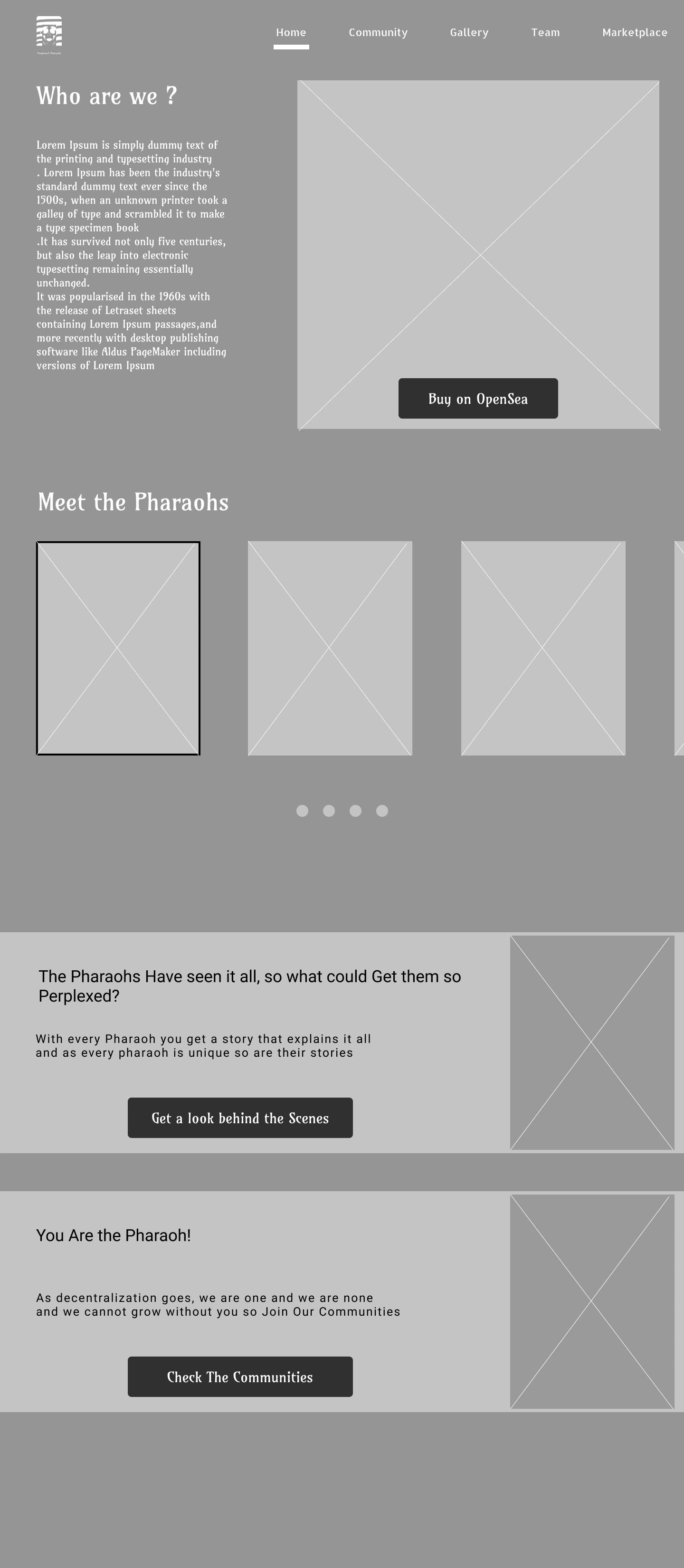
We knew we had a big task ahead so we needed to start simple, and form this simple concept, the wireframes were created
Landing page
Home
You can see that we wanted to make sure that we don't over complicate a simple matter, just a basic landing page, an about us and some engaging text
The Brand
Like any other project, we had to start form the brand, from the pharaoh himself.
I think we did a pretty good job with it!
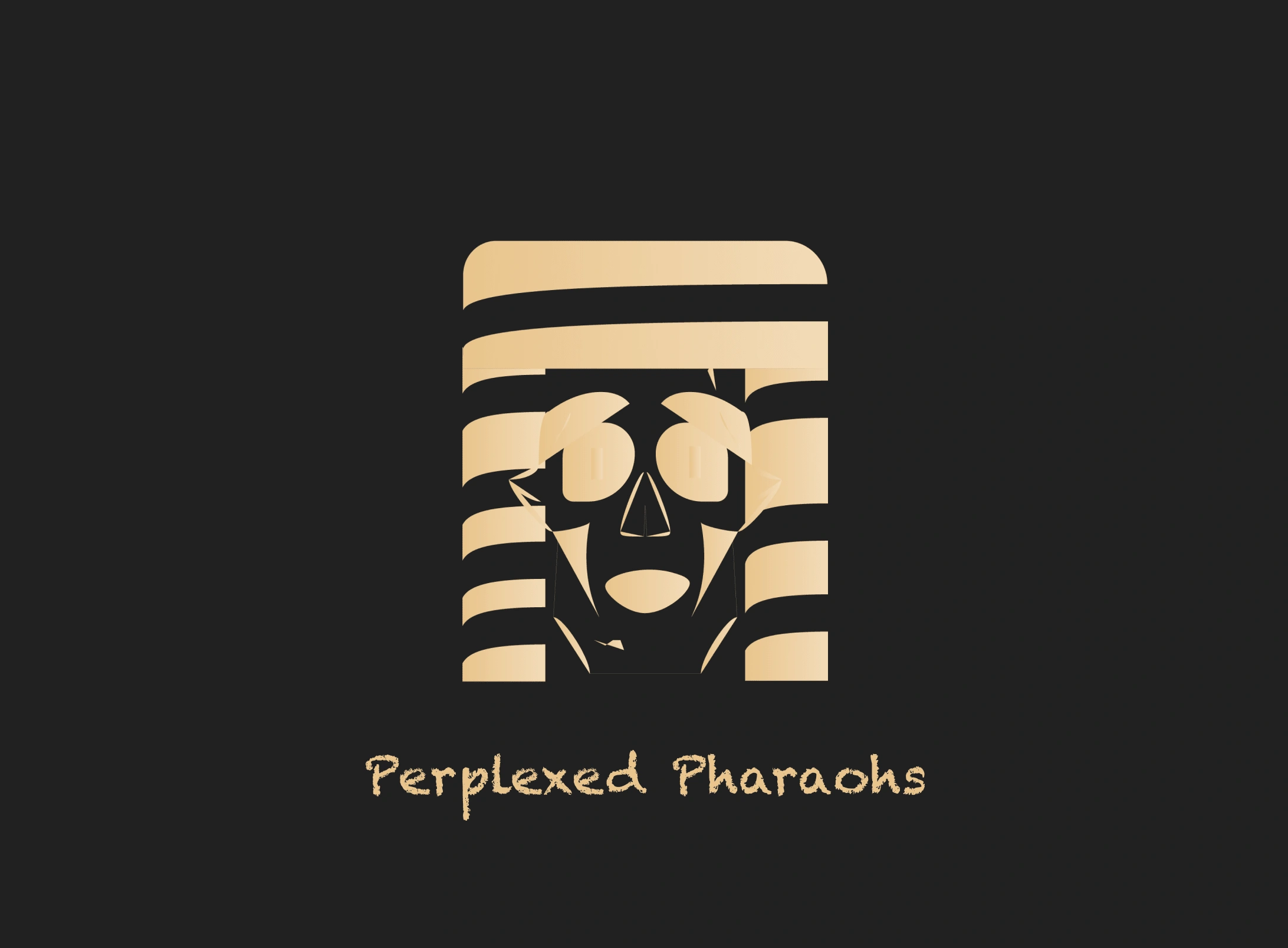
the pharaoh himself, really perplexed!
This is actually one of my favorite logos, working on it was so much challenging and fun!
Colors

Brand Colors
The color selection was simple, we wanted something that says pharaohs and new, the rest was easy
Font

amarante fon
We used the amarante for its closeness to the values we are trying to convey, it felt real and authentic
Final outcome

Homepage
and here it is! the pharaohs are here and they are perplexed!
Conclusion
I hope you enjoyed this sneak peek of our project as much as I enjoyed creating it.
I think our approach for this project was a simple yet effective approach and a way not to overthink stuff
If you ever needed more information, please feel free to contact me and talk more about anything you'd like!!
Like this project
Posted Aug 25, 2023
An NFT project that had great potential and a greater team, take a look at what happened to the pharaohs!
Likes
0
Views
19

