Built with Jitter
Developer-First Media API Website UX/UI Landing page design
Ittybit — Developer-First Media API Website UX/UI
Overview
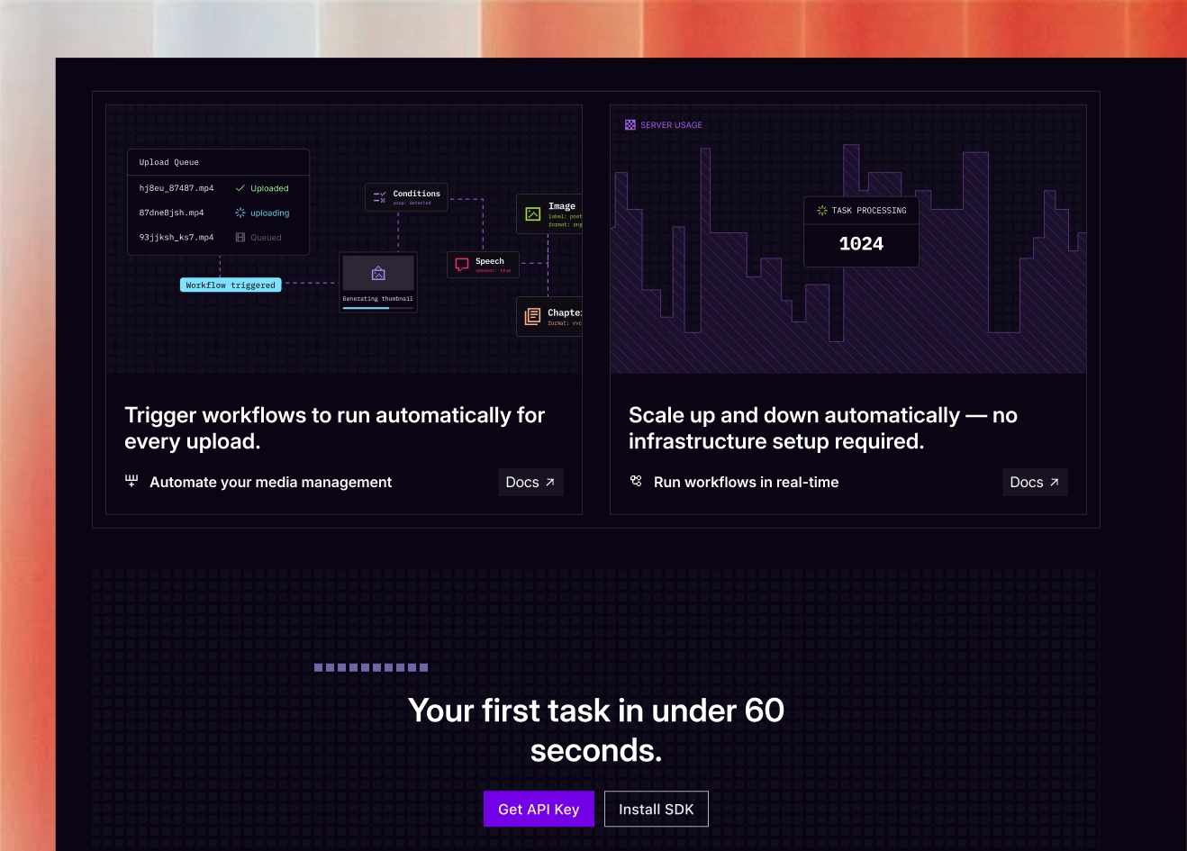
Ittybit is a developer-first media API that makes uploading, transcoding, and delivering media ridiculously simple. My task was to redesign their single landing page so developers could understand the product instantly - no fluff, no confusion, just clarity and speed.
The Challenge
The previous site didn’t fully communicate Ittybit’s value or technical clarity. The messaging was fragmented, code examples weren’t well structured, and the site didn’t feel like a premium developer tool. They needed stronger hierarchy, a clearer product story, and a UI system that matched the quality of their
My Approach
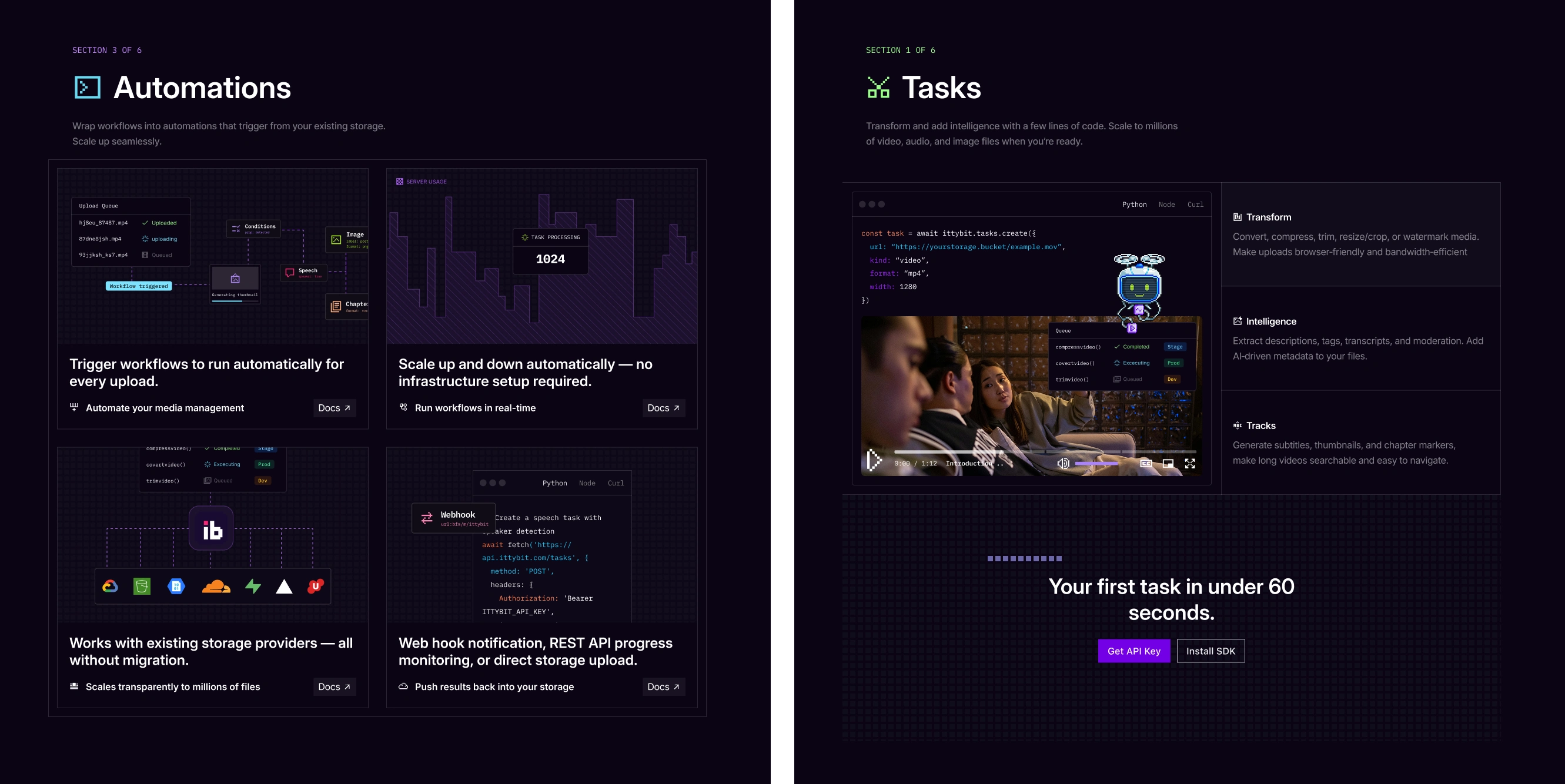
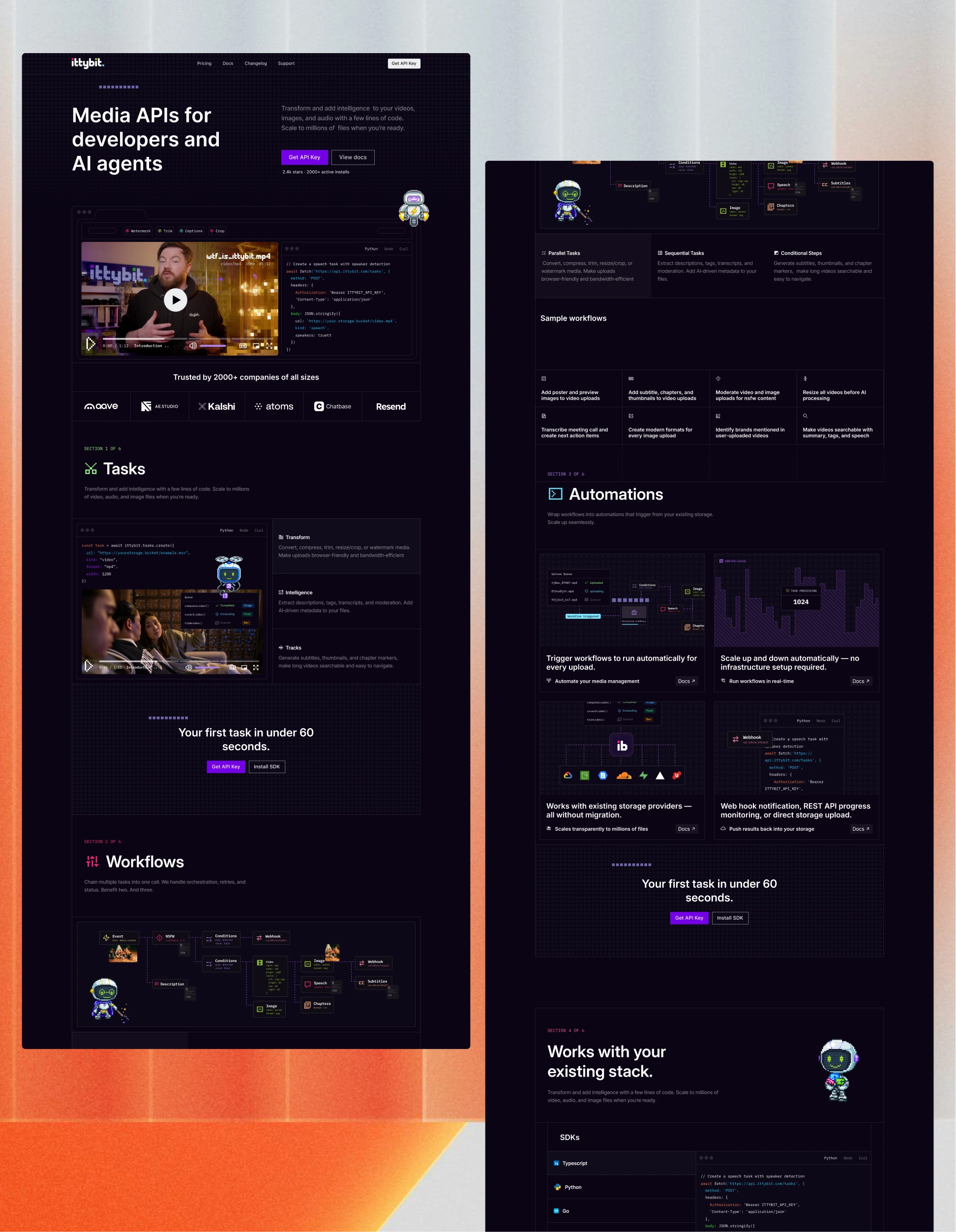
I rebuilt the structure into a clean, scroll-based narrative:
Hero: simple promise, visual API example
How It Works: 3-step breakdown
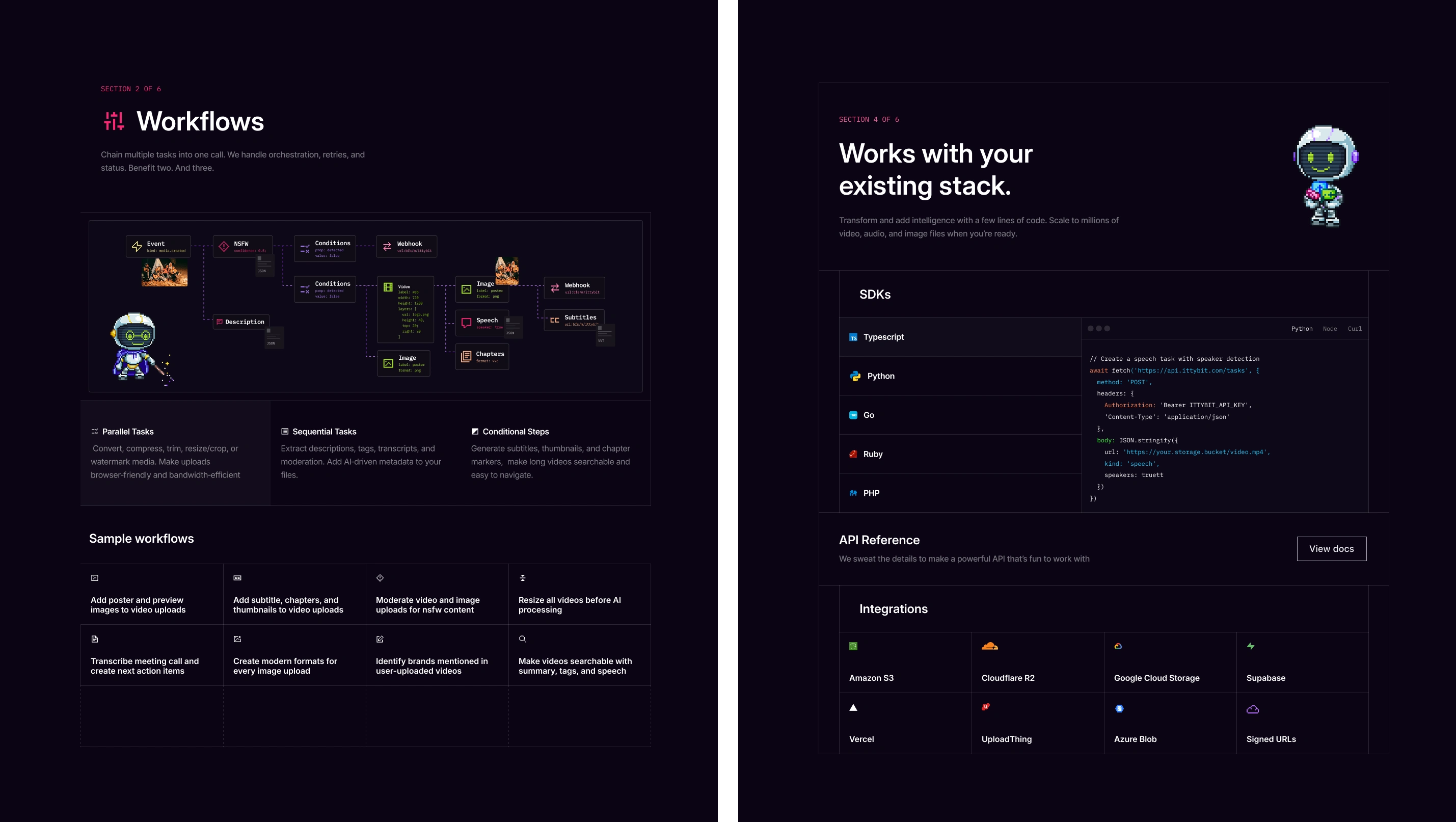
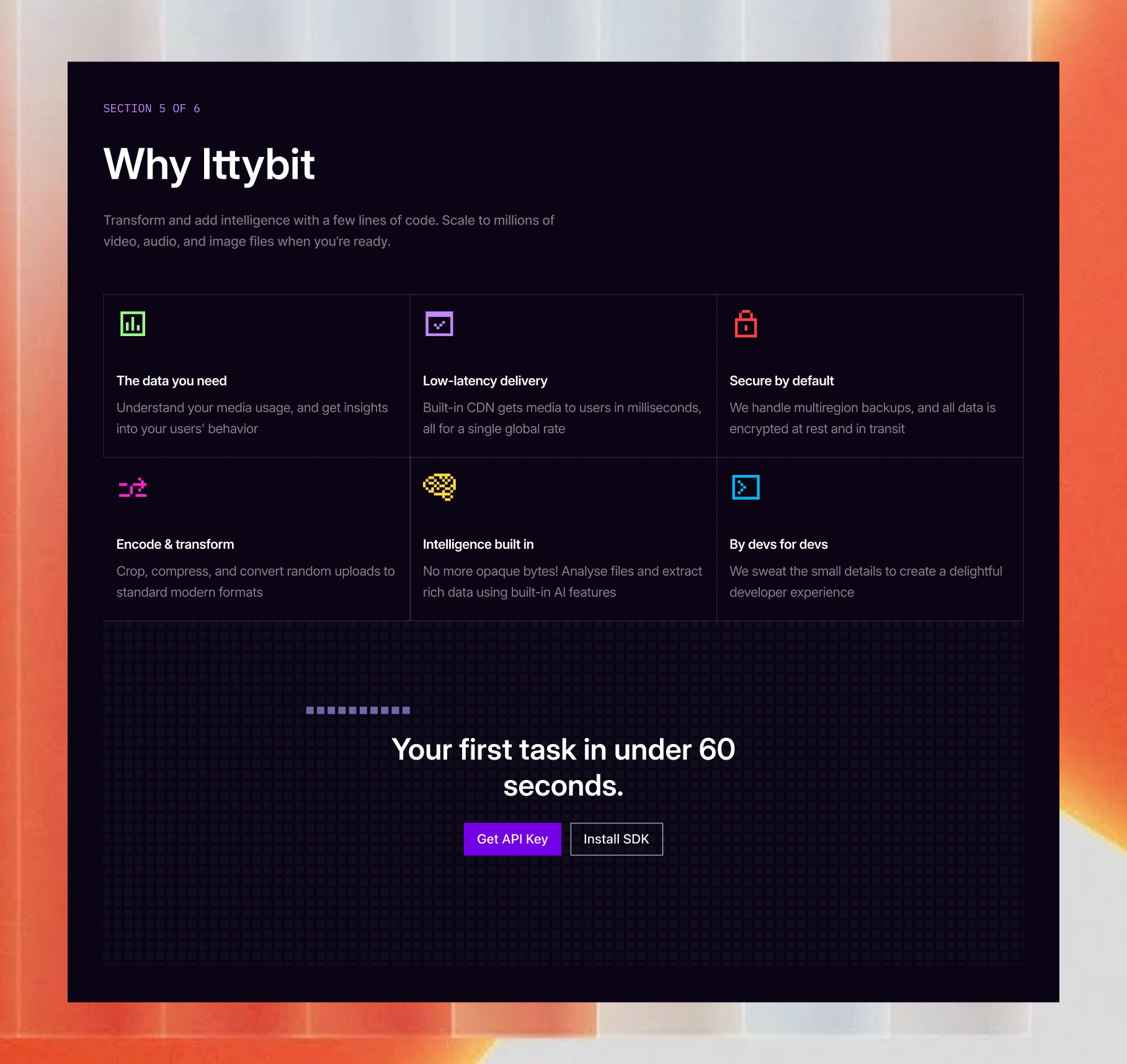
Key Features: clear, developer-focused
Code Snippets: readable and syntax-highlighted
Use Cases: what devs can build
CTA: docs and signup
The UI direction leaned heavily into dev-tool aesthetics: dark mode, strong mono typography, clean spacing, and a balanced mix of product visuals + code.
Outcome
The result is a sharper, more authoritative one-pager that communicates Ittybit’s value in under 10 seconds. Developers can immediately understand what the API does, see how it works, and jump straight into the docs. The page now feels premium, technical, and ready for scale.
Like this project
Posted Nov 20, 2025
I designed Ittybit’s new one-page developer site, simplifying the product story and creating a clean, modern UI that explains the media API instantly.
Likes
0
Views
25
Timeline
Oct 20, 2025 - Nov 11, 2025
Clients
Ittybit

