BIG HERO 6: How Type Becomes the Superhero
Mark K. Hamz
Project Overview
This project is a self-initiated UI/UX concept series exploring the expressive potential of oversized typography in hero sections. It allowed me to experiment with scale, composition, and visual hierarchy using type not just as supporting copy, but as the primary interface element that defines tone, personality, and experience.
Across six distinct platforms, ranging from marketplaces and SaaS products to healthcare and cloud services, I treated logotypes as both structure and storytelling. Each hero section plays with contrast, imagery, and restraint to show how bold type can coexist with usability, clarity, and emotion. This collection is a representation of big type as a tool that commands attention, communicates purpose instantly, and shapes memorable digital experiences.
1. WhichCar
For this design, I explored how oversized logo typography can act as the main visual and narrative element rather than just a branding asset. The WhichCar logotype is pushed to an exaggerated scale to instantly grab attention and set the tone, while the composition plays with the idea of choice by placing two contrasting vehicles directly within the typography, visually representing the choice of this or that.
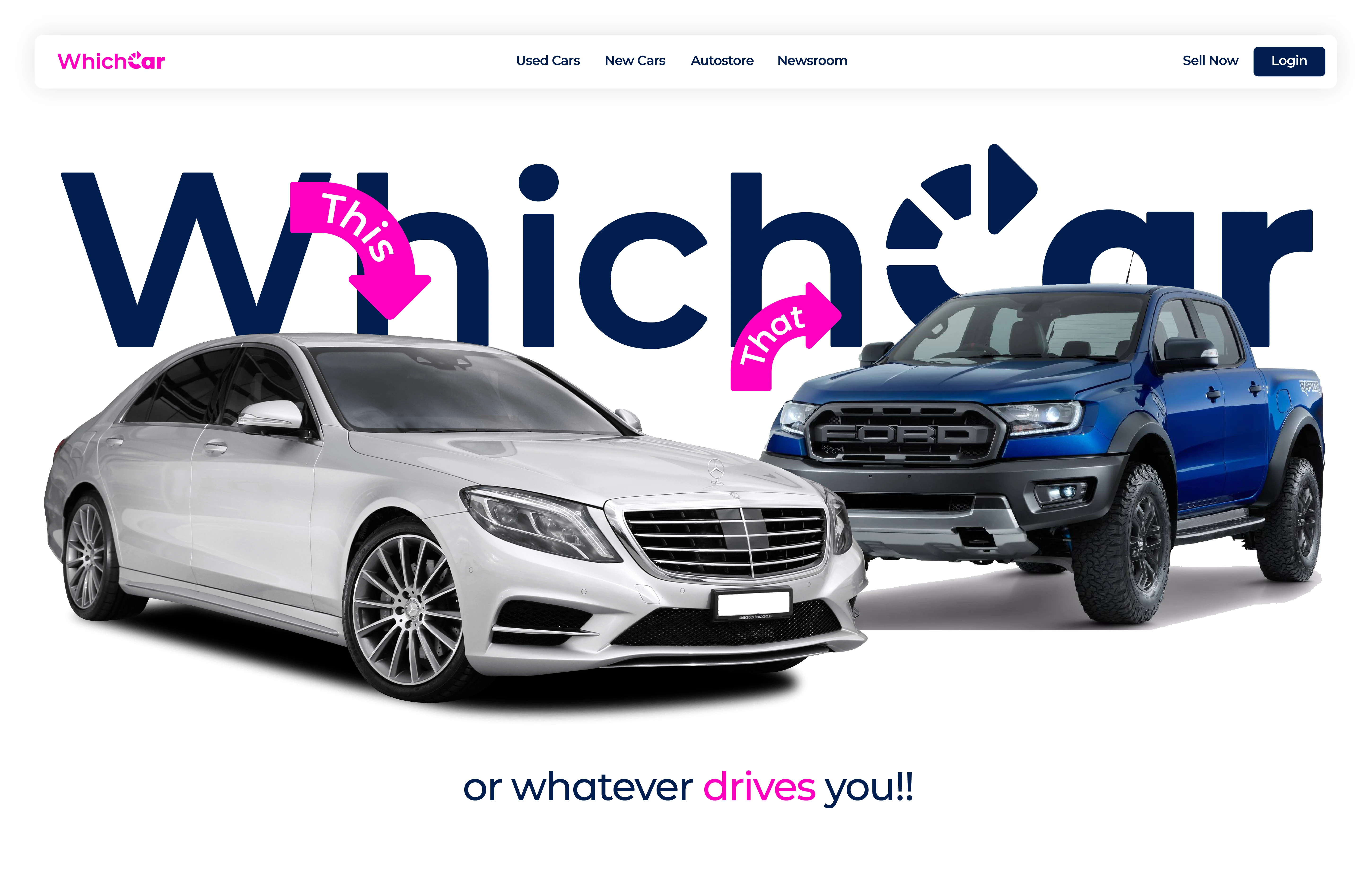
WhichCar
Kept the interface minimal and airy to let the typography breathe and remain the hero of the experience. The overlapping cars add depth and movement, while subtle color accents and a lighthearted tagline balance the boldness of the layout. This concept focuses on celebrating scale, contrast, and simplicity to communicate the platform’s purpose in an engaging and memorable way.
2. Manimal
For this hero work, I used oversized logotype as a structural element, allowing the Manimal wordmark to sit boldly across the architecture itself. The typography is intentionally large and calm, echoing architectural principles of balance, proportion, and presence, while the building imagery grounds the concept in realism and craft.
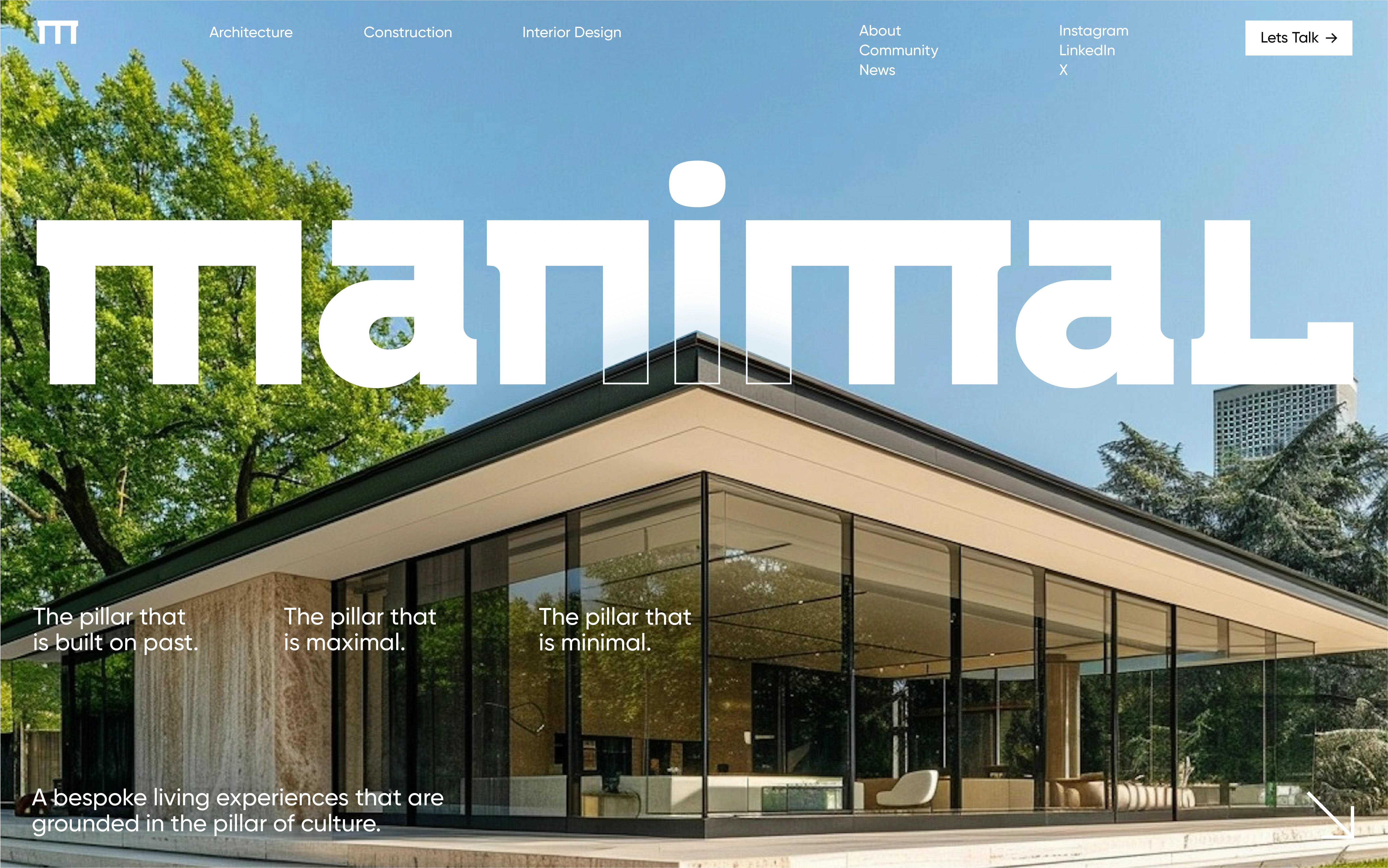
Manimal
I designed the layout to reflect Manimal’s philosophy of blending contrasts; past and present, maximal and minimal. By keeping the UI restrained and letting the typography and photography do the heavy lifting, the hero feels confident, timeless, and architectural in nature. This concept explores how scale and restraint can coexist, using big type not as decoration but as an extension of the built environment.
3. ToWonder
For this hero section, I explored oversized typography as an emotional entry point, using scale to evoke openness and possibility. The ToWonder logotype stretches across the sky, blending into the illustrated landscape and reinforcing the idea of expansion and forward movement, mirroring the promise of a simplified cloud services platform.
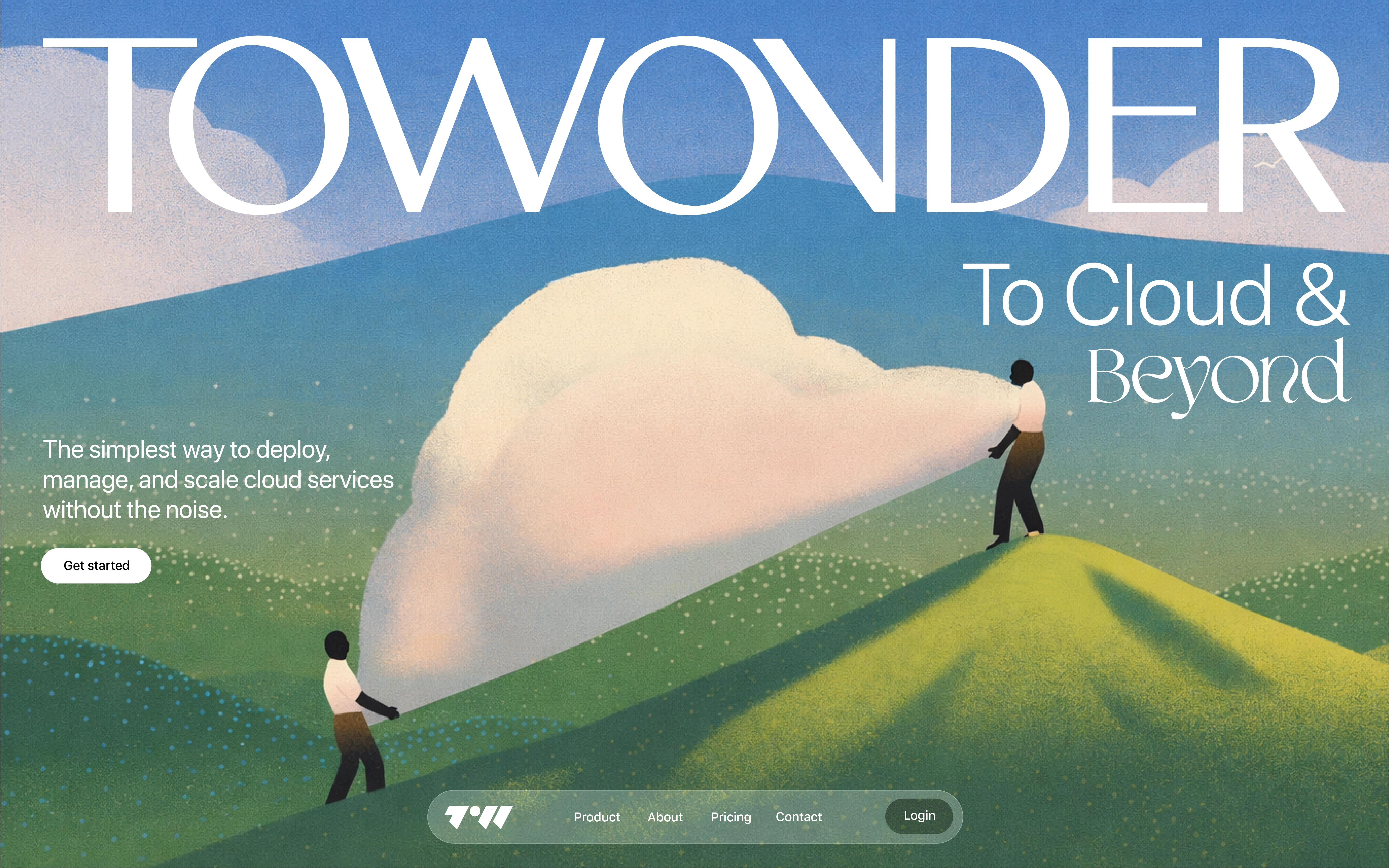
ToWonder
I paired the large type with a soft, narrative-driven illustration to make the experience feel calm and human rather than technical. The typography anchors the layout while the visuals guide the eye through the scene, showing how big type can feel poetic and inviting. This concept focuses on using scale and storytelling to transform complex cloud infrastructure into something approachable and intuitive.
4. Luminar
For this hero section, I explored oversized typography as a canvas, allowing the Luminar logotype to stretch beyond conventional boundaries and dominate the viewport. The massive type immediately establishes scale and ambition, while the luminous gradient strip flowing into the header introduces motion and energy, hinting at the intelligence and flow behind an AI automation platform.
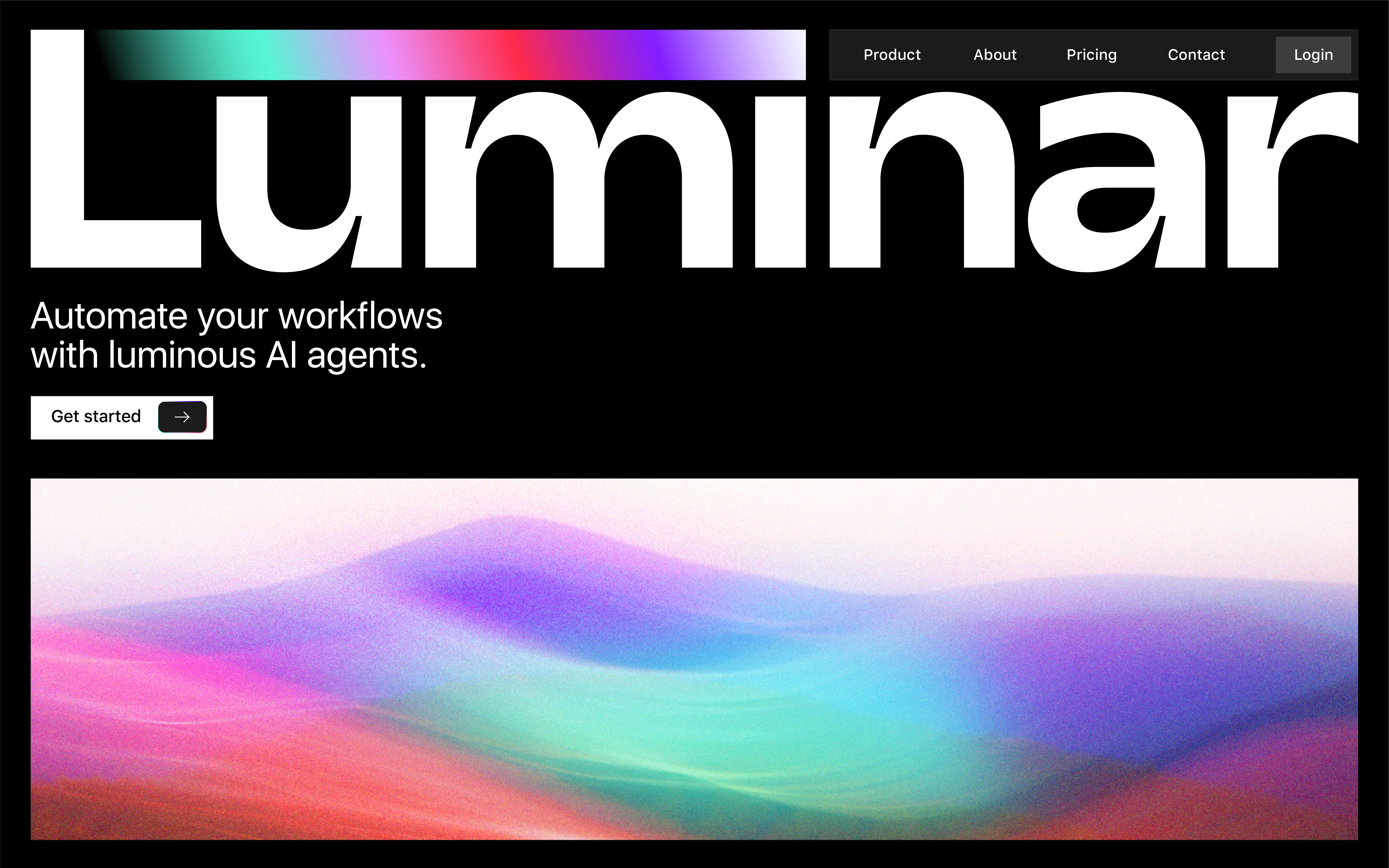
Luminar
I balanced the boldness of the typography with a restrained interface and soft, abstract visuals below the fold to keep the experience grounded and usable. The contrast between sharp type, dark space, and grainy fluid gradient creates a sense of automation in motion; showing how big typography can feel futuristic yet controlled, and serve as both branding and atmosphere.
5. Younify
For this hero section, I focused on using oversized typography to communicate confidence and clarity, two qualities essential to a smart Invisalign brand. The Younify wordmark spans across the layout, partially interacting with the portrait to humanize the experience and put the smile at the center of the story. The black-and-white treatment keeps the focus on expression, trust, and simplicity rather than visual noise.
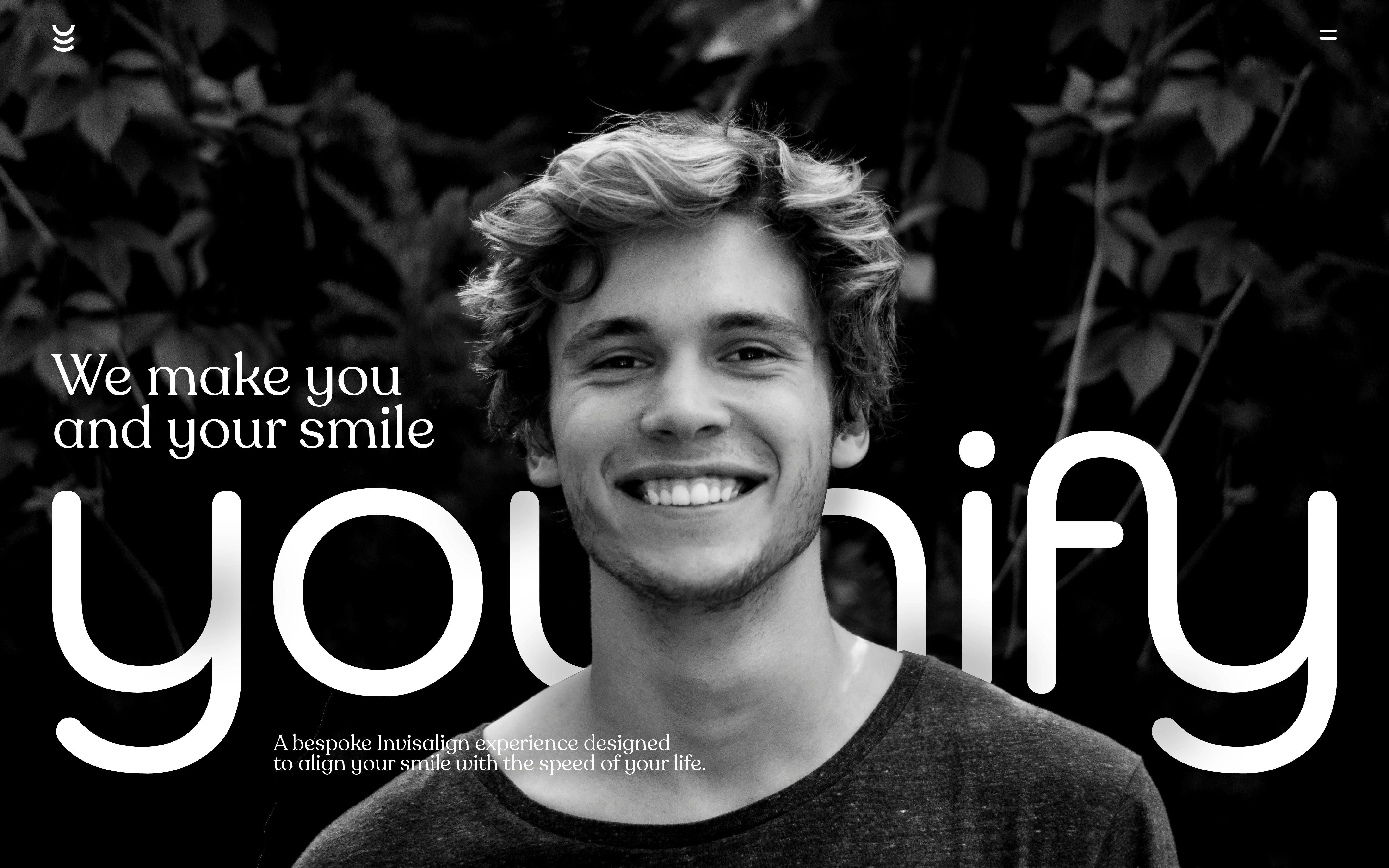
Younify
The interface is designed to feel calm, premium, and personal, allowing the large type to carry emotional weight while supporting copy adds context without competing for attention. By pairing bold scale with minimal UI elements, this concept explores how big typography can feel refined and reassuring, helping a healthcare-driven brand feel modern, approachable, and human.
6. Sproutar
For this hero section, I leaned into oversized typography as a backdrop rather than a foreground element, allowing the Sproutar logotype to stretch across the canvas and frame the experience. The large type creates immediate brand recall, while the soft, organic visuals reinforce the idea of growth, nurturing, and scalability, core to an email marketing and automation platform.
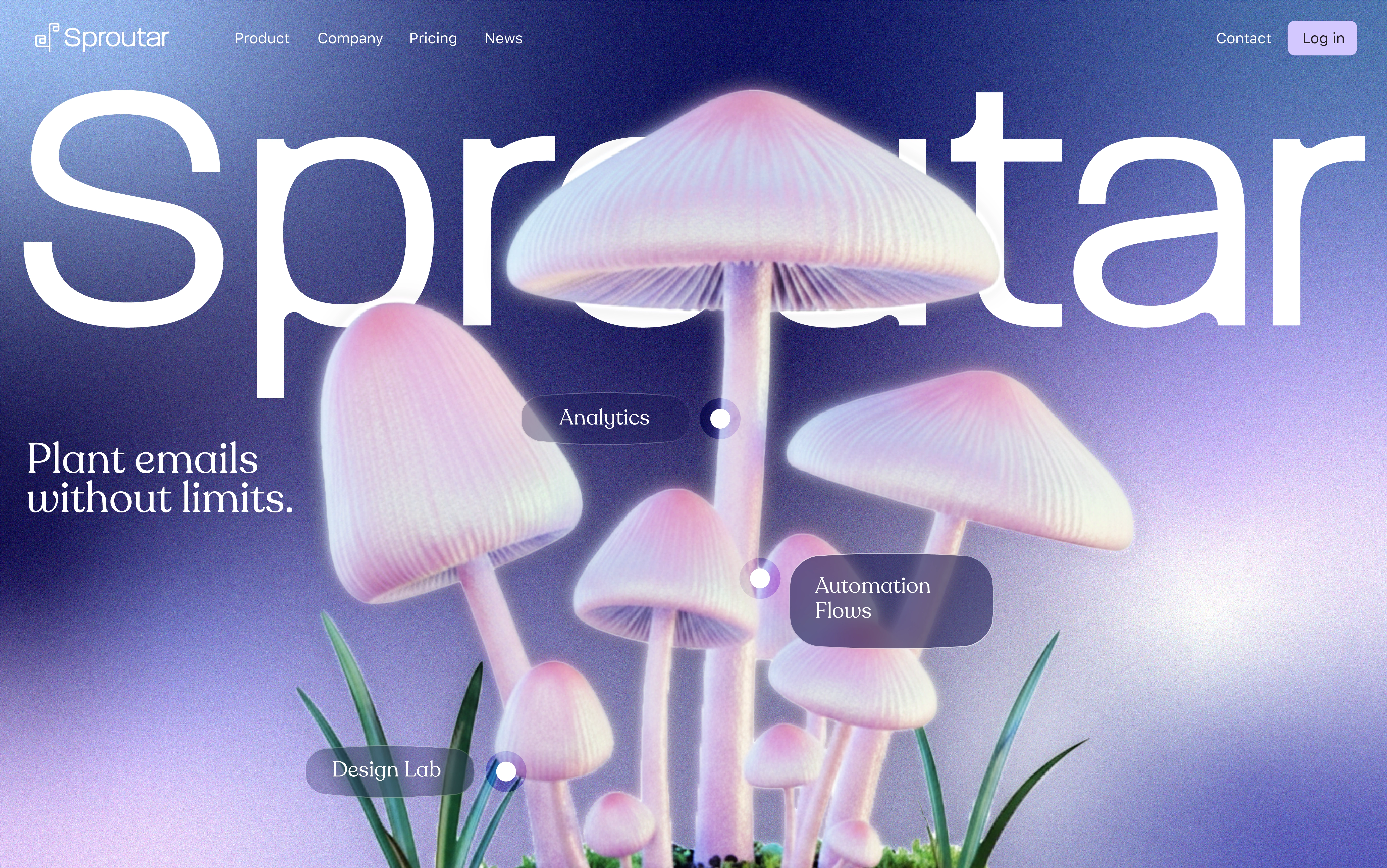
Sproutar
I paired the bold typography with a dreamlike, iridescent environment to make the interface feel approachable rather than technical. Floating feature markers introduce functionality without breaking the calm visual flow, showing how big type can coexist with product information. This concept explores how expressive visuals and scale can humanize complex SaaS tools while still keeping the experience intuitive and clear.
Like this project
Posted Jan 17, 2026
Exploring how oversized typography can shape emotion, hierarchy, and identity in hero sections; and becomes the interface and experience itself.
Likes
0
Views
3