Ecommerce Experience

Josefina Ciordia

Ecommerce Experience
Architects and designers depend on vendor sites every day. Not as marketing. Not as inspiration. As working tools, the infrastructure through which materials get researched, compared, specified, and ordered. Most of those tools are built like catalogs.
For over 25 years, Pantheon Tile has served the commercial design community with a catalog spanning thousands of surfaces and a reputation built on expertise, sustainability, and genuine relationships.
What they needed wasn't a bigger catalog.
They needed a better tool.
Every decision was made with one person in mind: the architect searching for the right material under real project constraints, where the process of finding a surface should never become harder than evaluating it.
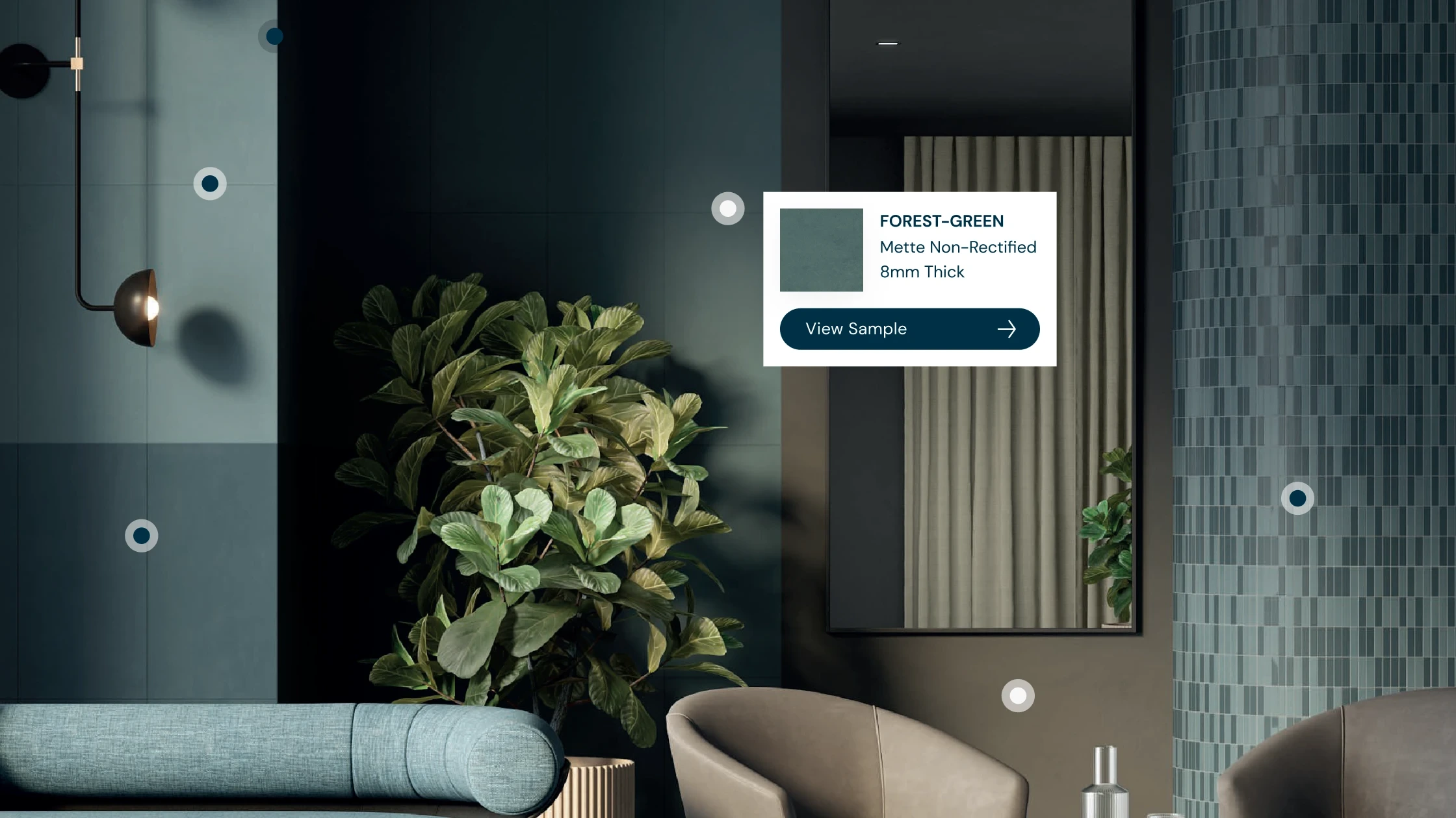
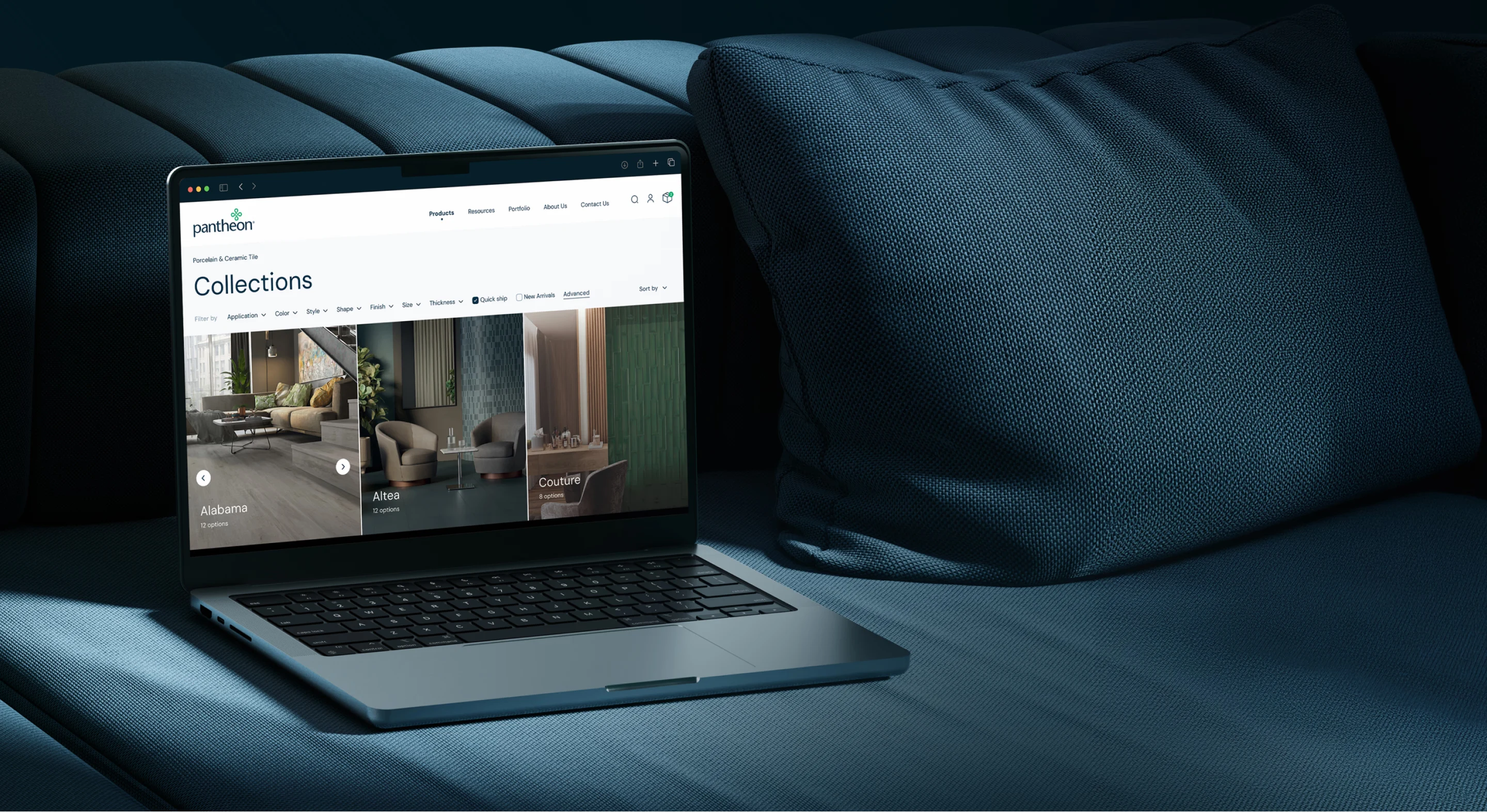
The redesign began with mapping key user flows and wireframing a more guided exploration process. A minimalist and modern UI was developed to let the tile details stand out while keeping navigation clear and consistent.
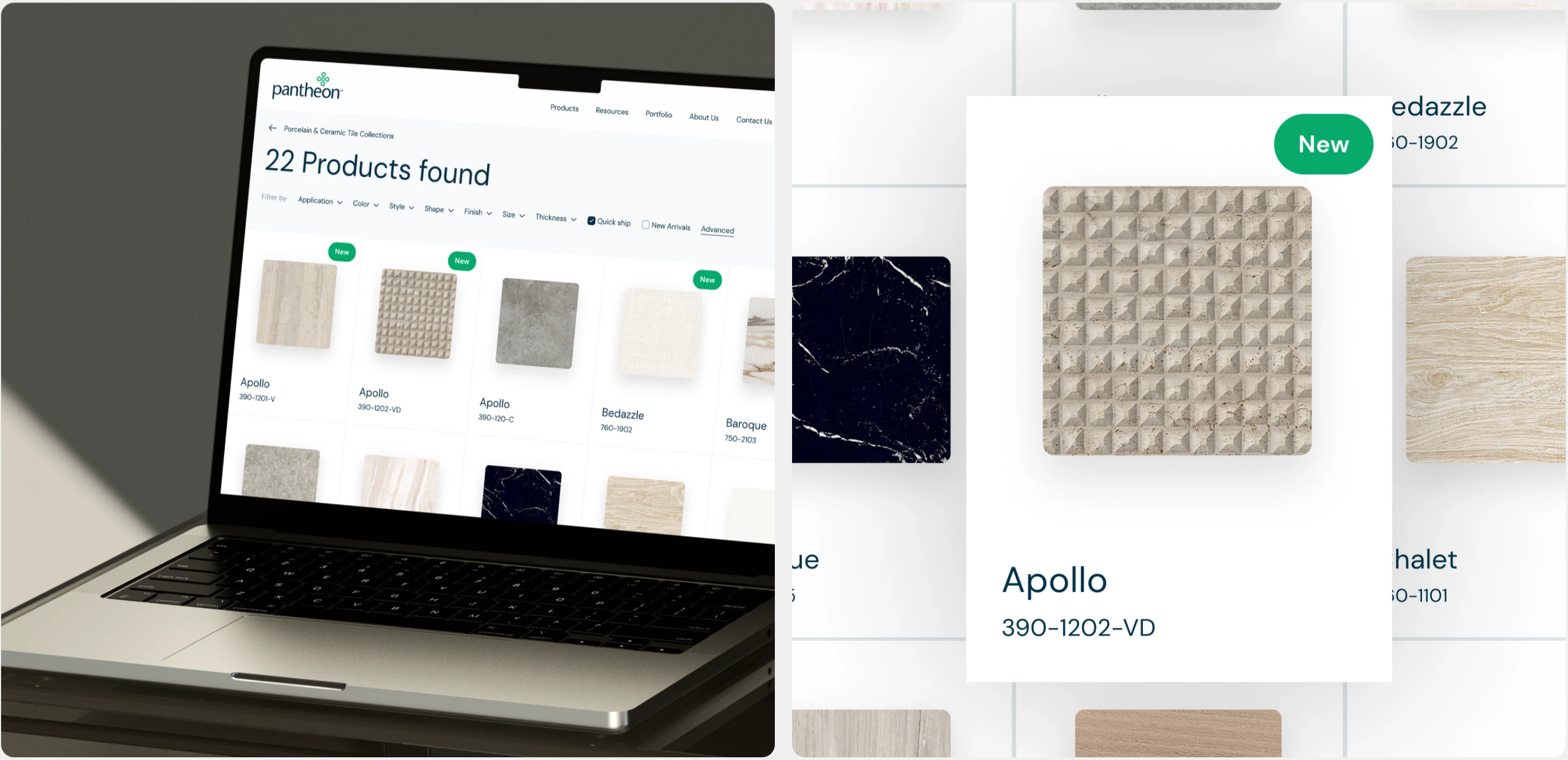
Across the homepage, category pages, product pages, and supporting sections, the layout prioritized visual hierarchy and ease of navigation. Filters were restructured to be clearer, more responsive, and aligned with how users naturally search.
The sample customization tool was redesigned so selecting shapes, sizes, finishes, and colors became effortless and transparent, creating a frictionless path from exploration to ordering.
Smart filtering. Search built around intent. A sample ordering flow designed around how designers actually work, not how catalogs are usually organized.
The success of the project wasn't measured solely in transactions. It was measured in confidence.
Customer finding the right material faster.
Designer exploring collections without friction.
Sales team supported by a digital experience that works as hard as they do.
The website evolved from a product catalog into a platform for discovery, evaluation, and growth.
Like this project
Posted Aug 4, 2026
The goal was to build a modern, intuitive experience where users can browse collections and personalize materials by shape, size, finish, and color.
Likes
0
Views
2
Timeline
Sep 1, 2023 - Feb 1, 2024